I've read comics for as long as I can recall. Was the first one a Zippy strip read to me by an adult when I was 3? That feels like one of my earliest memories, even outside of reading comics, but it's unclear. I can't pinpoint it as a "real" memory. Spotting a display for Tintin books when I was 5 and subsequently having my mom read me Tintin in America feels like a safer bet. Either way, cartooning has remained with me ever since those moments, constantly shifting between deep obsession and genuine love.
A change in my relationship to cartooning seems to have happened in 1998, when I first discovered zines and mini-comics. Up until then, my comics reading was a shared experience with the world at large. If one is interested in comics, Tintin is at the very least known and, odds are, read. A chance at replicating the emotions that I experienced reading Tintin are open to anyone who is interested: simply go to any bookstore in the world and find a volume. With mini-comics, a different thing begins. Work that becomes a profound experience in your life is shared by a much smaller group, and can't easily be sought out by those you describe it too. Perhaps you and five other people begin a relationship with a fully fledged work of art, and it pushes all of your lives in certain directions. For me, my first interactions with mini-comics was deeply felt, truly powerful. The experience was so strong that it felt universal. But of course it wasn't.
I've been looking through my zine and mini-comic collection a lot lately. It would be cliche to say, "These publications really tell the story of me more than anything else, don't they?" Well, they certainly did inform my ideas about what comics mean at a very young age; I was 15 in 1998. Lately, when I feel at odds with various attitudes emanating from other people happily (or unhappily) immersed in comics, I try to remind myself that they probably found their way to this moment through other artistic touchstones. Touchstones that, given the nature of zines, are hard to retrace, much less understand.
Mini-comics, even the "classic" ones, often disappear. Some of the most beautiful ones are never reprinted. Many artists choose not to have their earliest work collected, seeing the flaws ever so clearly, while the reader from the past holds the work close to the heart, aware of all the undeniable beautiful moments it also so obviously contains. Those private moments have shaped so many readers who went on to make mini-comics (or regular comics) of their own. The works disappear, remaining only in the hearts and minds of a happy few, but their essence (whether aesthetic, political, formal, etc.) live on as new shapes in new works of art.
Again, everyone's zine collection is a unique assemblage of specific touchstones. It depends on what area of the world you happened to be living in, whether your co-workers happened to make zines, the various festivals you intentionally or accidentally ventured to, or what you were willing to accept artistically at different moments in your life. To me, a zine collection assembled in this way is far more priceless than one built on determining who were the most important artists of every decade and adopting a completist attitude about seeking out every self published work these artists made. That's the same as reading Tintin; it's open to everyone to do.
For this column, I went through all my zine archives and picked out dozens of publications. While there are important (to me) zines that have been left out, I've tried to cull together a group that explains where I'm coming from. Within these selections, there is work by peers, artists I admired and emulated, people in my life, publications I acquired mysteriously, zines I carried from house to house because I found them comforting, and items that have a hold over me simply due to the moment in time that I found them.
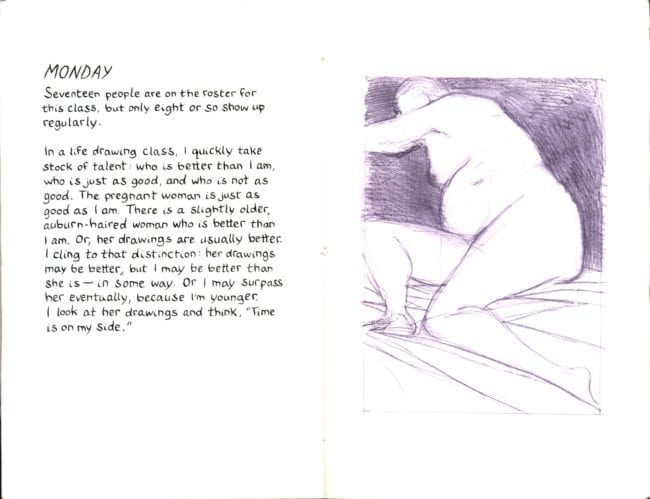
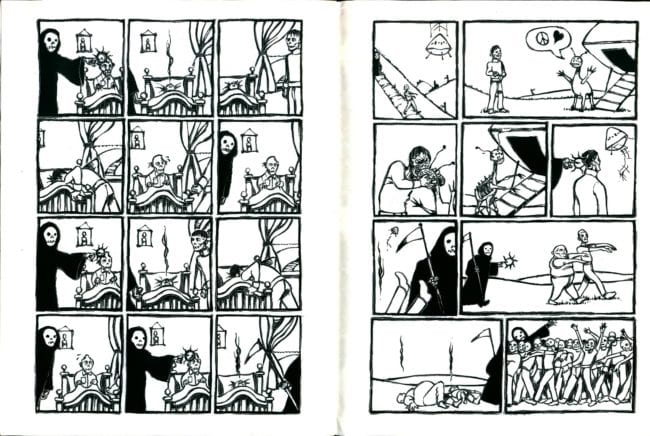
This is an atypical work from John Hankiewicz, but one of my favorites. Perhaps it's autobiographical, but I'd rather not assume that. A narrator makes observations about his experience in a life drawing class that meets on Monday and Wednesday. How the models pose, how many people show up for class, the narrators physical experience in the room where the drawing occurs: all are mentioned in simple prose.
What has always stuck with me about this zine are the remarks about the work by other students. Even if this work is not autobiographical, it's hard to separate the voice from Hankiewciz, an artist I (and probably most people who read this zine) hold in high regard in terms of his ability to draw. A certain passage, where the narrator sizes up his work against the others in the class ("I quickly take stock of talent: who is better than I am, who is just as good, and who is not as good") had a real power to it the minute I first read it. The narrator comments on an older participant in the drawing group whose "drawings are usually better [than mine]." But, perhaps, the narrator is better than her "in some way" or will surpass her with time "because I'm younger." The final statement, "time is on my side," is a refreshingly honest credo from an already incredibly talented artist. The idea of a lifetime devoted to art, a humble perception of one's own work, the desire to continue: all of these are things that the act of making a zine states in undertone. Monday Wednesday poeticizes that undertone.
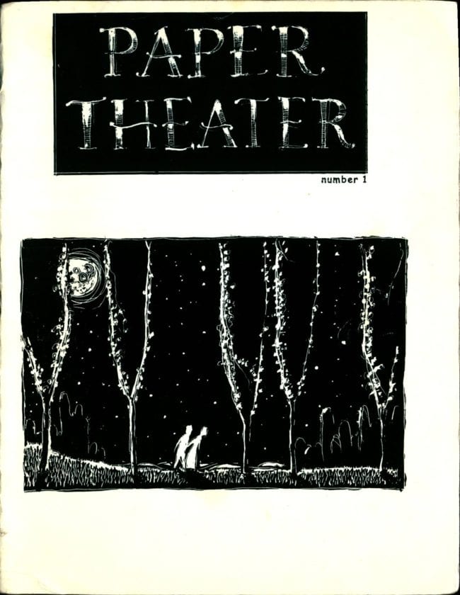
Paper Theater #1 was one of the first mini-comics I ever bought, at APE 1999 in San Francisco. It instilled in me a certain ideal I've never let go (no matter how foolish). This book didn't feel like what I had been led to believe zines might be: an experimental test of how to put a comic together, a desperate attempt to communicate, warts and all, with the world, or (the worst possibility) a business card in comics form. Instead, Paper Theater was a rich work, labored over by the artist with obvious conviction. The fact that the author had printed it himself, and printed it modestly, only made the work within all the more thrilling. Nothing asked you to like these stories besides the stories themselves.
It was never actually verbalized to me, but the vibe I gleaned from self-publishing at that moment in time was as follows: while the financial or cultural awards were basically nonexistent (if someone thinks art comics are a marginal art form today, the world of cartooning in 1999 would be a shocking revelation—as was the art itself, though in reverse), that didn't exempt one from a deep commitment to the form. It seemed like an adequate reward for making a beautiful comic might be a heartfelt letter from a respected peer and nothing beyond that. In that year, the faith in comics felt so strong that the reality of the medium's actual renown seemed inconsequential. The 'fuck you, pay me' doctrine of today might as well be an alien language, both in words and sentiment.
At least, to my extremely young eyes, that's what this comic suggested about how I could think of cartooning going into the future. I still think of it that way, for better or worse (I think better).
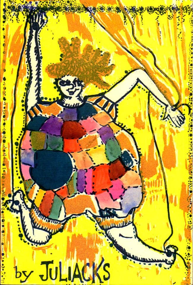

Juliacks is an artist whose art often gets lumped together with mine by critics, though often not for the things we actually have in common. Though she walked a different path, I think Juliacks had the same ideals about comics that Catmull's Paper Theater instilled in me: a complete belief in the potential of the form, a sincere feeling that all of one's creative potential could be explored here. When Juliacks handed me this book at SPX in 2006, it didn't seem like a painter trying on narrative for kicks, or a poet faithfully drawing their abstract notions into images. Instead, here was an artist whose work might 'fit in' better elsewhere, but felt the strong magnetic pull of cartooning all the same. The story itself had a deep emotional pull to it, which was valuable for me to see in 2006. Experimental comics at the time where deep in their flirtation with genre and video game aesthetics, with feeling repressed, if not (more accurately) thought of as an afterthought. This work, in contrast, maximized feeling.

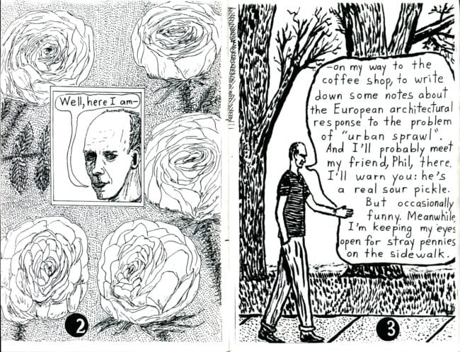
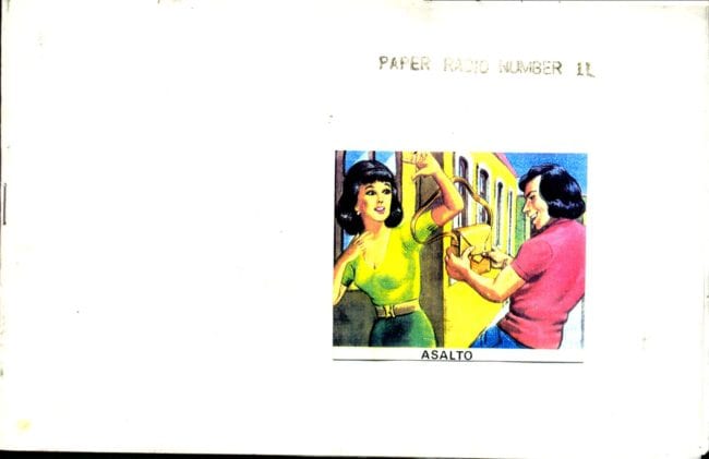
I have no idea how I came into possession of this comic, and the author remains a total mystery to me. I've never heard anyone else mention them, nor have I stumbled upon other works they've made, unless David Tea is a pseudonym for another artist.
The comic is deeply mysterious, taking the indy-comics conceit of 'chronicling my mundane walk' to dizzying heights. Dave walks with the reader as he searches for stray pennies, talks about the history of currency, introduces us to the man who works at the local coffeeshop and then spends a bulk of the zine speaking with a plant with whom he communicates 'via mental telepathy.' There is an outsider quality to this zine to be sure. But we might find more justice in calling it a surreal work in the true sense of the word, where the belief that 'there's another world, but it's in this one' holds true. Dave's walk feels unsettling until we accept the logic of his reality; after that it's highly comforting.
The anonymous nature of this zine has always placed it as a high watermark for the potential of zine culture: here is something perfectly made, sent out into the world without explanation, that commands respect because of what's inside of it and despite of everything else.


As far as I know, this is Margot Ferrick's first zine. It's striking in contrast to the more text-based work the artist has become known for. I loved this zine upon first reading, because it contains a successful exploration of an ideal I believe comics are capable of expressing: it depicts two characters, a bird and a spider, interacting in an explicitly kind way with each other but is all the while devoid of saccharine sentiment. There is a certain sweetness that comics can express which we see in the classic Dell Comics, but is nevertheless so rarely attempted today. This comic embodies the Dell approach while coming to it from another dimension. The characters are anthropomorphized, but you can view the way this is done as a harsh critique of how the device is utilized in the typical SPX/webcomics manner. Nothing here is drawn to be cute, and yet a real wholesomeness, a hardwon wholesomeness, emerges.

What I remember most about this zine might be an invented memory, but it has meant a good deal to me over the years nonetheless: I picked up this publication for free at the Highwater Books table at a festival. Standing at the table was the artist Ron Regé, who was talking about 'the Fort Thunder artists.' He wasy saying something along the lines of, 'Yeah, those people make a comic like every week or something.' The fact that these comics were free, that they were produced so often, was further grist for my idealistic comics mind. The very idea that another artist whose work I deeply admired found this approach of 'making a comic every week' to be praiseworthy wormed its way into my brain. The approach of artists like Clowes and Ware were pushed aside by this new credo. The authority of the humor and the uniqueness of how these comics were laid out indicated that the artists didn't just 'believe' in what they were doing; when reading them, their approach suggested itself as the only logical path. The work was so fun to read that it melted other approaches away, at least while the comic was in front of your eyes. Having something so strong given away as free didn't come across as humble, but instead as an attack on everything else.
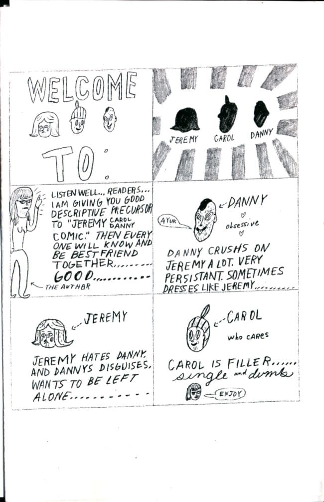
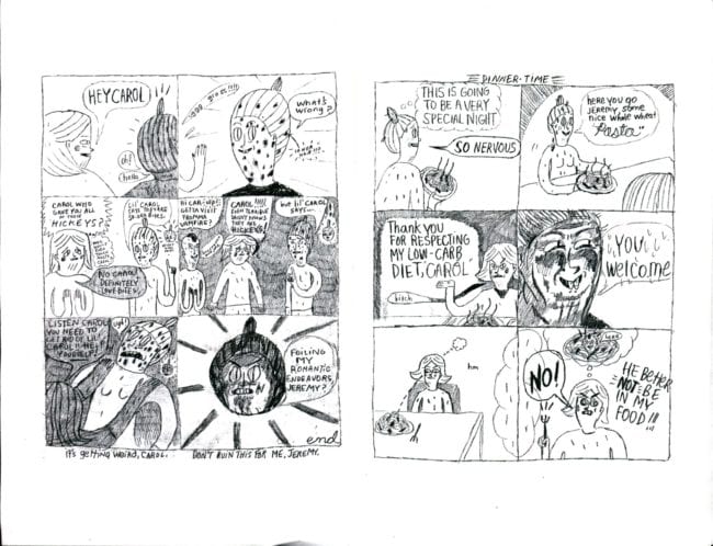
The presentation of these 'Jeremy, Danny, Carol' comics that Lizz Hickey was making in the early 2010s fit their tone so well. For instance, the one I used for this article lacks staples; it's just folded together. The cruel humor of the characters seems to overpower the paper itself, causing the zines to almost physically fall apart. But this isn't the work of a self-consciously transgressive shock artist, but instead a very thought-out response to Bushmiller. I still remember seeing Hickey deliver the all-time best public comics reading I've ever seen, using these comics. I wish she'd make more of these!
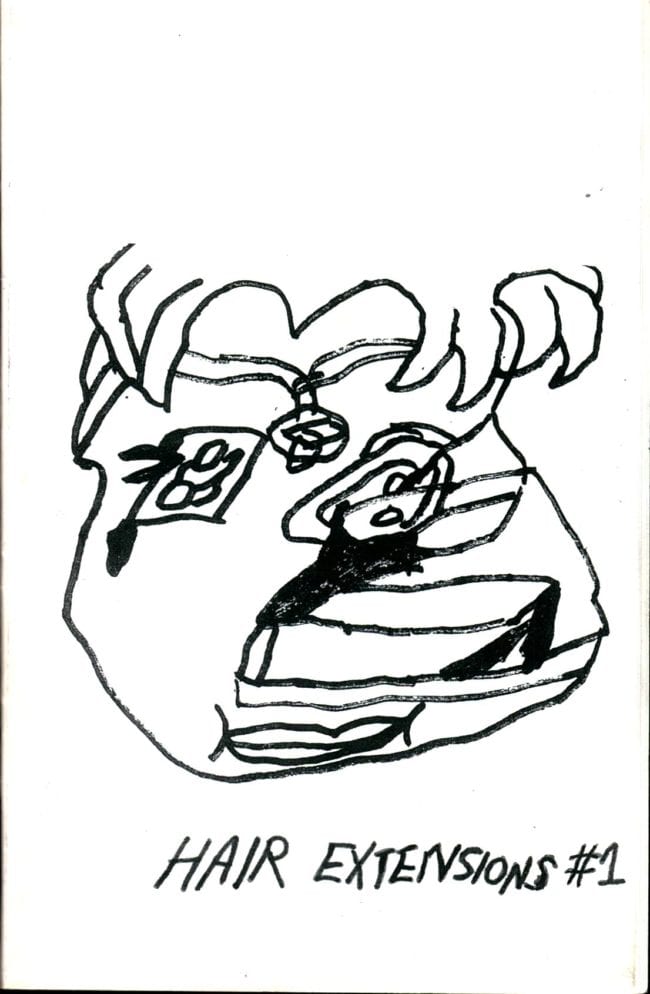

I used to sell this zine on the Domino Books website, and it remains one of the out-of-print items that people ask me about constantly, trying to obtain it. It's very valuable to me as a work of art. Wiley Guillot is an artist whose overall project I sympathize with: the desire to approach the page with a certain idea in mind, but without a clear path. Improvisation, collage, and editing bring about something more potent than the original 'certain idea' ever could have been.
At least, that's where I think Guillot was at during the time he made the drawings found within. It was important for me to see this work when I did---often times, work you correspond with can repel you from your own path. 'This is what I'm doing?' Hair Extensions #1, on the other hand, was a deeply positive vote to continue.

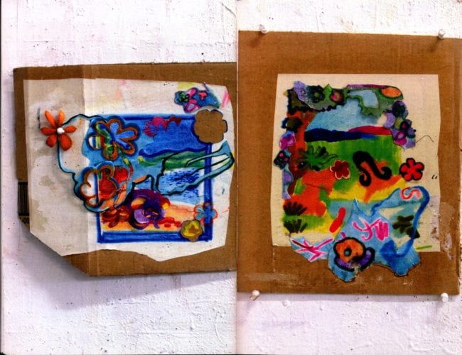
This is a zine I'm grateful was published because it captures work that I witnessed being made. I met Marlene Frontera as she was creating the paintings that fill this book (which, when presented together, dip in and out of narrative), and I remember when certain new pieces were created. The function of zines in large part is historical, often doubling as personal history for a group of readers close to the work, and as document for new readers who are entirely foreign to it. Complications arise for the former group's memory of the work as it was happening (Frontera presented her work paintings together in clusters, while this book presents them solo, page by page) and the reality of the publication. But I tend to accept the choices made in how a zine was presented; nothing can exactly replicate a first experience with any rousing piece of art. Santo Shoes is an example of art I loved translated into a book that now exists for me as a compact entry point for a series of memories. When looking through all my zines, so many of them give off this power just by glancing at them. Losing a copy of an item like this would be far worse than damaging a priceless antiquarian book.

I think Chris Cilla is one of the greatest cartoonists of his generation. This is the first zine I read by him, and it contains the qualities I think make his work so beautiful. There is a small reference of classic monster comics thrown to the audience, so that we know we are in the hands of someone who loves cartooning. But Cilla refuses to react against the idea of classic comics that he has brought up, or to fall in line with it. Instead, through his own specific, hard fought lines of ink and quiet storytelling, he finds a way to exist alongside cartooning of the past. Cilla's work isn't commentary or tribute but the actual thing itself. Cartooning that has digested its past happily but not slavishly.
An aside: Cilla's work always seems to me to be the most successful at communicating smell, without really trying to. I don't suspect a particular pungent scent from any of the scenes here, but that in some way, these subtle drawings are so accomplished that they actually deserve the too often used phrase 'lived in.'

Like Juliacks' work, Sakura Maku's cartooning me want to continue working in comics. In the previous installment of this column, I advocated for work like Krazy Kat: comics that create their own system of expression without reference to the real world. This seems, to me, an ideal comics work well striving for. While Maku's work is full of references to pop culture and to the city of New York, all of this is used as props for the deeper reality that Maku constructs in her art, one that exists only within the pages of her many zines. As far as I can tell, Maku has lived in New York for around the same time as me, and her vision of the city feels close to my own: sounds and images layered over and over upon each other, a lot of sensation that's easily accessible as long as you remain into it. Maku's comics might be hard to enter at first, but once you let your guard down, there's a real pleasure to be had, just like NYC circa early '00s to now.

Nate Doyle was my co-worker at the NYC comic book store Forbidden Planet from 2005 through 2009, and I worked with him throughout the time that he created this comic. I remember talking about it with him a lot during shifts, and a sense of deep pride for him when he completed it, as his work grew in assurance and breadth. His cartooning and mine were as opposed stylistically then as they are today, but my appreciation for his comics was always crystal clear. Part of my own education in broadening my cartooning palette had to do with working at that very store, FPNYC. When you spend a lot of time as an employee in a comic book store that carries virtually everything, your aesthetic barriers break down. I began working in the store with very specific ideas about what line quality I found worthwhile, but as time went on and certain customers passionately bought work that I'd never given a passing thought to, a wider idea of what comic art could contain opened up to me. I still think anyone with any interest in cartooning should work at a comic store, just to see that the things they feel opposed to exist as the object of real affection to a wide swath of readers.

I read this comic so many times, it's practically falling apart now. This really does feel like one of those 'they don't make 'em quite like this anymore' zines, as it has a lot of 'advice comics' within it, but none of them ever moralize. The cover is a hyperbolic summary of what we find within: Janelle Hessig, with a saucepan on her head and wearing only a barrel, hawks 'Muh Magazen.' She cares about what is within, but doesn't set herself up as an authority. There is a story about depression in here that feels so divorced from current zines that deal with issues of mental health: Hessig makes it clear she understands how depression feels, and offers strategies that might work, but remains very much simpatico with the reader rather than prescriptive. This zine is a good friend to talk to, rather than a tiresome one. It is in league with its readers, which is how the best punk rock zines tended to feel. The side-by-side quotes that end one story ('Hell is other people-Jean Paul Sartre/Hell is also yourself -R. Crumb') is as good a lesson as I've ever heard.


This anthology always felt like (if only in my mind) the missing link between Jordan Crane's Non and Sammy Harkham's Kramers Ergot, but it's not a particularly reliable bridge between those two publications. This was the first place I saw work by Ted May and Dan Zettwoch, and it feels like the 'enemy from within' for avant grade comics of the time. It's not in line with the 'literary comics' movement of Megan Kelso or Tom Hart that preceded it, nor does it explore the genre riffs of Fort Thunder, happening somewhat simultaneously. And it especially seems out of step with the more painterly approach that early Kramers Ergot volumes would showcase. If anything, it offers a path all its own, as described in one of the anthology's first comics by Kevin Huizenga. Huizenga draws himself composing a comic where Mickey punches out Goofy. Ted May walks by and remarks, "This is named 'impossible.'" The implication is that these guys are students of comics, they know what cannot be breached... and yet, they depict it on the same page that they reject it and name their magazine after the condemnation. There is a self-conscious defiance at play here, which would serve as a good source to refer to as more upfront defiance took center stage in the art-comics communities directly following this one.
I think it would be accurate to say this is the first zine by Aidan Koch in the style that she has continued to work in to this day. I remember a previous zine that made a lot of references to the film Predator which was really cool, but this is where Koch's highly influential style begins. It is still my favorite zine by Koch, simply because it was such a shock to the system. I can of course acknowledge that her work since this one is more developed, but emotionally this is still my favorite. This zine should act as a criticism to anyone who makes 'poetry' comics where the process involves simply writing out a metered poem and then illustrating, more or less, what the meter says.
Koch's comic is an actual poetic document, in that is communicates a extremely specific and pinpointed emotion by carefully placing text and images in a meticulously organized way. This description sounds so obviously 'comics,' and yet the form so rarely receives the respect for its potential that we see here.
My intention with this installment of 10 Cent Museum was to go through all the zines I had that told the story of my particular corner of involvement with mini-comics. But my selections couldn't be narrowed down in one column, so I'll be back next month with more of these.


