With his just-released masterpiece No One Else, R. Kikuo Johnson's slim body of comics work swells considerably, to now include three thoughtfully conceived and beautifully drawn graphic novels, along with his scattered wry short stories in periodicals such as The New Yorker and Golf Digest. Kikuo's other two books are both, like No One Else, also bound to his birthplace of Hawaii: the zoomy 2012 children’s book The Shark King for Toon Books; and his debut, the 2005 epic of teen tomfoolery Night Fisher, also just published in a revised edition by Fantagraphics. I buttonholed Kikuo via email from my various temporary locations, sequestered away from NYC due to the pandemic in 2021. - James Romberger

----------------------
James Romberger: I got Night Fisher and read it once years ago. I admired your eloquent art, of course, but recalled it as an uncomfortable book, full of a sort of druggy schoolboy testosterone-ism that brought me to a place in my own youth that I’d rather not return to again. I don't go to my high school reunions. But re-reading the book now held some surprises---ha, I liked it a lot better this time. Well, it still makes me cringe a lot and I really wouldn’t enjoy hanging out with some of those guys.
R. Kikuo Johnson: Yeah, I feel a similar way. I think some of that discomfort is a reflection of how high school, for many, is an experience of being sorted into a pecking order, and that’s part of what the protagonist is going through. Looking at it now as a 40-year-old, Night Fisher reads as a study of teenage boys navigating 90’s masculinity. I started drawing the book when I was 21, and I was just entering a stage of early adulthood where I no longer felt the constant pressure to prove my manhood. With just a few years' distance, the memory of being a teenager was still vivid, but I was able to look back with slightly clearer eyes. The desire for young people to prove themselves seems universal and timeless, but the specific pressures of masculinity seem to have changed a bit since then.
The way you tell the story is unique and striking---and the dialogue feels very real. The story progression itself---well, it is clear that the main character should have stayed well away from several of those characters, and been more cognizant of what was happening around him. Hey, we all go through our callow youth; I myself know from painful experience. Did personal experience inform some of the more sordid aspects of this tale?

Night Fisher is a blend of memoir and fiction. I got into some trouble as a teenager that was pretty similar to what was depicted in the book, but I generally didn’t feel as alienated as my stand-in. I actually had a great time in high school. A recent 4-page comic I did for The New Yorker called “Uncharted Maui” is true memoir covering the same time period, and it’s a pretty sunny recollection. Night Fisher skews darker because the theme of teenage alienation paralleled some of the themes I wanted to tackle in my depiction of Hawaii at that time. Tearing up the glossy depiction of Hawaii propagated by the tourism industry was definitely a motivating force for me when I started that book. Whenever Hawaii appeared in popular culture back then, it was a Hawaii I didn’t recognize at all, and I remember feeling impelled to fix that.
Ha, well, you don't make me not want to go to Hawaii, but I'm definitely inspired to continue to avoid assholes. It is interesting, especially knowing where your work is now, that you apparently drew the whole book with a brush. It is really hard to get some of the closely observed details you put in here ---with a brush. You even lettered it with a brush! And the thing is drawn fabulously---packed with a lot of very well-handled deep space drawings, design brainstorms and dispersed, precise infographics.
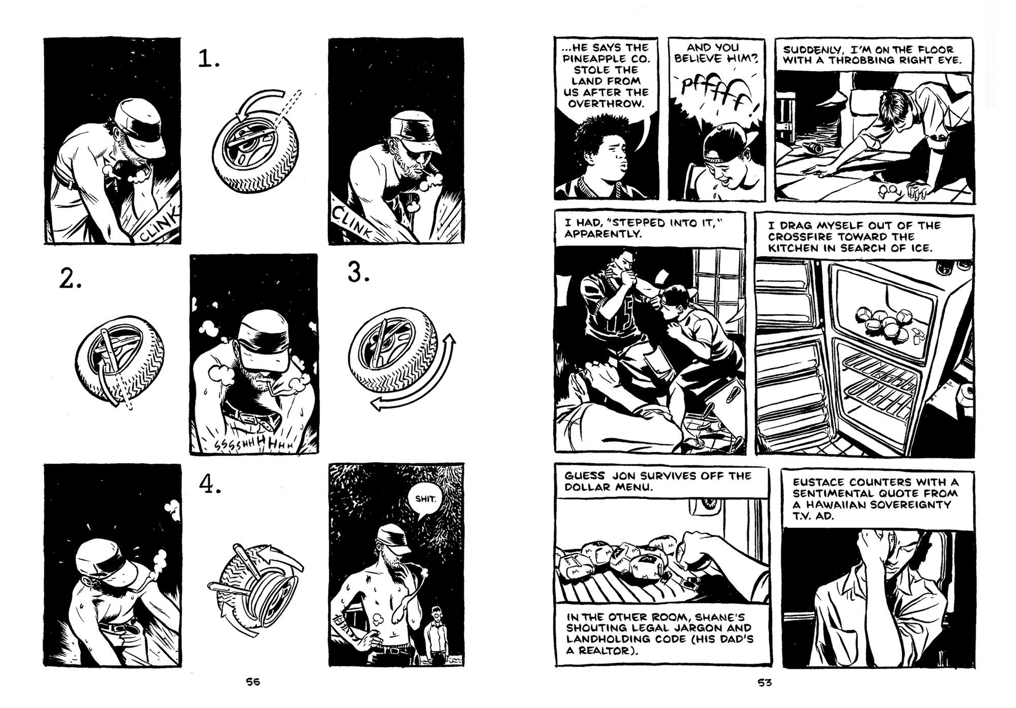
There are seriously brutal passages, as well as elegant sequences--after the worst teen clusterflop, Dad’s befuddled talk with the chastened hero in his dentist's seat is followed by a long passage of gorgeous inky scenes of life in Maui, punctuated by plants and flowers.
At that time, I was obsessed with the idea of a comic book being an intimate hand-made letter from the cartoonist to the reader. After abandoning the genre comics I read as a teenager, I fell back in love with the medium in college after reading Chester Brown’s I Never Liked You. His shaky line combined with a very revealing self portrait blew me away. I wanted Night Fisher to feel as authentic and handmade as possible, and I thought that drawing every mark with a single tool would amplify a sense of immediacy.
Oh yes, I think all of the hand-wrought illumination seen in the alternative is a perfect response to the plasticity of mainstream comics’ digital sheen and robotic fonts. The inky brushiness of the art in Night Fisher reminds me of some European cartoonists who know how to draw, like Atillio Michelluzzi, and a little of Paul Pope’s earlier work. And I see you thank David Mazzucchelli in there.
Paul Pope, Jeff Smith, Bill Watterson, and David Lapham were among my favorite cartoonists as a teenager. All were inky brush masters with varying degrees of “slash” in their attack. Also, growing up on Maui, the only real “art” I ever saw in person were the impressionist-style landscape paintings in local art galleries targeting tourists. Plein-air painting was my main artistic passion for a time, so building an image out of painterly brush strokes just kind of seemed like the default way to make a picture.
I started Night Fisher while I was a junior at the Rhode Island School of Design. I spent that year abroad in Italy, and searched Rome for whatever comics I could find. I actually did have an Italian Atillio Michelluzzi volume on my desk when I first started Night Fisher, along with an Italian reprint of one of David Mazzucchelli’s two-color Rubber Blanket stories.
Funny enough, this was my first exposure to David's work, and I completely fell in love with it. My next semester back in the states, I had David as a teacher for my first ever comics class. On the last day of class, I showed him the first 60 pages of Night Fisher which I had drawn outside of class over the previous summer. He gave me a few small pointers, but the broader concepts we covered in class helped guide my process as I finished up the book after graduating.
You use some unique cartooning devices to express physical things like winks and mental sensations like being high--those work great. There were a few minor sequences that confused me. So, for the new Fantagraphics edition, did you redo some of the drawings?---obviously you have the option to be revisionist and any newer drawings would be "better." But I wouldn’t advise messing with the energy and urgency of how your younger self did something, at the time. At any rate, the book certainly brought you to my attention.
I recently heard the Coen brothers laugh in an interview about some of the flashier directorial choices in their earliest films, particularly the camera movement. The implication was that they’d never do that stuff today because the more you draw attention to the artifice of filmmaking, the less likely the audience will get lost in the story. I think that shift in approach mirrors my own evolution in thinking about storytelling. With Night Fisher, I was trying to invent new tricks and formal gimmicks on every page; it was a kind of a game for me. Looking back, that playful invention may be the most fun aspect of the book, but I wouldn’t approach a story that way today.

I spent two months reworking quite a bit for Night Fisher’s hardcover reissue. I mostly just wanted to make some of the faces more consistent and clean up some of the lettering. There were two supporting cast members who looked different every time they appeared in the book, and just on a personal level, I couldn’t confidently promote a rerelease volume with what I perceived as bad drawing. There were some very minor storytelling changes made as well, but for the most part, the edits were done to soothe my own obsessiveness. That said, I think it’s a better book with those edits.
Interestingly, while I admire your economical decisions in the first example, in the second (overdose), there is an element of anger that is lost in the redo. And it's a different Dad in the third---- but of course, if we redraw some point because we find a character's better realization, then we might feel the need to change every drawing of that character----but a drawing that might look more like the new ideal of that character must retain the acting impetus in any given panel.
The main reason for the first edit was that Shane eventually gets into MIT, so showing him tap away at a typewriter seemed out of character, especially in 2021. Showing him behind a microscope is the only moment that might foreshadow his acceptance or at least suggests that it's not completely out of the realm of possibility. It always bugged me that in the original edition, his acceptance kind of comes out of nowhere.
I agree, many of the revised drawings lose the rawness of the originals, but I found the rawness distracting. Character wise, it made more sense to me for Loren to look panicked than angry in the "overdosed" scene, for example. While I was making the edits, I was wary that I might be sanding down some of the raw qualities that made the book feel urgent. Ultimately, I decided that there are 10,000 extant copies of the first edition if people want to find one on Ebay or in a library. To me, the new version tells a more coherent story, and it's the one I could feel comfortable promoting in 2021.
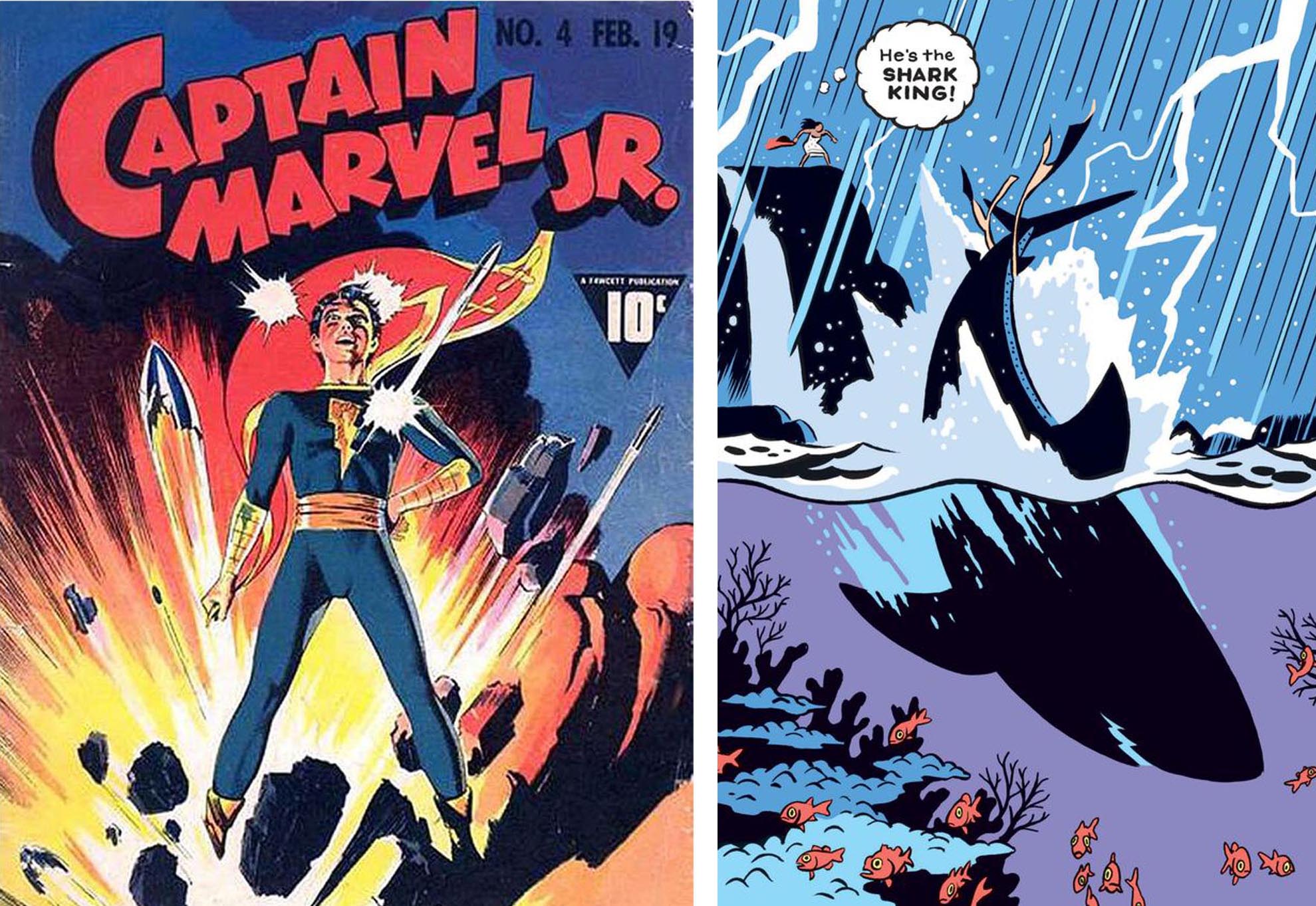
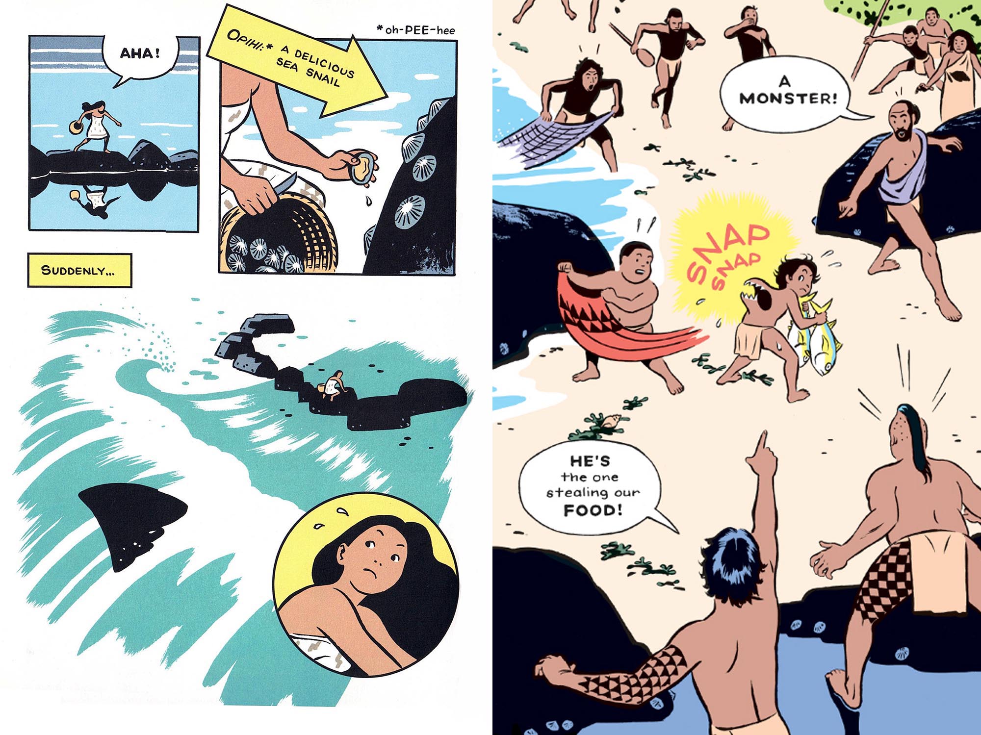
Bonus is, you do draw better now! Haha. The next thing I know of you doing is The Shark King for Françoise Mouly’s Toon Books, a lovely color children’s book with great art. I see a strong through line in your body of comics work of storylines dealing with Hawaii, specifically the island of Maui---including your new book. Here you beautifully articulate a Hawaiian legend in an extremely appealing, clearly delineated way. This has the feel of old adventure comics, in particular Golden Age comics, in the depiction of the hero as well as the design of the compactly laid-out pages. The drawings are super clean and concise (Mac Raboy style?), and the color is in that illustrative silkscreeny sep mode, similar to Eleanor Davis’s approach to color separations, eliminating holding lines where possible. Anyway, there is a lot to admire in the book.
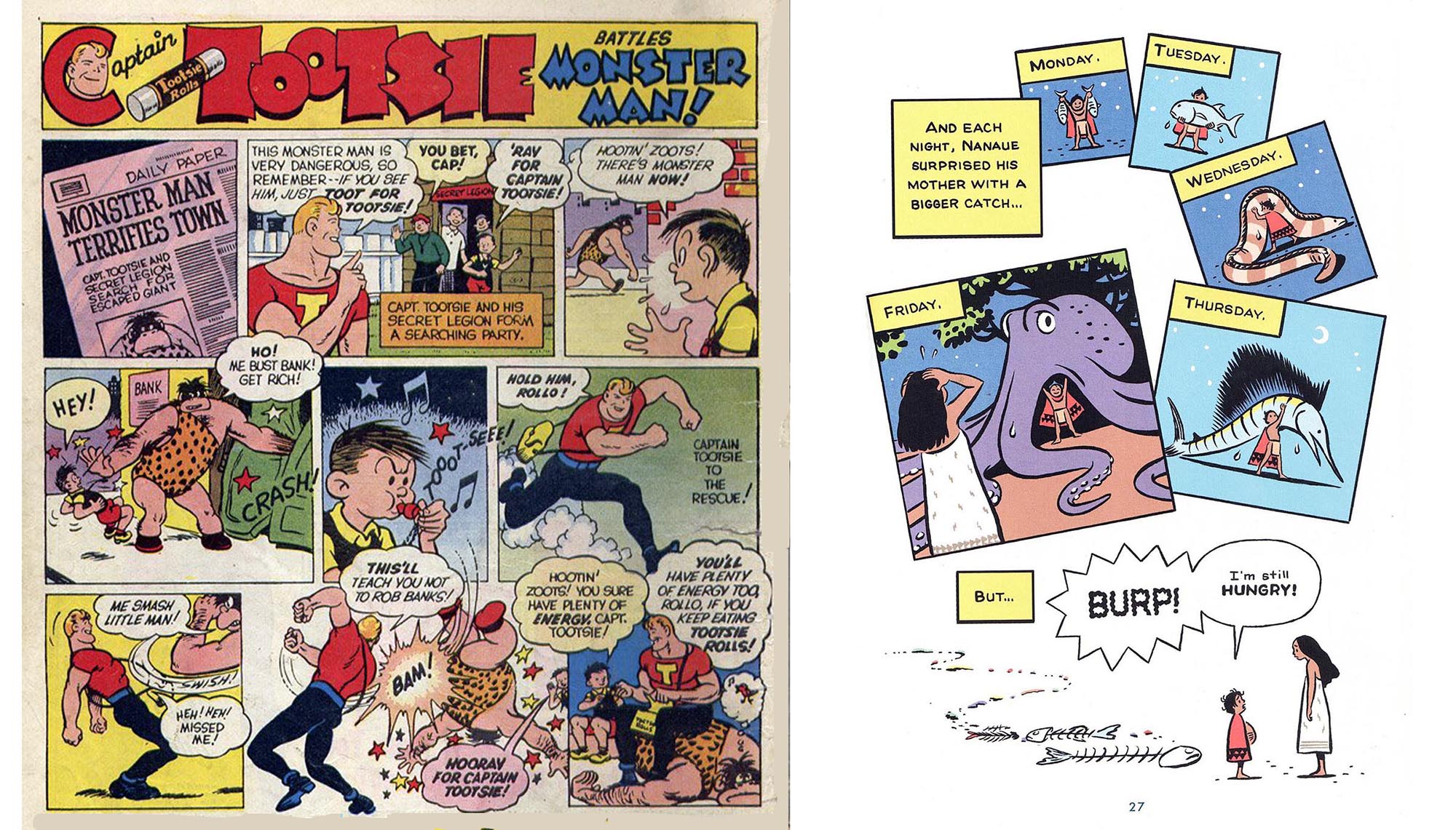
I thought of the Shark King as an action comic and had a lot of fun pulling from all the superhero comics and shonen manga I loved as a kid. Stylistically, I tried to channel C.C. Beck’s Captain Tootsie ads; they’re more panel-dense than his Captain Marvel stories which makes them feel a bit like newspaper Sundays, but the action and color is pure golden age comic books. I pulled a lot from Osamu Tezuka as well, particularly the inventive ways he constantly breaks out of the grid.
Okay, yes, I can see Beck and Tezuka in there. In between your books, I found art and covers by you in The New Yorker, and in the Columbia magazine I get sent as an alumni. I clipped them and am using them as examples for this interview. I freaked out when I first saw that New Yorker cover you did of the guy poking the graduation caps out of the tree at Columbia. It is just perfectly done.

At that time, I'd recently noticed the Croatian cartoonist Tonci Zonjic and I soon interviewed him here. I thought that you and Tonci had a lot in common, a similar reduced and elegant realism in spare, clean line and carefully chosen color. That precision that you and Tonci are able to achieve is something Alex Toth did throughout his career -- emotional cinematic storytelling in a reduced and refined linear shorthand that feels real is something I really admire. Every object and figure is properly drawn, no shortcuts really.
Note that although I admire you guys, I rarely draw so precisely myself, perhaps partly due to impatience, but also because what I like to draw is a lot more, let’s say, worn out, gritty and used-up than what you or Tonci or Toth deal with.
Toth is someone I discovered as a senior in college. I completely fell in love with that combination of precision and economy you cite, and he was probably my single greatest influence as I developed a style at the beginning of my career. I still think of composition as an arrangement of overlapping silhouettes largely due to studying his work. Toth’s brushy Zorro period was a huge influence on Night Fisher, and over time, my development has kind of paralleled Toth’s evolution toward his 80’s marker style. For both of us, I think that evolution was a product of changing career demands: Toth moved from inky comics to a clear-line style for animation. I went from inky black and white comics to a clear-line style for full-color editorial illustration. These days, art directors come to me when they need to tell a colorful, naturalistic story. My current approach developed organically as a way to satisfy those demands on a deadline.

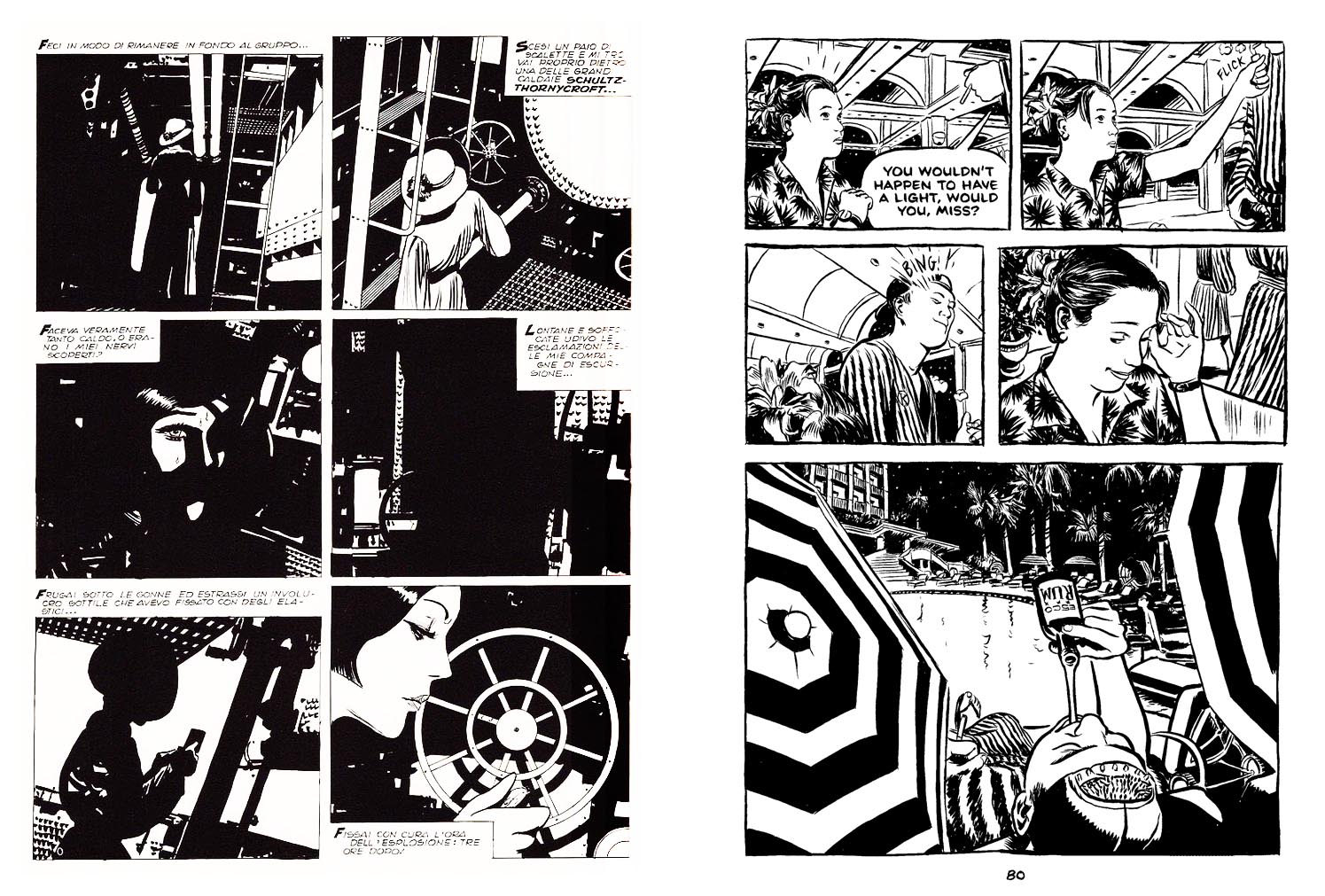
And now we have the new book No One Else where you veer into of course precise yet cartoony-expressive territory that is very different from the earlier books. I still see the equivalence with Toth, Tonci, David M, and kinship with Adrian Tomine and Hartley Lin too---and also, a bit of Jaime Hernandez, I get a similar feel from your lighter hand here, the way the characters move and the nature of the fully-thought-out narrative. Your kid is great, I feel him very vividly.
At this point, I think Toth is just part of my drawing DNA.
I definitely see the stylistic affinity in No One Else to all those artists you mentioned. That's probably the result of shared influences and similar goals in terms of story content. As far as direct influences go, the biggest ones for No One Else were Charles Schulz, Bill Watterson, Hergé, Nick Drnaso, Rea Irvin, and Jillian Tamaki.
When I pick up a Peanuts or Calvin and Hobbes collection, I find that I've read 20-30 strips before I realize that I'm even reading. I really wanted to try to make a book that was this inviting and intuitive to read. Also the wide range of emotion Schulz and Watterson achieve with so few marks was something I wanted to take a stab at.
From Hergé, I borrowed what I'd call a “dry” storytelling approach. For the most part, it feels like Hergé only changes the shape of a panel to accommodate the amount of detail he needs to fit into it: less detailed images are in small panels, more detailed images are in big panels. This approach is very different from superhero comics, most manga, or the Scott McCloud approach where layouts change shape to amplify the impact and emotion of a scene. Kirby might save a splash page for the biggest punch, Frank Miller might save a splash page to amplify his hero's anguish, and Tezuka might break a panel to sell a slapstick joke with a hyperbolic facial expression and gesture.

Hergé could write the exact same slapstick joke, but his grid layouts and predictable compositions wouldn’t telegraph it. Hergé's design doesn’t tell you how to feel about his story to the degree that many cartoonists do. Even though he’s writing for kids, this dryer approach makes TinTin feel closer to literature to me. The conflicts in No One Else are almost entirely internal and are generally implied rather than shown directly, and adopting some of Hergé’s restraint helped me manage that.
Formally, Drnaso’s comics are as direct and “readable” as Schulz's and Watterson's, and his grid layouts have a rhythm similar to Hergé's, but his minimalist drawings imply an incredible amount of subtext. He invites you to read so much into his panels, and that was something I was attempting to achieve in No One Else. His stories are often told visually, so you really have to look at a Drnaso comic even though the drawings might seem sparse at first glance. Halfway into Sabrina, I was so immersed in the story that I forgot that I was reading. This almost never happens with comics for me, but I’d love to someday make comics this immersive and invisible.
While working on No One Else, I did a deep dive on Rea Irvin’s comic strip, The Smythes. Save a few Sunday pages here and there, it's never been reprinted, so I dug through the New York Public Library’s online microfilm archives of the New York Herald. The acting in The Smythes can be incredibly subtle and Irvin's line is so elegant and descriptive.
Despite being one of the best drawn strips of the 30's, I can see why it’s never been collected for reprint: in addition to antiquated racial depictions, the repetitive, “my wife is fat” jokes are punishing to read. That said, seeing these strips in their original context was really inspiring. Out of the 8 or so different strips in the Sunday comics section at that time, The Smythes was the one aimed at literate, sophisticated adults, and there just aren’t that many examples in history of comics targeting that demographic.
Irvin's work is lovely----and thanks for turning me on to Nick Drnaso. I got his Sabrina to be able to get what you were saying about his influence. I can see a bit of him in No One Else---he nails a believable pacing and dialogue and inserts clever or creepy details--- well, I may have missed his work initially because the art seems a little impersonal on first glance.
Yes, impersonal to an uncanny degree. Another thing about Drnaso’s work that appeals to me is that it seems like he’s an example of a new generation of great cartoonists who came of age in a post-Ware world, but didn’t grow up with all the baggage that comes with reading the bad genre comics that previous generations of cartoonists have been saddled with. Of course, I have a lot of nostalgia for the comics I discovered as an 8 year old, but their influence can be an albatross. In many ways it feels like the entire history of what I'll broadly call "Art Comics" from the Undergrounds to the first generation of Fantagraphics cartoonists were making work in direct response to mainstream American genre comics. Crumb set out to subvert the values of the Comics Code, Maus played with the funny animal genre, and Ware satirized Superman in Acme Novelty. Comics got no respect, and Art Comics fought to justify their own existence in part by responding to the very narrow expectations of an adult population who largely saw comics as trash. Even as late as the early 2000s, when I was working on Night Fisher, I had a huge chip on my shoulder as I sanctimoniously set out to help prove that comics could be "art." Today, that debate has pretty much been settled, and cartoonists can make graphic novels that are much less burdened by the question, "why comics?" I may be imposing too much on Drnaso's work here, but in my own reading, I sense a freedom from the past that I find really inspiring. Drnaso gave me permission to adopt a more cinematic approach and freed me from antiquated ideals of formal purity that were weighing me down.
Jillian Tamaki gave me the courage to not worry if my line looks digital. It's 2021: if you want to capture the moment, use the moment's tools.
The design of Brandon, the boy in No One Else, is a combination of Little Nemo + the protagonist from Masaaki Yuasa’s Tatami Galaxy anime.
Don't get me wrong, I wasn’t implying any derivation---this is clearly all you, and it is a very satisfyingly complete story. I don’t want to go much into the details, the readers need to discover it for themselves.
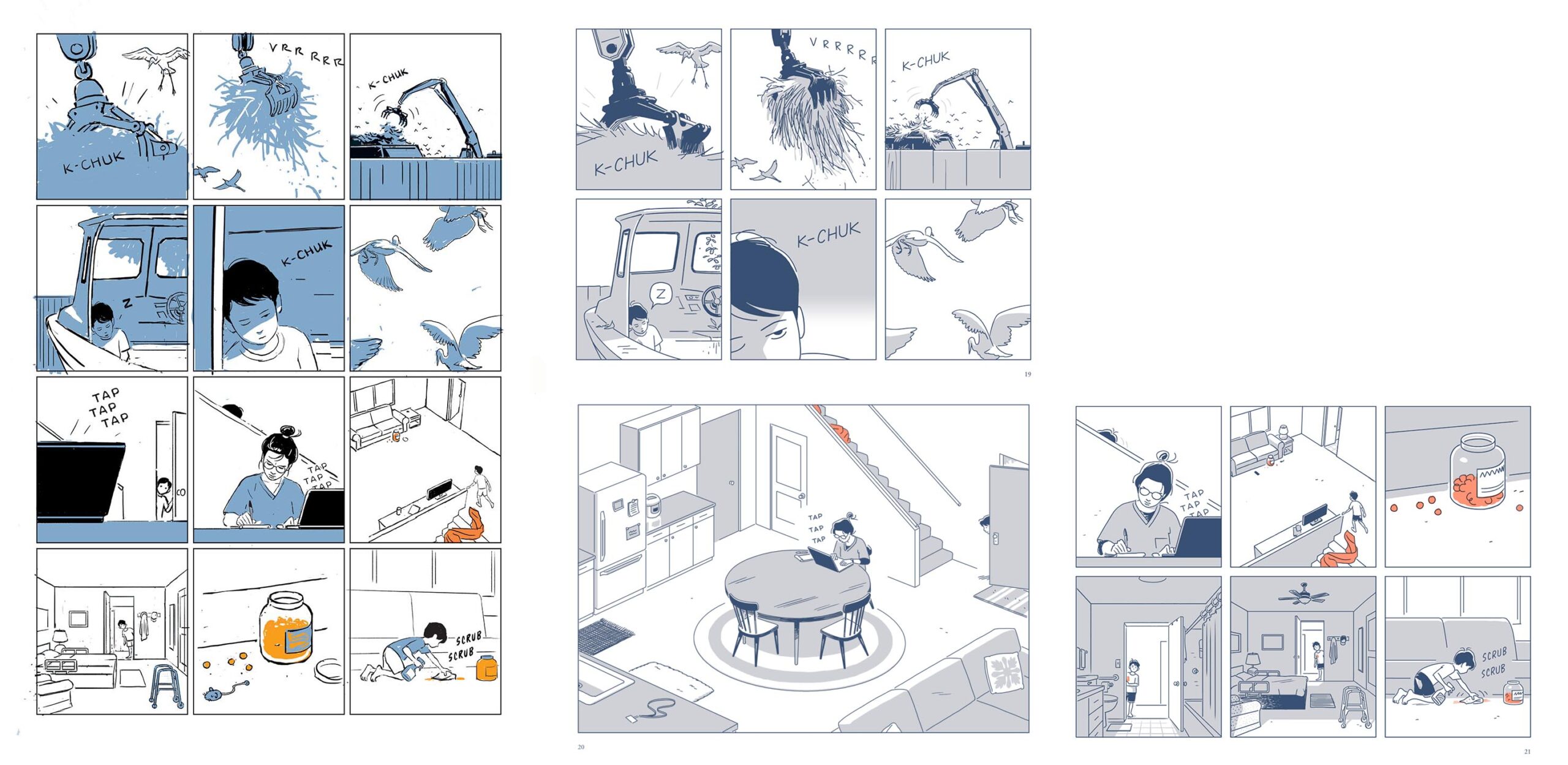
I found it to be quite moving. The art is stupendous, the spread storytelling exemplary. The sequences flow beautifully, the pacing is really handled well. And the way the little house and its rooms and the boat in the yard and where it is in the town are all perfectly worked out in space. All the sequences are realized in a fully animated way, so to speak. You kicked my Post York ass with your cat; I love that whole narrative thread. And I love the continuity with the fishing in Night Fisher and your spread of the fishing poles in the back of the boat here. How long was this book in progress?
I wrote the first draft of a script that became No One Else in 2012. After mulling it over for six years, I decided to commit to drawing it and spent about 2 years refining it. Lots ended up on the cutting room floor.
How much of this story is based on personal experience? Or, what inspired it?
Years ago, I heard a story of a friend storing her father’s ashes under the kitchen sink in between bottles of cleaning supplies. That detail was sad, strange, and funny all at the same time. It inspired me to write a short fiction. I write a lot of story seeds, but this one stuck with me, and I kept returning to it over the years. Halfway through drawing No One Else, I realized that I was exploring my own experience of losing my four grandparents over a 30-year span. Each death reshuffled our family dynamic in small and big ways. Comics take so much time and energy for me to produce, the ideas that actually get made into comics tend to be ones I could spend a lifetime mulling over.
What is up with the sugar cane burning? I thought at first before reading it that the cover signified that the story had to do with the wildfires all over everywhere.
Sugar was once Hawaii’s main industry. For 180 years, it was harvested with massive controlled fires that reduced the amount of plant matter to be transported to a mill for processing. As a kid in grade school, sugar cane ash would rain down on us at recess, and we called it “Hawaiian snow.” Out of all the islands, the sugar industry lasted the longest on Maui where I grew up, and the last sugar mill there finally closed in 2016. When it closed, I found myself mourning the loss of something I never had any affection for. That emotional paradox is central to No One Else, but I ultimately decided to omit any exposition about Hawaii's sugar industry in the body of the book. There is a paragraph about it on the inside cover.
Was it always intended for Fantagraphics (who publish Night Fisher too)? What do they offer as opposed to other publishers that makes you want to do your graphic novels with them?
Around 2015, Fantagraphics approached me to do a hardcover reissue of Night Fisher. The combination of feeling insecure about the drawing in that book and not having a new book to show 10 years after Night Fisher led me to pass on its reissue. Eventually, when I started working on No One Else, it seemed to make sense to ask Fantagraphics to release my new book simultaneously with a revised reissue of the old one. No One Else is a short book. It’s definitely closer to a short story or a novella than a novel. For a bigger project, I probably would have asked an agent for help finding a publisher, but I knew Fantagraphics would support making my passion project exactly what I wanted it to be, and I’m very grateful to them for that. The design and production crew at Fantagraphics made the print object of my dreams a reality.
Oh, they do books exactly how artists want them aesthetically, that is a fact. How do you feel about doing comics as opposed to doing illustrations? I ask because you seem to use the same style for both.

In both my illustration and comics work, I try to let every aesthetic choice be dictated by the story I’m telling, the format in which it will appear, and the deadline. I never had aspirations of being an editorial illustrator, and for years, I actually hated doing it, but I did it for the money. Eventually, though, I developed a digital process that made edits far less arduous, and I started to enjoy the work. While working on No One Else, the two disciplines really fed off of one another. Because I occasionally have to render and polish drawings with a lot of detail in my illustration career, I feel much less pressure to do that kind of “showing off” in my comics, so I can really focus on the storytelling. Also, the fluid digital process I developed for illustration lent itself well to making comics with drafts and rewrites. The difficulty of editing comics was always one of comics' greatest limitations for me previously.
Is the money coming from the illustrations, and the pleasure coming from the comics? I mean, there's obviously some degree of challenge, maybe even fun when you do things like designing the animation in Fanta ads for Coca-Cola. But are you driven to do comics? Because given the numbers nowadays, it seems we often do these things for the love of it. It is like we who create the things indulge a more expensive hobby making arty comics than the readers do buying them! Far from being paid, it actually can cost us money to do it! Unless we get lucky and a TV show or movie is made from what we do, but then that is a different art form entirely and one has to be flexible throughout that process, at the very least. Anyway IMO a great comic really doesn't need to be filmed, it can just be itself.
No One Else was 100% a passion project. My only goal with it was to make a print comic that I'd really want to read. My main incentive was to see what would happen if I focused all my creative energy on a project that I deeply cared about. It's rare to work on an illustration assignment and feel like I'm using my full potential. For all its faults, I think No One Else is better than anything else I've ever made, and that's been really gratifying after years of freelance work.
To be crass and put the financials into perspective, if I sell out of the first English printing of No One Else, my earnings for those two years of work will be just slightly more than the fee for a single cover to the New Yorker which generally takes me less than two weeks to produce.
I know that feeling: one decent gallery sale can bring more $$$ than the total proceeds from a 150 page book. It is absurd. Still, you have a very controlled body of comics work that you own, so that is a good thing, and you are also in an enviable position to be able to do strips for The New Yorker---but am I right in assuming they have a heavy editorial hand?
The New Yorker’s hand can actually be surprisingly light so long as I’m working within the parameters of what I think they’re looking for from me. Humor always tends to be the easiest sell. Generally, my strategy is to give them many different sketch options to choose from, and sometimes, the final piece is almost identical to my initial sketch.

When changes are necessary, the edits always make the work stronger. For example, Françoise Mouly recently asked me if I had any ideas for a short comic. I sent her about four written pitches, she chose 1, and the next day, I sent a very rough sketch of the whole comic. Françoise offered a few smart notes, and the next day, I sent back 2 fully baked sketch options. Françoise collaged the best parts of my two drafts together and sent it back to me. Her edit was without a doubt the best version of the strip yet. Once we got the thumbs up from the editor, I made some additional changes and started on the final artwork of what became “Uncharted Maui.” With such limited time, this kind of collaborative editorial process is a dream for someone like myself who spends hours second guessing every decision. Françoise is an absolute wizard, and somehow, the work feels even more "mine" after her input. That's definitely not my experience with all art directors.
____________________________
I make some equivalences to your work in drawing because you draw so well that you are clearly in a rarefied zone of comics draftsmanship with these others, like Toth, or Tonci, or Mike Golden, or Tony Salmons, who are all most often interpretive cartoonists, working from script. It is my opinion that few are able to draw on that level and also anchor it on their own to brilliant story structure. You have your Hernandezes, Pope, Clowes, Ware, Walden et al.
But then there is writing for yourself. Jillian Tamaki worked with her writer cousin for quite a while, but the piece of hers that really struck me is her solo short story "SexCoven." She left a lot of air on the page and hit a beautiful balance of intent and aesthetic.
That’s very generous company you’ve put me in. I definitely feel more confident about my drawing than my writing. I think I have a long way to go to polish my writing chops, but it’s something I hope to keep studying. As a reader, I often struggle to finish books written and drawn by different people. I'm not sure why that is, but my abandonment rate for auteur books is far lower.
“Sex Coven” is a gorgeous strip. Like you, my favorite work of Tamaki's is the work she writes herself. I often return to one 10-panel vignette she posted on Instagram in January 2020 about a woman whose ex sends her a short fiction he wrote after their break up. On one level, it’s a 10-panel gag strip. On another level the characters, symbols, and central mystery are much bigger than those 10 panels. I’m often drawn to short fiction more than longer works, and this comic is a perfect example of why. In both the drawings and the text, the fewer details she includes, the more meaning each stroke takes on.
I'm finding out myself how difficult it is to do everything. Now is really not a good time to work with writers because of the writer overcrediting issue, but how many people can both write and draw? It takes a lifetime to master even one of those forms. Yet young artists are encouraged at the onset of their careers to immediately write and draw longform stories that can sustain literary examination---that critical response coming usually from writers who avoid analysis of the art.
That's an interesting point: some folks who write for a living obviously have a bias towards words. I always think of The New York Times review of Fun Home that cheered: “a comic book for lovers of words!” It’s not an inaccurate description, but as a cartoonist, the reviewer’s exclamation point was a little dagger at first blush.
I think I may be part of the first generation of cartoonists who made their debut in long form graphic novels rather than serialization or short stories. There are examples of this from long before my time, but it seems like the early 2000s was when going straight to book format right out of the gate became a new normal. Craig Thompson's Blankets (2003) might be the book that signaled the start of that seachange in publishing. A 100+ page graphic novel is a lot for a green cartoonist to take on, and yet, great new debut graphic novels keep coming out. I suspect the relatively recent proliferation of comics classes at colleges and universities has allowed some of these cartoonists to cut their teeth a bit before publishing, but I’m biased since I happen to teach one of those classes. Whatever barriers to entry the market creates, young people who really want to make comics will find ways to publish; that seems to be a throughline since at least the undergrounds.
Yeah, I teach classes like that too. But I try to be realistic. Teaching comics is like teaching poetry or dance: "prepare to suffer and starve." At least, have some sort of practical sidelines or backups that will enable you to live.
Anyway, looking at Shark King, which plunges us headlong into a punchy amplification of a legend; it is directed towards a teenage demographic, some of whom are perhaps from single-parent families. I'm imagining a kid not knowing his dad for instance, and looking at how this kid in your book, whose dad is really a shark, and who left his mom to go back to the ocean--he can swim, obviously, but his dad's true nature is present in how a bizarre mouth with sharp teeth erupts in his back under stress--and in the end, he and his dad have both left the mother alone---which feels unremarked-upon. The end seems abrupt.
I was trying to imagine the conferences you had with Françoise---how are the thematics and techniques of these books for kids worked out between artist and editor/publisher? Because here, you are creating formative programming for developing humans. Did she talk with you about possible readings of the work by impressionable readers, or what?
Françoise initially asked me to submit a few different pitches and specifically asked for at least one based on a myth. The source material for The Shark King is far more violent than my story-- it’s mostly focused on an adult version of the protagonist, so there were liberties I took with the plot, but I tried to keep the themes at the heart of the story in tact. I never felt like an overtly clean and happy ending would do the myth justice. Françoise and I went through many rounds of revisions, but her comments were all about clarity, and making sure the logic of the narrative was clear at each plot point. None of her suggestions changed the plot or theme in any way, and there was never a discussion of what is or isn't suitable for children. She’s very good at editing books on the fly in a conversation, and I learned a ton from the process. The one creative clash I had on that book was with another editor at Toon regarding the final line of dialogue. The editor wanted to end with something that included “I love you,” to make it feel like the end of a bedtime story, and that felt too saccharine for me at the time. The line we ended up going with was a compromise that, in hindsight, contributed to a sense of abruptness and may have been a weaker choice than either of our preferred lines.
I wasn't meaning to grill you. It goes to intent though. I try to look objectively at this stuff. That's two of your three books I find disturbing. Well, your response makes me think of the Nirvana songs I still like so much. It is like, can you make things thinking through all the possible interpretations of them? For some kids, it is cathartic to see and hear their inner agony brought to life, any acknowledgement that they and people like them exist at all, that they are reflected in film, tv, comics, music and art. And that might be enough. Maybe some kid will think of his absent dad in the way you showed in The Shark King. And that will somehow help him, or not, or whatever. But it is hard to control how people view our work. I guess I expected Françoise to be stringent in analyzing what messages her books send.
I don’t recall having a conversation with her about the moral implications of The Shark King specifically, but I have no doubt she thought deeply about it, as did I. Françoise and I have had many long conversations about the morality and politics of many projects we’ve worked on together, including one of the alternate Toon Book pitches I submitted alongside The Shark King. We probably didn't discuss The Shark King's themes too deeply because we were simpatico in our vision for it. I can see how some readers might interpret the ending of The Shark King as a “down beat,” or even defeat. I don’t personally see it that way, but I welcome those readings. A lot of my favorite books as a kid were melancholy and morally ambiguous. Shel Silverstein's The Giving Tree remains one of my favorite artworks of all time, and many people interpret it as depicting an abusive relationship.
Yes, wow---so sad!
In my own work, I’ve never approached any story, for kids or adults, as a parable or morality play. My general approach is to just try to reflect something true and recognizably human, and let the audience sort out the meaning. Even in a book as fantastical as The Shark King, my approach was to study the source material, try to figure out why the story had survived for hundreds of years, focus in on what seemed true about the characters, and tell that story as directly as possible. I never thought about “simplifying” things for kids; I just tried to be direct. I never tried to convey a lesson. I trusted that the ancient source material’s durability was evidence of some utility. Someday, if I have kids of my own, maybe this approach will seem naïve.
Well, kid’s books…for instance, a lot of the Grimm stories are ghastly! It's hard to foresee where any creative project will take us, never mind anticipating every potential interpretation. With my book 7 Miles a Second, it wasn't for kids obviously, but older teens maybe, being put out by DC Comics. I pre-censored the imagery, but the real difficulty is in my friend Wojnarowicz's words. I tried to amplify a theme of empathy in my editing, but later I wondered how some might react to the black hole of despair David expresses as he's dying of AIDS...it goes terribly bleak. I got reactions--good, from from some progressive comics observers, and LGBTQ+ people happy to see themselves reflected in the media. And bad, from Toth, who took the copy I sent him to his back yard and burnt it. Haha, choke.
Wow. That’s an amazing Toth story. Too bad he couldn’t see how beautiful that book is. It sounds like 7 Miles a Second found who it was for, as did those Nirvana tunes. I try to trust in that natural vetting, but I know what you mean about self-censorship. My beat for The New Yorker is generally apolitical, but when I do dip my toe into politics, I wake up on publication day with a pit in my stomach. Is THIS the piece someone will take me down for? Should a female artist have drawn this? Am I Asian enough to talk about this? Luckily, the editorial staff has helped prevent me from putting my foot in my mouth so far. I really just need thicker skin.

I have to say you made your narrative in No One Else very complete and satisfying, you tie up the ends and give us a nice catharsis. You use images to do certain things and words to do the others and it feels right --there's little if any sentimentality and no redundancy and still it moves me. And that isn't easy. It feels more weighty than a novella but that is because your art speaks volumes. I can't care about comics that don't have a lot of care in the art.
“Abrupt” was a word I heard a few times to describe the endings of both Night Fisher and The Shark King, so in the years since finishing those books, I gave a lot of thought to what a satisfying ending is. When I think about endings of books and films that I like, most share at least two things: 1) we get to see the characters either achieve or fail at their goal, and 2) we are left with a vivid image in our minds of what the next act might be. No One Else has three main characters, and I tried to give each of them a complete arc and ending. I’m really glad to hear that it sounds like you found the ending of this one more satisfying than the others, even though “abrupt” does seem to be popping up in some early reactions to this book too. I think part of it is just that I’m attracted to stories that leave room for interpretation. Midway through working on No One Else, I read a pile of newly released critically acclaimed graphic novels and was frustrated by all of them. I decided that with my book, I was on a crusade against sentimentality. Not sure if I succeeded, but I appreciate you calling that out. My satirist contemporaries at Fantagraphics are laughing at our definition of unsentimental right now.
I think it isn't that collaborations between artists and writers aren't good, at least potentially, as opposed to single author comics, which is what is encouraged, particularly in the alt/lit area----but the current climate of credit inequity that is increasingly permeating the mainstream comics and the book trade should give all artists pause before collaborating. Don't work with a writer who isn't going to share equal credit and co-authorship. It has to be declared in the contract. And many of us had better figure out how to do it all ourselves. Note that not everyone can...
That’s fair, and it's good advice. I have nothing against collaborative comics in theory, but I do notice that, statistically, they are more tedious for me to read than auteur books. I'm sure that has more to do with me as a reader than the comics themselves. I sometimes fantasize about working with another artist on one of my scripts to speed up the process, but I know I’d just redraw everything later because I’m a control freak. The manga model always made the most sense to me as a model for a healthy mainstream industry: Auteurs with a team of assistants and editors who can help guide green cartoonists toward character-centric writing. So many innovations Frank Miller introduced in the 80s seem like they were a result of basically working in that model. It's funny how much of an anomaly that has been in American comics even now when publishers like Image let you own your properties. The manga industry suggests that it's not that rare to both write and draw well, but I guess there's a lot more money over there to entice young talent to take their shot. To be fair, there is pretty much no work that comes out of either Japan or America's mainstream industry that interests me at the moment, so I don't really have business speaking on this.
Another point, a bunch of rude urchins but only a dad in Night Fisher. Well handled though; I noticed that just before the boy goes off to get in shit up to his neck, the dad stops his son on the way out the door. It's a perfect bit of business, not really foreshadowing but a real detail; as the very effective bookending sequence is dentist Dad working on his son's teeth as he chastises him, after the numbnuts bring everything to such a drastic head. Then, as already discussed, poor Mom is left alone in Shark King. But in No One Else, we get the kid dealing on his own, basically. Mom is fully focused on her goal and at her wit's end. To the kid, the cat is an essential part of his dwindling family, so that absence hangs like a shroud over the story. I am a cat person. The mother is hard and cold, but I don't know how she got to that place, so shouldn't judge. The boy takes on the whole weight of the household; he seems to be the only one fighting for the family. He is the only one who cares about the cat.
I love your reading here. Family relationships are almost always the most interesting part of any story to me. I really love to draw action and fighting, but as a reader, a lot of times, those are the scenes I want to fast forward.

The brother is present but wasn't always. But he's nicely established. You leave some things hanging, I think, but I didn't mind, reading it.
I’d be curious to hear what feels left hanging. I love all these observations. No One Else is definitely the book I’m most interested in talking about, and yet, I’m not sure I have much to add to your insights here. They all feel dead on.
Well, I should leave the analysis to the critics, I think. I'd have to spoil it all to pull it apart. I love the story though and the drawing is acutely realized and clearcut---- except when it isn't and goes obtuse.
Drnaso’s work might fit that description too and I think that’s what makes it so captivating for me: It’s designed to be ingested quickly but digested slowly.
I can see a ghost of the straightforward brusqueness of TinTin. It has a strong forward momentum that makes one keep reading.
100%.
______________________________
I wrote this essay about what I call Parametrics several years ago when I was at Columbia, in an effort towards finding terminology that describes what we quasi-"cinematic" cartoonists do. I think a critical shortfall regarding comics is that text-centric critical writers tend not to adequately engage the artwork. As a remedy, I appropriated language used by James Gibson, a psychologist who investigated the visual perception of fighter pilots. It seems relevant to me, to the completely 3-dimensional way you developed your setting and characters and their choreography in No One Else. I'm interested in your thoughts.
It's an interesting piece that I enjoyed reading, and while I'm not sure I fully understand the concept of affordances, I think I'm broadly sympathetic to the observations about line drawing and its unique ability to conjure a world in a viewer's mind. Mazzucchelli touches on this concept a bit in that series of four 1-page strips he did as a kind of afterword to the collected Batman: Year One. In one, he questions his own tendency toward realism in that work and realism in comics broadly. He concludes, "this much I know: superheroes are real when they're drawn in ink."
The broad premise of the piece is that writers of comics criticism don't adequately engage the artwork. While my instinct tells me that's probably true to an extent, I'm not sure I read enough comics criticism to accept that wholeheartedly.
I also think my instinct on what makes good comics criticism, and for that matter, what makes good art in general, has shifted in recent years. I mentioned The New York Times' review of Allison Bechdel's Fun Home. I read that book a year or two after it debuted, and my first reaction after finishing it was frustration. My frustration was mostly rooted in the fact that I found the book so dull formally. It's been a while since I read it, but I remember the narration-heavy pages occasionally made it feel like illustrated prose as much as a comic. There was little in the book that struck me as particularly visual. None of the elements that excited me about the medium of comics at that time were in that book, so on one level, it read to me as a rote missed opportunity. To add insult to injury, when I read The New York Times cheer, “a comic book for lovers of words!” it felt like the precise thing that made that book frustrating to me, an over reliance on prose, was being championed by the literati. With some distance, though, I began to realize that I may have missed the bigger point. When I ask myself, what are the top 10 books that expertly and artfully articulate something profound about the human experience and also happen to be comics, Fun Home is close to the top of my list. Focusing on Bechdel's drawings may have missed the point, although I concede that a second reading may reveal that what initially struck me as dull may, in fact, be formally rich.
Well, firstly, regarding affordances, it describes the interactivity between artist and reader: we as cartoonists "afford" our pages and our drawings an extremely complex and idiosyncratic range of overt and subtle information; in turn the reader/viewer "affords" the work consideration based on their individual comprehension of that information. To me, the main premise of my essay is not about whether or not critics comprehend comic art, but about how to describe its qualities specifically---and a lot of that goes to "motion perspective," which is the spacial dynamic that Gibson explores and we cartoonists put into practice--drawing as we do from our "interior camera." We "fly" around an interior space and anticipate what is around the other side of something, to understand it and draw it in 3 dimensions, much like the way a fighter pilot must make split-second decisions about the airspace he is navigating at ridiculous speeds. Our job, though, is mixed with a wide range of other imbedded information, including the acting we imbue our characters with.
Now, I will figure out where my scenes must take place, and on paper map that space in a sort of 3D with proper timeframe and set decor and then populate it with also 3D moving and acting versions of people I've known or made up. One might also cast from actor types. The sets also can be made up or referenced, but everything must be as fully realized, believable and on-model in 360 degrees + as possible. At least that is the goal; a few of my books like Bronx Kill and Post York are drawn from my head without reference. Well, mostly--- I did use reference just for a specific bridge in Bronx Kill and the expensive boat in the third part of Post York---so I can see how precise the soft curves of the boat on your cover are. For real details like that, we really do need to use reference, or have access to the real thing to draw it from life. We have to believe what we are doing ourselves in order to make the reader believe it.
Old school strip artists like Caniff and Raymond hired models; my friend Gene Colan took photos sometimes, but he could also draw that well just straight onto the pages. I'm not against whatever it takes to be accurate, if that is what is called for. I was surprised to read in The New Yorker that Bechdel poses photos for every panel in her books. At some point you'd think she could just draw that flat and cartoony. It makes her thing then mainly about structure as you say, and the result has substance, but still, that isn't enough for me to really love a comic. I don't know how you go about your practice. But you could elaborate...?
Wow. I would not have guessed that you drew Post York without reference, nor would I have guessed Bechdel poses photos for every panel. I use quite a bit of reference. I’m not a natural figure drawer who can pull figures out of my head on the first pass. 80 percent of the time, I can eventually get a figure to look the way I want without reference, but a quick selfie speeds up process. In 2012, I switched from paper and ink to Photoshop and a Cintiq, and I still find it’s a bit harder for me to draw people digitally than it was on paper.
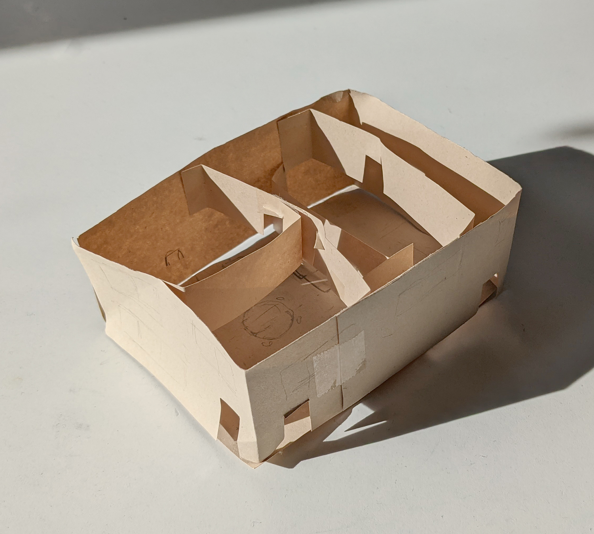
Like you, I imagine a 3D space with objects and characters on model from every angle. During the thumbnail stage of No One Else, I built a very quick paper model of the family home to make sure the space made sense. One reason I think I keep returning to Hawaii as a setting is that it’s a space I know really well, and I enjoy moving through it in my imagination.
It's beautiful--as ephemeral as a bird's nest, or a spiderweb. This is precisely the sort of three dimensional thinking that is called for.
In my mind, there are two types of drawers: doodlers and the composers. Doodlers are the folks who fill up sketch books with character designs and vehicles from every angle without reference. Kim Jung Ji might epitomize this category. Doodlers make brilliant animators. Composers are more interested in the abstract, graphic shapes that make up the picture plane and tend to be more invested in landscape than doodlers. I think of Monet, Hokusai, and Chris Ware as composers. Then there are the rare freaks who excel at both like Toth. That’s a super short list. I think I’m much more of a composer than a doodler. If I were a better doodler, I think I might have a bigger body of comics work; I’m so slow.
Honestly, I hate the term “doodler”--- sorry, but it devalues and trivializes the skills involved in visualization---I hated it when Toth used the term too. There are what might be termed “naturals” who “just draw well” ---some people refer to this as a “gift”, as if the artist found it under the tree Xmas morning. Well, the same people also call comic art the "art chores" as if it was equivalent to doing dishes and taking out the garbage, haha. I tend to consider it an “aptitude” for drawing which is refined through study and hard work. For others, drawing doesn’t ever come easily, but their skills lie in various other directions.
I don’t think having one skill precludes having another. My favorite examples are Steranko and Spiegelman, two brilliant analytical structural cartoonists for whom drawing doesn’t come easy---which corresponds with your “composers.” They are both perfectionists. Art struggles with drawing, I think, and his earlier short stories were all excruciatingly worked. If he hadn’t printed Maus as basically rough breakdowns, I think, he’d probably only just now be finishing it. And Steranko is similarly obsessive and exacting; when he does good drawings, they come from hard work and dedication to refinement---although, he somehow did most of his comic work under quite tight deadlines. But there are people who draw beautifully who are not good storytellers, and plenty of people with interesting stories whose art doesn’t make my heart beat faster.
You draw an interesting distinction; with my use of "doodler," I don't intend to imply an unrefined gift. Rather, I think of "doodlers" as having an approach, "learned" or "natural," that focuses on the proportions of objects over graphic composition. I don't think composers are "better" or more "learned" than doodlers or vice versa, but these two camps seem to represent distinct skillsets that are typically blurred under the umbrella term, "draughtsmanship." I think of both Monet and Kim Jung Ji as excellent "draughtsmen." but they strike me as having almost unrelated skills within that rubrick.
I don't know---everyone composes in the act of finding an angle to go at something, whether looking at it in reality or making it up out of the air. By the way, I know drawing digitally has its own qualities and advantages, but it also means you don’t end up with original artwork on paper---and so you wouldn't have that nice secondary source of income for your elder years in the form of salable originals. A lot of comic fans are collector types and so you won’t be able to take advantage of that mindset ---which incidentally, is a good part of how the art world works generally. People like to have art by their favorites.
But anyway, IMO your work in No One Else does NOT look digital in your linework. So I'm not sure if it matters that you are elegantly utilizing the current digital trend, when you are also leaving yourself without original art. Just because new techniques come along doesn't necessarily mean we have to dispense with the older stuff---unless you prefer to draw digitally! Personally I think the best thing is to use both organic and digital together. I do a lot of corrections on Photoshop so my originals retain whatever mistakes I made. And even though I color with watercolors, Photoshop is great to enhance and buttress organic color.
This is a conundrum I think about often; making art comics completely digitally is financially unsustainable. There is no way, even with TV/film options, that making comics could be a full time career using my current method. In many ways, drawing graphic novels is a very expensive hobby when one accounts for opportunity costs. On the other hand, I know the comic is much better because of the editing and precision that working digitally allows. I couldn't make this book using traditional tools. The malleability of pixels has finally allowed me fully employ the old truism about good storytelling: "writing is rewriting," down to the very end. No One Else went through at least 30 fully sketched drafts, and I made many additional rounds of edits to the finished artwork until the week it was due.
I suspect that today, the quality of many comics suffers because of the pressure artists have to produce salable original artwork. We saw this trend begin in the 90s with the Image founders eschewing storytelling for salable splash pages. I champion any method artists use to get the work done, but my guess is that many of them would be telling more immersive stories if original art was not a concern. I also think using the drawing tools of the day rather than the same tools my influences used has helped me find a unique voice, and hopefully helped me inch a little closer to the zeitgeist. My intention is never to make a nostalgic 20th century fetish object, but maybe that’s inherent in making print comics in the 21st century.
Last question, I’m wondering whether you have any training in, and interest in, "fine"/gallery oriented art; paintings, prints, installations or whatnot? Or, are you interested in doing that sort of thing? I myself straddle both worlds, comics and galleries---in fact, I make much better $$ on gallery stuff than anything connected to comics. Anyway, it is good to have your eggs in several baskets.
When Night Fisher came out in 2005, I had a solo show of original comics-style drawings at a Chelsea gallery that is now closed. I sold a lot of work and made a lot of money at that show, but hocking artwork to wealthy individual collectors left me feeling unfulfilled and downright gross. These days, most of my income comes directly from large corporations which is probably worse in moral terms than the gallery money, but I could see how continuing in galleries would create artistic incentives that I wanted no part of, and I've steered clear since.
At the moment, I think of my “art” pretty strictly as problem solving and writing with pictures. I'm sure I'll get back to formal and material experimentation at some point to keep things fresh, but right now, I’m generally shooting for pure communication, and making one-off art objects just doesn’t reach the audience I'm hoping for. I sell prints of old work to people who request it via email, but it's not something I actively pursue. I do still occasionally make watercolors as gifts for my family, though.
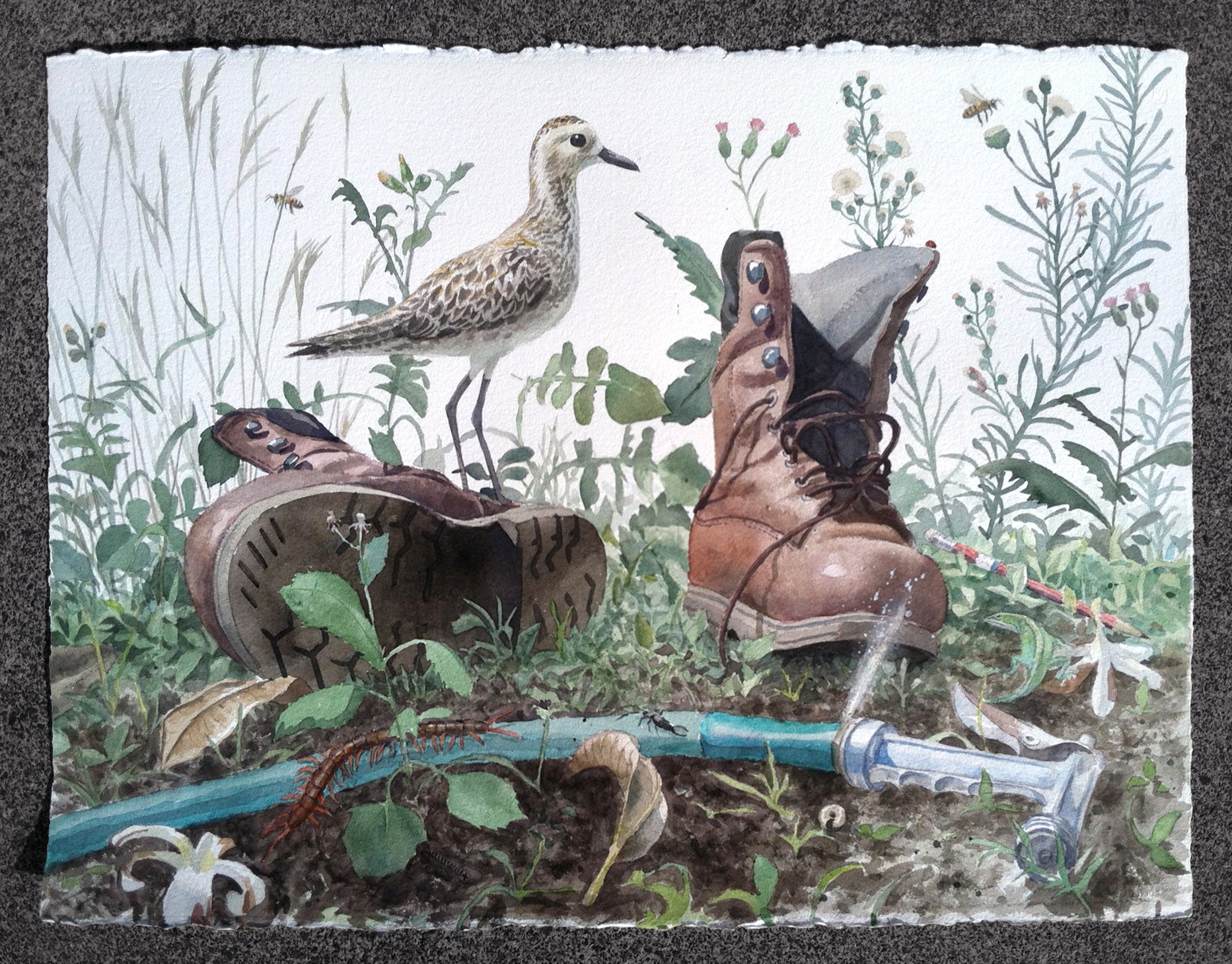
This is a watercolor that I did as a gift for my parents that seems somewhat related to my No One Else cover. It shows a scene from their yard on Maui including my dad's boots and a Kolea, a bird that migrates from Alaska to my parents' house every year in the winter.
______________________


