A compendium of short reviews on the occasion of the writer's birthday.
* * *
John's Worth, by Jon Chandler. Published by Breakdown Press, 2022.
Breakdown Press continues PictureBox Inc.'s tradition of giving beautiful production value to scuzzy, lo-fi work that feels opposed to such things in principle but shines bright when wrapped in it anyway. This time the recipient is Jon Chandler, whose grotesque drawings are equally dynamic and distended, and pack a Comics Comics deep dive's worth of influence into one striking style. Figures whose toothpaste tube bodies call back to the heta-uma manga of Yoshikazu Ebisu and King Terry pose against the spiny background environments of Gary Panter's Cola Madnes before springing into surprisingly lithe, muscular action that's more than a little reminiscent of Real Deal's Lawrence "Raw Dog" Hubbard. But Chandler brings something unique to his full-page panels - a force and bravery that's truly rare to see outside of children's drawings. The nonessential information in these pictures always feels like it's being viewed after sluicing halfway through a colander designed to drain out all impurities. In dialogue scenes, faces snarl or smirk in perfect rhyme with word balloons while bodies are reduced to a few stalks of folded flesh; in fight scenes, the same figures reanimate and puff up to steroidal glory, hurling themselves around the page as backgrounds ratchet down to slashing linework.
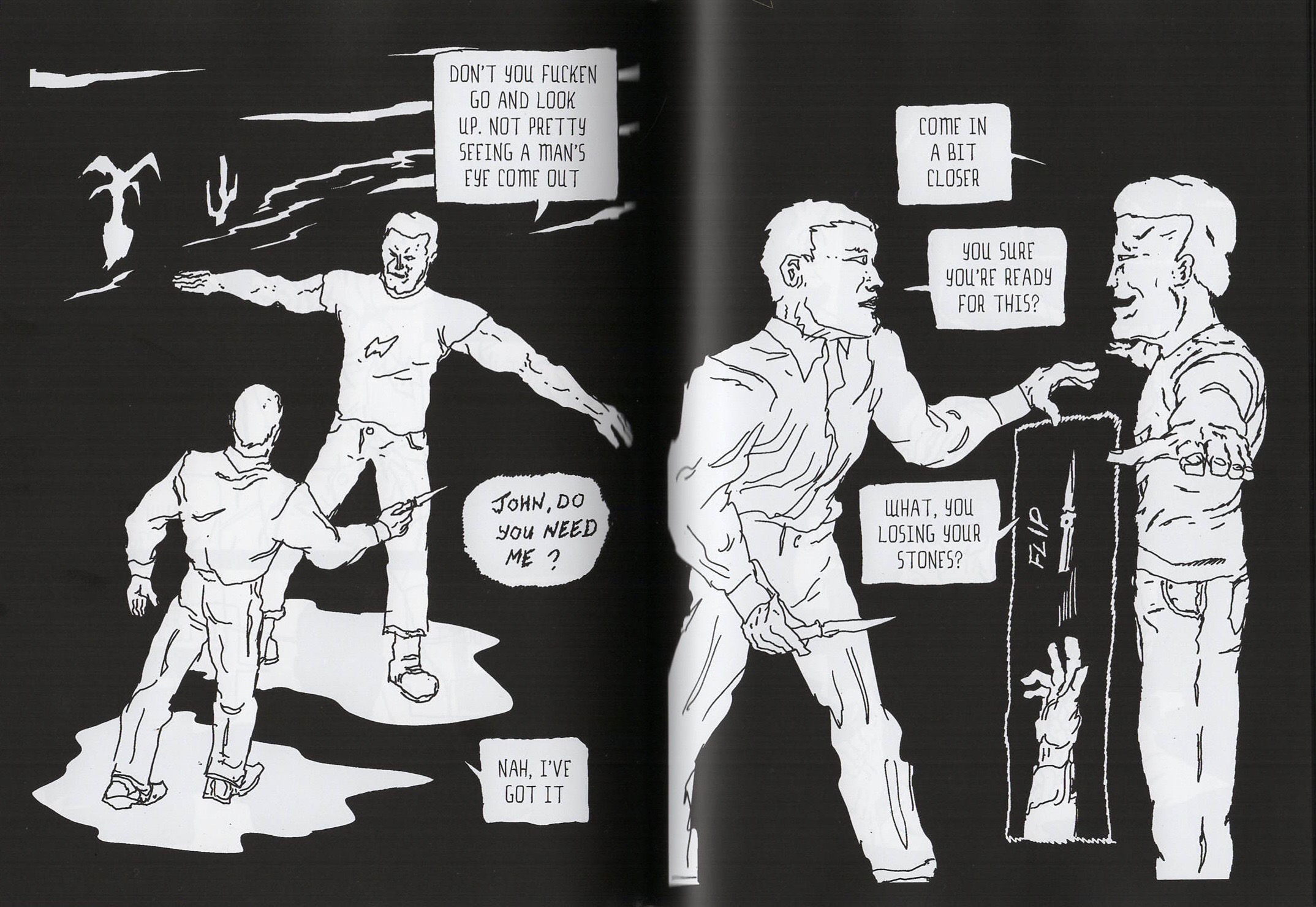
It's difficult to overstate the effect of Chandler's drawing. Barely there at times, its weird wrongness provides an absolutely overwhelming atmosphere, a Cronenberg movie's worth of harsh lighting, ominous music cues, and sloshing, dripping sound effects. This tale of a dystopian future in which social life is dominated by an addictive drug that turns into a sentient being with repeated use is fully committed to body horror aesthetics, but it goes past Videodrome and P.K. Dick to jostle shoulders with the icky sexuality of Andrzej Żuławski's Possession, and ultimately ends up feeling like a creature-feature version of Kathryn Bigelow's premillennial nightmare Strange Days. It feels like a lot of things, honestly: as our hero John goes from timid first-time user to a drug addict whose dependence ends up literally fucking him in the ass after it manifests a physical body, the plot shifts genres and characters with each chapter break. Somehow this sharpens interest rather than disorienting the reader, thanks mainly to Chandler's no-nonsense, Derek Raymond-meets-Judge Dredd dialogue, which punctures the story's more imaginative aspects and keeps everything in sharp, ground-level focus.
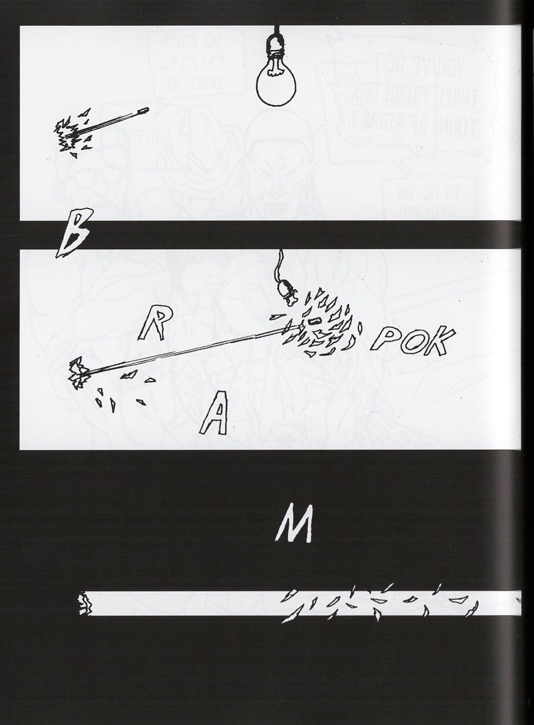
In a book this visually striking and unusual, it's seriously impressive that Chandler, also a seasoned novelist, makes the writing feel most important. The convolutions of the plot mean you will lose track of something, some character or their narcotic double, at some point - but the writer's utter belief in the reality of his comic's world, and the intensity of each layer of the story's set pieces, make John's Worth compulsive reading. At times the cold hardness of the word balloons and the slithering yuck of the drawing combine with sharp use of the comics form itself into something no less than genius. A page of a bullet shearing through a wall to shatter the only bulb illuminating a room is a vicious haiku. A long scene of two violent drunks tossing a knife in the air over and over to see who the blade cuts first as it descends is indelible. Like a seaweed salad, this comic goes down slimy, looks bizarre, and provides a sense of freshness you'd be hard-pressed to get from anything else.
The Ambassadors #1, by Frank Quitely and Mark Millar, with lettering by Clem Robins and color assists by Vincent MG Deighan. Published by Image Comics, 2023.
I'll admit it: I was worried comics had lost Frank Quitely, the most inspired, inspiring artist currently putting pencil inside panel borders. It's been more than five years since a new Quitely book hit the Wednesday racks, and between his bouts with sciatica, dabbles in animated filmmaking, gallery shows and sojourns in branding for extremely pricey booze, it's felt like the reigning champ might have succumbed to the lure of retiring to greener pastures undefeated. Not so, it turns out! Here's the first in a miniseries of one-shot superhero stories, each illustrated by a different artist - a one-and-done comic that evidently took Quitely two years to draw, and looks like it.
What better way for a humble critic to do their job than to say it's fuckin Quitelyyyyy, scan 8 or 12 pages, and toss up a link to some appropriately grandiloquent music to view by? I'll do my best; a long arc toward naturalistic drawing continues here, with the antenna limbs and Neolithic brow ridges of Quitely's early superhero comics smoothed out more than ever into neat, academic figuration. There's always been a battle in Quitely's work between the amount of squash and stretch he could pack into a figure and the amount of grotesquerie that came with it, but his comics from We3 (2004-05) onward show a commitment to packing all that crazy energy into soberer, more solid forms, like a man unhinging his jaw to swallow a ball of rubber bands.
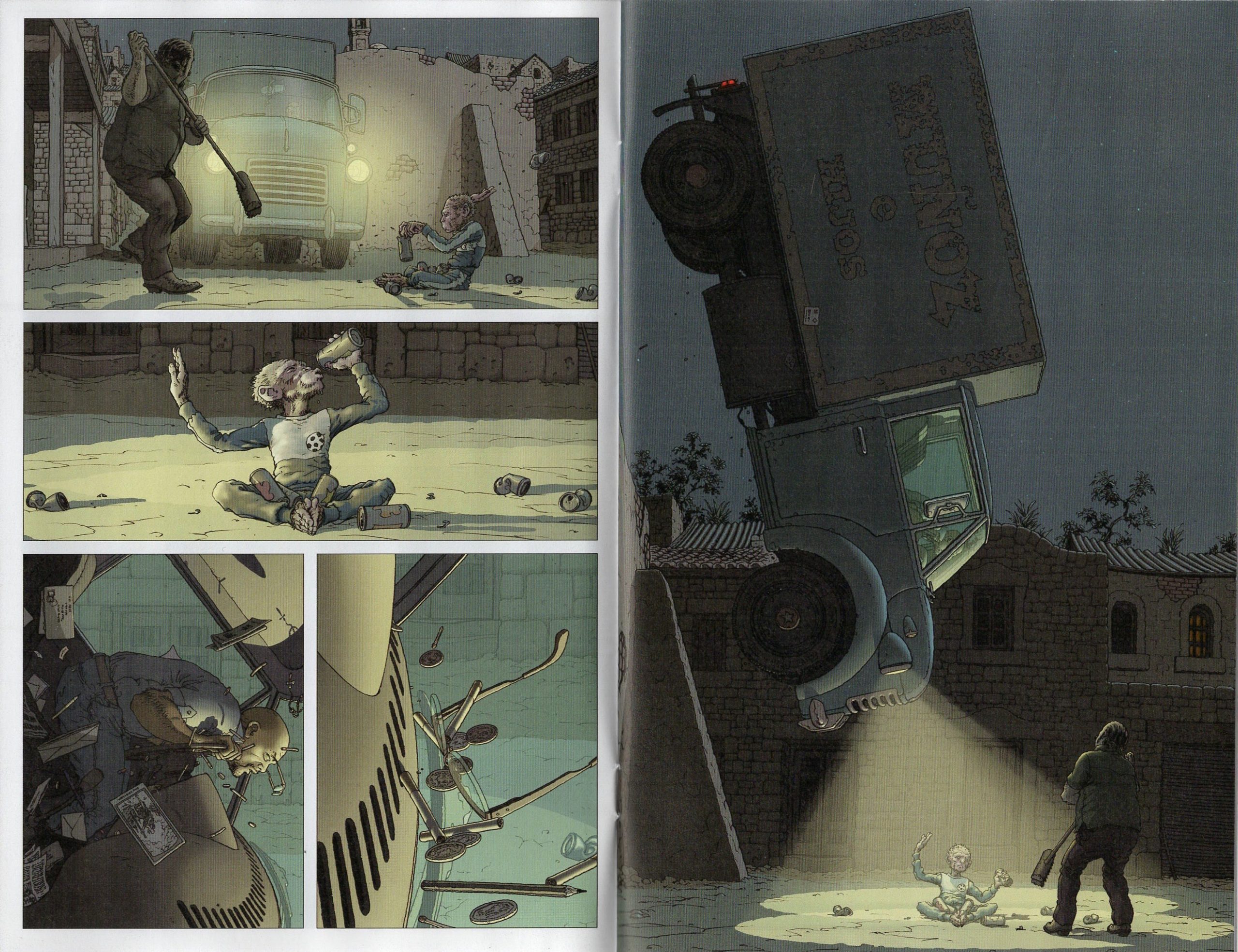
This has come with a move away from the Kirby-impactful panels of typical action comics and toward a mode of composition that, yeah I said it, is closest in spirit to the work of "neo-manga" artist Yuichi Yokoyama, taking the moments of intensity that would usually constitute a single panel and planing them apart into wafer-thin slices of time, examined from different angles, turning the explosive and dynamic into long chains of discrete events. You could call it filmic, this desire to capture every moving part of a scene, but it goes beyond that - rendered in comics form it feels more akin to watching sports highlights from the super slo-mo Phantom Cam, the suspension of time allowing you, mere mortal, to comprehend how a single Lamar Jackson stutter-step gets each one of the 11 guys on defense moving in the wrong direction. A canny moviemaker might find the inspiration Quitely does to linger on the coins and pens and eyeglasses falling from a truck driver's person as his rig is yanked into the air nose-down by a weird monkey kid with psychic powers - but you can't nail that shot with film's moving image the way it's nailed here, the framing approaching a still life's elegance, forcing you to leave the forward momentum of the book behind and stop.
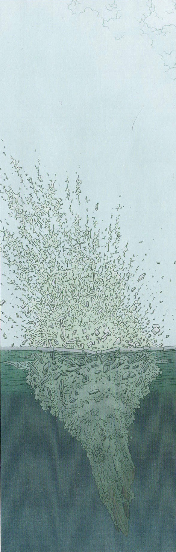
Elsewhere in the comic, a downed plane crashing through ice into a frozen sea is given more heft than the meanest Dolby subwoofers can grunt out by the meticulous spiderweb of underwater churn and aboveground spray Quitely conjures, mirrored by the sheer effort put into every strand of the pilot's braid-crown hairdo on the page before, in a close-up shot that fills about a postage stamp of printed space. No one else is doing this so hard, no one else musters such intense detail to such effect - not just rendering or crosshatching for texture, but evoking a specific sensory impression. Jim Lee does drawing this detailed, but it's granite on granite, lines not desiring to do anything but chisel. Quitely makes you hear the barely audible ching of those coins hitting the windshield, feel the mist of vapor swirling after that plane submerges. Doing his own coloring here, assisted by his son, Vincent MG Deighan, he's finally made a whole comic that carries the deep reality visible in parts of Jupiter's Legacy and Pax Americana, where panel boxes feel like views into legible 3D space. During Quitely's years as a monthly mainstream comics toiler, the knock on him was that he "didn't draw backgrounds" - I wonder if it bothered him? The flesh on the bones of this comic's world is swole.
As for the story, I made the painful but necessary decision to jump off Mark Millar's dick after decades of fandom when he pimped a Jordan Peterson book on Twitter - a choice I see no reason to revisit here. QUITELYYYYYYYY
Unstoppable Doom Patrol #1, by Chris Burnham and Dennis Culver, with coloring by Brian Reber and lettering by Pat Brosseau. Published by DC Comics, 2023.
You think Chris Burnham was mad the first new Quitely comic in forever happened to drop the same day as the debut issue of his big DC headline series? I figured so, but after looking at this comic I'm less sure. For years the best of a few Quitely mimics trawling in the wake left by their inspiration's disappearance from regular publishing—so much so that he was called upon to guide Grant Morrison's foundering Batman mega-arc into port after Quitely's departure—Burnham has moved onto other things from the look of this comic. Quitely's pin-thin line is traded for a thicker, crunchier scrawl that looks a bit like Darick Robertson in his Transmetropolitan/The Boys heyday and feels rather current in its evocation of action manga. I'm not sure it's an improvement, but it's more direct, and Burnham attacks this book like raw meat: bold graphics and solid figures ground a story that's at least attempting to find weirdness in plenty of twisted metal and smoldering rubble. The influence of Francesco Francavilla, an artist about as far from Burnham as the mainstream's style envelope will allow, is injected via Brian Reber's pumpkin orange color palette, which doesn't look that great to my eyes, but provides a sense of place and atmosphere that most superhero comics sorely miss.
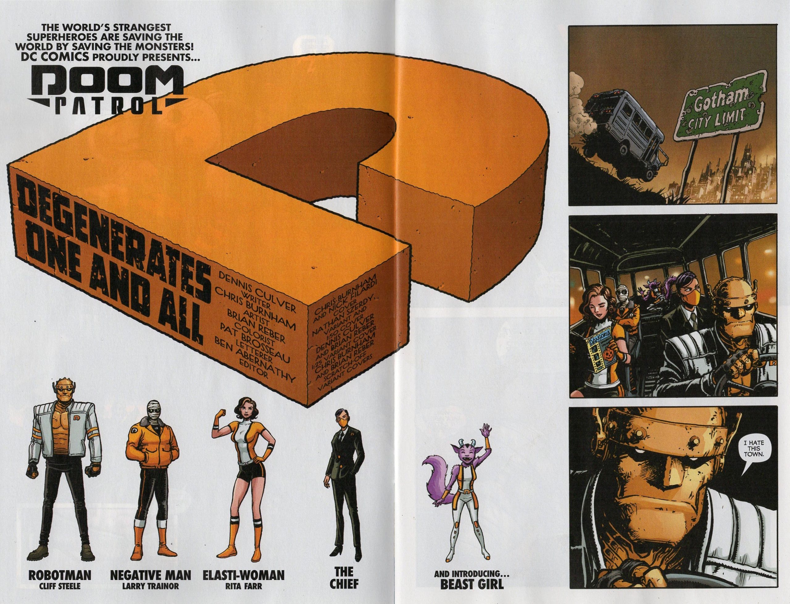
Achieving that atmosphere is a bit of a layup, however, because Dennis Culver's script is basically one extended scene, following the same group of characters in the same setting (plus a Batman & Robin walk-on) for the whole comic. There's nothing inherently wrong with this - kicking off a series in media res is certainly better than pages of talking heads explaining how the continuity justifies an editorial decision to give a book a shot... but, well. Part of what sold me on picking up my first DC comic since uhhhhhhh, was Culver saying in an interview that the first six issues of the series would all be self-contained stories. Add "drawn by Chris Burnham" and I'm there. But here's the thing: you know the reason one-shot issues worked back in the Silver Age, the era everyone doing that with their superhero comic is aiming for in the first place, whether they know it or not? Those comics had scope. The best of them mixed action and romance with world-building that made you curious about the unseen contours of the comic's setting; secret-identity subplots that meant reading the adventures of your hero was really following two protagonists; dialogue that deepened both characters and relationships; some bathetic sympathy-for-the-devil spotlighting a villain's axe-grinding; and the introduction of a recurring something - a gadget or power or hideout or sidekick or love interest.
If that sounds like a lot, well, it was! The DCU and especially the Marvel Universe were built over a startlingly short span, 20 pages at a time, in dense comics that often took a half-hour or so to read - about the same time demanded by one installment of an episodic TV show. This one-scene, Gotham City-set, All-Action first issue just falls short. It doesn't do none of the stuff I mentioned above, but in pages or onscreen in the mind's eye it takes up 10 minutes, max. It reads like one of those TV episodes where they're Doing Something: the musical episode of Buffy, the one-take episode of The Bear. But what makes those things cool is that those shows have spent hour after hour building up their scope, so that seeing one stitch in a tapestry suddenly expand to take up your whole field of vision is novel. You wonder if they can pull it off for the whole thing. Here, in a first issue, there's no scope established, and a comic-long fight scene isn't exactly a wild daredevil act of creativity. The few pages of villainous intrigue bookending the story to break things up try to be both cliffhanger and action sequence, lots of dialogue pitched at way too high a volume to stick as either one. If Burnham and Culver do six stand-alone issues like this, each with a stubborn focus on one thing—or shit, each only one long scene—I'm not saying it can't turn out cool. But they'll be starting from zero again in issue 2, despite some solid moments in this one. What is this series like? What's it going to be like? Five bucks down and I'm still in the dark.
(Bonus points for the scratch-off variant cover though. Comics' continued uncovering of ways to be Stupid and Fun is one of the few best things about the form.)
PeePee PooPoo #69, by Caroline Cash. Published by Silver Sprocket, 2023.
A retail market reprint of a self-published book from last year for people who had better things to do than go to a comic show, this is slight but exciting work that leaves you wanting more. Caroline Cash's 2019 debut graphic novel Girl in the World was good, if a little messy in the way debut comics usually are. This one stands on a more solid foundation, with smeared colors swapped out for screentones just clean enough to feel immediate, while still overlapping and moire-ing onto each other for a pleasant hit of disorientation. A firmer grid structure gives Cash's jokes a steady rhythm and helps the punchlines land. The book kicks off with a few short strips that feel native to Instagram, a bit uncomfortable in print - a corny Netflix and chill joke is the kind of thing that's better scrolled past and snorted at than unpacked on a nicely reproduced, magazine-sized page.
Cash's swing at an "art school confidential" strip, now as much its own genre as oh, say, "werewolf comics", puts a bunch of these short-shorts together to stronger effect, painting a convincing picture of a social scene. Cash's drawings seamlessly rope together shōjo manga, Scott Pilgrim and slashing photocopy-zine immediacy into something that reads like a fusion of punk cartooning (Kaz, Anya Davidson) with softer stylists like Sophia Foster-Dimino or Jillian Tamaki. This strip spotlights a keen eye for fashion—the outfits Cash draws are both current and iconic, and made me reconsider my choice of jacket for the day after I read this—but more impressive is her ability to capture how a person's energy determines their character more than their clothes do. Figures strut or slouch in tight lockstep with their dialogue, revealing just how much control their creator has over what she's doing. Still, the lived-in quality of Cash's drawings point up the lack of searing or unique insight in what she's saying - Walter Scott's Wendy books have made a number of the same rimshot jokes while developing them with more commitment. Cash's art school bona fides are genuine, but a cartoonist with her talent could have made this same strip by drawing the easy conclusions from reading Scott and Clowes. It's a drive-by that I wish could have pulled over and stayed awhile.
Fortunately, that's what PeePee PooPoo's concluding strip "One Beer" does, zeroing in on a bar hang between two baby queers who are figuring out the contours of dating fellow girls, but have the simpler art of gaming dudes for free drinks down to a reflex. It all comes together here. The dialogue is allowed to stretch out and flow, and the bar setting lets Cash the observational draw-er pour into the same pint glass as Cash the fashion cartoonist. But the writing is what really shines - it feels loose and easy in a way that's hard to pull off, like things are just randomly happening from panel to panel rather than choreographed for a specific effect. There's a bit of Eddie Campbell's early Alec or In The Days of Ace Rock 'n' Roll Club comics in "One Beer"'s sticky-floored enthusiasm for the chronicling of not much happening. I wish this strip was longer too, but for a different reason than the art school one: it's just a pleasure. The energy Cash brings to her comics is palpable, but her more relaxed moments shine the brightest, giving us the rare comic that actually manages to feel cool. Oh, and if this doesn't win the Eisner for best lettering they should probably shut down those awards. (They should anyway!)
Clobberin' Time #1, by Steve Skroce, with coloring by Bryan Valenza and lettering by Joe Sabino. Published by Marvel Comics, 2023.
Here's an artist showcase series that exists to let somebody whose drawings the fans love do whatever for a trade paperback's worth of issues without messing around with the flagship titles. It's not a bad moment for these, honestly! Marc Silvestri is cruisin' to conclusion on a Batman/Joker miniseries; Tradd Moore has completely disregarded coherence with a gorgeous Doctor Strange comic. And now Steve Skroce, whose X-Men stuff squared the circle between Image Comics' overdrive and Geof Darrow's baldly-stated maximalism and blew my little mind as a kid, is bashing out a Thing team-up comic just for the hell of it.
Skroce's art has changed a bit since the good old days, or even since I last saw him on a couple of fluffy Image series a few years ago. A pinch of polish and precision has been swapped out for some extra weight and expressionism - backgrounds are more scribbled than t-squared, and rendering lines seem to flutter like ashes in the breeze. The obviousness of way the Thing is drawn, less like Kirby's sentient rock pile and more in the Seth Fisher vein of a big buff guy bathed in adhesive and rolled around in a gravel pit, has a humor all its own. It feels like Skroce is having a blast rather than coasting - these are still fleshed out, detail-rich drawings, especially when they're more dramatically lit. A panel of the Thing and the Hulk sitting atop a pile of beaten-down kaiju, bloody and battle-scarred with the sun setting behind them, delivers everything I wanted from this book.

This kind of monster fight 'n joke comic has become so common over the last 15 years as post-irony has slowly hit the Wednesday walls that it's nice to be reminded Marvel once had a virtual monopoly on such things by seeing the classic characters play the riffs. Skroce doesn't do a bad job as writer either - with-it jokes for the kids these days have an atrocious track record in all comics, but a Timothée Chalamet punchline and a longer set piece about fake Instagram followers both got snickers out of me. It's an obvious Next Best book, taking a back seat as far as this exact thing goes to Berni Wrightson's Hulk/Thing graphic novel The Big Change (right down to the Watcher cameos), but on the other hand that comic was only one comic, and this comic has Wolverine in the next issue. You do the math!
The Gull Yettin, by Joe Kessler. Published by New York Review Comics, 2023.
Joe Kessler started his career with a fresh, unique visual style that still had traceable roots in David Mazzucchelli and Frank Santoro. As the years and pages have turned, he's developed that voice into something completely his own: primary-colored linework that feels indebted to children's book illustration more than comics, levels of detail ratcheting up and down across high page counts anchored with bold, large, striking images of relatively anonymous figures. I'm not sure if this is the best Kessler comic (could be!) - but it's definitely the most Kessler comic, an exhibition of its artist's tendencies and favored approaches, wrapped in a wordless narrative that distills its author's strengths while still stretching into unexpected territory.

The Gull Yettin begins softly, like a Miyazaki movie or a kids' book from an earlier age, following a child protagonist through the loss of his parents (mandatory for this kind of story), and into the strange embrace of the titular Gull, which is less a bird than a Mothmanesque winged humanoid. This figure, not so much enigmatic as questionable, becomes our lonely boy's guide for a series of escalating adventures, until a truly shocking act of violence restores the proscribed normalcy of human society. Kessler really surprises here, completely short-circuiting a mood that's not just well-established but well-earned, and nudging his apparent children's story from parable toward the realm of Greek myth. It's something that will happen again, more than once, over the long course of a book that makes a virtue of meandering: through page count, different settings, explosive tone shifts, and most delightfully, different drawing styles.
Kessler truly leaves everything on the page, adjusting his drafting approach and rendering style to fit scenes in a way that feels almost instinctive. Every reader will prefer one set of visual ideas in this book to a few others, but it's hard to say each isn't suited to the moment it's deployed. By the time a long nautical scene switches out the mechanically-screened colors of the rest of the book for gauzy, shimmering smears of paint, it's tough not to just sit back and shake your head at the poetic audacity of it all. This is comics as a tightrope walk, the showy kind with flips and handstands. That Kessler maintains a consistent sense of wistful melancholy through such exuberantly molting displays of artistic flash proves that, words or none at all, his talent as a writer isn't being sidelined.

The last time I wrote about Kessler, I gushed over the fourth issue of his old one-man anthology Windowpane, while closing with the caveat that "if there is a criticism of this book, it doesn't leave me with a strong sense that its sum exceeds its parts." Boy has he climbed that mountain. I've read The Gull Yettin a few times, and each time it deepens, surprises again, feels like something a little different. Kessler's comics themselves are as unique as his drawing, and he keeps getting better every time out.


