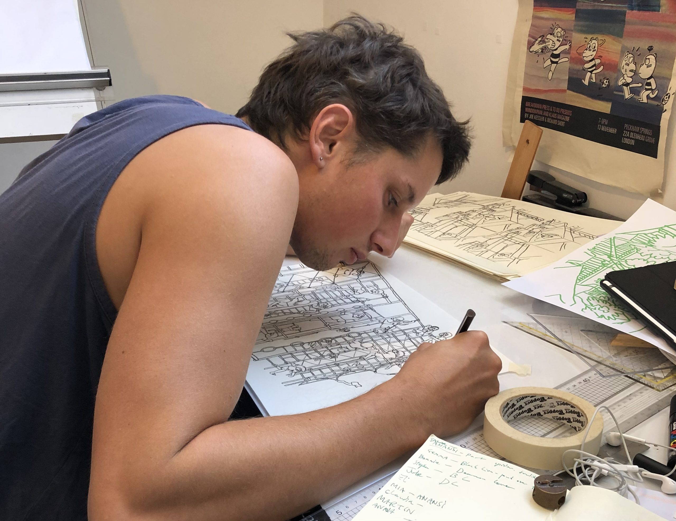
 London-based Joe Kessler makes sophisticated and emotionally striking comics that appear to be created by a visceral performance of colors on pages. His one-artist anthology series Windowpane was collected in 2018 from Breakdown Press, the publisher Kessler is the co-founder and art director of. His latest book, The Gull Yettin, will be out on May 2 from New York Review Comics.
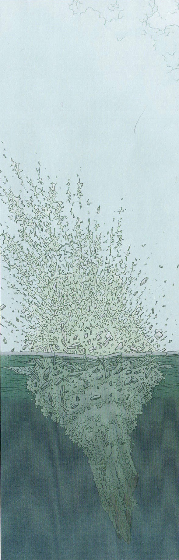
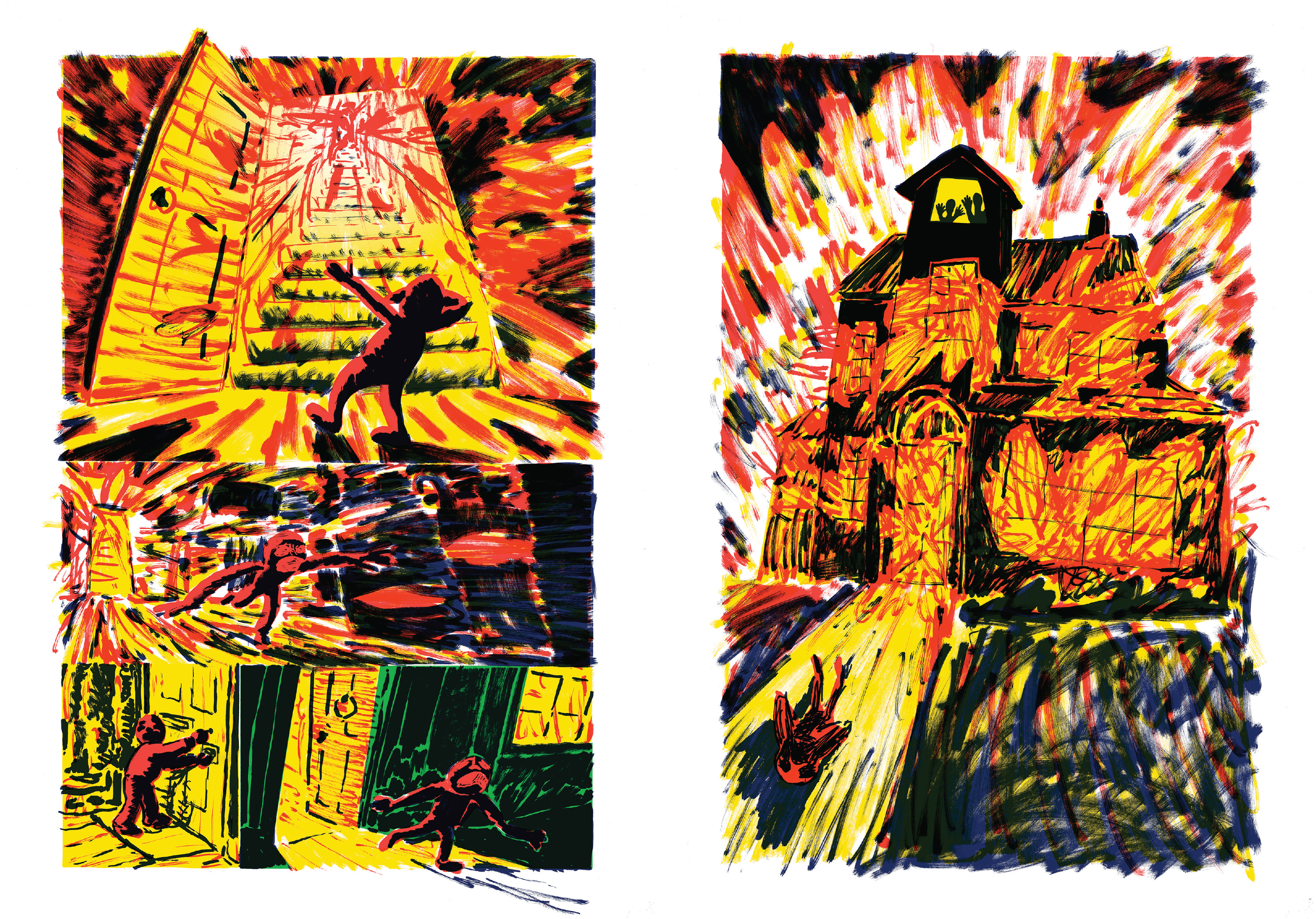
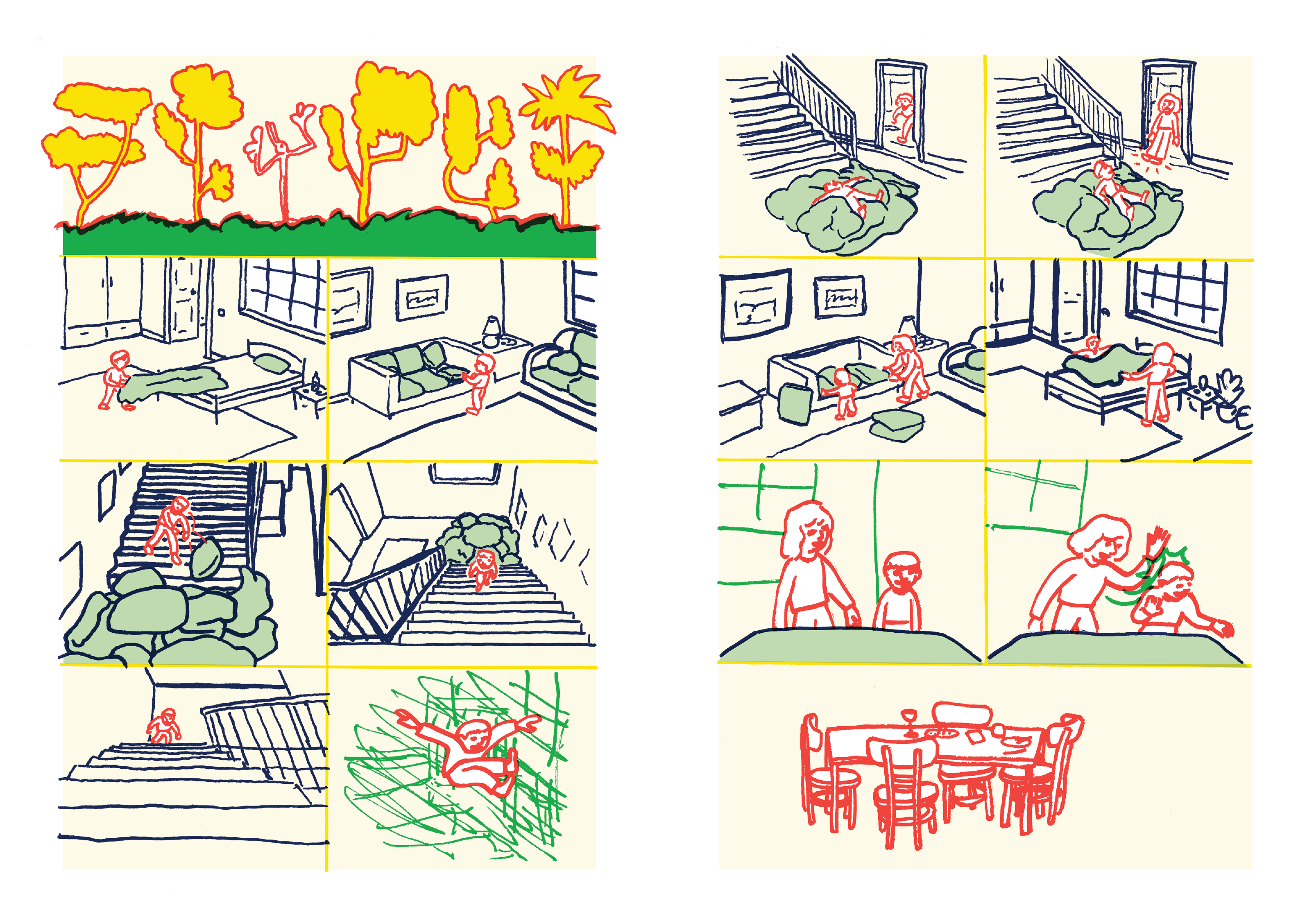
The Gull Yettin begins with a young boy’s home erupting in flames. The boy is visited by a tall, beaked shapeshifter, the titular Gull Yettin. The boy journeys with this creature. They drift on a watercolor-ed sea. They go get breakfast. The Gull keeps changing forms. It’s a wordless comic I’ve read many times. I’m amazed how a book so nearly abstract can also be so clear and inviting to read. I just open the book, and I’m off on the trip. It can read fast or slow. The creature is either the boy’s imaginary friend, or a ghostly nemesis.
I’ve talked to Kessler a few times over the years, but never for as long as this. Thanks, TCJ, for asking me to interview Kessler for the Journal, and thanks to Kessler for his time!
-Dash Shaw

DASH SHAW: What were some of the first ideas for The Gull Yettin?
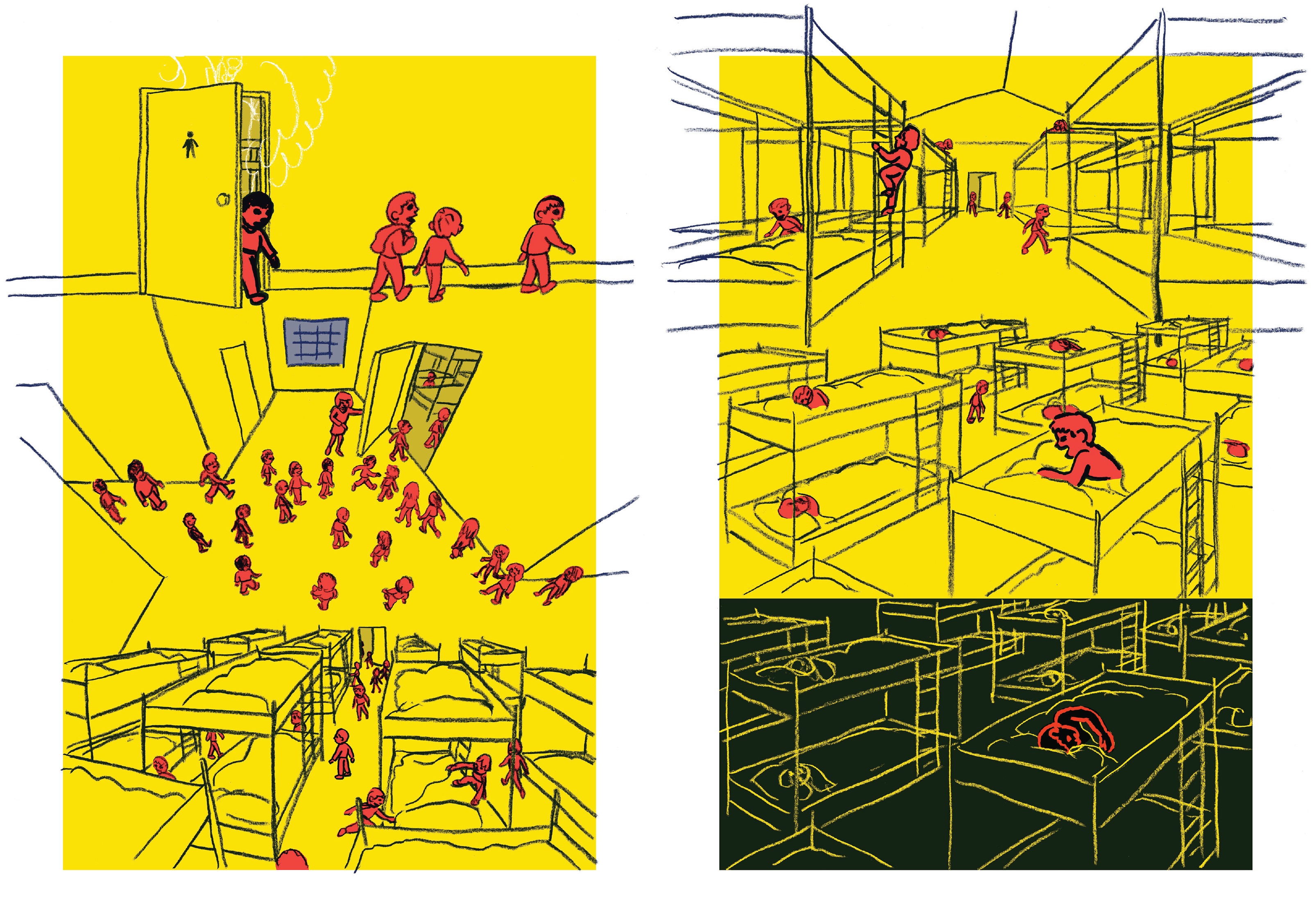
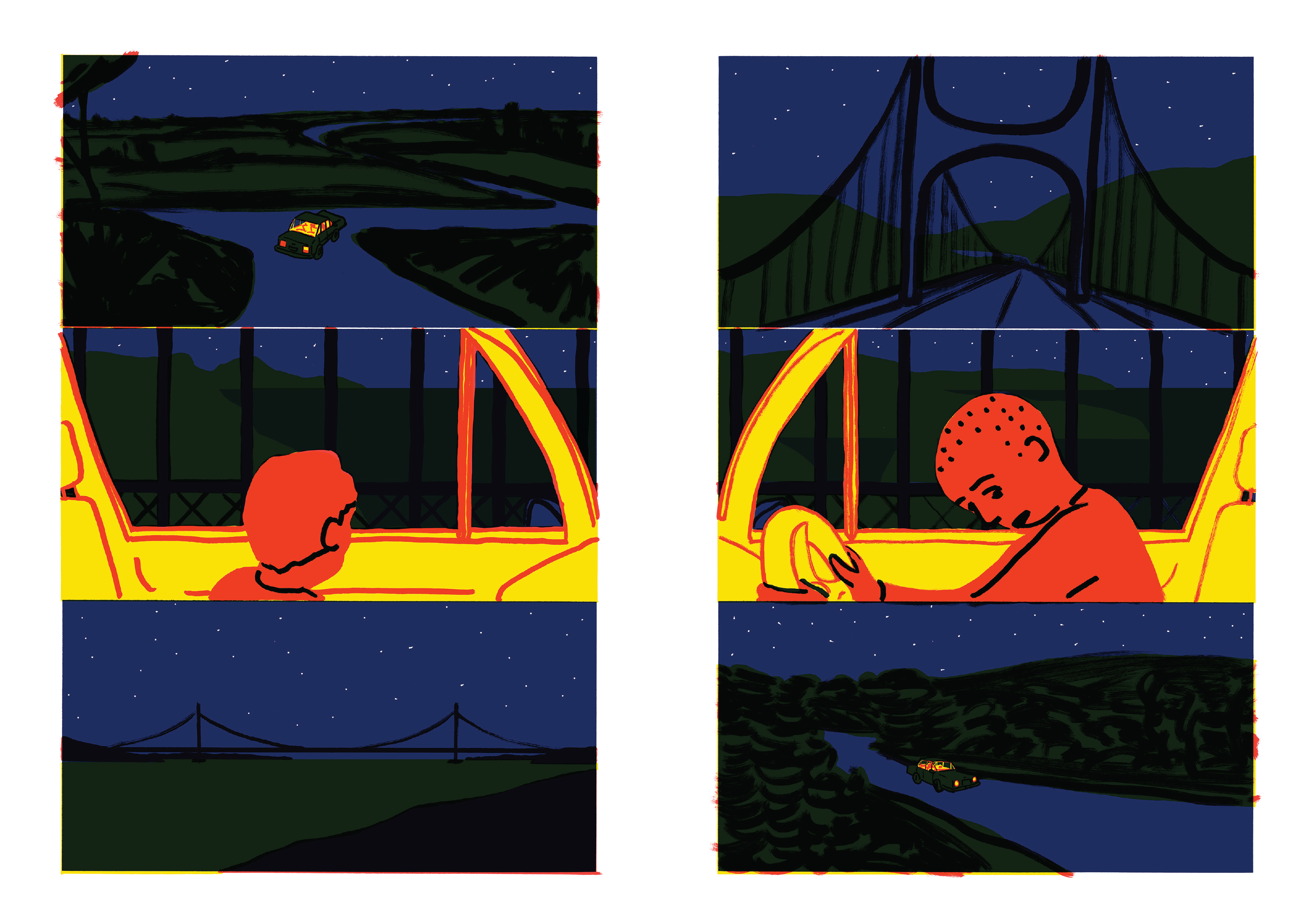
JOE KESSLER: The first bit I drew is right at the end of the book: a kid in a dormitory gets hit in front of his peers. He runs away and ends up on a drive at night to get a fry-up with a strange grownup.
I wanted to frame intense experiences with plateaus that give space and then hopefully take on their own meaning. So I had this whole sequence that eventually became the denouement of the book.
The drive reflected a memory of my uncle who died. When I was little, I woke up early one Christmas. He worked on building sites and was up early out of habit. Still dark, everyone else asleep, we drove to a service station for a fry-up.
When you said you had that sequence, does that mean you drew that whole sequence to completion?
I drew a version of it. The driving section was initially focused on the experience of listening to music at night while you rip through the countryside. That was complicated and felt wrong. It became a quiet sequence.
And the scene in the dormitory was also about people sleeping in the same room. All their dreams next to each other. I had some sequences of all of their spirits walking upwards out of their beds into their separate little mind-worlds. But I couldn’t quite make them work…
When you said “make them work,” what does that mean? “Work” how?
…in the context of the story. Imbue them with some feeling that has a relationship to what goes before or after… I s’pose. I’m not sure.
It worked in that I could communicate what was happening. I think. People lie asleep and then they leave their bodies and walk upwards into dreamland. The nice bit was that the back wall of the room bends round and becomes the floor as their spirits rise out of bed. So I was stuck because I had an eloquent, elegant way of saying something, but it didn’t make emotional sense in the context of the story. So I deleted it. Though I ended up using a version of that drawing elsewhere in the book. But just to talk about going to bed, not explicitly entering ‘dreamland’.
I have a 6-year old girl, so I read a lot of children's books, probably more than you.
I imagine so.
Your book made me think of children's books that are often about a magical creature that arrives after or around a trauma, you know? Like, a girl's mother dies and then the girl comes across a unicorn. And that seems to be what you're suggesting with that driving sequence, your uncle, then leading to the Gull Yettin creature.
The second thing I drew was the house fire that sits at the beginning of the story. The whole book is kind of a response to that event. I guess it would differ from those books you're describing in that it’s implied that the Gull Yettin might be responsible for the fire. And then later on is directly responsible for more horror. So, in my head at least, it's less neat.
Uh-huh. It sounds like you go sequence-by-sequence, when you get inspired, and you create or arrange a book out of order.
Yeah... not intentionally. I was drawing separate things then realized they were the same. Same characters, same shape and rhythm, same concerns. It took me a long time to work out how they connected… in hindsight, I was working in chapters out of order. And they brought each other into focus until gradually and mysteriously things became clear.
I wonder, working that way, how do you do narrative consistency or how do you think about consistency?
Not in the sense that I think is usually meant by ‘consistency’ in comics. I don’t care if the depiction of a thing changes drastically. I care that the story can be followed. The characters are fairly amorphous, nondescript. But they shape the world. The perception of the world is filtered through the characters. The way the world is drawn is responsive and subjective and inconsistent just like our perception of the real world.
Mythical creatures in illustration, they're usually rendered realistically. That's often part of the game right? Fantasy art where every feather on some fantastic bird has been rendered so that this creature that is totally imaginary is “grounded“ in our reality.
In Cryptozoo [Shaw's 2021 animated film] the characters were grounded in early or ancient versions of themselves, right?
Yes. But the Gull Yettin design is quite nonspecific and alters throughout the book. Did you ever see drawings by Heinz Edelmann for folk tales? That to me is a version of fantasy art where it's like the imagination is activated because you can't tell what it is. It's almost like the text itself. As if you're reading some H.P. Lovecraft story and you can't imagine what the being is, and so maybe the best way to draw it is something more like how you drew the Gull Yettin, where I'm not exactly sure what the Gull Yettin looks like after having read, you know, your 200-page book.
Yes. I think about Heinz Edelmann’s drawings for Tolkein often. Their lack of specificity. How they manage to capture tone without being pompous or heavy-handed. They’re talking about myth and legend, good and evil, Gondor and Mordor, elves… pompous and silly stuff that I love in the books but is so hard to depict without ruining. Every time elves appear in those Peter Jackson films it’s an embarrassment.
So, in a similar way, it felt important that the Gull Yettin wasn’t ever clear. It’s a shapeshifting mysterious creature and if over-defined I think it would lose power. But it should define the things around it, the environment. Just like the other characters.
So for you, the non-specific drawings, it feels like it has to do more with the environment that they're in. The whole page changes depending on the tone for a scene.
I think so. In a responsive way.
When you say responsive, do you mean how the Yettin is responding to its world or how you're responding to drawing that day?
[Laughs] Oh, hopefully how the characters are responding.
Okay. Yeah.
I'm always trying to enjoy myself when I draw, because otherwise I won't do it. I'll probably never be an animator. [Laughs]
But I’m still thinking about previous questions. How the story took shape. Because it's obscure to me. It's a collage process. Cobbled together and overthought. But that’s true of everything in comics. All the different structures within comics. Which is weird because the hope, for me anyway, is that they’ll end up feeling like organic and coherent worlds that effortlessly occur while being read. It’s an unnatural process.
Well, if you're going scene by scene, how do you know when to stop, and how did you know, like, “I'm gonna start with this soccer scene.”
I don’t know! The footy intro felt right and I wanted to draw it. It was good that it was banal and dynamic and could be watched through a green mesh-fence… but it could’ve been lots of other things. Some scenes had to be the way they are and others were much more flexible. Some of them are efficient and some very loose. I don’t know why that feels right. Why certain things become so significant.
But, for example, there are ‘pleasant’ bits of the story, such as a domestic sequence and a sequence in a school that are both series of vignettes. I felt I could keep on making those forever quite happily. And maybe it would be nice to read a million pages of them in a nonlinear way. Maybe the more violent or horrific things had to be brief and specific… for want of a better word: “punchy”.
I don’t know. I’m talking out my arse. This question is too difficult…
I feel something that unifies the whole book and kind of unifies you as an artist, are these four colors. This book and your previous book, Windowpane, are the same dimensions, at least the English versions are.
Yep.
And these are extremely odd, particular four colors to pick... how did you pick them?
I’m certainly comfortable with them. They have a large potential range in what they can depict practically, emotionally… and I like them.
They’re influenced by designing work for the Risograph in the past but they’ve ended up shaping my process. I usually build the images from light to dark: yellow and then the two mid tones of red and green, and then the ‘topline’ dark blue. They’ve defined my whole approach to composition.
So are you doing it old school-style where they're four separate sheets of paper?
Yes. I cheat quite a bit, but in my head that’s what’s happening most of the time.
Yeah. I wish I had a better way to say it, but the four colors are not garish. But they have a lot of “kick” and they just don't look like anything else. You seem to have gotten a lot out of them.
Thank you. I messed around in print rooms quite a lot and did a lot of ‘bad’ printmaking. Monoprinting mostly. So I found that I liked heavy coverage of ink butted up against each other. I found it dramatic, engaging. Good for stories.
I subvert it in Gull Yettin in a few places too. When things are less turbulent the colors and drawings become softer and staid. Drawn smaller and with less gesture. Simpler fixed viewpoints.

I think those scenes to me often look like they're observational drawings that you've combined into your fictional comic.
I’m pleased to hear it, but I don’t think any of them are. My compositions are so contrived that it’s difficult to use much that’s directly observed.
You know, all of your comics that I've read have been really good, and maybe that's ‘cause you've hidden your early ones. I don't know. But, it's enviable. They’ve all been great.
Thanks very much!
But I think this new one is your best so far. And I have two theories of why I wanna share with you.
Well, my mum's theory is that I'm finished now... [Laughs]
Oh, that you're done.
…in a kind of positive way. She likes this book but thinks that’s it for me. “Well, your next book's not gonna be as good." [Laughs] All washed up.
Maybe she just wants you to stop drawing comics.
Oh, yeah, I don't think so actually. [Laugh] Maybe she’s just right.

My first theory is that there are no words.
Yep, definitely.
Not that your words before were bad or anything, but there's something with taking those out. Did that just happen without you deciding it or what?
Once I got rid of words I realized it'd been inevitable. I'd been creeping in that direction. It’s more work. Much more drawing. But once I did it everything felt more powerful and I could say things and go to places that I otherwise couldn’t. Everything was direct. There was nowhere to hide. Like a barrier being removed. The story is more alive. Things feel easier to understand but broader in potential interpretation. It’s more reliant on a ‘good’ reader. But I think it encourages a ‘good’ reader. An active reader…
Right. Yes. I grew up reading comics, so to me words and pictures together always made total sense. And I was always confused by people who were confused by comics. But as I've gotten older, it's really become clear to me that words and pictures operate on completely different parts of the brain and that there's something just disorienting about putting them next to each other.
I think that’s been my experience too. But that awkwardness can be a strength of course. Like in Discipline [Shaw's 2021 graphic novel with New York Review Comics]. The words and pictures are often at odds with each other.
Yeah. I leaned into that probably cause I realized they're so different. I'm not gonna try to make them stick together. It’s about the dissonance, for that book anyway. But, you know, I think my favorite [Yuichi] Yokoyama comic is Travel, and that’s the one where he doesn’t have the onomatopoeias.
Travel's your favorite one?
I mean, I like a lot of 'em. I'm not knocking other ones, but, you don't like Travel or what?
I love it. I love them all obviously! Travel's probably been the most influential one for me. Hmm. But Baby Boom is the one I really love the most.
You know, in Yokoyama I saw action, movements, being meaningful in and of itself, and I'd seen that before in like Mat Brinkman and Jim Woodring and Kirby. But in Yokoyama it was just different. And in yours, I see this too. You don't look like any of those artists. Most of those artists, especially Yokoyama, are very clean and removed and also consistent. But you have action being meaningful and it's in a much more “heart on your sleeve” way.
Thanks! I love reading all of those artists’ work. The rhythm! The dynamism! [Laughs]
It’s a bit overblown, but in comics you create your own language, your own way of saying things. That feels more apparent when you aren’t using words. In wordless comics the reader’s forced to interpret images all by themselves. Give my creature life! Readers have more independence, moving through pictures at their own pace. It’s possible to go through my book really fast. Or backwards. Or whatever.
It feels like your book could be a folk tale or there could be kind of a text outside of it that we don't have access to.
Mm-hmm. Yeah, there is.
There is?
[Laughs]
But it's not based on an old folk tale.
A very short story that Richard Short wrote. About a mossy bird humanoid that sits on a rock by the sea and covets someone from afar.

This came after your car driving scene?
Yes. In the chronology of coming up with the story.
He gave it to you?
Yes. With consent. [Laughs] He came up with the name and was a huge influence on the whole book.
He gets a percentage of the sales?
No. [Laughs] Just the occasional acknowledgement. We’re friends and have been involved in each other's work for a long time.
So it felt like that folk tale could attach to these things that you were already cooking up?
It took hold of them. It got mixed in and strongly flavored the broth.
Was Short a test reader on the book? Does he give you good notes?
Yes. He’s one of a few. Most of the time I try to get people to describe the action. Not give a response. Just say what they think IS happening. Not what they think about what’s happening. But then Rich gives me lots of ideas and unbidden thoughts. We have a relationship in which we’re able to say horrible things to each other [laughs]… usually.
I feel like with test readers, there's ones where it's like, just clarity. Can you tell what the eff it is? Do you know what is going on? Yeah. And then there's like, did they laugh at a part that was funny? And those latter ones are kind of harder to know, especially if you're making work where you're not exactly sure if there's a locatable emotional response.
Absolutely. I have a handful of test readers, I guess. Most of them tend to do both of those kinds of readings but they are distinct. Practical and personal reads. Or something.
My second theory about why I think this book is better than the previous books is that there aren't identifiable inserts that are references to other paintings. Before, you'd be reading Windowpane and there'd be a panel and, okay, this kind of seems like a Milton Glaser panel. I feel like I recognize this.
In Gull Yettin it feels like all of these different modes of drawing and picture-making, all these different things, are integrated and not floating.
I think that's true. Maybe it’s just confidence… I often think about hanging the story on certain things. Certain images, scenes, interactions. Stringing the story between these various points. In the past these points were more referential. In The Gull Yettin there are tons of influences, but they’re probably more… broken down. [Laughs]
Yeah. It's just that because there's so many different modes of picture-making that I see inside your work, but it's digested. It's not like it was a swipe. It was more like a pause of some other element, you know, as opposed to one consistent flowing thing.
Yes. A flowing thing is something to aspire to certainly!
You know, I have kind of an annoying question.
Please.
I wanna know your answer [laughs], and I'm a little ashamed to even ask it, because I know that industries are different than mediums, but - I feel like your work is at the intersection of art books and comics, but the art industry and the comic industry are so different, you know? Do you have thoughts on this? [Laughs]
I don't think I have deep thoughts on it. I could quite happily just make pictures and find that satisfying. But I find that world mysterious, the art world. [Laughs]
In comparison, the pathetic world of comics often seems nicer…
Do you mean nicer, like friendly?
No, that might be true, but I don’t know. I meant in terms of engagement with an audience. It feels possible to have real engagement with people over an extended period of time, even if it’s only a small audience. Whereas with exhibitions I feel pretty wary. I have some in the next few months and am looking forward to them but… they’re drawings designed to be hung on walls, not comics. Even if people do come and respond and feel things, I don’t know what the life of the pictures is beyond that. Once the show comes down, maybe some of it sells and is gone forever and the rest goes back in the plans chest…
But there are art books, you know?
Oh yeah, sure. Yeah. Well, I’m very interested in art books. I usually, lazily, don’t distinguish between them. Art books, comic books, picture books, photo books… visual books. I don’t care.
Do you like the context of comics?
Not really. [Laughs] I don't particularly like the context of comics. I’m very devoted to the form, but I get exasperated with the tastes and ideas typical in comics. I’m not going to try to define those… I would probably feel the same whatever medium I was working in. Likely worse.
Though maybe I do like the context. When I was younger I think I loved the world of comics and where it existed culturally. Now it often feels so small. Limiting. And like the prevalent tastes might be oppressive. Comics are narrow, and that’s frustrating. It’s just a slightly codified way of engaging with pictures and could be almost anything.
Like saying I’m tired of the context of going from side to side? [Laughs]
You find that upper left to bottom right useful for your purposes.
Yes. But I think a lot about the immediate read of the whole spread. Like when you first turn the page, what are you confronted with? That’s especially important when there are no words and only six panels in front of you. You take in the whole thing at a glance. Then you can work out the specific order within the spread. But many of the spreads can be read as a collage. Simultaneous… not that collage has to be simultaneous… and it’s all collage.
That seems like a good way of thinking about comics in relation to other art contexts. Collage is in our heads all the time when we’re reading pictures. We’re used to putting images next to each other. Not necessarily extracting narrative meaning but navigating them in some way. Art books, comic books, whatever. I know comics tend to emphasize narrative and clearer sequencing. But… I’m drifting into the arena of stupidity here… [Laughs]
Different industries, businesses… same shite… art books and comic books… sometimes... put me out of my misery. [Laughs]
Yeah, I hear you. [Laughs] I just had to-- I dunno why I had to ask.
Well, the question is quite present for me even if I’d like to ignore it. Through working at Breakdown Press I’m confronted with the context of comics in a broader sense. More than I would be just thinking about my own stuff.
Well, something that I loved about the Breakdown Press book designs is that they feel, to me, like the ideal of what a graphic novel design is like. There's always a drawing on the cover. Someone glancing at it knows that it's a comic. It doesn't look like it's trying to be a prose book, but also it doesn't look like an art book. To me, they are the ideal presentations or vessels for comics.
Oh, well, that's really nice. It would be fun to make bigger books that might look more like art books. But the books we publish we mostly want to be readable. In the lying in bed sort of way.
Well, art books often, like-- it'll be a book of photos and the cover will just be a blue square. There's usually something kind of willfully abstruse.
…not for the uninitiated. You've got to know which mysterious door, which buzzer to ring, and go to the fourth floor at the back to find the gallery.
The Breakdown Press books are not like that. They say that it's a comic.
We’d like them to be welcoming. We’d like the books to look like what they are individually. But mostly it’s the artists we work with. Foreground the work. Try to understand and respect it, and not fuck it up.