Deena Mohamed is an Egyptian artist, writer and designer who broke into comics with Qahera, a webcomic about an Egyptian Muslim superhero. Her latest work, Shubeik Lubeik (or, "Your Wish is My Command"), is set in a world where living "wishes" (djinn or genies) have experienced the same colonialism, imperialism and commodification as the rest of Egypt. It was first published in Arabic as a series of three books, each focused on a different wish and the individual that possesses it. An omnibus collection of the series was published by Pantheon earlier this month, translated to English by the artist herself. The following interview was conducted in December and early January via Google Docs, in which we discussed tripartition in comics, calligraphy and language on the page.
-ML Kejera
* * *
ML KEJERA: The book is a master class in how translation affects the reading of sequential images. A page where you leave East Arabic numerals untranslated reminded me that, as those are read from left-to-right while Arabic is read from right-to-left, switching reading directions is not unfamiliar to many Arabic readers. This is not the first time you’re translating your own work into English, as readers may be familiar with Qahera. What was the process of translating the book like?
DEENA MOHAMED: Qahera was definitely my experimental ground for English-to-Arabic translation. It was originally posted in English, so once I started working on it in Arabic, I felt like I needed to adjust for both readerships as much as possible. I would work on Clip Studio Paint with a second window that showed me my page horizontally flipped, just to see how it flowed in both directions, and post them flipped for each language. It was a bit of a tiresome, defensive way to work. Even though I knew I couldn’t really dictate my audience, and I couldn’t dictate who would like it and who wouldn’t, it was still a subconscious distraction as I worked, feeling like a tour guide in both languages and a tour guide for the social issues the comic addressed.
So with Shubeik Lubeik, I wanted to try working in a different way. It was fully in Arabic, intended for print. I was aiming for the Egyptian readership. The constraints that came with that—[in addition to] language, the fact that it was physically in print and would have to be purchased locally—alleviated the pressure. They also helped me set more concrete goals, like experimenting with comics and Arabic calligraphy as much as I could, trying to produce something quality in print for mass consumption in Egypt, and working on a longer story told across several parts.
I only started thinking about the translation process once I was pitching it to US publishers, after I had self-published the first part. At first, I followed the method I had previously used for Qahera. But when it was time for the final translation files to be sent in, I saw that this method wasn’t really working. Some pages simply couldn’t be flipped or translated, like those depicting genies. And so the flow of the whole book would often stop at sequences like that. Once I realized I didn’t have to change the reading direction, it was such a relief. Pantheon had published manga before, and hadn’t changed the reading direction for it, and I suddenly realized that just because it hadn’t been done for Arabic comics before didn’t mean it hadn’t been done at all. It unlocked the whole translation process for me, and from there everything became easier.
I don’t know if switching reading directions on the same page is easier for Arabic-speaking readers. It’s true we do read numbers that way, but it actually makes me hyper-aware that it can make it more confusing for Arabic readers to follow the panel to panel sequence since they’re so used to looking back and forth, usually relying on context clues more than established reading rules. It happens to me too! I read so many comics in different languages, sometimes I’ll get lost in a page if I forget what language it was originally in.
I taught myself how to make comics over the years through the experience of publishing and getting feedback and, through that, I decided one of my most important personal rules in comics is to prioritize clarity above all else. The reader should never be confused about things I didn’t intend to be ambiguous. This seems obvious, but I think for many beginners, and even for professionals, it can be forgotten or underestimated in the midst of the desire to show off technical prowess. But when you’ve got all these elements in play—reading direction, translation, calligraphy, color and black & white pages, the story itself in all its complexity—clarity is really important. If something was obvious to Egyptian or Arabic-speaking readers, I would make it clear for English-speaking readers when possible by adding cultural context or translation in the footnotes, because it’s not a place the story is intended to pause or confuse, it’s a place where it needs to flow.
For the infographics, their reading direction is a little more haphazard since some of them were specifically modified for the English version, particularly the second section. Consider this page:

It has (what Egyptians call) Arabic numerals as design elements. I believe Pantheon changed them to real Arabic numerals (haha) in the final layout. But I did this deliberately, the infographics are meant to create a pause between each part, and so I am happy for the reader to stop and sit with them and read them in different directions and work out all the details and think about the timeline. The information isn’t particularly sequential or narrative, so there’s no wrong direction in which to read them.
Shubeik Lubeik has been lauded for its humor. I believe that this is reinforced by how some of its jokes are in the three-panel sequence of premise-setup-punchline so commonly found in newspaper strips. Tiers of three are not just done for humor in the book, though. Much of it relies on three-panel tiers and tripartite composition generally, not to mention the collected book consists of three narratives. Why the specific use of tripartition as a structuring element throughout the book?
Honestly, I didn’t realize how often I did that! But I think, like I mentioned previously, it’s probably my preference for clarity. While Egyptian comics are heavily influenced by newspaper strips in humor, satire and character design, most tend to be one-panel editorial cartoons. The three-panel comedy strip is definitely more of a Western comics tradition, but three-panel and four-panel sequences (just like nine-panel grids, depending on page and print sizes) are also very common in classic Franco-Belgian cartooning, which is the most similar for Egyptian visual preferences, and so I know they are less confusing and more familiar for Egyptian audiences.
They’re good for jokes, and generally good for controlling rhythms. I also tend to use three wide panels vertically as well, because they’re easy to follow. Because of their versatility, three-panel and grid sequences are almost “neutral” storytelling territory (even though many iconic graphic novels have used them to great effect), especially if you don’t have inlaid panels, characters popping out of panels, or full-bleed panels. They tend to have a general, classic feel to them because, as you mentioned, they invoke this newspaper strip motif, and overall they tend to have a less fixed visual identity. For example, crowded pages, inset panels and diverse panel structures are usually used for mainstream American superhero comics, and so have a very “American” feeling to them. Similarly, quadrilateral panels, large gutter variations and so on are more common to manga. With Shubeik Lubeik I didn’t want it to have a notably “foreign” feeling in any page, and when I did use these elements, I used them sparingly at key moments so they wouldn’t distract readers.
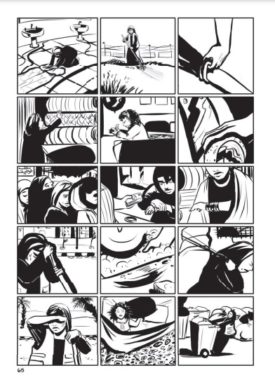
These are things that, I believe, most people might not really notice, and in many cases I was doing it subconsciously based on what “felt” right and what didn’t. But I also think it is palpable when you’re reading, because when people comment on how “authentic” or “Egyptian” Shubeik Lubeik feels, even if they hadn’t previously known Egypt had a certain comics visual identity, this is partly what they’re referring to. It is nice that it did end up echoing a lot of the tripartite structure that the book has thematically as well.
The history of the commodification of djinn into wishes in the book is tied directly to that of Western colonialism and imperialism in Egypt, and its commodification - especially that of its humans. The infographics (which are of course another form of sequential images) that go over this history also relate to the scarcity of wishes, partially manufactured by authorities. One is reminded of Albert Camus’ “cruel mathematics” or the “quantification of human life” as expanded upon by Bedour Alagraa. What was the reasoning behind exploring commodification through the lens of the subjugation of djinn?
It’s interesting that you think this is a lens, whereas to me the subjugation of the djinn is really an undercurrent to the story. The worldbuilding in Shubeik Lubeik works so that when you experience the world through the characters, you never think of the djinn, not really. They’ve been reduced to objects and plot devices. They are not central to the story at all, but at the same time, they are essential to understanding how this world is constructed, how it can be a world with wishes and magic and yet so similar to ours, built on commodification and exploitation. The truth is that the subjugation of djinn and the commodification of human desires are two sides of the same coin. I was thinking about the price tag on human dreams. Once you create a world where wishes are classified according to affordability (which is more or less the world you live in now), you consider what the real price of building a system like that would be. People pay a price, but so do other beings. It was just the natural adaptation of the mythology of djinn and wishes to me.
On top of this exploration of commodification, you take great care in rendering Egyptian advertisements—which are often just sequential images—throughout the decades. You’ve done quite a bit of research into Egypt’s history of sequential images. What did you pull from that in making Shubeik Lubeik?
For my undergraduate thesis, I researched the history of Egyptian comics, partly to understand what Egyptians would find familiar, what our own visual identity in comics looks like, and part of it was to decide what I liked about comics. In Egypt we almost always expect to find value in old things, so I wasn’t surprised to see our long history of comics had so many wonderful artists. You can trace it back as early as 1923, when al-Awlad [a groundbreaking Egyptian comic magazine] was published, which influenced artist Hussein Bikar, who influenced artist and designer Mohy el-Din Allabad, who influenced [Egyptian cartoonist] Shennawy, who influenced me. But nothing was as inspirational to me as TokTok (co-created by Shennawy), which is an Egyptian anthology magazine with a number of different artists. Every issue usually has a few short comics on a theme. Sometimes they do a little feature on Egyptian artists who inspired them. It felt special to realize contemporary Egyptian comics had this much wit, beautiful design and dedication, even with little to no appreciation of their genius from within Egypt. TokTok was one of the first comics that made me feel like I needed to start taking my work seriously to produce something on the same level. I think it’s a shame when people don’t recognize this and consider comics a “foreign artform”. If I see Egypt rendered in a manga, I don’t feel the same way I do when I see a comic strip in TokTok. And it’s important as an artist and storyteller to recognize these things, because at its core, storytelling is controlling the emotions you want to evoke.

I realized if I wanted to reproduce that kind of joy, it was important for me to draw the streets, food, homes, people in ways that would resonate. I’ve spoken before about the idea of a foreign visual identity, and I think it’s something that is underappreciated in countries that have been on the receiving end of translated media for the past few years, or countries that have had a sort of brain drain. Egypt has famously been one of the largest producers of all kinds of media in the Middle East. But in comics, and in digital media, there was a lack of recognition for our own homegrown visual identity, and frequent emulation of foreign styles to meet the demands of the Western and Gulf market. That’s why I consistently highlight contemporary Egyptian artists, because they prove we do have this visual identity, and it does matter in how our eyes and our brains perceive stories.
What most fascinates me about the book is the calligraphy and lettering generally. Why did you choose to render the djinn through calligraphy? Take us through the process of creating a page with a wish.
I was thinking about how in stories about wishes, genies are always very central characters. In Shubeik Lubeik, genies are commodities - they’re not even referred to as genies or djinn, but as “wishes”. They are a product of human industrialization instead of the producers of human dreams. Created, not creators. Ironically, though it was not my intention, a lot of the current arguments around tech and art are based on how people today look at art the same way: as a final product to be owned or serve a greater purpose in a consumerist machine.

When I was growing up, I was told Islamic art tended to avoid human figures. Of course, this is not true across the ages, but it made me think of the distinct separation between art with human forms and art without. If you’ve ever been an artist in a Muslim country, you’ve probably had at least one conversation about whether or not drawing people is haram. I certainly have. When I thought about removing personalization from genies, I thought of calligraphy and patterns. I love calligraphic art, and I also think it is visually stunning and incredibly flexible. Calligraphy tends to be a static centerpiece of its own, an architectural marvel of its own existence, but I was intrigued about making it a living and changing element of the story. After all, calligraphy depicts words, and words are not necessarily static. That’s why the scribbly third-class wishes are just as important to me as the elegant first-class wishes.
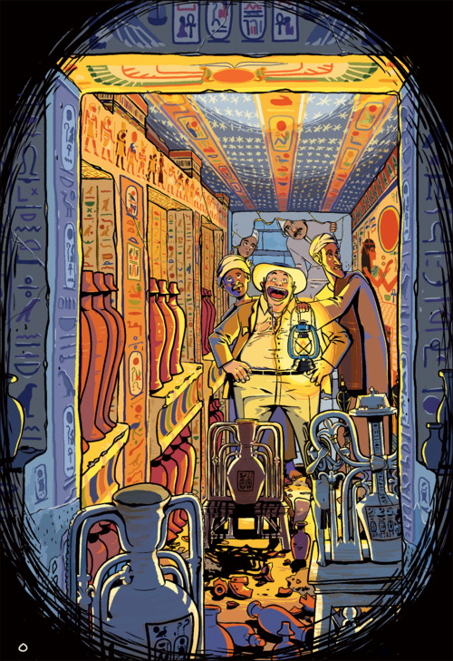
Of course, the concept was that the genies express themselves in the language of the land they’ve been extracted from, and since most are extracted from the Middle East, they speak to their owners in Arabic. I thought this was obvious in the first part: the label on the bottle says “Italia” but the wish speaks in Arabic calligraphy. One can imagine, to a non-Arabic speaker purchasing a wish, it is simply a glowing collection of mysterious, sweeping shapes. But it goes to show that no amount of manufacturing can deny where this wish was taken from.
Additionally, the wishes aren’t necessarily Arab or have a particular national identification. The panel where the wish goes through all the languages that were spoken in that land shows this; the unmanufactured wish bottled since Ancient Egypt speaks in a succession of Ancient Egyptian languages, then Coptic, and finally Arabic to communicate with the ones that freed it, mostly screaming “no.” Meanwhile, a third-class wish also speaks Arabic in Egyptian slang, like a disrespectful teenager (translated as “wat u want”). Although wishes are mythological, the wishes of Shubeik Lubeik are not frozen in time, and just through calligraphy you can make all these story elements clear.


