This column is dedicated to Richy, the Amazing Boy.
Welcome to the sixth installment of The Strip Mine. You all know the drill by now - $20, back issues, embarrassing declarations of fannish enthusiasm - so let’s cut to the chase, shall we?[1]

Lone Wolf and Cub #10 (February 1988)
First impression: GodDAMN! Now THAT’S a cover! Look at those blood drops![2]
Love him or hate him (or both, in my case), Frank Miller was a pioneer, and not just because he wrote and illustrated some of the greatest superhero stories ever published. He was also a torchbearer for comics as an artform, an outspoken advocate for the medium itself. I’m not gonna get into the details - there’s plenty of books written about Miller if you’re interested - but one of his most enduring efforts was championing the translation of Kazuo Koike and Gōseki Kojima’s 9,000-page masterpiece, Kozure Ōkami (Lone Wolf and Cub).[3]
Even though the original manga, which ran from 1970-76, sold millions of copies in Japan and was adapted to film and television, back in 1987 it was virtually unknown in the United States. Yet it was a major inspiration for Miller, particularly on his Rōnin and Wolverine mini-series, so the opportunity to introduce this classic to an American audience that was only beginning to awaken to comics beyond its borders was a thrill and an honor for him. From the high-quality production (its prestige format mirrors The Dark Knight Returns[4]) to his effusive Introduction, this book exudes Miller’s reverence for the series.[5]
Driven solely by vengeance, Ogami Ittō (“Lone Wolf”) is the quintessential loner, an archetypal anti-hero who’s basically the samurai version of Frank Castle. But it’s his son, Daigorō, who breathes life into this expansive saga. Juxtaposed against Ogami’s stone-faced visage, the doe-eyed “cub” is a cute, curious toddler who’s so fascinated by a snail that he doesn’t even notice the chaotic battle raging around him.
This tenth issue is a random point to parachute into the sprawling epic, but the chapter holds together as a narrative unto itself. It opens with Lone Wolf brutally assassinating three Orisuke gang bosses (the Orisuke were essentially feudal Japan’s version of street gangs). Following these executions, he encounters two siblings in the act of committing seppuku, ritual suicide by disembowelment. Their father’s honor was destroyed by the leader of the Orisuke and, according to bushidō, the samurai moral code, they’d rather die than live with the shame. Ogami, however, offers to help them and together they exact revenge.

In a few spots, it took some careful reading to grasp all the Japanese cultural references, but the real appeal is Kojima's art. He’s a master inker, the Japanese Hugo Pratt, combining hairline scratches with audacious ink-drenched brushstrokes. His frenetic fight scenes are extremely graphic, with multiple decapitations and severed body parts dragging contrails of blood spray across the page. Yet, despite the mayhem, there’s “grace, power, and utter vitality”[6] to these scenes.
Other times, when the story calms, Kojima shows impressive restraint, dropping to a knee and slowing the pulse. These transitional scenes allow readers to catch their breath, while giving Kojima the opportunity to envision medieval Japan’s natural beauty and architecture. There are several of these prolonged silent meditations in this issue.
Three decades later, you can still feel the cockiness behind this series. This isn’t just another manga translation, it’s Frank Miller pounding his fist on the podium, silencing the room, and demanding attention. I can almost see him, with burning eyes under his black fedora, spitting words at a packed convention hall.
“FUCK Batman! This… THIS is ‘one of the finest examples of comic book art in the world,’ you schmucks!”
Then, from his trench coat, he pulls out a dōtanuki sword and beheads some fanboy in an Elektra t-shirt in the front row!
“Fuck Daredevil, too!”
Obviously, this was a dollar well-spent!
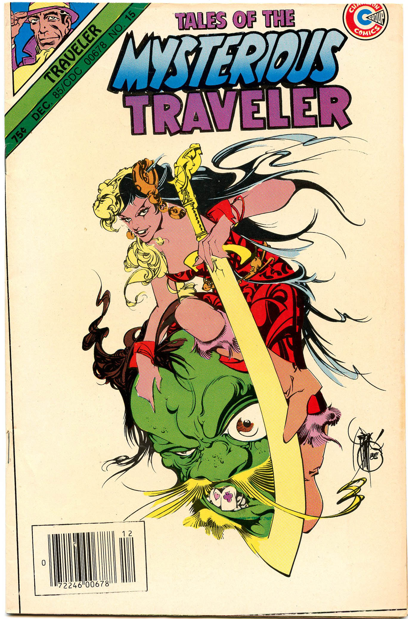
Tales of the Mysterious Traveler #15 (December 1985)
First impression: What an elegant surrealist montage by Alex Niño, both seductive and grotesque! And that is the signature of a master cartoonist!
The Mysterious Traveler is a character with an unusual genesis. He started out as a fictional radio show host in 1943. An anonymous train passenger, he would invite listeners to “take a journey into the strange and terrifying.” Capitalizing on the show’s success, a single issue of The Mysterious Traveler comic book was published by Trans-World in 1948, with art by the vastly under-appreciated Bob Powell.[7] In the early ‘50s, the character briefly inspired a pulp magazine of the same name. Then, from 1956-59, Charlton Comics published 13 issues of Tales of the Mysterious Traveler. Twenty-five years later, the publisher, on its last legs by that point, resurrected The Mysterious Traveler, releasing two more issues. This one is the finale.
This issue features nothing but Steve Ditko stories, though all but one are reprints.[8] The opener (“Desert”[9]), about stranded scientists who suffer extreme cabin fever, feels all too resonant in these long days of quarantine. Unfortunately, like most Charlton stories from that period, it’s clichéd and terribly written, with minimal plot and awkward dialogue. Not even Ditko's excellent art could rescue this story from being neutered by the Comics Code Authority. Yet, despite the hackneyed “tales,” sloppy coloring, and cheap printing, Ditko flourished during this period, lavishing one half-baked script after another with far more love and effort than they deserved.

Unlike the original, Ditko’s Mysterious Traveler was a vexing character![10] Most of his tales started with him, cloaked in the same dusky blue trench coat, collar permanently flipped up, reaffirming his superiority. "Nothing is unknown to the mysterious traveler," he boasts in "What Wilbur Saw...", Ditko's first story for the title.[11] He makes this declaration from the upper left corner of the panel, glaring down at the pug-nosed hayseed like God himself.
His constant appearances quickly become a distraction. He lurks in the gutters of almost every page, shooting intense, heavy-lidded gazes at readers from behind panels (he’s even ogling us from the cornerbox). His relentless intrusions are unsettling to such a degree that they overwhelm the stories. They disrupt the narratives and knock readers out of the story.
Why does this pretentious narrator loom so large in these stories? That’s the real mystery. Rather than spin yarns, he mocks the subjects of his tales, relegating them to the background. His stories don’t feel like “journeys into the strange and terrifying,” but rather like the judgments of an overbearing and insufferable patriarch.[12]
And yet, to Ditko’s credit, it’s those ominous glares that make these otherwise unremarkable tales so memorable six decades later. And one can’t gaze back into those piercing eyes and not see an early prototype for Mr. A.
This issue also featured one new story (well, if you consider 1985 “new”) both written and drawn by Ditko. Despite its eyeroll-inducing title, “Deadly Shadow” was a decent short. A man who can transform his body into a solid two-dimensional shadow turns to petty crime, but, well, you can guess what happens. It's all just a setup for the kind of visual gimmick Ditko excels at. Interestingly, Ditko banished the Traveler to the background, making this feel more like one of his Strange Tales or Amazing Adult Fantasy stories.
This new tale was hardly Ditko’s best work, though. While he had lost none of his illustrative prowess, his linework in this piece was noticeably simpler than the older stories, with less hatching and background detail, a trajectory of refinement that would continue through the rest of his career.
Sadly, by the time this issue saw print, the ship had already struck the iceberg, and Charlton sank into bankruptcy soon thereafter. However, two stories by Ditko that were intended for the 16th and 17th issues were published in Murder from Renegade Press in 1986.[13] That’s a great series, by the way. I should dig that one out and revisit it.
Blue Ribbon Comics #2 (November 1983)
First impression: Why is Mr. Justice's head off-center? And, is it just me, or is he groping that poor little girl? Come on, Rich Buckler. You’re better than this!
The first issue of this Red Circle series reprinted a few pre-war Simon and Kirby stories featuring the Fly[14] (as well as one by All Williamson and Angelo Torres) with remastered colors.[15] This second issue, however, is about as different from the first as possible. Different characters, different creators, different era.
Mr. Justice, both in name and appearance, is about as bland as a superhero can get. The character first appeared in Blue Ribbon Comics #9 in 1941. The ‘80s incarnation is, predictably, a rage-fueled anti-hero in the vein of DC's Spectre. He’s a ghost with a harsh moral code on a quest for, well, justice.
So why is this issue such a gem? Because it features a full-length story drawn by Trevor Von Eeden and inked by Alex Niño. Two of my favorite artists working together! This is what strip mining is all about!
And this is vintage Von Eeden, too, with innovative, off-kilter page layouts, fractured grids, intentionally misaligned tiers, and severed, disproportionate panels. It’s not quite as psychotic as his classic Superman story from World’s Finest #305, but it’s in the ballpark. There's considerable Frank Miller influence in his compositions, as well as Kirby, Adams, Brunner, Steranko, and I'm sure several others, but Von Eeden’s an original in his own right, too.

But forget Von Eeden. Let’s talk about Alex Niño’s inking. His lines are so precise, every contour and shadow so expertly applied, I was frequently reminded of Barry Windsor-Smith’s Storyteller. Niño’s masterful brushwork adds texture, depth, detail, and mood to every panel. Check out this 2015 video of him sketching!
The more I read of these early '80s Red Circle comics, the clearer it becomes that, despite the generic characters, the Archie editors really tapped into a rich vein of creative energy. They recruited a roster of genuine A-list talent, and all the creators involved brought their best efforts. That so many of these revamps have not aged particularly well, story-wise at least, speaks to the inherent limitations of the superhero genre, but still, I've been enjoying these quite a bit.

Omega Men #16 (July 1984)
First impression: Don't believe the hype, this was not a "very special issue" at all!
Somehow, despite my lifelong obsession with comics, I've never actually read an issue of the Omega Men. I couldn't even tell you the name of a single character. The only reason I grabbed this was for Niño, but, despite the beautiful cover, this fill-in issue is far from his best work.
One thing that fascinates me about Niño is his versatility. He’s adept at such a wide variety of styles. I got a Jack Kirby vibe from this story, which didn't quite satisfy compared to some of his other stuff. There are some nice drawings, for sure, but, given his talent, this was a pretty mediocre book. It's a good reminder that, even from creators I love, not all dollar bin books should be romanticized. Most of them are there for a reason. I can't let nostalgia blunt my critical faculties too much.

Imagine #4 (November 1978)
First impression: I love the combination of mod and Asgardian fashion! Bell bottoms and high heels? Sure, why not? I’d pay to see these guys in concert!
Imagine was a science fiction/fantasy grab bag that followed very closely in the tracks laid down by Andromeda. It was published by Star*Reach Productions whose trio of anthologies also included the eponymous Star*Reach (Imagine's sister series) and Quack!, a strange anthropomorphic series intended to parody Howard the Duck and other funny animal comics.

This issue opens with the first half of "A Dream of Milk and Honey," an early work by Michael T. Gilbert (of Doc Stearn...Mr. Monster fame) which should have been sub-titled “Jews in Space.”[16] It's a thinly veiled adaptation of the book of Exodus, a pre-Battlestar Galactica parable about humans searching the stars for a new home.
The story is unique, well-written, and visually ambitious, an outlier from the typical space operas that filled the pages of many ground level independents in the '70s. In the letters column in Imagine #5, the godfather of the graphic novel himself, Mr. Will Eisner, raved that Gilbert's story was "an example of the kind of innovation… that is most important in moving sequential art (or graphic literature) out of the primordial swamps in which comic books have so long wallowed." High praise indeed, but wait, Eisner went on, comparing Gilbert to Art Spiegelman! "You are giving credibility to the belief that this art form is capable of so much more than any of us have ever attempted."
Unfortunately, Gilbert’s artwork, while highly skilled, was a slog to get through. It's over-rendered, with too many characters and superfluous details crammed into each panel. Exacerbating the problem, he buried his drawings under an avalanche of screens, tones, and shading.[17]
This script is also deeeeense! There are so many paragraphs of narration, it makes even Chris Ware's books seem breezy. Seriously, these 16 pages took me an hour to get through! Despite his enthusiasm for the story, Eisner also complained about this. "I have but one critique: In future efforts I hope you will attempt a more disciplined ratio between art and text. I feel that the text in some areas overwhelms the art and in some areas the art obscures the text. There should be, I believe, a very carefully orchestrated balance between the two."
And yet, despite this imbalance, I gotta admit I liked this story (I even tracked down issue #5 just to read the full saga). It's a cliché but this was a true labor of love, every tiny detail obsessively considered. You can’t help but admire Gilbert’s effort.

"The Summoning," scripted by Paul Levitz, is another pseudo-religious allegory, this time about humanity's ultimate destiny in the distant future. Three mystic sorcerers (that stylish trio from the cover) invoke some kind of God-like being who is, of course, a white guy in green robes. They each try to convince him to create their vision of humanity’s fate, but, while the story hints at profundity, its vague ending obscures whatever its message was.
Despite its opacity, though, Levitz's script succeeded in playing to his artist’s strengths. There’s plenty of classic Ditko psychedelia in the story – cosmic beings, surrealist realms, etc. The story’s vibrant coloring by Carl Gafford looks great, too, in large part because of Star*Reach’s upgraded printing. The paper stock on this story is much thicker and whiter than the rest of the book. Clearly publisher Mike Friedrich pulled out his wallet to lure Ditko to his small press book.

"The Awakening of Tamaki" (no relation to Jillian or Mariko) is a cross-cultural story by the U.S.-based cartoonist, Lee Marrs, and Japanese artist, Masaichi Mukaide, whose work for Star*Reach was among the first manga published in the United States. Intended as the first in "an irregular series" (this was the only installment), the coming of age story centers on a young woman samurai in feudal Japan (no relation to Ogami or Daigorō).
Laden with Buddhist clichés, this piece is nothing special, but Mukaide's gray-washed art is occasionally sublime, particularly in the climactic splash page above. Mukaide appears to have drawn a smattering of other stories in the late '70s and early '80s but eventually left comics.

While a full color Ditko story would normally be more than enough to make this a dollar bin score, the real jewel of this issue is “Cosmix,” an early pre-Cerebus piece by Dave Sim. Sim's shadowy artwork in this four-pager was inspired by Steranko's Chandler, and its photorealism is pure, uncut Al Williamson.
The meta story, to the extent you can call it that, is a psychedelic conflation of music, comics, collage, and poetry. The whole thing seems like a metaphor for underground comix ("coSmix" instead of "comix"). The protagonist (presumably Sim) believes that his medium has limitless potential, but its lack of acceptance relegates him to a cultural outsider. He craves respectability and legitimacy, rewards that, given his debased mode of expression, he knows are impossible.
In the book’s Introduction, Friedrich wrote of this piece that "Dave takes us out to the edge of creativity and shows us the territory there (and) as usual, it's evocative." Unfortunately, what exactly Sim was trying to evoke remains elusive even after multiple readings. Sim acknowledges as much, describing the piece as “a story without cohesive plot…” Still, intentionally cryptic or not, this “intimate portrait of an artist in torment" offers a glimpse into the creative mind of a young genius in the making.[18]
BONUS GALLERY:

Original art by Frank Miller for Lone Wolf and Cub #3.

The Mysterious Traveler’s first comic book appearance. Cover by Bob Powell, November 1948.

An original, unpublished piece intended for Tales of the Mysterious Traveler #17. I couldn’t find an artist credit for this Indiana Jones knock-off. Is that Paul Gulacy?

Mr. Justice’s first appearance. Cover by Sam Cooper. February 1941.

Mr. Justice sketch by John Byrne.
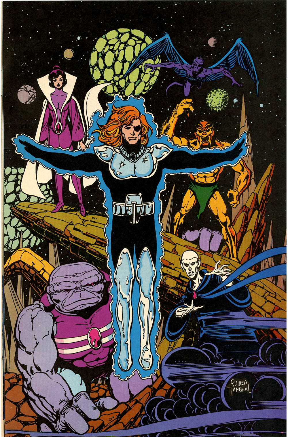
Pin-up by Romeo Tanghal from Omega Men #16. I have no idea who these characters are, but I like it.
NEXT: More Ditko, more Toth, an under-appreciated German master, and whatever other random crap I dig out of my longboxes. Stay safe, everyone!
[1] By the way, the books I reviewed this time were purchased at either the Koch Warehouse, which I visited the night before CAB (more on that next time), or CAB itself.
[2] Those blood drops are by Lynn Varley, of course. The first dozen covers for Lone Wolf and Cub are some of my favorite work by Miller and Varley.
[3] Kojima died in 2000 and Koike passed away last year. Here’s an excellent obituary for Koike by Joe McCulloch. I never realized that Max Allan Collins’ & Richard Piers Rayner’s graphic novel, Road to Perdition, which was adapted to film and nominated for six Academy Awards, was an homage to Lone Wolf and Cub.
[4] The prestige format really stands the test of time. These books still feel special, and the quality of the artwork and cover has not diminished at all compared to most comics of the era.
[5] These First Publishing editions flipped the stories to be read left to right.
[6] All quotes in this review were taken from Miller’s various Introductions that accompanied each issue of the series.
[7] Bob Powell was an excellent artist who, had he worked at EC Comics instead of Harvey in the ‘50s, would have at least one Fantagraphics collection by now.
[8] Well, there is the obligatory Henry Boltinoff strip, but that doesn’t really count, right?
[9] “Desert” was originally published in Tales of the Mysterious Traveler #4, August 1957.
[10] Is DC’s Phantom Stranger just a blatant rip-off of the Mysterious Traveler? Seems that way, but then the Traveler is, at least in appearance (fierce eyes, aquiline nose, hat and scarf, etc.), a rip-off of the Shadow, too. So it goes in comics, I guess.
[11] “What Wilbur Saw…” was originally published in Tales of the Mysterious Traveler #2, February 1957.
[12] If you think I’ve spent too much time contemplating the Mysterious Traveler, an undeveloped character whose sole purpose was to guide readers through some mundane tales, you should probably avoid my forthcoming monograph, Cackling at Death: The Multiple Modalities of Uncle Creepy.
[13] Starting in 2015, Ditko, with his longtime editor, Robin Snyder, self-published several more issues of Tales of the Mysterious Traveler (starting with #16) which reprinted stories from a variety of books throughout his career, along with some new material.
[14] The Golden Age Fly combines elements of DC's Green Lantern (magic ring) with superheroes yet to be created, including Mister Miracle (escape artist) and Spider-Man (wall-crawling, and bug-like instincts; he even ties criminals together with rope). Red Circle also rebooted this character with a pair of excellent covers by Jim Steranko, and equally impressive interior art by Jim Sherman.
[15] Blue Ribbon Comics #1 featured a decent wraparound cover by Ditko, inked by Rudy Nebres.
[16] The “Jews in Space” line is not meant as a slight. The lead characters are named Abraham and Sarah Ginsberg, and they're searching for a "New Israel." Abe often refers to himself as “the new Moses,” and when aliens slaughter most of the crew, the survivors recite the Mourner's Kaddish, the Jewish prayer for the dead. Later, Abe reveals that their journey was an escape from the anti-Semitism on Earth that resulted in a second Holocaust.
[17] The exceptional calligraphic lettering by Mary Gordon, including several Hebrew script passages, is worth highlighting.
[18] Interestingly, and probably unintentionally, Sim’s poetic techno-jargon foreshadowed the rise of YouTube, with its instantaneous feedback and global audience.