
Welcome back to the Strip Mine! In the last issue, I went prospecting for gems at the Book Nook in Atlanta, and unearthed, of all things, some ancient British relics. But that was before I discovered this:
Yep, it’s an actual nook! As every dollar bin junkie knows, those short boxes at the far end with that magical label “MISC” are where the real treasures are buried, so, with only 15 minutes to browse, I made a beeline for them. Here’s what I found:
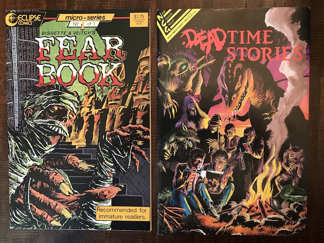
Deadtime Stories #1 (November 1987)
First impression: Stephen Bissette is one of my favorite artists and this painted campfire scene he did with Tom Yeates, evoking a throng of imaginary monsters, is superb!
I already owned Fear Book, a one-shot published by Eclipse a year earlier (in April 1986), which collected several of the short horror stories Bissette did for Scholastic magazine in the late ‘70s and early ‘80s, but I wasn’t aware of this companion book which was published by New Comics Group.[1] Deadtime Stories collects the remainder of Bissette’s earliest professional work, done while he was still a student or shortly after graduating from the Joe Kubert School.[2]
Scholastic is best known as the publisher of the Weekly Reader, a widely circulated children's magazine that was distributed free through schools across the U.S., however, they also briefly published eight issues of a horror magazine for middle schoolers called Weird Worlds. The series was edited by Bob Stine, who would go on to author the wildly popular Goosebumps series of teenage horror books. Both Fear Book and Deadtime Stories are very much in the same vein as Goosebumps (Fear Book even jokes that it's "recommended for immature readers" on its cover), although Deadtime’s stories, primarily scripted by Suzanne Lord, are a little more intense.[3]
Bissette has long been a champion for sophisticating the horror genre in comics, but in these early works, he had a very different agenda. These stories were obviously geared toward Scholastic’s juvenile readership, however, for Bissette, they served a greater purpose than simply providing momentary diversions from the drudgery of schoolwork. Having grown up in the ‘50s and ‘60s, Bissette was a huge fan of science fiction and horror from a young age. In his Afterword in Fear Book, he recalls being inspired by everything from classic monster movies to the Mars Attacks! trading cards to Aurora model kits. As for comics, he mentioned Kirby’s Atlas books, the Warren magazines, various Charlton and ACG horror anthologies, and the seminal first issue of Ghost Stories by John Stanley, though undoubtedly this is an abbreviated list. However, as a young man in the ‘70s, he was frustrated with the deluge of graphic, adult-oriented bloodbaths which had come to dominate the horror genre. He lamented what he referred to as a dearth of “innocent horrors.” Thus, he viewed his work in Weird Worlds not just as a professional gig, but also as an opportunity to introduce “a new generation of young readers” to his beloved genre.
Yet despite his enthusiasm, most of these stories are instantly forgettable. They’re just standard horror clichés, excuses for Bissette to cut loose and draw grotesque monsters and Kirbyesque beasts. Still, like so many comics, then and now, the strength of the artwork more than makes up for the deficiencies in the narratives. Here's a great example from Fear Book:
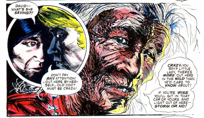
Look at the amount of detail poured into this single panel! The wisps of scraggly hair, the furrowed skin, the drooping eyes and broken teeth. It's impressive to see how fully developed Bissette's skills were at such a young age; he clearly blossomed under Kubert's tutelage.

Unsurprisingly, the stories in these two books, all drawn between '79 and '82, foreshadow Bissette's later work. “The Return of the Swamp Beast,” one of his earliest pieces, features a familiar muck-encrusted monster, and "No Place Like Home," his masterpiece from these pre-Swamp Thing years, focuses on one of his other great passions: dinosaurs, which he would return to years later in Tyrant. The story, a straight forward time travel yarn, also includes several photo/art collages reminiscent of Kirby’s classic Fantastic Four experiments.
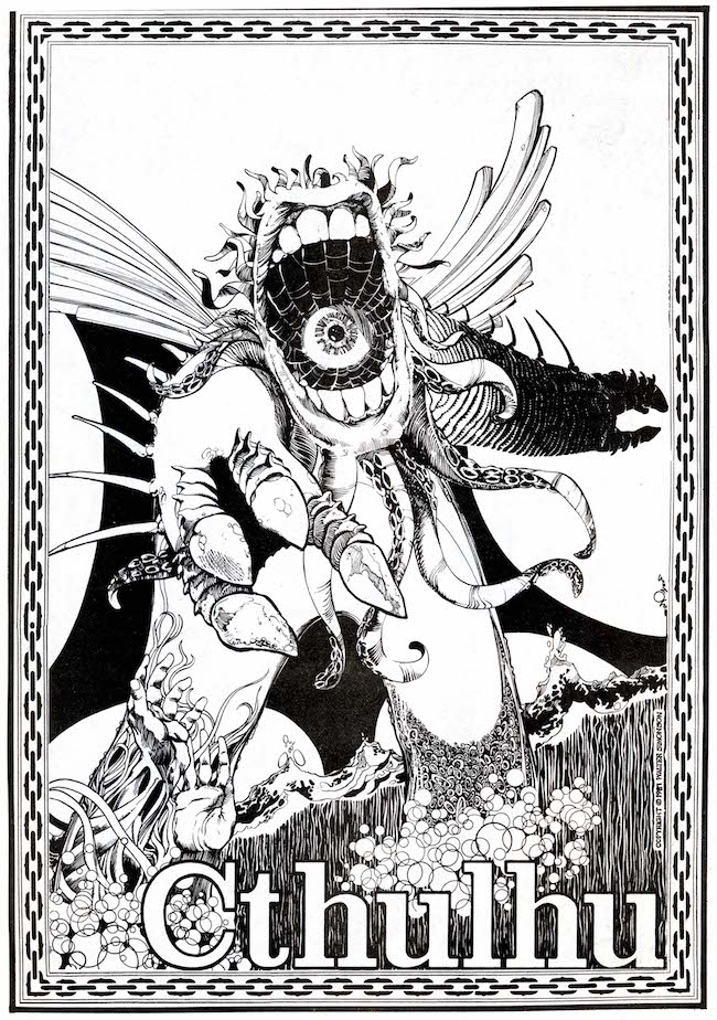
Both books are great little anthologies, definitely worth a buck or three, but for me, the scales tip toward Fear Book simply because it's in color (several stories were colored by Bernie's first wife, Michele Wrightson) and printed on much better paper, as was the case with all of Eclipse’s books. By contrast, the tales in Deadtime Stories are reproduced so poorly, with pixelated panels and smudged inks, the art loses some its luster. I would love to see these in their original glossy magazine format. On the other hand, Deadtime Stories includes an entire basket of Easter eggs: a pin-up gallery of classic monsters by a murderer's row of A-list '80s artists, including Mike Mignola, Jim Starlin, Art Adams, Paul Gulacy, Al Milgrom, and this spectacular Lovecraft homage by Walt Simonson:
Andromeda #5 (June 1979)

Andromeda, like Starstream and Unknown Worlds of Science Fiction, was an anthology that adapted short prose stories by well-known writers into comics. Published by Ron Van Leewen, the owner of Silver Snail Comics (a shop in downtown Toronto), the series was edited by Dean Motter, who would go on to create Mister X with Paul Rivoche and the Hernandez brothers, and it featured work by Motter, Rivoche, John Allison, Ken Steacy, Gene Day, and a bunch of lesser-known Canadian artists.[4]
The main feature of this penultimate issue is an adaptation of Walter M. Miller Jr.’s[5] short story, “The Big Hunger,” scripted by B. P. Nichol. Miller’s classic novel, A Canticle for Liebowitz, won the Hugo Award in 1961, however, this is one of his early stories, originally published in 1952.
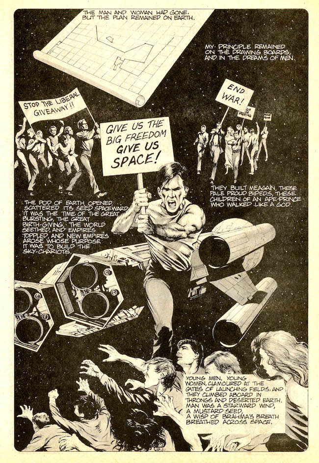
Like Hoshino’s 2001 Nights, Miller’s tale has a truly epic scope, chronicling eons of humanity’s future as it expands further and further into space. The story is a grand religious allegory where space exploration is portrayed as a metaphorical and literal search for God, a quest that is inevitably doomed from the start. The narrator is a sentient spaceship that describes each new colony’s rise and fall.[6] As each of these new societies inevitably begins to crumble, the humans are compelled back to the stars. This “big hunger,” the irresistible allure of space, is mankind’s ultimate curse. Only when humans finally reach the outer rim of the Milky Way do they realize the foolishness of their search: like God, the universe is too vast to ever comprehend.[7]
Miller’s story is intelligent, insightful, and sometimes even profound, but this adaptation is problematic. The main issue is the overwrought narration, which comes across as pretentious in spots and impenetrable in others. Understandably, since it’s witnessed hundreds of generations of human exploration, the ship has a lot to say, but the density of the prose and the overly flowery language made it a slog to read. The arduous script is so purple in spots, it's like overripe eggplant soaked in cabernet. The story is also riddled with typos.

So why didn't I just quit? Because the art was extraordinary! Tony Meers, an artist I'd never heard of before, was an extremely talented draftsman who apparently left comics after this piece.[8] That's a real shame because, for a newcomer, his scrupulous designs, painstaking anatomy, meticulous inking, and masterful wash tones were professional quality. His style would have fit right in with the Warren mags.

The issue closed with a 16-page story by Tom Nesbitt called "The Bellergon Version." It's a pretty childish piece, sort of an alien fairy tale, with an ending so cheesy I had to pop a Lactaid after I finished it. Unlike Meer's slick, polished style, Nesbitt's art is sketchy and open, a welcome contrast after such a dense read. His style is a cross between Charles Vess and Ken Macklin, and his aliens lean toward the funny animal end of the spectrum.
Usually I love the idea of resurrecting and restoring old underground gems like this for a new generation, but there’s something about these old newsprint issues that makes them perfect artifacts of that clenched-fist era when comics as a medium still had so much to prove. I picked up #2 at CAB and can’t wait to dig into it next.
The Miracle Squad #1-4 (1986-1987)

Although the title sounds like another generic super-team book, The Miracle Squad is one of the rare ‘80s comics where the writing is actually better than the artwork. Billed as a "rough and tumble" crime story, it’s a set on a B-movie studio during the Golden Age of the 1930s. An homage to its setting, it’s got the same grandeur and melodrama of the earliest Hollywood films.
From the costumes and characters to the aerial stunts, there are several similarities to The Rocketeer, but Terry Tidwell is no Dave Stevens. His mostly competent yet occasionally awkward art reminds me more of B.C. Boyer's Masked Man. In this panel, for example, the character’s thumb appears to be dislocated.

The Miracle Squad was published by Upshot Graphics, the short-lived imprint owned by Fantagraphics, best known for publishing Flesh and Bones, the final four issues of Jan Strnad and Dennis Fujitake's cult classic Dalgoda series. The first two issues have the crisp paper and sharp colors of an Eclipse book, but apparently sales weren't very strong because the third issue dropped the colors (by Tom Luth) and downgraded to cheaper paper. Yet in a way, the black and white art and cheap newsprint were more stylistically suited to the story’s pulpy, pre-technicolor milieu.
The best part of The Miracle Squad is the deeply researched back matter essays by Wooley chronicling the history of American B-movies. Not much else to say about this one. It was a solid read, but nothing special.
BONUS:

The Freak by Matt Lesniewski
I was drawn to this at SPX because of the intro by Jim Rugg. It's a simple but universal tale of an outsider trying to exist within a society that rejects him for his physical appearance, an obvious allegory for life in modern Instagramerica. The Freak is a mangled skeleton of a man, twisted and grotesque. Lacking any capacity for human connection, his only emotional bond is, oddly, with his shovel, both the tool with which he makes a meager living and a weapon of self-defense.
With flashes of Geof Darrow and Frank Quitely, Lesniewski's greatest strength is the way he draws, in intricate detail, the nameless post-industrial City. In panel after panel, his scenes of urban decay are splattered with filth and strewn with debris, sparking questions about war or natural disaster which are never answered. Like Hard Boiled or Flex Mentallo, The Freak is the kind of comic that demands to be read slowly, and with a magnifying glass.
NEXT TIME: Twas the night before Brooklyn and all through the warehouse..."
[1] New Comics Group was another short-lived publisher who put out a few lackluster comics in the heyday of the black-and-white boom. None of their books were hits by any stretch, but, like Trident, they were successful in attracting several top creators, including Neil Gaiman, Alex Niño, John Bolton, Bernie Wrightson, Neal Adams, and Kyle Baker. Their two issues of Asylum, another horror anthology, are worth grabbing if you see them.
[2] In addition to the requisite coursework, Joe Kubert would provide his students with professional assignments, allowing them to hone their crafts under real working conditions while earning a little spending money as well. “These jobs included everything from endless ads and catalogues for superhero merchandising, to paste-ups for paperback collections of DC characters like Superman and Wonder Woman, to ‘Sparky the Fire Dog’ fire prevention comics,” Bissette recalled, adding that Kubert’s supervision over these jobs included “strict approval and revision of every phase of the job: layouts, pencils and inks.” Clearly Weird Worlds was a crucial early opportunity for Bissette, which, along with Kubert’s mentoring, allowed him to get his foot in the industry’s door.
[3] Fear Book also includes a short science fiction story by Bissette's friend and Swamp Thing collaborator, Rick Veitch, that showcases his distinctive airbrushed coloring. Similarly, Deadtime Stories includes a two-pager by Norm Breyfogle, some of his earliest professional work.
[4] Proudly flaunting its pulp roots, each issue of Andromeda opened with a frontispiece by the visionary science fiction illustrator, Robert MacIntyre.
[5] Apparently, to be taken seriously as a science fiction writer back then, a middle initial was mandatory (Arthur C. Clarke, A. E. Van Vogt, Phillip K. Dick, Robert A. Heinlein, etc.).
[6] The spaceship narrator was likely inspired by Ray Bradbury's “I, Rocket” (1944), the classic short story which was adapted by Al Feldstein, Al Williamson, and Frank Frazetta in Weird Science Fantasy #20 (July-August 1953). There's plenty of other EC Comics pastiches in this story, too, like Krigstein's rapid fire sliver panels, Wood's vanishing techno tunnels, and Williamson's staged photorealism.
[7] David N. Samuelson explains Miller’s story far better than me: “A kind of prose poem, ‘The Big Hunger’ more or less establishes a rationale for some of Miller’s other stories of man’s evolution. A lyrical flight of fancy about space exploration, ostensibly narrated by the ‘spirit of adventure,’ this story alternates florid rhetoric and sentimental vignettes to take us far into the future, through several pendulum swings of expansion and contraction, as waves of explorers leave this world and others, while those who are left behind make peace with the land.”
[8] Oddly, Meers made one brief return to comics in 1996 to illustrate a story in Bettie Page Comics #1. Even more unusual is that the story was co-written by Gilbert Hernandez and Dave Stevens and laid out by Russ Heath!


