Let’s get the most obvious point out of the way, so there’s no mistake in the matter: Ann Nocenti had a very good 1989. She started the year by finishing the only good Colossus solo story that’s ever been written - and before you think that a harsh judgement, think about how many other solo stories the character has ever had. Well, Ann Nocenti wrote the only credible attempt anyone has ever made, in the pages of Marvel Comics Presents #10-17. Writing for Rick Leonardi, but we’ll get to him.
She was also writing a series of very nice short pieces for the back pages of Classic X-Men. Eleven, if I can count. Including one of my very favorite comic book stories ever printed, “Her First and Last”, from Classic #44. Penciled by the inimitable Kieron Dwyer at the height of his talent as a master of expression and emotion. I even wrote an essay about that story. I’ve already attested to its greatness.
This was a weird time, however, to start reading Daredevil.
When I started reading Daredevil, it was being written by Ann Nocenti, in the home stretch of her run. It was a long period - seemed long to me, at least, I was a kid! I didn’t have any baseline for what Matt Murdock’s life was supposed to look like, so the long period when he was roaming around upstate New York letting his facial hair grow a bit seemed like a natural role for the character. I had no idea at the time that it was such a rare treat. Daredevil works as a traveling hero, and heroes that travel can do interesting types of stories. It’s traditionally a productive theme in superhero books. Certainly one of Chris Claremont’s deepest themes, thought not often remarked as such. The X-Men got the see the world.
And so, for a time, did Daredevil, hanging out with Gorgon and Karnak. Of all people! Yeah, they hung out with Daredevil for a while, they had a whole traveling show number. With a genetically-altered laboratory woman named Number Nine, who has never shown up again, inexplicably, despite being a leggy blonde in a Daredevil comic. Anyway! That was the year Daredevil fought Ultron in "Acts of Vengeance", undoubtedly the strangest Ultron story that has ever been, and perhaps the best. Led into the sequence with Daredevil in Hell, fighting Mephisto, which is about as good a Mephisto story that has ever been done. This sequence was also Nocenti's swan song - not on the book, but with her primary collaborator of a couple years, John Romita Jr. Her run would be go on to be finished largely by a pup by the name of Lee Weeks, whom I believe I may have had occasion to mention.
But go back to the tail end of Romita. There’s a fill-in, undoubtedly intended to give him a breather between the Ultron and Mephisto arcs. Shipped December, right after the "Acts of Vengeance" crossover. Drawn by that fellow I mentioned briefly, Mr. Rick Leonardi.

Now, I will go so far as to assert that in Nocenti’s significant tenure writing Daredevil, nothing else went quite as far as issue #277, in terms of any reader’s expectations of what could actually happen in a Daredevil comic. I think it does bear more than a passing connection to another notable issue of the comic, #219. That was the throat-clearing exercise Frank Miller wrote in 1985, about a year before returning to the book for "Born Again". Miller writing for John Buscema, which seems like something that should have happened more than did. It’s another issue of Daredevil where Daredevil never puts on his costume. It’s customary when mentioning #219 to point out that it reads very much like an early stab at the genre and thema that would eventually cohere as the Sin City franchise. Which it totally does, no argument.
What the Miller story shares with the later Nocenti issue is its determination, on the part of someone who had already written a lot of Daredevil stories, to be as unlike a Daredevil story as it could be while still remaining, somehow, a Daredevil story. Issue #277 is a story where Matt Murdock encounters a problem that has nothing to do with a villain being punched. You may want to punch the villain, but the story gives us, essentially, a pointed conversation over dinner. In practice, not very dissimilar in tone and theme from a great many independent films around the turn of the '90s. Although it’s kept below the chassis, so to speak, there’s a great deal of sexual inference in this story, not in the form of innuendo but as an obvious and absolutely crucial aspect of the plot. This is perhaps the only superhero comic to ever use sex, lies, and videotape as its springboard.
It’s a difficult story for an artist. The plot, such as it is, concerns itself with a woman suffering from near-constant severe hallucinations. She encounters Matt Murdock out shopping, and he becomes concerned because he can see more than anyone just how distressed the woman is after a destabilizing vision in an art gallery. He follows her home to make sure she’s safe, and he finds her living with an absolute monster. Not a violent thug or a supernatural terror, however - the nature of the monster is simply that of a smug domestic tyrant. A preening narcissist in the form of a psychiatrist who has built his career on writing about her illness. While also marrying her.

Suffice to say, over the course of the story, Daredevil manages to contain any proclivity for violence. The resolution consists of Matt, sitting at the dinner table in normal people clothes and everything, telling the woman’s husband, I see what you’re doing even if you don’t, so cut it out you unmitigated sack of shit. And that’s what he does, and then he... leaves. Looks over his shoulder one last time, and walks into the night. He doesn’t break the guy’s jaw. It’s unclear what Matt Murdock could have done better without risking an assault charge, truth be told, which I suspect is very much the point. It’s also left to the reader to wonder as to whether Matt does enough.
One of the more interesting aspects of Nocenti’s run was her willingness to let Matt Murdock make mistakes. It’s bedrock, foundational, baked into the premise at Stan-level, that Matt Murdock has the worst judgment of any superhero. Where Nocenti excels, I think, and where she blazes a trail for later writers, is showcasing the degree to which Daredevil can be flat-out wrong in his own stories. Or at least implicated in the eyes of some readers. No excuses, just questionable judgment calls that hurt other people. If you recall the excellent Wolverine team-up that actually preceded Romita’s tenure on the book, #248-249—coincidentally, also drawn by Rick Leonardi—it’s always stuck in my mind that the story itself comes down pretty hard on ol’ Matthew for not letting Wolverine kill Bushwacker, when Bushwacker otherwise got back up and went right on killing people. It’s hard not to think Wolverine isn’t a little bit right when he castigates Daredevil for being someone all too willing to allow the nicety of principle to obscure necessity when lives are on the line.
It’s not a story very many artists could draw, or at least not well, our Daredevil #277. A poignant domestic drama with a foot in the surreal and a heaping spoonful of sexual tension. And not the good kind! The only other person I can think of who could have really sold it was Sienkiewicz - but he would probably have oversold it, truth be told. This needed to be intimate, a quiet story. When we open to the front page and see those dreadful horrifying horse-skulled demons working in the art gallery, it’s simultaneously fantastic and distressingly intimate. Downright claustrophobic. We’re seeing something very private. “Of Crown and Horns” is the rare superhero comic with a foot in the real drama of domestic environments, in no way contrived by the circumstances of the hero. (Not my favorite title, but you can’t win ‘em all.) Murdock is a stranger who drifts into a fraught household and finds a unique problem. It’s not even a particularly ambiguous problem - it’s clear who is in the wrong and why. But it’s also probably not a problem that you could figure out how to fix in the space of a dinner, either. In fairness to Matt.


The reason why only Rick Leonardi could have drawn this story is that almost anyone else would have made it boring as fuck. If you want to write a quiet story where people resolve their differences with terse conversation, you need someone who can make domesticity seem kinetic. Someone who draws characters always moving, even when they’re standing still.
It’s a shame that Nocenti and Leonardi only worked together a handful of times. Seems like something that should have happened more than it did. The evidence of his handful of Daredevil stories attests to the fact they brought out the best in each other as collaborators. To say nothing of the Colossus storyline in Marvel Comics Presents, of which we might speak at more length a bit later - why, I didn’t even tell you who inked it! But then, Nocenti brought out the best in a number of artists; made her artists better. It’s a significant skill for a writer to have, the ability to push artists in specifically productive directions. Claremont has it. Gaiman, too, when he cares to roll out of bed.
* * *
Daredevil #277 was nine years deep into Rick Leonardi’s storied career. He didn’t start off quite so strong. Promising, certainly, but there’s lots of promising people across comics history who drew half a dozen comics and then never again. His first published work was actually in another Marvel comic, Thor #303 from January of 1981. He started at Marvel and stayed at Marvel for a good many years.
Now, is that a good comic book?
I will not lie to you, friend, Thor #303 is not a good comic book.

The best that can be said of Thor #303 is that it is barely publishable. Notice I said “barely”. It’s the roughest work he ever turns in, almost certainly salvaged by classic Marvel inker Chic Stone; the two are jointly credited as artists. Leonardi's next book, Spectacular Spider-Man #52, inked by Jim Mooney, is better. Significantly better, actually, but in fairness he had set a low bar for himself. Some of the staging here is pretty good, a few of the sequences manage some distinctive imagery. Very much the kind of improvement you’d hope to see.
He comes back for another issue of Thor, #309, and you can see, once again, he’s loads better. Still rough around the edges, but getting more comfortable. Beginning to lean in to his strengths, which mean in this instance a proclivity towards motion as the primary driver of story. You think that’d be obvious for anyone making their living drawing comic books, but you’d be surprised!
His fourth published comic was Incredible Hulk Annual #10, from 1981. This is an important book for Leonardi, not necessarily because it’s good, but because it’s clearly a book that challenged Leonardi. It looks like he used every trick in his bag to get to the end of the story. His longest assignment to date, inked by an all-star crew of Al Migrom, Bob Wiacek, Chic Stone, Dan Green and Frank Giacoia. It’s a Captain Universe yarn, of all things - Bruce Banner becomes Captain Universe so he can fight the Hulk on top of a nuclear missile. Not actually a bad elevator pitch for a comic that takes all of 10 minutes to read. The most interesting aspect of the story is actually the writer: a man by the name of Bill Mantlo.
Mantlo had also written Thor #309. Apparently the two men liked working together, since they did quite a bit of it over the next few years. It would be a very fortunate partnership.
After that Hulk Annual, Leonardi doesn’t have anything on stands for over half a year - from September 1981 to May 1982. That’s when he pops up again drawing Amazing Spider-Man #228, a fill-in during Roger Stern and John Romita Jr’s run. Right before the famous Juggernaut two-parter. In truth, being a fill-in, it could have been drawn well before that May, and, in truth, this Leonardi bears a lot more resemblance to the rough work in those early Hulk and Thor jobs. When he appears again, in October of 1982, it’s been a year since that Hulk Annual. He shows up for Spectacular Spider-Man #71—written by Mantlo, again, and again inked by Jim Mooney—and is practically a different artist.
Whatever he did during that year with very little output—at least according to comics.org, which I’ve never found anything less than reputable in these matters—when he returned to Marvel to draw that issue of Spectacular he made a measurable leap in ability. You can see more ambition in terms of panel angles, action choreography, composition. To put it as simply as possible, he’s just far more in control of the look of his panels. You can begin to see more confidence with elements of design. There was nothing in those early four issues to indicate that Leonardi was going to be the guy to buckle down and improve so markedly. But, whatever he was doing in 1982, it worked, and not just for that one Spider-Man comic.

From here he starts getting higher-profile work. He drew the first Vision and the Scarlet Witch miniseries, again for Mantlo, which shipped its first issues at the end of 1982. There is no doubt: not only has Leonardi’s ability to tell a story improved dramatically, but he’s also become significantly more interesting in terms of his layouts. A few pages throughout are downright striking, as inked by the team of Ian Akin and Brian Garvey.
Strange as it may seem if you’ve come up in recent years, they only ever made two attempts at Vision and the Scarlet Witch: both minis, in the middle of the 1980s. The first by Mantlo and Leonardi in 1982, the second by Steve Englehart and the underrated Richard Howell in 1985-86. As a franchise it was significantly ahead of its time, decades too early to meet the comparatively recent demand for stronger domestic elements in fantasy across multiple mediums. People sure loved that WandaVision show, with a vociferousness none of that company’s other recent television projects have elicited. Definitely a comic that preceded its audience by a significant amount of time. And not the last time Leonardi would be called upon to exercise a facility with domestic drama.
After Vision and the Scarlet Witch wrapped, there’s another gap in the record: no work from November 1982 to July 1983. That was when the first issue of the first volume of Cloak and Dagger hit the stands.

Now, if the first gap in the record represents a significant improvement for Leonardi, it really can’t be stressed how much this second gap represented not merely a significant improvement, but a creative rebirth in every significant way. Vision and the Scarlet Witch is a well-drawn comic - professional, occasionally interesting, and never less than competent. But Cloak and Dagger is in a completely different ballpark.
My question to you is - why the fuck don’t we talk about Cloak and Dagger being a goddamn significant book? Because it’s a goddamn significant book. We talk about Michael Golden on Micronauts, and Art Adams on Longshot, we talk about Simonson’s Thor - books that galvanized the generation of artists who followed immediately after. Some of whom would go on to found their own companies. But there’s something missing from that genealogy, a book for the years in between. Adams was then still trying to break in at the time, working at a pizzeria in between early jobs for indie publishers. Longshot is published almost two years after the first volume of Cloak and Dagger, in June of 1985, and it’s inconceivable to me that the one could have been created without the significant influence of the other. Look at all the interesting, inventive, wild stuff Adams did in Longshot, and find perhaps its closest antecedent in the team of Leonardi and the slightly more experienced hand of Terry Austin.
I’m not always one for Austin, I’ve made no bones about this. He’s a very dominant presence, as an inker, and the approach doesn’t always work for every penciler. Sometimes he overshoots the mark in terms of fussed-over detail. His drawing isn’t always relaxing to look at. The approach worked for John Byrne on Uncanny X-Men. After leaving that book, Byrne retained some of the tightness and detail that Austin had given him. That’s how a good inker can help a penciler. Imagine having someone whose job is to follow you around and make you look better! When you trust your collaborator you learn how to bring the best out of your own work. A good artist gets better by learning from the people around them.

What Leonardi needed from Austin was to see just how a thin, sinuous line could work on the comics page. When he gets that, when Cloak and Dagger #1 hits the stands in 1983, and he sees how good his work starts looking when he goes for that clean line, Leonardi is unlocked. As simple as that. He goes from someone capable of drawing a decent comic book to someone incapable of not drawing a striking comic book, and drawing it distinctively. A journey of about three years. And you can see Leonardi in the people who come after. Mike Mignola starts for the company in 1983, two years after Leonardi, and follows a similar path from bare competency to mastery, just by refusing to sit and learning how to foreground motion in composition. Using the opportunity to draw monthly comic books as a means to make yourself learn how to draw better. How to draw comics the Gil Kane way.
Cloak and Dagger were created by Mantlo and artist Ed Hannigan, for the pages of Spectacular Spider-Man. They had no less than four series over the course of the 1980s: the initial four-issue limited series, 1983-84; a second ongoing bimonthly series that lasted 11 issues, 1985-87; a slot in the 1987 revival of Strange Tales, sharing that book with Doctor Strange for 19 issues until 1988; and finally another headlining series, from 1988-91. Leonardi drew the entirety of the first series, a good chunk of the second, and another chunk of the third solo attempt. He’s paired with Terry Austin for the great majority of that time, and Austin writes a few issues as well after Mantlo leaves the franchise.
Since 1991 there have been only a handful of attempts at a Cloak and Dagger revival. As much as I have a fondness for the characters, it’s not hard to see why they never made a larger impact. The duo lack any kind of rogues gallery, their origins are steeped in poorly-aged drug war paranoia, and their stories tend to lean dark, occasionally morose. Their one singular virtue as characters is that they are visually distinctive, with indelible designs. Dagger is a lithe blonde woman with a background in dance. She’s light on her feet, always moving, and moving like no other character in comics. Oh yeah - her costume is also a skintight white leotard. There’s absolutely nothing to fake. Either you can draw the human figure really well in extremis of motion or you can’t.
For illustration of this principle, as well as a handy primer on Leonardi’s work with the character, I highly recommend a specific text: Marvel Fanfare #19. One of the era’s more artistically significant single issues, I think, published in the gap between the first Cloak and Dagger mini and the ongoing. It consists of a new Cloak and Dagger story, written by Mantlo and split into thirds, shared equally by three teams of artists: the middle portion by Leonardi & Austin, the third by period mainstays Kerry Gammill & George Freeman, and the first by the great Tony Salmons. One of the most beautiful things Salmons ever drew, but also significantly different from either of the other two entries, themselves quite accomplished sequences in completely different idioms. Fascinating snapshot of an era’s cutting edge.

After the second Cloak and Dagger series, Leonardi enters a different class of artists. For the space of a couple years, he bounces between fill-ins for Uncanny X-Men, New Mutants and Amazing Spider-Man - a truly enviable run by any measure. His first issue of Uncanny, #201, continues a tradition of Leonardi stepping in specifically to help John Romita Jr. catch up with a big schedule. It’s a significant issue all around, seeing an early inking credit for Whilce Portacio, who had inked Art Adams on the aforementioned Longshot, alongside Scott Williams. And of course, it’s also the birth of the baby who would one day be Cable, which is why the issue costs so much on the secondary market. Change was on the wind, in more ways than one.
Leonardi’s first issue of New Mutants, #38, sees him working with Bill Sienkiewicz. I think it’s a rare misfire - the two artists seem to be fighting each other, Leonardi’s work demanding from its finisher a special kind of grace that was alien to the Sienkiewicz of 1986. Leonardi returns to New Mutants for issues #52-53, the first of which was inked by Dan Green and the second by Terry Austin. Seeing these two inkers next to each other highlights the confidence of Leonardi’s technique at this point in his career. Green isn’t always my favorite inker in some respects, but he’s usually a fairly loyal one, in terms of replicating the penciler's mark. He also put no small consideration, I think, to just how badly the books he inked would look with the godawful printing of the period. One reason Uncanny X-Men was as popular as it was in the second half of the '80s: Dan Green managed to look great with the absolute shittiest reproduction conceivable. It wanted to be the best-looking book in the line, even if it was printed like shit. Leonardi drew a fair stack of X-Men comics over the period - clearly, he was someone Claremont liked working with, since they do it so many times throughout his period and later. But in any event, Leonardi inked by Green at that point didn’t look all that different from Leonardi inked by Austin. Leonardi’s line was by then sure enough to dominate the conversation.
Nowhere is this more evident than in one of his issues of Amazing Spider-Man from that period, #279. Proof positive that Vince Colletta could, in fact, ink his way out of a paper bag. Weird fact about Vince Colletta! He actually turned in some decent work in the mid '80s. He inked a lot of Dazzler, and some of those books look pretty good. Here’s the secret to getting a good performance out of Colletta: put a pretty girl in your comic. That’s it. That’s the secret. Put a pretty girl in your comic, and he’ll put just a little bit more effort than usual, into making sure the girl looks good. Sure enough, this issue of Amazing is a Silver Sable spotlight. A perfect character to showcase Leonardi’s skill: a woman wearing a skintight leotard in highly athletic situations. He gets good work out of Colletta simply by presenting him with a drawing style that leans heavily on thin, even lines.

Around this time Leonardi did a few—only a few—assignments across town. He’s got a few pages in Batman #400, one of the more enviable invitations in comics history. He’s got an short Starfire story for New Teen Titans #22, inked by Romeo Tanghal. And one piece that I would label as truly essential: Secret Origins #20, from 1987, the origin of the Barbara Gordon Batgirl. A truly gorgeous job, inked by DC staple Dick Giordano from a script by Barbara Randall (later Barbara Kesel). The last conceivable moment in time when Barbara Gordon was still Batgirl, and still the only Batgirl. Bittersweet, if you have any affection for the character at all, to see her looking so good, right before - well, you know.

By 1988 Leonardi, is almost exclusively concerned with being Marc Silvestri’s fill-in artist on Uncanny. Silvestri never had any problem hitting monthly, but Marvel double-shipped that title as much as they could. They may not have gotten as many spinoffs out of him as they wanted, but they made Claremont write the damn thing twice a month for considerable spans of his last stretch. He was writing a lot of books for a while there, a pretty intense workload for the last years of his first tenure at the company. Leonardi and Silvestri made a good match, for those periods they were passing off with one another. Both very kinetic storytellers, both men who believe that oftentimes the sum of panel design can be found in understanding how to draw dynamic motion.
* * *
All of which leads us to the aforementioned Colossus feature in Marvel Comics Presents in 1989.
Now, in hindsight, I think MCP is probably less well-remembered than it could be. It’s easy to remember it as a book that published a lot of rough, rookie work from people who weren’t ready for primetime, with Barry Windsor-Smith’s "Weapon X" sticking out like a zit in the middle of the run. And that title did publish a lot of rough, rookie work, to be fair. But the other part of the equation was the fact that every single issue had four stories, save for a couple times they tried a four-part adventure. So that meant, even if one of the stories might be someone’s very first, barely-readable art job, the other stories would include people like Paul Gulacy or Gene Colan, to name a couple of artists who did more than one memorable turn in the magazine. Steve Ditko showed up all the time. The first run featured Steve Gerber’s return to Man-Thing, even. The series took advantage of its unique format - eight slots a month had to be filled, so some of them were going to be filled with crap, and a few would be sublime. Not a bad batting average for a Marvel anthology.
And so too for the aforementioned Colossus story. Although the magazine began with a Wolverine lead feature—Claremont and John Buscema, the beginning of their collaboration on the character—the lead slot bounced around for the first couple years after. Both Colossus and Cyclops received rare solo turns before the title defaulted back to Wolverine as the lead, after Marvel figured out Wolverine on the cover might just sell better than a run of stories featuring the main characters from Excalibur. He did, sad to say.
And that’s why "Weapon X" was serialized in bite-sized pieces, and what it maybe wasn’t even that unusual for there to be at least one or two stray living legends jostling elbows in those pages. So too for Leonardi’s and Ann Nocenti's Colossus serial, "God's Country", which ran concurrent with the tail end of Gerber’s aforementioned Man-Thing and the first chapters of Ron Lim’s bid on Cyclops, as well as the first chunk of Don McGregor’s “Panther’s Quest”, with Colan inked by Tom Palmer. To say nothing of incidental work from the likes of Ditko, Don Heck, Frank Springer, Dwayne Turner and Bruce Jones (with a rare Marvel art job, no less). Not a bad crowd to be seen in.
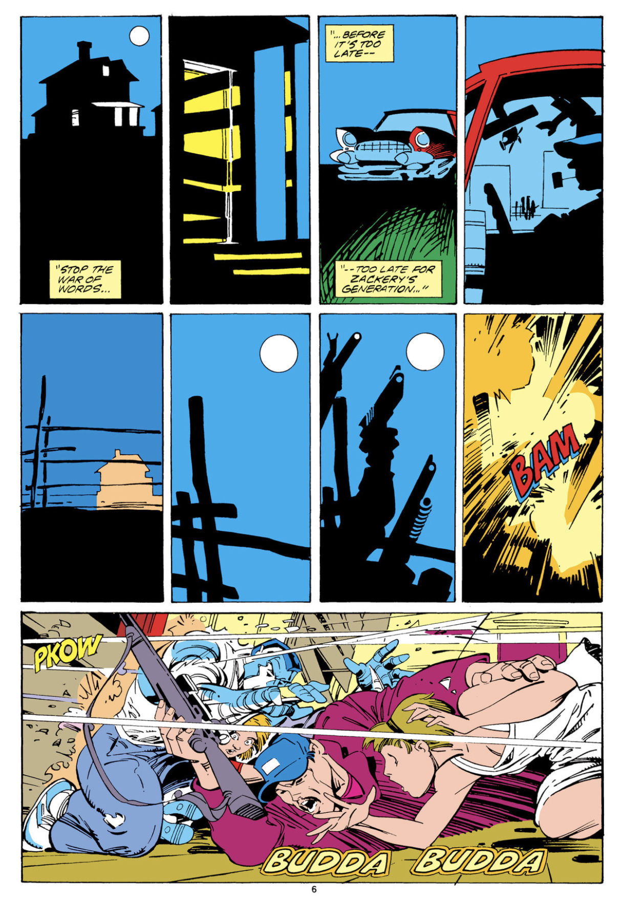
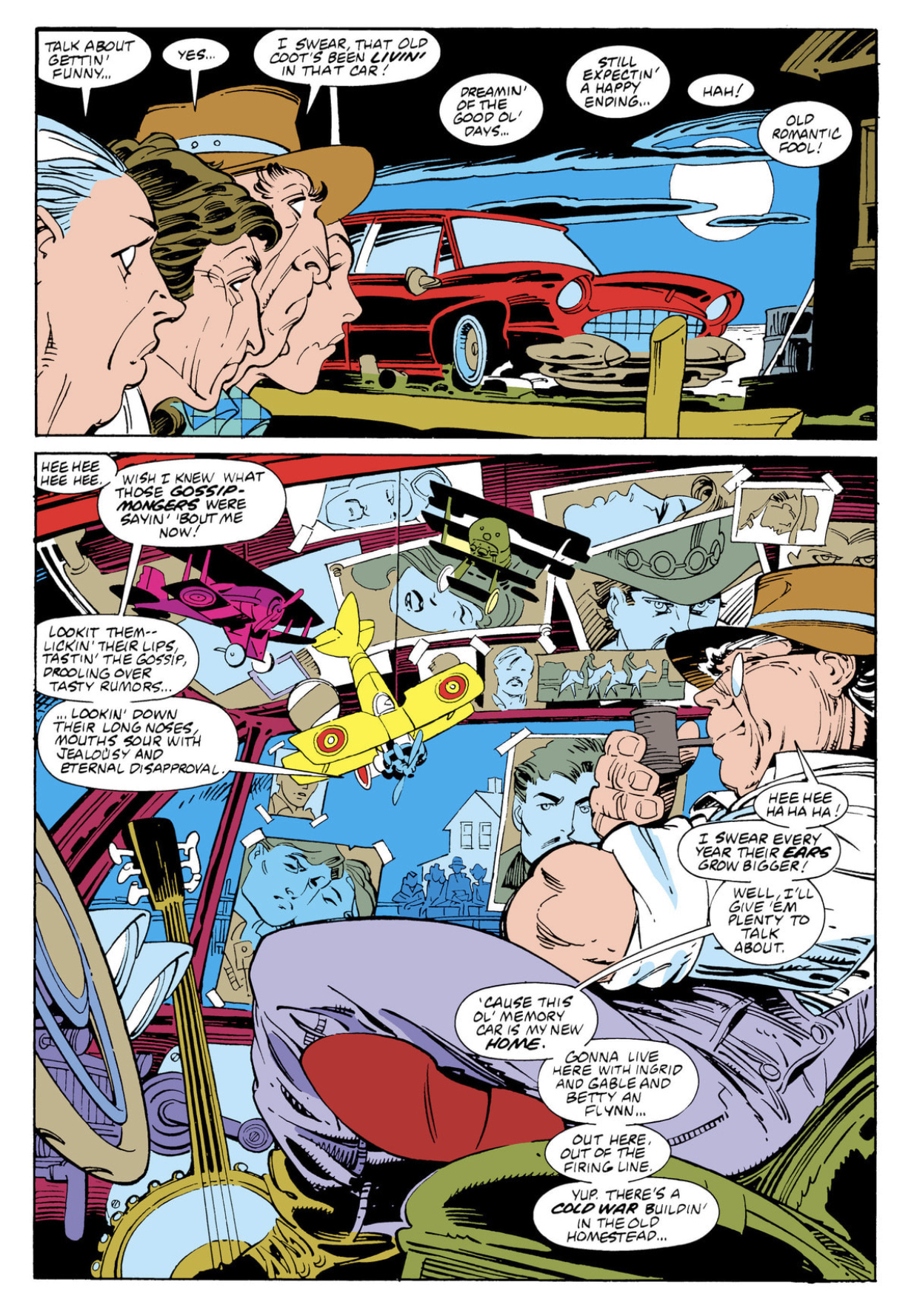
Believe me when I tell you, however, that this Nocenti/Leonardi collaboration was the most beautiful strip in the magazine for every week it appeared. It was gorgeous, and it was good too. Nocenti did the one really obvious thing with the Colossus character, which at the time no one had thought to do for the first decade and a half of his existence: actually explore the cultural experience of a Russian living in America in the high evening of Cold War paranoia. Claremont really only mentions it a couple times, never seemed interested in touching cultural differences for most of his characters. While it makes sense, considering the aspects of those character’s lives Claremont did want to emphasize, it’s also maybe in hindsight a missed opportunity.

But someone was going to get there eventually, and for all our sakes we can be happy Nocenti was the first writer in a position to answer the question of just what Peter Rasputin thinks about this kooky country of ours. Is this story politically charged? Hah! One of Nocenti’s most strident, a sharp dart aimed straight at the rotten heart of Reagan’s America in the final days of the Gipper’s second term. Gun culture, ecology, chauvinism, the pernicious effect of the country’s intelligence agencies on foreign and domestic policy - all are implicated in the ideological trickle-down of a ruinous capitalism. They let her get more than a little bit polemical in her stories. Can’t argue with the results, however: while this is a dense story, a dialogue-heavy story, a story with a lot more panels on the page that you might be expecting, it nevertheless reads like a dream.
A big contributing factor to that was the primary inker, P. Craig Russell. Alright, now that you’ve spit out your coffee, I should point out: Russell actually did a fair amount of work for the company through this period. Primarily but not entirely as an inker. Although it’s not the work for which he is best known, he was, nevertheless, one of the best inkers to ever do it. In Leonardi, he finds a uniquely rewarding match. Leonardi needs an inker who can meet the looseness of his line with precision, without sacrificing spontaneity. Russell possesses one of the most controlled lines in comic book history, and his translation of Leonardi’s pencil counts as among the best work attached to either of their names. It was most recently collected with some other issues back in 2016: X-Men Colossus: God's Country. Definitely a work you need on your shelf. One of the highlights of that era in the company’s history.
* * *
After “God’s Country” concludes in spring of 1989, Leonardi's on fill-ins for New Mutants, and his last regular issue of Uncanny X-Men, #252. The latter features rare inks from Kent Williams, who didn’t do that much work for mainstream Marvel, but probably still more than you remember. Around here Leonardi does his first of a handful of assignments for Excalibur, both on the main series and a few specials, but 1990 is most notable for his final work on Cloak and Dagger (the third so-titled series, remember), initially alongside Terry Austin. Leonardi and Austin also worked together the following year for two issues of Jim Starlin’s post-Infinity Gauntlet Adam Warlock revival (issues #3-4 of Warlock and the Infinity Watch), but rarely thereafter.
And then, once Austin bows out: a very brief collaboration on the last stretch of that volume of Cloak and Dagger, with the aforementioned Steve Gerber, working alongside another name I have so far scrupulously avoided: Al Williamson.

Williamson’s first work with Leonardi was, I believe, the Wolverine team-up in Daredevil #248-249. They meet again for #277, with a handful of other issues as well—Cloak and Dagger (third series) #14-16, New Mutants #78, Sleepwalker #4—before finally beginning what would become their signature collaboration, Spider-Man 2099: issues #1-25, November 1992 to November 1994, with only a handful of fill-ins throughout. It may seem strange this far into any outline of the man’s career, over a decade after his first credits, but Spider-Man 2099 represents the longest sustained monthly commitment of Leonardi’s career.
Not since the first Cloak and Dagger mini had he so much leeway to establish the look and feel of a series - and since Spider-Man was the launch title of the 2099 imprint, he had a hand in establishing much of the look of the line as well. By the time he and Williamson began their collaboration in earnest, Leonardi was already a stylish and distinct presence on the page. I don’t believe Leonardi’s period with Williamson is as crucial to his evolution as Williamson’s presence was for John Romita Jr., or even to Lee Weeks. There’s a tentativeness in early Romita that you might not even notice until you see him blow past those limitations on Daredevil. It’s similarly hard not to see that for Weeks; his collaboration with Williamson provided a necessary grounding, an aesthetic focusing, the evidence of which can still be seen in his work today.

By the time Spider-Man 2099 begins, however, Leonardi is already well into what I would call the prime of his style - if anything, the main factor behind the artistic success of that series is that it was simply Leonardi’s longest period sitting still and tilling the same field. He was matched on that book with Peter David, inarguably Marvel’s biggest draw as a writer in 1992, as well as one of the industry’s most outspoken presences. There’s no question that outsized presence helped him sell a lot of comic books, but that’s only a small part of it: his books kept a devoted readership largely because people liked his writing. Strange, I know! Turns out when you devote time to developing supporting characters, and give those characters distinctive senses of humor, and even some modicum of wit, people will respond. So too with Spider-Man 2099: as much as it should have been a silly gimmick with a short shelf-life, people loved that book, and still hold a lot of affection for that character and his milieu. The character is going to be in a movie soon, or so I hear, which is how we know people like something.

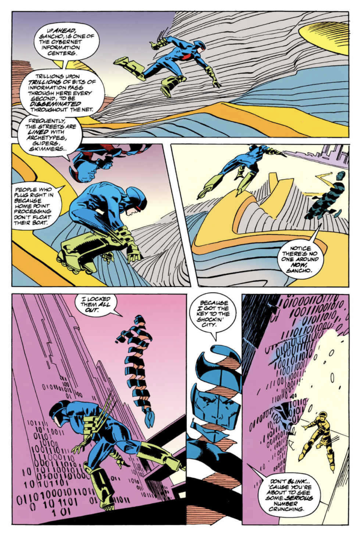
Leonardi’s work with Williamson was confident, above all else. Leonardi clearly trusted Williamson to follow his ambition, because the series is defined by nothing so much as Leonardi’s deft hand with spectacle - dynamic movement contrasted with stylish backgrounds. Their 2099 is clean but not necessarily bright, an evocation of a sterile, Russ Heath futurescape lit by noirish menace. There isn’t a bum issue of the run, but if you want to see the fruits of the partnership at its zenith, go for the later part, after they’ve fully worked out any kinks between them - there’s a cyberspace arc in issues #19-20 that stands out as one of the most ambitious sequences in Leonardi’s career. There’s something about his work on this series that reminds me ineffably of Gene Colan - a looseness to his figurework and design that never quite shoves over to diaphanous; never quite abandons the clean line taken from Austin and Russell. Expressive but never obscurantist. If you just want a done-in-one primer on the David/Leonardi/Williamson team, they did another special issue about a year after #25 shipped, a fun coda called, simply, Spider-Man 2099 Meets Spider-Man. Can’t beat that for honest labeling!
* * *
Spider-Man 2099 lasted another 21 issues without Leonardi, but the bloom was off the rose without his signature talent. Despite a solid couple years of building decent books with a strong following, the 2099 family couldn’t survive the mid '90s at Marvel, which saw the implosion of every imprint across the line. After Spider-Man wraps, Leonardi spends much of the next few years doing a lot of covers, for both Marvel as well as the later incarnation of Valiant/Acclaim. This is alongside scattered, unfocused assignments, like pitching in a few pages during the underrated Karl Kesel/Cary Nord Daredevil (#354 & 356), or random issues of Generation X (#24) and X-Man (#31), or the first issue of the generally-regrettable Fantastic Four 2099 (one of the last additions before that line went down the drain for good). He pops up across town to draw a Sovereign Seven Annual (#2) for Claremont, notable for being the only collaboration between Leonardi and Klaus Janson. He also did another brief story for Claremont, a spotlight on the JLI’s Fire—of all the random characters!—that ran in Showcase ‘96 #7.
His major output for 1997 was the first Painkiller Jane series, for Joe Quesada’s and Jimmy Palmiotti’s Event Comics. She’s a fun character, or at least I’ve always thought - a vigilante who gets by on a super-charged healing factor that still hurts like hell. Visually she’s a distinctive presence, ostensibly a sexy “bad girl” but for the fact that she’s wrapped in bloody bandages and usually bent over in pain like an angry gremlin, hence the name. Leonardi is inked here by Palmiotti, who had worked with him on-and-off throughout the previous few years. Palmiotti has always struck me as an ingratiating collaborator, and so too here. There were a couple crossovers the following year as well - Vampirella/Painkiller Jane makes a fun primer for the Leonardi/Palmiotti team, incidentally showcasing Leonardi’s dab hand at cheesecake. He’s very good at drawing pretty girls, you should probably be aware. There’s also a Painkiller Jane/Hellboy from later in '98, if you want to see what Leonardi’s Hellboy looks like - credible! Jane and Hellboy defeat a demon by playing him Chumbawamba, which is 100% a real thing I’m not making up.

Still, the late '90s were rough for anyone who wanted to draw comics for Marvel. Leonardi manages a brief, memorable run on Rampaging Hulk, a flashback series written by Glenn Greenberg that teams Leonardi once again with Dan Green. It lasts all of six issues, into the first month of 1999. Again with Green he draws a Cable/Machine Man team-up. It’s about as dire as you’re imagining, I fear: the villain is Bastion. (If you don’t know who Bastion is, congratulations on a righteous life.) This was intended to launch a new Machine Man book, part of the short-lived M-Tech line that also saw the advent of an awful Warlock series and a sublime Deathlok reboot by Joe Casey & Leo Manco. Didn’t really matter in the end - no one bought any of those comics, bad or good. Leonardi then reunited again with Claremont and Williamson for the X-Men mini True Friends, featuring Kitty Pryde and Rachel Summers traveling in time back to World War II. Did you know Claremont, Leonardi and Williamson did an X-Men mini right before the turn of the century? Of course you didn’t, Marvel was incapable of promoting even their best books at the time (see the aforementioned Deathlok), and most of their new promotions were mired in dross like Cable/Machine Man. Maybe not as egregious a sin as Lee Weeks drawing Magneto War, but in the same useless neighborhood.
Around this point in the story you’re probably starting to ask yourself, why didn't he just leave Marvel if things were so bad? And that’s more or less what Leonardi does after the turn of the century. His last work for the company for a few years’ time was Sentry/Spider-Man, early in 2001. Written by Paul Jenkins as part of the initial crossover that launched the Sentry concept, it’s also I believe Leonardi’s next-to-last collaboration with Terry Austin. For the next two decades he returns to Marvel only a handful of times.
He spends a good few years working on the Batman family. He draws a few issues of Nightwing (#57 & 59) and Birds of Prey (#39-41) under Chuck Dixon around 2001 and 2002. It's here he first works with Jesse Delperdang, who would go on to ink much of his DC work around this time. Delperdang is a loyal and effective inker for Leonardi, who returns to Nightwing a year later to draw the first year or so (minus a couple fill-ins, most of #71-84) of Devin Grayson’s run on the title. This would prove an eventful, controversial—and, as it would turn out—quite influential run on a popular character. He was a good match for Nightwing, not a character for whom I have much affinity, but one tailor-made for Leonardi’s strengths. Dick Grayson is an acrobat, constantly moving - jumping, leaping, kicking, doing something in a way that flatters Leonardi’s penchant for action as the prime motor of plot.
After Nightwing he decamps to Batgirl for a time, also with Delperdang, during Dylan Horrocks' tenure (seven issues between #45-54, also notable for the covers by James Jean). This was the Cassandra Cain iteration of the character, the young assassin learning a better way through her association with the Batman Family. Horrocks doesn’t think that highly of these books, at least based on his own lightly-fictionalized reflections in Sam Zabel and the Magic Pen, but there’s nothing here to be ashamed of. His own work as a cartoonist isn’t particularly action-heavy, but based on this example he knows how to write action, and write it well. Check out the 50th issue of that run for an example - there’s a battle between Batgirl and Batman atop a moving train that shows off Leonardi’s skills to their utmost.

Leonardi would return to these characters in 2015 during the Convergence event, drawing the Batgirl series from that promotion, which featured Cassie Cain alongside Stephanie Brown. That was one of the first steps towards the company acknowledging how badly they had mistreated those once-beloved characters during the first decade of the 21st century. They’ve basically mistreated every version of Batgirl, ever. Lots of subtext in those Convergence tie-ins! He also drew issue #2 of the Shadow of the Bat tie-in that featured the Azrael Batman vs. Whilce Portacio’s Wetworks characters - without a doubt the most 1994 thing to happen in 2015.
His best work in the 21st century, however, was I believe done for Dark Horse - specifically their Star Wars line. Leonardi produced two Darth Vader stories that require commendation. The first, Star Wars Tales #9 from 2001, is I believe the last collaboration between Leonardi & Terry Austin. It’s also a brawl between Vader and Darth Maul, and about as brutal a fight as you can imagine between those two titans. That was written by Ron Marz, with whom Leonardi had done a Green Lantern vs. Aliens mini the previous year, and with whom he would go on to do a fill-in during Marz’s long run on Witchblade (#112).
(The latter may not seem on the face of it to be a career highlight, but it’s the only time I believe Kevin Nowlan ever inked Leonardi - for those of you who are into such things. For what it’s worth, he draws a more-than-credible Witchblade, credible enough to make me—noted Witchblade fan that I am—wish he’d drawn the character more.)
The second Vader series followed ten years after the Star Wars Tales issue - Darth Vader and the Lost Command, five issues in 2011, written by Haden Blackman and inked by Dan Green. Simply gorgeous. Leonardi draws a really good, emotive Vader - a stocky bully, hunched over, choleric and violent. Vader stories generally work best in the mode of military noir, and that’s pretty much what this is. Vader is always chasing some kind of conspiracy on the outskirts of the Empire; the challenge emerges from watching an inherently impatient man having to use his self-loathing brain to figure out who precisely deserves to die and how much it needs to hurt.
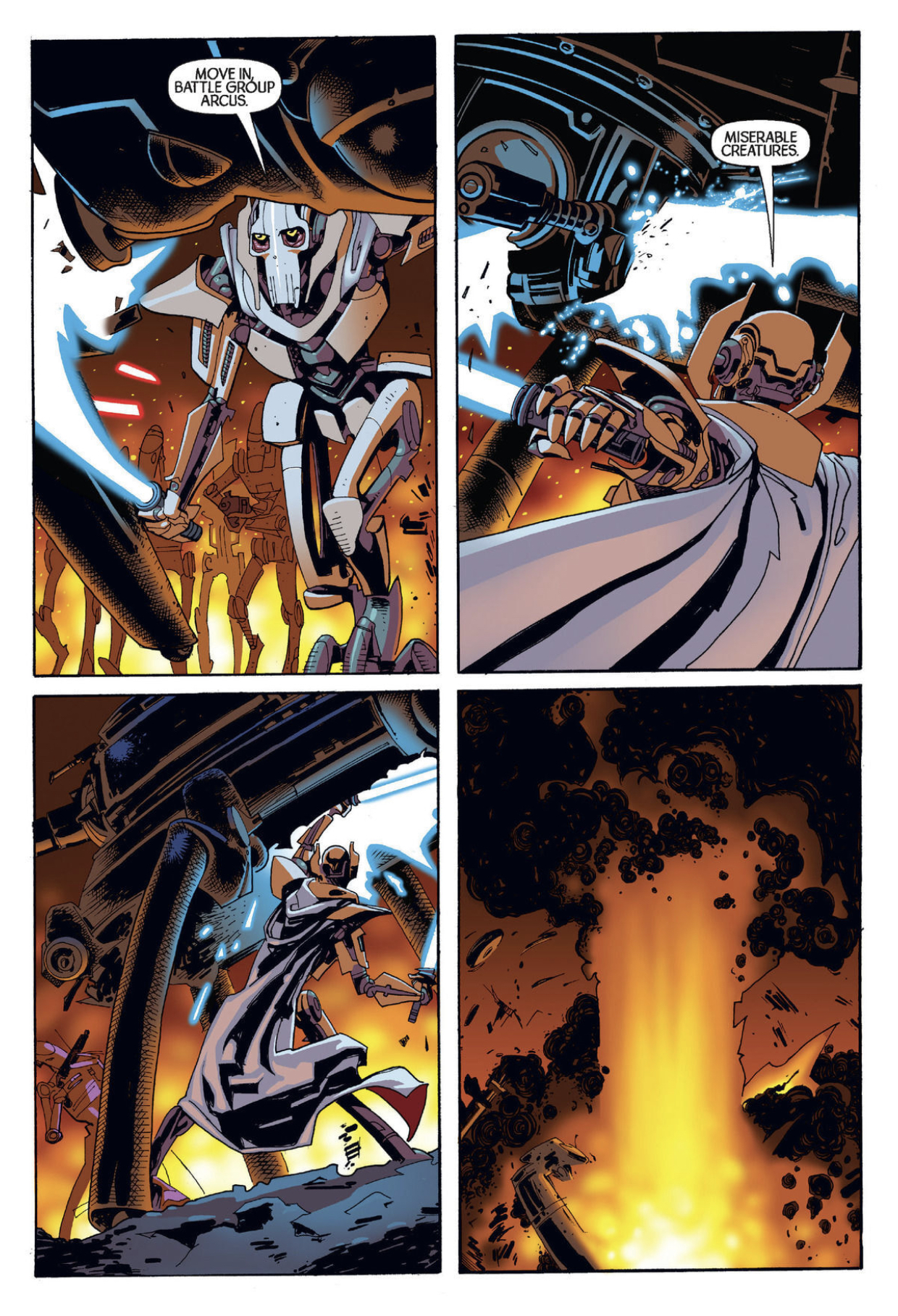
However, my favorite Star Wars work from Leonardi is the General Grievous miniseries from 2005. Written by the aforementioned Chuck Dixon with inks by Mark Pennington, it’s without a doubt the best Grievous has ever looked in comics. He’s a merciless character for an artist to draw: a fussy, intricate design, nothing but straight lines and machine parts, six arms and a god-damn cape. Oh yeah, and he moves like a pissed-off freight train made of spiders. Works perfectly well on a movie screen, but not a character you imagine most comic book artists relishing the chance to draw! Well, I promise you: Leonardi draws a stunning General Grievous - always moving, relentless, by turns magisterial and pathetic. Most definitely a late career highlight, as unlikely as it may seem on its face.

As with the early part of his career, much of the memorable work from the later years is incidental: fill-ins and small runs. He contributes four issues to Kurt Busiek’s generally underrated Superman run (#665, 668-670), and, a little later, stops in for an issue of Busiek’s Astro City (#44, with Ande Parks on inks). He does a five-issue stint on JLA Classified in 2007 (#42-46), on a story by Justin Gray, which is notable for the fact that his finisher for the run is Sean Philips. Is it as good as you want Sean Philips inking Rick Leonardi to be? You betcha, hoss. It looks like a million dollars. A Vigilante revival from Marv Wolfman appeared in 2009, and Leonardi did 9 out of 12 issues, with John Stanisci inking. As with much of Wolfman’s Vigilante material, its simultaneously thoughtful, overwrought, deeply misguided and striking. Doesn’t necessarily seem like a book that should work for Leonardi’s skill set - he’s never drawn the Punisher, to my knowledge, and Wolfman’s Vigilante is basically Diet Punisher. Yet it looks as good as anything else he’s done these last decades.
In 2018 he drew Green Lantern/Huckleberry Hound - written by Mark Russell with inks by both Green and Parks. Russell was the writer behind that depressing Flintstones series about genocide. Anyway, GL/HH is even weirder in its way than the Batman/Elmer Fudd team-up that came out around the same time, as it’s got Huckleberry Hound and John Stewart talking about Vietnam and race riots. I can’t for the life of me figure out how it got made, but it’s pretty remarkable that it did. Do I recommend it? Well, yes, it's a gorgeous book. Of course it's gorgeous. But it’s also got Huckleberry Hound opining on the subject of the Vietnam War, so make of that what you will.
That more or less brings us up to the present. His most recent extended run was six issues on Dan Jurgens’ Batman Beyond in 2019 (#31-36, inked by Parks) - not a book to which I’ve ever felt the need to pay attention, but as the issue before he started was drawn by Doc Shaner and the issue after he left was Sean Chen, clearly the character has more juice than I credited.


Leonardi hasn’t done much for the last couple years. He was involved in some manner of crowdfunding campaign, a project called Resolution with Ron Marz and Andy Lanning that was announced in mid 2021 and seems just now to be reaching fruition. Supposedly he won’t be doing full art, but contributed designs and a handful of spreads to the finished product. I have no insight into how Rick Leonardi fills his days, but I hope he fills them with as much drawing as he would like, and I hope we will continue to see new work from him for some time yet - certainly more than we’ve seen of late. How come he doesn’t have some manner of prestigious DC Black Label project in the pipeline? That seems like something that should have happened by now.
Maybe if we all say please, politely but firmly? Couldn’t hurt. He’s one of our very best, and we should take every opportunity to remind them.