So, first things first: get up and walk over to the longbox, take out your set of 1989’s Marvel Summer Annual Crossover Atlantis Attacks. It’s important, I’m trying to prove a point.
I’m willing to bet you don’t have a lot of fondness for this story. Literally never encountered anyone who likes it as much as I do. I think it’s quite brilliant, from a purely structural perspective. But that’s neither here nor there - the point we’re here for today has to do with the fact that this is, I’d argue, probably the single high-water mark for Annuals in the company’s history. Past the 1960s, naturally. All of these installments have a crossover chapter up front, but each Annual was also stuffed with bonus material - short stories, pinups, humor pages. You still see packages like that sometimes, to be fair, but usually now it’s the big Anniversary issues that get the grab bag push. They put a lot of effort into the Annuals back then, even if not always a lot of work that lasted.
When you’re leafing through these, don’t even look at the front stories - you probably wouldn’t care for the main crossover yarn, very much a Bronze Age rag & bone shop, 10 pounds of plot in the five pound bag, ask me about it after class. Just pay attention to the names in the art credits for the backup strips. First off, Mark Bagley had a short feature in the back of every one of these, a wonky continuity recap that had to do with the front of the book. He even drew a couple of the main stories, too, because he’s always worked very fast. Just push past them and take a look at all the other names they snuck in the back forty of those 1989 Annuals:
Jim Lee. Whilce Portacio. John Romita Jr. with Klaus Janson inks. Those are just the backup features in that year’s Daredevil Annual that weren’t drawn by Mark Bagley. In other titles we get a super-young Scott McDaniel (Spectacular Spider-Man). Dan Jurgens—at Marvel in 1989—drawing a Mary Jane solo turn (same). Jim Lee shows up again to give us The Punisher’s Fighting Techniques (Punisher). Jon Bogdanove did a hypersexed Duck Amuck with Boom Boom (New Mutants). Not the only super-horny backup feature that year. The horniest would have to be Mark Gruenwald & Amanda Conner rating the hunks in that years West Coast Avengers Annual. The Iron Man pinup section was also very horny, honorary mention, thanks primarily to a number of pieces by Jackson Guice - but there are also pages I’m pretty sure you haven’t seen from the likes of Gene Colan, John Byrne, Bob Layton & Keith Pollard. Jim Valentino pops up a couple times - draws a Steve Englehart backup (Silver Surfer) that was more or less just teaching real-world astronomy for a few pages alongside Marvel Universe factoids. Blew my mind when I was eight. John Byrne also drew Magneto vs Dr. Doom (X-Factor). As a backup. Steve Ditko drew Captain Universe (Web of Spider-Man). Fred Hembeck showed his face in a bunch of them! My god, those Annuals were stacked--
How stacked were they, Tegan?
Those Annuals were so stacked that the Thor Annual—the same one with a memorable Ernie Chan strip!—had a Bo Hampton Balder the Brave story that they forgot to put on the table of contents. How many good comic book stories do you have sitting around that you’re just going to forget about Bo Hampton drawing "Tales of Asgard"? Must be doing pretty well for yourself. Guess that’s also where I got my rock-solid conviction that something was off in the universe if more than a couple months passed without a Fred Hembeck feature somewhere in the back of a Marvel comic. Fred Hembeck could fill a medium-sized Omnibus with his Marvel work. We might even live to see such a thing, the way the world is going.
So, where in particular are we paying attention, since I just spent so much time running down a murderers’ row of talent from multiple eras of comics who were all a phone call away from Marvel in 1989? What are we supposed to be focusing on here, other than that Marvel was employing a lot of very talented people at the end of the '80s?
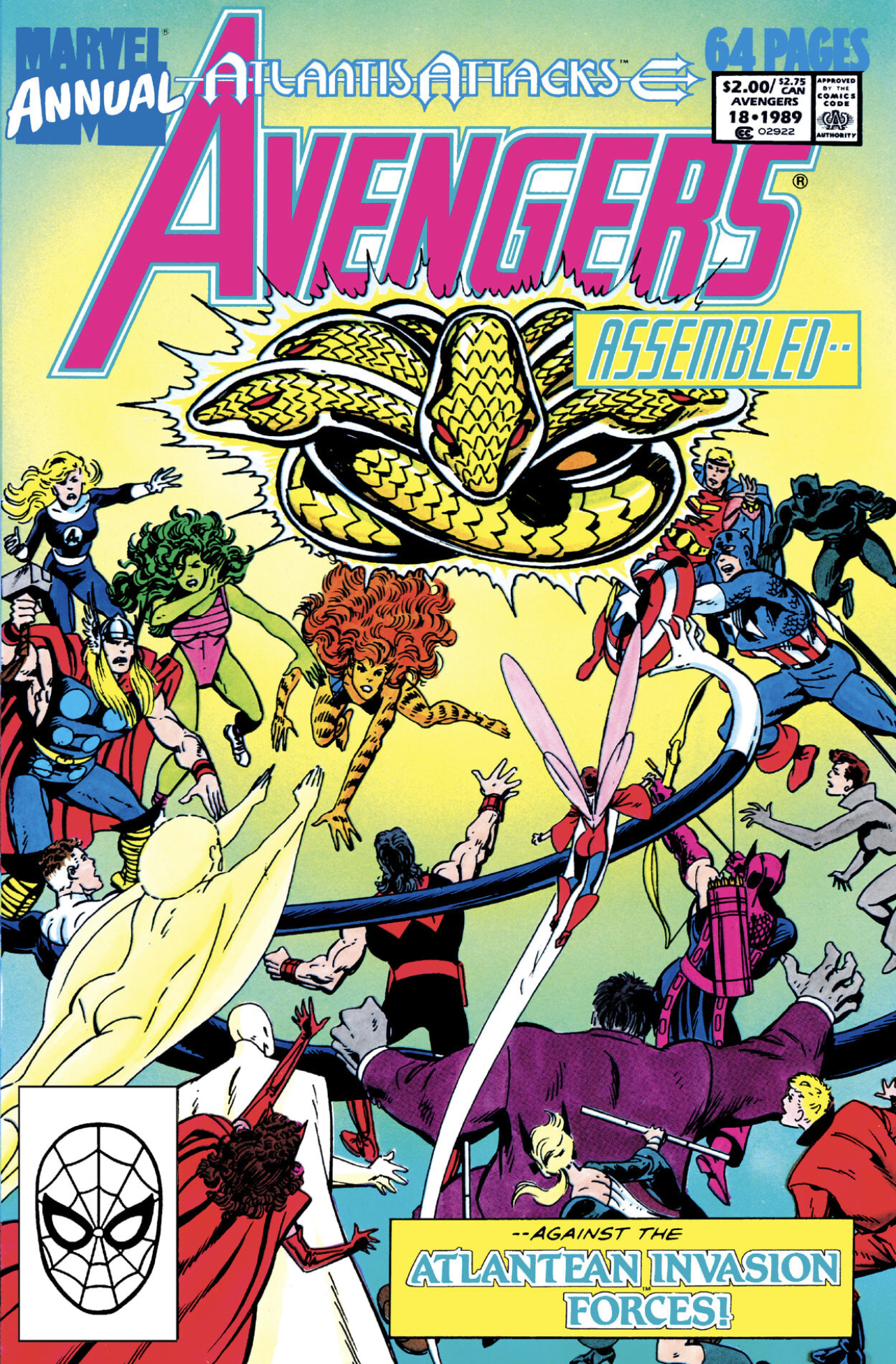
Open up your F/F+ copy of Avengers Annual #18 and flip to the feature called “Cap's Avengerability Analysis” - Fabian Nicieza writing a text-heavy feature premised on Captain America’s journal entries, disclosing his thoughts on fellow Avengers. Well-written character profiles, alluding to history - the kind of thing they used to publish periodically to bring newer readers up to speed, or give insight to older fans. Fannish interstitial stuff like this actually seems remarkably ahead of its time, considering the modern proclivity towards using text pages for exposition or background.
Anyway, easy money for a good artist - draw something really cool, but it just has to be kind of small. Ok, gotcha. Kevin Maguire shows up for some Marvel flex with a page that has Iron Man, Thor and Captain America on it. Kieron Dwyer, Mark Bright, Paul Ryan pop in. And, oh, yeah, some kid named Lee Weeks draws the Vision and Scarlet Witch.
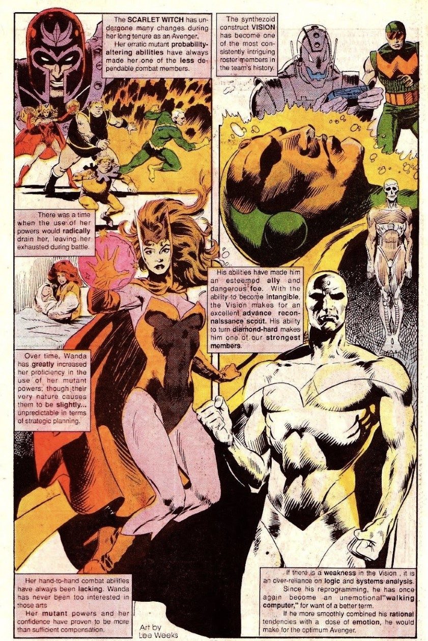
And, let me say, it’s a much better pinup of the Vision and Scarlet Witch than it has any right to be. Definitely the standout from the set, barring the Maguire piece. This was probably the best treatment the characters got for years - the damage done by one years’ worth of mischief set them on the path to being completely unmoored for a decade. And you know, they look good here. Weeks was by far the greenest of the bunch called for that assignment but he really knocked it out of the park.
His first published work, near as I can tell, was an Eclipse anthology called Tales of Terror #5, illustrating a Tom Field story. He stayed at Eclipse for a while, producing a full year on something called The New Wave. After that he washed ashore at Marvel, drawing 16 late-run issues of Justice. You know, that New Universe thing. The one they gave to Peter David to completely rework in order to keep it afloat, and hey, it made it to 32 issues, so they had to be doing something to stay in the game. In hindsight you’d be hard pressed to place the work in the essential bibliographies of either gentleman.
From there, Weeks has a fairly diverse couple of years: drew a few issues of G.I. Joe, a handful of Doctor Strange backups. I believe he also drew the most issues of of anyone in Marvel’s attempt to make a go of the Remo Williams license. Not bad, from what little I’ve seen, but it seems clear now that the time for Marvel to make good Remo Williams comics had probably been about 10 years earlier, if not more.
And then, in the middle of 1990, he got the assignment that would define his career: following John Romita Jr. on Daredevil. He was stepping in for the last stretch of Ann Nocenti’s epochal run, as well as inheriting Romita’s primary artistic collaborator for the preceding four years: Al Williamson.
You know, that Al Williamson. Young contemporary to the invincible cohort of EC Comics. Mature contemporary to the founding partners of Image Comics. Artist of the most beautiful Star Wars comics ever created, bar none. Also, perhaps—maybe just—John Romita Jr.’s best inker. Certainly the inker from whom he learned most. There’s a JRJR before Williamson and a JRJR after Williamson, but the two are nowhere near the same caliber artist. A quantum leap has occurred.
Something similar occurs during Weeks’ tenure on Daredevil. Albeit slightly tempered by brevity. It’s not a full stretch, there are fill-ins throughout - the aforementioned Kieron Dwyer, a young Greg Capullo, and a very, very young Ron Garney. Nor is Williamson the only inker. But in a little under the space of a year and a half, Weeks draws roughly one dozen comics for Al Williamson to ink. After that, Weeks is a much better artist, albeit not transformed as completely as Romita. That’s on account perhaps of Weeks and Williamson starting from a similar place. Romita had already been drawing Marvel books for a while - but his run on Uncanny X-Men is clearly and unambiguously tentative in the context of what follows immediately on Daredevil and, to a lesser extent, Star Brand. That was Romita’s first team-up with Williamson, barring the issues Williamson filled in for Dan Green on Uncanny.
What comic book artist worked for EC and inked the Secret Wars II crossover issues of Uncanny X-Men? Hopefully that’s useful bar trivia for you some day.

What I associate most with Weeks is his sense of solidity. Objects in his comics have mass and dimension. He attended the Kubert School, from ‘81-‘83 according to their website. He draws the same downturned grimace as his default facial feature as Joe did, and his sons do. I’ve always thought Joe Kubert drew extraordinarily tired people; kept me away from his work for most of my life, to be frank. Of course, Easy Company had a reason to be tired, but he more or less drew everyone like that. Even his Superman looked beaten. Andy and Adam both took after their dad in this respect, which is why there are so many X-Men and Ghost Rider comics from the early '90s where those characters look dog-ass tired.
Bishop, you have no reason to be tired. You’re from the future.
Al Williamson challenged his pencilers. It must be a remarkable thing, for a penciller, to know without a shadow of a doubt that your inker knows how to draw better than you ever will. Better than anyone else at Marvel at the time who wasn’t being published through Epic. If that sounds harsh, just walk over to the bookshelf and pull down that Fantagraphics collection of Williamson ECs, 50 Girls 50. Judge for yourself, even against his earliest work. Now, I don’t know if I rate his EC material as high as some of his later pages. His compositions are stiff, he’s still carrying around Alex Raymond in his front pocket. Perhaps Fanta did him a bit of dirt by also slipping some Frazetta into the back of the book: you can assess at a glance who was already a master by the early '50s and who was still the apprentice. But even young Williamson, firmly in the shadow of his predecessors and teachers, still looked better than just about anything else going.
When he decided full pencils were too demanding, he had a long respectable second career as a better inker than Marvel ever deserved. Didn’t care to draw much by this time. What he did do was take a lucky artist’s pencils home every month and redraw them so they looked a lot better than the artist in question was at that time capable of themselves. And that’s no slight to any of the men he worked with at the company. But the fact is that runs with Al Williamson made John Jr., Lee Weeks—and let’s not forget Rick Leonardi on Spider-Man 2099, or Pat Olliffe on Spider-Girl—all demonstrably better artists. The guy who drew “50 Girls 50” inked the first 60 issues of Spider-Girl. What a country!
Anyway. You can’t say Williamson transformed Weeks in the same manner as Romita. For JRJR, his late '80s were as much about shaking the cobwebs as anything else, continuing the long process of growing out of his father’s shadow. Learning to trust his instinct when he began to lean expressionistic. That tendency is largely missing from his work today, to its detriment. Weeks wasn’t as far in his career when he hooked up with Williamson as Romita had been. A look at some of Weeks’ early sequential material is occasionally rough - there’s a single representative issue of his Justice available on Marvel Unlimited, if you don’t believe me. He’s much, much sturdier after a year with Williamson. If you like the Weeks / Williamson team you should also track down a bit of a rarity from 1992: Ghost Rider/Captain America: Fear. A rather grisly story about Marvel’s Scarecrow on a killing spree, a fun one if you enjoy seeing Cap out of his element in a horror milieu. Worth it just for Gregory Wright’s colors. Was he their best colorist that year? He certainly seemed to be paying attention to what Julia Lacquement was doing across the street, dollars to donuts.
Looking down his credits from the early years of the '90s, this is a very successful period for Weeks. He veers from Marvel to draw 1992’s Predator vs. Magnus Robot Fighter. He’s the sole credited artist for that story - excepting the Barry Windsor-Smith covers, obviously. And folks - I wish I could tell you it was hacked-out nonsense, but I cannot lie, it is a very good-looking comic book. The story starts in a familiar place, a place you’d expect - Weeks the Classicist channeling a little bit of Russ Manning to go alongside a heaping dose of Williamson. Magnus’ uptight future world always was retro, even at the character’s genesis, and it’s a comfortable aesthetic for Weeks. The original run of Magnus was aesthetically a lot closer to EC, in many ways good and bad, than anything happening at either Marvel or DC at the time. The Williamson in Weeks is there when he’s left to ink himself, of course; it's become part of him by 1993. What surprised me was seeing some Mike Mignola in Lee Weeks solo Stark, design-y panels. A bit more plot-heavy than you maybe want from a story called Predator vs. Magnus Robot Fighter, but it was also plotted by Jim Shooter and scripted by John Ostrander. So one must accept there’s to be a bit of story interspersed with a handful of absolutely dazzling setpieces.
Next is a book that seems in hindsight like a ferocious missed opportunity: Lee Weeks’ Gambit. He drew more X-Men books than you probably remember - and he drew Gambit’s first mini-series in late '93, early '94. When I tell you who inked it you’re going to plotz: Klaus Janson. Did you plotz? I just wish I could tell you the story was worth the first pairing of Lee Weeks and Klaus Janson. It’s pretty, certainly. But it suffers from the same problems as every other X-Men spinoff at the time: they got top-shelf artists to draw very unmemorable stories across the board. Continuity maintenance! This book is following up on plotlines from the main book - oh yay, it’s the Thieves Guild, everyone’s favorite. It’s got other characters in lead roles alongside the putative star - not that I mind seeing him draw Rogue, I just wish it had been in service of a better story.
Marvel did that a lot in these years - for all the problems they had with personnel in the early '90s, they further burnt a number of very good artists who ended up drawing almost unreadable X-Men spinoffs as the decade wore on. I say “almost” because, y’know, I sure read ‘em at the time. Many of them look as if the artist didn’t enjoy what they were doing. As I believe I have belabored elsewhere: they got the luminous Mike Wieringo to draw a Rogue series - and it’s awful. Just a terrible story. Wouldn’t recommend trying to read it. How bad do you have to be at your job to screw up Wieringo drawing Rogue? Precisely as bad as Marvel in the mid '90s.
In fairness, Weeks also drew one of the better regarded X-Men issues from that period, Uncanny #314 - that’s the one where Emma takes over Bobby Drake’s body, maxes out his powers, and has a nervous breakdown. Inked by a fella you might have heard of, name of Bill Sienkiewicz. One of the few highlights from a generally misbegotten era of the titles’ history. The X-Books could still manage the occasional decent character study in between their generally turgid main stories, a rare bright spot in those post-Image years of lean and fat.
After that he pops up at DC for the first time - which makes sense, I’d have been looking for the exits too if they made me draw that Gambit book. He shows up for a very interesting time in Batman history: "Prodigal". We’re to the last bit of 1994 here.
What’s "Prodigal"? That was the first time Dick Grayson was Batman. Lasted a few months. At the time it definitely felt like a bit of an apology. After really enjoying "Knightfall", tolerating "Knightquest", and generally not enjoying "KnightsEnd" in the least, I wasn’t exactly looking for a reason to keep buying Batman comics. Anecdotal evidence from the time indicates I wasn’t the only person thinking this. But, "Prodigal" was how they kept us around: Bruce Wayne came back and said he was ready to be Batman again, but he needed a little bit more time off. So he did was what he should have done the first time around, called Dick and asked him to fill in while the old man got his groove back. Lee Weeks’ Batman was definitely Batman, while also legibly being a smaller and more athletic version of the character. That’s a neat trick, as we saw when the same Dick Grayson filled in again a decade ago during Grant Morrison’s era. Some people know how to draw a different kind of person under the same familiar suit, some never pick up the trick.
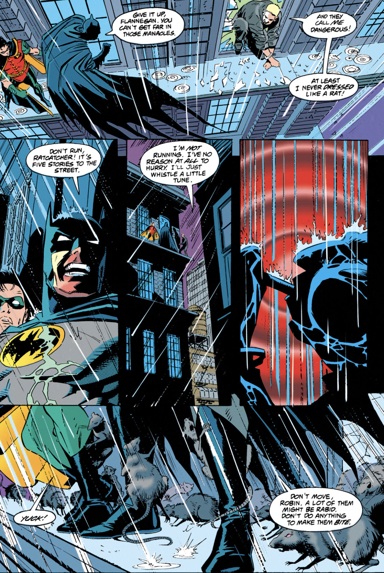

People loved this storyline. Ron Wagner popped in for a bit, and Bret Blevins. Mark Bright! Breaking Batman’s back was a big sugar rush, but the story went on way too long - as I believe I once spent a productive summer explaining. If they didn’t explicitly know they needed to give the diehards some down-home comfort food to follow up "KnightsEnd", well, there’s a reason it went down so well. Why, they even got the guy who was just drawing X-Men to do some Batman. People love that.
And they do! They still do to this day! That Marc Silvestri was able to postpone his Bat-era until literally right this moment was an amazing omission on the part of the universe.
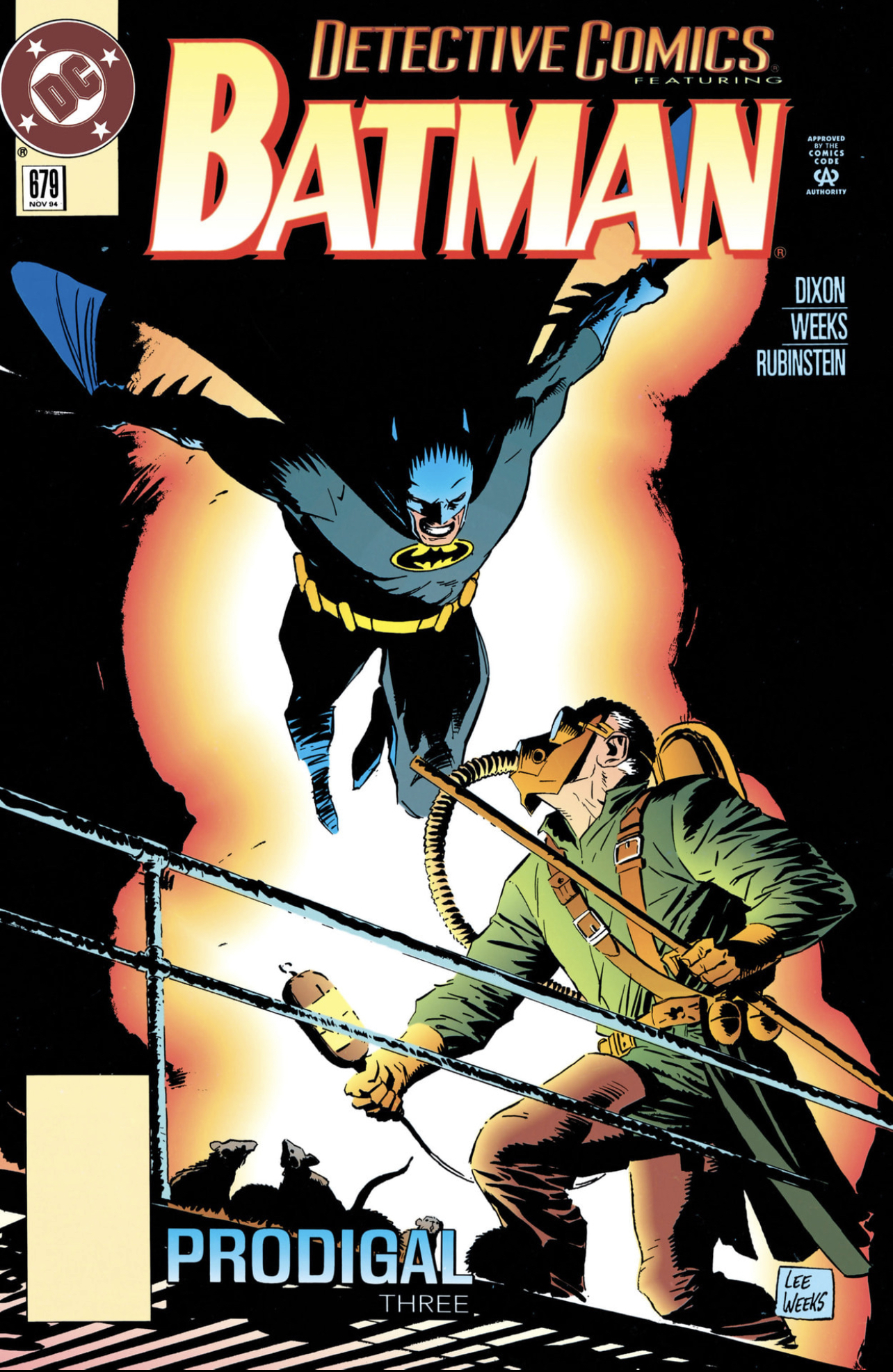 If you think I’m just blowing smoke up your skirt about that Mignola comparison, incidentally, check out the cover to Detective #679. Joe Rubinstein inks that issue - I don’t know if he’s my favorite for Weeks, to be honest. But Weeks draws a great Batman nonetheless. Incidentally, don’t sleep on Batman Chronicles #1 from 1995 if you run across it in a box somewhere. It’s got Weeks inked, again, by Bill Sienkiewicz. The Sink did a lot of inking for both companies in that decade - I wish he still would. His run inking Spectacular with Sal Buscema - a truly special period, two dissimilar artists finding a hot rhythm on some terrible stories.
Weeks draws and inks the Dick Grayson character again a couple years later, in a 1997 one-shot called Batman Chronicles: The Gauntlet, devoted to an early adventure of Robin. Hats off to him for getting Robin to make sense on the comic book page, I imagine it’s harder than it looks.
Early in his career, Weeks figures out the trick of maintaining career momentum without committing to a lengthy monthly run. That really wasn’t the norm back then - or at least, rarely by design. The longest consecutive runs in his career are bunched up in his early years - as soon as he can, he starts moving around between publishers and projects. A month here, four issues here. It starts to seems a big deal when he shows up. In 1996 he joins up with the Predator again for a Tarzan crossover - and by now there’s probably a light bulb going on over your head right now, oh, I get it, he really likes drawing like Russ Manning.
Yes. Yes indeed. Lee Weeks really likes drawing like Russ Manning. That he can, when he takes a mind, is more than most anyone else.
He’s doing a lot of covers in the late '90s. Continues to draw some very nice-looking books for DC, and some borderline unreadable garbage for Marvel. If that seems unduly harsh, know they had the poor boy draw X-Men: The Magneto War. I think every person involved in The Magneto War both owes and is owed an apology. There were no victors. It’s not bad on the fault of Weeks, or his inker for that, Dan Green. Now, I have my issues with Green—maybe we’ll get there, someday—but this is a nice job. I like it for being a bit heavy-handed: precisely where my difficulties with the man usually stem. But it still looks like the X-Men, because I’ll be damned if Dan Green doesn’t know what an X-Men comic is supposed to look like. Even if I couldn’t pay you money to actually read that comic book. "Joseph" is in it. Remember Joseph?

I own a copy of this. I tried for a couple seconds to remember anything about the Marvel books around this period, just before and after 2000, and I came up with absolutely nothing except for the realization that stories such as this had been a big part of my decision to severely cut back on X-Men titles soon thereafter. I really don’t want to have to go back and try to understand this comic. Please don’t make me. In hindsight I only ever bought as late as I did because they brought back Alan Davis right after this, and I just wasn’t going to drop an Alan Davis title. Which is something I’m pretty sure Marvel was counting on.
Because, man, it was rough. The highlights around that time at the company was stuff like a pleasant year on X-Men by Alan Davis. Watching Joe Casey absorb a lot of body blows. Busiek & Pérez on Avengers was consistent but in a different universe entirely, it seemed, from much of the rest of the line.
Mostly the Marvel titles were getting to be a drag, and they were getting to be a drag in a way that only truly mediocre stories leavened with occasionally still compelling art can be a drag. But that’s the problem. They had people like Lee Weeks in their Rolodex. They had the whole of the universe to pick to draw an X-Men event focused on Genoshan politics - and they got Lee God-damn Weeks. Marvel was suffering, visibly suffering. There’s a reason why the early Marvel Knights books from around this time stood out so bright against this backdrop. To see the work this artist was doing for the company at this period, compared to the work he was doing for Marvel’s competitors - well. Asking Weeks to draw Joseph when he can give you Russ Manning seems a fairly tendentious proposition.
He drew the Hulk Annual where Byrne redid a lot of old continuity in order to update the Hulk’s origin. As a critic and a fan I plead with you, do not read this comic. There’s also an issue of Dan Jurgens’ generally underrated Thor, a sanguine reunion with Klaus Janson. Somehow the two of them pulled off a really strong Sal Buscema vibe, and I don’t mean that in a bad way. Just an odd comic.
Much of Marvel’s output from that period reads odd, in hindsight. Given that, they were still capable of producing interesting things on the margins: case in point, the downward slope of Weeks’ career at Marvel was arrested abruptly and dramatically in 2000 when Weeks wrote and drew a three-issue Spider-Man miniseries called Death and Destiny.
Friends, I beseech you: this is the business. This is the business right here.

In the first place - well, let’s not beat around the bush, the inker here is Richard Case, with Robert Campanella credited as well on the first issue. Case brings an extraordinarily fine eye to Weeks’ pencils. He draws out the Williamson, very pronounced here - and he still draws figures a little bit like Russ Manning might. A classical interpretation of the wall crawler, in other words - a moody character piece with noir grace notes slotted into the brief continuity window between the deaths of Captain Stacy and his daughter. Abetted by the smoothest brushwork you’re likely to see in a 2000 comic, certainly a 2000 Marvel Comic.
It’s a gorgeous book. But I can’t even tell you, scanning his bibliography, that Weeks quits doing weird fill-ins and miscast event books ever after. Right after Death and Destiny he returned to Spider-Man, and Daredevil as well, for a three-issue team-up, The Mysterio Manifesto, which you've probably never heard of because it was written by Tom DeFalco for the express purpose of cleaning up the continuity mess of Kevin Smith’s Daredevil. Fun time for the kids. But. Weeks took a break, relatively speaking, the following year. 2001 was quieter than normal. When he pops up again it’s another three issues on Spider-Man, part of the Tangled Web series that was probably Marvel’s best overall attempt to duplicate the vibe of Legends of the Dark Knight. Not fill-ins by any stretch.
And then he returned to the Hulk, in 2002. You couldn’t have blamed him if he hadn’t wanted to return! The character doesn’t necessarily seem to play to any of his strong suits. He made his name and seems most comfortable working with more-or-less human heroes who live and breathed in cities - Tarzan excepted, naturally. The Hulk only goes to the city when something bad is about to happen. He fights larger-than-life monsters. He walks around nature a fair amount.

Weeks only did four issues of Bruce Jones’ run, is the amazing part - it looms a lot larger in my memory because that run impressed the hell out of me. Bruce Jones’ Hulk, as I believe I had cause to reflect recently, was one of NuMarvel’s signature hits - if one of its more unusual, considering no one associated with the book was particularly new to Marvel. It had excellent art throughout by experienced veterans - John Romita Jr., Stuart Immonen, Mike Deodato. And, of course, Weeks.
Now, it’s a rather notorious fact that although it is a very good book I highly recommend, Bruce Jones’ Hulk doesn’t actually have the Hulk in it very often. He’s a presence - simmering tension, dire foreshadowing. Maybe not so far out of Weeks’ wheelhouse after all. Everyone knows he’s coming, but Jones made hay out of rising tension before the Hulk shows up on a scale no one had ever imagined. This makes at times for a terse comic: the Hulk never arrives because things are going well and everyone is getting along. His Hulk had noir elements, such that Al Ewing was able later to fan into the flames of true horror.
 Anyway, Weeks is working with Tom Palmer here - yes, yes, seems really obvious. I know. How the heck did it take them this long to get together? It’s possible they may have met on something smaller but this is the first time I remember seeing the two work together. It looks - folks, it looks really good. These are handsome comic books.
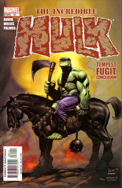
Weeks returns to the character again. He draws Peter David’s first reprise on the Hulk, right after Jones’ departure - an uncharacteristically terse adventure story that seems to acknowledge and appreciate the tonal changes Jones brought to the character. Weeks pulls off a Frazetta homage on the cover to issue #81 of that run that I absolutely adore - Hulk hefting a giant axe on horseback, great stuff.
Lee Weeks is, I believe, the only man to draw the Hulk for both Peter David and John Byrne. The kind of trivia you put on your tombstone.
So what do we take from this summary, so far? It’s the first of a handful I have planned, unless this one goes over like a lead balloon. The guiding question going forward: why don’t we talk more directly about the careers of artists in the same way we do writers? And by we I mean me, but I do also mean a tendency of the critical profession in general. I’ll tell you why: it’s not actually that easy to write about art! It’s a difficult thing to do, and do well. And the line between well and not well just ain’t as wide as you want it to be, this being a very niche field in a deep recession.
It’s just easier for writers to write about stories. About writing - about the writer’s personality, if that applies. Backstory! Those concepts are creatures native to words. It’s hard not to gravitate to those elements because they’re easier to discuss. So why not try looking at the arrangement from the other side, actually give some serious attention to the careers of people who’ve put decades of their lives into these books?
Now, I should say: the situation has partially remedied itself for an unexpected (to me) reason: it’s much easier to actually engage with art in a legible way to an audience by just doing it on video. There’s lots of decent-to-great comics content on social media, lots of people engaging with art in just the same way I described. Puts the old-school blogosphere to shame in some ways - even if you can still see the contours of those divides in online video content today. Small personal blogs with engaged followers sit side by side with big accounts that get a lot of engagement for talking you through old stories. Same as it ever was, David Byrne falls dead to the floor.
So, let’s put a line down here, in the career of Mr. Lee Weeks. Because these years—the early '00s, the valleys and the troughs— represent to me I think a point of punctuation. And I think it also fair to notice that this period I’m talking about also coincides with a period of extraordinary change at Marvel. The reason why so many very good artists drew so many terrible comic books in the 1990s is that the company was terminally mismanaged during that period. Bankruptcy shattered Marvel’s confidence in a way that’s really quite something to measure in hindsight. Took a whole change in management to really shake the doldrums - out with Bob Harras in 2000, in with Joe Quesada and the eventual stem-to-stern transformation of every aspect of the publishing slate.
We’ve had a great deal of experience these past decades in seeing how Bob Harras runs a comic book company, and I think it’s fair to say that he runs a comic book company like he’s slapping Phil Swift Flex Seal on the side of a boat. Plugging holes in the most haphazard way possible. It’s a hallmark of his tenures with Marvel and DC that good people are often tremendously miscast and end up doing remarkably banal work on account. Something very definitely changed in Marvel’s approach to making good comics after the turn of the century. Some good things and bad, but in this context, an unalloyed good is that the company generally tried to utilize artists better. They didn’t always succeed and there were a lot more misses than people remember, but Lee Weeks isn’t the only artist who suddenly starts getting consistently better material around this time.

To illustrate the principle, let’s run down next time he showed up for a multi-issue run on a title, after Bruce Jones’ Hulk - Captain America, 2003. Would you like to know who else Weeks was working with? On those four comics? Well, Tom Palmer was inking, for one, and the covers were by Gene Ha—never a big Marvel guy!—so already you know it looks good. But still, you might be surprised to learn that Dave Gibbons wrote four issues of Captain America 20 years ago.
What were the comics about? I think it was a parallel world yarn, fighting the Red Skull in a timeline where he won the war. Perfectly normal setup for a Captain America story - he does a fair amount of time travel, even in his own book. But no-one’s phoning it in. Gibbons and Weeks understand each other quite well, both meticulous craftsmen in their own traditions. Gibbons is a very precise scripter of other people’s work. These issues scan in places as Gibbons’ work; you see his same approach to staging panels around very precise physical layouts. There are more splashes here then you’d probably have seen in most comic books before the turn of the century, although that was true across the Marvel line. It wasn’t without reason that some in the audience grumbled about decompression - this is still a packed story by the standards of the time, but paced with more in the way of big establishing shots.
But then, it’s difficult to argue with a little bit of slack in the pacing since the artist gets to stretch their legs a bit more in the doing. If you notice the pacing in a story is bringing you down, you’re probably either more into the story than you’d acknowledge, or just not into it at all. Worry not, by the standards of Marvel 2003 this is still very much a comic written by a British person who believes deep down a proper splash only needs half a page. And speaking of which - Weeks and Palmer show up next a little bit down the road on a Wolverine/Punisher miniseries written by Peter Milligan.
It’s really not that hard. It shouldn’t have taken a turnover in editor in chief. Joe Quesada did well as an editor when he put good people on projects they cared about. The simplest thing in the world. It didn’t always work, and it’s not like miscasts didn’t still happen. But if you go back to that period, even the smaller books were swinging for the fences, ambitious stuff like District X and Muties that you couldn’t imagine being printed at any other time in the company’s history. Now, good artists? Artists the company knew could perform at a high level? Well. Weeks traveled in the space of four years from The Magneto War to Dave Gibbons. Good on Marvel for figuring it out.
Of course, the comics industry does not stop in its tracks - eventually the worm turned and later in the decade, once again, the climate was such that not even top-grade talent could avoid being press-ganged into crossovers. On the contrary, they sometimes get good people to draw them now, on purpose, a practice that seems like it solidified around the turn of the '10s. Something everyone has to deal with in those professional spaces.

Weeks actually did a Secret Invasion tie-in that I quite liked, maybe my favorite story from what I found a generally underwhelming promotion - a Captain Marvel revival (2008) starring the seemingly back-from-the-dead Mar-Vell. That you know its a Secret Invasion tie-in probably gives away the gimmick, but it ended up being one of Mar-Vell’s better stories even if he wasn’t really in it. One of the problems with this stretch of Weeks’ career is that I don’t think the inkers are doing much to his pencils - Stefan Guadiano and Jesse Delperdang are inking on different issues here. The days of inkers having eccentric inclinations were and are for the most part over, and we are all the poorer for it.
By this point, his imperial period, Weeks doesn’t turn in bad work. I’m not going to say he doesn't draw some boring comics, now and again, but your results will vary. None of them are ugly. He does breakdowns for an excellent Venom story in Sensational Spider-Man in 2007, for Roberto Aguirre-Sacasa. Gaudiano again on inks and finishes - the blacks loom a big heavier here, to match the mood. One of the best uses of the Venom character in 30 years. Weeks pops in again with Amazing Spider-Man for three issues with Roger Stern in 2010 - finishing himself here, so it’s fully meticulous. As I say, after the turn of the century he doesn’t miss, but you can still tell when he’s paying more attention to the target.
To the point: he punctuates his time at Marvel with a brief run of writing and drawing—with a little bit of help from Tom Palmer and Sergio Cariello—on the first three issues of Daredevil: Dark Nights, 2013. That’s as gorgeous a comic as Lee Weeks is capable of producing, and about as dry as you would expect for the writing. Not a hair out of place.

Now, the problem with going over to DC in 2014 is that DC was at that moment still trying to pull themselves out of the rubble of the New 52, and was thereby mired in regrettable crossover hell across the line. Not that Marvel was doing much better - Weeks at least dodged having to be involved with Civil War II. One of the first things he drew after having been gone from DC for quite a while was a Dan Jurgens puffball called Superman: Futures End. He has a lot of enthusiasm for the character that shines through even when he ends up working on Convergence tie-ins.
DC’s Convergence was a very close echo of Marvel’s 2015 Secret Wars, right down to the company putting their normal publishing slate on hold for a few months to showcase a crossover built around alternate dimensions. In hindsight, a lot of Marvel’s Secret Wars books veered too far from the source material to cook any kind of proper retro vibe. The funny thing is that even though the central series was—let’s be blunt—terrible, quite a few of the Convergence crossovers turned out memorable. That was because they brought in a different set of faces to draw older versions of the characters, so we got June Brigman drawing Gen¹³, John McCrea drawing Plastic Man. Stuff like that. Lee Weeks drew the hell out of his '90s Superman tie-in, Lois and Clark, let none doubt.
He drew a few issues of Tom King’s Batman. Certainly a very popular book, even if I’m not one for King. Worth at least flipping through these, however. Weeks inks himself, but the crucial collaborator is Elizabeth Breitweiser. Here you see the modern adage made real, of the colorist stepping into something that resembles the collaborative space that used to be occupied by the inker, once upon a time.
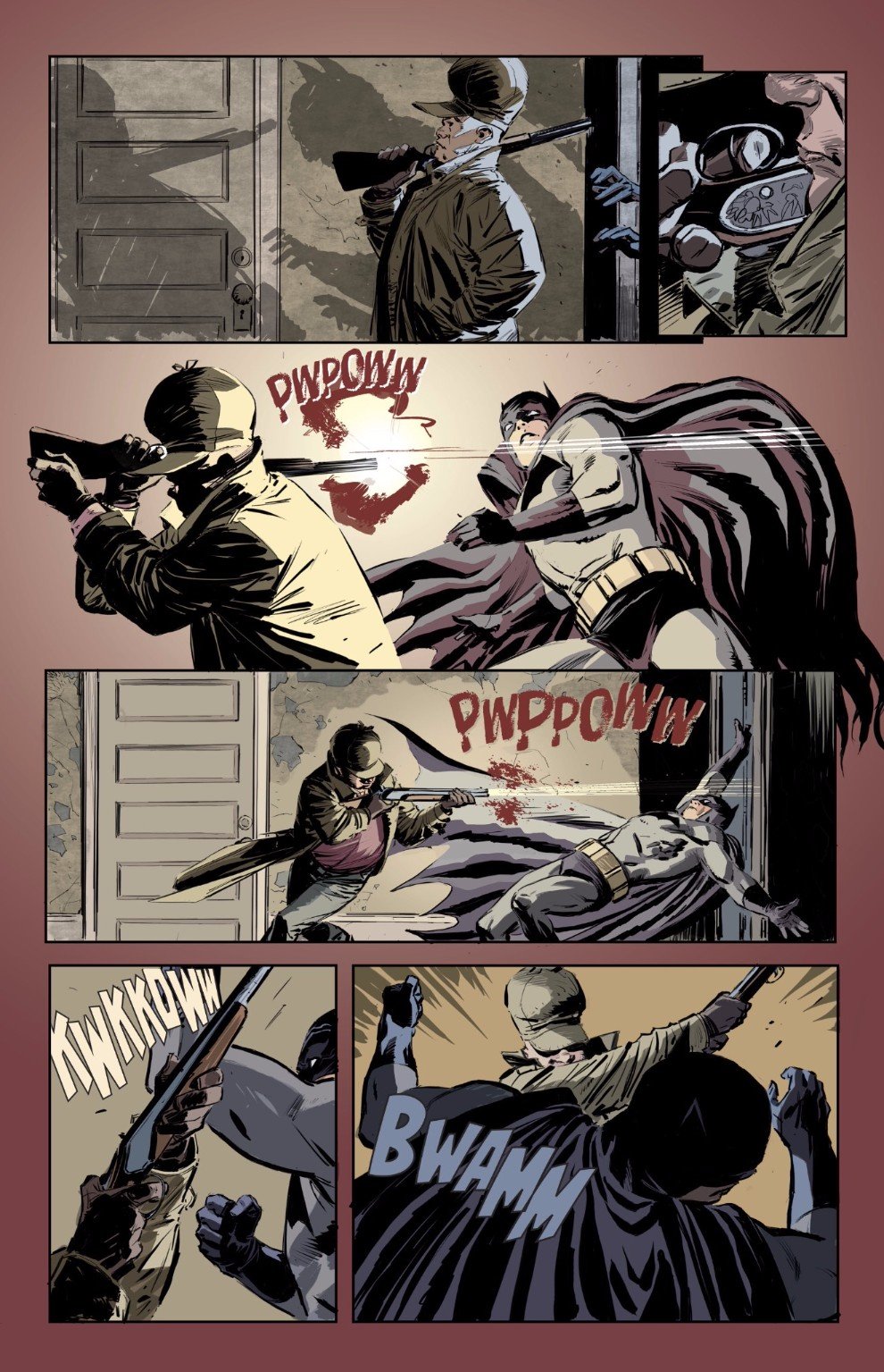
I would also be remiss if I did not mention that Weeks collaborated with King on a crossover between Batman and Elmer Fudd, 2017, excellent colors by Lovern Kindzierski. It’s the kind of book that could only exist if both creators were 100% in on the joke, and even if you think it's one joke padded out to absurd length, there can be no doubt that Batman/Elmer Fudd is nonetheless a beautiful comic book. The joke is only funny if you can keep a straight face.
Weeks presents an interesting relationship to his inspirations. Often artists strive to shake early influences, but for Weeks his influences were largely aspirational. He didn’t spring fully-formed from the head of Zeus, able to do a decent Russ Manning. No, he had to work at it. Spent a few projects studying and internalizing that influence. Much as he had with Al Williamson during their collaboration. Now I see the Kubert and, yes, the Mignola ascendant in his recent Batman.
Careers in comics—in all the arts, for that matter—are largely shaped by forces outside our control. Lee Weeks’ career shows the warp and striation of an industry only sometimes able to accommodate the best inclinations of its top shelf talent. It’s never a sign of a healthy industry to see talented people wither away drawing stories they don’t enjoy. In fairness, it doesn’t look like Weeks draws much of anything he doesn’t want to draw, anymore, and good for him.


