1. This comic is a test. If a writer of Ta-Nehisi Coates’s rhetorical power cannot create an interesting, unusual superhero comic when working within the current “corporate production method,” then perhaps no one can.
2. It’s certainly unfair to make any book a test case, and, ideally, the production method should be irrelevant to our enjoyment or assessment of a comic. It’s just that, in practice, the contemporary editorially-driven, division-of-labor approach tends to produce slick comics that rarely rise above skillfully executed competence. (Black Panther #1’s credits list a writer, artist, colorist, letterer, designer, assistant editor, editor, executive editor, editor-in-chief, chief creative officer, and more.) Editors always have the final say. They’re charged with brand protection: corporate characters generate a lot of revenue, and when so much cash is at stake, it makes sense, they believe, to play it safe. Yet based on what Coates has said in interviews, Black Panther #1 is exactly the superhero comic he wanted to create. His vision was in no way diluted by the editorial process.
3. Like many readers, I was excited when I learned Coates would be writing a comic. I assumed the result would be artistically less safe than most of what shows up in America’s comic-book shops every Wednesday. Hiring Coates didn’t seem to me like “stunt-casting,” as some claimed. It also didn’t appear to be, as others said, a transparent attempt to show Marvel’s newfound cultural sensitivity, especially in light of recent blunders like the company’s white-artist-dominated series of hip-hop-inspired comic-book covers. (And if it was, at least it gave Coates the chance to write a comic.) Having admired his essays, I was optimistic that he could create something compelling. (Though, as art forms/production methods go, the collaborative comic and the single-author prose work are worlds apart. And in the non-corporate alt-comics world, a cartoonist often does all of a comic's writing, drawing, and lettering.)
4. Was I expecting too much? Maybe. Black Panther #1 is ok, I guess. But I prefer other stories with the character, such as the well-regarded 1970s Jungle Action series, in almost every way.

5. Maybe it’s a genre thing. Not the superhero genre, but the classification that (loosely) divides books into two age-based types: adult literature and children’s literature. Perhaps I cut 1970s mainstream comics too much slack, but I think of them as cheap, disposable entertainment for children and teenagers. Many contemporary corporate comics present themselves as serious stories for adults. So, fair or not, I expect more.
6. The Jungle Action Black Panther comics were produced within the corporate system, yet are pretty entertaining, if overwrought (sometimes to the point of absurdity).
Why does the current corporate method generate many comics that, at best, are blandly competent?
7. And yet . . . Marvel produced one of the most interesting superhero comics of the last decade by enlisting another non-comics writer with a well-known appreciation of superhero comics. 2008’s Omega: The Unknown is scripted by novelist Jonathan Lethem in collaboration with artist/letterer Farel Dalrymple and colorist Paul Hornschemeier. Unlike Black Panther #1’s art team (each of whom has a long history in corporate comics), Omega: The Unknown’s team features alternative comics artists with little connection to mainstream comics. Omega uses Marvel characters but feels like it’s set in an altogether different comic-book world (and, unlike the corporate reliance on generic computer fonts, Dalrymple's hand-lettering instantly communicates this difference).
 (Marvel has created solid superhero comics when the production involved a cartoonist in a primary role: Unstable Molecules, written by alt-comics cartoonist James Strum and drawn by Guy Davis; Truth, written Robert Morales with art by cartoonist Kyle Baker.)
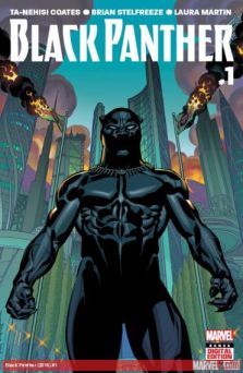
8. Black Panther #1 is entrenched in the visual and narrative expectations of the Modern Marvel Universe. Though Brian Stelfreeze is a highly skilled artist and clear visual storyteller, to my eyes his hyper-polished work recalls that of many artists working for Marvel, DC, Dark Horse, etc. I wish Coates had worked with someone idiosyncratic, less Marvel-friendly. Though I guess that’s the point. Maybe I’m just not the audience for this. (One reviewer called it one of the year’s “best first issues.”)

9. After reading Black Panther #1, I checked out a few pieces in which Coates talks about his plans for the series. Oddly, the interviews were more enjoyable and interesting than the comic. In his telling, the book comes off as smart and unusual, a comic I’d be interested in — but I’m not quite able to see these qualities in the issue itself. It reads like many other 2016 Marvel comics: visually proficient, verbally minimalist, and over-colored.
10. Likewise, Stelfreeze’s discussion of traditions that influenced his character designs was more enjoyable than the book. To me, his characters are more successful than his interior scenes, though I can’t tell if it’s really the coloring choices that make them a little bland:
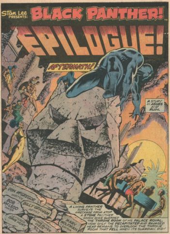
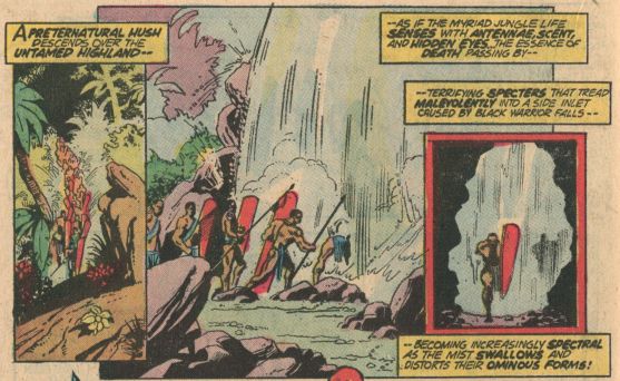
11. The 1970s Jungle Action comics involved many artists, only one of whom was black: Billy Graham. He penciled and inked several of the best issues (including the famous Klan story), and the old-school printing and coloring methods allow his line work to shine. Though Graham’s art looks good when inked by Klaus Jason, Graham’s inking over his own pencils brings an added grace and dignity to the characters. I find his innovative layouts and outdoor scenes (especially of the fictional African country Wakanda) more visually compelling than those in Black Panther #1.
12. While several pages and panels in Black Panther #1 are attractive, there’s nothing nearly as cool as this two-page sequence drawn by Rich Buckler, who penciled the first few Jungle Action issues:

13. Though each Jungle Action comic is part of a larger narrative, it also works as a complete story, with a strong internal arc. Black Panther #1 feels like all backstory and prologue, a heavily-dependent slice of a larger narrative that perhaps shouldn’t be presented on its own. But Marvel wants two sales opportunities: the separate issues and the collected graphic novel.
14. Coates is a great writer, infinitely better at what he does than writers working for Marvel. It might seem odd to say this about a comic, but I just really wanted more words — I wanted to hear Coates's language, his voice. His Black Panther and the comic’s other characters don’t really say much. And when they do, they tend to sound like familiar superhero-universe types: “the brooding noble super-male,” “the angry male usurper,” “the wise elder female,” etc. His Panther speaks like a less verbose (and therefore less interesting) version of Don McGregor’s Jungle Action protagonist. (In this series, one of McGregor’s characters talks about the Panther’s “poetic” tendencies, which we don't see in Black Panther #1.)
15. Maybe this is a peril of writing a corporate character like Black Panther: since its persona and voice have been established, your job is primarily to come with a new plot and some new concepts.
16. The comic includes a few “behind-the-scenes” features, one of which reprints part of Coates’s script, which I enjoyed more than comic’s corresponding panels.
17. While Jungle Action’s dialogue and third-person narration can be over the top, I generally like Don McGregor’s florid prose. While far from great literature, it is entertaining (I have a high tolerance for purple prose).
In the past, the corporate comic was driven by a “give the kids their money’s worth” ethos. This approach lead to comics with more text than was needed — especially expository dialogue and indulgent narration that shows off the writer’s vocabulary (I recently had to look up a few of McGregor’s words). The corporate comic was more “writer-friendly” — or at least word-friendly — than it is now: third-person narration has been exiled. (For a good example of a smart and entertaining “writerly superhero comic,” see Joe Casey’s Catalyst, which, like Black Panther #1, uses characters the author didn’t create.)
18. (In the late 1960s and ’70s, it seemed that any Marvel comic with a black character must be set in “the ghetto” and employ a lot of slang “black” dialogue often written by well-intentioned but clueless white writers. Perhaps because most of the Jungle Action stories take place in Wakanda, McGregor generally avoids this trap.)
19. It’s tacky to mention price when talking about a work of art, right? Yet $4.99 is a lot of money to pay for such a quick read. Reading/looking slowly, it took me five minutes, and it’s full of ads for Marvel products. (Issue # 2 will be a dollar less, making #1 look like a “cash grab.”)
20. I paid a couple of bucks each for my copies of Jungle Action. Though their Black Panther stories are shorter than Black Panther #1, much more happens in terms of plot and language. As the series’ title promises, each story contains a lot of action. They take a lot longer to read, which I know is not the standard for judging a comic’s quality. And yet, a dollar a minute? (Down, of course, after re-readings.)
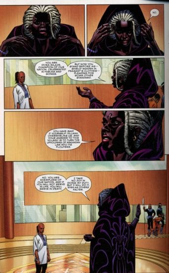
21. Black Panther #1 begins: “I am the orphan king who defied the blood . . . who defied his country, and was divided from you.” Most of the monologue and dialogue sits firmly in this register of “grand drama”:
“If you will not serve in life, you will serve in death.”
“You are not a soldier. You are a king.”
It’s a little much for me. Though McGregor certainly has his problems, he also has fun with language and his characters’ speech. (He also creates odd villains and blends superhero and horror conventions in entertaining ways.)
22. Coates’s Panther, like his comic, is a bit too stoic, laconic, and earnest. Again, maybe I’m just not the audience for these kinds of stories. I need something at least somewhat unexpected. (According to Coates’s interviews, the comic will deal with racial and gender politics in interesting and unusual ways. But there hasn’t been much of that yet.)
23. Black Panther #1 technically starts before the opening scene mentioned above, with a prose paragraph of back-story that tells us who Black Panther is and what he’s been up to. Did Coates write this? I don’t know. It doesn’t sound like his prose. I wish he/Marvel could have shed the need to tie his character into the Marvel Universe.
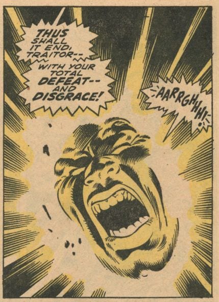
24. Coates’s comic is verbally much better than Jack Kirby’s mid-1970s Black Panther comics, which came out after the Jungle Action series. Though Kirby created the character and his back story, he seems to have no idea how to make him distinct or interesting. The character’s dialogue could be that of almost any of Kirby’s white American superheroes:

Appearing in 1977's Black Panther #3, a letter by Jana Hollingsworth offers a solid critique of Kirby's approach and his decision to ignore McGregor's more character-driven, socially conscious take on the character (Hollingsworth's letter begins Dear Marvel):
24a. While writing this piece, I happened to read Scar Face (1974), a comic book in cartoonist Jack Chick’s “Crusader” series. Like 2016’s Black Panther #1, it’s an adventure story that dramatizes a fictional African nation’s political turmoil (Scar Face portrays the racial violence of Britain’s colonial past and its effects on politicians contending for power in post-independence Africa). Chick’s infamous comics tracts and comic books are hate-filled Christian propaganda (with over half a billion sold globally, he claims). So Scar Face’s simple solution to any African nation’s complex problem is, unsurprisingly, Jesus. Both despite and because of its hate, it’s a powerful comic. Scar Face indulges in manipulative scenes of sadistic brutality involving alternately grotesquely and attractively rendered faces and bodies; and its panels are garishly colored, though in a good way (it almost looks as if grease has been mixed into the colors).

Written by Chick, Scar Face is beautifully drawn by Fred Carter, one of the most important and under-appreciated black artists in American comics history (his work’s national and global reach is likely unparalleled). I wouldn’t expect Marvel to release something like this (Chick self-publishes), yet it reminds me of how gripping an adventure comic can be, even one whose politics I reject. Part of its power may result from its production method: a collaboration between a cartoonist (Chick is writer, editor, and page designer) and an artist.
25. The opening images in Black Panther #1 appear to show scenes from earlier stories, a tactic I found, like the insertion of the introductory back story, off-putting and insider-y. It implies that we’ve missed something important and won’t be able to figure out basic facts, when the story has all the information we need. It hints at a lack of faith in the audience.
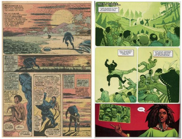
26. When I think of good (i.e., enjoyable) corporate superhero comics, I think about plot and dialogue, but even more about imagery. In this way, the Jungle Action comics are much better (i.e. more fun). They pass the important “black light test”: many panels or pages would look cool blown-up and hung on your wall as a poster — they have that bold, stylish Pop Art sense of drama.

Though some of Rich Buckler’s art never goes beyond the era’s Marvel house style, he does lots of interesting things with POV angles and page layouts, taking approaches his Marvel contemporaries often didn’t. For me, his and Graham’s ‘storytelling through page design’ — the way page layouts create/perform/amplify the plot — is more compelling than Stelfreeze’s, though I can easily image that many readers would dismiss Bucklers’s characters as a boring retread of work by Marvel mainstays Kirby and John Buscema.

27. Compared to their contemporaries, pre-1990s colorists better understand how to work with the size limitations of the comic-book page and its small, image-filled boxes. Like Glynis Wein, who colors several Jungle Action stories, earlier colorists often employ more white space, giving the page some ‘visual breathing room.’

Likewise, earlier artists create open, unbounded layouts that require much of the page to remain uncolored, letting the white newsprint do some of the work:

(Since these comics have more words, all of the text balloons' white spaces help the page to breath a little, too.) In Black Panther #1, an excess of saturated color and too many similar shades (often muddy hues) in a panel make for cramped, indistinct images, blurring distinctions between objects and between the foreground and background. The coloring competes with Stelfreeze's line work, and the coloring unfortunately wins. (Given the popularity of this coloring style, I must be ‘out of touch.’)
28. Coates has said that his Black Panther “breathed the same air” as the current feminist critique of female characters’ limited roles and sexist representation. I believe him, though I can’t see much of this in Black Panther #1:

Some of the female characters’ idealized bodies and outfits, for example, recall a long tradition, going back to the 1930s, of generic fantasy imagery designed and executed by men (who were raised on misogynist pulp fictions) for boy readers (who were raised on misogynist pulp fictions). Perhaps it’s possible for “comics” to move “beyond the male gaze,” as Coates says (see * below). But when working within a system that has internalized, and come to depend upon, certain approaches for decades, such movement, though easy in theory may in fact be difficult. (Black Panther #1’s credits page lists nineteen people: eighteen men and one woman).
29. Perhaps the artist’s designs and/or the comic’s allegiance to “canonical” stories and “character continuity” negate some of the force of the book’s forward-thinking ideas. It doesn’t seem that controversial to say that the imperatives of the corporate method might present a challenge to innovation. Maybe the method is — or at least tends to be — the message.
30. Well, issue #2 should be out soon. Though little in #1 works for me, maybe I’m wrong, and I’m open to being dissuaded by future issues. Coates’s interviews suggest that a smart comic is on its way. And #2, reduced to 3.99, will be a bargain. So we’ll see.
31. [*It’s important to note that in America “comics” began moving past “the male gaze,” not just recently, but in the 1960s. To recognize this requires an expansive notion of “comics” that looks beyond the corporate mainstream. For decades, hundreds of important female cartoonists from diverse traditions (underground, alternative, art-comics, political/editorial, webcomics, poetry comics, etc.) have created work that rejects the aesthetics and ideological practices of the corporate comic (see this site here and here].


