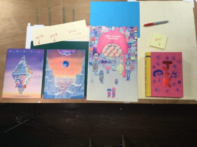
John Pham has been making and publishing comics since the year 2000. (Thanks to Bill Boichel and Copacetic Comics for hep'ing me to John’s work back way then.) Under the umbrella title of Epoxy or Epoxy Cartoon Magazine, Pham has slowly and steadily made comics over the last five years that give me the same sense of wonder that F.C. Ware’s varied output did in the '90s, before the book trade put a damper on experimenting issue to issue with format and different modes of printing.
The latest John Pham collection, J+K, from Spanish publisher Fulgencio Pimentel, does a great job of recreating that sense of wonder. They have produced a book which maintains the plush printing standards of Mr. Pham’s small-run self-published comics. The book manages to translate that untranslatable magic of a handmade risograph printed book into a boutique offset hardcover book for the “mass market.” It won the prestigious Puchi Award in Spain.
If you are familiar with John Pham’s Epoxy issues, then this collection is, as far as I can tell, the “J+K” material from issues four and five and the oversize Epoxy Cartoon Magazine, plus the story in Kramers Ergot 9, along with some new material. It’s all in Spanish. Apparently one can mail-order an English translation booklet from the publisher. I don’t have the translation booklet, but I have the original strips to reference, so I feel like I can write about the book as a whole. Don’t let the fact that the book is in Spanish discourage you from ordering it. This is one of those books that is so well made (printed in Spain!) that I wouldn’t care what language it was written in; it’s that beautiful of an object.

Mr. Pham is a versatile artist. Years ago, I spoke with him about using his comics skill set as a passport for getting work in other fields. Since that time John has produced three stunning issues of Epoxy all by himself. "He’s created brushes that mimic how we would use pencils, and he’s using the risograph, hacking into it using all this digital technology", says Ben Jones. "It’s a lot like silkscreen, but it’s more powerful than silkscreen because the risograph and Photoshop are talking to each other. So he’s mixing the two worlds. A majority of cartoonists [...] are still using digital tools to imitate old coloring processes. John has invented a whole new workflow." Read about that process HERE. John thinks it's boring stuff, but I am fascinated about how he actually produces the work and how the final printed object is made.
J+K retains the Pham look we know, just with the volume on 11. It seems to me that he took his printed strips and scanned them and touched them up to loomore consistent than the slightly inconsistent riso comic magazines. Like every color is amped up and right on the money. No mis-registration of the printing or streaking or digital effects that look like mistakes. Very smooth and very nice. And simply gorgeous bigfoot cartoony drawing. His approach here, by his own account, channels Suiho Nagawa’s aesthetic by unifying or harmonizing, the color and the line. The lines are made by overprinting colors. Not by a traditional, single “blackline.” So the lines which contain the colors have different values or different sounds, if you will. The effect being one of a warm gauzy magic hour firmly rooted in cartoon symbolism. Meaning it just works on your eyes and brain in a way “blackline” based comics do not.
Beyond the softness of the color, there is a whole language of symbolic color forms perfectly harmonized with the linework that elevates Pham’s work into new territory I’ve never seen in contemporary comics. In part because of the technology and in part because of the fusion-type comics John is creating. Lots of East meets West type cartooning here, by way of Vietnam and California. And here, this collection is in Spanish. Which makes sense; John lives in Los Angeles, where all the freeways meet.

BFFs Jay and Kay wander through the landscape and have their adventures in the mall and in a homeless encampment. It’s mostly funny comic-strip-type decompressed gag humor. Light and playful. The strips do get deep in the emotional sense sometimes. Meaning the characters, through their adventures, transmit their bond and the bond they have to others, quite touchingly. There’s an interplay here that Pham has used very well throughout his career, using humor to play off the tragedy, like Ware maybe, but more like Ben Jones. In fact, seeing this collection made me think a lot about how John and Ben have been working closely together on animation projects for years. John is totally his own person, and I mean that respectfully. However as a fan, it’s something I see with glee. Two of my favorite artists play off of each other and push each other to greater heights each time they make a new comic or animation.

The new comics in the collection are a bunch of great one-pagers as well as one longer strip. They are all very charming. Regarding the new stuff, John told me, “There’s a good chunk of new material in the book. A couple of the strips will eventually be in either new issues of Epoxy or the next Kramers. One strip ["Yard Sale"] is exclusive to the collection, however.” That “Yard Sale” is a busy strip with lots of detail and an interesting counterpoint to the six-panel one-page strips preceding it. Pham uses real cartooning economy for the six-panel gags and plays on the readers heartstrings in a way I didn’t expect. These strips, like the whole of the book, do not read like isolated short strips strung together without a plan. They read into the endpapers and all the little inserts and even a mini vinyl record. Like it’s not a collection but one long story that makes sense even if it reads like individual puzzle pieces in places. Pham’s lines, his "3-D imaging" sense of space and "excess" (excess of color immersion) harmonize together spectacularly in this collection. It’s a feat to put it all together and serve it up in a smooth package like this. I’ve never seen anything like it, honestly, because I know how hard it is to translate handmade zines into hardcover books. Bravo.

One more note about the extras stuffed into the endpapers. This collection also manages to mimic the magic of the self-published magazines and to transcend them in a way because with hardcovers and printed "pockets" on the endpapers. They contain a copy of a mini-comic like Cool Magazine, a sheet of stickers, a membership card, and a 33rpm vinyl mini-record (not a flexi-disk). Pham actually outdoes himself or what's come before with this packaging. The record is by "Gaseous Nebula" which relates to a feature in Cool Magazine and it's own fold-out insert, and seems to relate to the dancing video game Jay and Kay play during the "main" narrative. Again, these are things we've seen in Pham's magazines, however, the way it is all ordered and put together here for, undoubtedly an audience who has very little contact with his self made magazines, is fairly awe inspiring. I really don't have anything to compare it to. John Pham is staking out new territory in contemporary comics and I urge you to hunt down this award winning collection.
Oh and one last note: As of this writing, no English edition is planned. Meaning it will be years before this sees publication over here in the States. I highly recommend getting it in this incarnation and not waiting for it to be in English. Remember, you can get a translated booklet from the publisher on their website.


