“I came here in 1986,” the diminutive counterman who’d been there every day I’d visited for the last year said to me, “and in the four blocks of Telegraph between Bancroft and Dwight were eight great bookstores. I walked down four blocks that day and found every book I’d ever wanted in my life up till then.”
Here is Berkeley, California, and There was Mad Monk Center for Anachronistic Media. Forget 1986, this books and vinyl place hadn’t been around this time two years ago. Owned and run by the same dude who does the infamous-to-East Bay-residents Rasputin Music and Blondie’s Pizza, Mad Monk was hosted out of the palatial ruins that Berkeley institution Cody’s Books - one of the eight - had left behind at its closure a decade past. The place had stood empty but unbowed, curiously free of graffiti and the bodies of the homeless, until a little under a year and a half ago the guys from Rasputin up the street had cracked its glass-doored ribcage open and started hauling records and trade paperbacks into its guts. At the time I’d been working three doors up at Moe’s Books, immortalized in print by Aaron Cometbus and the last of those Telegraph bookstores standing, and we’d shook our heads and muttered darkly when those doors opened.
Mad Monk was the kind of store that deserves to fail. They sold shitty books - three years ago’s bestsellers du jour in bad condition; and shitty records - eight copies of the same eight Creedence/Doors/Ohio Players/Stevie Wonder records everybody always has, also in bad condition and priced as much as they cost new. Their customer service sucked - I felt bad for the diminutive counterman whose place was going under, but I’d often seen him bitch out the bored, resentful kids he had dragging around the floors to perform a sole function as shoplifter lookouts, and I’d be hard pressed to say the place was owed much better. The place's intended clientele beyond "suckers," "people with underdeveloped tastes and money to spend," and "people who couldn't find what they were looking for anywhere else on the block" was a mystery. A good bookstore both is and is of a community, and if you give both of those ideas the Heisman, you’ll forever be Division II. Mad Monk had found its level: below water. It was sunk, and I’d treaded into the going out of business sale.
Still, by way of making conversation I told the counterman I recognized his boat. My left jab was saying I’d been working book retail just up the way a minute ago. Then I followed on it with the right hook: the job I’d worked before that had been managing a New York bookstore that isn't around anymore. And then to make the combo prettier - I remembered the eight places he was talking about, having grown up around this burg - and at the bell - my first job ever had been at a since-deceased-and-resurrected comic store down on the next big street in town. Before that, the comic store I made my first ever purchases at was a block and a half from where we stood now, and it had gone belly up when (rumor had it) the guy running it got caught doing something he shouldn’t and had to file his Diamond Previews order from jail every month. Below is a picture of the Hernandez brothers signing at that store back when they were changing comics every time they put an issue out. I knew this boat, all right.

I meant my story by way of commiseration. I didn’t tell him that the New York store had left the party while it was still roaring; or that Moe's right up the street had its own fuckedupnesses; or that the comic store that had given birth to my career in book retail was killed by unsold inventory, slowly strangled by an owner whose eyes were bigger than his customers' stomachs as he slipped from local legend to tax-evading petty tyrant in the years before his premature death. I didn’t say that stuff because I wanted him to hear that I knew him, I saw him, I’d also looked at the portion of the barrel he was contemplating now, and I knew that half the plates book retail’s dishing out these days is made of it. But insolvency is a cross each man must bear alone, and this dude just wasn’t really trying to hear it. He cut me off to ask me how the job up the street was and I told him I’d left because they weren’t paying me the money I needed to live here. That was the least of it: me and my three best friends had left the store to protest our unequal wages, two leaving town and two just selling out to jobs that allowed us to retain our apartments and significant others. “The rent is too damn high,” I told him, and he sighed and nodded like he'd heard plenty of the same: “Yeah, that’ll open your eyes in a hurry.”
The store itself was a capitalistic salon des refuses. Any store running a going-out-of-business sale is by definition a display of products that don’t sell. The vinyl in Mad Monk had been replaced with shitty old CDs, DVDs, and plenty of vacant space. The books were worn down to the nubbins: a decade old Italian cookbook next to a marked up obsolete edition of the Norton Shakespeare next to Gillian Flynn’s Sharp Objects ad nauseam. The comics, always a sizable chunk of the place's inventory, were in a similar state. No copies of Civil War or Fun Home or Bone, nor any books about Marvel characters that had a movie out in the past two years, or first volumes of in-print manga series. But this is why we love comics, right? This is definitely why I love comics anyway. The fact of this medium in America for almost 50 years is that what’s good isn’t what’s sold. The history of good comics is a history of books overlooked, and of the vanishingly few exceptions that prove the rule. It's a form for foragers.
And! Looking at a shelf full of unsold, mostly unsellable comics-with-spines is still some kind of extremely Pyrrhic victory. I'm not even that old and I can remember when the only comics that made it to the book market were the guaranteed hitters, Maus and Watchmen plus a couple Will Eisner melodramas and Sandman trades and Batman warhorses sprinkled in to round out the section. As the '90s passed, they slowly but surely appeared in all the Telegraph stores because not carrying them couldn't be explained as anything but leaving money on the table. I was just a kid who liked comics at the time, and I was all about it. Then came the manga boom, and Ware and Clowes and Burns at Pantheon, and suddenly every mainstream bookstore had a "graphic novel" section that would have seemed absurdly robust ten years prior. I was all about that too. Then another ten years, and you get this: a medium that a dude in his mid-twenties can remember not being represented at all in places that sold literature and theory and photography books and whatever else, now developed into a facet of the publishing industry large enough to account for a significant chunk of a store's failure if they don't do a good enough job with it. A big shelf full of comics-with-spines that didn't - couldn't - sell says just as much about the medium's 21st century come-up as the NY Times Graphic Bestseller lists did. It says comics have become a big enough section of the landscape for a bunch of them to be allowed to fail. Cold comfort for the counterman, maybe. But it's not nothing, especially not in a medium where the good stuff fails with shocking regularity. I'm still all about it.
So I became part of the problem, and descended on the going out of business sale at the store I'd never much shopped to grab up the discounted comics that had found their level in the market here. Namely: inventory items that contributed not to the store that carried them’s year-plus in operation, but to its ultimate failure. In most mediums, that status would speak to a majority of these products’ quality, mark them out as simply inferior. But American comics is home to the creative world’s most chauvinistic fan community and most predatory distribution monopoly, not to mention a greater percentage of product whose motivating factor for existence is corporate greed than just about any other. In American comics, a going out of business sale is as likely a place, percentage wise, to find something good to read as a thriving concern is. I spent just under 30 bucks and got these six books to show for it, each of them showing off something worth a reader's while: unique modes of artistic expression, or legitimate innovation, or a lesson about the form's history, or a look at paths left untaken, or a hilarious level of badness that provides its own justification, or simple brilliance.
As ever in comics, it isn’t the money you put into it that gets you what you want out of it, but the dedication. You don’t need to throw much cash to find success here, you just need to know what to do with it. You need to have put hour upon hour upon hour of your life into longboxes, thrift stores, garage sales, the internet, to know what material in the junk heap makes it worth putting in all that time to begin with. And you need to have a place to go and find it all, when those places are all disappearing...
BOOK ONE
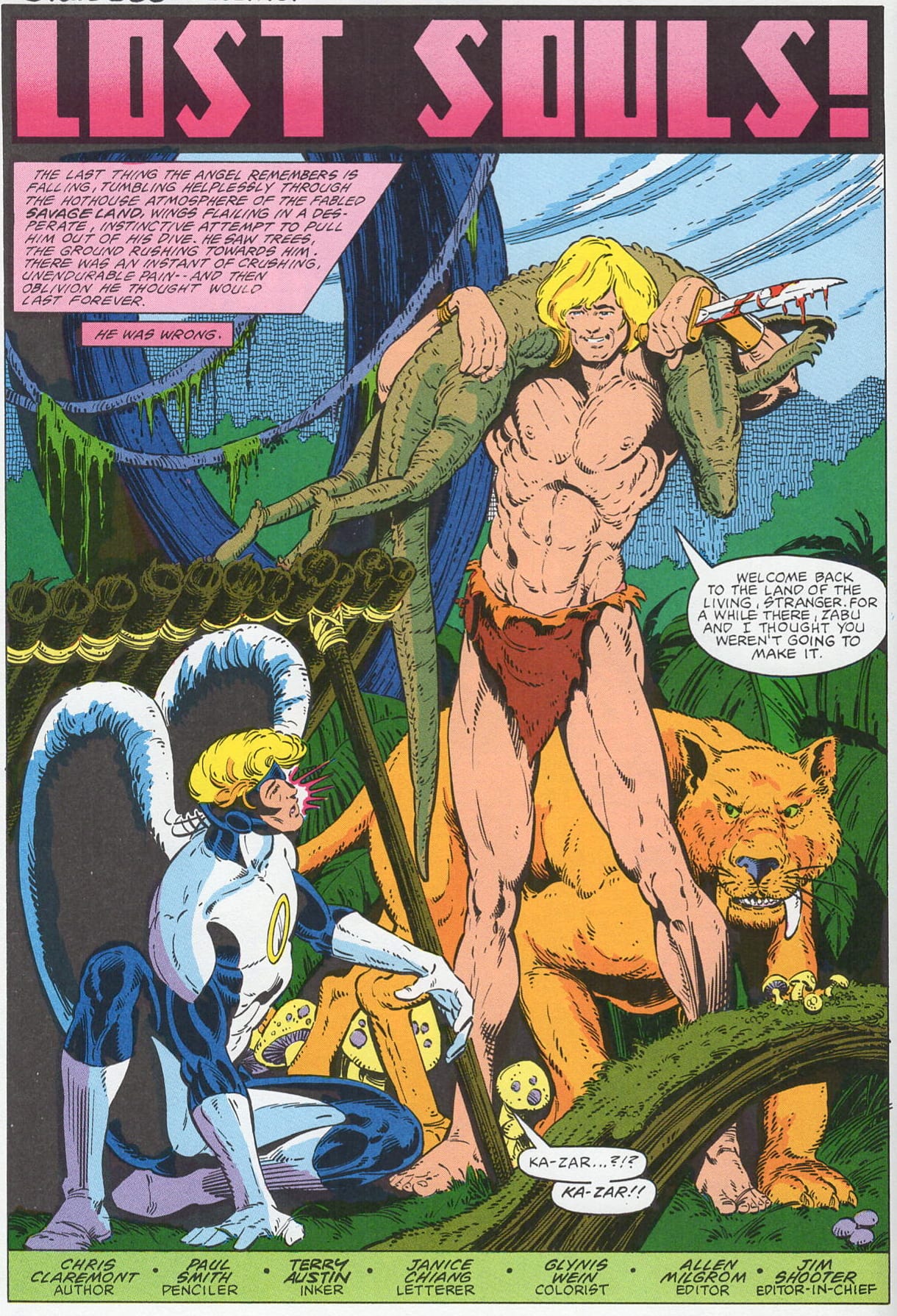
X-Men in the Savage Land with Spider-Man, Ka-Zar, and Zabu, by Chris Claremont, Michael Golden, Dave Cockrum, and Paul Smith. Marvel, 1989.
WHY IT'S A DOG
A pretty good rule of thumb for book retail - hell, maybe all retail, I dunno - is that at any time there are about a hundred list items that will sell simply by virtue of being displayed in the store. Those hundred change all the time, and about half of them are usually just different works by the moment's five or six popular people, but if you can keep 85 or 90 of those books on the shelf day in day out, you've got bread and butter. The flip side of this coin is that when you stock anything else, which you have to do, you're either looking at making hand sales, or hoping to get lucky when the fabled Right Customer walks in. Selling superhero comics is weird because there are a lot of Right Customers - dudes whose subjective measure of quality is how many pages in a work feature the Green Lantern - but even with them simple math dictates strategy. You can keep one book around for those dudes, sure, but giving shelf space to all the ones that feature their favorite guys is a losing proposition.
Especially when it's the X-Men. We've reached the point where there are multiple thousands of X-Men and X-Men-related trade paperbacks floating around. Of those, at a stretch you can put five on the bound-to-sell list: the first Grant Morrison one, the Frank Miller Wolverine one, Old Man Logan, the Dark Phoenix Saga, and Days of Future Past. Beyond those, you're basically just hoping. This one is a 1989 collection of '82 Marvel Fanfare issues by three different artists that has no public profile whatsoever and hasn't been reprinted since 2002. Nobody, even X-Men fans, has heard of this story - I hadn't, even though it's Claremont in his prime with good art, because it didn't run in the main Uncanny X-Men series but an anthology - so nobody knows they want it, even in the still unlikely event that they do. Like Rob Liefeld, Claremont has become an internet figure of fun, the idea of his work as overly verbose obscuring the top-notch reality of it from potential new readers. And this is maybe his 25th- or 30th-best story. It probably only got printed as a book in the first place because it's one of the few X-Men stories to prominently co-star Spider-Man, maybe the only one with good drawings. And even as far as that goes, it's a disappointment: the only X-Men character Spider-Man actually teams up with is... wait for it...Angel. Add in an ugly green-spined book design that doesn't feature the Marvel logo, and I'd be surprised if anyone else even pulled this off the shelf for a look before I got to it.
WHY I BOUGHT IT ANYWAY
It's Claremont in his prime with good art! Like I said, this is hardly the maestro's best effort, but he still juices his incredibly generic story of the X-Men on a jungle adventure fighting dinosaurs and evil mutants with some extra sturm and drang. Wolverine and Angel having an extremely weird argument about when if ever murder is justified that Wolverine "wins" by proclaiming that when he kills, "it's out of necessity, or passion," and not "as a matter of state policy" is a highlight. Pretty sure Ted Bundy was doing it out of passion too, guy! I'll give Claremont credit and assume Angel stops talking after that because he's either dumbstruck by the idiocy of the conversation he's ended up in or fearful for his life in case the dialogue gets too passionate, and not that he's conceding the point. The doomsday weapon facing the X-Men here, which steals their powers for the bad guys to use while turning them into Neanderthals, is the ultimate in superhero scripting on autopilot; but Claremont really makes an effort to go the extra mile and show how pissed off and violated our heroes feel about getting kicked a few dozen rungs down the evolutionary ladder, plus how scared they are to get anywhere near the weapon again after it's been used on them. The way this material is handled, thrown in as dialogue where lesser writers would have their protagonists discussing battle plans or laboriously flashing back to previous issues, is surprisingly effective, and typical of Claremont. His characters don't just have emotions, they contend with them, and unlike in Stan Lee, that has its effect on the course the super-action takes.
At its heart, this book is an art showcase. Cockrum does his usual baroque, brushy job, turning in a Part 3 issue that, like all his work on these characters, is competent and stylish - though this is hardly his best effort. Paul Smith, in Part 4, ups the ante. His issue is the debut X-Men work by one of the franchise's iconic artists, and he's clearly ready from the jump. Smith's expertly blocked, richly drawn issue, inked over by John Byrne's X-Men comrade Terry Austin, looks like an appealing cross between Byrne and Paul Gulacy. It's cool to see how good Smith was right out of the gate. More interesting is how much he changed his style in the time between this comic and when he took over drawing X-Men proper, growing an action-manga influence and doubling down on his use of solid black space in a few months. He also takes a completely different approach to drawing Storm here than he would in his work to come, which is interesting considering he'd be responsible for the character's audacious-for-the-time (and perhaps Love and Rockets influenced? Dude did do art for The Comics Journal!) punk redesign. This is the kind of silly little stuff that only hardcore Claremont/X-Men fans will notice, let alone care about, but then again the exact same thing could be said for this book itself.

If there's anything resembling a legitimate draw here, it's Michael Golden's art in Parts 1 and 2. The original idea for the Marvel Fanfare series was something a little like DC's Solo anthology: a showcase for top creators working on the Marvel superheroes continuity free, with nicer production values than the regular comics offered. The books themselves didn't end up doing much to reflect that mission statement, but these first two issues are Golden on the X-Men, which isn't a bad stab at it. Golden draws the living hell out of this book's first half (the part with Spider-Man in it), cramming metric tons of tiny figures into panels whose expertly balanced compositions let them read with perfect fluidity. By pulling his camera back much further than most superhero comics ever do, Golden creates pages that feel realer, more corporeal, than the stuff we're all used to seeing in these kinds of comics. He also makes the most of the opportunity to color his own work, putting together a vibrantly hued job that manages both more aesthetic unity and more expressiveness than the norm. One gets the feeling reading these that a young Todd McFarlane was eagerly drinking Golden's drawings in, perhaps with tracing paper on hand. It's high quality superhero comics of the type that anybody looking for one of the "classic tales" would be pleased with.
THE BEST PICTURES IN THIS COMIC BOOK
Claremont is semi-infamous for his tendency to get his characters involved in scenarios with heavy BDSM overtones to them. I like that about his work for a few reasons. First, it's just weird; second, it's an obsessive attempt at personal titillation rather than a cynical attempt at audience titillation (or at least it contains a measure of the former); third, it gives Claremont's stuff a not-inelegant tinge of creepiness; last and most importantly, if you're gonna have sex shit slopping inappropriately up against the sides of your superhero comic, incorporating S&M stuff necessitates more work with narrative, character, conflict, than just drawing cheese-or-beefcake poses does. There's a little bit of bondage in this one but nothing that really raises the eyebrows - however, there's a shitload more homoeroticism in it than the usually pretty hetero-oriented Claremont usually ladled out. Also, seemingly catching the vibe, Golden draws Angel with giant aureole that look pulled straight out of Tom of Finland.
BOOK TWO
Colossus: God's Country, by Ann Nocenti, Rick Leonardi, & P. Craig Russell. Marvel, 1994.
WHY IT'S A DOG
Another collection of X-Men material from an anthology (late '80s issues of Marvel Comics Presents this time). Do I have to spell it out again? This time though, instead of the franchise's star creators doing Wolverine and Spider-Man, it's some random folks doing a character that never needed to ever have a solo adventure in the first place. The spine is also hella skinny and reads simply, "MARVEL COMICS GOD'S COUNTRY". All those alt-right Comicsgate assholes ought to take solace in the knowledge that even when Marvel breaks with some of its traditions, its terrible trade paperback program is forever.
WHY I BOUGHT IT ANYWAY
Cause it was three dollars and I'd had a couple beers before I walked into the store, I guess. Rick Leonardi's excellent drawings in his Marvel Fanfare Portfolio also played a part. This is a rare thing in comics, one whose weirdness precludes goodness. It's the product of an age that's truly passed, that of "politically relevant" corporate superhero comics. In it, the X-Men's Russian robot dude, Colossus, wanders the American heartland, meeting sexist racist Reagan acolytes who clearly just have that copy of The Turner Diaries around the house for show, because they hate their brothers in whiteness the Russians just as much as they love guns. How far bigoted Republicans have come since those dark days! Anyway, evil mutants attack the small town Colossus is passing through for absolutely no discernible reason and he decides to protect it out of sheer inertia. Literally; this is the kind of comic where every character talks to themselves about their motivating ideology whenever they don't have anyone else around to talk to, and as he moves from squabble to squabble in the book's "epic" "conclusion", Colossus muses "More men here somewhere, to beat, to hit. Why am I fighting all these men? What's the point?" It reads less like creative auto-critique and more like a bored writer putting her head down on the keyboard in frustration. Elsewhere, Nocenti gives her readers a fictional Cletus safari, putting lines like "A man's gotta know the grip of a gun as well as he knows that of a woman!" and "Let the homeless clean themselves up and get a job!" in the mouth of the clueless hick Colossus ends up joining forces with to protect the town from whatever.
Superhero comics don't do stuff like this anymore, which gives this book a pinprick point of interest. Nowadays they're too busy being all things to all people and protecting the billion dollar payoffs from the movie versions to inveigh, however unconvincingly, against things like "vile pornography" and "Reagan's bulldinky". But it's hard to pine for this stuff when it results in something like this book's message that Russians and Americans, or the American left and its right, have a lot more similarities than differences. It's both so banal as to be void of dramatic impact, and a lazy cop-out. I'm aware of the fact that I share 99 percent of my DNA with a chimp, but all the same I have no intention of allowing one to dictate my political future. At the end of the book the redneck moron Nocenti's spent the whole book setting up for a Lesson Learned saves his property and family by shooting guns out his window at a gang of deep-state bad guys, one of whom is the only non-white character in this book, regaining the love of his son and his left-leaning wife, whose FDR Democrat dad's environmentalism has been turning her head a bit lately. Said dad, realizing his time in this world has passed him by, willingly dies at the end of the book. Yep: not sacrifices himself in the big gunfight or kills himself, he just lies down and lets his spirit go. If I'd known it was that easy I probably would have tried it at some point while I was reading this, to be honest. It's hard to make something this bad when you're trying to be bad: only the combination of cynicism and disinterest will do. But hey! Here's the perfect book for the #comicsgater in your life, should they be interested in the comics from that golden, hill-topping city known as Simpler Times. Spoiler: They sucked too.
THE BEST PICTURES IN THIS COMIC BOOK
There's nothing in here half as good as any of those Leonardi portfolio drawings - his style and Russell's never quite manage to mesh comfortably. The best ones are the night scenes, which take place in more of a color space than a concrete setting. I thought this was a nice minimalistic sequence.
BOOK THREE
Agrippina, by Claire Bretecher. Rowohlt, 1989.
WHY IT'S A DOG
Claire Bretecher is one of France's greatest cartoonists - great enough that I recognized her name on the shelf despite the fact that it was printed upside-down in the weird manner that the French do their books' spines with, not to mention that she hasn't had an English-language book in print since I was 2 years old. TCJ's Cynthia Rose calls Bretecher "a virtuoso and a national treasure," and everybody else I consulted in a little internet digging seemed to agree. They made a TV show about this book in France! Still, even in a major university town foreign language books are a tough, tough sell. Foreign language comics are even more so, and a foreign language comic that's been translated into another, less popularly read foreign language (this is a German edition of Bretecher's Agrippine)... buying this book was a charitable donation, pure and simple. Still waiting to see whether or not the IRS agrees with me on that.
WHY I BOUGHT IT ANYWAY
Ever since the days when looking at French-language Moebius books was the only way to see that guy's work, I've always enjoyed seeing other lands' leading lights in their own context. Don't get me wrong, I'd rather actually be able to read the stuff, but there really is something to trying to do the work of assembling a comic's story in your head with only half the pieces. It's like when the coach would drill you on fundamentals at the beginning of a new season. Not the most enjoyable experience, maybe, but a valuable exercise nonetheless, one that reminds you to stop inhaling your comics and slow down to consider each element of each picture and how in the hands of a good cartoonist they all make a contribution. Every committed comics reader should do this a few times a year, both to keep the mind plastic and to experience some books that would otherwise be inaccessible.
All that said, this is the kind of book that's fuuuuuucking impossible to figure out without being able to read the words. Agrippine is Bretecher's longest-running series and the one she closed her career with; like all of them, this inaugural volume chronicles humorous incidents in the life of its eponymous teenage girl and her family with one-page gag strips. Though there's plenty of humor in Bretecher's drawing, rare indeed is the strip employing a visual punchline. "Her dialogue broke new ground and set long-lasting trends," Rose opines. "When it comes to the ironies of French "second degree" wordplay, few humorists have managed to profit more." So as a stupid mono-lingual American I'm screwed, basically. I mean, idk what French "second degree" wordplay even is. Agrippine banters with her mother and father, both seemingly teachers, and with her best friend and her classmates, usually in what looks like a blustery and contentious tone, but occasionally with evident affection. Money is a common topic, and adolescent romance plays a part as well. Sibling rivalry makes sporadic appearances. Past those deductions, I was pretty much adrift in this book.
Which, considering, was a pleasant experience. Looking at fifty-odd pages of Bretecher's art is a top notch way to spend an evening. American readers will perhaps think first of Jules Feiffer or Roz Chast when they see Bretecher's loose, self-consciously sloppy pen and ink work and slumped, rubbery figures. But she's easily twice the draftswoman than those two combined are. Meticulous line quality seems to worry Bretecher little - she draws with gusto, each trail of ink a confident, flowing statement contributing to figure after figure with perfectly observed facial expressions and poses. Bretecher's drawings of furnishings have more body language to them than most cartoonists' people do. Every element of her pictures is considered, balanced. Her compositions, mostly centering a full figure or two alongside a single piece of furniture, are minimal but built with great solidity. There's nothing left wanting in these images, simple though they are. Whenever there's an appearance by Agrippine's kid brother Justus (who probably has a different name in the original French edition, and bears quite the resemblance to Bill Watterson's Calvin), the humor inherent in Bretecher's style is allowed to shine through a little brighter, and her capacity for drawing the antic comes to the fore. And the colors! Fuck! I stared at this panel for longer than I'd care to admit, just drinking in the richness of the tones and the way they're placed in concert with each other. Sublime.

THE BEST PICTURES IN THIS COMIC BOOK
A nearly wordless strip shows off more of that virtuosic coloring and Bretecher's facility for allowing the comics medium to speak for itself, and lets even dimwitted readers such as myself appreciate a bit of her humor.

BOOK FOUR
Parker: The Score, by Darwyn Cooke. IDW, 2012.
WHY IT'S A DOG
It's not! This one's the exception that proves the rule, I guess. The Cooke Parker series sold just great out of the three different stores in three different cities I've worked in since their run began. Wrong place, wrong time for this particular copy, I suppose. Though I will say that IDW's glacial schedule for getting rock solid perennial items like these books into paperback is the kind of shitty business that only flies in comics. The time elapsed between hardcover and paperback editions for these books averaged about five years per. High hardcover list prices on new books mean prices higher than people are willing to pay for secondhand goods when those copies hit the used market. Hence, this, here.
WHY I BOUGHT IT ANYWAY
I like these comics. They're markedly inferior to the series of Richard Stark crime novels that spawned them, but that's hardly an unpardonable sin. Most fiction works are inferior to the Parker books, which are easily the best novels to focus on the process of committing criminal acts rather than the psychology of the people committing them. The books are as close to writing without style as it gets, which is to say they're masterpieces of style by a master stylist. It's rare to see prose stripped any closer to the bone than what Stark puts to page in Parker. Marry it to grim subject matter and a protagonist so emotionless and driven that today we'd say he's "on the spectrum", and Stark's novels - though often filmed, and comic book-ed here - seem almost to defy visualization, to insist on an abstract world of cold fury, forward momentum, and the 47 keys on the keyboard.
Though in theory Cooke's a great fit for a noir series set in the early 1960s - and though in practice his take on Parker is good, highly enjoyable comics - it still always feels like a bit of an awkward pairing. If I had to pick an artist to adapt a Parker novel, I'd go with somebody like Eddie Campbell, whose human characters don't emote nearly as much as his settings and his style itself do. Cooke's rounded, bouncy, midcentury-modern approach always seemed too soft for Parker to me, even in the roughed-up form it took in these books. A greater mark against Cooke's take is his ad-art influenced focus on clothes, furnishings, accessories, which always seemed diametrically opposed to what Stark was trying to do. Too many wrists in Cooke's Parker come adorned with sharp Triumph watches, too many countertops with perfectly referenced jet-age fixtures. And almost all the character drawings can accurately be described as either caricature, or cute. Neither have a place in Stark, for whom the drab and the outright ugly were muses. I read the first couple of Cooke's adaptations before I'd read Stark's originals, and rated them quite highly. After seeing the raw material and processing Cooke's books as something he made from it, they're less impressive. Dan Nadel's thoughts here preceded my own and are well worth reading.
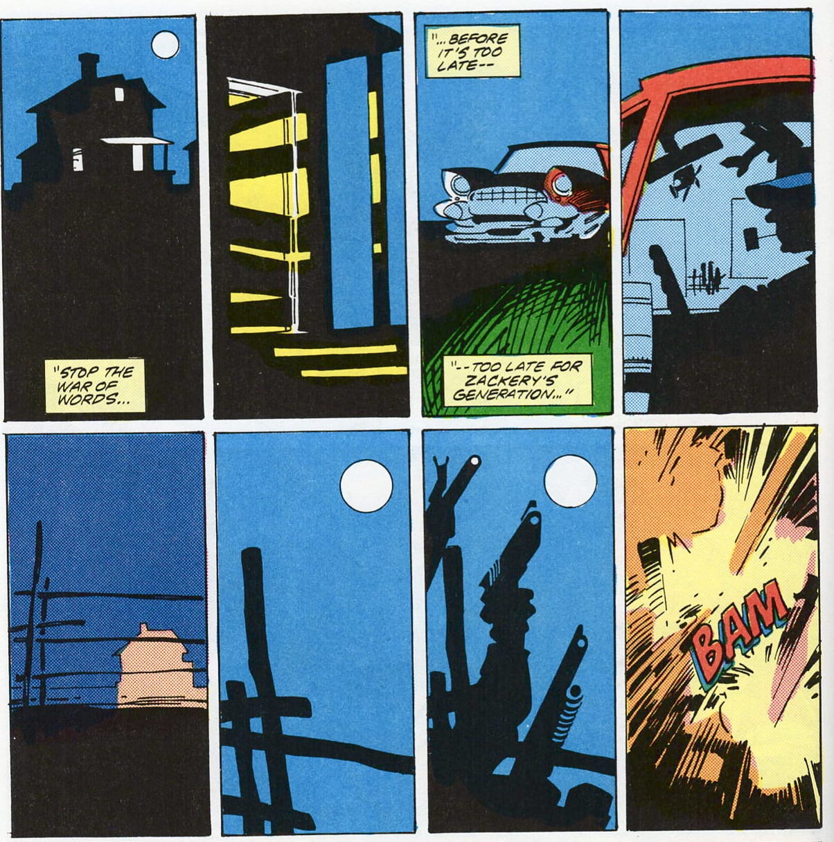
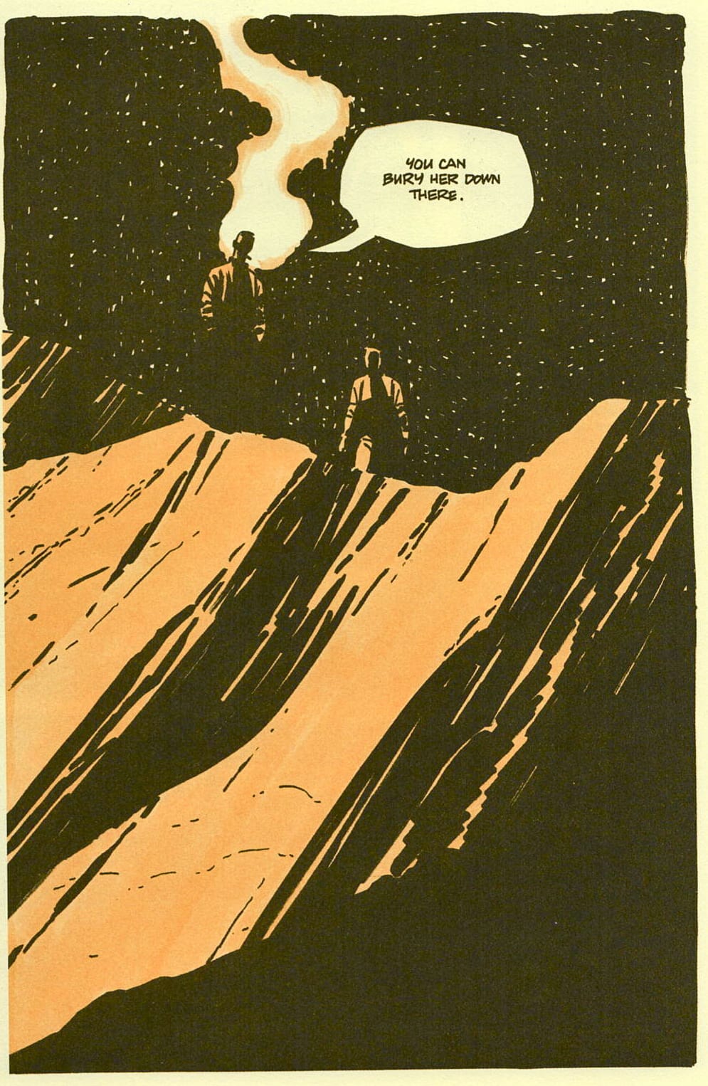
Still, the combined power of Stark's stories and Cooke's undeniable talent basically guarantee something better than what the vast majority of comics offers. A big part of the nagging impression Cooke leaves of being miscast, I think, can be traced to his choice of material to adapt. Stark's Manhattan-set, James Bond-influenced The Black Ice Score is unique among the Parker books in that it seems to cry out for the lavish visual treatment Cooke bestows on more downbeat stories; my personal favorite Parker yarn, The Seventh, is an extended chase sequence that's a natural fit for comics, with a slow-burning climax in a dilapidated Art Deco mansion that Cooke could have gone wild diagramming. It should have been Cooke's longest work on Parker - instead, he truncated it into a short story. The Score, for my dollar, is the closest Cooke got to a Stark book that matched his style - though it's more of a fortuitous compromise than actual harmony. The book's bare bones North Dakota setting forces Cooke out of his glitzy, urban(e) comfort zone and into a greater level of focus on light and shade, stillness and movement. There are less sequences that yell for the adjective "bravura" and more that simply function. The temptation to draw Playboy-cartoon dames seems to have been fought. The black and yellow color scheme flatters the art in a way that the black and blue of the other books never did.
The Score culminates with a dead-of-night sequence in the crevice of a canyon that forces Cooke into almost completely blacking out his characters' faces, hairdos, and outfits, reducing them from pretty cartoons to shapes and shadows, getting his work as close to Stark as it ever did. It's stunning stuff, climaxing in a few pages dominated by sheer rock faces that strip Cooke down to a pure expression of his individual drawing style, smooth brush marks and scratched rendering lines. They're clearly
THE BEST PICTURES IN THIS COMIC BOOK

BOOK FIVE
Judge Dredd: Block-Mania, by hoo boy... John Wagner, Alan Grant, TB Grover, Mike McMahon, Ron Smith, Steve Dillon, Brian Bolland, and Tom Frame. Titan, 1984.
WHY IT'S A DOG
In America, you hand-sell Judge Dredd or you don't sell it at all. The UK's most notorious comics export it may be, but it's also a sprawling continuity saga printed mostly in black and white, with a ton of confusingly trade-dressed volumes available, a constantly rotating cast of artists and no single story famous enough to act as an obvious point of entry. The titanium-jawed, generic-uniformed killer cop Dredd isn't exactly Spider-Man when it comes to reader identification, either. There are a number of good Dredd comics - far more than I've read, if Joe and Tucker are to be believed - but this material doesn't exactly come to you. Priced at 17 bucks in a generalist bookstore that hasn't heard of customer service, it's a lost cause.
WHY I BOUGHT IT ANYWAY
I wanted this little expedition to be as international as I could make it, and I remembered hearing that Block-Mania was one of longtime Dredd engineer John Wagner's better moments. You gotta hand it to Judge Dredd: material that relies so heavily on shock value is rarely effective, but this stuff is both genuinely shocking and genuinely well made. What braces me whenever I read a Dredd comic isn't the in-your-face violence or the coal-black humor. Plenty of comics have plenty of those. It's the way the comic's central concept is handled by Wagner and company. Judge Dredd is the agent of a fascist apparat, singlemindedly devoted to keeping it running smoothly; that is, Judge Dredd makes the fascistic subtext of every other superhero comic text, turning the "hero" at the center of its story into something closer to comics' most competent and successful supervillain.
In a vacuum, this is interesting, but what makes it more than that in practice is the decades of deep thinking that Wagner has put into the nuts and bolts of his world-on-the-page, his writing of its history. As an artist, Wagner reminds me more of that dude who "beat" Sim City than he does of, like, Peter Milligan. Like all writers of superhero comics, his stories tend toward the maintenance of stasis. What's so truly shocking about them is how monstrous and cruel the stasis of Judge Dredd's world is. How much worse it looks the more you think about it. Rare indeed is the escapist fiction that offers such a seamless living nightmare as its refuge from reality. While individual Judge Dredd stories vary in quality, the constant is that they all take place in and deepen a world that not every artist could stand up to the agony of imagining in such detail.
All of this is very much in the foreground of Block-Mania. The book depicts a day when the citizens of the dystopian Mega-City One go mad en masse, with housing projects the size of entire cities spontaneously turning against each other in high-tech tribal warfare. Caught in the firing line are the Judges, who unhesitatingly and unquestioningly use the state's full military capabilities to subdue its rioting citizens. One panel is particularly pointed. Providing a cliffhanger for the story's fourth installment, it depicts the helmeted and visored Judge Dredd barking into an intercom, Tom Frame's iconic, ridiculously controlled lettering blaring out the ultimate in totalitarian logic. "Get those sonic cannon working!" shouts the Judge. "I want these block maniacs pacified -- the whole northern sectors!" "But Judge Dredd --" replies the voice from the other end of the line, "you're talking about150 million people!" The maintenance of state power is all, its exercise an inevitability - even when it is acting in representation of nothing but itself. Here is as clear an illustration as could be of why the "war on terror" has never ended and never will: because war waged on or by or for a concept, an absolute, can never be said to have exhausted itself. Eventually, Dredd ferrets out an external cause for the Block-Mania afflicting his city and runs its mastermind to ground. But these scenes pale in comparison to those of the rioting itself. After all, they demand explanation. The logic of the riots in Mega-City One, on the other hand, does not. Bend something, and it breaks. Then you can fix it, or you can keep bending. There are some things, we are told here, that can never stop breaking.
THE BEST PICTURES IN THIS COMIC BOOK

Mike McMahon draws the first two chapters of this story, followed by Ron Smith on parts 3 through 6 in a very similar style. (Steve Dillon and Brian Bolland, more familiar to American readers and feeling a bit miscast because of it, round things out.) McMahon is the Jack Kirby of 2000AD, the architect of a style that everyone who's followed him has found themselves responding to - Simon Bisley and Kevin O'Neill are probably its two proponents who've had the most success in US comics. It's not a style I've particularly cared for when I've encountered it, rendered and brawny and spiky, with figures that rarely distinguish themselves from the pictures' overall ground, the antonym of pretty or sensuous. But seeing McMahon's work, and Smith's work in his style, in Block-Mania was revelatory. When McMahon draws his stories' well-muscled principals in action, close up and gleaming in their spandex and chrome - when he draws superhero comics, in other words - he's one artist among many. It's when he draws the scenes that makes Judge Dredd the nightmarish thing it is, the seething masses of tiny figures converging on each other in all-consuming hate, the endless darkened meeting halls filled with thousands of citizens unanimously voting to enter a war with no stated goal or cause, the towers bigger than anything reality ever built crumbling under laser fire, that his genius is displayed.nDredd is about the big ideas, about society and not individuals (which is probably why Americans have never managed to figure out liking it). These ideas are more difficult to make into images than the ones that power most comics, which makes McMahon's ability to find a concrete, iconic visual shorthand for them all the more impressive.

BOOK SIX
Strain vol. 1, by Ryoichi Ikegami and Buronson. Pulp, 1999.
WHY IT'S A DOG
This was one of maybe three manga books labeled Volume 1 on a packed manga case. Anything with a volume number that isn't 1, even Karl Knausgaard or the House of Leaves guy's, is on life support in the used book trade. Most good used book stores will only carry a few manga books, and unless they're Nausicaa or Akira, you can measure how well they know what they're doing by how few "subsequent volumes" you can find. In a vacuum, I could see making a bet on this book to sell - it's the first installment of a series by the Fist of the North Star writer and the Crying Freeman artist - but wearing ugly all-black trade dress in a sea of random volumes of manga boom also-rans, it's gonna take somebody pretty diligent to reel it in.
WHY I BOUGHT IT ANYWAY
I'm a pretty big fan of Ryoichi Ikegami's comics. He and John Romita Jr. are probably neck and neck as the two Spider-Man artists who've sold the most copies of their other works, which is funny to me, but more than that, I see Ikegami as the Platonic ideal of what readers of the pre-manga boom generation were sold as Japanese-style comics art. Simplified, expertly drawn figures with a tendency to either overact or underact from scene to scene; expert use of screen tones that frequently opens up into full-on ink washed panels for moments of "high drama"; a persistent, troubling male gaze; and backgrounds and props too perfect not to have been photo referenced. The same way that John Buscema's art looks like superhero comics, Ikegami's art looks like manga, specifically the kind that Americans were used to before chain bookstores got hip to Naruto.
The closest Western equivalent to Ikegami is probably Bryan Hitch, with whom he shares a certain stiffness and tendency to under-design his stories' worlds, and an annoyingly hilarious predilection for full page facial close-ups whenever anyone says anything that has any effect on the narrative. But reading this book, a yawningly obvious, panderingly prurient Taxi Driver rip-off starring a street level hitman who takes out contracts on anyone you want for only five dollars (italics Buronson's), I was put more in mind of another dubious classic from the Exploitation section of the comic store, James O'Barr's The Crow. Strain isn't half as racist as that book, thank God, and Ikegami's a much "straighter" and more refined artist than O'Barr, but there are a number of weird parallels. The random and distracting tendency to switch from black line to watercolors whenever the urge strikes, the nihilistic soooo coooool hero with a death wish... shit, there's even a ton of symbolic imagery of horses that adds nothing to the story! Who knows, maybe one of these guys had a VHS of the Crow movie or something.
Reading this comic is a somewhat unpleasant experience, one that really rides the line between genuine interest during the tightly blocked action sequences, total boredom during the expository scenes whose "shocking" plot twists can be seen a mile off, and revulsion during the scenes of violence against women, underage prostitution, and oh yeah, violence against underage prostitutes. I honestly have trouble imagining Strain being published in the US market today, despite its creators' back catalogs. Sometimes the driving ideas behind US manga translation in the 20th century seem to have been a low opinion of the captive audience and a confidence that exoticism would obscure poor taste. Buronson and Ikegami seem to have agreed, pointedly setting this book in the hardest hoods of Kuala Lumpur, and emphasizing that Japanese residents of their comic are marked men. I suppose all that is fine and good if it's coming from a place of legitimate artistic striving, but this is a resolutely commercial comic dialed in by two industry lifers with perilously little insight or passion behind the misogyny and murder. Ikegami's drawings are accomplished enough that it might just dodge that old canard about "redeeming social or artistic value", but only by a hair. This book is an artifact for sure: weird enough that not just any dudes off the street could have created it, professionally polished enough that the same holds true, and a relic from a time not all that long ago when the received wisdom about publishing manga was 180 degrees from where it is now. But it's also far from good.
THE BEST PICTURES IN THIS COMIC BOOK
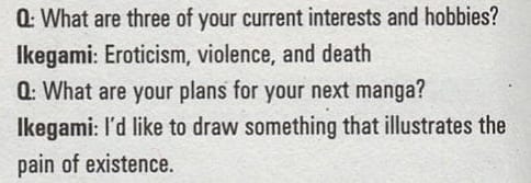
Honorable mention goes to these tidbits from Buronson and Ikegami's respective Q and A pages in the back of the book...

...but the real star is this full-page splash winning the title of Greatest Ever Sound Effect by leaps and bounds.

CLOSING UP SHOP
First of all, if you've made it this far, congratulations! It occurred to me toward the end of this long ass article that I ought to be drawing some kind of conclusion from my little sojourn at the going out of business sale, putting together a larger picture of book retail and the comics industry's relationship to one another and how it often isn't a happy one. But it's hard to put together a picture with six pieces from six different puzzles - and maybe that's the lesson here. Good comic stores (and stores with good comics sections) are able to put together one puzzle: to place Judge Dredd in between Moebius and V For Vendetta, or Parker with Steranko and Sin City. A trash heap made out of comics - a quarter bin, a Goodwill shelf, an everything-must-go - is appealing to a true fan because it's always bound to hold some treasure. But what's easy to do if you're more in love with the medium than any individual title or creator is miss the forest for the trees. That trash heap is still a trash heap, which means it's mostly made of trash.
I wrote about this particular bookstore because I'm hoping you, dear reader, have a bookstore or comic store around where you live that resembles it: an independent book vendor that deserves your support in theory, but never earns it. A place that sells comics, but doesn't care about what comics is - and doesn't care, in all probability, about anything but the idea of selling books for money. There are a lot of places like that around still, but they won't be for long. When they've gone they'll be rose-colored and romanticized by a lot of people, myself included, because of the horror of what's taking their place. But it's not just Amazon that's putting these places out of business. The ones that die fast and hard also do it to themselves.
Selling things with limited commercial potential is one of the most important things comics retail does. (One could argue it's the only thing comics retail does.) Not every book that doesn't sell is a stinker, as the history of excellent but shuttered publishers from Catalan to Picturebox attests. A good store will find a way to make people see the value in the valuable books, regardless of how they move in places where neither seller nor buyer cares about them. But plenty of books, including a few I've looked at here, simply aren't good enough to sell, getting by for however long they do on impulse purchase, accidents of taste, misidentification. And so they pass from unsatisfied customer to unsatisfying used bookstore and back again until they're too dog-eared and yellowed to be resold, and finally take up residence in the round file that's been their true home all along. Both the comics market and the retail industry at large are brutal places at the moment, and both can benefit from being told to be better at what they do whenever they might get the chance to hear it.
And yet...
And yet I do so love the trash heap, because it serves me something I didn't ask to eat. I don't want to live in a world where the only comics are the ones good enough for lots of people to buy them, where the majority of sales are the result of recommendation algorithms. There are so many more ways to fail than there are to excel, and I want comics to explore every last one of those pathways, to write a history so wide and variable that what it's already set down looks narrow and hidebound by comparison. I want to leave room for a place where I can be forced into discovering things that look weird next to my favorites because there's nothing else on offer. Sometimes those are the things that stick with you, that make a difference. The reality is, though, that the burden of keeping the poorly put together places and books around is also on the good stores and the good comics. A rising tide lifts all boats, and more shitty bookstores and shitty-with-qualifications comics only mean that eventually, there will be less of both. More that is good, however, and there's more freedom to be bad alongside. I have a soft spot for bad retail and bad comics, because for so long you had to deal with both to find what little of value this medium did offer. I don't think that's the case anymore. But it's still hard to let go.


