
For the past six months, I was stationed in Norwich, England, at the Sainsbury Institute for the Study of Japanese Art and Cultures, SISJAC for short. The institute’s namesake, Robert and Lisa Sainsbury, proprietors of what was once England’s largest supermarket chain, were avid art aficionados. Their collection comprises a stimulating gumbo of figurines, sculptural heads, ceramics, ritual objects, and decorative axe and harpoon heads from such diverse places and times as the American Northwest, ancient Egypt, ancient Maya, Africa, and Jōmon Japan. They also owned paintings and sculptures by major post-primitivist counterparts in modern art, Henry Moore, Francis Bacon, and Alberto Giacometti foremost amongst them. In 1978, the collection was opened to the public as the Sainsbury Centre for Visual Arts, housed in an early Norman Foster building on the campus of the University of East Anglia, with which SISJAC is affiliated. Recently (to throw a quick bridge across to comics) a portion of the next Avengers film was filmed at the Sainsbury Centre.

Japan, it seems, was not Robert or Lisa Sainsbury’s first love. But thanks to the efforts of Nicole Rousmaniere, a ceramics scholar who is now Curator of Japanese Art at the British Museum, the Sainsburys were persuaded to provide seed monies for a research center dedicated to the field. They did so by selling one of their first art purchases as a married couple: a handsome Modigliani titled Portrait de Baranowski (1918). As a result, since 1999 there has been located, in a historic building next to the medieval Norwich Cathedral, one of the world’s leading institutes dedicated to the promotion of Japanese culture. I am told that the best collection outside of Japan of research materials on Japanese archaeology can be found at SISJAC. And now, in the aftermath of my exploitation of the institute’s library resources (thank you Akira Hirano), there can also be found at SISJAC the best collection in England of research materials on pre-1980s manga.
So Londoners who love old manga, pack up your laptops and catch the next train from Liverpool Street Station. But – first learn Japanese, and you must let them know you are coming in advance.

Everyone working in Japanese art has heard of SISJAC. Many art historians and curators, and many historians and anthropologists, have passed through the institute over the years on research grants and lecture invitations. SISJAC has also been host to visiting artists, craftsmen, garden designers, and filmmakers. My image of SISJAC (like many people’s, I suspect) was conservative. I thought of it as a patron of tea culture and woodblock prints, whose idea of cutting-edge was figurative painting from the 1920s. Judging from the roster of associated researchers and former fellows, I have to admit I was wrong (sort of). But one thing I did observe at SISJAC was a high degree of passive disinterest in avant-garde and contemporary art.
I think this is a wonderful thing, and I will tell you why.

In my opinion, the social and cultural value of contemporary art is grossly overblown. I am not saying that I think contemporary art is bunk. There is an amazing amount of imaginative and thought-provoking work out there. Simply that the amount of capital invested in it, the amount of press coverage it is given, and the claims made for it within curatorial statements and critical essays are all so utterly inflated that it actually does most artists a disservice. The lucky few are rewarded with fame and fortune. But the vast majority is stuck in a web of puffery that effectively cuts artists off from meaningful feedback and meaningful relationships with a wider public. This has created a situation in which one has to be wealthy not only to buy art, but also to afford the education required to understand art, and moreover to afford the social privilege of maintaining oneself in a community that does not ask too many fundamental questions about the actual social, political, or intellectual worth of contemporary art. Such questions are necessary for any field's long-term health, and of course there are people asking them. But my general sense -- as someone who has had extensive contact with the art world in New York, Tokyo, and Mumbai, who writes art reviews with fair frequency and tries to keep up with what's published in the field -- is that contemporary art is suffocating on its own hot air.

When it comes to the dogged issue of comics’ artistic legitimacy – meaning, in this case, its legitimacy within art history and the art world – this engorged edifice poses a serious obstacle. I am not making the usual complaint that the art world unfairly thinks that all comics are crap. Getting outsiders to see basic aesthetic quality in comics is not the real problem. For comics to be seen as art -- I know some of you care about this question though most of you don’t -- it is not enough to argue for deft draftsmanship or storytelling, or astute social or political commentary, or self-consciousness about the medium’s place within the stupefying effects of the cultural industry. No, comics will also have to sound like contemporary art. At some point, comics writers (the people who write about comics), at least those intent on appealing to the art world, will have to take on the rhetoric of contemporary art discourse and either a) prostitute themselves by casting comics in similarly inflated terms or b) try to undercut that discourse's claims by showing how in certain cases comics have done art's job better. Thankfully, the recent issue of Artforum (Summer 2014) is relatively free of the former. Unfortunately, it is equally devoid of the latter. Probably this was unintentional -- an immediate indicator of the magazine's obliviousness is the fact that its editors thought "Graphic Content: Art and Animation" was an adequate title for a special issue focusing mainly on comics -- but I have to applaud the self-preservatory instinct in Artforum's decision to commission a set of writers who pose zero threat to the status quo.
It requires a firm grasp of both comics and modern/contemporary art to write comics into art history in a way that will make the medium stick. That's hard work. So sadly I think we will see a sharp increase in highbrow comics hucksterism first, modeled on the kind of high-flying curatorial statements, critical essays, and gallery reviews that one finds at all levels of the art world (from MFA shows to international biennales, from art zines to MIT Press journals) and across the world. Say goodbye to expressions of average adult skepticism. Any hint of admission that comics are oftentimes juvenile and probably not that important in the grand scheme of things – which I would say also of contemporary art, but in neither case mean it as an insult – destroys the aura that is required for something to circulate as art. If contemporary art could be brought down to earth a bit, the task of comics activism would be much easier and require the comics writer to sell much less of his or her soul. But with the art world only getting bigger and richer, and the number of true believer art writers only growing, there is little chance of that. For comics to become an integral part of the history of modern and contemporary art, there will be little choice for writers but to play by the rules of the game. Considering comics' own intensive parochialism, the effects of this will also be salubrious.
However, if you don’t care, if you are not convinced that museums, galleries, art magazines, art history departments, and curatorial programs are the only qualified arbiters of cultural worth, if you are not a true believer of contemporary art, and most importantly if you do not depend on the art world for a living, then the matter of artistic legitimacy totally changes. Furthermore, if you are open to the idea that something can be art (meaning, in this case, a cultural product of exceptional quality) in the twentieth and twenty-first centuries without fitting into the institutionalized history of modern and contemporary art – the one canonized at MoMA or in Art Since 1900 – then suddenly it becomes very easy to see the richness of the medium and its importance for the twentieth century . . . all the more so in the Japanese context where comics are king.
This has been a roundabout way of saying that, while SISJAC might seem old school to those who work on postwar Japanese art, the fact that the institution is bereft of prejudicial modernists and has the resources to be independent of the art world also means that it is free to explore modern Japanese culture as it wishes. I said comics are king in Japan. What I really mean is that comics are sovereign. There is much talk these days about “global modernism,” which is essentially about how the canonical expressions of European and American modernism spread and diversified across the globe. For the non-art non-Western art historian, this is a double-edged sword. Though “global modernism” promises that light will be cast onto regions where the power of Paris or New York has historically been weaker, it also means potentially – and in practice, this is how things seem to be developing – that the prejudices of Euro-American high culture will increase in power as they are inflicted upon new geographical areas of study.

There is also talk about “world art studies,” and for comics this is a much more promising horizon. It proposes that no single canon can adequately represent, or be used to narrate or judge, the entire world’s cultural developments. Scholars of premodern and non-Western art have been more or less working according to this assumption for decades. But applied to the twentieth century – the field with the narrowest definition of art – the idea of “world art” is explosive. Regarding Japan, a world art perspective would first of all quickly recognize how important and vibrant comics have been for the country during the past century, and especially since the end of World War II. Then, rather than saying, as they do elsewhere, yes comics might be interesting but they are not art, the unprejudiced world art historian would conclude that the history of manga occupies a dominant position in the history of modern and contemporary Japanese art, without feeling any need to justify use of the word “art” in that statement or make recourse to wishy-washy terms like "visual culture." Then, in the final chapter of my little fantasy, people who work on painting, sculpture, experimental film and video, et cetera in postwar Japan will scurry to figure out how to make their topics relevant to the history of manga.
One has seen movement in this direction in Japan for many years now. There have been crossover critics like Sawaragi Noi and Matsui Midori, and Ishiko Junzō decades before them. But the biggest impetus has come from the simple financial need on the part of museums and magazines to increase attendance and circulation by appealing to the general public. Funny how lack of money – how freedom from the vested interests of rich donors – can open an art world's mind.
At any rate, SISJAC warmly supported my research and there is a good chance that we will be working together on projects in the near future. What I want is to be able to make a living writing about and translating comics, while doing odd jobs on the side. That being touch-and-go, I am forced to think about ways to appeal to the powerbrokers in art history and the art world – where the secure jobs and money are. “Build it [solid comics scholarship, quality translations] and they [the art people, the money people] will come,” I tell myself. I hope that is how it will be. I thank SISJAC for helping me hoist a few more bricks up to that castle in the sky. But until comics scholarship has its own independent support system, it will continue to be a guest in other fields’ institutions and hounded by questions of who are you and what are you doing here -- which is not all bad. There's much to be learned in fighting for turf, but what a waste of energy to have to repeatedly justify your mere existence to people who see a speech balloon and immediately think Pop Art, or who think (like Artforum) that comics and animation are synonymous.
While supporting research and writing, SISJAC also urges its fellows to organize an event in conjunction with their research. Most people opt for academic workshops. I thought it would be a great opportunity to bring over a living legend for a series of talks. Having shared numerous beverages with Hayashi Seiichi in Tokyo – usually between the hours of 10PM and 2AM in the drunken paradise of Shinjuku – I knew that he was a gracious and intelligent talker, always happy to recall the past, reveal details about his sometimes cryptic work, and hold forth on a wide range of cultural topics. Very generously, SISJAC funded a series of three talks in England, the first at the Japan Foundation in London, the second at Gosh! Comics in Soho – the English edition of Flowering Harbour from Breakdown Press was published to commemorate this event – and the last in Norwich. The first event was a general discussion of Hayashi’s early career for a capacity crowd comprising young fans and expat Japanese. The talk at Gosh! was an elaboration of the ideas set forth in “Enka Gekiga: Hayashi Seiichi’s Pop Music Manga” and was structured as a listening party of 60s Japanese pop music with commentary from Hayashi. The last event at SISJAC was titled “Art vs. Manga/Anime: A Talk with Hayashi Seiichi.” The idea was to explore manga and anime and Hayashi’s work within a framework more accessible to a non-specialist and non-comics audience, and better fitting with SISJAC’s traditional commitment to orthodox Japanese culture and art history.
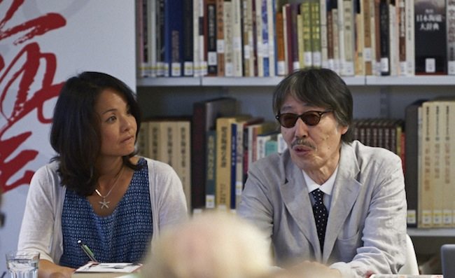
Below is my edited transcription and translation of the SISJAC event. Advertised as a discussion, it ended up a series of mini-lectures by Hayashi on the relationship between art, manga, and animation. That was just fine with me. If the content strikes you as a bit breezy and jerky at times, keep in mind that Hayashi was talking on the fly with frequent interruptions so that an interpreter (Kazuko Morohashi, an artist on SISJAC’s staff) could convey his dense discourse to a novitiate non-Japanophone audience.
Without enumerating them here, I have serious questions about Hayashi’s historiography and interpretations. Whether you are a comics person or an art historian, I am sure you will have your own complaints. But if his art history fails peer review, it really doesn’t matter to me. Hayashi makes art. Given his influence, he has also succeeded in making art history. It is precisely the kinds of leaps and stretches you find in verbal form here that underwrites the surprising visual imagination of his manga. Equally valuable for the critic and historian, one also catches a glimpse of how Hayashi sees art history through the lens of his own practice. Granted, how he thinks at the age of sixty-nine is not a reliable indicator of how he actually thought at twenty, or thirty, or even at fifty. But the distortions are fascinating and instructive, and at the very least they make for a narrative far more interesting than a textbook recitation. This should be a lesson to art historians and critics that they too need to be creative, even at the risk of being wrong. For the manga historian or critic, working in a field dotted with crumbling edifices and surrounded by vast tracts of virgin territory, adventurism is practically a must.

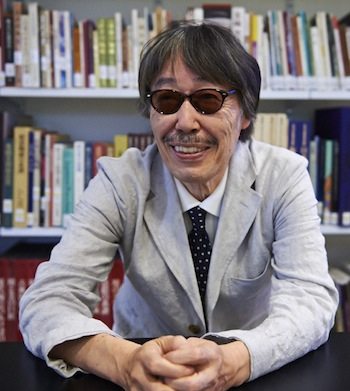
HAYASHI SEIICHI at SISJAC, Norwich, July 3, 2014
INTRO: As someone who did their PhD in art history but works on comics, I am something of a black sheep in my field. When it comes to manga within Japanese art history, traditionally the conversation looked like this: Brigitte Koyama-Richard’s One Thousand Years of Manga. How do you go about explaining manga as part of Japanese art history? Go back to emaki (picture scrolls) from the medieval era, and show how there is narrative in the scrolls, caricature in them, how there is sequential movement, how there is animated action. I like this book, but it's like going back to the Bayeux Tapestry to explain the origins of Western comics.


More recently, there has been a move to recognize manga as an art form in itself, without reference to the past or to institutionalized forms of art. This has led to publications like a recent issue of Geijutsu shinchō featuring the work of Tsuge Yoshiharu. Geijutsu shinchō is a leading art magazine in Japan, associated not with contemporary art in the avant-garde tradition, but arts of a more traditional, more overtly Japanese-y and technically refined nature, as well as the canon of Western art history up to about Picasso. It is rare that issues of Geijutsu shinchō sell out, but apparently this issue did so in about a week.
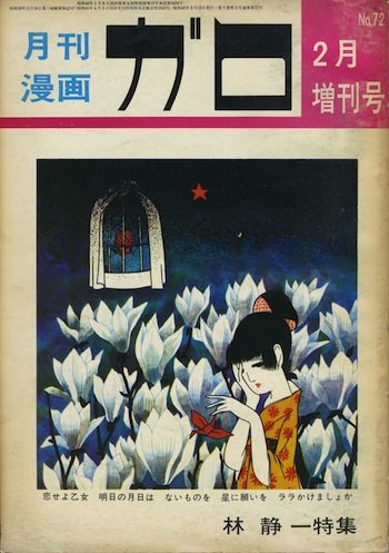
Tsuge Yoshiharu was a major figure in Garo, the same magazine that our guest today, Hayashi Seiichi, contributed to. The magazine was founded in 1964 by the publisher Nagai Katsu’ichi and the cartoonist Shirato Sanpei. It is respected for having entertained more politically leftwing work, and aesthetically experimental work, than what one typically found elsewhere in the manga world at the time. A large number of important artists drew for Garo. Sticking just to the 60s and 70s, there was the non-narrative work of Sasaki Maki, who rose to fame together with Hayashi in 1968. There was Hanawa Kazu’ichi, who combined the imagery of Imperial age boys’ magazine illustration with hard-hitting, political, S/M themes. There were also giants like Mizuki Shigeru, whose yōkai characters are probably known to every living and recently dead Japanese person. Mizuki was also featured in his own special issue of Geijutsu shinchō in 2010. There was a Tezuka Osamu issue of Geijutsu shinchō in 2008, and an Ōtomo Katsuhiro issue in 2012, making for one manga issue every two years. Maybe as we get closer to the tipping point of comics’ full recognition as art, it will become one manga issue every year. And maybe Hayashi sensei will be one of the artists so honored. In keeping with its traditional commitment to fine art and craft, Geijutsu shinchō has tended towards cartoonists whose every panel is meticulously rendered. Hayashi’s work certainly fits the bill.
Hayashi Seiichi was a leading figure not only in comics, but is 60s and 70s Japanese culture in general. He was born not in Japan, but in colonial Manchuria. He and his mother were repatriated to Japan in 1947. At the age of seventeen, immediately after graduating from middle school, he began his professional career as an artist working for Tōei Animation, Japan’s answer to Disney. After Tezuka Osamu’s Astroboy hit the airwaves in 1964, animation studios shifted their weight from theatrical feature-length films to television serials. From making one one-hour movie a year, the studios now had to make one thirty-minute program every week, utterly transforming the way animation was produced in Japan. At the event two days ago at the Japan Foundation, Hayashi explained to the audience just how insane this situation was.
Hayashi’s first manga was a short story published in Garo in 1967. His early work dealt with many themes, including war, defeat, postwar Americanization in both the political and cultural spheres, and the Vietnam War. His work at the time incorporates figures not only from American comic books, but also from Japanese folktales, children’s literature, and art history. Much of his work from this period was inspired by pop music, primarily British and American rock and its Japanese derivatives, and a form of Japanese blues known as enka.
Garo started losing its readership at a dangerous rate in the early 70s, yet survived on a small and maniacally loyal core up until the mid 90s. Hayashi started drawing for a new magazine called Yakō, founded by Takano Shinzō, a former editor at Garo. In the early-mid 70s, he largely withdrew from manga and shifted to illustration, simply because comics made no money. Nevertheless, about every ten years he has plunged back into the medium, reemerging with a new and visionary book-length work, first The pH 4.5 Guppy Will Not Die (1987-89), and then Yumemakura (Dream Pillow), originally drawn in the early 90s, but then redone with a computer and published in 2007. We will be talking about Yumemakura shortly.
Back in the late 60s and early 70s, Hayashi also made his own animated shorts, which were shown widely at festivals in Japan and Europe. He has done a wide range of illustration work: covers for magazines, novels, and record albums, posters for avant-garde theatre troupes, drawings for children’s books and calendars, designs for cups, plates, and other merchandise. He has been active as a writer, publishing two books, one about his life with his mother (Momoko and Me, 1994), and another a personal history of food in postwar Japan. Hours before catching his plane to London, he finished the first article in a new series for the film magazine Kinema junpō.
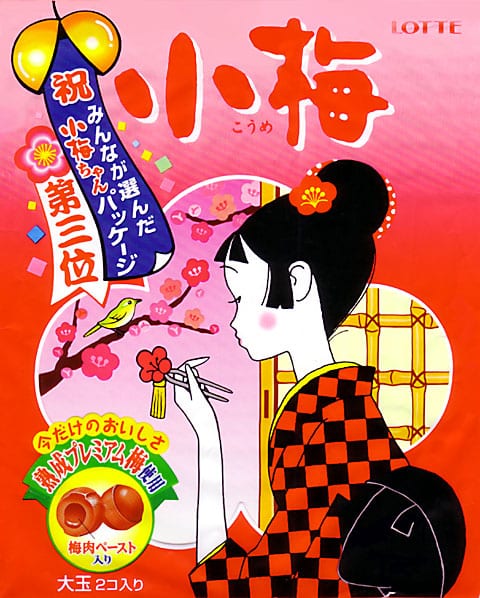
As an artist, he focuses now on painting, which he has been exhibiting since the mid 70s. He is probably most famous for his character and package designs for a type of sour plum candy known as Koume (Little Plum). Walk into any supermarket or convenience store in Japan and you will find these candies. So, in effect, Hayashi’s artwork can be found almost anywhere in Japan. This spring he was busy coming up with new package designs and animated commercials in celebration of Koume’s fortieth anniversary.
That's my introduction. The theme of our talk today is the relationship between manga and Japanese art history. As I said before, comics are only now in the process of being accepted as art in Japan. Hayashi’s work presents an excellent opportunity through which to further this argument. His manga are provocative and aesthetically innovative. There is also an exceptionally strong relationship between his work and Japanese art history, with many references to woodblock prints, for example, or illustrators of the early twentieth century. It is important to point out that this first occurs in Hayashi’s work alongside an engagement with postwar Americanization and symbols of that process like Superman or Batman, who become targets of critique in Hayashi’s early work in the context of the Vietnam War. Hayashi’s art historically sensitive manga work first developed as a form of critical Pop.
The question I would like to open with, however, addresses something more basic. And that is, Hayashi sensei, what do you think is the relationship between manga and traditional Japanese art, in your work or in general?
HAYASHI: Hmmm . . . difficult question.
When I started drawing comics, I think it was with an idea different from what you usually find amongst cartoonists. I wondered if it wasn’t possible to make comics in a Japanese style. That was my experiment.
Why did I start thinking that way? There was a shift at the time from story manga that were just for kids to story manga for young adults. To draw comics for adults, it is necessary that you make them competitive with established media like novels, movies, and the theatre. While manga had begun with simply formed characters, now the characters had to be drawn at life-size, as if from the real world.

In the pictorial tradition of the West, artists have used shadow, for example, to create figures that are like us. Even in Japan, in a special type of painting known as nihonga [modern neo-classical painting], figures are also rendered in way closer to real-life humans. If you look at foreign comics, like those from Marvel or DC, Superman or Batman for example, the characters are relatively realistically drawn, even though the comics were aimed at teenagers. I suspect it was an unconscious process when Japanese cartoonists absorbed this formal sensibility of strongly built characters. It was very rare at the time for a Japanese cartoonist to have graduated from a proper art school, or to have to studied life drawing, whether it be for oil painting or nihonga. Most cartoonists probably taught themselves to draw like that simply by looking at paintings or American comics.
This development poses two serious challenges to picture-making. First, when creating a large world, the manga author has to be sure that the world and the people who act within it possess an equal degree of reality as the reader’s own world. Because they were self-taught, Japanese cartoonists were faced with a unique situation in which they had to figure out how to do this all by themselves.
Important in Western painting is the use of light and shadow. This enables you to create depth and space upon a flat surface. The result can be that you feel like you are looking at an actual event, like a photograph. This has been one of the goals of Western artists for a long time. Then in the twentieth century, artists found this realism to be . . . not a hindrance exactly, but they wanted to head in a different direction. Meanwhile in popular culture, things like Batman and Superman carried on that older tradition.
In the case of manga, there is something called gekiga. From the beginning, it adopted this tradition of light and shadow. I am not saying gekiga cartoonists aped Western tradition, but they did try to copy the crosshatching that you find in, say, someone like Dürer, the kind of thing that someone with a proper art training understands as a matter of course. Early gekiga artists attempted to learn these techniques without that training. This situation was very unique.

When I started making manga, I thought it would be interesting to use the traditional Japanese method of using line to creating form. By the Edo period, this method had achieved a fair degree of realism. I felt that the tradition of using light and shadow probably does not have deep roots amongst the Japanese. I still suspect this. Probably most Japanese cartoonists at the time depended on copying American comics. I thought maybe it would be possible to create comics instead through the Japanese tradition of rendering form through line.
That was a very roundabout answer, but basically the idea was to create manga using line.
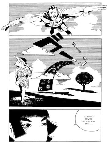
HOLMBERG: As an illustration of what you are talking about, I think this page from Yamanba Lullaby is good. Superman is at the top right, and is done in a volumetric style. At the bottom, you have Kintarō, whose face is kept blank and flat, in which form is constructed through line and solid planes of tone or pattern. Yamanba Lullaby touches on various aspects of modern pop culture, both American and Japanese. But it also draws in a very explicit way on Japanese woodblock prints. Oftentimes when people write about the longer history of manga, looking for the original roots of manga, they cite woodblock prints and woodblock printed books from the Edo period. Do you think there is a connection between modern manga and Edo ukiyoe?
HAYASHI: I think if you look at the early print artists, like Kiyonaga and Harunobu, then move on to Utamaro, you can see an important shift. Utamaro is most famous for so-called ōkubi-e, “large-head pictures.” This mode was already established as a way of drawing figures on paper fans, so some say that Utamaro was not really breaking with tradition. However, I don’t think that explains everything. What makes me think so is the fact that, during Utamaro’s time, Edo overtook Kansai as the economic center of Japan. This marks the beginning of an urban way of life, familiar to most of us, where in cities one is forced face to face with all kinds of people. What Utamaro did was try to capture the personal character traits of specific types of women, some greedy, some careless with their money. There is no need to draw the entire body for this. By focusing on faces, sometimes adding small bodily gestures, Utamaro was striving to capture the new reality of the crowded city space of Edo.

A few years later, an artist named Sharaku began making ōkubi-e. Sharaku has long been shrouded in mystery, but some suspect that Sharaku was actually Utamaro. Even in comparison with later artists like Hokusai and Yoshitoshi, Sharaku’s realistic faces are highly deformed [note: “deforume” in Japanese implies not so much physical malformation as caricature and abstraction]. In the Western context you have someone like Daumier, who drew heavily deformed faces in order to show, say, how fat or skinny people could be. This creation of what you might call “characters” [kyarakutaa], the division of humans into different types, is close in some respects to what Sharaku was doing. I thought this represented a high point in Japanese art and the full ripening of Edo urbanism. In the background, developments in things like medicine, the economy, and politics were headed towards full maturation. Yet if you look at something like Utamaro’s still-lifes, and compare them with the carefully done pictures of Western artists, you can see that the organization of the picture is much less rigorous.
So coming back to your question, I thought it might interesting to draw manga in that mode.
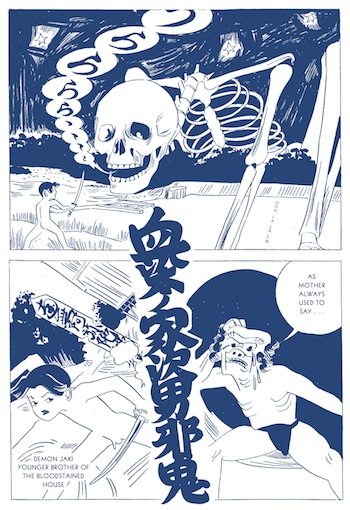
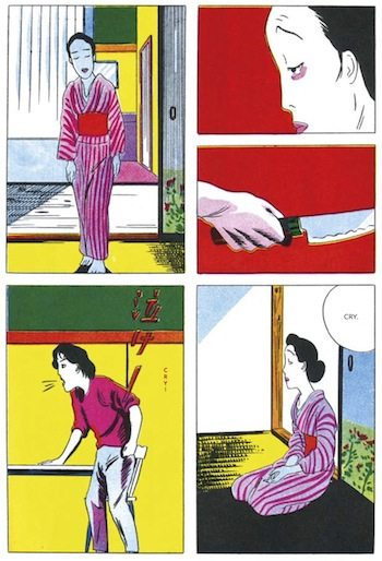
HOLMBERG: Just to give people an idea of other work you did in the 1960s and 70s in which debts to Japanese woodblock prints are fairly clear, I am showing here first a page from Flowering Harbour, a story from 1969, which was published in an English edition by Breakdown Press just yesterday. There’s also this page from Gold Pollen, which was published in English by PictureBox last year, with a reference to a famous triptych by Kuniyoshi.
There’s a lot that could be said with these images about the relationship to art history. But since we are a bit short on time, I want to jump ahead to your most recent book. Early in your career, you used Japanese art history in a rather off-hand way, citing it for various effects in your stories, while your most recent book, Yumemakura (2007), a large format book, deals in depth with not only Japanese art history, but East Asian art, specifically Chinese art, and also Japan’s early confrontation with Western art.
HAYASHI: Well, everything I said earlier has to do with the shift from children’s comics to adult comics. During that process, there was a move to incorporate pictorial realism. I think of myself as part of that movement. What I was trying to do, as I said before, differed from Western painting in that I was not relying on light and shadow. The world that I was trying to create aimed to transcend the existing framework of comics and access the history of East Asian painting, which is not based in light and shadow.
In Chinese art, it was only with the introduction of the technology of oil that paintings started having light and shadow. Such artists were called simply oil painters. In Japan, unfortunately, we ended up instead with a division between nihonga (Japanese-style painting) and yōga (Western-style painting), creating a binary opposition in painting throughout the modern period. With Yumemakura, I wanted to go back to the roots of this, the foundations of East Asian painting without light and shadow, in other words to landscape painting, which I believe appeared in China before it did in the West. And from there I wanted to move into the modern era and the period of confusion that followed with the introduction of oil painting into Japan.
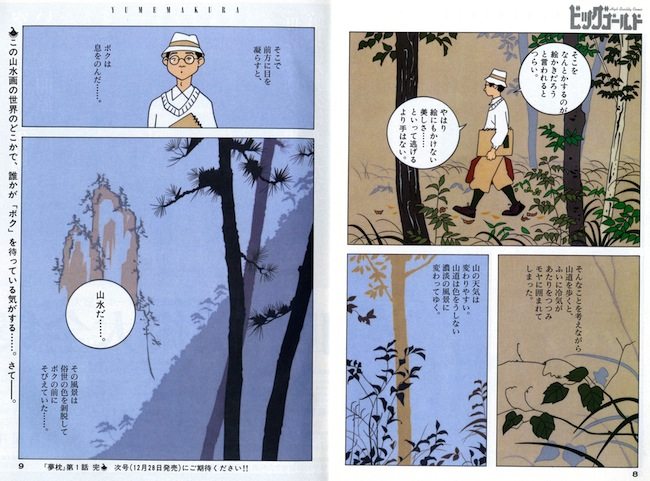
HOLMBERG: Most of your manga, like manga in general, are ink on paper. Using ink on paper, you have at times mimicked the effects of ink painting or woodblock prints. This seems natural: you use a medium of drawing to revive other drawing-based media. Woodblock prints are obviously printed, but they are created on the basis of drawings, at least the line art, which is the aspect that you seem to have been more interested in. Ink painting is called painting in English, but as something that involves the direct application of ink on an erasable surface, it could also be described as a form of drawing. But with Yumemakura, the relationship to art history is very different. The work actually exists in two versions. It was first made for Big Comic Gold in 1991, and used animation cels. And then remade in 2007 for Parco using computer graphics. I wonder if you can say something about this shift, the fact that you are now using modern technologies, animation cels and computer graphics, to engage with Japanese art history.
HAYASHI: This is going to be another long answer.
As young adult manga more firmly planted its feet within realism, this eventually caused a situation in which manga merged with new developments in the sphere of painting. What was occurring in the West at the time was an attempt to revive figuration for the first time since its abandonment in the modern period. This was known as the hyperrealism movement, which first emerged in the late 60s. I cannot remember the person’s name, but one Western critic said ironically that with hyperrealism one is finally able to comprehend again what paintings are trying to depict. This was different from earlier realism in that, though representing things as carefully as did say Van Eyck, the artists were depicting New York skyscrapers, supermarkets, and other things that were visible everywhere at the time. I think they were very successful in what they did.
Where was gekiga headed at that point? Its artists were trying to depict things even more carefully, more accurately, and more realistically.
It is useful to remember shifts that happened in film, the move from black and white to color, and the first time the actor on the screen was able to talk. The history of movies is made up of these kind surprising twists and turns. As for comics, of course there are many foreign comics with color, but in the context of Japan in the early 70s I think I might have been the only one making color comics, for example with works like Dwelling in Flowers. When you have color, the image inside the panel more closely approximates the real world. It was with that understanding that I first experimented with color. Alas, there was a French magazine that beat me by starting to publish color comics right before this. I tip my hat to their pursuit of the real. At any rate, I was thinking that Japan, a small island nation, needed to fight harder and do something to catch people’s attention on the international stage. So I continued making color works after this. It might surprise you to know that my work with color was motivated by such strong feelings.
The next step was to create manga and pictures with a computer. As the young people amongst you know, graphics software has something called layers. These layers are related to a type of equipment known as the seven-tiered multiplane camera. The one at Tōei Animation, where I had my first job, was exactly the same as the one at Disney Studios. When Disney first started making films for theatres, the studio simply used transparencies with painted figures, placed over a background that shows through. If you watch not just early Disney, but also early Fleischer, you will notice that there is hardly any depth to the pictures, only just a flat surface with Mickey Mouse or whomever moving around.
Then came Disney’s technological revolution. Disney talks about this in his autobiography, but until then animation had been nothing more than a supplement to live action feature films. What Disney did was put a background behind the background, and then yet another background behind those, in order to create space. Why create space? So that animated films could capture viewer’s attention like live action films. What made that possible was Disney’s invention of the multiplane camera, with seven tiers of imagery and a camera above. One of the representative movies using this technology is Peter Pan. The opening scene shows Peter Pan and the children flying above London through many layers of clouds. This was created using a multiplane camera. Things in the foreground are out of focus, and things in the background are also out of focus, while the area where Peter Pan is flying is shown clearly. Below you can see London at night.

Now finally returning to your question. Graphics software is also designed to handle different images through layers. If you look at this landscape panel from the second version of Yumemakura, in the background you see that the diagonal range of mountains is out of focus. The mountains even further in the background are also out of focus. With CG layers, you can create the same effect that Disney did with the multiplane camera. You can create an image with a higher degree of reality than what is possible by carefully drawing a single picture on a sheet of paper.
HOLMBERG: I have more questions, but we have run out of time and my head is full, and I think before our interpreter, Kazuko, short-circuits, we should bring this to a close. Thank you Hayashi sensei. And thank you SISJAC.


