In 2014, superheroes dominate America’s comic-book shops and the graphic novel sections of major bookstores. But it wasn’t always this way. In the early 1970s, drugstore and supermarket spinner racks overflowed with an array of genres: adventure, horror, sci-fi, mystery, romance, western, war, and comedy. Like their superhero counterparts, these mass-produced comics frequently regurgitated tired ideas, relying on familiar character types, plots, and art styles. Since publishers needed to crank out dozens of titles per month and meet sales goals, they embraced easily executed — and easily digested — formulas. Yet, we can find artists eager to move past clichés if we search in the right places — which often means exploring stories without caped crusaders. In 1972, the innovative work of Jack Kirby and Alex Niño graced spinner racks and challenged readers of Weird Mystery Tales and Adventure Comics.
* The Despair of Jack Kirby
The covers of DC’s Weird Mystery Tales typically present readers with a conventional scenario: humans in imminent danger from a non-human menace. Many issues employ a version of this set-up we could call the “monstrous villain/female victim” format:
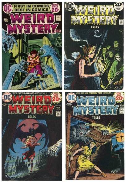
Nick Cardy’s cover for Weird Mystery Tales #3 sells Jack Kirby’s “The Burners!”, the issue’s first story, as standard "monster vs. female” material.

Yet the cover illustration (likely suggested by an editor) fundamentally misrepresents Kirby's premise. Rather than portray a typical ’70s comic-book conflict, “The Burners!” examines the physiology and psychology of despair. The blue flame — personified on the cover but not in the story — emerges internally, from the character’s despondency. In fact, the story avoids conventional bad guys and dramatic confrontations. There’s no battle, no chase. And there’s no sexy blonde — only unattractive people who have given up on life and spontaneously combust.
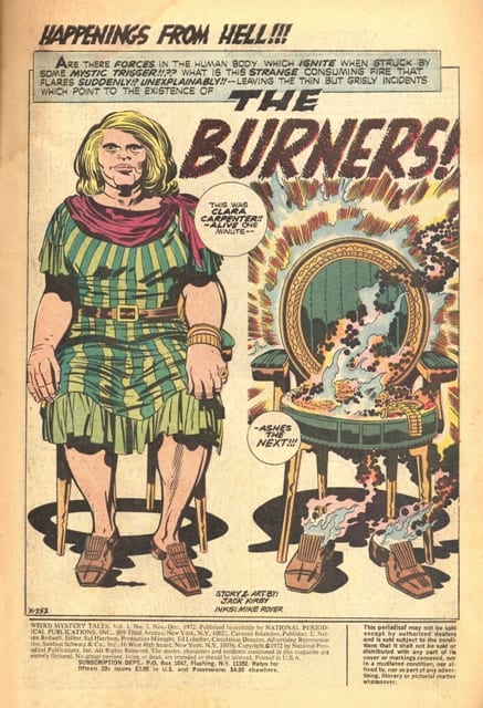
On the story's opening page, Clara, a very masculine woman — the antithesis of Cardy’s svelte and active cover girl — sits motionless and stares blankly. She’s not running from anything:
The next moment she's gone.
Comic readers in 1972 expected to see desirable women, whether they were heroes, villains, or victims. To open a comic and be stared at by a character most young males would have considered old, overweight, ugly, flat-chested — a near-grotesque, impossible to fantasize about woman — must have been a surprise. Kirby was writing/drawing against the grain. Were readers happy that Clara disappeared so soon?
Kirby’s comic recounts a series of ‘case studies in alienation.’ In one scene, a woman dances by herself in public, surrounded by several un-Clara-esque, fantasy-friendly women. The narrator reveals very little about the “flaming dancer” — and the panel doesn’t depict her — but he leads us to believe that, for some reason, she can’t tolerate the sight of so many happy couples — so she combusts, engulfed in blue flame:

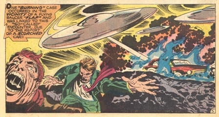
Did she go to the dance in order to commit public suicide? Did she will herself to combust? Kirby’s paranormal investigator/narrator Dr. Leopold Maas (an allusion to The Crying of Lot 49’s sleuth Oedipa Maas?), notes that popular wisdom connects the flame’s mystery to a material phenomenon: UFOs. Kirby knows that comic readers want visually exciting confrontations — like those in the superhero-adventure stories he was famous for — and prefer fantastic explanations to melancholy ones. Perhaps in a nod to readers’ desires, he draws the conventional (but false) explanation of the flame in the story’s most unusual panel, a full-page photo-montage of a UFO shooting blue rays

and in the over-the-top chaos of this full-row panel:
 Kirby doesn’t stay with one character for more than a few panels, perhaps because he wants to show several dramatic, reader-friendly scenes of violent combustion and its aftermath. He leaves us to imagine the kinds of lives that led to such profound anguish:

Loneliness might not be visually interesting enough for the era’s comic-book readers, some of whom might have felt they were sold one thing (i.e., what the cover promised) and then received another. Perhaps Weird Mystery Tales’s editor anticipated such disappointment, telling readers that Kirby's story was originally created for publication elsewhere, in Spirit World, a short-lived magazine format comic Kirby had edited. Unlike “The Burners!”, Kirby’s previous Weird Mystery Tales comic, “Toxl, The World Killer!” (WMT #2) delivered what readers expected from the King: non-stop, man-muscle hero vs. villain action. They wanted artists to "put on a great show":

The disconnect between Weird Mystery Tales #3’s cover and Kirby’s story may reveal that mainstream editors lacked faith in their readers’ ability to appreciate a story about alienation, a condition that many teenagers certainly could have identified with. But to get high sales, you have to give the people what they want: action, danger, sex. So the cover substitutes Cardy’s model — a young blonde in a low-cut red dress and stylish red scarf —for Kirby’s mannish older blonde in frumpy peasant clothes. And it distorts and demystifies Kirby’s blue flame — a representation of a hard-to-understand internal drama — by personifying it as an external menace just about to have its (i.e., his) way with a victim.
If Kirby’s opening image of Clara

appeared on the cover, it would have made a far weirder presentation and sales pitch, one more in tune with the notion of “weird mystery.” What if Kirby (who was 55 at the time, near the despondent Otto’s age) felt free to experiment dramatically with pacing, to slow things down and stay longer with each character? I wonder what kind of story he might have created . . .
Although Kirby believed that comics could embrace adult themes and address a more sophisticated readership — this belief inspired him to create Spirit World — perhaps he also had his doubts. Maybe he played a willing role in hyping and misrepresenting “The Burners!” Positioned like a kind of subtitle, the first words readers see promise something spectacularly satanic:
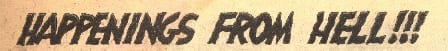
This set-up and its excessive exclamation points!!! violate the story’s premise, directing attention away from the psychological dilemmas that drive its plot. In “The Burners!” there’s no villainous blue flame and no hell-spawn demons. Just deeply troubled people.
____________________________________________
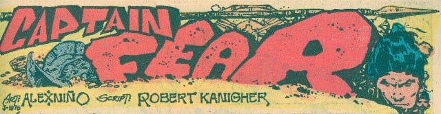
* The Many Faces of Alex Niño
Alex Niño was one of a host of inventive Philippine artists hired by DC Comics in the early ’70s. In Adventure Comics #425, Niño, an under-appreciated stylist, makes some highly unusual and compelling artistic choices. He repeatedly — and radically — changes the look of his characters’ faces throughout the story.
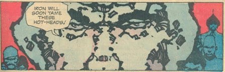
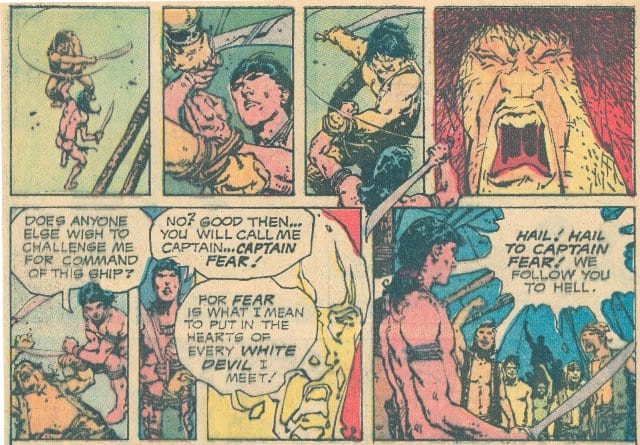
The title illustration below features three objects that represent the comic’s central conflict: the helmet of a Spanish Conquistador, the spear of a Caribbean Indian, and the face of the natives’ leader, Fero (who names himself “Captain Fear,” hoping to generate terror in the “white devils” out to enslave him). Niño draws this face in what we could call the story’s ‘baseline style’:
Yet on page two, Fero’s and his father’s faces deviate significantly from this approach. Niño uses an almost pixelated effect, as if enlarging a photo that can’t take being blown up and becomes blocky:

A close-up of the Spanish leader receives a similar, though even more abstract treatment:
The next close-up employs a thick and rounded inking style:
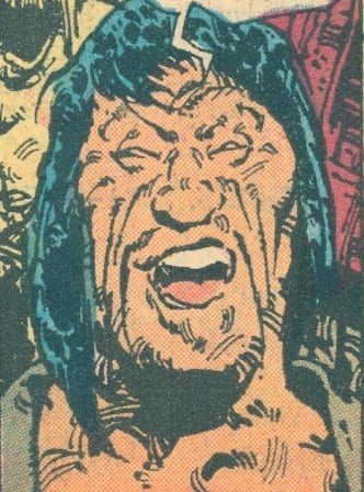
 The next face (Fero again):

Stylistically, this face resembles the previous one, with its smooth areas of brushed black ink. But the coloring provides a distinct, statue-like effect. I’m not sure who colored the story — no credit is given — but he or she understands Niño’s technique and selects a different palette for each new face style, a palette that’s distinct from the story’s general approach to coloring characters and settings.
As Fero slays a pirate, Niño employs another cartoony style of distortion. The pirate’s head almost melts as his hair disintegrates and mouth contorts:
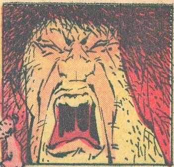
Here is the same character’s face — drawn in the baseline style — a few panels earlier:
When Fero christens himself “Captain Fear” in the penultimate panel, Nino designs his face in a way that resembles a picture taken by a thermal imaging device — this look suggests the “white hot” intensity of his rage and echoes the panel's bolded word “WHITE.” This face

looks like a looser version the statue effect used earlier:
Faces shift style as the characters change emotions.
Here are the two prior faces in the context of the story's final eight panels:
Niño’s approach to faces throughout “Captain Fear” likely owes a debt to the kinds of distortions that characterize 1960s and ’70s psychedelic art, a style often interested in portraying shifting states of perception and consciousness by evoking the visual experiences of someone on a hallucinogenic drug. There is something trippy about reading a comic whose main characters continually transform in front of your eyes . . .
In humor comics, artists often shift facial styles, using dramatic forms of exaggeration:
In adventure comics, while artists might employ facial distortion, they tend not to move between distinct styles that appear only for a single panel. I can't think of many artists in any genre who use so many visual strategies within a single piece. Niño's technique is radical — a fresh way of drawing / seeing.
Perhaps there’s something about the integrity of older mass-produced comics that makes the effect Niño employs — or perhaps the effect it has on readers — distinctly a comics’ one. While his changes are striking, the basic printing and production methods of the 1970s (the way comics had been produced for decades) give a kind of naturalness to something that otherwise might be jarring, especially if used, say, in a movie. The warm, flat colors printed on newsprint ensure that the images don’t jump out at readers in the way they might if printed on the glossy paper of current mainstream comics, which often employ hyperactive, video game-influenced coloring styles.
Like “The Burners!”, “Captain Fear” looked beyond the era’s artistic formulas. Both stories displayed a belief that the human mind, not the superhuman body, offered an inexhaustible source of drama and conflict. The mind’s many faces were fertile terrain for restless comic-book artists like Kirby and Niño.
_____________________________________________
Story Credits:
Weird Mystery Tales #3 (November-December 1972)
Cover Pencil Art and Inks: Nick Cardy
Colors: Unknown
“The Burners!”
Story and Pencil Art: Jack Kirby
Inks and Letters: Mike Royer
Colors: Unknown
(Reprinted in black and white in DC Comic’s 2012 Spirit World collection)
“Captain Fear,” Adventure Comics #425 (December 1972-January 1973)
Story: Robert Kanigher
Pencil Art and Inks: Alex Niño
Colors: Unknown
(In Adventure Comics #426 — the second part of “Captain Fear” — Niño draws the story in a single style.)


