How Comics Work, by Dave Gibbons and Tim Pilcher, and published by Wellfleet Press, is an ideal "How To" book for the beginner or dilettante. It is exactly the type of book I would have wanted as a young person searching for clues about how to make comics. It is also, in some ways, a retort to How to Draw Comics the Marvel Way. Indeed, this book could have been called How to Draw Comics the DC Way, despite the plethora of examples of great comics from all over (non-DC) comics history. There are plenty of examples of Mr. Gibbons drawing Marvel characters but so entrenched in my mind is his DC work that it feels like a "DC" book. The awful cover meant to move units makes it feel that way, too.
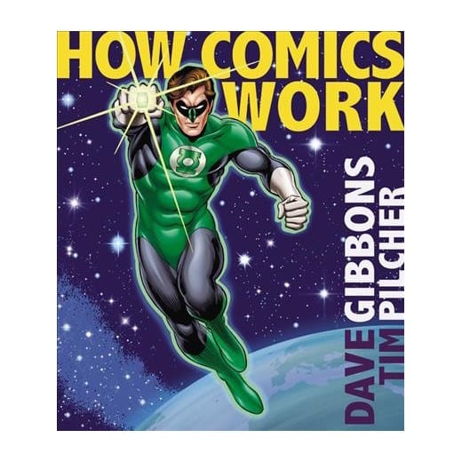
Don't get me wrong, I love the work of Dave Gibbons, and hold it in the highest esteem. It's just that I wish the cover wasn't a giant Green Lantern advertisement and a pitch to the elusive market of young persons who know Green Lantern from some character on a popular TV show wearing a Green Lantern shirt. I know, I know, Gibbons did a definitive Green Lantern star turn. But the cover looks like a bad Gil Kane imitation and it has the poorest design in an otherwise flawlessly designed how to draw comics compendium. The cover is my biggest gripe with this book, so I thought I would get it out of the way first. I blame the publisher for that one slip, not Mr. Gibbons. Instead of being sold as a Dave Gibbons comic book artist masterclass, it is billed as "Green Lantern will show you how comics work with his magic ring."
I guess it could have been worse. While deciding on whether I should take my own photo of the book's cover or if I should find one on the internet, I came across the alternate cover below, which isn't much better. For a book that has pages and pages of "How To Make A Comic Book Cover" chapters, this isn't promising, is it? Why are "comics people" so often befuddled on how to make a good cover for the book trade? This is worse than that "so bad, it's good" Rich Buckler "Secrets of Drawing Comics" comic book from the '80s. How about just a classy photo of the distinguished auteur at his desk surrounded by his stuff? Why does it always have to be middle-of-the-road comics crap?

In the introduction, Tim Pilcher explains that this book is "The Dave Gibbons Way," making direct reference to the Buscema/Lee book from the mid-'70s, which is the gold standard amongst the elusive young persons' market of people who buy "how to draw comics" textbooks. Again, I love me some Dave Gibbons. The guy can work a nine-panel grid like no one else. The guy can design incredible pages from incomprehensible scripts, pencil the pages, ink the pages, letter the pages, color the pages, and show you exactly how it is all done. Mr. Gibbons is truly a master cartoonist, er, comics artist. However, because the book is intended for hopeful artists and fans just looking to hang around the studio to catch all the shop talk, it sort of falls into the dreaded negative zone called "the middle of the road."
I know, for example, that there are other places I can find Mr. Gibbons and Alan Moore's ideas on using the nine-panel grid for Watchmen, but it feels like a missed opportunity (and a shame) that Gibbons' brief remarks on the subject here are limited to a few sentences. The whole "Grid Structures" chapter is only a few pages. The chapter on "Page Layouts" is also unfortunately brief. Knowing that entire books can be written on the subject, it feels like it was purposely abbreviated. Many more pages are devoted to front cover designs, wraparound cover designs, back cover designs, splash page designs, and all the other flashy crap that "looks good" when flipping through the book. I understand that concession, but it feels like a loss to me. The point of the nine-panel grid, as Gibbons notes in his brief remarks, was a response to splashy layouts of the mid-1980s. And yet in this department of "How to Do It the Gibbons Way," we get more splash and flash than masterclass calculus problem solving.

Nevertheless, it is a solid book, and otherwise quite thorough. The design of the book is, as I said, flawless. I appreciate the way each "spread" is arranged. Each chapter is a spread or a consecutive series of spreads. AThe spreads themselves are well designed so that the idea is transmitted clearly. This is the tricky bit where most books like this fail miserably. It is indeed this book's strongest suit. Each spread leads into the next so from beginning to end there is a very clear exposition of how it is done. Particularly when it gets into the 2017 version of digital outputting and all that. This is why this book is great for making comics in the digital age. Comics is a strange combination of hand-drawn and digitally made processes now. And Mr. Gibbons is schooled in both traditions and makes it very clear the advantages of his professional experience. Many of the best "How To" books on comics made in the last ten years have outdated information in them regarding this subject and often that info comes from folks with less experience making professional mainstream comics.
The chapters on comic book lettering and balloon "flow" and placement are also very well done. Gibbons is a fantastic letterer and there are pages and pages of examples and insider knowledge about this dying artform. I remember meeting Tom Orzechowski at a comic convention in Cleveland, and he told me the hand-lettering scene was “dead as a donkey.” He was selling little pieces of bristol board with "Biff" and "Pow" sound effects laboriously hand-lettered upon them. There is a bit of a renewal in interest of "old time" lettering done by hand and Mr. Gibbons does a great job of walking the lay person and expert alike through the explanation of "the world that was" of hand lettering and "the world that is" of digital lettering.
I really like this book and wish I could give it a more ringing endorsement. However, Mr. Gibbons was one of the proponents of "mature" and "forward thinking" comics once upon a time. I can't help but think we haven't come very far from the "comics aren't for kids anymore" vibe which often accompanied a review of a comic Mr. Gibbons' was associated with, and this book makes me feel that way. That comics are still for kids, and that comics is all about superheroes. This book is for kids, really. Lots of pages on designing superheroes and all that. I had a feeling this book was going to be for the beginner but secretly, I hoped, hidden in plain sight would be manna for the expert. There are rivulets of manna congealed in there somewhere but I wanted a book not meant for the mass market. I wanted a book for the snobby comics know-it-all like myself, which is, I know, unfair. But since I am one of the "kids" Mr. Gibbons helped "turn on," this is, to me, a penalty shot goal — not the incredible play made by a superstar on a breakaway that I was hoping for.


