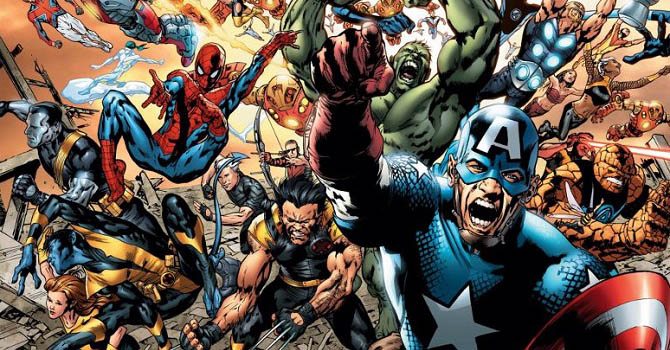
We have come a long way from the cranky use of color in the old superhero comics, a tedious process all done by hand, to the eye-candy colors of modern books.
In the '90s the hand was replaced by computers. Pioneers like Steve Oliff paved the way to a new conception of colors in mainstream comics with his works on Akira and Spawn (production values-wise, Image was instrumental in the popularization of digital colors). For years, colorists were underappreciated by the industry, and reviewers and critics rarely wrote about their efforts. Now a new generation of artists are shaking things up. Colorists are actually helping to sell more books and “Colorist Appreciation Day” brought the spotlight on their craft. Even an institution of old-fashioned black-and-white comics like Sergio Bonelli Editore, the Italian publisher of Tex and Dylan Dog, has added color to its latest series, Orfani, a sci-fi spectacle that uses colors as a vital feature.
Artists like Dash Shaw have recently pushed the envelope in using color as a primary tool in the making of their works. In the mainstream world too, color in comic books has become more that a spot of red on Superman’s cape. So we decided to gather some of the most important colorists from all around the world and make them talk about the pros and cons of their job, the best and worst ways to color, the effects of new digital tools, and oh yes, how much they get paid.
First, let me introduce the participants:
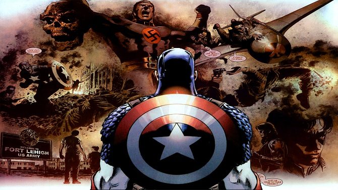
Frank D’Armata, a Marvel evergreen, has worked on long runs on Iron Man, New Avengers, Captain America, and Astonishing X-Men.
Lorenzo De Felici and Annalisa Leoni work, for the biggest Italian comic book editor, Sergio Bonelli Editore (Tex, Dylan Dog). They colored a recent Bonelli production, the sci-fi series Orfani.
Brigitte Findakly works with French masters like Joann Sfar, Manu Larcenet, and Lewis Trondheim (who is also her husband).
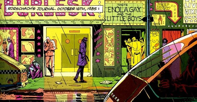
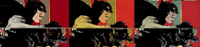
John Higgins colored Watchmen and Batman: The Killing Joke. I think that’s enough.
Matt Hollingsworth (Hellblazer, Daredevil, Hawkeye, Preacher, Alias) is one of the best regarded colorists in the industry. He’s also a judge in beer contests.
Paul Mounts is a close collaborator of Bryan Hitch's, but he has also worked on Wanted, Harley Quinn, and FF.
Ruby's real name is Véronique Dorey. She’s the colorist of Cyril Pedrosa (Brigade Fantôme, Auto bio, Portugal) and she works mostly in the French market.
José Villarrubia has colored pages for Jae Lee, Paul Pope, and Jeff Lemire and worked for Marvel, DC, Dark Horse, and Valiant.
Matthew Wilson is the third member of the award-winning team behind Phonogram, The Wicked + The Divine, and Young Avengers.

So, what’s your background?
Brigitte Findakly: I’m self-taught. I studied economics and during my youth I met writers and artists who gave me the chance to become a colorist.
Lorenzo De Felici: I studied at the Scuola Romana dei Fumetti (an Italian school for comic book artists in Rome) and right after I got the degree I started working as a storyboard artist and colorist.
Annalisa Leoni: Like Lorenzo, I studied at the Scuola Romana dei Fumetti. Before that I never attempted any artistic study. During my school years I started working, mostly in animation, as a storyboard artist and environment designer. My first works as a colorist were published much later, for Piemme Junior and Glénat.
John Higgins: Art college, three years' training as illustrator and technical artist/anatomist and traditional painter (oil paint, Gouache, etc). We had a wide spread of art disciplines in the course I took.
José Villarrubia: I took private lessons in painting and drawings since I was 12 years old. I also attended an academy and later the University of Madrid. I then transferred to the Maryland Institute College of Art in Baltimore and graduated with a Bachelor's degree in Fine Art. I then studied and received a Master of Fine Arts degree from Towson University.
Paul Mounts: I went to the American Academy of Art in Chicago, Illinois. I studied two years of life drawing, one year of graphic design, and one year of illustration. After graduation, I worked at The Storyboard Studio in Chicago for three years doing storyboards and animatics for television commercials before entering the comics world. At the time, there were several comics publishers in Chicago, including NOW Comics, First Comics and, later, Comico. I eventually became the editor/art director of NOW Comics (using the pseudonym Cygnet Ash), where I also wrote, penciled, inked, lettered, painted covers, and designed comics, as well as handling the coloring.
Matt Hollingsworth: I attended the Joe Kubert school straight out of high school and learned color there. The school doesn't allow you to specialize until third year, so you have to learn all skill sets for comic book production from lettering and design to pencils, inks, colors, and painting. I had a great painting teacher there, a guy named Dennis Corrigan, and he had a big influence on me and inspired in me a love for color and painting. I enjoyed the painting and design classes the best. Starting around the middle of second year, I started going to Marvel and DC in New York to show them my portfolio on a regular basis.
What year are we talking about?
Matt Hollingsworth: 1990. In those days I was able to just call editors up on the phone and make an appointment with them. I think there's no way in hell they would do that these days. Anyway, I started to regularly visit them. I would listen to what they had to say and try to incorporate that into any new work I did, learning from them as well as school. The next time I went in, I would have an entirely new portfolio to show them and they could see I was improving and listening to their input. I was showing inks as well in the early stages of this, but eventually dropped those. I loved colors much more and was growing there more than in inks and the inks were dragging me down. In third year at the school, I specialized in color, so I was doing almost entirely color work with input from teachers. I kept going up to Marvel and DC. I graduated from JKS in May of 1991, on a Wednesday. On Friday I went up to Marvel and DC again and they both gave me work. Mike Carlin at DC gave me work on an Action Comics Annual and Marcus McLaurin gave me fully painted color work on Hellraiser. I kept working for both and eventually ended up working very closely with Michael Golden at DC. He was great at shooting straight with me and I sort of considered him a mentor for a year or so in the very early 1990s. I continued working for DC and Marvel and eventually ended up much more at DC, then also Dark Horse, where I went staff for one year from 1993 to 1994.
Matthew Wilson: I went to art school and studied comic books at Savannah College of Art and Design (SCAD). After I graduated from university I worked in a comics coloring studio owned by the colorist Lee Loughridge, called Zylonol Studios. At Zylonol I was able to gain a lot of experience in coloring comic books. I think the most important lesson I learned there was how to meet deadlines. The studio worked on a lot of comic books, and we constantly had work due to turn in. After working at Zylonol for five years I began to get coloring work on my own, starting with a small story in an anthology, and then coloring a few different Image books for Jamie McKelvie (Suburban Glamour) and then Jamie McKelvie along with Kieron Gillen (Phonogram Vol 2: The Singles Club). My first big break was coloring a single issue for Marvel. I got that job because a writer I was friends was friends with the artist, and the artist needed a colorist that he liked. The artist looked at some of my work and then recommended me to the editors at Marvel and I got the job. At the same time Kieron Gillen, Jamie McKelvie, and a few other collaborators began to get jobs at Marvel, and they also recommended me to color their books. All of these recommendations landed in the email inboxes of Marvel editors at about the same time and I quickly became a regular colorist at Marvel.
To an outsider like me, a colorist seems something like the director of photography or the editor of a movie. As a kid, you always want to be the director, not the DP or the editor. Did you always want to become a colorist or did you find it along the way? What attracted you to the job?
Lorenzo De Felici: When you're a kid you just want to be a director. You don’t even know what a DP does. Sadly, even grownups don’t know what a DP does. I never thought about becoming a colorist. I’ve always loved drawing. Actually, when I started working as a colorist I did it just because I wanted to be in the industry, even if my "penciler side" was not ready yet.
Annalisa Leoni: Being a colorist was never a dream of mine. When I was in high school, I just wanted to work in the world of comic books or animation. I started as a penciler and only then I fell into coloring. The interesting thing is that with colors you can make emotions palpable, you can drive the tone and the mood of a scene just with lighting and colors.
John Higgins: Me too. The last thing on my list was to be a colorist. I fell into it by being one of the few comic artists in British comics at that time (most regular comic strips were usually b/w) that used color and was free to take on a small job called Watchmen when asked to by Dave Gibbons.
Paul Mounts: I actually always wanted to be the director of photography or the cinematographer. As I said above, I handled almost every job in comics, but the ability to use color to set the mood and tone and truly affect the storytelling in a way that hadn’t been done in American comics at that date (1987! Most comics were still limited flat color on newsprint) appealed to me. Beautiful color work was being done in many European comic albums at the time, but hadn’t really been explored in the U.S.
José Villarrubia: No, I never set up to be a colorist. Was a teen, I wanted to draw comics, but when that did not pan out, I became a professional fine art painter. It was not until many years later, when my dear friend Jae Lee asked me to color him, that I thought of doing it.
Matt Hollingsworth: I discovered coloring while at the Kubert School and stuck with it. I did some inking there as well and enjoyed that, but never loved it. When I went pro, it was just colors and I loved it straight away. I like setting the mood of the story, setting the scene with color and doing design with color.
Matthew Wilson: I did not set out to become a comics colorist. I didn’t really know anything about doing digital coloring for comics until my last year at university. I grew up drawing, painting, coloring with design markers, and sculpting. I also enjoyed making home movies with my friends, and went to several film camps when I was a teenager. So, when I started studying at SCAD I intended to pursue a degree in film making. But after my first year I decided that I shouldn’t waste my drawing abilities, and choose to study comic books instead. It shared many of the things I enjoyed about film-making but just used drawing instead of a camera so it seemed like a good fit for me. During my studies I took a class about coloring comic books. I did well in the class and really enjoyed the coloring process. When I finished school I looked for any job that involved creating art, and almost took a job as a concept artist at a video game company. At the same time that I was interviewing at the video game company I also visited Lee Loughridge at Zylonol Studios. A position opened up at Zylonol, and Lee offered me the job. I choose to take the position at Zylonol instead of pursuing the video game job. While working at Zylonol I learned a lot about coloring by doing it and studying what other colorists in the industry were doing. The first comics coloring that made an impression on me, and has had a lasting influence, was a Vertigo book called Beware the Creeper. It was drawn by Cliff Chiang and colored by Dave Stewart. After that I began to search out other coloristss work, as well as watch and learn from Lee in the studio, and tried hard to refine my style of coloring.
Explain to us what a flatter is. You all have a flatter, right? And why they don’t get credit for their work?
John Higgins: A “flatter” blocks in the black line artwork dropping in flat color to define the shapes. The colorist then goes in and adds light and shade tonally. The flatter tends to be an untrained colorist, so I think they do not get a “creative” credit as it is not a creative discipline. I give my “flatter” a full credit as it is easier to do that than to ignore her! (My wife is my designer/color collaborator and flatter.)
José Villarrubia: A flatter prepares the page for coloring. They pick colors that are not used at the end. That is why they are not normally credited.
Matt Hollingsworth: A flatter can do different jobs for different people. For some people, they actually choose the colors. If they do that, they should get a credit since their colors are used. But I think this is very rare. For me, the flatter simply traces everything out and fills with random colors. I then change all of the colors and do the rendering. If they are only tracing everything out, no, I don't think they should get credit. It's a support job and not creative if they are only doing that. Part of that is that most people don't know what they do, so if it said “flats” in the credits, people might think they made the color choices, which in my case they never do. I consider the color choices to be the most important part of coloring and would never leave that to anyone else. That said, I value my flatter and pay them very well compared to other people, as far as I know.
Matthew Wilson: Yes, I do use a flatter. A flatter is someone that does the first step in the coloring process. They take the black-and-white page, and put down flat colors so the colorist can easily select those colors and create the finished colors. Imagine a black-and-white drawing of a man standing in a grassy field with a sky behind him. The flatter puts down a color for the grass, colors for the man’s clothes, skin, hair, eyes, etc., and a color for the sky. Now, when I receive that flatted image I can quickly select the sky, or the grass, or the man with a few clicks of the mouse. Once I’ve selected one of those elements I can then begin to change it’s color, or paint over it, rather than spend time individually outlining each shape myself. The colors that flatters put down don’t have to be correct, and are almost always very different from what the finished colors look like. As the colorist I pick colors that best fit the story, either enhancing the mood or conveying the location. Whereas the flatter’s job is to give the colorist a simple base to work from. Employing a flatter saves me anywhere from 45 minutes to 2 hours per page. This allows me to color multiple books a month because I can focus on the coloring and not worry about the flatting. And you are correct, a flatter is often not credited in comics. When I started at Zylonol I flatted for Lee, and for many years I flatted my own work. It’s often an entry-level position for someone wanting to become a colorist. To me, since I’ve been a flatter, I don’t mind that flatters aren’t credited in comics. It didn’t bother me that I wasn’t credited as a flatter. I looked at it as a step I needed to take to become a colorist, and once I began coloring books I would receive credit. But that was just my personal feeling about being a flatter and not receiving any credit. It just didn’t bother me. That said, I have no problem giving a flatter credit in books where I have control over that sort of thing. For example, I’ll probably never be able to get my flatter credited in a Marvel or DC book. But, in a creator-owned book like The Wicked + The Divine, we credit my flatter (Dee Cunniffe). It was Kieron’s idea to do it, and I thought it was a terrific idea. There’s only a handful of us responsible for creating that comic, and Dee is definitely a big part of us being able to get the pages done on time each month, so I’m happy to have him in the credits.
What makes a good or bad colorist? A writer can write bad dialogue, an artist can mess up the anatomy or not having a strong sense of composition or storytelling. What can a colorist do to make a bad page?
John Higgins: To not read the story. You need to understand who the characters are and how they feel and what they are doing at any given time of day, so you know when the colors have to change, indoor or outdoor color should be different. If the colorist has no sympathy for the flow of the story then that would make a bad page.
Lorenzo De Felici: In general, everything that puts itself between the page and the reader. Your attention should not be focused on colors and colors should not change or cover the line of the artist. You can commit so many little "sins": incorrect shadows, dark colors, wrong juxtapositions. The good colorist is the one who works in sync with the artist without showing off.
Annalisa Leoni: A bad colorist is the one who doesn’t respect the artist’s work. You must be adaptable and functional. Also, the storytelling is very important. You must know how to tell a story with colors, guide the reader to a simple and effective comprehension of the page.
Ruby: That’s right. An example: when I started working on Le roi des mouches I realized I was using colors that were too bright and not useful to the story. It was all too vivid, and that can be a mistake too. So I went with earthy colors, a few lights just to give the sense of volume and shape.
Paul Mounts: Like a great cinematographer on a film is there to help tell the writer and director’s story, the color artist’s main job is to help bring forth the vision of the writer and line artist. Color should set the tone, and direct the eye through the panels and pages. Bad color has everything over-rendered to the point where even small background objects are made as important as what the eye is actually supposed to see. Or, where in the name of "realism," everything is grey and murky, and nothing leads the eye to where it needs to go. And both of these problems also tend to obscure the line art that the penciler/inker has worked so hard on.
José Villarrubia: It is a matter of taste. The worst thing a colorist can have, is, of course, poor color sense. The second is not respecting the drawing, the light sources, or the anatomy…
Matthew Wilson: A good colorist is someone who enhances or complements the artwork, never overpowers it, and uses their colors to add a layer of storytelling to the page. To enhance or complement the artwork, a good colorist has to consider what the right approach might be to each artist’s work as they begin a project. A colorist should adapt their style to suit the work, and never do something that fights against the inks, or needlessly overpowers the artwork. You may want to paint every leaf on a tree, but does that best suit the artwork? You may not want to add shadows and highlights to the faces, but might they look better if you did? Different art requires different approaches. To add a layer of storytelling the colorist needs to read the script and communicate with the rest of the creative team. There are often aspects of a story that the writer indicates in the script but isn’t in the dialogue or isn’t drawn in the inks, but it can be shown with colors. Or sometimes there are things written as dialogue or drawn in the inks that can be made even better with the right coloring decision. Coloring can foreshadow story elements, or enhance the mood of a scene. Coloring can show a progression in time by changing the palette to show different times of day. There is always a way to help tell the story with colors. The common theme that links all of this, and makes someone a good colorist, is that a colorist should be thinking about every decision they make in a book. Do not arbitrarily decide on a color palette. Instead make it work for the story in the best possible way. Do not arbitrarily paint realistic textures if they don’t look good with the artwork. Be mindful of what you’re doing and why you’re doing it. Because while a colorist is bringing their artistic vision to a project, service to the story must come first.
Dean White’s white lines on Uncanny X-Force and the all-purple vibe of Hawkeye are two examples of "new" ways to craft the look of a comic book in order to pop out. What are the new boundaries for comic-book coloring for you right now?
John Higgins: For a while adding a percentage of K (grey) to the color hue added a depth and gave a sense of shadowed realism. That seems to be falling out of favor now and using clean color hues seems to be the more prevalent way of presenting today's books. They are the books I do tend to see predominantly and buy nowadays; this suits me and my color style. Or maybe I am just drawn to that sort of coloring.
Frank D’Armata: I'm trying to spend more time with the pages, which can be counterintuitive. You want your work to look as good as it can, but you have time factor and money factors against you. Also the printer can distort what you see as well, with the ultra fast printing of today. Graphic novels, as a whole, look better than single issues.

Matt Hollingsworth: There's nothing new about the approach to Hawkeye. Just the opposite, actually. It's old school, flat coloring, with an emphasis on design and leading the eye. I was doing that kind of coloring a long, long time ago, possibly most notably on Catwoman about 13 years ago. I was also using a flat-colored, design-based approach a lot of times more than 20 years ago. David Aja wanted a flat approach on the book, so I sort of went with the approach I had on Catwoman years ago. David sometimes would color a single page to let me know the approach he was looking for and I would start from there.
Matthew Wilson: I was blown away by Dean’s work on UXF. I’d never seen anything like it. I think the new boundaries in coloring at the moment, for me at least, have to do with how the tools we use to color are now capable of producing any look you can imagine. In particular, I’m very interested in making digital colors look as if they are done with traditional media. Dean White is a great example of this. His work is extremely painterly, and if you weren’t aware of computer coloring you might think he did it all with real paints and real brushes. I’d also mention Matt Hollingsworth, Elizabeth Breitweiser, and Dave Stewart’s recent works. They are all able to get a textural, natural look to their colors that don’t look like they were made with a computer. I love seeing the artist’s hand in the work, and I love that our digital tools have evolved to the point where that’s possible. I’m also very interested in “less is more” with my own colors. I was always drawn to the Impressionists when studying art history. The idea of the artist suggesting reality and letting the viewer’s eye fill in the details always fascinated me. So I’d say those two things, looking handmade and being economical with the colors I use, are the boundaries that I’m most interested in seeing pushed at the moment.
Matthew, you did work on Uncanny X-Force. Did you try to follow the lead of Dean White or you did you just go off on your own?
Matthew Wilson: It’s hard to remember now because that was so many years ago and so many projects ago. I’m sure I looked at Dean’s work as an influence. I also remember thinking I wouldn’t be able to replicate his style very well, and that I’d be better off not studying Dean’s work too closely because I didn’t want to just do a pale imitation of his style. I thought the end product would be better if it came from me and my instincts, while being aware of the colors in the book up to that point. Also, the way Esad Ribic drew those three issues of X-Force probably had the most influence over how I colored those issues. Esad had a lot of input since he is a master painter himself. We had rather long emails about the coloring and the lighting in those issues. I may have frustrated him!
Why have I only mentioned Marvel titles? You've worked for almost every big publisher! Is Marvel more focused on color or is it just a coincidence?
Matthew Wilson: I think that between the big two superhero publishers that Marvel started using a wider variety of coloring styles earlier on than DC. However, I think DC has started to diversify the visual styles represented in a lot of their current, and soon-to-be-released books.
In an interview about his work on Ultimate Spider-Man and its main character, Miles Morales, Justin Ponsor said that he studied several tv series to see how light bounces off human flesh. We were talking about how in a sense you are like the director of photography of a comic book. With the new digital tools, do you feel that this parallel is even more relevant?
John Higgins: Even on Watchmen, waaay back before computers. I looked at movies and color photographs, to see how different base colors, human flesh or clothes, looked in shadow or in glaring neon light and tried to show how color changed by reflecting or absorbing a light source. The characters' original base colors changed when passing into different light sources. I also colored bearing in mind the sort of surface it was, be it absorbent cloth material or a shiny smooth surface.
Matt Hollingsworth: I think there's a fundamental historical misunderstanding of what was going on with coloring when the transition to digital was happening. At the time before I made the transition myself, I was doing mostly color guides, like most colorists. These color guides were just that, guides. These were handed in and then handed off to someone else to interpret. Earlier on, this process was more primitive. But around the time Oliff was doing his thing on Spawn, the people interpreting our color guides were called separators and they were doing that work on computers, same as Oliff. So, we basically had a middle man between us and the final colors, and they more often than not ruined our work. Oliff had fantastic artists doing his separations. They were amazing colorists in their own right. A lot of other seps studios had technicians and not artists and they often did a bad job on the seps. This is not to say all separators were bad, but the vast majority of them were. Some pages would come out great and you could tell that that separator was good and an artist. Most of us made the switch to computers so that we could do our own separations and avoid having other people destroy our work. These days, in digital, it's possible to achieve the best of both worlds by including real paint. Real paint can be composited onto the page or used to create brushes. A variety of techniques can be used. To properly answer your question, though, I would say it depends on the colorist. I personally don't like to see everything look all shiny and clean and perfect. I prefer that things are a bit more dirty and organic looking. Some colorists can really pull off that clean, computer-looking coloring and I don't really see a loss there. But those are the exceptional colorists.
Matthew Wilson: I’m always so impressed with how Justin colors flesh tones in his work. He really does nail the look of light bouncing off of skin. So yes, there is so much you can do with the digital tools that the colorist is really responsible for a lot of the final look of a comic. Often times if you look at the inks for a comic page, anywhere from 30% to 80% of a page is white. The final look of all of that space, sometimes the majority of a page, is determined by the colorist. The color or strength of the light sources, the time of day, the color of the walls or clothes, level of detail, it’s all up to the colorist. The colorist really is responsible for much more of the final look of a book than I think most people realize.
I think comic coloring right now is the best it’s ever been and is getting better and better. There was a transition period when digital colors were horrible, and looked worse than analog. But honestly, the majority of analog colors didn’t look that great to begin with. I think color has detracted from comics art for a lot longer than it’s enhanced comics art. But that is all long gone, and I think the digital coloring of today is far superior to the earlier digital coloring and to most of analog coloring. Now that the digital tools have been around long enough, and are much more affordable, they’re just as commonplace to an young artist as a paintbrush or pencil used to be. At some point, and we may already be there in some cases, the computer and tablet monitor just become another tool, like all the other tools used to make art.
Who decides the color style of a book? You, the artist, the editor? Does the writer have any input? How much freedom do you have?
John Higgins: Mainly the color artist. The writer and artist can give color ideas, but the colorist has to relate scenes to scenes and panels next to each other so colors clarify the story, so it is mainly left to the color artist to decide the total color direction.
Paul Mounts: I usually try to have a conversation with the artist and editor before starting any big project. The writer usually puts any color direction he/she has in the script. After doing this for so many years, I seem to have gained a certain amount of trust with most of the artists that I work with.
José Villarrubia: All three. It depends in the situation. Every time is it different, and some artist want a lot of control over the color, some want some control, and others do not say. Same with the editors.
Matt Hollingsworth: Generally, the artist will give me some kind of idea what they are thinking with regards to the color, then I just do my thing and send it to them for notes. On some books, it's a good match immediately, like working with Sean Murphy on various books, Lee Bermejo on Suiciders or Steve Skroce on We Stand On Guard. On other books, there's more of a back and forth to develop the look. On Wytches, Jock was not so into the first few iterations I sent to him. It was fairly standard coloring, and he kept pushing me to go more extreme, to go more organic. He was open to me going more extreme. When I finally sent him some of the more intense spatter stuff, he loved it and encouraged that look, so we went with it. It took a bit of time to arrive at that, though.
Matthew Wilson: I like to get as much input as possible, and from anyone that has an idea to give. Writer, artist, editor, whoever! I love it when a writer or artist has a specific idea about the coloring, because I can use that as a starting point and then make the rest of my decisions around that one idea. These days I tend to work with artists, and some writers, that bring at least some ideas about the colors to the project, and we usually work very closely on the overall concepts of the colors. I like that. I like the collaborative nature of making comics. I feel I do better work that way, rather than to be left by myself for the entire process. As to how much freedom I have, it’s usually quite a lot. Once the “big picture” stuff is decided I’m free to do what I want with the colors. There are a lot of decisions being made about the colors on every page, and the artist or writer doesn’t have time to make, or help make, all of those decisions for me. So I use my training and experience to make the best decisions possible at the time, and most of the time I make pretty good decisions so it works out. Sometimes I’ll get something wrong, or someone will have a better idea after seeing my colors when I turn them in, and I’ll make tweaks or corrections. So while I feel like I have a lot of creative freedom there’s plenty of communication and sharing of ideas.
Is it the same thing in France?
Ruby: Yep. Every author is different. Some give me complete freedom, others have a clear idea of what they want. Usually, I speak with the artist. Michel Pirus is an exception, because he’s a writer but he has real opinions about the coloring process.
What tools do you use?
John Higgins: Photoshop and Wacom digital tablet.
Paul Mounts: 90% is Photoshop, although I’ll use Painter, Illustrator, and other programs occasionally. Working on a 27” iMac with an Intuos Wacom tablet. I also have a 24” Wacom Cintiq, but I’m still getting up to speed on that one!
Frank D’Armata: Still old Photoshop 5.5; I want to update, but would need a lot of time now relearning what I need.
Matt Hollingsworth: Mostly Photoshop. I throw real paint in sometimes, though, as on Wytches. On that book the real paint is mostly watercolor spatter but some of it is also pastels, acrylic and liquid gouache applied in various ways from brush to palette knife to fingers or whatever.
Matthew Wilson: My computer is a 27” iMac with a 21” Cintiq 21UX hooked up to it. I do all my coloring in Photoshop CS5.
When you see your work printed are you generally happy with the result?
Paul Mounts: Yes. When I began, the color was either hand-coded and passed off to an outside studio who would actually cut rubylith film by hand for the flat color, or was hand-painted on illustration board using dyes, gauche, acrylics, markers, coffee, blood, etc., after which the line art, printed on a transparent acetate overlay, was laid on top and then scanned. There was a loss of control - the art was at the mercy or whomever was going to scan the painted art. Many early books I worked on looked nothing like the original painted art. With the computer, I have control all the way to the printed book, and while I’m always making small tweaks to my color/separation settings in Photoshop, in general I am very happy with the printed books, especially the trade paperback collections, which are printed on better presses.
Matt Hollingsworth: No, not always. Sometimes a book will print too dark or too light and it's annoying as hell. We want the book to look just right, so it's heartbreaking when it doesn't print right. I had a recent book print bad, though I won't say which one it was. I've generally been very happy with printing lately, though.
Annalisa Leoni: Yes, but it depends on how they are printing the pages. It would be useful to test the different papers, in order to adjust your colors. With Orfani we were able to do that, which was fundamental for the happy result we were luckily able to get.
Lorenzo De Felici: The fight between screen and paper cannot be solved, so you might just want to let it go. I personally gave up because every publisher use its own printing system and it would be crazy to follow every one of them in the post-production process. I must say, until now, I have only had a couple of unpleasant results.

What’s the most difficult thing to color?
Paul Mounts: Thousands of shards of broken glass or drops of splashing water.
John Higgins: Nothing is difficult to color. The only problem most artists have is the deadline that will not allow you to give an object the time and attention it might need to give it the right appearance or color weight.
Frank D’Armata: Large things. You have to try and figure out how to make something really big, with lots of open space, fit the scene. Smaller things are much easier.
Matt Hollingsworth: I hate coloring chrome-like surfaces.
Matthew Wilson: Hard to say, really. I used to have certain things that I disliked coloring. But I’ve found tricks to coloring those things over the years, or developed a style that I like using on things that used to give me trouble. I guess the thing I still struggle with the most is closeups of faces.
How fast can you complete a page?
John Higgins: From the start to finish a stylized page can take two hours, a detail page with a more realized approach and more attention to the modeling - on faces or objects - can take four to six hours.
Matthew Wilson: Depends how hard the page is to color. I try and color a page in between one to three hours. A normal day is coloring about six pages, and a long day is coloring seven to ten pages.
How much do you make per page?
John Higgins: All of my color is done for my own comic work, so not completely relevant to standard page rates, which can vary between $120 to $150 a page for a name colorist and for a new color artist $55 or less, depending on the company.
Ruby: Between 70 and 100 euros.
Lorenzo De Felici: It changes from publisher to publisher. Usually, between 50 and 100 euros.
Matthew Wilson: I’ve made many different rates. There are a lot of factors that go into rates. Some publishers don’t pay much while others pay more. Depending on where you are in your career, or the type of books you want to work on will dictate which publishers you work for. I’ve made as little as $0 per page to more than $100 per page.
Readers usually follow a book for the character, writer, or artist. Do you follow any titles just because of the colorist?
John Higgins: No, but it will make me stop and look at a book. I might buy it if the color is good and the art is also, but bad color can spoil a good book for me and not make me inclined to buy it or to carry on reading it.
José Villarrubia: No. LOL! Well, maybe if Corben colored someone else…
Frank D’Armata: I do. I just want to see who is really killing it, and mostly it's the same people, but there are some new artists starting to shine too.
Matthew Wilson: Oh yeah. I probably buy more books based on coloring than anything else. Part of it is I want to keep up with what’s happening in the industry. But I also just love comics coloring. I love seeing how other people solve the same problems I have to solve every day. And I’m constantly seeing new ways of dealing with color that I’ve never thought of.
Right now, who’s your favorite colorist and why? And could you name me a colorist who inspired you in the beginning.
John Higgins: So many color artists please me today. I particularly like Laura Martin and FCO Plascencia, Matt Hollingsworth. Mainly for not playing safe and usually trying some thing new by either – their combinations of color, modelling or the adding of a new brush texture. Richard Corben, Tom Ziuko and Marie Severin are among four or five who stood out in the pre-computer color days.
Lorenzo De Felici: Dave Stewart. His knowledge of coloring dynamics is so deep and refined that it’s impossible to spot any mistakes on his pages.
Brigitte Findakly: Hayao Miyazaki. He’s an incredible artist and I admire everything that he does.
Annalisa Leoni: Dave Stewart and Marte Gracia. Actually, when I began, I used to follow concept artists, not colorists. I looked at Craig Mullins, who is great at using lights and colors in interesting ways. I’m influenced by movies so I watch a lot of visual development artist like Nathan Fowkes and Dice Tsutsumi.
Ruby: Since my first work (Rose profond by Pirus and Dionnet) I’m inspired by Maxfield Parrish.
Paul Mounts: Two of my recent favorites are what Kristian Donaldson did on Supermarket, and Jean-Pierre Gibrat on anything. The colorists who inspired me early on, in the mid 1980s, were Steve Oliff and Lynn Varley.
Matt Hollingsworth: Earlier in my career, I was influenced by Mark Chiarello, Lynn Varley, and Richmond Lewis. More recently, it's been Moebius, Van Gogh and Hiroshi Yoshida, a Japanese printmaker who's amazing.
Frank D’Armata: Justin Ponsor. He's just too good and too fast. He's touched in the head when it comes to art as a whole. Steve Firchow inspired me more than anyone, and still does, but now he's mostly doing stuff in games for WB.
José Villarrubia: I do not have a favorite. I like many of my peers: Dave Stewart, Dean White, Laura Martin, Laura Allred, Chris Chuckry. My influences were not colorists but artists who colored their work like Richard Corben, Neal Adams, Victor de la Fuente, Moebius, Bill Sienkiewicz, and other masters…
Matthew Wilson: I can name you my favorite colorist of the last year for sure: Elizabeth Breitweiser. Her palettes on Outcast have been so unique, interesting, and unsettling (which really suits that story). I also love the little subtle details she uses in her coloring. Sometimes her colors can appear as if they’re just flat, but upon closer inspection you’ll see variations in a character’s skin tone or subtle texture to a wall or surface. I also love the way she paints the figures in Steve Epting’s work in the book, Velvet. And like I mentioned before, Dave Stewart’s work on Beware the Creeper (and later on a Human Target story and on DC New Frontier after that) was a huge inspiration to me early on. His color palettes, the way he would light a scene, and the textured look he gave the colors. A lot of what I do today got it’s start from looking at that miniseries.

Do you feel colorists nowadays are mistreated by the industry? Also, what’s the worst part of your job?
Paul Mounts: There’s always a pendulum: when one company starts to treat colorists better, another starts to take them for granted or tries to pay lower rates. In general, treatment is better today than in the past - at DC and Marvel we get cover credit and incentives (royalties on sales). The worst part of the job is that we color artists are always at the end of the line, so if the writer or penciller or inker are late, the colorist has to make it up. This leads to a lot of all-night work marathons!
John Higgins: Deadlines can only be “stretched” by comic artists as usually there is wiggle room at the stage the pencil artist take on the job, but as it gets closer to publication date each stage gets tighter deadlines. The colorist being the last in the creative chain has little choice in the time they are given to work too.
I think colurists are recognized in a very healthy way in comics now, compared to pre-computer days. I know some color artists have been guests at conventions, so that unnamed convention has a color blind spot! But unless a colorist is an all round artist then they do tend to be low down on the pecking order for convention invites. The worst part is always too tight deadlines.
Matt Hollingsworth: I can't speak for everyone else, but no, I don't really feel like I am mistreated or under-respected. Mostly, though, I am not so into the persecution-fueled outrage over this whole issue. As a color artist, I feel satisfied. The worst part of the job is scheduling, which is very difficult. Late artists are hard to work with mostly because of scheduling. Usually the art is beautiful, but when it comes in very late it's hard for the colorist to be able to give it the time needed.
Matthew Wilson: I’m sure an editor or publisher would rather that the writers and artists not miss their deadlines, but because they’re at the beginning of the process it is easier for them to miss their deadlines without totally disrupting the book. However, since the colorist is toward the end of the process, every missed deadline by the writer or artist is then left to the colorist to make up. Sometimes it’s irritating to have to rearrange your life due to someone else not meeting their deadline. But you either decide you’re OK with it, and finish the coloring. Or you say no, and the editor had to find someone else to finish the colors. You run a risk either way. If you always save a deadline editors may come to expect it and possibly abuse that by overloading you with late work. But if you’re always saying no to last minute work you may stop getting offers all together. My approach is to be honest and reasonable. If I can do it, then I do it. If for some reason I can’t, and even if that reason is I already made plans for the weekend and don’t want to break them to finish a late book, then I say I can’t finish the book. It’s a system that seems to work for me.
Do you feel colorists are underrated?
Matthew Wilson: It’s true that various people in all parts of the comics industry are either unaware of, or do not appreciate how much colorists bring to a comic book. If they’re unaware, I don’t blame them. The industry didn’t make much of an effort to celebrate colorists until recently. If someone chooses not to appreciate colorists for some reason, then I rest easy knowing that they’re a part of comic’s past and out of touch with where comics fandom and appreciation is heading. Recognition of colorists is happening more and more, so I’d say things are moving in the right direction. Trying to work when I have no motivation and/or no inspiration. Being freelance and working from home means I have no one in the room telling me what to do. Any number of distractions are no more than 10 feet away, and they’re hard to ignore when you don’t feel like working. So the worst part of the job is making myself work even when I don’t feel like it. But overall it’s pretty much a dream job for me.
Lorenzo De Felici: Again, it depends. In Bonelli, on books like Dylan Dog Color Fest or Orfani, the colorist is regarded as one of the authors. It’s funny because Bonelli was always – and still is to a certain degree – a black and white publisher. To me, it’s a cultural problem. If the industry won’t recognize the work of the colorist, the audience won’t either. On the same token, if the audience doesn’t care about us, the industry won’t bother to protect and valorize the job. This is a job for the critics. That’s also a major issue, because when you read a review, the discussion of colors is always confined to half a line, and they are always "pretty colors." That’s it, there’s no intellectual analysis whatsoever.
This article is a translated and revised from a piece that originally appeared in Fumettologica.


