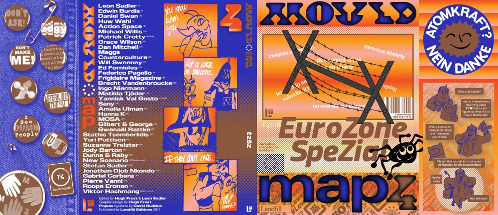
I've already mentioned my incredible shock, surprise, and delight at the new issue of Mould Map, which, as I've rattled on about before, I think is the best book of comics anyone will release anytime soon. It's European-only issue printed in English, containing comics, graphics, art, and a few well placed articles, and it should be in stores now. By excluding the often dominant North Americans, editors Hugh Frost and Leon Sadler present a consistent and strong vision of the EU, and one that is bracingly different than the usual suspects and festival favorites. They also let in the usually taboo: politics. It worked, and I've been fascinated with this strange high gloss, spot-color festooned object ever since. So I emailed them some idle questions and here's what came back.
Why is this one Euro only? Why did you feel the need to establish that ground?
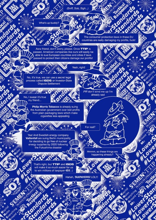
Hugh: We were wondering how activist imagery operates in 2015. That's quite a broad question so it seemed necessary to narrow it down geographically. It seems like the problem with a lot of political work is that it's too vague. We worked quite closely with the artists early in the commissioning stage to make sure we'd cover the specific range of topics we wanted to include - TTIP (the US / EU free market trade deal), nuclear disarmament, immigration, neo fascist populism, national debt, surveillance, Scottish devolution etc. Obviously it can only be a partial and fragmented view of contemporary European questions but on the other hand, because these themes are linked semi-locally it still reads as a cohesive collection, and that's been an aim with each of the books in the series. Also, we've always been really excited and inspired by the specific American energy in comics, films, books etc and we were curious to see what a Mould Map book would look like without any of that.
Is it important, Leon, to emphasize your being from where you're from? It seems like that comes up a lot...
Leon: It's important to remember that the UK is part of Europe, I dunno if it's the way we're trained here, but I don't think that anyone in the UK feels that Euro-connection. Maybe in the Republic of Ireland, since they have Euro coins? I think we are trying to tighten that bond. It's funny that this identity thing seems like it comes up a lot.
Something about USA has such a bully status, I'm wary of that (am I the definition of a xenophobe?) There's definitely an appeal to saying to the US artists, I'm not one of you, I'm with these guys; the Belgians, the Hungarians, the Italians. We're all like these exotic guys, we're separate, we aren't part of your culture. Maybe that's it? We come from a different place, our backgrounds, our aspirations are different, try and look at our work outside of your usual view. My friend told me it was a total fascist move of us to exclude non-europeans, but if it helps us put an interesting new book out into the world then I think I'm ok with that.
I mean, god I love so much American exports, so many American artists, it's too much.
Hmm, reading that answer again, makes me look like such an old bag. The internet has completely derailed all those things above in many ways, I wonder how the artists in Mould Map position themselves?
Hopefully identity is becoming fluid in every possible way. In conclusion, It's not important to emphasize your being where you're from, as long as you aren't mistaken for being an American. BTW Hugh is half Polish and I'm half Latvian. We are all such hybrids all over the world and borders should be dismantled.

You present Europe as "in crisis". The politics I get, but is it an aesthetic crisis too?
Hugh: Naomi Klein, Adbusters, Mark Fisher etc have all written that the problem with transgressive imagery and other radical artistic gestures is that the marketing strategies of big business are very good at hoovering up "edgy" imagery, and repackaging it to sell the very products or lifestyle that the original work was positioning itself as being against. In a different but closely related way you can see this happening with, for example, the design of clothes which convey a futuristic feeling, but have been made in a regressive manner in terms of inefficient material processes and exploitative labour conditions. All types of culture can use a futuristic aesthetic to channel new ideas about "progress" but if the invisible social, environmental and economic conditions underpinning the whole show remain unchanged then it's just business as usual. So "futuristic" aesthetics are in crisis in this sense, which is really interesting from the point of view of a publication with a heavy sci-fi influence.
Leon: I like the angle of this question, but I think no. Is Europe in an aesthetic crisis? I think we are living through a global aesthetic crisis of boredom. No new aesthetic can be invented, or at least be around long enough for it to become an exciting thing. Our collective visual output is trapped in a loop, to find satisfaction we need to explore the most extreme imaginations we can find. Maybe it will lead to a state or worldwide aesthetic serenity, where we consider pure beauty in every style of glasses frame, every pile of rubble, every insect wing. Aesthetics are easy to market, but no-one wants to invest in imagination.
You manage to avoid the usual Euro comics touchstones (Herge, L'Asso, etc.) while carving out a new history and an unnameable aesthetic. Intentional? There's almost zero traditional cartooning in this issue. Why?
Hugh: There's a sneaky little Herge reference in the first TTIP comic on the front jacket flap where Tintin's face has been stuck inside the helmet (hat?) of the guy from Adventure Time. A unique US/EU GM hybrid, sort of like TTIP. We are probably more influenced by films, art and design than we are by traditional cartooning and anyway I don't have enough knowledge of the form, European or otherwise, to use it as reference material.
Leon: Hmm this is a hard question to answer. I'd say this is the most visually disparate one so far, it's not so much of a focus this time, all those artists in Mould Map 3, it would be crazy to try to recreate that visual sensation again. I think what you're picking up on is the absence of nostalgia in the artist's works (not the articles though)
MOSA's paintings employ the conventions of fantasy aerosol art, but his energy, everything, that kind of cosmic is always out of time. Sany's pieces use newspaper strip cartoon language a bit... Brecht Vandenbrouke's piece I'd say is the most anomalous inclusion, I'd say it's the most 'European' looking work in the book, but I love the way it jars against other pages. And I think Brecht ought to be one of the most famous cartoonists in the world, he ticks all the right boxes whilst following his own vision The book ain't a smooth read, I love it!
Frigidaire was a funny thing to focus on in that it moved rather quickly from radical mag to T&A mag, and the politics were overtaken by sex, or something. Why that?
 There were a few topless shots included in Frigidaire during the 5 year period covered in the article we published. They're 'sexy' in a macho kinda way and it does feel a bit dated now. But radical graphic art found a young audience which had never seen anything like it before through that magazine. The layouts were revolutionary for the time. And most importantly the defining editorial vision that Sparagna had (and still has today) was to push his artists to make work relating to the journalism printed alongside it. This was the key link for us - the way Frigidaire used graphic narrative as a journalism / activism tool. Frigidaire was the first publication in Italy to report on the HIV / AIDS crisis, it covered a lot of smaller foreign conflicts which were largely ignored by the mainstream press as well as providing satirical commentary to endless domestic political scandals. The mix of art, sex and dangerous investigative journalism isn't a million miles from what Vice became, 35 years later. Great bits and sometimes not so good bits, but definitely important.

Gilbert & George: Interesting choice, as they are so much a part of the British order. Or are they?
Hugh: I saw their White Cube show in 2014 and it was incredible. Went back 4 or 5 times in the end. The exhibition text says it all:
The ‘SCAPEGOATING PICTURES’ unflinchingly describe the volatile, tense, accelerated and mysterious reality of our increasingly technological, multi-faith and multi-cultural world. It is a world in which paranoia, fundamentalism, surveillance, religion, accusation and victimhood become moral shades of the city’s temper. Gilbert & George take their place in these ‘SCAPEGOATING PICTURES’ as shattered and spirit-like forms – at times masked, at times as grotesquely capering skeletons, at times dead-eyed and impassive. These ‘SCAPEGOATING PICTURES’ consolidate and advance the art of Gilbert & George as a view of modern humanity that is at once libertarian and free-thinking, opposed to bigotry of all forms and dedicated to secular realism.
Also, its so inspiring to see 'late' career artists going completely OTT with digital manipulation and totally pulling it off.
Leon: Until Hugh showed me these recent pieces, I was quite unfamiliar with their works. I was totally blown away by these new things though, and tried to get him to include way more than the final selection. Hugh said that Gilbert & George are really into the kind of stuff we're doing, but I guess since they're such megastars it's easy to assume that the small interesting stuff isn't visible to them. (Also, it's easy to forget that Gilbert is Italian) I think it's so cool to look at these things they've made alongside the other artists. This is what Mould Map is all about!


