
If you will indulge a few loose thoughts on the aesthetic state of comics for this rare installment of my Eurocomics column, I’ll present them in the form of a few short reviews of French-language comics that have gotten me thinking about a number of issues raised for creators by the remarkable aesthetic and thematic developments of the last twenty years.
The New Wave comics of the '90s and '00s, including but by no means exclusive to the "graphic novel boom," opened up the art form to pretty much any mode of expression of pretty much any type of idea in the minds of artists and readers alike. A watershed for a medium which has historically defined and refined itself within a limited number of genres and stylistic frameworks.
This poses the challenge to ambitious contemporary cartoonists of what to do with this newfound freedom – a freedom enhanced immeasurably by rapidly evolving digital connectivity. Unsurprisingly, the Internet is becoming the platform of choice for many cartoonists, often exclusively. How this is going to affect the art form in the medium and long term is hard to predict, but right now younger cartoonists are focusing on shorter, more easily digestible bursts of creativity. The ideal of a major, coherent – even literary – work so central to the concept of the graphic novel is eschewed in favor of Tumblr- and Instagram-ready exercises in condensation.
Meanwhile, long-form, book-ready comics are struggling to maintain their relevance on the edges of the art form. Even if many more of them are being published today, it is rare one gets the sense, previously so acute, of electrifying innovation from a so-called graphic novel.
One problem among several that I want to call attention to here is the old bugbear of form vs. content, so close to the surface in comics criticism because of the form’s verbal-visual, so-called hybridity. I hesitate here, as I am perfectly aware of the fallacy of separating "art" and "story" in comics, and of how long it has stunted comics criticism, but I beg your indulgence, if nothing else to let me bluntly make a point.
So, the New Wave liberation of the art form has not meant a return to the older cliché of "great art-bad story," but rather a situation where "art" and "story" are becoming misaligned to such an extent that the whole is less than the sum of its often impressive parts. This, I believe, is a crucial problem in much of our contemporary, would-be innovative comics.

I.
To wit: French author Olivier Josso Hamel’s Au travail (‘At Work’) series, published by foundational alternative comics publisher L’Association, and of which I have recently read the second installment out of a projected five. This is basic autobiography, in the mold of Julie Doucet and Joe Matt, and indeed Josso belongs to that same generation, which made confessional comics the spearhead of the '90s New Wave. Back then Josso published short comics with seminal autobio publisher Ego comme X as well as L’Asso. Only now, however, is he producing the kind of long-form work that made the careers of several of his peers.
Au travail is a family history as well as a partly poetic account of the author’s childhood. It outlines from a child’s perspective his working-class origins and broken family tree, consisting of single mothers and deceased or absent husbands, with touching excursions into the lives of key family members, such as the author’s grandmother and his factory worker cousin once removed, who lived with his aunt and became his first model of masculinity. Black-and-white family pictures are inserted into the comic’s strongly orange pages (a reference to the paper on which he drew as a kid), with their contrasts of bright green, black, and white.
The author often depicts his childhood self as a small figure with a giant eyeball for a head. His attempts to understand his surroundings and his place in the family sends Josso into trippy quasi-psychedelic sequences with often rather obvious symbolism, such as a tree speaking to him about his genealogy. At other times we find him inhabiting his formative childhood reading, in this volume most notably Hergé’s Tintin comics (volume 1 had a Spirou thing going), cherished panels and sequences of which are recreated in his frenetic, expressive style. These function more as an acknowledgement of his creative sources than a meaningful enunciation of his childhood experiences, unfortunately.
Everything is dialed up to eleven: cartoon emanata signifying revelation or concern radiate constantly from the protagonist’s diminutive form. The panel grid more often than not explodes into sprawling pages rife with symbols and significant forms. Balls-out underground-derived cartooning, with more than a shade of L'Asso co-founder Mattt Konture’s intense expressionism, is in service of an ultimately rather conventional, even bland but potentially touching narrative. Reading it, it becomes hard not to imagine how much better it would have been served by a more discrete style, select in its use of symbology and subtle in visual characterization. Form subverts content in what one cannot help but feel is an attempt to jazz it up.
II.
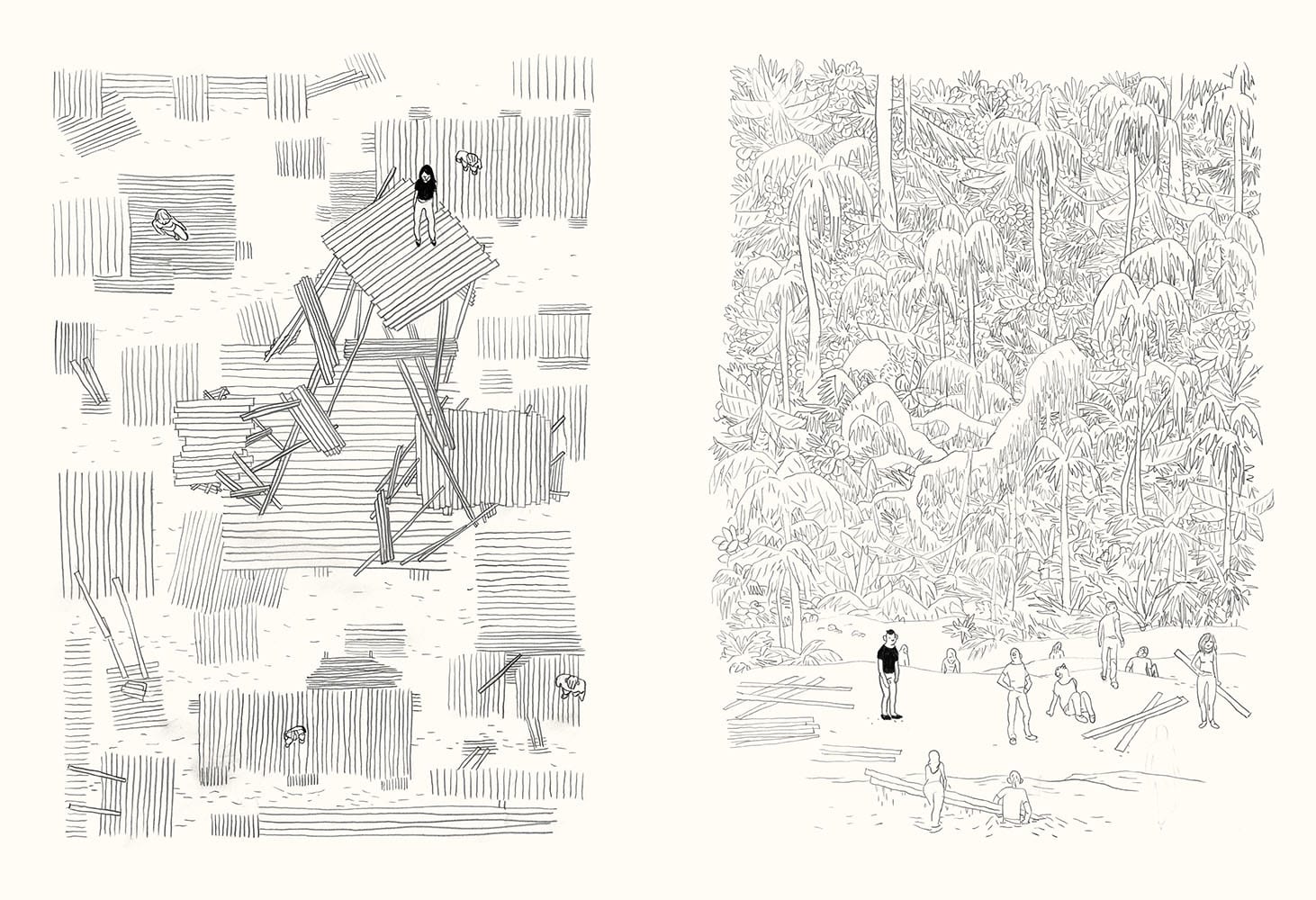
Switching gears, let us look at Swiss artist Yannis la Macchia’s Des battisseurs ("Of the Builders"). His production has been characterized by exclusive, silk-screened experimental comics published with noted art comics collective Hécatombe, so this book – published by Atrabile, Switzerland’s distinguished pendant to L’Asso – marks a step toward wider recognition for him.
In contrast to Josso’s realism, la Macchia trades in predominantly visual allegory. On pages that slowly transition from white to yellow, he constructs a parable of civilization, utopia, and their decline through the motif of ramshackle wooden structures built around a majestic baobab tree by a group of young people seemingly stuck on a desert island. Delineated in uniform, fragile pencil lines, as if drawn by an architect who has banished rulers and set squares from his worktop, la Macchia achieves striking graphic effects as the structures grow and coalesce into something enormous. The central foldout spread is particularly impressive, recalling Deanna Petherbridge’s abstracted architectural fantasies.
The builders discourse in philosophic fragments, have sex, and erupt in violence around each other. The story, such as it is, is punctuated by head shots of a person growing from childhood to decrepitude. A feral creature, imprisoned in the structure escapes. Havoc ensues before things return and continue as normal. More philosophical nothings are uttered.
All very impressive on the page and commendable in ambition, but distinctly disaffecting. La Macchia’s penchant for the suggestive comes across as an unwillingness or inability to commit to a critique or analysis of the civilizational patterns he lays out. He is clearly visually gifted, but there is something precious about his linework and its affected tentativeness. A builder of empty forms.

III.
Lastly, we have something different again: Antoine Marchalot’s Histoires croûtes (a play on the word for "short," substituted here with "toasty" or "snacky"), which takes us closer to the digital platforms of today’s avant-cartoonists. Another French artist, Marchalot is part of the progressive and very varied Arbitraire collective. He works in what one may perhaps describe as a kind of International Naïve. His cartoon characters are traditionally big-nosed, but tend toward the empty-eyed, rendered scruffily – pencil smear is a favorite technique – and slightly disturbing in all their energetic childishness. It's everywhere, from Norway’s Dongery to Melbourne’s HTML Flowers.
This he combines with another internationally proliferating digital style, a kind of souped-up, post-Pop idiom redolent of drug culture and generous in its deliberately slapdash use of Photoshop and digital effects. A kind of willed stupidity is crucial to the humor. Here, his immediate, funnier paragon is French Pierre la Police.
Published by another of the long-established alternative houses, Les Requins Marteaux, Histoires croutes is a landscape-formatted, fat book featuring eight tales, told in one image per right-hand page. It formally recalls in its format the visual novels of yore – think Franz Masereel or Lynd Ward – which I guess is the paradox you get when you transpose the kind of format that works well on the rectangular interface of the idiot box in our pocket.
And indeed, they were originally featured in Professeur Cyclope, an online magazine founded by cartoonists Gwen de Bonneval, Brüno, Cyril Pedrosa, Hervé Tanquerelle, and Fabien Vehlmann – all prominent names in the progressive French-language mainstream. Published monthly for subscribers with free content provided on the website of the public French-German culture network ARTE as well as the culturally savvy TV guide cum cultural magazine Télérama, it is an eclectic concern, featuring works from dozens of very different cartoonists, among which Marchalot clearly belongs to the edgier, more artsy set.
As is the case with some many book compilations of shortform comics, the croûtes stories work much better on screen in short, sharp bursts than overloaded into a paper volume such as this. But even disregarding that, we’re talking empty calories here. They’re short, digitally executed stream-of-consciousness romps, where dialogue blooms and warps punnily across each panel in multiple balloons, chasing tangents in mostly vain search of snappy rhythm, sometimes with additional, captioned and omniscient narration.
Each is graphically distinct, adapted to the tale at hand: the one about the little boy who refuses to eat his fish, and gets invited by it and his suddenly talking dog to record a "hardcore pornographic rap video," is rendered in digital imitation of smudged crayon with irradiant coloring and turns spectacularly expressive toward the end; the one about a renegade scientist in a fancy lab secretly trying to hook two potatoes into a network, and eventually succeeding with two dogs instead, is drawn in black and white in thin, clear lines, with old school zip-a-tone-type texturing (very Elvis Studio); the western spoof with a dog-cowboy riding a tiny horse kept in his pocket features black and white or monochrome figures set against hallucinatory, digitally patterned desert landscapes garishly colored not to look like nature.
All this is obviously done with some skill, and the occasional dialogical exchange or visual surprise hits home, but it really, really helps if you are high. Which basically seems to be the point. Now, far be it from me to dissuade people from getting high, or reading comics while doing so, but there’s something safe, even lazy, in resorting to absurd non-sequiturs and digital psychedelia rather than coherently building a humorous language or crafting a visually compelling environment where the absurd takes on its own meaning. In other words, the difference between disposable fare such as this and, say, Cowboy Henk or Megg, Mogg and Owl. The problem here is not so much the one I've been outlining of mismatched form and content, but rather a digitally-enhanced shortcut taken to update a traditional comics format -- the short-form humor strip.
Maybe I’m jaded, thinking I’ve seen all the brilliance before. I certainly feel jaded. These are skilled cartoonists. But to return to the initial point, it does seem to me that the new, open landscape of comics poses unforeseen challenges. There will always be bad, derivative comics around, but that’s not what I’m getting at here. It’s rather the frustration at seeing talented cartoonists flailing in their newfound liberty.


