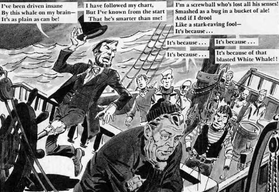
Andrew Delbanco’s biography of Herman Melville, Melville: His World and Work, opens with a long set of excerpts from various texts, referring either the life of Melville or the stuff of his creations. This is an obvious stylistic nod to the second pre-opening1of Moby-Dick, in a rather un-Moby Dick text.2 It contains some things one would expect, quoting Camus, Bradbury, Updike, etc. But also nestled inside is a surprise appearance by MAD magazine: a few panels from “Future Broadway Musicals Based on Famous Literary Classics” by Jack Rickard & Frank Jacobs (from MAD #100, Jan. 1966), which I have vague memories of reading in one of the MAD reprint specials during my youth. It's an amusing little piece whose central gag is pretty much what you expect from the title. There are other bits of visual media noted in Delbanco’s "Extracts", like the discussion of Billy Budd from The Sopranos, but MAD's is the only one reproduced in its proper visual glory. It stands out.
I hadn't thought of that particular piece when I started working this article, but it’s pretty telling that when I sought out comics referencing Moby-Dick, I was not lacking for examples. By my count there are over a dozen direct adaptations of the novel in comics form in the English language, counting foreign works translated to English, starting with Classics Illustrated #5 (then called Classic Comics Presents, Sep. 1942) and ending (so far) with Disney Moby Dick, starring Donald Duck (Dark Horse, 2018).3 This is merely what I could find and read in the last few months, others elude me still: “He tasks me; he heaps me; I see in him outrageous strength, with an inscrutable malice sinewing it.”4
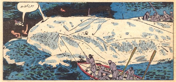
There are dozens and dozens more comics that utilize the name and some visual notions from the novel to various degrees of fidelity. Military Comics #22 (Sep. 1943) contains the unsparingly racist “Moby Dick Doesn’t Like Japs”; Adventure Comics #213 (June 1955) has an Aquaman short titled “The Court-Martial of Moby Dick II” (Aquaman proves the whale innocent); a decade later Adventure Comics #332 (May 1965) would dedicate an entire issue to the Legion of Super-Heroes tangling with “The Super-Moby Dick of Space!”,5 in which Lightning Lad loses a limb and sets out determined to stop the space whale at seemingly all costs; the book is at the center of a two-pager in American Splendor #3 (the Vertigo series, Aug. 2008). I could go on; if I fully adopted the spirit of Melville, I might’ve gone on ad infinitum. Moby-Dick is as vast and all-encompassing as the whale itself.6

All of this is impressive for a failure. When first published in 1851, the novel was the literary equivalent of a box office bomb - it would sell about 3,215 copies during Melville's lifetime, another downward step in the author's slumping literary career. Critics were divided; Moby-Dick didn’t get quite the beating popular history had ascribed to it, but the novel certainly wasn’t hailed as an immediate classic. Even today, Moby-Dick isn’t quite as frequent a reference as the heavy hitters of popular culture, your Dracula or Sherlock Holmes. Yet it's surprisingly durable as a reference point - especially considering the original tome is often qualified as an indecipherable work that’s a slog to get through.7
Or perhaps it is durable because it is considered so long and difficult. Certainly comics, long the considered the dregs of literary world, sought to assign itself importance by attaching, like a remora, to more reputable mediums. In 1942, the editors of (the eventual) Classics Illustrated made sure to advise their readers: “don’t miss the added enjoyment by reading the original.” While the covers of Classics Illustrated would boast of “STORIES BY THE WORLD'S GREATEST AUTHORS,” the visual element is downplayed as a brutal necessity. Already, comics were ashamed of being comics.

A later rendition in Four Color #717 (Aug. 1956), actually an adaptation of the John Huston film version of the book, contains a more bellicose promise made by publisher Dell: “The Dell Trademark is, and always has been, a positive guarantee that the comics magazine bearing it contains only clean and wholesome entertainment. The Dell code eliminates entirely, rather than regulates, objectionable material.”8 Dell promises to do to the text what Ahab promises to do to the whale. And unlike Ahab, they deliver!
Here, we arrive to the crux of the issue. Comics, as an industry and a culture, wished to adopt Moby-Dick because it gave them the veneer of cultural validity. The industry, however, could only do so by presenting itself as a juvenile replacement for ‘the real thing’ - which meant the thing had to be altered. The Dell version of Moby-Dick (such as it was), and most versions preceding and following it, may contain some striking visuals, but they tend to omit entirely the raw biologic presence of Melville’s novel. If attempts to suppress Melville’s homoeroticism can be somewhat understood (it is subtext), the decision to present the physically bloody whaling profession in a clean and sanitized version is less so. In Four Color, Starbuck shouts of “Black blood! Black blood!” in the water - but nothing of it is drawn. Even Will Eisner, a man celebrated for making the comics form attractive to adult readers in America, falls into that particular snare. His 1998 version of Moby Dick, published as a slim graphic novella by NBM,9 has its back cover boldly declare (and I mean full bold letters): “WHAT BETTER WAY THAN BEAUTIFUL COMIC ART TO GET KIDS EXCITED ABOUT READING!” Kind of a rhetorical question, but not a particularly good one.

The Eisner adaptation is a particularly curious case because it fits so easily with the comic book adaptations of half a century before, cramming the entire novel into as small a package as possible. By 1998, Eisner wasn’t just the guy who did The Spirit in the newspaper; he was the 'Father of the Graphic Novel,' known for weighty works like A Contract With God, or A Family Matter, which was released the same year. Eisner wasn’t what I would call a children’s artist. The Spirit was certainly read by children—it was popular enough—but in style and content it’s obvious the intended audience skewed older. The graphic novels certainly skewed much older, if not in terms of sophistication than at least in terms of theme. Eisner would know from the entanglement of comics and the literary; in his Comics and Sequential Art he makes the particular choice of illustrating his thesis with a comic titled “Hamlet on a Rooftop”, which presents Shakespeare’s famous soliloquy as plainly as possible: a man proclaims it boldly, limbs flailing in a single setting.

This sequence encapsulates all of Eisner’s strengths and limitations: the drawings are beautiful, the movements are bold, the backgrounds are simple yet evocative, there’s strange power to it all; and yet, it is philosophically bare. The best that comics can do, apparently, is evoke the stage. In Eisner’s later works, the drawings are often crowded out by text,10 as if 'comics' must surrender to the literary element, as if indulging in the visually fantastic would drive away serious-minded readers.11 Eisner’s adaptation of Moby-Dick is the same: beautiful and timid. Unable to see beyond admiration for a great text, without trying to understand what makes it into a great text.
Melville wrote: “To produce a mighty book, you must choose a mighty theme.”12 Moby-Dick is certainly not lacking in themes. Yet almost all comics adaptations seem to have a single theme in mind: the greatness of Moby-Dick (the book, not the whale). They all cower before its surface, fearing to venture deeper. They continually confuse the map with the territory, mistakenly believing they can transpose its greatness to comics by simply copying plot and characters.
Some adaptations surprise by being a bit more bloody-minded. Such is the case with Marvel Comics’ 1976-78 mouthful of a series, Marvel Classics Comics Series Featuring. Issue #8 was the Moby-Dick version, drawn by Alex Niño; sadly, no colorist is credited. It begins roughly at the same level of its Classics Illustrated and Four Color counterparts. Obviously lacking any interest in Melville's characters and metaphysics, it rushes through the first few chapters - everybodu is out to sea by page 11, when in the novel the ship does not leave the wharf until chapter 22. The assumption appears to be that nobody, especially children, has any patience for the parts that aren’t seafaring adventure.

The comic grows stronger when the sailors set out to the dangerous business of hunting their prey. Suddenly, the whole story is charged with new energy. The more-than-capable Niño builds a fine sense of atmospheric threat. Whoever the colorist may be, their contribution is considerable; a rough drawing of a boat out to sea is draped in blues and greens, skies and seas in sharp contrast - and in between them a shaft of soft red, as if the small boat is guided by an aura. From that point, any pretense of pictorial realism abandoned, Niño draws as if these men are sailing into the very heart of hell. For a few pages, it's as if the comic is ablaze with passion: an almost-sad reminder of what could’ve been.
Parts of the adaptation remain encumbered by the limitations of the period: scenes in which a whale carcass is butchered and processed are far less grimy than their novelistic counterpart - a recurring element in all of these adaptations. On the other hand, the chapter in which a sailor falls into the head of the whale and nearly drowns is suitably nightmarish, a mix of slapstick and true horror. It’s as if the art team is struggling to get free from beneath the script. There are shades of the sort of 'ugly beauty' Melville strived to describe, nature as a place of awe in the old-school meaning—the wonder that might blind you with its power—but the story keep pushing these moments below the surface, bottling anything and everything that might cause the least bit of excitement.
There is something bland about the whole thing. An emptiness which befits the manner in which the book is considered nowadays: a masterpiece, a work belonging to dusty library shelves, its weighty subject weighing down the story. Moby-Dick in the popular imagination has no griminess, no humor, no passion. The subject of the novel is America and the world, but the subject of so many comics is just Moby-Dick.

A later Marvel adaptation, the 2008 Marvel Illustrated: Moby Dick, makes this assumption plain, despite heaving six full issues to tell the story instead of one 48-page comic. It also rushes to the sea parts, affording the most ample room to the final confrontation with the whale. Writer Roy Thomas mentions this as a conscious choice in his introduction to the collected edition: “[t]he editors and I made what I like to think is the defensible decision to play-up the three-days pursuit of Moby-Dick.” I like the passive voice in ‘defensible decision’ - someone could defend it, sure. Maybe not Roy Thomas; he read the novel, he knows how this whale is being butchered.13
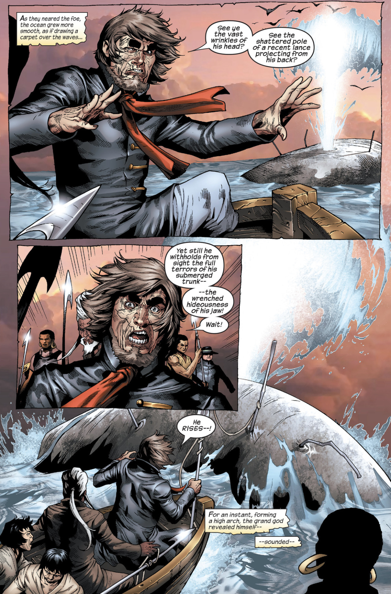
Marvel Classics Comics Series Featuring at least provides the readers with a bit of violent excitement, lacking (to an extent) the bland educational aspirations of the Dell and Classics Illustrated versions. It at least aims to be an exciting sea story. It lacks vision, and refuses to properly apply the vision of the novel, but it's fun to look at. The same visionless vision is apparent in Marvel Illustrated: Moby Dick, which doesn’t even has the benefit of Alex Niño going hog-wild; and three times as long! It’s the apotheosis of Moby-Dick as a book without readers: high up on the literary shelf where all can see it and none can reach it. This version is dead to begin with. A carcass in the form of a comic book.
Abridgements, of course, are not something unique to the world of literature. From the time of its publication, Moby-Dick was subject to tampering by people who did not understand, or outright rejected, Melville’s work. The original publication in England, an important spot for an American novelists in those times,14 saw the alteration of passages considered blasphemous,15 as well as the removal of language deemed overtly sexual, including that relating to mating habits of whales (whatever floats—or sinks—your boat). Right from the get-go, there was an attempt to steer the work in a more ‘acceptable’ direction.
These efforts only intensified as Moby-Dick moved up the ranks from ‘another book’ to a ‘classic’. As William H. Hansen noted in his 2010 article “'So far as what there may be of a narrative': Abridgment and Moby-Dick”:16 “Abridgments of adult works for children date to the Reformation, and by the 1790s Isaac D'Israeli was commenting on the 'ample employment' provided for abridgers by 'the indolence of modern readers.'” Several years later, Thomas Bowdler would publish his notorious Shakespeare edits, slicing off anything that might offend the general public.
While we can’t be sure that it was Bowdler’s version that Melville read first and was unimpressed by, Delbanco makes sure in Melville: His World and Work to explain the importance of Melville procuring an unabridged version of the plays. It was apparently one of his greatest influences before writing Moby-Dick: “After finally acquiring a readable edition early in 1849, [Melville] discovered a Shakespeare far beyond the melodramtist (nineteenth-century productions of his plays were often grossly unfaithful to the text)[.]” This influence can be felt in chapters 36-40, which are written in the form of a play. One of the damnedest things about the comics adaptations (one excepted, we’ll reach it eventually) is their outright refusal to try and ape Melville’s formalist experimentation - the man basically did stream-of-consciousness before it was a thing, yet so often the ‘plot’ is the be-all and end-all of the novel-as-adapted. Yet without the unabridged Shakespeare, Melville might not have flowered as he did.
Hansen’s article goes on to categorize 32 different abridgments of Moby-Dick, stretching all the way back to 1924 with the Macmillan Pocket Classics series. My eyes were fixed on 1938’s “‘There She Blows!’ A Condensation from ‘Moby Dick’” in Reader’s Digest. This version was apparently 18 pages in length.17 Most of Hansen’s examples, unlike their comics counterparts, seemed aimed at the adult reader; some contained simplified language, but others were just shorn of accoutrements.

The “children’s version” of a major text is something different: sometimes not an abridgment, but a rewrite built from the disassembled skeleton of the original. Of all the adaptations I’ve read, the least loyal is the aforementioned, Dark Horse-published Disney Moby Dick, starring Donald Duck - ironically, it is also the third-longest comics adaptation, clocking at 80 pages, allowing much leisure time with the characters and setting. This is not time well-spent; the characters are throttled into fitting the Disney figures who ‘play’ them. Ishmael is now a hapless Donald Duck instead of over-erudite original. Ahab’s harpooners, an assortment of Beagle Boys, are outright villainous. I assume you won't be surprised to learn that all the named characters now survive the voyage, and even learn a valuable lesson. It's not a very good Duck comic either; at least Gold Key’s Moby Duck series (1967-78) had some decent gags.18 The most striking aspect of the project is how Paolo Mottura & Mirka Andolfo give us a truly monstrous vision of the whale, creating a ridiculous level of contrast between the scenes featuring the Moby Dick itself and everything involving the Duck characters.
What I am getting at is that abridged versions, in book form, are not made for children alone - or even mostly. In today’s world of film connoisseurs playing movies at 1.5 speed, it seems nobody has time to go through all that tiny text. Abridged versions allow one to have the sensation of having completed a difficult and worthy text, the reading of a classic, with less effort.
In a 2007 article for the New Yorker, Adam Gopnick discusses the experience of going over Orion Publishing’s "compact editions" of classic books. Explaining the need for that initiative, the publisher insisted: “The great classics contain passionate romance, thrilling adventure, arresting characters and unforgettable scenes and situations.... But finding time to read them can be a problem.” Comics were seen as a way to make such texts approachable to children, while literary abridgment is, purportedly, a way to make the text approachable to busy, overworked adults.
Gopnik’s article begins with Moby-Dick in mind, describing it as “a book that, if every reader has not always wanted shorter, then certainly, as Dr. Johnson said about 'Paradise Lost,' no reader has ever wanted longer.” He then goes on to explore what exactly has been cut: “Melville’s story is intact and immediate; it’s just that the long bits about the technical details of whaling are gone, as are most of the mock-Shakespearean interludes, the philosophical meanderings[.]” In short, Orion cut exactly the things that most of the comics adaptations cut: the things that make Melville into, well… Melville.

The Orion version sounds pretty much in line with Roy Thomas' take, which is to make Moby-Dick into a rip-roaring adventure yarn. As Hansen writes: “often the goal of Moby-Dick’s abridgments can be seen as the simple avoidance of boredom.” Now, boredom is a personal matter; personally, I enjoy reading Ishmael going off about whatever crosses his mind.19 The abridgments (both comics and literary) do their best to focus on the plotty bits to the exclusions of everything else. David Foster Wallace wrote in The Pale King: “Gentlemen, here is a truth: Enduring tedium over real time in a confined space is what real courage is.... True heroism is minutes, hours, weeks, year upon year of the quiet, precise, judicious exercise of probity and care--with no one there to see or cheer.”
The ‘everything else’ is important to Moby-Dick, because it is the very thing that transforms a typical sea-faring book—there were so many at the time, including Melville’s earlier efforts—into what Moby-Dick is. There’s a reason people don't care as much about Walter Scott's The Pirate - Melville sought not write an adventure, but to describe a society in miniature, with all its ceremonies and habits, which means describing also the drudgery that is daily life on the ship. The reason the actual whale hunting is such a small part of the novel is because the sailing life is mostly about the day-to-day business of keeping the ship intact. Richard Henry Dana Jr.'s near-contemporary Two Years Before the Mast (1840), as influential as any American text about seafaring, made it plain that life aboard a ship is a working life: “It is the officers' duty to keep every one at work, even if there is nothing to be done but to scrape the rust from the chain cables.” A society that ignores this is a society that treats its adult like children. Bowlder cut out anything that might offend; today’s editors cut away anything that might bore.20
The plot of Moby-Dick is important, but so is everything else. Moby-Dick might not be sacred, but it is written as if it is, with the mad reverence of a prophet. Gopnik correctly writes: “The subtraction does not turn good work into hackwork; it turns a hysterical, half-mad masterpiece into a sound, sane book.” It should be noted that all the adaptations I have read work. None are embarrassingly bad. Even the Roy Thomas version would feel less dull if I read it in isolation instead of at the end of a long trawl through dozens of other comics. Yet they all suffer the ills Gopnik describes. They are all sane. Or, better said, ‘sanitized.’21
Most of the comics versions don’t seem to try and adapt Moby-Dick, they adapt the abridged version: an idea of an idea of the novel. Still, there are exceptions…
Christophe Chabouté’s Moby Dick, published as two French albums in 2014 and then collected in English by Dark Horse in 2017, is the longest comics version I’ve encountered. Weighing in at 256 pages of black & white art, few would confuse this for children's comics. Instead of promising “TO GET KIDS EXCITED ABOUT READING!” Dark Horse promises “A masterful adaptation of the timeless literary classic, faithfully and beautifully rendered by an award-winning artist.”

Some of this is true. Chabouté has won several prestigious festival awards, and the book is certainly very beautiful to look at. Is it faithful, though? It certainly is more comprehensive than any other version - more characters and chapters make their way onto the drawn page than in any other example. Still, one could point and ask: Where is Bulkington?22 In an Introduction, John Arcudi gushes over Chabouté’s loyalty to the text; noting that Melville's book has been adapted to film several times (and avoiding the many comics adaptions that preceded this one), he comes up with an odd take: “Comics, unlike movies, can take their time.”
This is true in the abstract, I guess; a comic can be as short as one panel, or tens of thousands of pages like One Piece - just as a movie can be 1 minute or 24 hours long. In actuality, most comics adaptations tend to be quite short - and they rush through the text. Granted, even if the early adapters wanted to give the novel a proper berth, market conditions wouldn't let them. But Chabouté too ends up cutting bits and pieces of the book. Melville wrote a whole chapter about eating breakfast, which Chabouté skips. What of the infamous “The Whiteness of the Whale”? That breaking point of many a reader, a long philosophical spiel, is also absent.
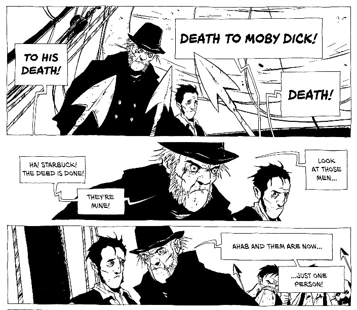
This is understandable; despite its impressive artwork, Chabouté's book is somewhat rigid in style, staying true to a sort of European realism. “The Whiteness of the Whale” would require a serious change in style that Chabouté is unwilling or unable to provide. As previously mentioned, the strength, the art of Moby-Dick, is in how alive the novel is; how it shifts in both form and content. A thundering tragedy in one moment, a righteous comedy in another. Chabouté keeps thing on even keel.
Arcudi's assertion about the nature of comics, that they can "take their time," is a weird one. This is a visual medium almost wholly defined by its ability to suggest information via omission. Cinematographic art eventually settled on 24 images for every second; space is too precious in comics. Compare the chapel scene in John Huston's Moby Dick to Chabouté's. Huston mounts a long tracking shot, gliding along the faces of the congregation before Father Mapple (Orson Welles) steps through a door and up to the lectern. In Chabouté's version we have a one panel showing the audience, then one panel showing Mapple upright, ready for his lecture. Comics cannot beat cinema at this game.
I do not browbeat Chabouté for cutting things; a truly uncut version, adapting every line of the book, would probably run for thousands of pages.23 Chabouté’s adaptation is good because he is a good artist, and because Melville was a good writer. Yet even with the larger page count, it feels more like an abridgment than a work of its own, as if one might still turn to the final page and see the smiling people of Classics Illustrated recommending “added enjoyment” by reading the original. The very nature of the attempt to offer a faithful adaption only accentuates the scope of the abridgement. The Eisner version is so thoroughly edited down that one mere stops to count everything that was removed. Chabouté’s version allows the reader to confront all the missing pieces, to see through limitations of the project: “That to attempt it, would be inevitably to be torn into a quick eternity.”24
One cannot adapt Moby-Dick any more than one can slay Moby Dick. It is in its very nature, its vastness, to be unconquerable. Still, there is yet another example I have not discussed. The one which comes as close as any.
The First Comics run of Classics Illustrated, #4 (February 1990), gave us a version written and drawn by Bill Sienkiewicz, co-written by Dan Chichester. That version of Classics Illustrated was certainly more artistically-minded than its predecessors. Among its unusual choices were Gahan Wilson on “The Raven”, Kyle Baker on “Through the Looking Glass” and Gary Gianni on “The Gift of the Magi”. P. Craig Russell on “The Fall of the House of Usher” may not be an obvious choice, but it is a very good one. Still, this one trumps them all.
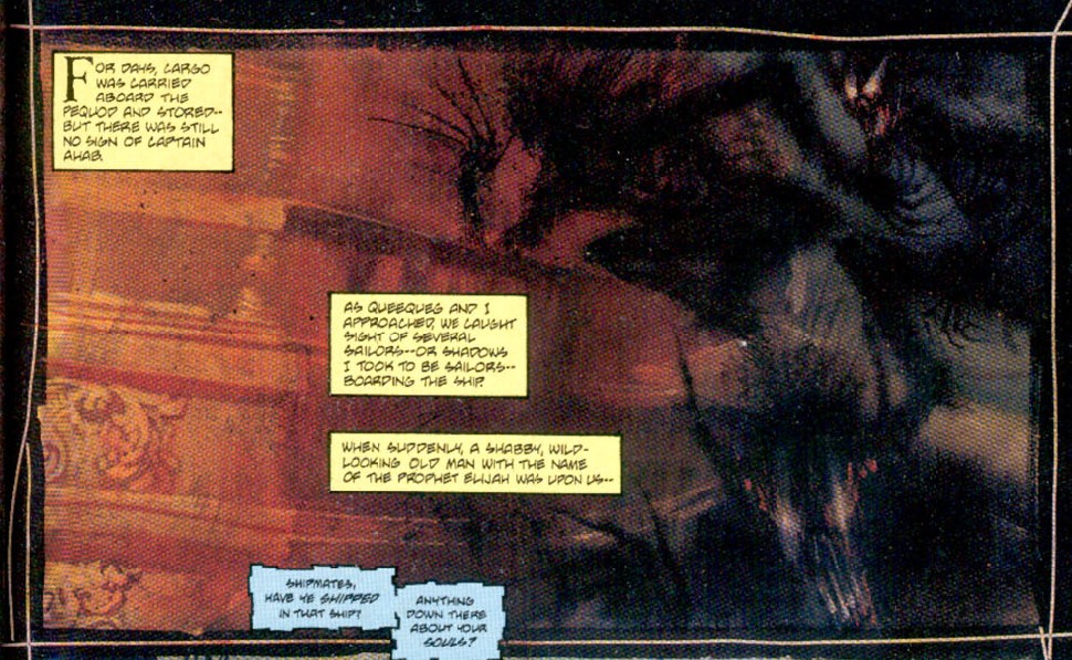
As with Chabouté, Sienkiewicz's adaptation seems to be aimed squarely at adult audiences; it’s hard to imagine any parent looking at this as suitable for tykes learning to read (though a teenager might try to circumvent a reading assignment with it). Unlike Chabouté, it is unapologetically short - shorter than even some of the older versions, at 45 pages. Instead of struggling against the limitations of space, Sienkiewicz and Chichester make it work for them.
As befitting Sienkiewicz’s already developed style—this was after Stray Toasters—the book flows as a flurry of scenes that evoke (rather than borrow) Melville’s language. This is clear from the second page, as Queequeg first appears as a shadow that is almost scratched onto a door. Darkness into light, the two-dimensional shadow becomes a three-dimensional figure. This adaptation flows.
It’s a true stream-of-consciousness comics, and in so doing feels more loyal to the mood of Melville. The novel’s version of Ishmael is a talkative fellow with an apparently endless amount of time to explain, in detail, every thought that passes through his mind. In this comic, he is more like a man attempting to transcribe a dream - the pages are like a series of snapshots from a nightmare that he lived vividly, but now cannot fully recall.
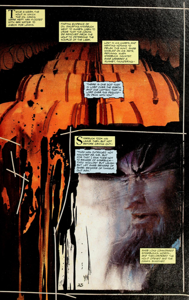
“There is one God that is Lord over the earth, and one Captain that is lord over the Pequod -- on deck with you!” On one page this sentence is contrasted with an image of barrels of whale oil in the ship’s hold, one of them seeming to leak in so prodigious a manner that the liquid sweeps away the panel borders. With this single image, Sienkiewicz and Chichester transcend all other adaptations. Their subject is not Moby-Dick, but the pulsating heart of global economy. Ahab imagines himself a God aboard his ship, but he is fighting with a greater God that guides this journey: the god of capital that equips and orders this hunting voyage. Ahab blasphemes not just against the Almighty, but also against the almighty dollar. Had he stayed true to his course, to hunt and kill other whales, he might’ve come out on top. Of course, if he would’ve done so, he would not be Ahab. The following page jumps to Queequeg's coffin. What might’ve felt abrupt in other adaptations works here because Sienkiewicz’s visual style carries it: the barrels threatening to burst give way to a man's final containment; the death of the whales followed by the prophesied death of their hunter.
When this version of Moby-Dick ends, I do not feel that it needs to be longer. Like the original novel, it is the perfect length to become itself. Chabouté, Eisner, Roy Thomas… all sought to be something else. All sought to be Melville; but only Melville could be Melville.25 The comics that sought to be great by aping great literature failed. The 1990 adaptation uses Melville’s work as a jumping-on point, shifting scenes and words with reckless abandon. Chabouté gave us a vision guided by realism: the ship-bound world that Melville inhabited when he first set sail as a youth. Sienkiewicz gives the world of whaling as imagined - Ahab less a man than a phantom, hunting the bowels of a ship and the human psyche. This sort of mess hysteria allows people to fall under the spell of a ravenous dictator. Moby Dick itself is less a great beast than some unearthly presence: power incarnate that overwhelms the page. It cannot contain him.
This type of article cries out for a definitive ending, after dragging all of you down this path for so many words (and pictures). Alas, I cannot provide one. The brilliant summation eludes me. To read these adaptations, set across eight decades, is most often to read an industry chasing fruitlessly after a respect it does not believe it deserves. To adapt Moby-Dick as it truly deserves is to adapt not merely the visual images Melville's language conveys, but the ideas he was working with: "If man will strike, strike through the mask!"
* * *
- Moby-Dick has two pieces of text before the famous “Call me Ishmael” opening line: the short “Etymology” (Supplied By a Late Consumptive Usher to a Grammar School) and the longer “Extracts” (Supplied By a Sub-Sub-Librarian).
- A good book, but too straightforward and down-the-middle for its grand subject.
- The cultural vandalism of Disney is evident from the very cover: they have left out the hyphen in Moby-Dick. Yes, I know Melville's text mostly doesn't use the hyphen when referring to the whale, but it's in the title! You would think comics people would be more attuned than most to the necessity of a hyphen.
- Ch. 36.
- A hyphen in the title, but alas - in the wrong spot
- “One of the wild suggestions referred to, as at last coming to be linked with the White Whale in the minds of the superstitiously inclined, was the unearthly conceit that Moby Dick was ubiquitous; that he had actually been encountered in opposite latitudes at one and the same instant of time.” Ch. 41.
- The sad fate of most ‘classics’, whose deification in the literary canon takes them out of the hands of readers. Moby-Dick is a pretty fun book to read, even the long technical and philosophical bits.
- One imagines this vow is sworn for the benefit of parents; children at this point were probably wondering what happened to the scary EC Comics.
- Two other classic works were similarly adapted by Eisner: The Princess and the Frog (the fairy tale, not a novel) and The Last Knight (an adaptation of just a small part of Don Quixote). Moby-Dick is the only one of these adaptations in which a full-length novel is crammed into 40 odd pages. No hyphen either.
- Eisner's The Plot (2005) contained possibly the most un-comics like scene imaginable prior to Jonathan Hickman's charts: two people sitting at a table and comparing blocks of text for 17 pages.
- Shakespeare would bemoan being limited to a single stage: “...can this cockpit hold / The vasty fields of France? or may we cram / Within this wooden O the very casques / That did affright the air at Agincourt?”
- Ch. 104.
- “The sea-vultures all in pious mourning, the air-sharks all punctiliously in black or speckled. In life but few of them would have helped the whale, I ween, if peradventure he had needed it; but upon the banquet of his funeral they most piously do pounce. Oh, horrible vultureism of earth! from which not the mightiest whale is free.” Ch. 69.
- The United States in the mid 19th century was still searching for a national identity, as well as a national literature; books from England often dominated sales and discourse. To be accepted in England was a mark of success, of acceptance, much like comics sought for a long time the approval of the world of ‘serious’ fiction.
- "Ahab stood before them with a crucifixion in his face" was changed to "an apparently eternal anguish..."
- Leviathan: A Journal of Melville Studies, Volume 12, Issue 2, June 2010, Johns Hopkins University Press.
- This is very much like comics. Being a Judge Dredd aficionado, I can’t help but recall the Daily Star Judge Dredd strip cutting down the entire “Apocalypse War” storyline down to a single page. It’s arguably better than the original. Marvel did something similar with its Marvel Saga series in the era before collected books and the internet. To be clear, the one-page version of "Apocalypse War" succeeds because it realizes the sheer impossibility of maintaining the drama of the story when pared down to such an extent, playing the abridgement for (extremely) bleak laughs.
- Not to be confused with Israeli cartoonist Dudu Geva’s parody strip "Moby Duck", a very different kind of thing which, nonetheless, did not dissuade the notoriously litigious Walt Disney Company from trying to sue the pants off Geva, as if he was Donald himself.
- Even better, whether intentionally or not, when he is obviously wrong, such as his insistence that whales are fish.
- Scholar Timothy B. Shutt remarked of Moby-Dick in his audiobook Moby-Dick: America's Epic: “Had he submitted to a fierce editor, with something like our modern sensibilities, he could’ve told his tale in half the pages he expends. Or less.” None of this is complimentary to modern standards.
- One of those historical coincidences that are both pointless and yet important: while Moby-Dick was initially a failure with the American audiences, at roughly the same time the masses jumped at a visual representation of the same basic concept. Benjamin Russell’s and Caleb B. Purrington’s The Grand Panorama of a Whaling Voyage 'Round the World (1884) was a massive 1,275-foot panoramic painting which toured the country, spooled along as a narrator provided explanation. You can watch it unfold here. There is something about the manner in which a visual representation, sticking to the tried and true facts of historical voyages, soundly thrashed Melville’s metaphysics...
- “...they raised a cry of 'Bulkington! Bulkington! where’s Bulkington?' and darted out of the house in pursuit of him.” Ch. 3.
- Recall Erich von Stroheim’s attempt to translate Frank Norris' McTeague fully to screen, ending with a nine-hour behemoth, Greed, that was chopped up by the studio. Roger Ebert: “The original version of Greed is perhaps a masterpiece more lamented than missed; there is a point after which an audience will simply not sit still.”
- Ch. 41.
- “His titles are, in reality, nothing but sub-titles. The real title of each and every one of his books is Melville, Melville, Melville, again Melville, always Melville. I express myself; I’m incapable of expressing any being other than myself.” - Jean Giono, Melville: A Novel, 1941, translation by Paul Eprile.


