Comic Shop News #1385
Edited by Cliff Biggers & Ward Batty
Published by Comic Shop News, Inc.

So, you're probably looking for a shopping list right now. At the same time, you're no doubt aware that: (1) this website had padlocks on the door until this morning; (2) most comic book retailers put out their new wares on Tuesday; and (3) any traditional installment of this column would therefore be of limited use. Believe me, this was all I thought about over the entire holiday, when not playing video games or struggling to identify my cousins - or, for that matter, visiting this one particular shop about 15 miles from my parents' house. It was a sturdy, well-stocked, old-fashioned comic book direct market retail institution, the type that still slips Comic Shop News into your bag.
Oh c'mon. You know CSN. The little eight-page newspaper filled with promotional capsules and short interviews? Hewing to the same formula as virtually every major comic book website today? Honestly, I'd thought the internet had sent that old dog off to the farm, but no - not only is CSN still around, it has apparently teamed with Newsarama to populate its pages with credited, semi-recent news burbles re: the likes of PictureBox's closure and the publication of Matthew Thurber's Infomaniacs, which I can only suppose will serve as background curiosity for the majority of the publication's readers, if indeed anyone doesn't just throw it away.
*I* didn't throw it away, though. Immediately, I'd noticed that about half the space in issue #1385 was taken up by annotated lists of upcoming comic book releases, not unlike what I'm ostensibly doing here every week. And reading through the choices clued me in to some things I'd have never realized on my own. Certainly I'm not plugged in to superhero culture enough to realize that once-marginal properties like Art Baltazar's & Franco Aureliani's Tiny Titans had apparently built up enough retrospective good will that Dynamite is launching an entire cutesified 'all ages' line, including Roger Langridge on a kids' version of Evil Ernie...! Or that Diamond will soon be distributing a manga adaptation of James Joyce's Ulysses - my bread and butter!
And that got me thinking: if I can't just list the things I might like to buy this (and last) week, what if I actually review a bunch of the comics I'd sometimes just *mention* in my column? Comics that may or may not turn out well, but at least boast the participation of somebody I like. Passing fancies; "background curiosity." A few of these books are the backbone of the direct market; others target extremely small sub-specialists among the Wednesday crowd. Please do not take what follows as an exhaustive compendium of good books released on 12/24 & 12/31 - here, I am bound by how much money I can spend, and what the retailer in question had kept in stock.
Also, since virtually nothing was scheduled to arrive on Christmas Fucking Eve, I wound up buying a few items from earlier in 2013 on a total whim. Surprises abounded. For example, did you know each Comic Shop News runs an entire week's worth of the Larry Lieber/Alex Saviuk Spider-Man daily strip?

I wonder how much Stan Lee identifies with J. Jonah Jameson? While Lee remains the sole writer-of-record for the newspaper comic, it's an open secret that Roy Thomas contributes a bunch of uncredited scripting - of course, Jonah doubles as the very apotheosis of the Steve Ditko 'shitty media guy,' so perhaps Lee's relative sympathy underscores the profound creative tension between the character's creators.

Also, I thought Petey was wearing a Zenith shirt there for a second. I was wrong. Is this a bad omen? We should move on.
--
Legion of Molly Doves #1
Original story, breakdowns, art direction and color by Philip Phillipson; written by Amanda Raymond & Brian Phillipson; drawn by Alex Niño; lettered by Kurt Hathaway
Published by Bliss on Tap
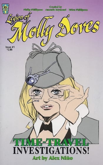
Be aware that the italicized promenade above is, in fact, a simplified version of this 26-page comic's full credits, which further attribute costume designs to Amanda Raymond, book design to Kurt Hathaway, and overall creation -- denoting, one presumes, both the initial creative spark and some share in legal ownership -- to Raymond and the Phillipsons, the elder of whom (Philip) is an experienced animation professional, having provided background art for the majority of Disney's ink 'n paint-styled theatrical features from the 1990s.
Still, I trust from the font sizes on the cover that it won't be offensive to suggest that pretty much the only reason anyone will even potentially look at this is for the participation of longtime alt-genre/counter-mainstream comic book stalwart Alex Niño, now 73 years old. And, honestly, there are limits to even that interest - if there's any one proclivity of mine that my peers in reading tend not to share, it's a fascination with older cartoonists breaking down their name-making styles to the absolute fundamentals of visual identity.
Which is to say, from this:
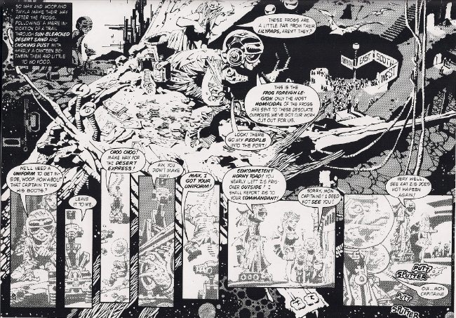
we get:
It occurs to me that it's perhaps a dereliction of the critic's duty to proffer even a conditional recommendation of a comic like this, so tenuously stitched together it seems. I mean, Phillipson, Sr. handled the 'breakdowns,' so presumably he retained some control over the page design, but what we're seeing above -- a conversation between two characters awkwardly continued among various surrounding characters before circling back to the original duo -- suggests to me a late-coming attempt to hammer a sense of give-and-take into an image that probably should have been panelized, yet wasn't. Obviously, I don't know anything about the private considerations that went in to the collaboration of this comic ('writing' and 'art' are rarely absolute divisions of labor on their own, forget about 'breakdowns'), yet merely by evoking the sensation of the visual element sneaking away from the script, the comic-as-a-whole forces attention onto the artist as a potentially renegade player. And aren't good comics supposed to strike a holy balance between words and pictures?
I'll answer with another question: how many 1970s issues of Vampirella have you read? Or Niño's post-Heavy Metal showcase 1994? I've long suspected the reason why the old b&w Warren magazines vanished into obscurity for so long was not because they were all terrible (although the non-Niño portions of 1994 *were* frequently terrible, believe me), but because their stories rarely functioned as anything more than catalysts for sometimes-eccentric exercises in visual style, which, despite reaching its apex among the post-Breccia artists of Selleciones Illustrada, was a legacy of the fandom that sprang up around the old EC artists who inspired (and sometimes contributed to) earlier, 1960s issues of Creepy and Eerie. To mature, comics needed a greater sophistication of writing than shock-suspense could afford, and -- by the noble and necessary critical efforts of champions of this evolution -- comics made for drawings' sake (or reliant on drawings for their salvation) became diminished, except in manifestations of top-of-the-game draftsmanship, which cannot continue for as long as Niño has been at it.

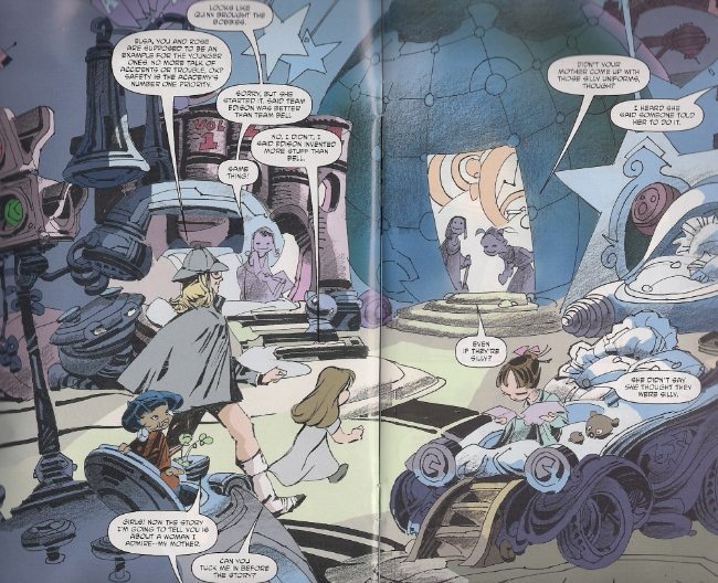
So, perhaps it's my preoccupation with the old Warren magazines that has prepared me for Legion of Molly Doves, the plot of which, fittingly, is postured like a Bill DuBay space-filler circa The Rook, seeing the young scion of a blighted future's time-travel academy become caught up in a backstory-heavy conflict between various political and familial interests, resulting in a trip to "Women's Prison" and a whole lot of fight scenes set against fields of color, irregular smears of black, and future tech suggested with varying degrees of lucidity. I have no idea what the title means, though I harbor suspicions.
Against my better judgment, I found myself both distanced and absorbed by the work, which is to say I sought irresistibly to inhabit the minds behind the creation of this book - where can a line be drawn between a glorified sketchbook and a satisfactory 'full' comic? What, indeed, is the purpose behind drawing this distinction? For the sake of art? Of pride? An attempt to pitch a movie, with the visuals demanding only negligible completeness to loan the hesitancies of a comic book script a veneer of adaptability? Or, less cynically, the enthusiasm of artists curious about what coloring can do, or just interested in getting a comic out per market assumptions?
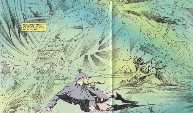
It is tricky to write about the pleasures of seams bursting and popping atop a narrative, though I hope at least I can convey enjoyment of the looseness of what might as well have laid in the heart of the younger Niño's style. I'd have probably just bought a sketchbook by him, but seeing this kind of harried narrative reminds us of an older set of expectations. One year older, now - like all of us.
--
Hawken: Melee #2
Written and drawn by Jim Mahfood; colored by Steven Chunn
Published by Archaia Black Label/BOOM!

Another thing I did over the holiday was see Anchorman 2: The Legend Continues, which is the latest Will Ferrell/Adam McKay exercise in ultra-masculine lampoon. The theater was packed, and one guy seated in my row was dosing his ICEE with gin - definitely a party atmosphere. At one point in the film, Ferrell's Ron Burgundy -- a pompous local hero newsreader, ill-equipped to cope with the nuances of big league cosmopolitan work in New York -- finds himself so flummoxed by the prospect of a black woman as his boss that he becomes paralyzed, unable to do anything other than stutter the word BLACK to her face over and over: BLACK BLACK BLACK. The audience roared.
And then, after the movie -- for days after! -- I would hear people tittering BLACK BLACK BLAAACK to each other. There is, at least, a tenuous justification for this in the film: Ron Burgundy is obviously a boob, albeit ensconced in so constricting an apparatus of parodic 'drama' that his eventual realization that black women are not exotic zoo animals is pitched with exactly the same jokey who-gives-a-shit off-handedness as anything else, thus inevitably foregrounding the immediacy of humor derived from being extremely fucking racist. Black, black, black. The second you're out of the theater, it's naughty time for white people.
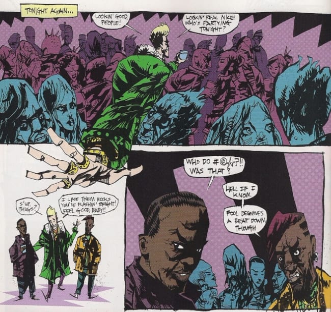
I bring this up because the caretakers of Hawken: Melee -- an anthology miniseries of stories set in the world of an online multiplayer mech-battle game I've never played -- have surrendered this particular issue to the distinctive stylist Jim Mahfood, who immediately transforms the whole thing into a comedy centered around a Ferrellesque cocksure tool, although I guess it's more Jamie Kennedy-as-Justin Timberlake-as-A Shitty Athlete. Either way, "Lance Armourstrong," ex-pop star turned hotdog mech pilot, lives an exemplary life of ignorance, endangering the health and safety of everyone around him until his teammates hire a femme fatale to fuck her way into his apartment, swap his performance-enhancing 'power-ups' with psychedelics, and ensure the lethal consequence looks like an accident during their next sortie. It's basically a goof on multiplayer gaming: how you often want to murder people who mess things up for everyone. It's funny because it's so mean. Like, they kill this guy!

That said, Mahfood, while much crueler to Armourstrong than Ferrell & McKay are to Burgundy, nonetheless grants his non-hero one crucial favor: every woman in this comic is drawn with the chop-licking glee of a Tex Avery wolf. Mahfood is *very* good at drawing sexy woman, and so it seems natural (almost inevitable) that the humor of the story will be filtered, to some extent, through Lance's lecherous gaze.

Yet this leads the comic into tricky territory. Clearly, the story Mahfood is telling does not want to endorse this character's perspective - not only is he depicted at all times as a total jerk, but many of the most sexualized images in the story are direct POV images. We're riding behind Lance's eyes as he smacks the woman's ass in her skin-tight pilot's suit, or when he witnesses what you're seeing above: the femme fatale, having engaged in sex she would rather not have, arching her back in adoring silhouette, her smooth curves marked only by the white of feathery armbands and tiny panties.
We're never granted an alternate POV, not in the way the perspective breaks away from Lance's self-absorption so the black men up top can openly criticize the same character's racial cluelessness. For women, hotness is *always* emphasized, despite the fact that Mahfood specifically connects this aspect of gaze to an agent of supreme cluelessness. Thus, a very prominent portion of the comedy resounds less with the condemnation of its plot action (THEY FUCKING KILL THE GUY) than a sort of auto-critical equivocation, the implication being that some troubles, while identifiable, have not yet been overcome.
--
Sin Boldly
Written and drawn by Joseph Michael Linsner; lettered by Jeff Eckleberry
Published by Image

One way to avoid this conflict, of course, is to just draw a lot of sexy women without any hint of apology. I get the impression Joseph Michael Linsner tends to get slotted in with Adam Hughes and whomever's drawing Cavewoman as a cheesecake guy - more visible for pin-up-style covers and standalone images than the comic book interiors he composes with great deliberation. Linsner, however, actually has his professional origins in b&w indie horror comics, a scene for which I retain a predictable fondness, so I was interested in checking out this similarly no-color one-shot. What I had not anticipated seeing was the exact opposite of Hawken: Melee #2.
A little over half this book is taken up by "Burning Roses," a fantasy/SF short that wouldn't seem out of place in Epic Illustrated or a "ground level" b&w genre anthology like Star*Reach, which is to say it's your basic swashbuckler with a noble-rogue hero and hints of palace intrigue; pretend Howard Chaykin is somehow involved and you'll get just what you're expecting.
More (let's say) striking, however, is "Hell is Waiting," a 14-page saga of Sinful Suzi (the young lady of the cover), which attempts some display of raucous, take-no-prisoners humor: page 1 depicts Kurt Cobain, in line for the Infernal Revenue Service down below, smoke issuing from the back of his head, frantically pulling the trigger of his emptied shotgun after hearing of Courtney Love's 2006 sale of 25% of the Nirvana publishing rights. "Well, hell is repetition," remarks Sinful Suzi, hanging a lampshade on the age of a joke which really does bring me back to listening habits of the early Clinton administration.
Anyway, Suzi is summoned to Earth by a frustrated artist who is angry that a peer has copied his ingenious portrait of a three-eyed Joan Crawford and flipped it into a successful gallery career, whereby the dastard can outsource the subsequent painting of his work to Mexicans. Suzi agrees to have the goof murdered in exchange for the artist's soul, but after a Mommie Dearest/Hellraiser-themed attack at a prominent opening, the now-departed plagiarist's prices skyrocket, prompting the commissioning artist to commit suicide, which then inspires a jurisdictional soul-collecting conflict between Suzi and, ah... "Big Black," as Suzi calls him.
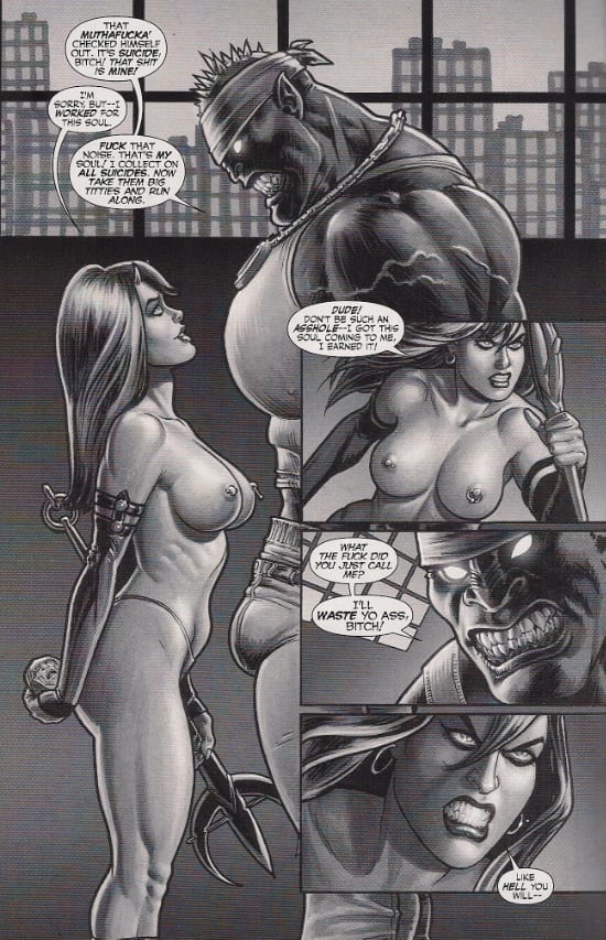
I *think* he's supposed to be a rapper? Like, contra the whinges of Nirvana? A charitable interpretation of this is that "Big Black," a creature of perdition, is merely *adopting* a breathtakingly ugly, caricatured persona for reasons known only to him (i.e. he's probably an idiot) - Linsner indeed has another black character elsewhere in the story, who is not defined by risible qualities of racist caricature such as a huge, bulging cock pressed in the direction of a white(-coded) woman under threat of violence. However, we must also look to the character's position in the story: "Big Black" represents the breakdown of social order inherent to Hell, rewarding the meanest and toughest and least 'fair.' Kurt Cobain isn't treated with an enormous amount of sympathy in this story -- nobody is, not even Suzi, whose fault is naiveté -- but it's only the presence of rap culture (or some half-recalled simulacrum thereof) which denotes the most forceful manifestation of loathsome brutality.
It's satire as the product of a rather old culture war, one I knew well in junior high. It's not fought on that front anymore; my fucking mom listened to 50 Cent. This wasn't the throwback I'd expected.
--
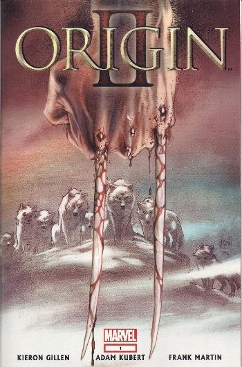
Origin II #1
Written by Kieron Gillen; drawn by Adam Kubert; colored by Frank Martin; lettered by Joe Caramagna
Published by Marvel
Speaking of throwbacks! My favorite Wolverine origin remains Barry Windsor-Smith's Weapon X, which, despite its 1991 publication, is best taken as the last of the '80s blood & thunder interrogations of superhero properties: a worthy position for the character which perhaps best embodied the appetite for darker subject matter as the '70s wore on, illustrated as spiky stained glass in a manner that bridged the classical values of Windsor-Smith's own rise to popularity and the new dominance of ultra-detailed pummeling via the future Image founders, many of whom were working on X-Men titles at the same time.
But unlike X-Force and company, Weapon X was a grand and bizarre vehicle for moral narrative, giving as much prominence to worker bees trapped in the mechanisms of the military-industrial complex as the clawed berserker, whose background was kept deliberately obscure so as to properly weaponize him. This was not a work of continuity; its looping, dreams-within-dreams storytelling actively fought against notions of certainty and permanence (like a book-length elaboration upon the old Alan Moore bit where the Joker can't remember his own origin), so as to better assess the normalization of systemic, cyclical violence, the eruption of said violence into a mutant avatar, and the dawning realization among the participants in this abuse -- the reality of what they are doing banalized through incessant background chatter improved from The Dark Knight Returns -- that they too are components of a Weapon.
The fact that something *that* experimental and aggressive and not-at-all-what-you'd-assume-superhero-readers-would-want was the 'official' origin story of this insanely popular character for years seemed like such a miracle that I can't even recall very much consternation over Marvel's decision to do a cleaner, more movie-ready origin in 2001, though I do recall the project itself, titled simply Origin, attracting some mockery for its 19th century period dramatics; I've never read it, myself.
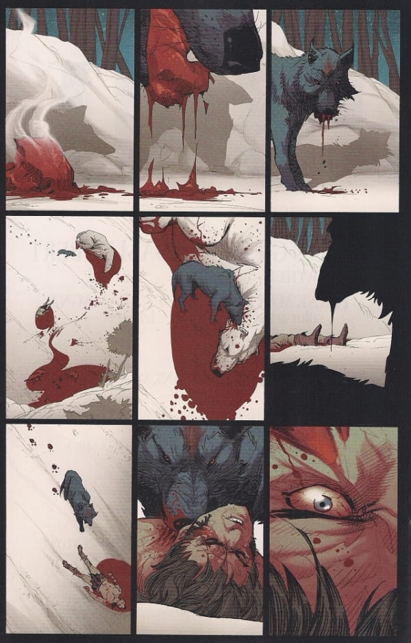
In true corporate superhero fashion, this new sequel comes from an entirely different creative team, though Marvel has freighted the appeal of the character and his [o]rigin(s) with such expectation that the comic arrives in a super-deluxe 48-page format with a fancy acetate cover, script excerpts in the back, relevant excerpts from the first Origin reprinted for your convenience, and a five-dollar asking price, which I gladly plunked down after I realized that the whole damn thing was gonna involve Wolverine fighting woodland creatures in the snow, because I guess I just associate animal violence with quality when the ol' canucklehead is concerned!
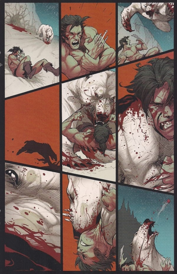
There's a little bit of Tor in the best of Adam Kubert's pages here, which I definitely appreciated, though his characters are more heavily-muscled than Joe Kubert's lithe wild man heroes, and his framing -- not entirely dictated by the script, judging from those excerpts -- tends to favor one or more small figures traversing environments. Despite the heavy combat focus, there's not very much in the way of skin-on-fur contact here (the page above has the most of it), the impact of which is often lessened by Kubert's collaboration with colorist Frank Martin, who works to fill out lightly-detailed backgrounds (or even the crazy squiggles all over that bear), giving the final output a lacquered, heavy feel, which translates to my eyes as an absence of immediacy.
Speaking of heavy, the writer is Kieron Gillen, whose captions preside over this bestial stuff with a maximum of serious-superhero mythic portent: "The bear needed flesh, and even with good hunting, the Wolfish Man had none to spare." We are told and shown that Wolfish-erine has become accepted into a pack of actual wolves, his tendencies for solitude literally lurking around the fringes in the anthropomorphized form of the sinister Lone Wolf; everything is pitched with a minimum of subtlety, so that Wolverine's happy family life is marked by the birth of adorable puppies, whose inevitable corpses are sloshed in solid crimson when the tagged bear (a fellow experiment, you see) arrives on the scene. It reads very much like a writer isolating core traits of the character under scrutiny and externalizing the fundamental conflicts, like maths where all work is shown.
That said, we can nonetheless imagine Gillen building a bridge of his own, between the desultory swagger of Windsor-Smith and the presumptive high populism of Origin I. The narration states the year as 1907, which hints at the coming Great War: a mechanized killing machine made grand and specific. Supervillain Mr. Sinister has played a role in Weapon X history post-Windsor-Smith, and Gillen has suggested he will be involved in his story in a non-superpowered manner. These are all good ideas, though I may just be favoring similarities to a story I've liked more than any other X-comic. If, typically, the X-Men are pitched as a dubious metaphor for societal abuses, then it was that old, superseded origin for the most individual of all the group which most adroitly investigated complacency in that society. You can't replace that, no matter how market-savvy you get.
--
Damian: Son of Batman #3
Written and drawn by Andy Kubert; colored by Brad Anderson; lettered by Nick Napolitano
Published by DC
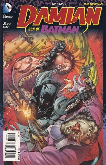
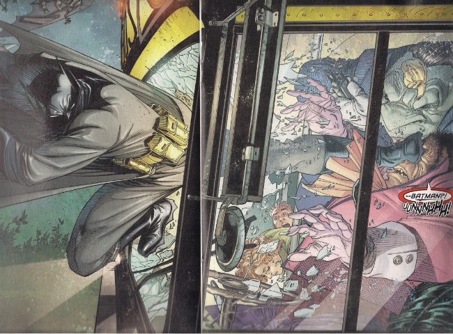
Plus, at least Origin II seems to *have* big ideas. This, in contrast, is nonsensical, overblown fanservice from Andy Kubert, whom some of you will remember as the initial artist for writer Grant Morrison's lengthy tenure at the front of the Batman franchise. Among Morrison's biggest successes was his introduction of Damian, Bruce Wayne's son by the villainous Talia al Ghul and an utter prick whose imperious attitude and taste for violence made him a quick favorite for readers who remembered back when Jason Todd got himself killed for one-third the misbehavior. At the summit of the Morrison/Kubert collaboration sits Batman #666, a riotous peek into a future where Damian has transformed the Batman legacy into a compendium of all the worst gritty superhero tendencies imaginable.
Damian himself was killed off toward the end of Morrison's run, but his co-creator is now back for a solo miniseries set in presumably the same dark timeline as #666, with many of Morrison's gruesome unique characters, yet Andy Kubert is simply not Grant Morrison: his blend of jokes and grue isn't nearly as deft, his dialogue is leaden in its attempts at whimsy, and the story he's telling is nothing more than a tiresome manifestation of the oldest superhero trick in the franchise manual: elaboration. What's Commissioner Gordon doing while this stuff's going down? How about Alfred? Can we see more of those talking gorillas? Does Dick Grayson die? Like many alternate continuity superhero stories -- Elseworlds, What If...?, whatever -- quite a lot of characters suffer weightless deaths for the purposes of noisily smashing expectations, to no particular end. There was a point to Morrison's goofing around with this timeline - it spoke to the necessity of the character to overcome his worst habits, with the help of others.
Now, eh:
That's as much of a point as you can expect.
--
Absolution: Happy Kitty Special
Written by Christos Gage; drawn by Paul Duffield; colored by Paul Duffield & Nadine Ashworth
Published by Avatar Press

Getting back to Kieron Gillen, though - I mentioned above that I'll buy comics based on people I've liked in the past, and I have liked Gillen's ongoing series Über, a Caanan White/Keith Williams-drawn superhero book that positions itself as a docudrama recounting the late history of a World War II grossly extended by the development of super-soldiers. And I do mean *grossly* - this is an Avatar Press production, which means the drama is loaded with sensational violence befitting a publisher that's built its name on letting popular writers do whatever the fuck they want, so long as the splatter flies. Usually it's Image that gets pegged as the new Vertigo, but for my money it's Max Brooks' & Raulo Cáceres' The Extinction Parade that truly captures the scolding, verbose texture of vintage Jamie Delano. You know who the real vampires are? THE RICH WORLD, YOU PASSIVE SLUG.
On the other hand, you're a little more likely to wind up with something like this.
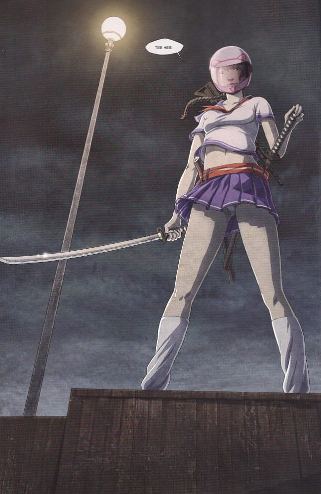

I just counted four panty shots in two pages of this exercise in Asian lady fetishism, which I guess is maybe supposed to be parodic-- god, I don't even fucking know anymore. It's a spin-off of another Avatar superhero comic, Absolution, which I stopped reading a long time ago; I only picked this issue up because it's drawn by Paul Duffield, a contributor to the high-gloss UK kids' comic The Phoenix who'd previously drawn Warren Ellis' Avatar-sponsored webcomic Freakangels. Duffield is an interesting fit in Avatar's stable; if you take top dog artist Jacen Burrows (co-creator of the line-leading Crossed franchise of gore comics) as the model for a publisher 'house' style, Duffield is the sole furtherance of Burrows' cel animation cleanness into something not unlike screengrabs from the anime they used to advertise in Heavy Metal before only porno companies were left.
So, of course his look would flatter this tale of a Yakuza pimp who discovers a girl not entirely unlike the autistic super-fighter of Prachya Pinkaew's Chocolate, though this kid is obsessed with violent video games, the killing maneuvers of which she can easily translate into real-life murders, at least until the puzzlingly far-off day when one of her targets lets slip that he has a wife and child, prompting a slight awakening of ethical calculation in Happy Kitty.
The writer is Christos Gage, who, given his 2002 collaboration with Larry Clark on the television movie Teenage Caveman, would appear to be the most apropos Avatar scribe possible, but actually leans hard on a superheroesque calculation of how a character's power set might 'work' in a logical story. Like, how do you keep her from killing guys on her side? The story thinks out loud, confined to the four corners of its dead-basic scenario.
My gut tells me this is all supposed to be tongue-in-cheek, but it's never enough to simply check for the presence of comedy - what, instead, is the comedy saying? That Japanese schoolgirl fetishism is brain-dead? The story totally misunderstands the protective, moe impulse that underscores the prevalence of that trope to begin with. That video games are dumb and violent? The girl ought to broaden her horizons to any number of games that deliberately and explicitly address these very issues - this is a lampoon that denies agency to anyone in a position to affect change, resulting in fatalistic junk. Strange as the notion may be to the dissenters, Avatar can do better than that.
--
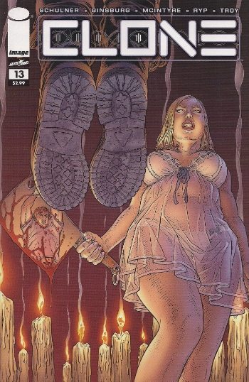
Clone #13
Written by David Schulner, Aaron Ginsburg & Wade McIntyre; drawn by Juan José Ryp; colored by Andy Troy; lettered by Rus Wooton
Published by Image
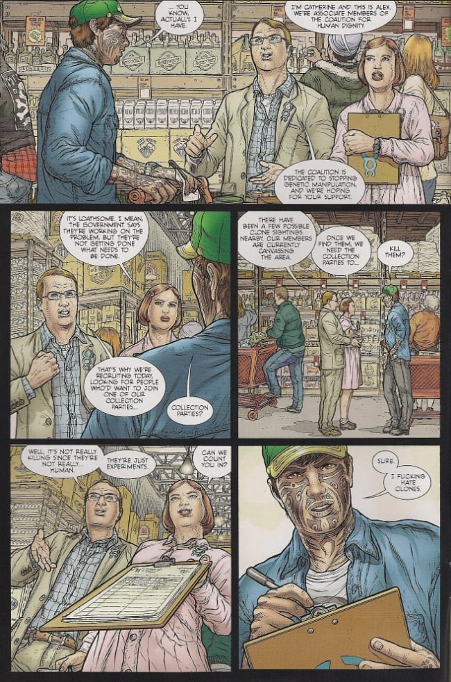
So, to reiterate a few of the above topics - dodgy satire:
Sex fantasies/physical threats:


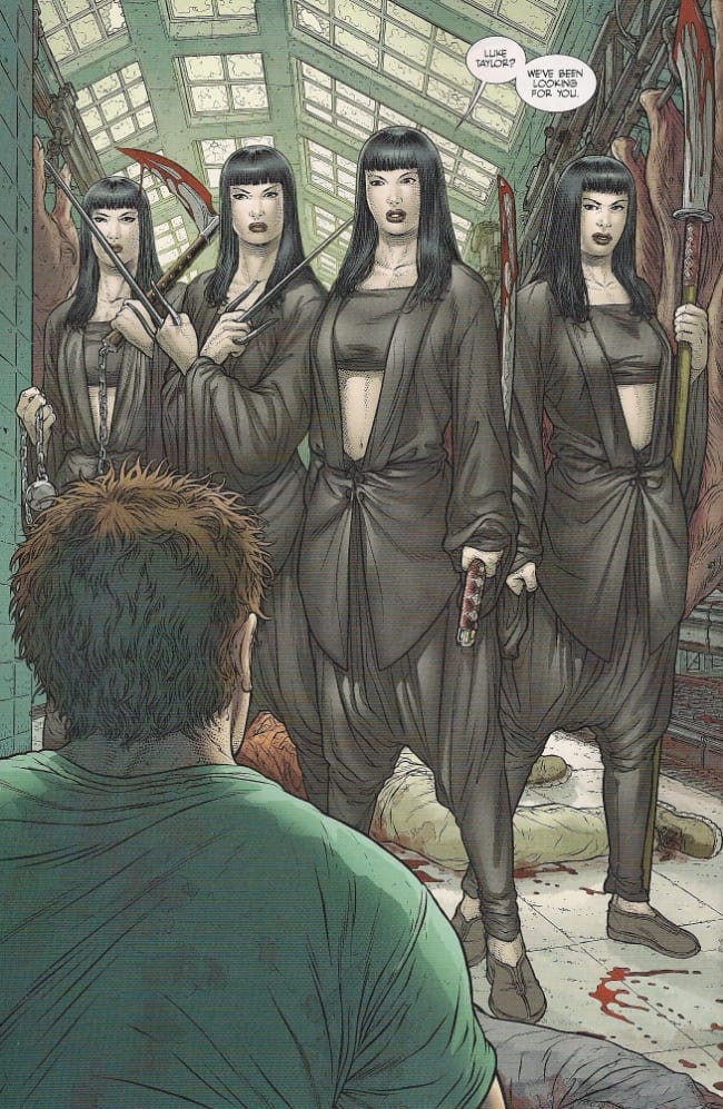
And lethal Asian babez:
Reading this week's column over (fancy that!), I seem to have fallen prey to a mounting frustration. This I attribute to a predilection for reading comics based only on the joy to be found in one aspect of the whole; I cannot honestly say these works are entirely satisfying as a result, as the problems I describe are real.
But then, so is the joy, which I'm afraid I've done a poor job of conveying here today, so used I've gotten to editing my critical output to writing on very select works. Presenting a shopping list through this column was supposed to keep me grounded, honest. I am an absolute fool for comics that have drawings which tickle me. You see Juan José Ryp up there? He's an utter delight, one of the most antic of all the Moebius-informed artists out there today, a high-output workhorse eternally buzzed on enthusiasm. That conservative guy up there in the glasses looks stiff, yes, but something about the self-seriousness behind him is really funny; I adore the thick necks on Ryp's blade-wielding girls and the syrupy, gooshing quality of all the blood. It's like you can hear this hysterical cackling behind every page, and I confess that's something I'll chase through a thicket of lame plotting to find.
I won't always write about it, though. Sometimes there's only so much you can say beyond "Juan José Ryp sure can draw a man taking it up the ass with an electrified wand." Here's to a great 2014.


