Alfred D’Orsay was not the sort of fellow I’d invite into my home for a drink, dinner, and deep philosophical conversation in the Hare Tonic Library over a vintage bandy. Reading between the lines of even a short biography (such as St. Wikipedia’s), we learn that Comte d’Orsay, while an amateur painter and sculptor of modest attainment, was a calculating social climber and parasite of somewhat more conspicuous success. He was the sort of fellow who would make off with his host’s wife. And in fact, that’s exactly what he did—with an eye on both her charms and her fortune.
Born in Paris in 1801, son of a Bonapartist general and the illegitimate daughter of a duke and an adventuress, D’Orsay entered the French army of the restored Bourbon monarchy at the age of 20 and while in London attending the coronation of George IV, he became acquainted with the first Earl of Blessington and his wife Marguerite, reputedly forming a menage a trois, which may account for at least some of his attraction for George Gordon, Lord Byron, who was rumored to have indulged in a similarly illicit affair with his half sister, Augusta. Byron praised Comte d’Orsay’s “gifts and accomplishments” and his knowledge of men and manners and his prowess of observation. And probably envied the count’s domestic arrangements.
At 26, D’Orsay married Blessington’s 15-year-old daughter Harriet by a previous wife, hoping to secure a claim to the Blessington estate, but when Blessington died two years later, his widow took up with D’Orsay, and the two of them established a fashionable salon for the literary and artistic society of London. Meanwhile, Harriet, finally having had enough after a decade of decadence, separated from D’Orsay in 1838, effecting a settlement in which, in exchange for her paying off 100,000 pounds of his debt (about $150,000 at today’s exchange rate, but only a portion of what he owed), he gave up any claim to the Blessington fortune.
At his salon, D’Orsay met Benjamin Disraeli and Edward Bulwer-Lyton, other young dandies of the day, and they became such friends that Disraeli asked him to be his second when it appeared he would fight a duel with the son of an Irish agitator. D’Orsay, however, declined the dubious honor on the grounds of being a foreigner.
Comte d’Orsay went bankrupt in 1849 and returned to Paris; the widow Blessington (Marguerite), after selling all her possessions, followed him there but died a few weeks later, leaving him heartbroken and without means. He dabbled in portrait painting, but as a Bonapartist, he probably banked on his acquaintance with Prince Louis Napoleon, who had been elected President of France in 1848, subsequently, in 1852, through a coup d’etat, establishing himself as Emperor Napoleon III. Leery of D’Orsay’s dependability, Napoleon appointed the count to the harmless post of Director of the Beaux-Arts, but D’Orsay died of a spinal infection just a few days after the appointment was announced.
In his day, D’Orsay was a model of men’s fashion but scarcely a model of decorum and propriety. With his appetites and indulgences, he may, however, have been right at home in New York’s Roaring Twenties. In fact, by a circuitous route, he was exactly that. Which brings us, by the sort of oblique roundabout manner of the writers of articles in The New Yorker, to Eustace Tilley, the actual subject of this posting.
Eustace Tilley is the name given to the 19th century boulevardier languidly inspecting a passing butterfly through his monocle on the cover of the first issue of The New Yorker dated February 21, 1925. The same picture appeared on the magazine’s anniversary issue every year until 1994, when a new editor at The New Yorker, Tina Brown, suddenly violated hide-bound tradition by replacing Tilley with a 20th century version of the boulevardier, a chronic slacker and layabout drawn by Robert Crumb.  Nothing was ever the same at The New Yorker since.
Crumb’s drawing arrived at the magazine without explanation, said art director Francoise Mouly. “We noticed that it showed the view in front of our old offices on 42nd Street, but we didn’t realize that it was also a play on Eustace Tilley.” Understanding that the picture was a parody of Eustace Tilley, Brown seized upon it as a way of breaking a 69-year logjam: she put Crumb’s Tilley, subsequently christened Elvis Tilley, on the cover of that year’s anniversary issue.
As Lee Lorenz, one-time cartoon editor at the magazine told me, Eustace Tilley appeared on the cover of the anniversary issue because no one could think of an appropriate alternative. So year after year, Eustace Tilley returned. Without too much difficulty, we can see how this custom had become a habit. It was Harold Ross’s fault.
Without question, Harold Ross was the world's most unlikely candidate for editor-founder of the nation's most sophisticated magazine of humor and urbanity. A frontier kid with only a tenth-grade education, he was born November 6, 1892, in Aspen, Colorado, then a mining camp, not a ski resort or a hideaway for Hollywood celebrities. The Ross family moved around to some small Colorado towns, and then to Salt Lake City, where Harold attended high school but never graduated; he quit school after his sophomore year and went into newspapers. In high school, he’d worked on the school paper, The Red and Black.
There, he met the other Salt Laker who would influence cartooning in America—a teenage artist three years older than he, John Held, Jr., who was born and raised in Salt Lake City.

They became friends and both were stringers for the Salt Lake Tribune while in school, and they were sometimes sent to the Stockade, the old redlight district, to interview such stellar attractions as Ada Wilson, Belle London, and Helen Blazes.
When Ross left Salt Lake City as a teenager, he became a slovenly tramp newspaperman who spend his years before World War I roving from one newspaper to another, a common type in those years. By the time he was 25, he had worked for at least seven papers around the country; then he joined the American Expeditionary Force attacking the Hun in Europe.
During the War, he worked on Stars and Stripes, the armed forces newspaper, where he was nominally managing editor. The staff was a convivial crew, and after the War, they all landed in New York; there, Ross was encouraged to launch, after a false start or two editing other magazines, The New Yorker. The magazine struggled in fiscal red ink for years, but Ross never wavered in pursuit of his vision.
Ross remained throughout his life the same contradictory sort—a rowdy, gangly, mussed-up hick-looking wight with electric hair (a sort of brush cut standing on its ends), Hapsburg lower lip, gap-toothed grin, a droll sense of humor, and a profane vocabulary. In both his uncouth eccentricity and sheer doggedness, Ross was without equal in American journalism.  He was also very, very lucky.
Ross knew what he wanted The New Yorker to be, but he couldn’t articulate his vision in order to guide his writers and cartoonists. So they all fumbled around for several months and a couple years until something started to gel. Eustace Tilley was one of Ross’s first fumbles. And it turned out to be a very lucky fumble.
By mid-February 1925, the first issue of The New Yorker was ready to go to the printer. But it lacked a cover. “Ross toyed with various concepts for this crucial first cover,” said Ross’s biographer, David Kunkel in Genius in Disguise, “and he asked several artists to work up sketches on what amounted to a dreadful visual cliche, a curtain going up on Manhattan. What he got back was predictably static and maddeningly literal.”
At the last minute, Ross turned, luckily, to his art editor, Rea Irvin.
Irvin was born August 26, 1881, in San Francisco, California, to which his parents had journeyed by covered wagon in the 1850s. Although Irvin attended Hopkins Art Institute in San Francisco, he also entertained the idea of a career in acting, which he pursued briefly beginning in 1903. He then served in the art departments of several newspapers, including the Honolulu Advertiser, but eventually, he moved to New York, and by the 1920s he had achieved a good measure of success as a newspaper and magazine cartoonist, becoming art editor of the venerable humor magazine Life. His thespian inclinations remained, however, finding expression in his theatrical manner of attire and in his demeanor, which radiated the stage presence of an accomplished actor. A lumbering bear of a man albeit soft-spoken, he was a familiar figure at both the Players Club and the Dutch Treat Club.
As Ross refined his plans for The New Yorker in the latter months of 1924, he enlisted Irvin to help with the art chores. Irvin, who had just been replaced as art editor at Life, had a flourishing freelance art business, but he agreed to serve as "art consultant" (Ross eschewed formal titles), stipulating that he could afford to give only one day a week to the task, for which he was paid $75 and shares of the magazine’s stock.
The day that Irvin gave to the magazine every week was the day he helped Ross select the cartoons for the next issue. The "art meeting" was "one of the great New Yorker institutions," according to Russell Maloney, a member of the staff for many years who, in the August 30, 1947 issue of The Saturday Review of Literature, described the process, "hardly changed by the passage of the years," by which the cartoons are selected.
"The art meeting has always been attended by Ross and Irvin, the first art editor. The current art editor attends; so does one of the fiction editors; Mrs. White does if she is in town. [She's E.B. White's wife, who was Katharine Angell when she started editing fiction and poetry shortly after the magazine began.] These people sit four abreast at a conference table, while the [cartoons], one after another, are laid on an easel in front of them. At each of the four places at the table is a pad, pencil, ashtray, and knitting needle. The knitting needle is for pointing at faulty details in pictures. Ross rejects pictures firmly and rapidly, perhaps one every ten seconds. 'Nah ... nah ... nah.' A really bad picture wrings from him the exclamation 'Buckwheat!' —a practical compromise between the violence of his feelings and the restraint he feels in the presence of Mrs. White or a lady secretary [taking notes on the proceedings]. 'Who's talking?' he will ask occasionally; this means that the drawing will get sent back to the artist to have the speaker's mouth opened wide. Now and then Ross gets lost in the intricacies of perspective. 'Where am I supposed to be?' he will unhappily inquire, gazing into the picture. If nobody can say exactly where Ross is supposed to be, out the picture goes."
Irvin's taste in art was expansive: he liked classic and modern art, he was sympathetic to anything new, and he knew good craftsmanship when he saw it. Moreover, he was articulate about art: he could tell artists specifically what to do to improve their work and to make it acceptable to the magazine. When a drawing amused him during the art conference, he chuckled; and he often gave little lectures on art appreciation. Irvin's presence and his manner undoubtedly educated Ross in the subtleties of cartooning, refining the editor's taste and raising his standards.
In his 1959 book, The Years with Ross, James Thurber, assessing Irvin's contribution to the magazine, says unequivocally that Irvin "did more to develop the style and excellence of New Yorker drawings and covers than anyone else, and was the main and shining reason that the magazine's comic art in the first two years was far superior to its humorous prose."
In her Defining New Yorker Humor, Judith Yaross Lee agrees that Irvin was essential: noting his "taste for ironically related images and text," she goes on to say that "what is often called the 'New Yorker cartoon' deserves to be called 'the Irvin cartoon.'"
Since The New Yorker style of cartoon set the pace for American magazine cartooning since the early 1930s, Irvin looms large in the history of the medium as a major influence. In fact, he might even be said to be the "father" of modern magazine gag cartooning.
In turning to Irvin for the magazine’s first cover, Ross asked for a picture that “would make the subscribers feel that we’ve been in business for years and know our way around,” said Dale Kramer in Ross and the New Yorker—“anything that might suggest sophistication and gaiety,” added Kunkel. Over the months of preparation for The New Yorker’s debut, Irvin had prepared the layout for the first issue and designed the distinctive typeface for the magazine, modifying a face developed by Carl Purington Rollins. He also drew most of the department headings, including, for the first section of the magazine (called, initially, Of All Things, it was soon dubbed Talk of the Town), a monocled Regency-era scribe in a high collar with his nose in the air. The same personage is shown gazing through his monocle at an assortment of thespian caricatures for the Theatre department.

About the owl: I have no idea why an owl figures so importantly in all of the Talk of the Town headings. Is it intended to suggest a “night owl,” a creature of the evening and wee hours, haunting speakeasys and saloons? Whatever—whoever (“who, who”?)—the owl has been as faithful an attendant at The New Yorker as Irvin’s dandy; he’s there even today, winking at us conspiratorially.
In waiting until the last possible minute before enlisting Irvin for one more try at a cover illustration (he’d already done one of the lifeless curtain raisers), Ross hadn’t given his art editor much time. Desperate, Irvin went back to his files for the pictures that had inspired the 19th century dandy that headed two of the magazine’s departments. Since the character appeared twice in the first issue already, why not on the cover too? Irvin might have settled for something similar to the cover he drew for Life the previous fall, instead he turned again to an 1834 caricature of the Comte Alfred d’Orsay at the height of his stylish influence (bringing us, in the manner of New Yorker writers, back again to the otherwise wholly superfluous, but tenuously, slyly, pertinent paragraphs of our opening gambit).
Irvin again added a monocle to signify supercilious intellect and, this time, a butterfly for whimsey, producing an elegant emblem of insouciant detachment. 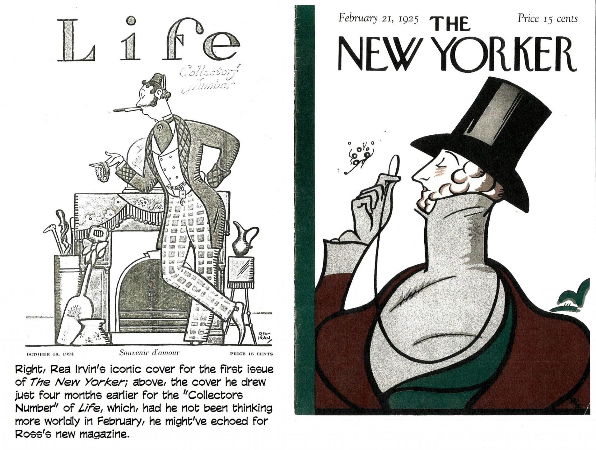
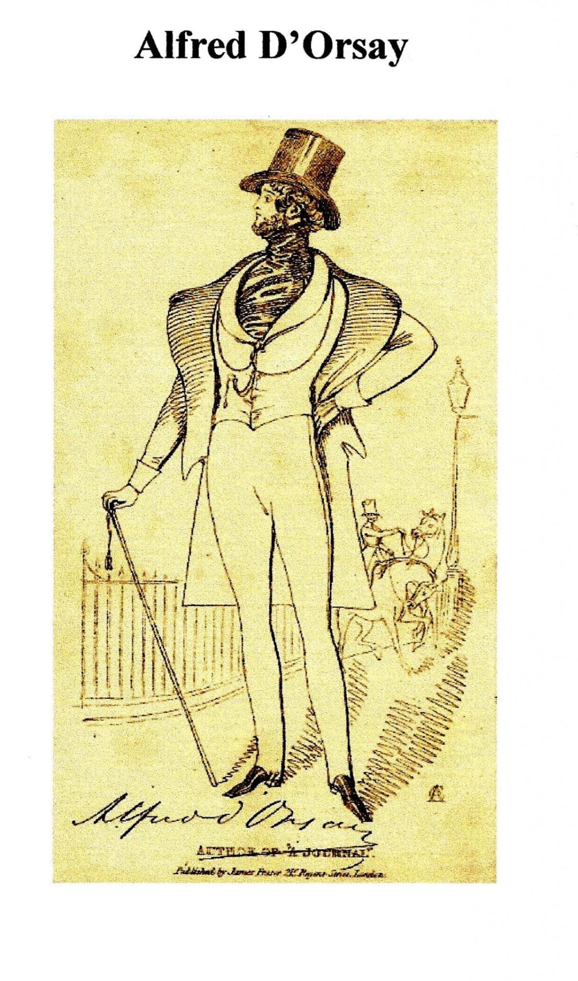
 (This incarnation of D’Orsay seems harmless enough that we might invite him to dinner—only to discover, doubtless, that his conversation was so vacuous that we could tolerate his company only once a year.)
Irvin’s picture was perfect. The perfect portrait of a seeming sophisticated man-about-town who is so vapidly empty-headed as to find a fluttering insect an object worthy of minute inspection. What prospective first-time reader-buyers thought of this incongruous picture when they saw it on the newsstand, we can’t, with authority, say. Certainly they knew nothing about the Comte d’Orsay or his vaguely shady but entirely extraneous machinations of the previous century, so they were no doubt baffled by the image of a man dressed in the height of 19th century fashion covering what purported to be a magazine of contemporary jazz age sophistication and wit.
But what they thought, at this last minute of preparing the first issue for the printer, was, like everything we now know about Comte d’Orsay, irrelevant. Ross, knowing nothing of d’Orsay, loved the drawing. Despite the time-warped attire, Irvin’s picture of a would-be sophisticate gently ridiculed the very people the magazine aimed to appeal to, embodying exactly Ross’s intention. Irvin’s dandy set the tone and intent for everything that followed—within the first issue and all subsequent issues.
Ross always said Irvin’s cover was the best thing in the first issue. It was so apt an emblem for the magazine that no one could ever think of a suitable sequel to use for the ensuing anniversary issues. In fact, until the first anniversary issue, probably no one had given any thought to anniversary issues. That the magazine had survived a year since its debut, running deeply into the red, was miraculous, so to celebrate the miracle, Ross and his cohorts no doubt decided to repeat the cover image of the first issue as a gesture of defiant triumph—“Look at me! I’m still here, snooty and distant as ever.”
Perhaps for substantially the same reason, Ross repeated the cover again on The New Yorker’s second anniversary and then the third, by which time, the magazine was running a little in the black. The habit was formed. Thereafter, Ross ran the same cover every year on the last issue in February. And until the advent of Tina Brown, Ross's successors did the same in honor of the founder (and of Irvin). So Irvin's haughty dandy, anachronistically attired in top hat and high collar, graced the cover of America’s most urbane weekly magazine once a year for nearly 70 years. And he continued to appear inside every issue of the magazine in the heading for the opening section, Talk of the Town. Still does.
But Irvin’s Regency dude didn’t get a name until he was almost six months old. In the summer of 1925, Ross had another of his routine fits of exasperation—this time, about “the goddam inside cover” of the magazine, which was “embarrassingly empty of advertising” as Judy Yaross Lee puts it. So he asked humorist Corey Ford to fill the page with comical subscription promotions for the magazine.
Ford would become an occasional diner at the famed “round table” lunches of writers, actors, critics and other wits (among them, Robert Benchley, Dorothy Parker, Alexander Woollcott, cartoonist Ralph Barton and, often, Ross) that were held daily through the 1920s at Manhattan’s Algonquin Hotel just a block away from The New Yorker’s offices.
“Although Ross was liked by the Round Table group,” Ford wrote in his 1967 memoir, The Time of Laughter, “its members did not take him seriously, and his raffish face and gawky manner made him the butt of continual ‘joshing’ as he called it. Woollcott [another fugitive from the WWI Stars and Stripes, who, with Ross and his wife and a fourth cohort, co-owned the midtown apartment they all lived in], considered Ross his personal protégé and described him as ‘a dishonest Abe Lincoln.’”
Ross may have been ribbed for his country-boy appearance and demeanor, but he regularly moved in celebrity circles. The apartment he lived in was designed by its tenants who remodeled it, connecting two adjoining brownhouses, and it became a gathering place for artists and literary types, including such dignitaries as George Gershwin, Edna St. Vincent Millay, F. Scott Fitzgerald, Irving Berlin, Dorothy Parker and Harpo Marx
Ford, who would soon make his way into this exalted company, was born and raised in New York City and had just graduated from Columbia where he edited the campus humor magazine, Jester. He would eventually author 30 books and over 500 magazine articles, mostly humorous, but in 1924, he was peddling his comedy around town to humor magazines like the old Life and Judge. At the latter, he met and grew to like Ross, who was then enduring his brief frustrating tenure as that magazine’s editor.
In his memoir, Ford confessed that “it is hard to say what inspired my immediate confidence in Ross. He looked like a bucolic bumpkin, his features plain to the point of being homely, his big hands flailing in all directions to bolster his inarticulate speech. Often he would leave a sentence unfinished, and fling both arms aloft in utter futility. He was always perched on the edge of his chair ready to leap up and start pacing the room in restless pursuit of an idea. Even when standing in one spot, he managed to remain in motion, jangling a pocketful of keys and loose change or stabbing the air with a forefinger or banging the desk as his voice rose to a squawk.
“Ross seldom laughed aloud. If something amused him, his upper body heaved spasmodically a couple of times, and his heavy lips parted in a broad silent grin, showing large teeth with a gap in the center. He wore his coarse brown hair brushed upright to a height of three inches; and now and then, when he was embarrassed or frustrated, he would rub a hand across his face and comb his fingers back through the thatch of hair in one prolonged gesture of confusion, or explode with a heartfelt ‘Jesus!’ and then grin at his own ineptness.
“His language was a curious admixture of roundhouse oaths and bits of antiquated slang which dated back to my earliest childhood—bughouse, spooning, stuck on her, sis. After a tirade, his mobile face would light with sheepish amusement and he would sigh, ‘God, how I pity me.’
“It was his balancing sense of humor about himself, I think, that made him a great editor, another of the half-dozen greatest I’ve known. ‘All right, Ford,’ he would conclude an interview with me, waving a limp hand in dismissal, ‘God bless you.’”
In picking him to fill the hole on the inside cover, Ford said Ross was recalling a “random series” Ford did “on the Fugitive Art of Manhattan—beards and moustaches on subway ads, chalked sketches on brick walls, doodles on Wall Street blotters, and the like. In his impulsive way, he called me into his office and began jangling coins and pacing the floor. Could I do a series of promotion ads to fill the goddam inside cover. Have the first one by tomorrow? Done and done. God bless you.”
Irvin suggested to Ford that he use the inside cover to parody the kind of burlesque in-house testimonial that Vanity Fair was then running. Ford obligingly produced twenty-one “chapters” (including an unnumbered Introduction) in an epic entitled “The Making of a Magazine.” Each chapter delved into some arcane aspect of the magazine’s production: beginning with “Securing Paper for The New Yorker,” Ford discussed in exhaustive pseudo-scientific detail how paper is made from wood and from rags, how ink is obtained from squids, how type is “mined” deep underground, how the pages are bound together, how punctuation marks are cultivated, how contributors are nurtured, and so on.
Before getting into these mechanics of magazine production, Ford assembled some statistics (“the Funny Little Things”) testifying to the immensity of The New Yorker’s circulation.
“Here it is Friday,” he commences, “and at a rough estimate, there have been probably thirty or eighty millions of people who have bought The New Yorker since last night; and the returns from Maine are not due till tomorrow. This means that if you add all these figures together and multiply them by the number you just thought of, then the card there in your hand is the eight of clubs.”
At the time, the circulation of Ross’s brain child was minuscule, scarcely between “thirty or eighty” (which?) millions.
Not content with perpetrating a paragraph of this ludicrous nonsense, Ford forges on: “Perhaps the following illustration may serve to bring home to the average mind the magnitude of these figures: first, conceive in your mind’s eye the entire population of New York, New Haven, Hartford and a fourth city about the size of Pittsburgh (let us say, Pittsburgh), and picture them arranged kneeling side by side single file in a long line, all blindfolded and holding in their hands the combined output of the New York Times, the Saturday Evening Post, and Dr. Frank Crane. Now suppose that someone were to sneak up and give the first man in line a sudden shove. Why, over they all would go like so many nine-pins, and wouldn’t it be fun though?”
He concludes with a promise to conduct a “tour” through the “great organization behind that circulation, making stops at Tennessee and other points of interest along the way. ... For this trip we should advise a complete change of clothing, two blankets, and comfortable footwear, since there is nothing so important on a journey as easy feet except (ah, yes)—The New Yorker.”
And here, amid the concatenation of increasingly meaningless statistics, we first see “Mr. Tilley.”  He appears in an illustration that compares a towering stack of New Yorker magazines (B) to the Leaning Tower of Pisa (A). Because Mr. Tilley is included chiefly to provide a human dimension against which the height of the two towers can be compared, he is pictured at a monstrously diminutive size. We can see only that he wears a top hat and carries a cane and is referred to as “Our Mr. Tilley.” No first name yet. And he isn’t mentioned in the surrounding text at all.
In the next chapter of Ford’s “Tour through the Vast Organization of The New Yorker,” Tilley is pictured directing the cutting down of trees for making into paper. Compared to the size of the trees, he is still pictured very small, but we can discern a top hat, cane, and cut-away coat—formal attire. And the caption tells us that he is “Our Mr. Eustace Tilley.”
According to Ford in his memoir, the last name he borrowed from a maiden aunt. And he says he chose the first name “for euphony,” a patently false but lugubriously comical claim. Eustace is scarcely euphonious with Tilley. Instead, the assertion reveals only Ford’s penchant for word play: euphony = Eustace. More likely, he chose Eustace because he liked the high-toned but vaguely effete sound of a fraternity brother’s name, Eustace L. Taylor.
While Eustace Tilley is named in the text of most of the other chapters in Ford’s saga and appears in the illustrations accompanying all of the rest of the series, we don’t get a good look at him until Chapter XVII, when he appears in close-up; and the last chapter provides a portrait at full length.  Close-up, Ford’s Tilley looks absolutely nothing like Irvin’s Tilley. In the last chapter’s portrait, we see the top-hatted figure in a cut-away coat, striped trousers and spats, carrying a cane and wearing—a monocle.
The monocle is the only physical evidence that Ford’s “Our Mr. Eustace Tilley” is the same as Irvin’s cover creation. In fact, of course, they aren’t the same at all. Ford’s Tilley is a 20th century fop-about-town; Irvin’s is an elegant refugee from the early years of the previous century.
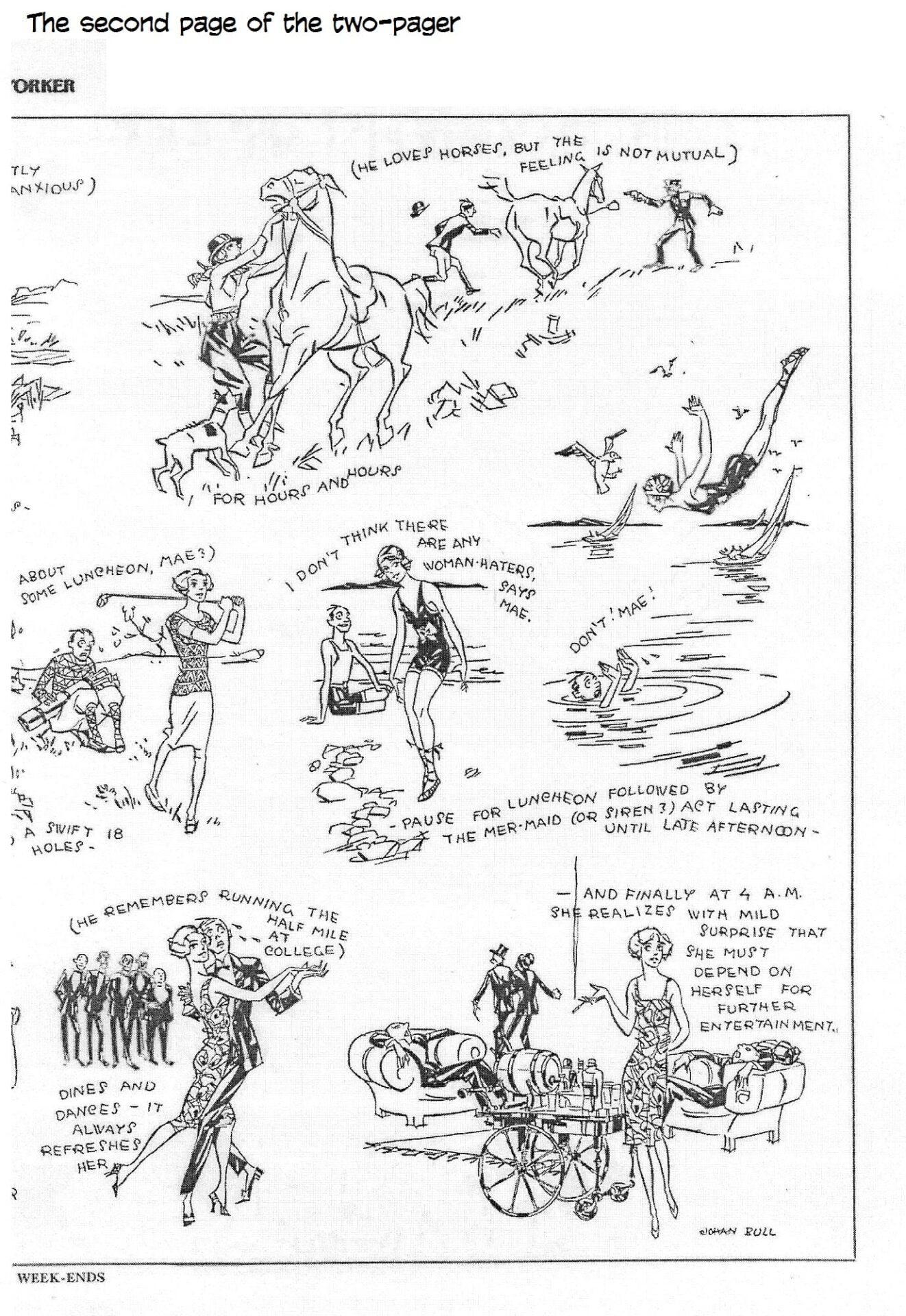
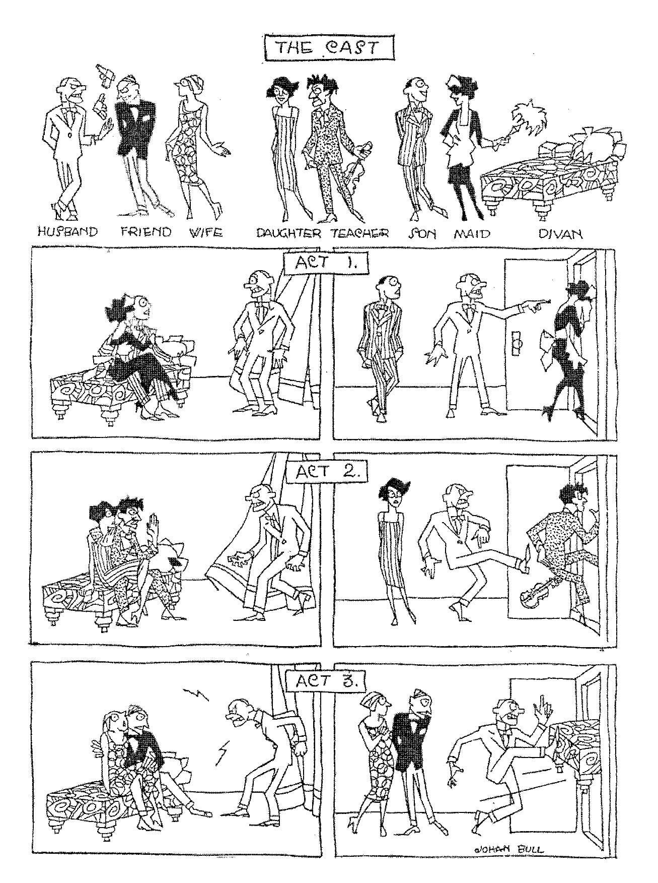
Ford’s Tilley is drawn throughout the series by Johan Bull, who had recently been added to the magazine’s staff having just immigrated to the U.S. from his native Norway; for Talk of the Town, Bull supplied spot drawings, wonderfully deft and clean-cut renderings. 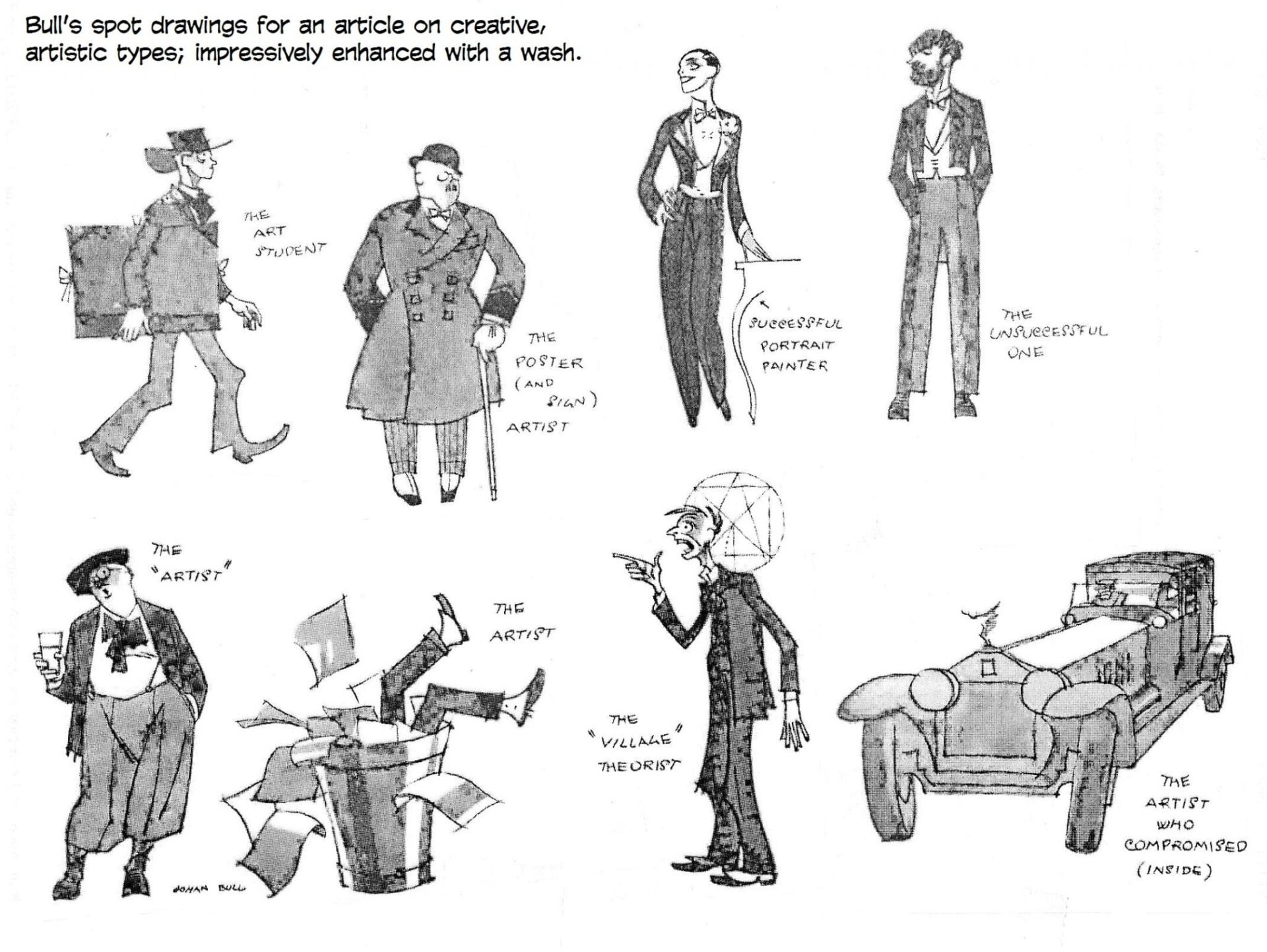
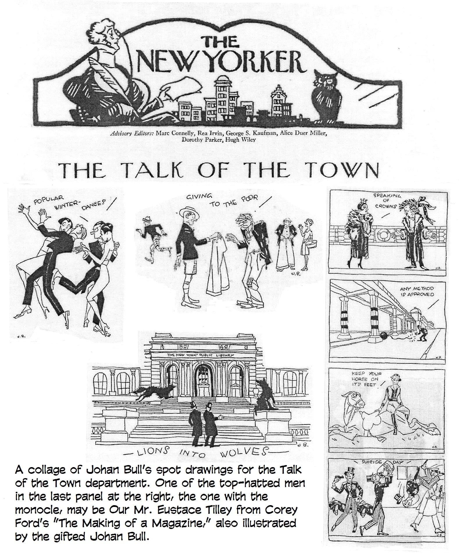 He also illustrated longer articles in the magazine with supple wash drawings, and he produced two-page “cartoon essays” (groupings of cartoons all illuminating the same subject) in naked linear style. He was remarkably versatile, resorting sometimes to an entirely different sketchy manner for cartoons.
Bull may have been, after Irvin, one of the most accomplished artists to work in the cartoon form in the early New Yorker. Bull’s crisp drawings show up in various other American magazines of the day, but he seems, unaccountably, to have disappeared from New Yorker annals altogether: he shows up in none of the reprint tomes that started coming out in 1928. His last cartoon for the magazine appeared in the issue dated October 22, 1927; his first, July 4, 1925. (We’ve posted a short gallery of his New Yorker art down the scroll.)
Bull was in good company in those early years. The magazine featured much more purely decorative art, illustrative only in the sense that pictures of festive restaurant diners might accompany an article about New York nightlife. Reginald Marsh often supplied ash-can scenes of city street life spread across the bottoms of the two facing pages that followed the Talk of the Town opening. Two-page spreads of cartoon essays were common. Helen Hokinson, famed for her matronly ladies, provided a couple such spreads during that first summer, neither featuring her plump, doughy matrons; one was a visit to the beach, and the sun bathers were all young people; the women, shapely rather than dumpy.
Spot drawings were not tiny inserts as they are today: in the early issues, spot drawings took as much space as their subjects needed. During the notorious “monkey trial” in Dayton, Tennessee, which unfolded during The New Yorker’s inaugural summer, caricatures of William Jennings Bryan sometimes broke up columns of gray type the content of which had nothing to do with the Scopes Trial. Almost in the manner of editorial cartoons, the drawings themselves commented on the evolutionary questions being addressed.
Page layouts under Irvin’s watchful eye were much more free-spirited, particularly in the several pages of Talk of the Town: layouts continually changed to suit lavish display of the art, the subjects of which were often merely tangential to the prose surrounding them.
Cartoons were only part of the magazine’s visual content. Eventually, most of the visuals were cartoons—until Tina Brown arrived. Then, overnight, photographs were introduced, and other kinds of decorative art showed up throughout the magazine.
But, to return to our Tilley history and the identity question we left dangling: how do we connect Ford’s Eustace Tilley that Johan Bull attires in modern dress with Irvin’s cover drawing of a Regency boulevardier in 19th century garb? How did the name get transferred from one to the other?
The conundrum is all the more puzzling when we notice that the dandy of Irvin’s design appears in every one of Ford’s promotional chapters as a decoration at an upper corner of the border surrounding the treatise. Two Tilleys? Or only one—the one in modern dress, the only one given a name?
We don’t find out that Irvin’s creation is Eustace Tilley until someone at The New Yorker tells us that’s his name. And exactly when that happened, I can’t say. Ford doesn’t know either: he says only that “in time, Irvin’s creation became known as Eustace Tilley”—without remarking at all upon the discrepancy in the appearance of the two characters. And so, with no more evidence than a monocle, the lepidoptera fan, himself more social butterfly than the object of his lassitudinal gaze, came to be called Eustace Tilley; his namesake, “Our Mr. Eustace Tilley” of Ford’s put-ons, faded in memory and in fact.
But before we leave him behind, let’s glimpse the comedy of Ford’s essays, all worth more exposure than they ever get. And here, we accompany these excerpts with some of Bull’s illustrations—by way of giving the only authentic Eustace Tilley, an otherwise airy nothing, a local habitation and a moment of fame.
Here’s the conclusion of Ford’s discussion of “Securing Paper for The New Yorker”:
“Although most of the paper is made nowadays from trees, nevertheless, there is a certain percentage which is made the old way, by picking it up here and there. The material best suited to this work has been found to be an oblong sheet of green paper issued by the United States Government and bearing the words ‘Five Dollars.’ From this single scrap, enough paper can be procured to print 52 copies of the magazine; and to any reader who will submit such a bill to The New Yorker, the editors will mail a year’s subscription free.”
A year’s subscription, we rightly conclude, is $5. Some of Ford’s essays plug subscriptions, but not all; restraint is the mark of the sophisticate, even the mock sophisticate.
Nurturing forests of trees to make into paper requires a vast number of “paperjacks”—so many that “an area equal to half the State of Kansas is needed to raise sufficient grain to feed these men and an area equal to the other half of Kansas is needed to clothe them. To meet this problem it was necessary for The New Yorker to purchase Kansas, at considerable expense.
“The merry paperjacks often indulge in friendly contests of skill, testing their prowess in chopping with the axe. Fred, a powerful Canuck, who if laid end to end would reach six feet four in his stocking feet, was recently declared the champion paperjack.”
Our Mr. Eustace Tilley is the Field Superintendent of paperjacks.
It is subsequently discovered that “the very best paper is made from rags,” which causes a massive adjustment in the production of the magazine. Gathering rags suddenly takes precedence over chopping down trees. “In the early days, the editors gave their shirts, handkerchiefs and socks to be made into paper.” But the supply was soon exhausted. “At this crucial moment, a young member of the staff entered the room clad only in a barrel, bearing in his outstretched hand the remainder of his clothing,” which he donated to the cause.
In the accompanying illustration, “Our Mr. Eustace Tilley, Director of the Committee on Paper Shortage, may be seen supervising the collection of offerings by society matrons who gave their finery to relieve the paper shortage of 1882.” 
The next chapter is devoted to a description of how rags are made into paper. Bull’s illustrations show “one of the many debutantes employed in the Rag Cleaning Department of The New Yorker. On the table may be seen the hat and gloves of Our Mr. Eustace Tilley, one of The New Yorker’s Directors-in-Chief of Rag Cleaning.”
Another illustration shows “the thrashing and mangling of rags from which paper is made. In the background may be discerned Mr. Eustace Tilley himself.” When pondering “the actual work of printing itself,” Ford emphasizes the importance of type: “Were it not for type, The New Yorker would have to be printed in pictures instead, and probably would sell for two cents in the subway like the illustrated Graphic, sometimes laughingly referred to as a ‘newspaper.’”
The New York Evening Graphic, founded only a year earlier, in 1924, by Bernarr Macfadden, a physical cultist, was notorious for its doctored photographs, many of which faked scandalous scenes involving well-know personages. Before the discovery that letters of the alphabet must be mined “far underground,” the magazine “obtained its letters from alphabet blocks, noodle soup, or even the monograms on the editor’s watch and cuff links; and letters were used sparingly, hell being spelled ‘h–l’ and damn ‘d—m’ in those times.”
Then a prospector in Chile, “while washing out the dirt at the bottom of a stream preparatory to taking a bath, suddenly discovered two R’s, a Y and a battered figure which might have been an E or an F or part of an old bed spring. Seizing his pickax, he struck down into the earth and uncovered a rich vein of alphabet, including the letter S, which had been missing up to that time, our forefathers using F instead of S, as for example ‘Funny face’ for ‘Sunny face,’ followed by a sock on the jaw.”
Alas, the “rich vein of alphabet” was missing W, resulting in the magazine being called The Ne Yorker until “the memorable (will we ever forget it?) late afternoon of Thursday, August 26, 1823, when young Joseph Pulitzer, while putting his head between his legs to avoid a playful ceiling draught, considered the problem from a new angle and discovered that what was being exploited as an M vein was really a rich strain of inverted W. By turning the dredging machinery upside down and working it standing on their heads, our workmen were able to mine excellent W’s from then on.” 
In Bull’s accompanying illustration, “Our Mr. Eustace Tilley, Field Superintendent of Type Mining [attired, as always, in cutaway coat, striped trousers, top hat and monocle], may be seen in the background registering polite, though conservative, surprise.”
No effort is spared in the mining of letters, we are assured. “In The New Yorker type mines, operated by the Type Representative Mr. Eustace Tilley, one letter receives just as much attention as the next and is read and answered personally by Mr. Tilley himself. Sometimes these letters contain a five-dollar bill and to all such correspondents, Mr. Tilley invariably mails back a year’s subscription, just to show his appreciation and good will.”
In the next chapter of his disquisition, Ford takes up the matter of arranging the letters into words and words into sentences. “Sentences in The New Yorker vary in length from six inches to six months or $100 fine or both.” Bull’s illustration shows “a group of The New Yorker’s highly-specialized General Utility Men puzzling over the carefully selected bench-made syllables which will eventually be put together as words, sentences and articles. In the left background may be seen Our Mr. Eustace Tilley, one of The New Yorker’s staff of Syntax Engineers.” In succeeding chapters, we learn that punctuation marks are cultivated at a farm, and that at its founding in 1867 (the date varies from chapter to chapter), the magazine was delivered by the editor on a high-wheel cycle, an operation described as “peddling his wares.”
When Ford arrives at the actual printing of The New Yorker, he is forced to describe the gigantic electrical printing press (“named Bertha”) which, “according to legend,” consists of only 24,927 pieces, “over half of which were cotter pins.” When the editors ran out of spare parts, they advertised for more and received a goodly quantity, including “a piston ring, three fly-wheels, and a rare gasket, or female gadget.”
But Our Narrator found the printing operation itself “too long and difficult to describe here, where it may help the reader to form some conception of this important step in the Making of a Magazine.” Wait—what? So Our Narrator, after asserting that a description of the printing operation may help the reader understand “this important step” (a circular statement in itself), he refrains from offering the description. The height of nonsense—at which, as we all now acknowledge, Corey Ford was proving marvelously adept. The magazine and its staff and printing plant were housed in a 74-floor structure occupying eight city blocks, and each department was put into a separate room of its own, each named “Private” —“after the father of Our Mr. Tilley, a private in the Civil War.” The departments were connected by an intricate network of pneumatic tubes through which pieces of the magazine are conveyed elsewhere until they emerge as a whole issue of The New Yorker.
Later, in order to provide housing for the magazine’s millions of staff members, Our Mr. Eustace Tilley purchased Manhattan Island in 1893, “ingeniously” evolving the name of the place from the name of the magazine—New York. 
Bull provided illustrations showing a movie critic at work and Our Mr. Eustace Tilley christening the island “New York” in the presence of a couple local citizens (whose names no longer signify much to us) and such historic personages as Christopher Columbus, Napoleon, Pope Gregory VII, Edgar Poe, George Washington, Caesar and Lief Erickson.
The last of Ford’s chapters is devoted to a description (with illustrations) of “the original New Yorker building, destroyed by fire in 1868" (pictured is Grant’s Tomb), the interior of the present headquarters where contributors wait to see the editor (depicted is the inside of Grand Central Station), the printing press Bertha, and the present New Yorker buildings, where the staff meets every day in weekly meetings. 
And so we conclude the True History of Our Mr. Eustace Tilley, who, by proclamation in lieu of any substantial evidence, is the same person as Rea Irvin depicted on the cover of the first issue of The New Yorker. As noted in the array of Bull’s Talk of the Town spot drawings, Our Mr. Eustace Tilley—that is, Johan Bull’s Tilley—may have appeared at least once outside of the Ford narrative. And he also may be discerned, perhaps, in the accompanying cartoon by Peter Arno: the top hat is maybe a clue, but the defining monocle is altogether missing. Probably not Our Mr. Eustace Tilley at all. 
Irvin’s Tilley also appeared at least once beyond the cover or any of the department headings Irvin designed. He appears next to the aforeposted Arno cartoon in his customary Irvin garb, welcoming a visitor to New York, the British actor Michael Arlen. Don’t know who drew the picture, but the signature seems to be a dingbat of that irrepressible owl. Perhaps in recognition of his persistence, we ought to give him (it) a name. How about Comte d’Orsay?
Eustace Tilley, as it turns out, is not the only fabricated personage lurking the editorial offices and the pages of The New Yorker. For almost forty of its ninety-two-year existence, Owen Ketherry has been writing to some readers in response to their letters. Not all readers who write the magazine get a letter in response: only those who write to point out an error. The magazine has been, since the beginning, paranoid about making mistakes in print. And when an alert reader catches an error and writes about it, Owen Ketherry dutifully responds.
But Owen Ketherry, like Eustace Tilley, is not a real person. The name is an anagram of “The New Yorker” and represents a collective response, Rachel Taylor tells us in the April 1999 issue of Brill’s Content (now sadly defunct). “Reader correspondence is routed through the letters editor, the fact-checking department and occasionally the writer and editor of the story [at issue]—all before it reaches ‘Ketherry’s’ desk,” explains deputy editor Pamel McCarthy. ... Because ‘so many people are involved’ in responding to reader corrections, ‘it does seem appropriate that the response come from the magazine rather than one person.’”
Owen Ketherry has been signing response letters since at least 1975 or so.
Taylor asked editor David Remnick whether it was appropriate for a magazine of The New Yorker’s standing and reputation to lie to its readers. “I don’t think it’s a lie,” he said, “—it’s an institutional rubric,” adding that the Owen Ketherry tradition is “harmless. The key thing,” he continued, “is that letters are answered institutionally. The editor of the magazine cannot personally answer hundreds and hundreds of letters” (from know-it-all readers who’ve made a spare-time vocation of pouncing on imagined—or real—errors).
The Brill Content report is illustrated with a picture of the imaginary Owen Ketherry.  Ingeniously fashioned by Rollin McGrail, Owen Ketherry looks remarkably like Bull’s Tilley might look if he’d survived his short life in 1925 to displace Irvin’s Tilley.
But Irvin's Tilley keeps reappearing, as we said at the beginning of this foray, every year on the cover of the magazine’s issue for the last week of February. Until, that is, 1994, when Crumb’s Elvis Tilley took the place of honor. After that—the habit having been broken, shattered—other “Tilleys” surfaced on the covers of succeeding anniversary issues. Eustace Tilley returned in 1995 to soothe the feelings of rampant traditionalists (like moi), but the year after, we had “Eustacia Tilley”—a feminine image at long last!—then Art Spiegelman produced a rendering of Chester Gould’s cleaver-jawed detective, “Dick Tilley.”
Eustace Tilley was back again for a couple years, then William Wegman dressed one of his dogs in dandy duds and called it “Putting on the Dog.” Eustace Tilley returned until 2008, a presidential election year, when two Tilleys adorned the cover, one upside down, together creating the impression of a face card. One looked like Hillary Clinton; the other, Barack Obama. The title: Eustace Tillarobama. One year, the butterfly was featured in a six-panel cover comic strip.
The covers from 2012 through this year have been “takes” on Tilley—a blurred image like that on the computer screen as your computer is loading, a “Brooklyn Tilley” (an somewhat artsy dude in his apartment, and through the window, in just the right juxtaposition to the man’s raised right hand, we see a panel truck out in the street with a butterfly painted on the back door), and 2014's “Night Windows,” a silhouette of Tilley formed by lighted windows of buildings in the New York night.
For a few years, readers were invited to participate in annual Eustace Tilley contests, contributing comic-strip Tilleys, dog Tilleys, tattooed Tilleys, emoji Tilleys, and twerking Tilleys. 
 But in 2015, the anniversary Tilley had to be different, as art director Mouly remembers. She was asked by editor Remnick months in advance to come up a way to celebrate the magazine’s 90th birthday.
She turned, as she does every week, “to our artists for ideas, and this time we decided to publish more than one. We picked nine covers for our ninety years”—one for each decade—“selecting images that reflect the talent and diversity of our contributors and the range of artistic media they use: oil painting for Kadir Nelson and Anita Kunz; pen and ink with watercolor for Roz Chast, Barry Blitt, and Istvan Banyai; oil pastel for Lorenzo Mattotti; collage for Peter Mendelsund; and digital art for Christoph Niemann. Some of these artists are regulars—this is Barry Blitt’s eighty-eighth New Yorker cover and Lorenzo Mattotti’s thirtieth. Others are newcomers. Each brings Eustace Tilley squarely into the twenty-first century, and proves that art is as alive on the cover of the magazine today as it was in 1925.”
And here they are, all nine of the covers, one of which, Blitt’s, consists of nine separate images. 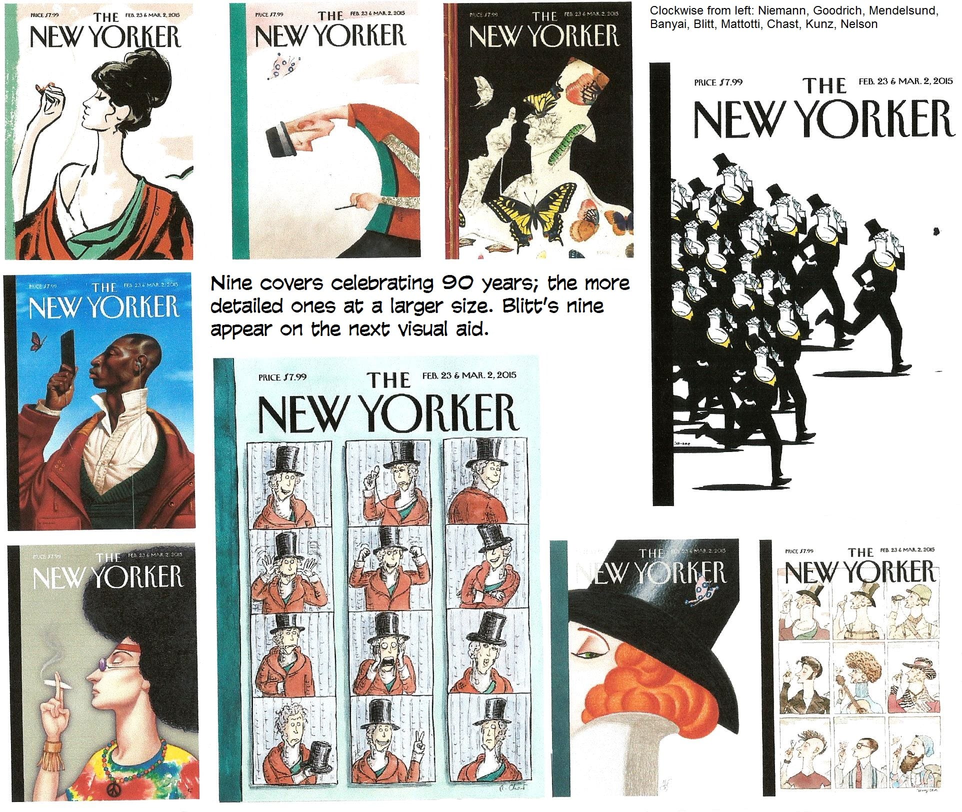
 Blitt explains: “I thought it would be amusing to present Eustace Tilley in the various styles that have come and gone over the past ninety years. So I showed the inveterate dandy coming unstuck in time, appearing as greaser, hipster, hippie, yuppie and punk, among others.” So does that make 97 covers for Blitt? Or only 89?
His Eustace Tilleys look pretty good, but his fragile sometimes wavering penline bespeaks a kind of tentativeness, and in more complex compositions, that lack of confidence is a distinct blemish—in my so-called mind, anyhow. But then, Blitt’s rich and famous, and I’m just a harmless drudge, laboring enviously in the digital backwaters.
The 2015 anniversary issue prints all nine of the covers, including Blitt’s nine-Tilley cover: three as actual covers, one after the other at the front of the magazine; then all nine, in miniature on the table of contents page. Behind the opening trio of covers, the magazine does little to celebrate the occasion: nine one-page essays, called “snaps” (for “snapshots,” I assume), each focusing on some minutiae of each decade.
For the 2016 anniversary, Eustace Tilley is again on the cover, albeit a somewhat updated version showing him in a subway car performing a “manspread” (by spreading their legs, men claim more than a reasonable amount of space on the bench).  But in 2017, Tilley is gone again—and in his stead, another Blitt extravaganza (with Russian lettering), Vladimir Putin, who, with his monocle, is inspecting a Trump butterfly. And so does Eustace Tilley, who began as a fop, finish, for now, as a powerful foreign tyrant opposed, symbolically, by only the fluttering of a passing insect.
And now, that gallery of Johan Bull’s New Yorker artistry.