As a young comics reader, I first encountered Keith Giffen's work in publications from Image Comics. He was plotting books for Erik Larsen (SuperPatriot, Freak Force) that I was a fan of. These were minor comics, but they were also, in a way that I of course couldn't articulate at age 10, so much stronger than most anything else Image was putting out. They felt sturdy, they congealed together while other comics seemed to dissolve upon reading. I didn't know who Giffen was at the time, and I didn't pay much attention to his name in the credits of these comics. Later, when I came to admire Giffen's art, I'd think about these books and how much they say about Giffen as a storytelling artist: he made comics in every possible way, co-penciling, doing breakdowns, writing plots, and of course also putting out titles where he did everything - pencils, inks, scripting. All of these books looked different, but Giffen's mark is so strong that it's often as present in a book he worked on the corners of as it is when he's going solo.
The Comics Journal is traditionally an advocate of the cartoonist, the artist who draws and writes, who makes a synthesis of text and imagery. The professional comics penciller or plotter is often neglected or at odds with the Journal. Giffen has been covered in this magazine from a critical lens in the past (he was famously accused of plagiarism by Mark Burbey in The Comics Journal #105). But Giffen has always been a cartoonist, though a cartoonist working, paradoxically, as a collaborative artist in mainstream comics. He is a cartoonist even when simply working as a plotter, that's how deeply he understood comics. Mainstream comics is a collaborative field, but so often that collaboration is highly uncreative. Giffen is a counterpoint to this. You see this confidence in his work: while he lets his fellow artists breathe and express themselves on the page, his idea of what makes a story is not obscured.
It's hard to define just what Giffen's art was: he published so much but never underlined himself with one definitive book. I think people struggle to give him his due acclaim because of this. In putting this tribute together, I thought it was important to get critics on the record to speak about Giffen, as his work was not done the justice of close reading enough while he was alive.
-Austin English

(critic, editor)
Trying to encapsulate the impact Keith Giffen's comics work has had on me as a reader is like trying to nail down what the color green means to me when I'm in the woods. He was the first writer whose name registered as being someone I needed to seek out more of (after I had fallen in love with the way he and J. M. DeMatteis depicted bickering DC superheroes in the '80s Justice League), he had a starring role in one of the first pieces of behind-the-scenes-of-comics prose I remember reading (an essay about that Justice League relaunch, printed in the back of the the "A New Beginning" trade paperback), and his art—his weird, extreme, completely unique to him (or so I thought at the time!) style—was the first comics art that, to my eyes as a 12-year old reading DC and DC only, stuck out as being Legitimately Serious Comics. The comics I had on hand were limited, and after getting caught stealing the cash from my parents' Sunday School class (my mother was the treasurer, she kept the cash in her closet on the shelf, I used it to fill in the gaps on my Justice League Detroit run), it was months before I was allowed back in the store. Legion of Super-Heroes #1 and #13, the 1989 series—drawn by Giffen, written with the Bierbaums—were the only comics I had on hand of my own, and I re-read them the way soldiers in war movies read the Bible. I knew nothing of the Legion or its history, of Giffen and his, and my only exposure to the nine-panel grid was those two comics. Their overly complicated all-text pages. The moody, depressed characters whose every conversation betrayed a history the comic did nothing to explain. Giffen's repetition, his characters' lack of enthusiasm, the dread and exhaustion that came through - I was hooked. I was hooked by their potential, by how much they expected of me, by the earnest belief I had that these were comics not meant for me, but for others, and if I wanted to participate I would have to earn my way towards understanding.

That's the way I remember it, at least. I know from looking at the calendar it can't have been true. Lobo #1 came out around the same time as Legion #13 - I knew that was the same Keith Giffen, I knew that Lobo was, in part, a joke. But when I think back on those comics - they were the DNA of my mania. Those were the comics—those, not some undergrounds or Fantagraphics-related titles or any of the late '80s/early '90s comics that weren't in suburban Georgia anyway, or if they were, never crossed my path—that made me hunger to find more. They made me insane with potential, they got me drunk on my own imagined hopes of what a story could be about. And when it came to Lobo, or the moment when Despero comes back and kills a comatose Hank Heywood, or Guy Gardner sucker punches an overweight Ted Kord, or Batman tells Amanda Waller she fucked up, or Kent Shakespeare gets told what a flop he is, what a shit dad he is, how much he sucks and will always suck because he's a liar - Giffen's work actually did live up to what I imagined. He exceeded my expectations every single time - and I wasn't even a teenager, which meant my expectations wrapped all the way to the moon and back.
A few years ago, after I'd gotten deep enough into comics that my mind was poisoned against all joy, a friend of mine sent me a care package. It consisted of many of the comics Giffen had drawn after I'd moved on, grown up, and put away childish things. It consisted of Images of Shadowhawk, Mars Attacks, that 2019 Inferior Five miniseries that DC didn't even finish printing and just tossed online. I didn't crack those books right away. I read the great ones, of course - Giffen's old Superman vampire comic, The March Hare, that kind of thing. And then, at some point earlier this year, I finally made my way through what I thought would be the dregs. I was wrong. The grid and the extremity, the visual noise and complicated chaotic illustrations, the never-ending frenetic banter - it was all still there. It was exactly how I remembered it, even when it was something I had never seen before. It was the very essence of the first time I had learned what comics are supposed to be: it was one soul's handwriting, plastered directly onto my own imagination. It was Keith Giffen, and he was still my favorite guy. Because he was my first.
(cartoonist, critic)
Keith Giffen was a real rarity, the mainstream comics writer/artist who brought an individual flavor to his work on both sides of that equation. The acerbic, adrenal, character-driven humor of his scripts was a real breath of fresh air in the superhero world, and it never went out of style or got caught up to and incorporated by everyone else out there. It stayed special. And his artwork was sui generis. Giffen is a great example of how distilling and combining influences can form a visual style as powerful as one forged from whole cloth. It's a little stroke of genius in and of itself to recognize fertile areas for mining in the ground Kirby and José Muñoz shared, but it takes real chops to add in little filigrees that call up Frank Miller (and not just Frank Miller, but the comics where Frank Miller's riffing on Vaughn Bodē) or Moebius (and not just Moebius, but the comics where Moebius is riffing on Druillet or Crumb). Giffen's best artwork braids vastly different strands of the cartooning idiom together into something that plugs deep into the central source, vibrating on the page both as immersive story and as lines on paper.
Giffen was a measured professional, a guy who did his time in the superhero salt mines, while absorbing all the lessons he needed to get and keep both jobs and fans. His jokes have timing, rhythm, themes and patterns - he could blast out a drumroll of punchlines one per gridded panel, or light a joke to burn all issue long. His art, even at its most expressionistic, is always hung atop a skeleton of the kind of rock solid heroic anatomy Mom used to make. Here is one of the few guys in comics who ended up rising to a level he'd both earned and was deserving of: a cult hero who moved enough units on Wednesdays to seem like he always had a book on the racks if you walked into the store looking for a cheap and easy hit of craft and art in equal measure. He carved out a corner of DC's corporate firmament that was indisputably his own, in spirit if not legally, and he left enough work behind that comics heads for the next couple generations will be fishing his books out of the bins and whistling, "I can't believe they published this," or arguing about which book is his best. Having guys like Keith Giffen around is what makes mainstream comics healthy, vital - workable, even. The entire medium will sorely miss him.

(critic, editor)
If imitation is the sincerest form of flattery, Keith Giffen certainly flattered some of the best. Beginning his career in the 1970s as one of Marvel’s then-ubiquitous “Kirby clones,” his approximation of the King was admittedly only and always that. But credit where it’s due: his pages at least showed an intuitive understanding as to the whys of Kirby’s privileging of action’s impact over its rote mechanics rather than merely the hows. It was work that was hardly indicative of what was to come, though - after all, from a purely commercial standpoint, his decision to imitate Jack not only made sense, it could very well have been thrust upon him via editorial edict, and it’s worth noting that while Kirby imitators were a dime a dozen, Giffen did Kirby so well that he was chosen to succeed Kirby on Kamandi when the frankly insane decision was made to try and continue that title without its creator. The next long-term stylistic aping that Giffen undertook unquestionably wasn’t born from commercial considerations. He landed upon the idea to do a nominally “Americanized” version of José Muñoz, which remains of one of mainstream comics’ great mysteries. It was a decision that stood him in good stead for an awfully long time when it came to getting gigs. Hell, Giffen was literally all over the place in the 1980s, and his Muñoz riff roadshow seemed to polarize readers wherever it turned up: in the company of writer Paul Levitz, he transformed Legion of Super-Heroes into a fan-favorite at a time when DC desperately needed one, but when he teamed with Michael Fleisher on Hex, sales tanked so drastically that the book was cancelled within a few short months. Admittedly, Hex was premised on the threadbare gimmick of transporting a disfigured Western outlaw into a stereotypically Road Warrior-esque future post-apocalyptic wasteland and only had so much gas in its tank from the outset, but it was during his brief stint there that Giffen really, in dated parlance, “let his freak flag fly,” training the metaphorical eye of his equally metaphorical lens on such things as the smoke coming from a gun barrel rather than the shot itself, or simply the leg of a fleeing villain rather than their entire body - with such frequency that I can only imagine (hope?) it drove Fleisher around the bend.
On Legion, Giffen at least made concessions for what Big Two readers were expecting to see on the page - on Hex, he clearly (as well as excitingly, thrillingly) couldn’t have cared less. There were so many sub-phases within Giffen’s “Muñoz phase”: an extended nine-panel grid phase; a twelve-panel grid phase (on the wonderfully anarchic Epic Comics series Video Jack, scripted by Cary Bates); even a brief run at 16 panels per page in the DC graphic novel adaptation of author Robert Bloch’s Hell on Earth, which Giffen rendered in a crazy quilt style halfway between Muñoz and Bill Sienkiewicz. Who would have ever guessed that his biggest blockbuster was just around the corner? Okay, fair enough, Giffen didn’t draw the post-Crisis on Infinite Earths revamp of Justice League, but he plotted it for scripter J. M. DeMatteis and laid it out for artist Kevin Maguire, and his vision for the tone and tenor of the title—as well as its distinctive page mechanics—was the glue holding the project together. Whereas other series in the freshly-shrunk DC Universe were bogged down with either resolving continuity quagmire (John Byrne’s Superman) or convincing readers that, hey, this new guy can be a hero, too (Mike Baron’s & Butch Guice's The Flash), the Giffen/DeMatteis/Maguire Justice League was plainly and proudly fun capes 'n tights nonsense, and stood in stark contrast to the “dark” deconstructionism so popular at the time - and readers responded accordingly. So resounding was its appeal, in fact, that it even managed to dethrone Chris Claremont’s Uncanny X-Men as the biggest team book going for a brief while.

Looking back, a solid argument could be made that it was only when Giffen was finally freed from the month in, month out penciling grind that he was able to freely demonstrate just how much fun he’d been having in comics all along. Viewed from this 20/20 hindsight vantage point, the shamelessly uber-direct Muñoz swipes in earlier works that publications like this one had called him out for, the by-the-numbers devotion (okay, maybe I’m being overly kind) of the “Kirby phase” - they all make a kind of sense. Giffen’s career trajectory is that of a cartoonist always looking for ways to have a good time, to remain not just engaged with his work but excited by it, and when one shtick got dull, he’d simply find and/or develop another. The narrow-minded could view him as little more than a thief, a chameleon, a rip-off artist, sure - but it’s not like he was hiding anything. He was letting everyone in on the joke from the outset, if they wanted to be. Is it really any surprise, then, that for his next act—a return engagement on Legion of Super-Heroes—he shifted gears and drew in the style of Justice League collaborator Maguire? To go from giving the lead to following it might be seen as a step backwards for some (hell, most), but not for Giffen - it was one more tongue in cheek exercise of the impishness he reveled in. Giffen’s love for the inherent absurdism afforded by the comics medium in general and the superhero genre in particular is plain to see in “cult favorite” co-creations like Ambush Bug (with Paul Kupperberg) and the delightfully Ditko-inspired the Heckler (with Tom & Mary Bierbaum), but it’s every bit as present and accounted for in his most celebrated and popular co-creations as well, those being Rocket Racoon (with Bill Mantlo) and Lobo (with Roger Slifer) - and it was the latter which directly led to the most radical 180 degree shift in a career defined by them.

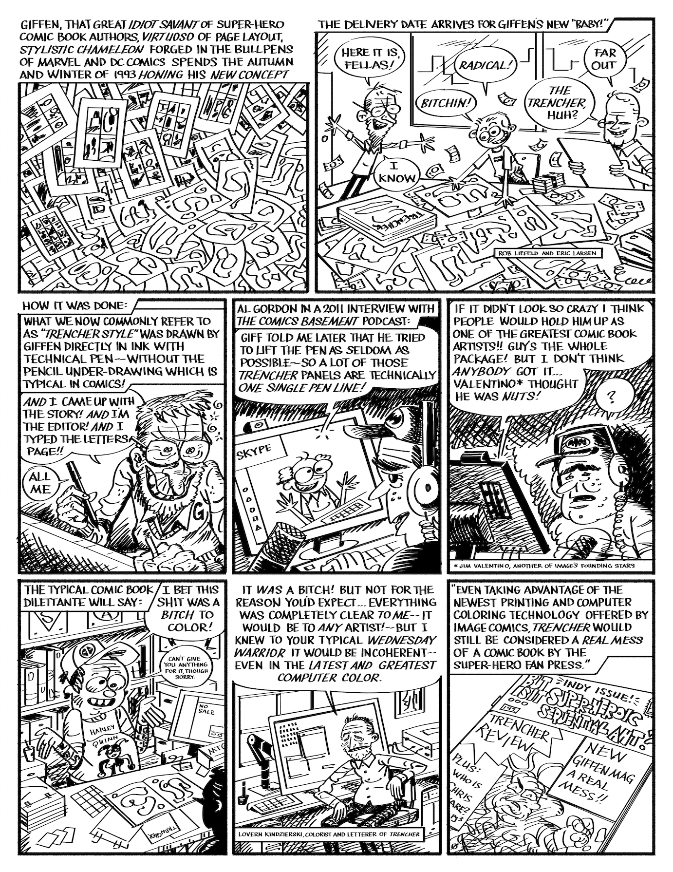
After all, it was Lobo by Giffen, co-author Alan Grant and artist Simon Bisley that upped the “balls-out mayhem” quotient so popular in the “anti-hero” titles of the early 1990s to unprecedented levels, and its influence extended far and wide - most notably and especially to the Image founders, for whom “bigger, badder and louder” wasn’t just a mantra, it was a creative philosophy. And when the time came to extend a hand to Giffen to join their party, he wasn’t nearly so interested in anteing up as he was in doubling down.

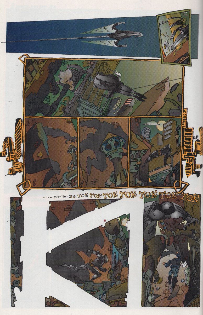
Trencher is, by any standard, unlike anything else before or since. It’s Giffen not only showing the young upstarts that he can play in their sandbox, it’s him reminding them who built it, and who can tear it down. It’s the apex, the apotheosis, the inevitable heat-death of everything Youngblood and Spawn and WildC.A.T.s and Cyberforce were playing around with. It’s the pinnacle. It’s everything every “hot property” creator in the 1990s had in their heads but couldn’t figure out of how to get on the page. And better still - it doesn’t owe any of them anything. It’s what they were trying to be, it just happened to come along a little later. It’s the limit-smasher, the outermost extreme. I can imagine the reaction to it as the pages were coming in to the Image offices: “Where the hell do we go from here?” And, honestly, that’s a question they were never able to answer until completely retooling their line with longform and Hollywood-friendly projects such as The Walking Dead and Saga. It may not have been anything like a bestseller at the time, but for those who read Trencher? The full-throttle usurpation of the “comics rebel” throne occupied by the likes of McFarlane and Liefeld immediately and irrevocably rendered all their future work redundant. Even sad. A pale echo of the real thing. Unbearably dense and exaggerated and energetic and visceral, its nearest thematic and stylistic counterparts aren’t to be found elsewhere on the Image roster, but in Pat Mills' and Kevin O’Neill's preceding Marshal Law and Frank Miller’s and Lynn Varley’s succeeding The Dark Knight Strikes Again, both of which shared a similar overarching goal: let’s just blow the whole thing up.
The less-remembered Images of Shadowhawk saw Giffen doing essentially the same thing with an extant character, but who are we kidding? A supernova this intense is only going to burn for so long. When Giffen came out the other side, it was as a mellower, more subdued amalgamation of many of his earlier versions rolled into one. Projects such as OMAC and Infinity Man and the Forever People saw him returning firmly to his Kirby roots, but with notable splashes of Muñoz linework and texturing; Inferior Five returned him to the Invasion! crossover playground he’d devised decades earlier and added a subtle (if you can believe that) McFarlane flavor into the mix; most other gigs he took saw him function solely as a writer. I didn’t pay attention to all of it, by any stretch, but there’s a good bet that if I had, I’d have found something worthwhile in all of it - yes, even obvious workaday assignments such as Scooby Apocalypse. The twinkle in Giffen’s eye was always there, even if it was buried under layers of corporate dictates. Now that he’s no longer with us, it’s easy enough to say that much of Giffen’s body of work will be judged by how successfully (or, if you’re feeling uncharitable, shamelessly) it managed to evoke or even swipe the work of others, but when you consider it in its totality, there’s no way to escape the conclusion that it was all an expression of himself. Something tells me that he damn well knew that, and that he got a chuckle when he thought about it. While my own thoughts on the afterlife are muddled (hell, all my thoughts are), and probably irrelevant, for whatever it’s worth, I like to imagine Giffen, ever the ebullient trickster, enjoying one last grand cosmic joke played on his detractors - after decades of asking “Will the real Keith Giffen please stand up?” it’s only in looking back that they’ll realize he was there all along. I dearly wish he still were.

(cartoonist)
(reprinted with permission from his Instagram)
Keith Giffen was one of the first handful of cartoonists I recognized when comics became my obsession. As a kid, I loved his stories. As a teen, I was into his styles. As a professional, his attitude clicked with me. He’s always been an influential presence in one way or another.
I had a blast working on his characters and concepts across several publishers, and it was a privilege to meet him, to share a panel with him, to tell him how much his work meant to me. Pretty selfish of me on every count, but I’m glad it all happened. He was one cool customer.
My condolences to his family, his friends, and his collaborators. Keith Giffen R.I.P.

(cartoonist, publisher)
My editorial style was very agenda-driven. I first approached Keith with working on SuperPatriot and I provided him with a basic framework for him to build on. I need to get the character from A to B and get him prepared to join Freak Force at the end of it.
Same kind of thing with Freak Force. I gave him the gist and provided the raw material, the characters and basic setup, and Keith took it from there.
I had an inkling of Keith’s reputation going into it. I had heard stories of Keith beating himself up and claiming he had been mugged, and that he had his portfolio stolen when he went in to see an editor at DC. I had heard that he repeated the performance with the Marvel editor the following week. And there was some of that in the mix. Keith would make excuses and I knew he was bullshitting and I think he knew I knew that he was bullshitting.
At one point, Keith was supposed to write a Freak Force Annual, and he was telling me all about how densely it was plotted and how the only splash page was on page 1. When I got the job some weeks later, it was loaded with splash pages.
Working with Keith meant laying out an occasional page because he fell short, or even an entire issue to keep a penciller busy. What he delivered was unquestionably brilliant, but it came along with stories of the FedEx guy skipping his house and his fax machine going on the fritz and Keith missing the top step and taking a tumble down a flight of stairs.
Keith’s storytelling could be very meat and potatoes. His first priority was telling a good story, and he didn’t give a shit if the artist was stuck with a splash page of an establishing shot of a warehouse that he couldn’t sell if his life depended on it.
When my wife gave birth to our first son, Keith called me up and said, “Your life is OVER!” Then he faxed me this cartoon.

Freak Force ended. Victor Bridges [the penciller] had moved on and finding another artist who was as dependable proved a daunting task. Keith and I did a final SuperPatriot miniseries together, and that was the end of that.
In 2001 we reunited to work on Fantastic Four: The World’s Greatest Comic Magazine, and he laid out 3 of the 12-issue series as well as drawing numerous pages from my layouts. When I had fallen deathly ill from overwork, Keith stepped up to help me out.
He was a talented motherfucker and I would say, despite having only met him in passing a few times, a good friend. We lost a giant, kids.
(cartoonist, publisher)
So bummed about losing Keith Giffen. At first, my go-to Giffen was the Lobo miniseries. Then it was Ambush Bug Nothing Special, that made me laugh so hard I stopped breathing. That was terrifying and amazing that that could happen, in any form. Never have I had that result from any other art. The March Hare was a big deal to me for a period. Then it was Trencher, forever one of the most amazingly beautiful and mind-shattering comics.
Giffen has been such an inspiration and such a beacon of hope for me, normal and weird, solid on his own and with virtually any other writer. So compatible despite the stories of him being difficult. This year I’ve been hanging out with this Spider-Man comic he did with Vince Colletta inking [Peter Parker, the Spectacular Spider-Man #120], which is somehow really great. Watching Vince try to beautify his little faces on giant heads gives it a deformity that’s so authentic, like the cast has acromegaly.
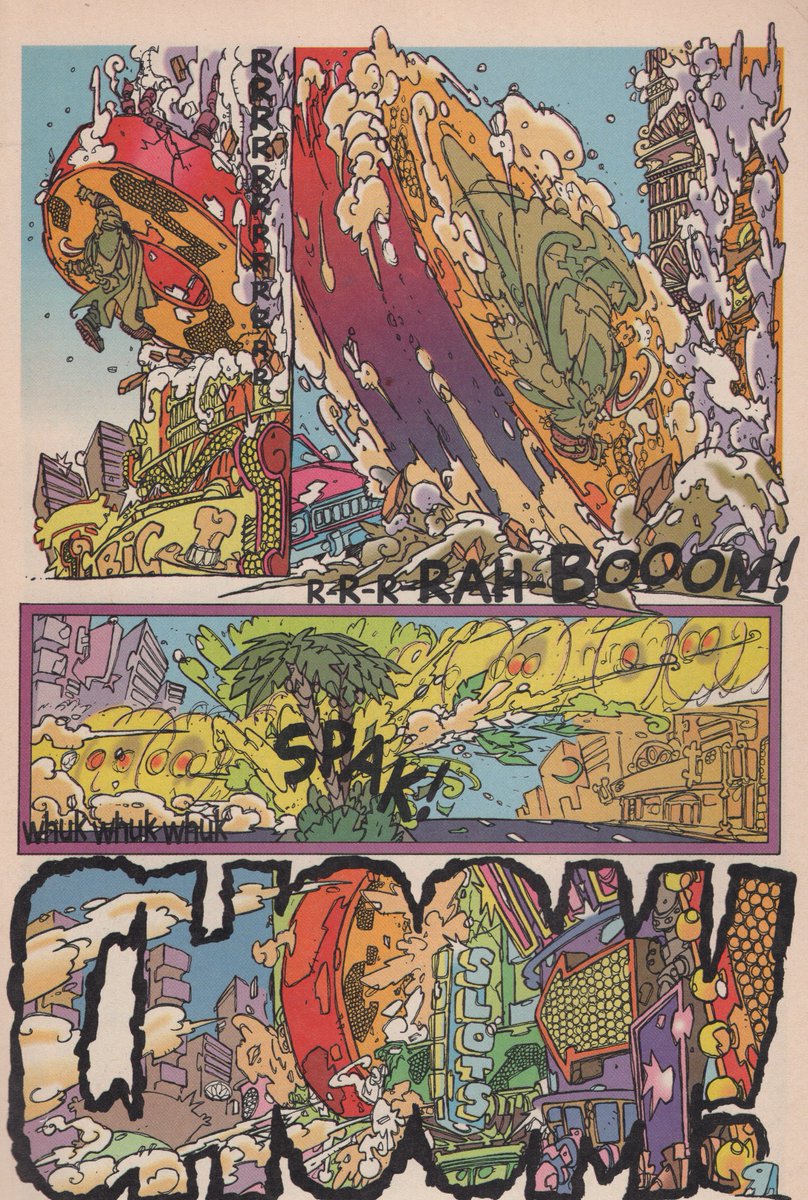
That Trencher style is from beyond, I know it wasn’t loved by most but to me it was a secret path through the woods of not knowing who I was/am. "This guy did Legion? Now he draws like this?!" I see the O’Neill in it but he goes way past Nemesis, way past the furthest reaches of Marshal Law. It makes Darrow seem clear and simple, it made me look more deeply at art and what it was that’s being said in the way it’s shared. So epic an artist and always degraded by almost everyone I’d talk to.
(cartoonist)
(reprinted with permission by the artist from But is it... Comic Aht? #2, 2019)