
The original Classics Illustrated (Classic Comics at first) was published between 1941 and 1967, with a pair of straggler issues released in 1969 after the sale of longtime publisher Gilberton. It is not one of the lost treasures of comics. Characteristic artists like Alex Blum or Henry C. Kiefer would draw in a rather stodgy manner, respectful of the comics' subordinance to their source materials. The biggest compliment one can give to most of the issues I have read is that they are ‘professional,’ although that is not a totally hollow virtue; there was some measure of quality control at Classics that endured across periods of glut and famine alike.
As a result, you can be pleasantly shocked to open Arnold Hicks' "Dr. Jekyll and Mr. Hyde" (#13, 1943) and see him playing a bit with tilted panels showcase the title characters’ transformation; Hyde may look less like the figure described in the novel than Fredric March's movie persona, but most issues steered clear from even that much artistic derring-do. The format seemed built to overpower the artist, so that EC names like George Evans and Graham Ingels felt more Classics Illustrated than themselves. Witness issue #130 (1956) in which Joe Orlando plods along an adaptation of Julius Caesar's Commentaries on the Gallic War like it's contemporaneous television. Might as well read the books, if you ask me; at least those won't have the gnarly bits sanded off.

Still, because something was once popular, in comics it must continue. Punchline or not, the name is stronger than the content of any actual issue. Even as other publishers try their hand at adapting the classics, Classics Illustrated may limp on into eternity... though it needn't always limp.
Between 1990 and 1991, right before they closed up shop, First Comics—publisher of notable 1980s titles like American Flagg, Grimjack, much of Nexus—acquired the Classics Illustrated license, in conjunction with prose publisher Berkley Books, and proceeded to do something pretty worthwhile with it. First was the format: perfect-bound and 48 pages, much more respectable for the nascent graphic novel market. Sturdier than their predecessors too - you can find copies in good condition on the cheap, and since only 27 issues came out before First closed up shop, there aren’t that many to find. Even the logo was different, no longer a stern black on yellow, like a government stamp; it looked thought-through, artistic even, like someone gave a damn.
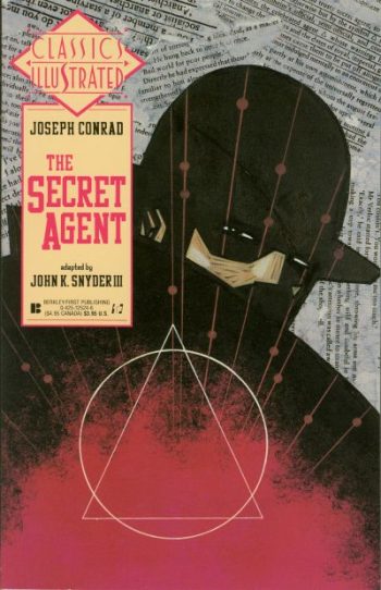
Since I've already mentioned John K. Snyder, know that his adaptation of Joseph Conrad’s The Secret Agent (issue #19, Feb. 1991) embodies everything that’s good and everything that’s bad with the First Comics approach. On the one hand it’s extremely pretty, in the way that all of Snyder’s work is pretty. He’s got a great knack for expressing the emotional core of a scene, his pages complex webs of human misery as characters bounce against each other in a dog-eat-dog world. On the other hand, they are wordy. Snyder’s Secret Agent is smothered in words, often dulling the effect of his free layouts. With each page in a nearly liquid state and text boxes floating on top, it becomes strangely difficult to follow the story all the way through. I am familiar enough with plot of Conrad's novel (though I have not read it in full), but I still found myself lost in the weeds. Similarly, his take on the Strange Case of Dr. Jekyll and Mr. Hyde (#8, Apr. 1990), a book I have read several times and that is short enough to be adapted without much cutting, seemed determinedly convoluted as heaps of narration distracted, rather than illuminated, the action. I have no idea if that was a choice by Snyder or an editorial directive, but the result is the same: words less preferable than images.
This tension is also present in Kyle Baker’s adaptation of Through the Looking-Glass (#3, Feb. 1990): a choice of artist that is obvious and correct. You can see how much fun Baker has thinking through Lewis Carroll’s absurdist scenery without simply repeating older visual representations. (And competing with John Tenniel is no mean feat.) Still, why so many words? The adaptation layers on narration that is sometimes amusing, but more often doesn’t flow naturally with the art. Baker is such an accomplished cartoonist; words cannot help but detract, rather than add, to his comic vision.

The problem with Classics Illustrated had always been a simple lack of space; the need to compress a whole novel into just 40 odd pages of comics. Even when adapting shorter works, Classics would devote an issue to the short stories of Poe or O. Henry, instead of simply picking one. In the original run that simply meant slashing the story to the bare essentials, losing everything that did not contribute to the main plot. The First Classics were more artful, but also could not expand in order to accommodate larger texts: The Rime of the Ancient Mariner, A Christmas Carol and Moby-Dick all get the same page count.
As a result, the recurring sensation I felt while reading the First Classics, Snyder’s notwithstanding, was that the more familiar I was with the original text, the easier it was to accept a new visual interpretation of familiar situations; which is quite the opposite of the original line's stolid, direct communication.
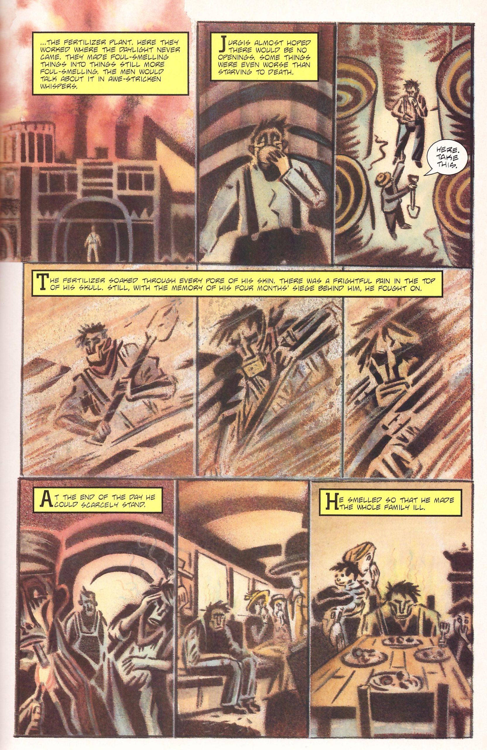
Sometimes there is harmony in the meeting of artist and subject. Peter Kuper’s take on Upton Sinclair’s The Jungle (#27, June 1991), might actually be the best thing he's done. I've found Kuper's more personal work to lose all sight of character and story in favor of making a statement; as ideologically driven as it is, Sinclair's focus on the human element of The Jungle, on the characters inhabiting his story, negates some of Kuper’s weaknesses while playing to his strengths.

Speaking of ships and menace, I will not be long with Bill Sienkiewicz's and co-writer D.G. Chichester’s take on Moby-Dick (issue #4, Feb. 1990), which I've written about before in an article on Moby-Dick adaptations; that article inspired me seek out more of the First Classics, and the Sienkiewicz remains my favorite of the bunch. It probably makes almost no sense unless you are already familiar with Melville's book—it is closer in adaptation terms to interpretative dance than a movie—but it makes absolute emotional sense if you realize what it is built on. In this case, the novel is not something to imitate, to try and condense; one does not sense indebtedness on the part of the artist, but inspiration.
You can get something similar from Gahan Wilson’s take on works by Ambrose Bierce (issue #18, Feb. 1991). While Wilson’s version of The Devil’s Dictionary is too direct, replicating the funnier entries with some pictures added on top, closer in spirit to an illustrated text than anything we would call ‘comics,’ one cannot fault his expressive take on “An Imperfect Conflagration” or “The Boarded Window.” In both cases it could be expected that Wilson’s airy line would clash with the gorier elements of Bierce's stories, famous for their harshness of spirit, but it succeeds in forging a newly bleak comedic spirit. The true dazzle of that issue is that it says something about Wilson and something about Bierce at the same time: a true meeting of the minds.
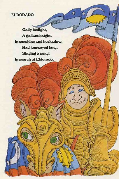
The same cannot be said for Wilson’s takes on the poems of Edgar Allan Poe (issue #1, Feb. 1990). Most of that issue is closer to the bluntly illustrative style that failed to capture The Devil’s Dictionary, and though one cannot question Wilson's bravura drawing talent, it also shows a certain limitation of emotional texture. The high hysteria of “The Raven,” the tragedy of “Annabel Lee,” the grim vision of “The Conqueror Worm” - these are all very different in tone and subject matter, yet Wilson articulates them in a similar register. Wilson's cynical style is most befitting the worldview of Poe's “Eldorado,” though it flattens the comic poignancy of a life wasted on an impossible quest with its ‘look at this asshole’ depiction.
Still, even as he falters, Wilson falters in an interesting manner. He falters as Gahan Wilson, not as a vessel for Edgar Allan Poe. This is his version. You could not confuse it for any other. There’s something to be said for the First Classics enterprise as a whole, short and faulty as it may be, in offering to us a snapshot of so many talents stretching beyond the simple recitation of the earlier Classics Illustrated. Here, they may speak for themselves.
* * *


