
Are we ready to discuss Francesco Francavilla? Yes, yes I believe we are.

Look at that line of his - just look at it. I stare at lines for hours, trying to figure out how to describe the ineffable vagaries of technique. That’s my job, looking at lines on paper. It does not appear to me as if there is an ounce of self-consciousness in his stroke. One imagines the hand moving with the casual alacrity of a greengrocer adding his sums. It is not trying to be anything other than what it is, an ink brush line traced by hand across a page. Sometimes I think he does detail work with a nib, but I could be wrong about that. Just an educated guess.
I went back to look through some of his old books, to see what I could see about the evolution of that line. I was sickened to be reminded of the fact that he has been this good for a significant amount of time. After some work all over the map in the years leading up, 2011 appears to be the year he fully announced himself in the mainstream as a presence to be feared. In quick succession he worked on a handful of issues of Detective Comics with Scott Snyder and a strange run on Black Panther with writer David Liss.
Now, I’m fairly certain I saw that run of Detective at the time, even if I didn’t end up paying a lot of attention. The run up to the New 52 was a lethargic period at the company, not much of anything sticks out in memory except for a general feeling of disappointment that the few books I was enjoying met truncated ends in the harried buildup to an ill-fated relaunch. Francavilla, of course, still ended up doing a couple striking turns for the company after said relaunch, including an issue of Snyder’s Swamp Thing that remains a memorable highlight from a generally underrated run.
But the real coming-out party, which I remember being impressed with at the time, was that aforementioned Black Panther. I mentioned it was strange, but that didn’t have anything to do with Francavilla - no, it had to do with the fact that the run was all about T’Challa setting up shop in Hell’s Kitchen for a while so he could fill in for Daredevil. This was not a well-received development, if memory serves. Now, T’Challa has an established history of periodically bugging out for lost weekends in New York, but at the time it seemed a bit of a backwards move for a character who had, over the previous decade, been rewired into a major player at Marvel by successive and popular runs of Christopher Priest and Reginald Hudlin. Taking over for Daredevil for a while seemed, at the time, a transparent attempt not to have to spend time with his wife.
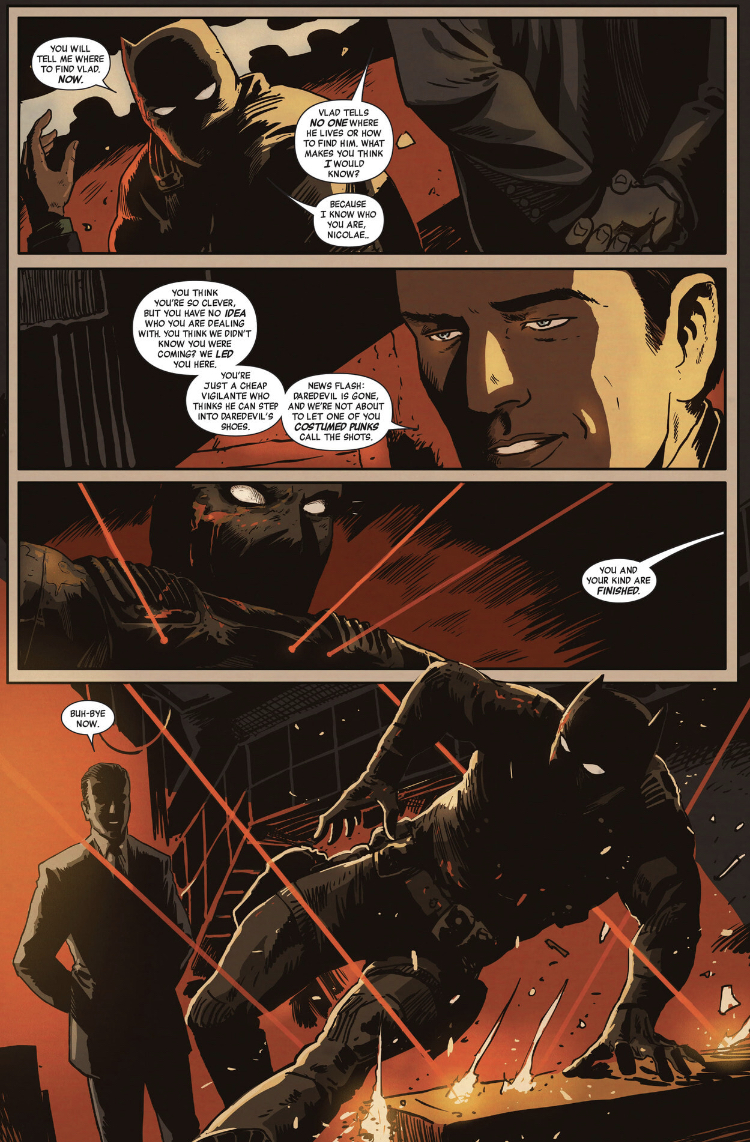
However: they may not have been the Black Panther comics anyone wanted, but with Francavilla drawing them they were infinitely better than they had any right to be. It was all right there, over a decade ago in that odd run where the ruler of a powerful African nation just hangs around New York for a spell so he can fight the Kingpin. The Panther isn’t traditionally a noir character, but everything Francavilla draws ends up looking just a little bit like one of those black and white movies where half the budget was spent on shadows and the other half on gams. Follow his social media and you’ll see in short order the guy watches a lot of movies. Doesn’t surprise me at all. His work is cinematic not in terms of the size or shape of the panel but the fact that he knows how to use shadow to frame a figure in a shot. No one else working today makes such good use of shadows. Good enough to make Alex Toth weep tears of blood and rend his garments in the street.
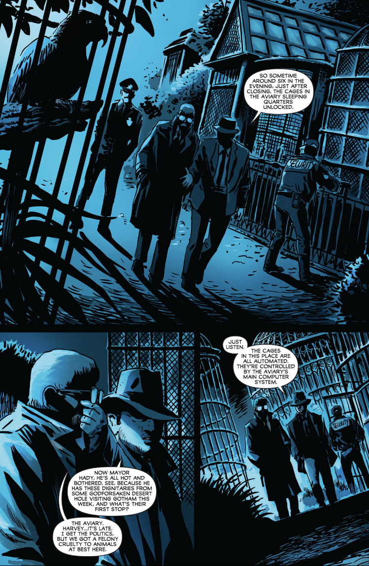
All of which brings us to the present moment and the release of Night of the Ghoul. While the format I found was three giant-sized pamphlets released by Dark Horse at the tail end of last year, the series originally saw “print,” so to speak, on comiXology. What perfect timing! That venerable service was just the other week gutted by Amazon. They laid off a bunch of good people for no reason. So, why did they spend so much money on Original stories for a service they were going to shutter just a few miles down the road? Beats the holy hell out of me, sounds like a job for the news editor. All this critic can tell you is Night of the Ghoul doesn’t deserve to be passed over as collateral damage in Amazon’s ongoing war against human culture. It’s a good book that now gets to be part of another very old story - a comic book orphaned by its original publisher, gunned down in Crime Alley by the vicissitudes of capitalism. Thank goodness the indicia attributes the copyright to Scott Snyder and Francesco Francavilla - that’s a happy ending not every such orphaned comic book enjoys.
It’s also about the only thing resembling a happy ending to be found here. People forget–by which I mean me, I’m people–Snyder got his start doing horror before moving on to years of success with Batman and the Justice League. Just the other day I picked up a trade of his Death Metal, with Greg Capullo. That one’s got Wonder Woman melting down the invisible jet to build an invisible chainsaw with which to kill Evil Batman... totally different vibe. Ghoul here doesn’t have a shred of irony - it’s frankly terrifying. And I don’t mean “terrifying” in scare quotes, like we usually do when we politely refer to a decent enough horror book with a few memorable images. This is a genuinely scary story. The last page reveal for the first issue actually made me start. If you’ve ever wondered what it would look like to find a monster hiding in a chest X-ray, this one’s for you.
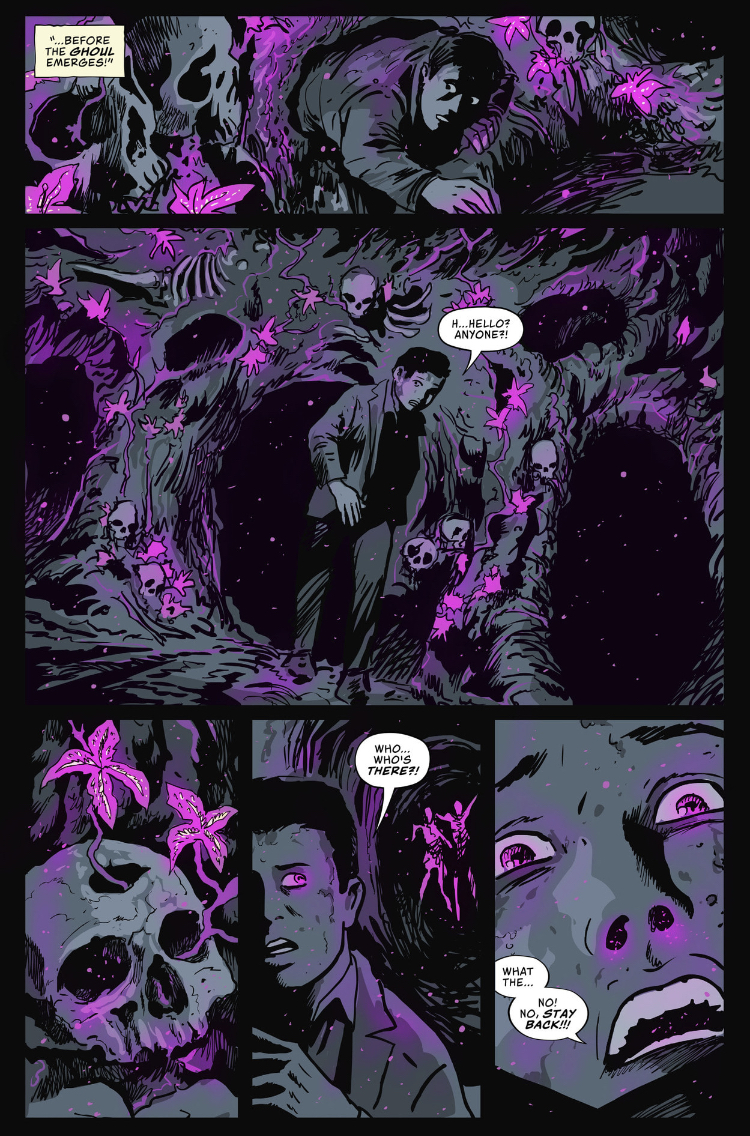
What’s it all about? Well, there are a couple different tracks. In the present there’s a film scholar tracking down a dying director to ask about his great lost film - the titular Night of the Ghoul, believed lost in a fire. The other track is the film itself, and the story of the film and why it came to be lost. There’s a ghoul, of course, and a very good reason why the film was lost to time. A very good reason why it should probably have stayed lost. Here’s where you can see Francavilla’s eye for movie history. The samples of the film we see are evocative of the era - an interwar Hollywood horror production, influenced by German expressionism in the manner of James Whale.

None of this works without Francavilla. Sometimes when a webcomic is ported onto paper there are stretch marks, but I frankly can’t imagine reading this story on the glowing screen of a tablet. Each of these issues is a satisfyingly hefty object - you feel the weight of all that thick black ink pressed onto the paper. It feels nice in your hand.
All of which brings us back to the man of the hour. Francavilla and his line. But something else I realized, flipping through his back catalog - it’s not just the line. It’s the color. He’s been coloring his own work all this time, at least back through those breakthrough years on Batman and the Black Panther. He’s got a thing for reddish copper and pale yellow - his copper as distinctive in its own era as Michael Golden’s sick magenta and neon green in his.

And in case you were worried he was a one-trick pony in that regard, you should pick up the recent run of Joker books that had Francavilla backups. You know, the ones you saw featured on Fox News, which is a real thing we all saw happen with our own two eyes. Life now is apparently indistinguishable from parody. Anyway. He can do a lot more with color than just moody reds. It just so happen those moody reds work really well with the moody, noir-influenced horror stuff he usually does - when he’s not doing gleefully campy Omegaverse Joker.
And if you know what that last clause means, I’m sorry. I wish I didn’t.

In any event, I’ve spent a lot of time looking at his art. The more comfortable he has become with his brush, the chunkier and less self-conscious his line has become, the freer his composition and the more assured his set pieces. He’s quite an ambitious artist, and he’s still getting better. Everything he draws just looks good. What more do you need to know?


