One of my biggest moral failures is my inability to live with other people in cooperative proximity. I support the abstract idea of a “commune,” but when I’m with family or friends nonstop for more than two days, my mood darkens, and I have to go on rambling walks and nighttime drives by myself. That said, I adore the dramatis personae at the core of many comics, from Kirby’s kid gangs and super-teams to Hoppers’ pals-n-gals and Buddy Bradley’s dysfunctional family and peers. Chronicling the passage of a few people through a rather brief moment in time is also what Pat Palermo pulls off in the first two issues of AdHouse Books’ Live / Work—and since Palermo’s milieu is the pre-Great Recession New York City art world, most of his characters would catch the Situationist reference in the first half of this sentence.
I discovered Palermo only last year, even though he’d won a Xeric award in 2006 for his comic Cut Flowers, and self-published the first issue of Live / Work in 2012. But I’m relieved I’ve found him now. In a market ruled by manga-influenced YA graphic novels, “mainstream” superheroes, and minimalist art comix, Palermo’s heavily-plotted, narratively compressed, naturalistic, lushly-drawn serial ensemble comedy feels refreshingly new, but only because too few cartoonists make comics like this anymore.
Palermo’s narrative focuses on three characters in their twenties and early thirties. The first introduced is Rich, a skinny-pants hipster who read too much Baudrillard in art school, and whose current job is procuring pop culture objects for collectors—and for artists looking to incorporate a little kitsch into their installations and canvases. (He also has a strong contrary opinion about the most influential Pylon song.) Next is Mike, a whiskey-drinking Sluggo in a black hoodie who does freelance grunt work for upscale Manhattan artists. And there’s Abi, an energetic would-be painter pining for her absent girlfriend. In her position as the administrative assistant for an influential and obliviously callous sculptor, Abi meets Rich and Mike and inadvertently sets in motion the events—which converge at the end of Live / Work #2—for the trio to become roommates.
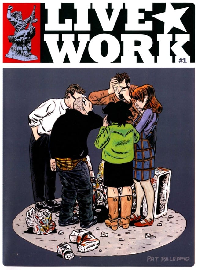
But Palermo’s ensemble is much broader than these three main characters. One metaphor for Live / Work’s expansive cast is the cover to issue #1, where the faces of Rich, Mike, and Abi are hidden by Palermo’s circular composition. But we can see the profile of Veronica, a gallery receptionist and aspiring painter, next to the open-mouthed shock of an obsessive portraitist named Ben as everyone looks down at a broken statue.
Live / Work’s second-issue cover again features Veronica, this time in shocked medium-close-up as she tends bar at an exhibit opening. (At issue’s end, we find out that the cover image is from the literal point-of-view of a major character, who stumbles towards Veronica for booze and consolation after a particularly rotten day.) Even though Veronica gets less narrative attention than many of Live / Work’s characters, she still gets the covers and some major interior scenes, including an awkward art critique from Abi’s abusive sculptor-employer. Palermo loves all his people, second-banana or otherwise, and the innumerable ways that personalities bounce and rebound off each other.
The organic relationships among Live / Work’s characters find their visual counterpart in Palermo’s brush inking, which already dominates issue #1, although some of the delicate lines on faces are of uniform width and appear to be inked by pen. Six years on, in the second issue, brush lines and spot blacks are much more prevalent, as in a three-quarter splash on page two that renders a football game as a nest of slashing lines and collisions. Sometimes, though, Palermo overdoes the brush: on pages 14 and 15 in issue #2, in a scene in a thrift shop, the characters are hemmed in by ink marks and the panels are messy and claustrophobic—although maybe claustrophobic is the best way to capture a cluttered thrift shop. Palermo is still searching for the sweet spot between horror vacui and the blank page, but his cartooning always feels joyfully sloppy and alive to me.
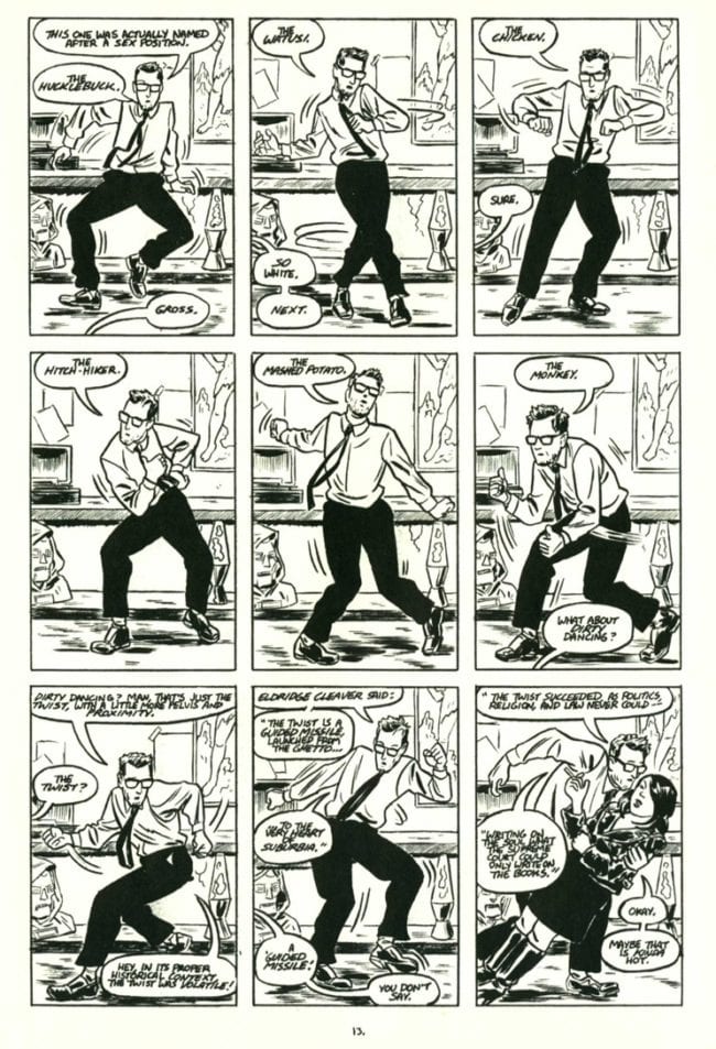
Palermo’s rendering is occasionally inconsistent, but his panel compositions, page layouts and storytelling are more reliably on-target. There’s a bravura page in issue #2, for example, where Palermo uses a uniform nine-panel grid and moment-by-moment transitions to present Rich’s discourse on rock-era dances as he shows off for a cute clerk at the thrift shop. My eyes glide across the horizontal tiers and down the Z-path of the page so quickly that it almost makes Rich move, a Krigstein-esque flourish. But Palermo also designs layouts that deemphasize panel transitions, and instead guide readers to take in double-page splashes as single design units. These don’t always work: one such spread is built around a large, full-bodied, horizontal picture of Abi and her girlfriend lying on a bed, surrounded by small inset panels, but odd word balloon placement makes this composition confusing. Better is a two-page diagram of Abi and Mike building molds out of a broken statue (the same one toppled on the cover of issue #1), a double-page image with a formal audacity that rivals Dan Zettwoch:
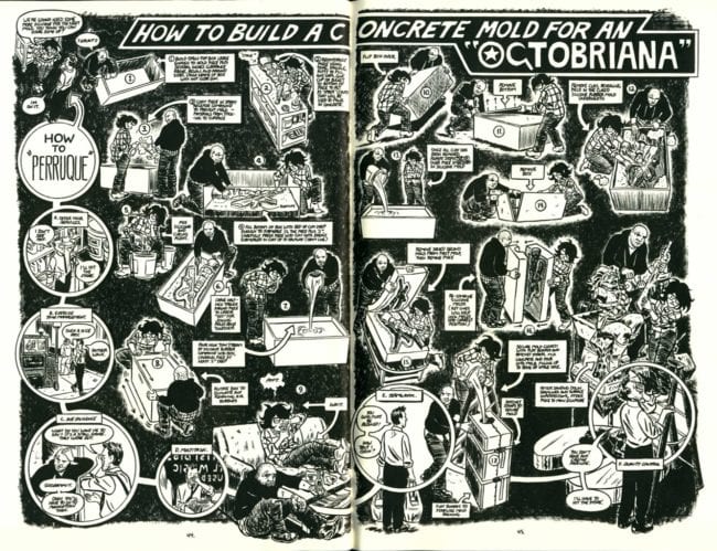
As Palermo expands and deepens his cast, he does the same for his repertoire of storytelling devices, and that’s just one way issue #1 of Live / Work improves on its predecessor. In issue #1, Abi is played a bit like a hayseed, with a goofy Southern accent (“He’s liable to go crazier’n a piss ant!”) and a background that relies too much on stereotype: in flashback, we see her as a child in a barn, sketching two pigs “busy with what my Gran’pa Leeds would call ‘amorous interludes.’” By issue #2, though, Abi’s grown up: Palermo gives her mature traits (the above two-page diagram defines her and Mike as hard workers) and a dramatic situation involving an awkward reunion with an old flame. I want to see what happens to Abi and Rich and Mike and the rest of the cast. I’m eager to watch Palermo grow as a cartoonist and I’ll continue to appreciate how Live / Work is packaged as a Love and Rockets magazine-sized comic, with lush art and symbolic, peripherally-related-to-the-story back covers. (Issue #2’s back cover playfully alludes to Robert Longo’s “Men in the Cities,” with Rich dodging the invisible tennis balls.) Live / Work is charming and rough-hewn in the best ways. Let’s hope 2019 brings us two more issues.


