
Welcome to uncertain ground. When Richard Corben sidled into American comics' mainstream after decades of Adults Only work and self-publication, he was greeted as a conquering hero: ushered into prime position on a prestige Batman project, garlanded with fulsome Alan Moore introductions, catered to by star writers intently providing vehicles for his talent. This country’s comics cognoscenti, on the other hand (that's you, Comics Journal reader, and me, Comics Journal writer), have generally reserved judgment. Despite his status as a prime-period underground cartoonist, published in the same magazines as Spain Rodriguez, Jack Jackson and Kim & Simon Deitch, the genre tropes and brawny physicality in Corben always struck a different vibe than his Last Gasp and Print Mint publishing mates. His 1990s-2010s crossover to the mainstream—so seamless in the context of his own career!—was perhaps the final confirmation that this was Not One of Our Guys. "A jot simplistic," sniffs the Elevated Reader, polishing their pince-nez, "and hardly elegant," snickering into their cufflink.

They're not wrong! It’s more difficult than with Crumb or Rodriguez to make the case in writing that Corben's Neverwhere, in which a horse-hung nude muscleman stomps monsters' heads into jelly on his quest to save a girl with some big-ass titties, is deep and complex. But reading it makes things feel less plain than they seem, simply because Corben is two kinds of artist in one. As an image-maker, Corben is as innovative, layered and incisive as any of the pantheon-level Great Cartoonists you care to name. But as a writer, he plays it straight, stolidly refusing to sing along with the wildness of the music conjured by his drawings, keeping one foot grounded in populist entertainment for the comic book likin’ masses. Art is harder to write about, to even describe, than writing - and let's face it, most critics come from a writerly background. The importance of what is there on the page in front of your face is paramount in comics, and yet it's too often been passed over in the literary critic’s search for prosaic indicators of intelligence or sophistication.
Fuck That, says I. If you are reading comics, you signed up for an experience more visceral and sensory than what is offered by word books, and having a threshold beyond which these things are Too Much is like having a point where music gets Too Loud. You know what they say: if it's too loud, you're too old! The comics form's linchpin is drawings of the human figure in motion, and in Neverwhere—the first of (so far) three announced collections to feature Corben's signature character Den—this artist reaches the absolute pinnacle of a certain approach to the art. Corben's style, ultra-realistic yet vigorously cartoony, rotgut pulp with Beaux-Arts flourish, is shockingly visceral, overwhelmingly sensory. It provides an ultimate form of what reels in so many readers when they're young and ripe for picking: the meticulously detailed fantasy images of gender and power that give action comics—superheroes in particular—their psychoerotic escapist charge. All muscle-hero (or milker-hero) art takes you, reader, into your own suspension of disbelief; you've never actually seen a body so perfectly developed, but there it is, living on the page, walking down the street and talking to people and turning its head to look at you, just like they do in real life. That's the magic of the art form at work, the germ of what we all end up addicted to.
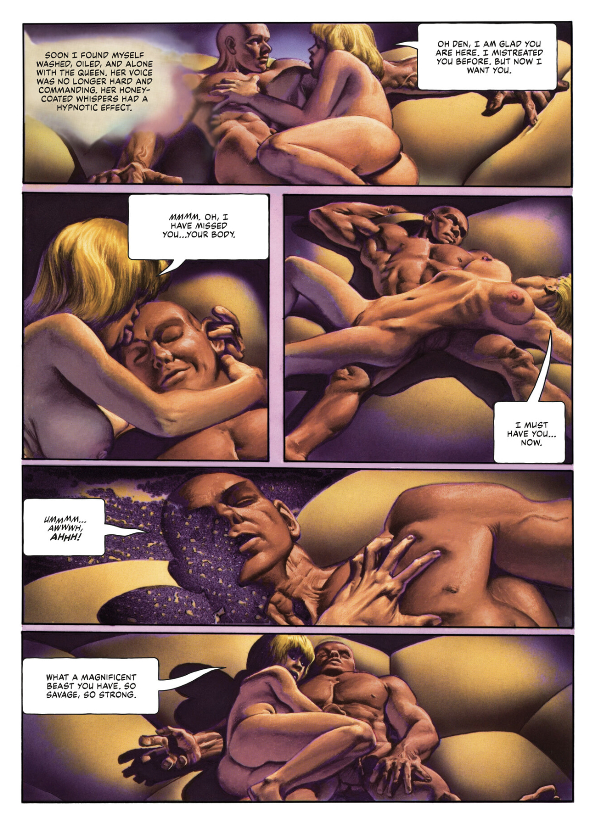
In Neverwhere, Corben overloads this system, sending the needle into the red. His characters' almost exclusively nude bodies are inflated with so much brawn and pulchritude that they go beyond the pleasant or attractive straight into grotesquerie - yet they are still powerfully seductive, appealing on a level less erotic than perverted. Muscles cut not from granite but molded out of still-damp clay; heaving muskmelon tits both pendulous and buoyant; thick-veined firehose cocks with angry nectarine heads; all wrapped in smooth and hairless skin that seems to glow dully from within. These are rendered with such disturbing realism, such light and shade and squash and stretch, that it becomes impossible to deny their essential freakishness - the freakishness of the heroic ideal that any comics reader has spent an afternoon or fifty floating in the lizard brain appeal of. Neverwhere is purely visual satire, exposing uncomfortable truths to pitiless light with a deadpan tone that takes great skill, since the point of it is never to crack and show you're in on the joke.
No cracks here - Corben is as much a classicist as he is a satirist, and his comics are as much a pleasure taken straight as with a wink. This is where his work gets tough for sophists. In Corben there's true point and counterpoint, where most cartoonists strive for streamlined unity of form and purpose. His dynamically posed, creatively angled, virtuosically drafted figures are tremendously affecting. His plainspoken meat-and-potatoes writing gives the wicked humor of the drawing its edge. He pursues the same ends as plenty of humor comics, from Wally Wood's and Harvey Kurtzman's "Superduperman" to C.C. Beck's Captain Marvel stories to Moebius's "The Horny Goof" - but nobody else before Alan Moore did Miracleman managed to lampoon hero comics' bodybuilding pipe dreams in a way that still held them worthy of respect and awe, delivering the atavistic goods.
Corben's writing never hits any emotional register. It's never funny or scary, or even sad or happy. It confines itself to simple presentation of the Strange and the Exciting. It is the mythic form of storytelling, a rote succession of plainly told events, each topping the last in imagination and outlandishness. It's not what lots of readers—superhero fans included—want from their comics, but it's the best and maybe the only voice to keep the overall work balanced on the same edge as its art: between farce and fantasy, beauty and ugliness.
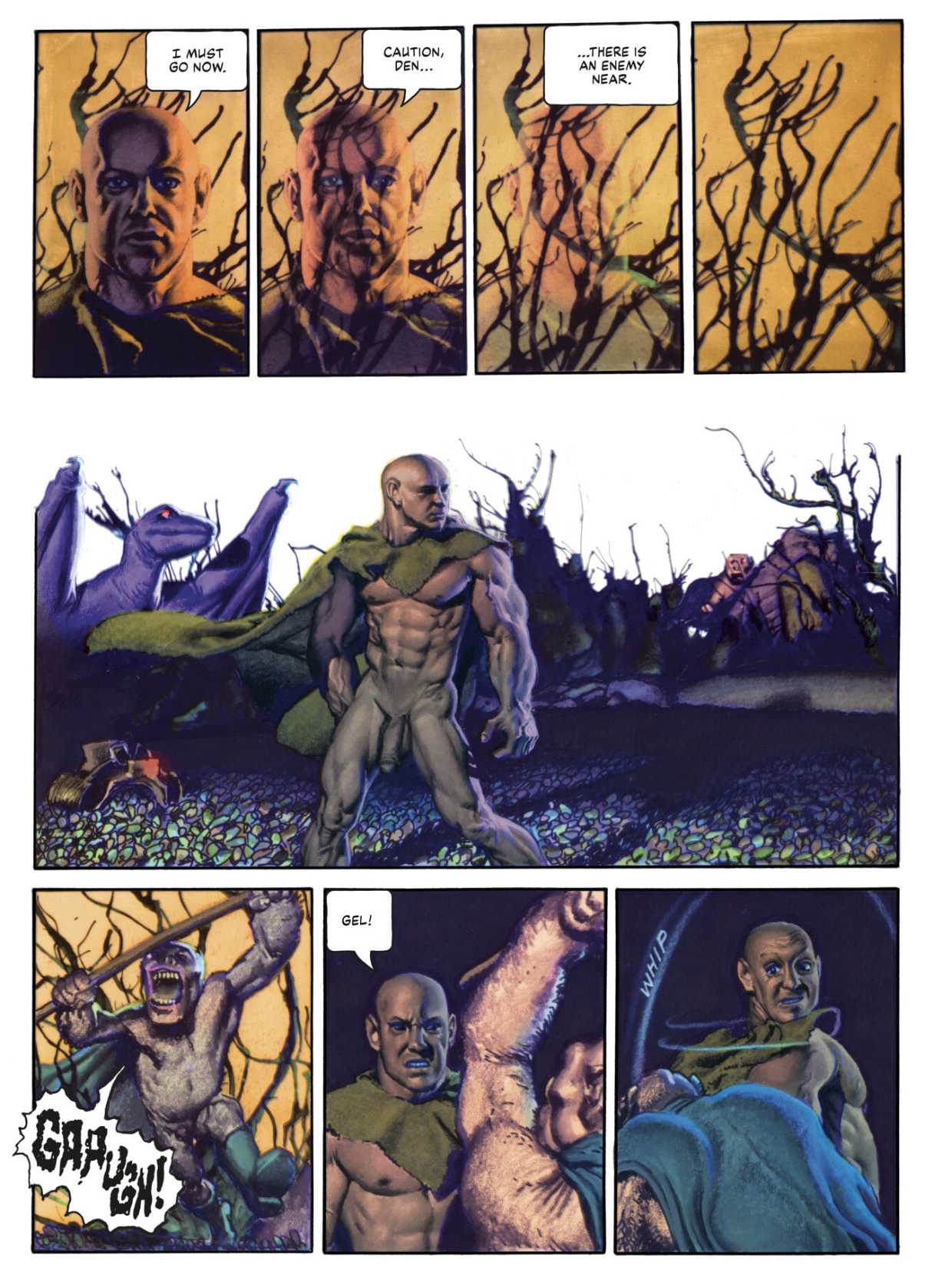
If I'm speaking entirely in generalities, it's because Neverwhere is absolutely Corben's typifying work, where his unique brilliance and wide-ranging skill set shows to greatest effect. A plot summary isn't the keys to this kingdom, but for courtesy's sake: Neverwhere follows its big-dicked adventurer's lumberings through blasted wastelands: part Western hardpan, part sci-fi phantasmagoria, part high fantasy realm, which is to say all pulp. Same goes for the through line of brawny, naïve Den’s struggle with sly, sophisticated, inevitably gay-coded Ard, who took Den's girl from him and, in matters of less import, wants to end the world, or conquer it or... well, something. As in so many of the comics published in Métal hurlant (and that magazine's American offspring, Heavy Metal, which took over the serialization just under halfway through), the journey's delights are greater than the destination's. Corben nails the simple wonder of seeing a story play out in comics form; when it's drawn this boldly, a simple transition to a new setting or two figures negotiating each other's presence in physical space are compulsive reading, and how they impact the master narrative is less important than that they lead to more experiences in the same vein.
There's a special reason why passive, zoned-in reading is the default mode of experiencing these comics: Corben's colors. Whether you think his drawing is gorgeous or garish, or if you enjoy the humming dissonance between those two magnetic poles, the hues he bathes his world in bypass critical thought to soak directly into the brain's pleasure centers. Executed mainly with their artist's proprietary method of layering acetates painted in partial tones of each color over the black line art, the color builds up stunning depth of field and roundness of form with deceptively simple chunks of purple, green and orange that bleed into each other here, pop vigorously there, and swirl into lysergic abstraction whenever the story gives them half a chance. The contents of this book, originally serialized across several venues between 1973 and '78, see Corben testing out a number of different drawing approaches, and the otherworldly burn of the color is what forces an otherwise scattered work to cohere. It's hard to imagine any writer's efforts giving a comic as strong a tone as Corben's color does for Neverwhere.

Just as impressive is Corben's worldbuilding: this comic's setting is no pulp magazine or sci-fi paperback cover hand-me-down, but a rich visual dimension all its own. Corben's way with monumental architecture feels both instinctive and educated, cobbled together from the leavings of pre-Columbian empires and Soviet brutalism. The many monsters massing in the corners of panels are largely humanoid in form, but in close-up panels they show how pure and imaginative a cartoonist their creator could be. Some visual flourishes go beyond drafting to show a keen mind for the form at play. The shadows on Den's face sluice into an abstract oil-on-asphalt pattern as he orgasms; a figure seen in a vision fades into transparency against a boldly marked background of barren tree limbs; a nude girl in an ornate headdress strides across desert sands with bells tied to her ankles ringing into the silence. This stuff goes beyond just good drawing and into the realm of good thinking about what makes an effective comic. It's instructive to contrast Neverwhere against Corben's contemporaneous horror stories for Creepy and Eerie, well-scripted by crack hands like Bruce Jones and Doug Moench. Corben’s own scripting may lack the snap and bite of some of those short-form thrillers, but the epic scope, dreamlike pacing and natural feel for the alien and uncanny are genuinely special. There's a reason beyond the art that Neverwhere is one of the very few Heavy Metal serials getting a deluxe hardcover reprint treatment nearly half a century later.
It's long overdue, honestly. This stuff has been out of print since the early ‘90s, and its publication history wasn't simple before that. Neverwhere's opening chapter was created for issue #2 of the underground series Grim Wit, a typical four-color process printed comic book of the early '70s. (This comic succeeded a 1968 live action/animated hybrid short film introducing the story concept.) Corben's approach to those first pages is graphic and primitivist compared even to the stories he was doing at the time for the Warren horror mags, or undergrounds like 1971's Rowlf. Thick black lines and blocky figures stomp through an acrid haze of color, the setting feels less alien and more Mayan, and one of the biggest joys in the whole book comes in the first fight scene, where already stripped-down drawings shed yet more detail and gain an emphatic simplicity that feels as close in spirit as the undergrounds got to Jack Kirby.

The following installment is probably the craziest-looking thing in the book, as Métal hurlant and its vastly superior slick magazine printing took over the serialization. Corben now applied his color process over artwork that was fully painted in black and white, photographic elements collaged into the backgrounds, allowing him to sculpt dimension and detail in three different media. Skies feel choked with gaseous fog, eldritch forces swirl with true majesty, and figures are weighty with momentum, their sense of animation feeling just a bit obscene. Kirby had to wait decades for his own experiments with photo collage to be as seamlessly incorporated by printing as Corben's are here. It's obvious why this material was chosen to headline the Heavy Metal animated movie: argue about its merits all you want, but in 1976 comics had never looked so vivid.

Following what must have seemed an obvious progression, Neverwhere's next installment featured fully painted color art boards (co-signed with studio assistant Herb Arnold); but here Corben was on shakier ground. The painted colors don’t punch with the same force, and the figurework grows tentative, smeary and crusty where it had been smooth and sharp as glass. Credit to Corben: he realized how important the artificial textures of mechanical reproduction were to making comics, and went back to a color over black-and-grey line art approach for the remainder of the serial. Where much painted (or painted-style) comics art is all about shading, importing none of the strengths of paint and illustrating how resolutely line-based the cartoonist's approach is, here Corben was really revealing and refining an ability to draw with color, using an arcane, labor-intensive process he invented himself. Just seeing this stuff is incredible enough: knowing how it was made is awe-inspiring. One panel of Den is simply beyond a lot of cartoonists' talent level. Only a handful of comic book artists have ever worked with the combination of drafting skill, unique visual style, color sense and technological innovation that Corben was flexing here.

Of course, technology never stands still, and this new edition of Neverwhere has undergone a good amount of optimization on its way to the market. José Villarrubia's digital remastering of the colors from the original art boards and acetates is yeoman's work, done with a true craftsman's attention to detail and sympathy for the artisan's intent. More unusual is the standardization of the pages, drawn over the years for the varying trim sizes of different publications to fit this book's one frame. It's subtle, but a few gutter spaces and between-panel breaks are widened significantly, and sap individual sequences of some momentum in favor of giving it back to the book as a whole. An interesting choice, and one I ended up appreciating.
I'm less wild about the standardization of the lettering. It might be a necessary evil, given that this book's contents were originally lettered partly by hand, partly with mechanical type, depending on the venue - but Corben's scratchy, sometimes labored or cramped letters constantly remind you that a human hand actually made all this stuff, and the digital professionalism of Nate Piekos's well-executed job loses something by comparison. This being said, the overall yoking of a work with as far-flung a publication history as Neverwhere into something that reads as smoothly as an original graphic novel is a tall task. Maybe I'm being my own kind of pencil-neck by imagining a presentation of this work that celebrates the fucked-upness of how it was first ladled out to the world, rather than something likely closer to the artist's actual vision.
Two generations after Corben, in the first decade of the 2000s, a wave of neo-underground comics from publishers like Highwater, PictureBox and certain corners of Image would mine the same delights, exhibiting fresh new drawing styles to remind us how much fun it is to watch characters simply move and encounter, and to take it all in next to them. Video game and RPG-influenced comics chronicling lone wanderers’ progress through multi-stage fantasy landscapes have become a rich and varied 21st century genre of their own, and while Corben can't quite be called the father of the idiom, this work is the first epic of its kind, one that's lost none of its power in the 50 years since its first pages appeared. Aside from all the cool comics that followed, it's impossible to imagine Dungeons & Dragons or The Dark Tower or The Terminator existing without these specific images… but that's damning with faint praise. Neverwhere is the comics medium pushed as far as it has ever gone in one particular direction that tons of its practitioners have strived to take it, first-ballot hall of fame comics by a master. If it's too loud, you're too old.


