
Since we’re on the subject, you know who draws a pretty decent Hulk? Erik Larsen. Never had a regular run on the title but he did draw the character a few times. He did a year on The Defenders with Kurt Busiek around the turn of the century that featured the classic lineup - you know, Hulk, Dr. Strange, Namor and the Silver Surfer, with all the other yahoos fighting for screen time in the background. A strong year on an improbable book. Think of the stars aligning again that those giants could just bash out a year together on a lark like that.
Larsen actually has another important bit of Hulk trivia tucked into his resume: his very first Marvel work was a fight between the Hulk and Thor, in a fill-in issue of Thor tucked right before the launch of the DeFalco/Frenz run on that book, from 1987. First Marvel pencils by Larsen, on a plot by Jim Shooter and a script by Stan Fuckin’ Lee. With inks from Vince Colletta. To the best of my reckoning, Larsen is one of three Image founding partners to receive a Colletta ink job in their early days. (Silvestri and McFarlane are the other two, incidentally.) The story itself - you probably want me to say it’s pretty mid, but no, ‘tis not. ‘Tis most definitely not mid. Larsen really pulls out all the stops. Confident work for a kid, wet behind the ears but bursting with ambition. A much more brutal fight than you’re probably imagining. The Hulk is savage. And the over-the-top narration from late-period Vegas-era Lee really sells it.


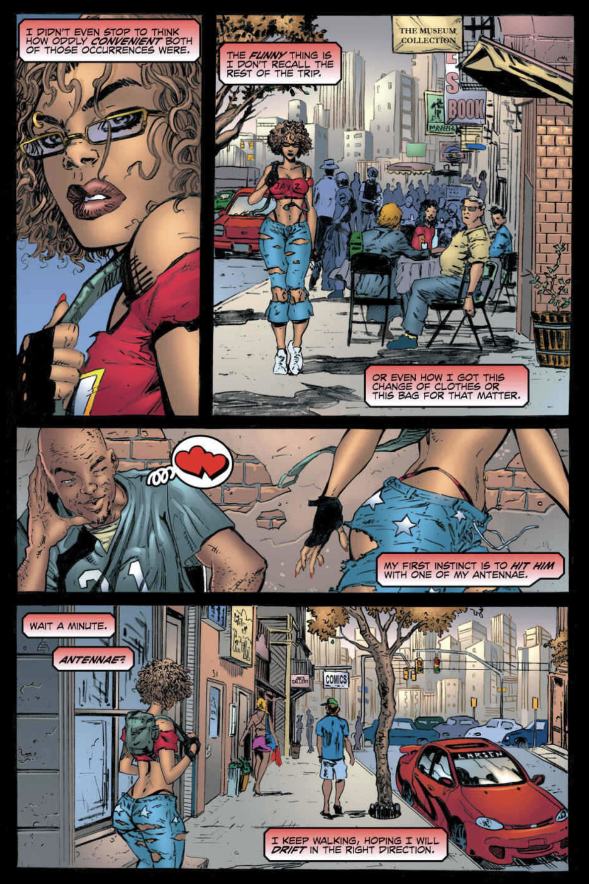
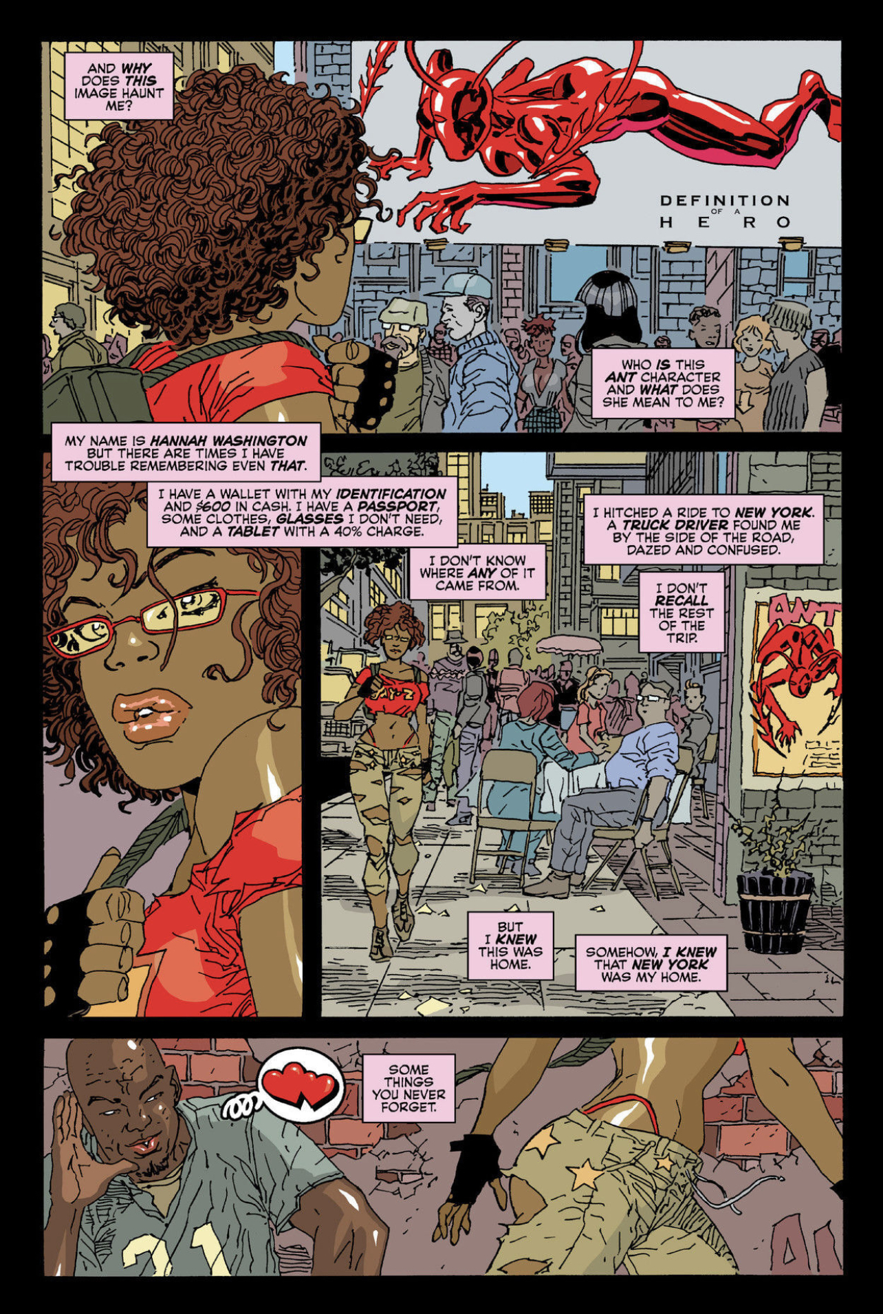
Although, if you want to talk about implausible comic books - Larsen in the here and now has launched another ongoing, and he’s resurrected one of the very last characters I was expecting to see again. Before running across the first issue of this new incarnation of Ant (which technically is the second issue, as there was a preceding issue #12 by Larsen that wrapped up the character's prior Image series a few months before the new #1), I would have sworn up and down that Ant had been a '90s book. Being so thoroughly of that earlier decade, it surprised me to be reminded that Ant was a product of the early aughts - 2004! As I believe I have spent quite some time illustrating rather recently, 2004 was a terrible time to launch any kind of comic book, let alone such an enthusiastic throwback. Still, Ant, the brainchild of creator Mario Gully, managed a respectable run for an indie book with a “bad girl” heroine, in an era not exactly crawling with a lot of either.
It would not be in the cards for Gully to remain in the industry for very long. But people bought Ant, people remembered the character. There was enough value in the proposition for Larsen to purchase her outright when Gully came with the offer. Larsen reintroduced the character to the world in a 2016 crossover with his Savage Dragon and McFarlane's Spawn. Always a trip to remember that both those characters—which after 30 years each possess rather formidable and insular continuities—are also technically still connected on the same world. A world where the Witchblade and Shadowhawk also occasionally kick it. All manner of byzantine continuity unspooled like so much confetti from a firehouse for three decades. The true legacy of the Image Generation is that if we’re lucky we all live long enough to become our own Roy Thomas.
Well, here’s Larsen doing the ultimate of old-school excavations: taking the time to explain in great detail how all the stories with this character that happened before in comics created by someone else also still happened, only in slightly different ways. There’s an interesting text piece in the first issue detailing the character’s history and how Larsen came to be the new owner. It’s bracingly honest, in places, about just what worked for the character and what didn’t in Gully’s original conception. Larsen has spent a fair amount of time thinking about how Ant might work in the 21st century, at least in his hands. These decisions weren’t made in a vacuum, and it’s interesting to see his thought processes.
All of which leaves us with the series itself, a Larsen production from stem to stern. It’s got a new logo: three massive block letters in primary colors, looks a little bit like the same font as the old Thor logo from back in the day. An unmistakable Silver Age move, another kind of throwback to demarcate a new beginning for a character historically identified, if anything, with a much more recent and dismal period in comics publishing. And there’s Ant herself on the cover, “costume” (such as it is) completely unchanged: a well-endowed woman who has been sealed in skintight red tinfoil, two rakish little antennae floating around her head like a laurel wreath. That’s it! The Ant costume itself works a little bit like the Venom symbiote - it gives her power like unto a human tank, can reshape into (similarly shiny red) clothes, even regenerate fake limbs.
On the one hand, it’s goofy as hell in a way that only comics can be - skintight red costume leaving absolutely nothing to the imagination regarding the anatomy of the wearer, yep. That’s a Larsen book for you, whatever the character pedigree, whatever the year. On the other, you cannot argue it isn’t completely indelible. The character is recognizable on the rack at fifty paces and that’s not nothing.

Perhaps my standards have fallen! I’ve been reading a lot of vintage Top Cow lately, by choice, so I may not be the best judge as to what does and doesn’t work in terms of sexy ladies in comic books. Appreciating wonky but earnest cheesecake art has become part of the #brand, I cannot deny. If that elicits a sneer I can’t gainsay. As far as that goes, I never thought Larsen drew particularly sexy women, per se. He draws women of a type, by and large, “sexy” in the same way most of the Image partners drew “sexy” women: exaggerated past the point of prurient appeal, at least to this lonesome cowgirl. Interesting as exaggerations, perhaps. The only one of that gang with even a jot of sensuality to their work was Silvestri - a weakness of the era, not the men. Silvestri came into the picture a little earlier than the others, remember.
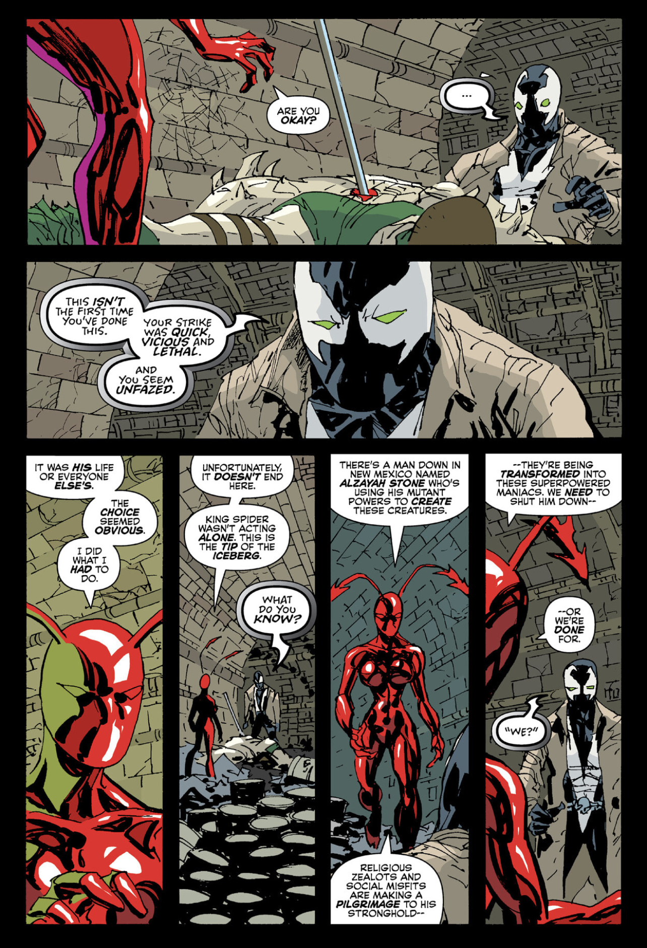
But, if Ant isn’t nothing, what is it? I think Larsen does his best to launch the character on firm footing. As origins go, hers is fairly standard: injected with an experimental something-or-other while her dad was trying to protect her from sinister corporate goons. You could fit it into a movie template and it’d make perfect sense. The reprised crossover with Spawn ends with a timely reminder that Spawn is easily the most unpleasant person to ever be a popular comic book character. Just a completely garbage attitude in every way. No one is ever happier to have run across Spawn. Thirty-one years of the most garbage attitude in comics! Who could have guessed he’d make it this far? Not The Comics Journal!
The real appeal here, however—the reason I kept coming back to flip through Larsen's Ant long after the story had washed over me—was how good it looked. Larsen has been doing this for a long time - remember that issue of Thor? 1987! And that was far from his first professional work. He’s been doing this long enough and at such a high level that the only reason to want to do more at this point is pure love of the game. You probably knew that. There’s a reason to mention the rest of the Image founders in this context: none of them are still drawing comics every month, or even close to Larsen’s relentless ongoing pace. They all still work, or course, fiddling about, doing this, that, or the other thing - but of that group, there’s still only one of them who seems to need to work, at the drawing board, producing pages of his own art, month in and month out. At this point there’s more Savage Dragon in the world than Love and Rockets, by a fair margin. We really ought to appreciate that. More than just about any other cartoonist alive today, Erik Larsen manifestly needs to draw in the same way some people need to breath oxygen. That urgency in his work has never faded for me, and it places him in elite company.

Ant doesn’t look quite the same as Savage Dragon, is the thing. Larsen is coloring himself, for one (albeit with Mike Toris credited with flats). Please don’t take this as any kind of faint praise when I say the coloring is the best thing about this book. It’s revelatory. It’s become commonplace to observe that colorists exert a significantly larger influence on a finished comic now than they ever did before - especially true in an era where a number of artists are simply doing their own colors. By and large, Larsen’s generation was too early to really get into color as anything other but enthusiastic early adopters of digital techniques. (McFarlane colored that one profoundly odd issue of the adjectiveless Spider-Man, #4, but took the impulse no further.) Here, however, Larsen is going for it, without reserve. The colors are wild: shocking oranges and reds and magentas, moody and bold. Not a lot of gutless gradients. Expressionistic in places. It compliments this new drawing technique he’s playing with - mostly thin lines, not so many of the chunky Kirby brushstrokes into which he tends to lean. It’s a style designed to fit the color, and vice versa. Really shows his chops as a pure storyteller.
How many guys you know from the '80s still out here putting their ass on the line to learn to color a comic book in a completely new way? Because Larsen has colored before, but nothing quite like this. Dude should start coloring some stuff for other people - it’s that striking. I’d love to see how he might work with someone else. Color some jazzy Spider-Man comics.


