
I will be completely honest, I did not intend to like Spy Seal: The Corten-Steel Phoenix! That the book won me over is a testament to the skill of its creator.
Why didn’t I think I was going to like the book? Well, here’s where I make my own shameful confession that I’m sure will see me permanently blackballed from the Journal: I’m just not that big into Hergé. So when I saw the cover to Spy Seal I groaned, and although I’m not completely certain I think it was even an audible and not an internal groan. A Tintin pastiche? There are few things within the realm of comic books that hold less inherent interest for me.
Now, as the critic in this instance I think it’s only right and proper for me to frontload my prejudices. That’s part of the story, after all: right off the bat the book starts off with a demerit for me because I never read Tintin as a kid. And the problem with that is actually fairly common in comics: let’s call it the problem of secondhand nostalgia.
Because comics is a visual medium, pastiche is tricky and taxing. Committing to doing a story in another cartoonist’s style – even a short story – can be, alternately, a stylistic tour de force or a numbing recitation of technical skill. The difference in either case is simply a matter of perspective. If you share a fondness for whatever the original art object may be then it’s easier to grab a foothold. It’s a lot harder by a few orders of magnitude to use pastiche to make someone enthusiastic for a stylistic originator they don’t particularly know or care for.
Which is not to say that it’s completely impossible. But I think the important thing in this instance is that I stayed with the book long enough to see that my initial judgment was unfair. Yes, Spy Seal is a Tintin pastiche, and my general unfamiliarity outside the very basics of Hergé’s career made the idea of sitting through an album length dissertation on the man’s style seem an academic exercise, at best.
But here’s the thing about pastiche: everything I just said about it really isn’t true, or only partially true, or – and maybe this is closer to the mark – perhaps only true if you’re trying to perform an autopsy on a comic that doesn’t work. The fact is that pastiche can be a very potent tool when used correctly. Sometimes it’s even better if you don’t know the original, aren’t even aware that there’s any kind of generational dialogue at work. Because when you do you fall into traps like the one where you’re a critic trying to crack open a problematic comic and you focus on the most glaringly obvious surface aspect of the book to the detriment of the book itself.
 I realized at a point reading the book that I had stopped to hold its stylistic proximity to its inspiration against it. It really is a terrible red flag to throw in the face of a charging critic – we’re only human, I promise you. If you go through the Journal’s back pages you’ll find similar sentiments written about folks like Tom Scioli and Don Rosa. There are so many artists in comics who ape other peoples’ styles so mindlessly and with such cynical detachment from any context but the commercial that it’s often hard to discern intent. It can be difficult without the hindsight of a proven track record to discern (figuratively speaking) a photocopy from freehand reproduction. The former betrays the weaknesses of the mechanism for reproduction, the latter accentuates the idiosyncrasies of the second artist in conversation with the first. It took a while for Scioli and Rosa to get their dues but eventually they did and have, because enough readers over a long enough period of time recognized that their respective bodies of work, while deeply indebted to certain stylistic progenitors, represented genuine attempts to use familiar styles as points of departure for significant and thematically distinct projects.
All of which is to say – I saw the cover for Spy Seal and it took me a while for the book to win me over. And the reason it won me over is that, as I read further and got more involved in the story, I realized there was a lot more going on than just a facile (if extraordinarily technically accomplished!) element of pastiche. Sadly I spent all the time that I was supposed to be studying bandes dessinées studying Roy Thomas, so I can’t even say how deep the stylistic debt may go beyond the obvious touchstones. What I do know is that Rich Tommaso does such a good job with the surface elements of how this comic is supposed to look like that any anxiety over influence I may have had evaporated about thirty pages in. It’s important to recognize that not merely does Tommaso know how to make his comics look like Tintin, but understands why and how Tintin works in the first place.
 Of all the great styles to emulate, the ligne claire strikes me as one of the most difficult. The whole point of Kirby is that he’s got a lot of energy leaping past the bounds of technical precision and into the realm of visual expressionism. You can cover up a lot of sins with bold lines and Kirby Krackle, and that’s OK because Kirby is a mood as much as anything else. You can’t fake it with Hergé, though. If an artist commits to the clear line, they are eschewing so much in the way of the tools cartoonists use to cover up their shortcuts: Crosshatching! Heavy contrast! Even something as basic and variable as line density and brushwork really isn’t up for debate. You’re talking here about ink lines that look like they could have been laid down with a Rapidograph.
When you step into the ring with Hergé or Joost Swarte you’re stepping into a style that leaves no room for obfuscation. If your basic chops are not impeccable you will fall flat on your face. There are far fewer ways to hide if you can’t, say, draw a car, or do three-point perspective on a staircase. Every artist reading this just cringed when I said “staircase” – well, Tomasso doesn’t shirk away from staircases. I find it impossible not to respect an artist who refuses to cut corners with staircases. There are lots of steps in this book, and he drew every one along the way.
So, why Hergé? Rather than simply a direct pastiche, Spy Seal is something a bit more expansive. The common denominator here is that Hergé was active at the height of the Cold War, as were John LeCarre and Ian Fleming. It was also a time when leftist organizations sprang up across the western world for the purpose of agitating against capitalism – the Baader-Meinhof Group started in ’70 and therefore only overlapped with the very tail end of Tintin, but they were both products of the same continental conflict. It shouldn’t really work the way Tomasso juggles between all these different contrasting literary and real-world inspirations – his view of MI-6 is strictly the kind of thing you’d expect to see on Joe 90, for instance, but this is also a book that isn’t afraid to drop a few bodies.
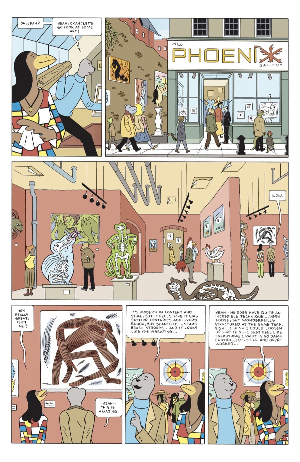
The titular character, the “Spy Seal,” is a seal named Malcolm who finds himself recruited by MI-6 after breaking up a political assassination at an art installation. From the beginning of the book it seems as if this is as much the Europe of Godard’s La Chinoise as Hergé – the very first page sees Malcolm discussing international class struggle. Not that his wokeness prevents him from wanting to be a spy, after all – he’s got the military background and can handle himself in a fight, and what more does a spy need? Honestly, the charm of Spy Seal as a book and as a character is that the guy just keeps falling into adventures and somehow managing to hold his own despite just randomly waking up and falling into an international criminal conspiracy. As the kids might say: relatable.
 I don’t particularly care for spy stories because I’m not one for twisty suspense – I’ve seen multiple versions of Tinker, Tailor, Soldier, Spy and have yet to understand the last third, for instance. I think Spy Seal works perfectly for me because it has a similar attitude towards those kinds of horrendously busy suspense narratives: a bunch of stuff happens, the good guys eventually end up in the right place to sock the bad guys on the jaw, and no one really cares at the end of the book when Malcolm points out that the book’s major MacGuffin was, well, just that, a MacGuffin.
The last words of the book are “doesn’t it bother you?” a question aimed at just that kind of unsatisfactory resolution – but honestly, no, it doesn’t bother me, because the point of the book was just to maneuver this really cool spy guy into a bunch of completely preposterous situations. There’s a bit where Malcolm has to escape from a falling airplane after being knocked out and tied up that I had to reread three times because I wasn’t sure what actually happened – but it certainly wasn’t Tomasso’s cartooning, which is extraordinarily straightforward and highly legible at all times. No, it took me three times to register the joke: it doesn’t really matter how Malcolm got out of it, but it’s funny that he did, just as it’s funny he survives getting thrown off the back of a speeding train going over a high bridge just a few pages later, and survives falling to his death from a mountain chateau just a few pages after that. The reader begins to recognize a motif.
It’s a fun book, but “fun” carries such a pejorative connotation in comics – it’s fun in the best way, as the product of someone who put a lot of work into a singular vision that you can’t really imagine taking flight in any other medium. Look past the clear line technique – not that you don’t want to anyway, because it works quite well – and you see a very well-thought out dissection of sixties spy narratives told with the deadpan absurdity of either a comic book or the French New Wave – take your pick. Works either way.


