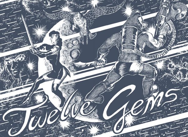
This week we are going to look at Lane Milburn’s new book Twelve Gems. Lane is an old friend. We’ve collaborated on some projects and I’ve been a general booster of his work since the first time I met him back in 2007. When Twelve Gems came out I was enthusiastically talking about it to one of my students, Ben Humeniuk. We both loved it. Ben really loved it and was making insights into the work which I had not considered fully. So I asked Ben if he would be willing to take over my column and give Lane Milburn’s Twelve Gems a fair shake with a fresh pair of eyes. Take it away, Ben.
======================================
Twelve Gems mini-review by Ben Humeniuk
As a child of the '90s, I missed out on comics’ black-and-white boom by just a few short years. That said, whenever I stumble across a back issue from one of the short-lived self-publishers of that time, it’s a real source of joy. There’s usually a clear love of genre at play, combined with the eager sort of writing and illustration that signal a creator’s intention to make their mark on the world. Those are qualities my generation certainly has in spades, and for me, Lane Milburn’s work taps directly into that vein.
If you’ve paid attention to the press rollout, Twelve Gems is being sold as an action-comedy, which is absolutely on point. Our plot concerns a ragtag trio of adventurers, commissioned by the eccentric Dr. Z. to track down twelve gems that supposedly began life on “Erth.” From the moment Venus, Furz, and Dogstar step on to Z’s space station, the jokes come fast and furious. There’s a surreal, Adult Swim quality to some of the gags, and the combat is no holds-barred. We've got blood. Punches. Explosions. Laughs. It’s episodic, earnest, and it’s totally a riot.
But there’s something else at play, too. If you take your cues from Lane’s meticulous hatching and scratch the surface for yourself, you begin to find something more than just non sequiturs and hijinks.
Take, for instance, a scene deep into the book after our protagonists escape from a major throwdown. They order some celebratory take-out, and, this being space, their food is delivered directly to their ship by nomadic crystal aliens. Once it's ready, the food pod unexpectedly unfolds into a huge, bountiful kind of feast. Lane’s characters look at it for a second with a grateful disbelief. It's a single page beat, but it really resonates. You don't give moments like this to characters that you're treating as jokes.
So I'm presuming depth. And with that in mind, I interviewed Lane about his process, influences, and some of the deeper concerns that under-gird Twelve Gems. Many thanks to Frank for letting me share his platform here, and to Lane for being an immensely gracious interviewee.
INTERVIEW:
BEN HUMENIUK: You drew this book over the course of about three years. What changed in your process by the time you were done? Any new approaches you added to your toolkit?
LANE MILBURN: It's a bit hard for me to call to mind my working method back then... I do remember that I started the book sort of timidly, meticulously penciling the first few pages and so on. I like to pencil as little as possible... I know it's necessary but it's all going to be erased anyway! I also learned to love the nine-panel grid from this book.
How big are the original pages? Brush? Nib? Micron? Talk shop with me.
I drew all the pages as spreads on sheets of 14x17" Bristol. I'd say an individual page was drawn at about 8.5x13". I used an itty-bitty Speedball crow quill and black India ink. For the lettering I used a larger spade-tipped nib that has a duller point and doesn't "fan" out the way the smaller ones do. Microns for panel borders. Random neglected brushes for black-spotting.
Was there any digital work involved in the book besides scanning? Or was it all done with analog techniques?
No digital work besides scanning. I used to be a painter and I think with that background I like to have the page on the drawing table look as close to the printed page as possible, given that a painting typically goes directly from the easel to the gallery wall. I'm considering doing a second monochrome layer in Photoshop for my next book.
How does a painterly approach translate to meticulous black-and-white linework like in Twelve Gems? Do you try to maintain the same mindset when you’re relying on hatching and spotted blacks as when you’re working with a range of values and tones? Is there any frustration in that process?
I do try to maintain the same mindset as with painting though it's translated into the realm of black ink and print. I think it all comes down to my love of texture. In a painting you can give the surface a rich physical texture and I try to translate that effect into my comics through the use of stippling and hatching. I was home in Kentucky recently and I saw one of my old paintings on the wall. The paint was daubed on just like stippling! I love how these realms bleed together.
Did you conceive it as one big book or as serial installments? Didn't you publish the first chapter in an issue of CCC?
Yeah, I drew a sort of preliminary story in CCC 9 featuring two of the main characters. When I started working on the book I had envisioned it as a series, and now it's hard for me to imagine why. I feel it works just fine as a standalone graphic novel. Sometimes I envision projects that just go on and on and on and on... maybe one day I'll do a series, who knows?
Is Anya Davidson (Lane’s girlfriend) the main character? Did you make this book to impress Anya? It's interesting because you dedicate it to her, and it's really sweet - like a sci-fi adventure love letter.
Hee hee hee hee hee! It is sort of a sci-fi adventure love letter. I didn't intend the main character to be her... Venus and the other characters are too straight-faced and dour. Anya would be more witty and charismatic! The book embodies lots of our shared interests: sci-fi/fantasy (of course), heavy metal/rock'n'roll, creatures, vintage retro-future stylings. We're almost at the end of the last season of Battlestar Galactica.
Which version of Battlestar? The original, or the more gritty reboot? My wife and I are pretty fanatical about the latter, so I’m curious how that informs your tastes on sci-fi.
The new series! My girlfriend and I are watching it all the way through (this being her second time). I loved the first two seasons especially and am experiencing some anguish at how the show fizzles out in Season Four. I've compared it in conversations to Twin Peaks. Maybe not a perfect analogy, but my feelings are the same. For me, good science fiction has always been about societies, or a more general picture of human civilization. (Twelve Gems, I would say, is more of a fantasy/adventure/comedy than sci-fi). I liked the power struggles in Battlestar and the different leadership principles on display (like Admiral Cain vs. Adama in Season Two). The question of how to organize a decimated human population on the run in space was a fascinating theme of the show.
What kind of references were you using? You're making up a lot of stuff and it's a pretty fluid looking world. Did you plan out the spaceships and the different monsters walking around?
Thanks! Not much of that stuff was planned in advance.... I think it all just draws on the pop-cultural vault in my brain which is stuffed with decades of movies, comics, video games, toys, airbrushed heavy metal album covers, sci-fi book covers, Japanese movie monsters, etc. I think there are only two places where I used direct references: the engine parts Dogstar is working on at the very beginning and the ape-alien with the bulbous head in the foreground of the big spaceport crowd scene. He's from a series of kaiju paintings, but the artist's name escapes me. The other stuff flows out of that memory vault. Some specific things off the top of my head that I was channeling: Moebius, Druillet, Fritz Lang's Metropolis... childhood essentials like The Neverending Story and Star Wars, plus lots of other movies (Total Recall, Fifth Element, Deathsport, Zardoz, you name it).

In the Thornacia-Vii sequence, is Furz channeling Major Grubert? The costume’s a kick.
Hell yes! Grubert all the way. It coincides with their landing on a lush alien jungle world.
I read this digitally and it worked wonderfully. Especially the spreads—the ones that serve as “act breaks.” They’re reminiscent of chapter title pages for manga. Intentional homage? Just a way to give breathing room?
Yes, they are probably derived from manga, and also mimic the screen wipes from cartoon shows. They're supposed to establish rhythm.
Also regarding spreads, the print edition is really tightly bound. With the physical version, do you feel like you lost anything in that “valley” where the pages dive into the spine?
I did feel that way about a couple of spreads and it was entirely due to a lack of foresight on my part. Live and learn. Also, I do live for print. Books are a major part of my life. I don't see Tumblr or a PDF as an ideal final presentation of my comics, and I really don't like reading other people's stuff online mostly.
One of the last spreads in the book kickstarts the final battle with Dr. Z and the Titan. It’s where the Titan leaps from the cube-station toward a sphere-ship that the protagonists are flying. This line of obscene, hyper-rendered techno-organic fury links up these two platonic forms—a simple sphere and cube (with a planet’s hemisphere behind it in the background). I like the contrast, but I also like what it suggests. How’d you get to that image?

Interesting. The orbiting cube storage facility was actually something that popped into my mind years ago, although I had originally envisioned it as a prison. That was a cancelled story thread for TG: the heroes are captured and locked up. I think the use of simple geometric forms comes from a study of old futuristic design motifs and also my being fed up with aerodynamic spaceships. No air in space = no aerodynamics!
I want to talk about your use of language, now. The “technobabble” was fun. Did you have an idea of why stuff like Dr. Z’s “hypercompressed fuel” was so significant? Or was it all there to just give some texture?
I used to listen to a podcast called Astronomy Cast and there was an episode on the extreme difficulty of interstellar travel. Of the many issues that prohibit our traveling to another star, one sometimes overlooked is the problem of fuel: being able to carry enough for such a long journey. So "fuel hypercompression" is just an ad hocsci-fi solution I came up with.
The P-Quad’s name was a nice literary gag. Any others you’d want to highlight for readers who may have missed them?
That may be the only one, though I'm a huge fan of literature. Some favorite authors are Faulkner, McCarthy, Gogol, Virginia Woolf, Lautreamont, Krasznahorkai, Anne Carson, Murakami, etc. etc.
What about music? Grant Morrison says some of his stuff is Tibetian Death Metal, Chris Ware has based comics on ragtime rhythms, and some mainstream-y guys even create and share playlists to accompany their books. What’s Twelve Gems’ soundtrack?
Well in the book there are direct references to Pink Floyd (not a fan though), Mercyful Fate, Judas Priest, and maybe Manowar. Other stuff on the TG soundtrack would be: Yellow Magic Orchestra, Hawkwind, Giorgio Moroder, Dead Can Dance, King Crimson, Blue Oyster Cult, Joe Meek ("I Hear a New World" BIG TIME), and Grace Jones.
Let’s talk characters for a sec. I found Dogstar really compelling. Compared to the archetypes that Venus and Furz represented, he seemed more singular—and maybe personal. He’s a sweet, nervous soul who digs into the components of what makes things work- whether that’s technology, or the spiritual underpinnings of the universe. How’d he come about?
I also love and sympathize with Dogstar. He seems to have more personality despite having the fewest lines. He's a romantic and an idealist. As for his design... I'm not quite sure. I think I found it to be visually funnier to have this expressive winged shepherd dog be in the mix rather than some bizarre alien. I also love dogs and all animals.
On to the antagonist, Dr. Z. I noted a size issue with him- he seemed to keep creating things larger than himself to give himself value. That seemed true of Esmeralda as well as the Titan. Was that just for comedic effect?
Nice observation! A couple years back I was listening to a science segment on NPR and I learned about a concept in biology and psychology called supernormal stimulus. It has to do with artificial things sometimes being more enticing than natural ones. There have been experiments showing butterflies being more attracted to a large, artificial, brightly colored, robotic butterfly than its real counterparts because of its enhancements. They would try to mate with it even though it wasn't real. There are lots of parallels in human life. The beauty industry hinges on supernormal stimulus.
That's what I had in mind when I came up with Esmeralda. She's supposed to be Dr. Z's bizarre notion of the ideal sex object, even though she's completely non-human. And the Titan was supposed to be Dr. Z's first foray into robotics.
The three-headed being Dogstar encounters really struck me. It’s on the cover and in the epilogue, so it seems it’s significant beyond just the “Dog’s Dream” sequence. That said, it talks about “the mirror-trick of consciousness.” That didn’t seem comedically facetious. Is that a hint at some of your philosophy?

I was listening to a lecture by Daniel Dennett on YouTube, though I wouldn't necessarily call myself a fan of his, but that's neither here nor there. He was talking about consciousness as something automated, like a factory with no workers. He may have referred to the "I" or the "sense of self" as a "trick," but I don't exactly remember. "The mirror-trick of consciousness" is something I came up with to reflect this materialistic/deterministic view, though I wouldn't necessarily call it my own.
Twelve Gems has already been compared to ‘80’s black-and-white boom comics stylistically... but I think it also has something in common in the way it celebrates and synthesizes a mélange of influences (which you mentioned previously). Books like Cerebus started in a similar place, and then arguably transcended it, at least for a time. That’s a long way of asking: now that you’ve done a pastiche, is this your last word on sci-fi? Or do you have some next-level investigations in store down the line?
I definitely don't think this is my last word on sci-fi. A few months back I was working on plans for a more serious dystopian sci-fi book but that has been temporarily scrapped. I might revisit it. I absolutely want to take on some higher-level investigations at some point, now that I've done the comic equivalent of Spaceballs (yuk yuk). For now I think I need to try a different approach, so my current project is a semi-autobiographical story drawing upon memories from my high school years.
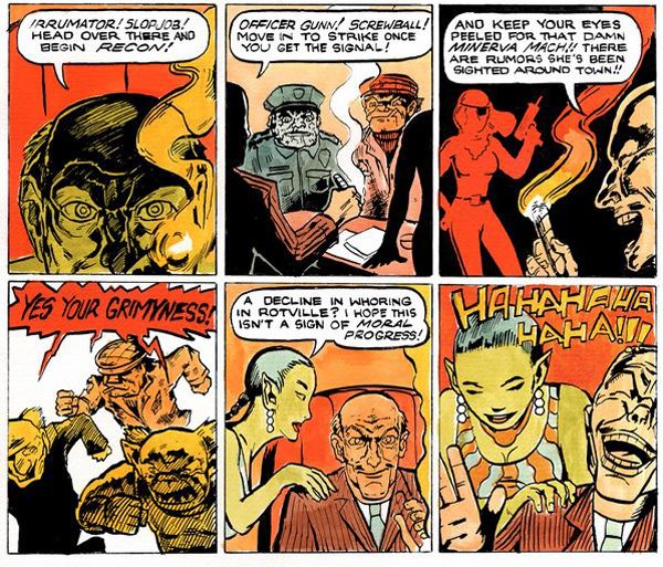
Before this came out in print, you serialized a short comic called Organized Grime on your Tumblr. It’s an interesting contrast to Twelve Gems. Instead of a graphic novel, it’s an 18-page adventure. You rely less on black and hatching and let painted color control a lot of the image. And it’s serialized digitally. Tell us how you chose that format.

Like I've said, I see Tumblr/the internet as a quick means to an end and not a "final" presentation platform. I had originally envisioned a full-color printed zine for Grime and I haven't ruled that out. My hope is to continue putting short color stories up on Tumblr and then one day collect them into a book. So I have kind of a "dual" working process right now: I'll be working on a long graphic novel and shorter color stories simultaneously. Stay tuned for more Tumblr stuff. I'm taking a break in order to focus on my next graphic novel but I'll post more short stories by the end of the year for sure.
Can you talk about the way you code color? In Grime, for instance, there’s this great streak of lurid reds, yellows and oranges that permeate the work… until you hit the end when the characters have cleaned up town, and the sky is clear and blue.
Yes! I've become fascinated with the use of non-local color in comics. Four-color comics in particular have a fascinating sliding relationship with color. I'm thinking of the early Ditko hard-boiled crime and gothic horror stuff. A face or an entire figure might be solid green or red in a panel and that can mean different things. It may signify shock or another internal state, or it might be a purely formalistic means to create depth: you might have a foreground figure seen from behind and he's flooded with dark blue. That would emphasize whatever action is going on behind him. So non-local color is a tool for dealing with composition and storytelling and it seems rather unique to comics. Too much local color can look drab.
In some ways, your work seems to celebrate virtue from unlikely sources. In Twelve Gems, Dogstar and Venus want to do the right thing for the right thing’s sake, and Furz is seeking an escape from life as a gun-for-hire for the corrupt galactic nobility. In Grime, the Madame and Minerva Mach, despite their controversial industry, are really, genuinely trying to clean up their town. You touched on materialism earlier—is this a refutation of that perspective? Is it too broad to peg you as someone who trucks in “unconventional virtue?”
I'll take that peg! Yes I believe in virtue from unlikely sources, absolutely. I want to believe in human kindness and cooperation. It would be totally superfluous to mention that there are enormous obstacles to maintaining this belief! I think I sympathize with outsiders. Two of my favorite filmmakers are Herzog and John Waters, and I think they each in their own way celebrate outsiders, freaks, and the whole grotesque human pageant.
Here’s some more synthesis—your bad guys over the past two works are old white dudes who use people as a means to an end. But then they end up impaled- Dr. Z through the heart, and Boss Dross with an arrow through his eye. Perhaps the things that generated their lust get destroyed? What do you think?
Zounds! I dig your analysis of symbols. Needless to say, those at the levers of power in our country/world and who cause tremendous hardship for humanity and are busy wrecking the planet are mostly greedy old white men. So that's not an arbitrary thing. In Death Trap, Twelve Gems, and Organized Grime I have male villains who are manipulating people, or forcing them to do or experience something. They each have a devious lust of some kind, so I think your analysis of phallic symbols is apt.
Looking toward the future… in addition to the high school project you touched on earlier, you’ve also mentioned a graphic novel called Down Among the Dregs being in the works. This one is supposed to expand on the town of Rotworld you established in Grime. What should we expect from that?
Down Among the Dregs has been scrapped. My next book is going to be a graphic novel that centers around a public high school in Kentucky. The last few months have involved a sort of mini-crisis of me trying to figure out what to work on next. I think it's time for me to choose a different starting point: TG and Grime begin in constructed, fantastical worlds. I want to start something in the real world and see if the fantastical wants to work its way in.


