Seth has kindly allowed TCJ to excerpt a portion of his lengthy and compelling essay, "Creating a Personal Vernacular Canadian Design Style", originally published in The Devil's Artisan issue 69, which is currently available for sale. Special thanks to publisher Tim Inkster for supplying the text and images and to Jeet Heer for the suggestion. We pick up with Seth discussing the process behind The Collected Doug Wright.
After fifteen years of collecting, research and study, I finally got a chance in 2008 to co-edit and design a monograph on the largely forgotten, but great, Canadian cartoonist Doug Wright. This was a project dear to my heart and I wanted to make it something special. The meat-and-potatoes part of the design job was no worry. I knew what to do with the biographical essay and with the reprinting of his comic strips. That was straightforward and would surely work itself out at the drawing table with thought and thumbnails. What worried me, as the book came together, was that I didn't have an overarching design concept for it. I was stumped. Even though Wright's comic strip Nipper was ostensibly a domestic family gag strip, its most defining attribute was actually the quiet, matter-of-fact, slice-of-life nature of the work. Setting was all-important. Wright's work was quintessentially Canadian so it went without saying that the book should have a Canadian flavour too. The strip practically broadcasts the essence of Canada in the 1950s and 1960s. I puzzled and puzzled. I remember thinking it was all-important to have Nipper on the cover. I drew up a bunch of disappointing thumbnails. One had Nipper among a downpour of falling maple leaves. What was I thinking? I sure didn't want that! Thank God for serendipity. As the time to begin working on the book approached I happened to read an article in the Globe and Mail on the Vimy Ridge Memorial in France. It didn't hit me immediately, but later that day some disparate thoughts came together. It had often struck me that the central irony in Wright's life was that he had been raised fatherless yet had unconsciously (perhaps even unwillingly) picked as his life's work a comic strip about a father and his sons. It was too perfect to be an accident. This enticing bit of back story had intrigued me but I hadn't seen any reason to dragit into the design. Not until that Globe article. Wright's father had been killed in the First World War. He wasn't killed at Vimy, and he wasn't even a Canadian (a Brit), but his death in that war left Wright to be raised alone by his mother. I had read a letter that Wright's father wrote to him from the battlefield shortly before he died. Advice on how to be a man. That had to have had a very powerful effect on the young boy, and probably on the grown man too, as he read it again in the years that followed. I know thismuch, it was still among Wright's papers after his death. Admittedly, this was a pretty tenuous thread on which to string the design of the book. But, as I mentioned earlier, sometimes intuition is the strongest deciding factor in these matters. Smart or a stretch -- the decision was made. The book would be built around the appearanceof the Vimy Memorial. It wouldn't be overt. No one would ever guess it to look at the finished book but it would give a deeper underlying meaning and a clear visual plan that would allow me to structure the concrete design of the book itself.
Step One: The first thing I needed was to get a good feel for the impressive Walter Allward-designed memorial. It is located in France, and a visit to the site was out of the question. I assumed a good book of photos would solve my problem but, to my surprise, I could find no such book in existence. I'm still dumbstruck, writing this down -- but it appears that no one has ever published a good coffee-table book (or even apoor one) on the Vimy Memorial. Is that possible? I certainly couldn't locate one. If any reader knows of such a book -- please, let me know. I'd like to own a copy.
Anyhow, with that avenue closed, I turned to my least-favourite source of visual information -- Google Image. Over an afternoon I explored the available photographs online. I found a blueprint of the memorial and by organizing the photos in sequence I was able to mentally visit the site, approach the memorial, walk up the stairs and make my wayaround its towers and sculptures, and exit down the rear stairs againand away. Not the same as actually being there, but as close as I was likely to get before the publication date of the Doug Wright book. I admit, this is turning out to be a rather plodding account of my methods. It feels drained of the creative enthusiasm I felt during theprocess of putting the book together. It wasn't a dry affair at all.I was very focused -- deeply immersed in the work. I'd certainly hate for anyone to think I studied that memorial dispassionately. The site has a remarkable potency -- even with the veil of the Internet between the viewer and the monument. That shrouded female figure of sorrowing Canada has to be one of the most moving sculptures I've even encountered.
I sometimes wonder if Allward's masterpiece wouldn't have had a more central place in our national imagery if it had been built here on Canadian soil. I think most Canadians are largely unfamiliar with it. It is such an impressive work -- so rich in national imagery -- it should be as iconic to Canadians as the Lincoln Memorial is to Americans. But it isn't. I'm a cartoonist first and foremost. Design is a secondary pursuit and, because of that, most of my design work probably has a narrative underpinning to it. So, naturally, after mentally making my waythrough the monument I sat down and roughed out a "storyboard" of the "walk".
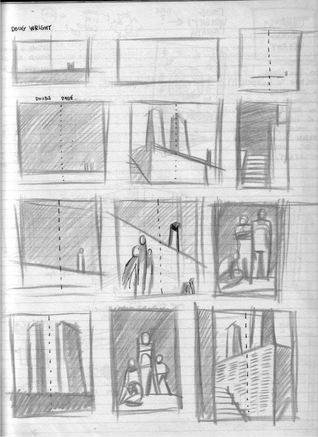

This was a first attempt. Sketching my way into the idea. I decided this "walk" would comprise the opening pages of the book. I intended a long section between the half-title and the introduction. Doing some quick calculations based on the page count (240 pages total), minus what I would need for the strip reprints, the portfolio of Wright illustrations and the long biographical section, I determined I could likely carve out nineteen or twenty pages for my self-indulgent "poem" to Wright and Vimy Ridge (the symbolic stand-in for his dad)
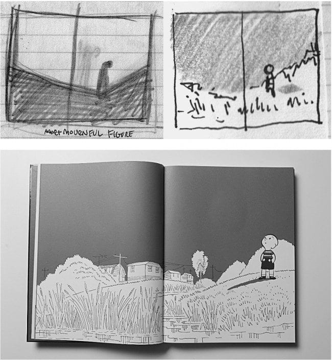
Going back to my rough storyboard I refined the "narrative" with the new limitation of ten double-page spreads in mind. I also reduced the imagery to silhouettes so I could start to think of the pages as simple graphic shapes rather than the specifics of the actual monument. It still encapsulated the same movement -- from walkway to stairs, through the monument, and out and gone -- but it was now abstracted into pure shape. I'm cutting out a few steps. To go from the storyboard to the final images in the book required a lot of shuffling through Wright's work, and a certain amount of tedious trial and error to match up ideas with pre-existing images. No one reading the final book would ever recognize my opening sequence as an ode to the lost soldiers of WorldWar I, and it wouldn't have made much sense if they could -- for the reader, these pages had to be a coherent visual sequence about Doug Wright and his main character, Nipper. Allow me to cut this short and not bog down the writing with all the boring details of mix and match that went into crafting that transformation of Vimy to Nipper. Instead, let me simply say that I worked through a handful of ideas and finally settled on a simple narrative sequence (Nipper running wild) interrupted by a few compelling images and artifacts from Wright's life. I'll let the following thumbnail speak for itself. I recognize that it isn't likely to make much sense to anyone who doesn't know the final book intimately. To bring clarity, allow me to walk you through each spread. To do this properly I'll need to go back and connect the Vimy storyboard and the above thumbnails to the final book spreads themselves.
One: We approach the Vimy Memorial from a great distance. I thought it was important to open the book with a calm horizontal image that would immediately begin to establish afeeling of place and direction. In my little storyboard it's nothing but a low horizon.A nice quiet bit of Doug Wright landscape fills that space. I had to do some real searching around for the perfect Wright drawing to both capture quietness and fulfill the proper space consideration. This one did the job.The horizon is low and there is plenty of sky above to allow me to introduce the first part of the title without compromising the horizontal thrust of the page.
Two: Here on the second spread of the book the tone changes. Now we pick up the pace by using Doug Wright's iconic Nipper both as a character and as a design element. In the storyboard you can just make out the shape of the memorial on the horizon. I introduce Nipper here as a stand-in for that shape. The horizon beneath him offers a perfect space for the rest of the book title. Lined up low on the page and bleeding off in three directions, it reads as a continuation of the horizon line on the previous landscape. Whereas the previous spread is quiet and still (a reasonable mood for the opening of this sort of book), strong motion is called for hereon the second spread. Motion that will carry the reader through the rest of the opening sequence. On this spread I needed to propel the reader into the book and that dynamic running figure with his strong horizontal motion-line scoots the eye across the double-page spread with great force. We're off and running.
Three: On the storyboard, the towers of the Vimy Memorial come into focus. Large and looming. To me, this works both in a cinematic manner (as a kind of tracking shot) and as graphic design. Nothing is more basic to a graphic design sensibility than simply varying the size of shapes that are in juxtaposition. Big contrasted with small and vice versa. Horizontal with vertical. And so forth. Since the first two spreads were basically just horizontal bars it seemed a good time to shake that up with some vertical shapes. Nipper's perplexed parents stand in for the shapes of the towers. Note the white ground line used to connect with the previous horizons. That keeps the eye moving right as well.
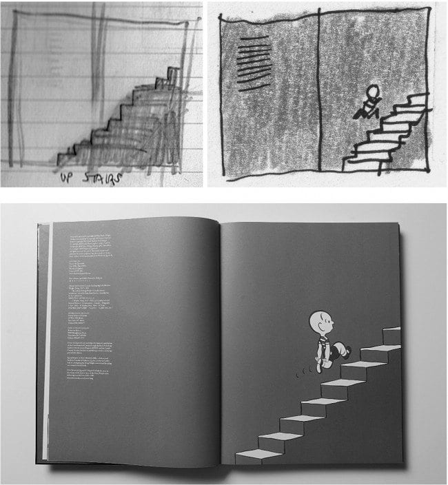
Four: Up the Vimy staircase. While studying the photos of Allward's monument I couldn't help observing that the memorial was actually rather complex to walk around. More twists and turns than I could fit into this extended visual metaphor. Even with twenty pages at my command there was no way I would truly get at the real sense of walking about up there. As you will see in the next few spreads, necessity demanded some simplification. The actions shown are mostly up, over, and down again. This spread is a just a basic sleight-of-hand. A case where the obvious works best. The figure of Nipper climbing some stairs simply mirrors the actual climb up the memorial staircase. Again, I continue the movement from left to right to keep the pages turning. Note the indicia over on the left-hand side of the spread. These indulgent pages still need to fulfill nuts-and-bolts tasks as well.
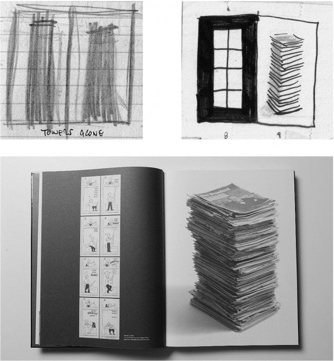
Five: Now the towers are closer. Here I break my brief Nipper narrative (before it gets too tiresome) and introduce artifacts relating to Wright's career. This kind of shift in visual tone makes a tremendous difference in how an extended sequence reads. I'm not sure if I could boil my thinking down to a set of solid principles but as I said before, changes in size and scale and rhythm are vitally important in managing to keep this sort of opening sequence visually interesting. The vertical Nipper strip (the very first one published) stands on the left to represent tower one and a great stack of the Standard Magazine (where Nipper appeared weekly) poses as tower two. The heart of the Vimy Memorial. The weeping figure of Mother Canada.
Six: I stop the forward motion here and turn Nipper back in contemplation. He's actually looking in the opposite direction than the Vimy figure but I wished to create a dead stop here and I needed to turn him to the left to halt the reader's eye. I also tried to maintain (with this particular Wright landscape) something of that dynamic V-shaped horizon you see in the storyboard sketch. Obviously I'm not hoping to capture any of the profound emotion of Allward's sculpture on these pages. I'm just dropping Nipper in as a place holder for the graphic shapes. I'm certainly not equating the symbols themselves -- Nipper and the memorial -- just establishing a symbolic, emotional underpinning for the design. A kind of sympathetic magic between Wright's lost father and the symbol of Canada's war dead. An odd choice, perhaps, but one that intuitively worked for me.
 Seven: As we walk around a corner of the memorial we see the towers in perspective. This is my one nod to the complexity of the views you would likely see if you were strolling through the monument itself. There are a few perspectives I could have picked for the towers but this one, with the left-hand tower receding, perfectly suited my graphic needs.Its small-vs.-big dynamic suggested some images of Doug Wright himself that I had hoped to squeeze into the book's front section. Wright's wartime photograph takes the position of the further tower and the closer tower is replaced by a large self-portrait from the same era. It goes without saying that getting a shot of Wright in uniform into this sequence was a must.
 Eight: Down the stairs in both the storyboard and the completed spread. Again, as in the fourth spread shown a few pages back, I've just plopped Nipper down on a staircase. Job done. I'd like to imagine that the reader will view this staircase as a different staircase than the one Nipper ascended, but I'm not all that sure if that is the case. I see it that way because I'm thinking of that imaginary trip up, around and down from the Vimy memorial but readers are surely picking up none of that. For all I know they aren't even taking these spreads collectively as a sequence. It's tricky to try and guess how other people process images.Especially since most readers likely just flip by this sort of introductory material to get to the meat of the book. Sigh. Note that the empty space of the right-hand page does double duty as the dedication page.
 Nine: A final look back at the two towers before leaving. They loom large over the viewer and produce a nice vertical symmetry. Just the right shapes I needed for the title page and its verso frontispiece drawing. The frontispiece is a sketchbook drawing Wright did from the window of his Montreal studio. A strong vertical -- especially with the upward thrust of those buildings in the sketch. Even though I wanted to mirror this effect with my hand lettering on the right-hand page, I didn't want to make it too boring by having the column of lettering exactly the same width as the sketch. Maybe that's a cheat (since the towers are the same width) but I think the lettering works much better at this narrower gauge and that gap of whitespace in the column really gives the design some breathing room as well. The spread still strongly reads as two vertical towers to my eye.
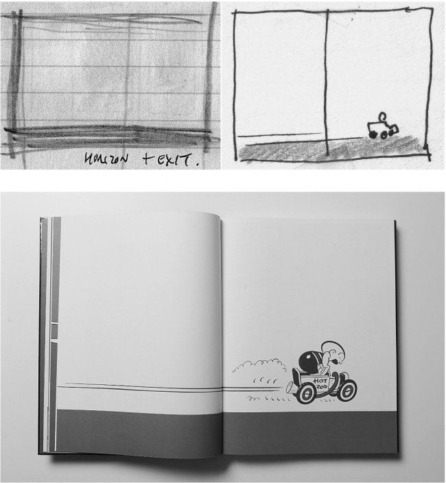
Ten: Back to the horizon motif again, and we are done and gone. Very little explanation is needed here. A dead-on horizon on the storyboard and the same for the final spread. I included Nipper here because his motion keeps the eye moving right and because it would be a pretty dull graphic design with only a red bar along the bottom. It gives the sequence some closure too. I also thought this would be a good opportunity to feature Nipper's famous little hot-rod pedal car. I didn't use it throughout for the very practical reason that it would have been an awkward fit with all those staircases. I couldn't leave it out entirely, though, because of the fact that if there is any detail from Wright's long-running strip that people recall (besides the Nipper's memorable bald head) it is that little pedal car.
The Book Itself: I should say a few words about how the underlying thought process about Vimy affected the look of the physical book as well. To begin with, the book had to be tall for the rather practical reason that the comic strips were originally designed in a vertical format. Sothat was a prerequisite right there. Of course, that played verynicely with my Vimy metaphor. Especially because the Wright book was to be the first volume in an eventual two-volume set. Two tall books-- two towers. Voila. Once thatobvious image fell into place I just followed that line of thought toits natural conclusion. If the books were to be monumental, then they needed to be unadorned -- slab-like. Of course, they needed to be eye-catching as well. A couple of grey slabs might not be the idealimage for book collections of light-hearted comic strips. They wouldn't exactly stand out on the shelves of the bookstore either. Always a consideration when designing a book. My solution was to encase the book in the shiniest foil I could locate (which, unsurprisingly, was in Hong Kong). I chose red foil because Wright always used a second colour of red in his strips, and because no colour is more associated with Canada than red. An easy decision. No decision, really. Again, though, a big shiny red slab might not be quite enough to transmit the subject matter of the book. Nipper had to be on the bookcover somewhere. Stubbornly sticking to my sculptural motifs, I decided to die-cut an oval into the front cover that could reveal an uncoloured but embossed image of Nipper inside the book. Like a bas-relief it would suggest sculptural detail but be subtle enough not to detract from the overall monolithic surface of the book itself.
I was happy with the final results. It's a physically imposing book at 38 by 29 centimetres. A belly band spared me the anguish of cluttering up that stunning foil with type. I kept the case entirely text free. Thank goodness for a forgiving publisher. A few years have passed and we still haven't produced that second volume. It's coming, some day. Drawn and Quarterly decided that we should release a few inexpensive Wright books in between the two to help build an audience for his work. In some ways I think the book has been a hard sell. Canadians are a poor audience for their own pop-culture heritage and, God knows, Americans don't care one whit about us. I've started to think I might not design the second volumeas another big slab. The later strips were more horizontal in shapethan vertical. I might just change horses in midstream --design the second volume in a landscape format. It needn't be a tower. The first book can carry the symbolic weight of both towers. Maybe the second book could be the base of the memorial. Maybe I can come up with some clever slipcase that holds both books. Maybe. I'd like that foil again, though. That would tie them together, no matter what the shape. Maybe gold this time. Or silver? Did my "hidden" design help sell the Wright book in any way? I sincerely doubt it. Did it add any Canadianness to it? That's a good question. It certainly did for me as the designer ... but if the reader cannot detect a hidden theme what possible purpose does it serve? Another good question. As an artist I believe it's essential to try and communicate some quality of your own life through the work. That can take a lot of forms. Anything from straightforward autobiographical material to work that merely displays your particular sensibilities. Trying to capture some quality of where you live seems like a natural. Sometimes it's deep, sometimes not so deep. The physical landscape around me makes its way into my stories and into my sketchbook. Inevitably some of it finds its way into my design work. Much of what I've talked about in this article is less place-specific -- more "Canadian" in the iconic sense. That works for me as well. I love Canada and I'm happy that I am a Canadian. Not in any strident, nationalistic way. I think I love Canada simply because I was born here and I'm familiar with it. It's part of my memory. Where you grow up shapes your thinking. Even within Canada I'm a regionalist. I love Ontario because I know Ontario. When I go out east, for example, I can recognize that in many ways it's prettier there. Ontario is progressively growing uglier each decade with its Levittown communities and box stores and four-lane highways. But what can you do? I doubt I'll ever leave. It's home. And so, I embrace the images of Canada by association. Whether corny, mundane or profound, they strike some chord in me. Perhaps this form ofthinking is fruitless -- just an egocentric whim. Could be. Still, in my humble opinion, a whim is usually worth pursuing.


