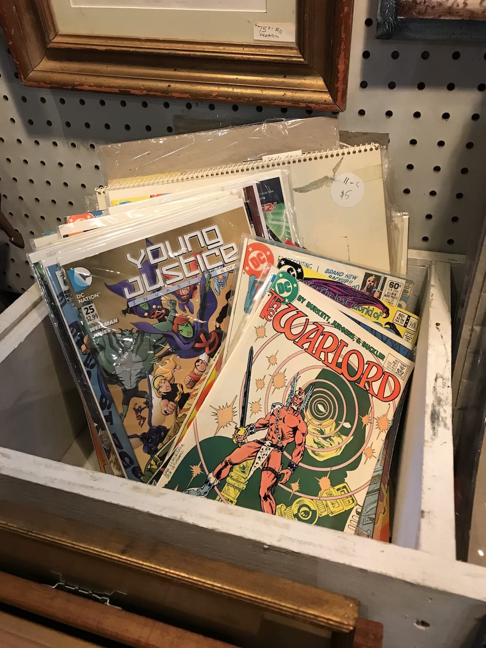
Welcome back to the second installment of The Strip Mine! If you missed our first issue, the premise of this column is pretty simple. Every month or so, I go to a different comic shop and see what treasures I can unearth for $20.
This time, the family and I drove up to Cold Spring, NY, on “a cold and wet December day”[1] to celebrate my wife’s birthday. Unfortunately for her, I discovered comics in the first antique shop we set foot in. The store in question was Bijou Galleries Ltd., and, though it bills itself as “the jewel of the Hudson Valley,” it’s really just a dumping ground for all kinds of random crap. Unlike your typical comic shop, there was nary a longbox in sight. Rather, the smattering of comics they had were thrown into broken drawers which were scattered around the gallery. I found drawers nestled in with the old typewriters, broken sewing machines, and collectible spoons. There was even one underneath this horrific thing.
It wasn’t the best selection and the condition of most of the books was somewhere between “Very Sad” and “Near Ruined,” but what could I do? I had to look! It’s an obsession, I know, but fortunately I have a very understanding partner. Anyway, an hour later, here’s what I walked out with:
 ADVENTURES OF THE OUTSIDERS #44 (April 1987)
I’m sure you’re thinking, why on Earth would I grab this random issue of a D-list super-team? Well, it certainly wasn’t for the cover by Joe Brozowski and Danny Bulandi.
Let’s take a closer look. Geo Force, whose costume looks like it was designed by an 8-year-old, has a right arm protruding from his neck and a dislocated left shoulder, probably caused by his exploding forearm. Then there’s the awkwardly posed damsel, Dr. Jace, who can’t decide if she’s falling down or not. Maybe she’s just disoriented by the complete lack of any background? It looks like a bluescreen scene that never made it to the effects department. And, of course, there’s the groan-inducing villain, the Duke of Oil (whose real name is Earl J. Dukeston, get it?).
To be honest, I never read an issue of The Outsiders before.[2] I couldn’t even name the characters (what happened to Ponyboy?). All I knew was that they inexplicably liked to team up with Batman, so obviously the story made little sense. There’s a bunch of soap opera plotlines and the whole thing ends with the old beaker-of-acid-to-the-face-reveals-the-villain-is-really-a-robot twist. If I had a nickel…
So why did I buy this book?
Mostly for Jim Aparo’s art. It wouldn’t be fair to say Aparo is underrated since everybody knows his Batman work, and I’m sure many of you also remember his Phantom series and the many great short stories he did for Charlton. To me, Aparo is like Curt Swan, one of those reliable workhorse artists who, though very competent and skilled, didn’t draw with a lot of flash or flare. His style is clean and unremarkable, proficient to the point of invisibility. This isn’t a knock at all. He’s a great visual storyteller and I like what I’ve seen, but this isn’t Aparo’s best work. Still, there are a few nice pages. I especially like this architectural schematic of the Outsider’s secret underwater base.[3]

The second reason I grabbed this issue was for this little Easter egg - a random pinup by Brian Bolland!

What is this doing here? Was this supposed to be a cover? Maybe a hero using his powers to clip his toenails was too much for DC’s editors?[4] GCD tells me that Bolland also illustrated an 8-page Metamorpho backup story called “Freeway of Fear!” which was published in The Outsiders #18 the same month.[5] Gotta track that one down!
But even that wasn’t what clinched it for me. The real gem of this issue is the perfectly executed Mad-style backup story by Mike W. Barr and Jim Engel, an artist I’d never heard of before.
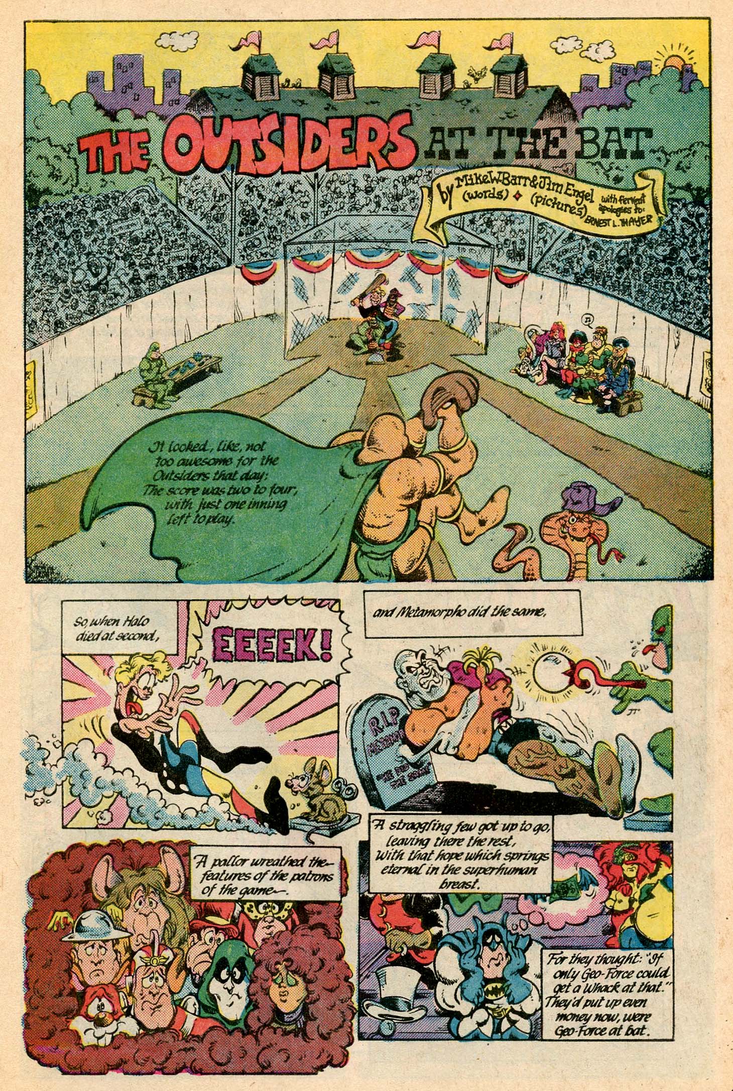
Doing his best Kurtzman impression, Barr’s script spoofs Ernest Thayer’s classic, “Casey at the Bat,” using not only the Outsiders but the extended DC cast in the baseball antics. Engel does a great job channeling the spirit and humor of the early Mad strips, delivering panels loaded with visual shenanigans.
So, I guess it’s true what they say about books and covers and judging. True, this was nothing special but with all the extras, I think it was a dollar well spent.
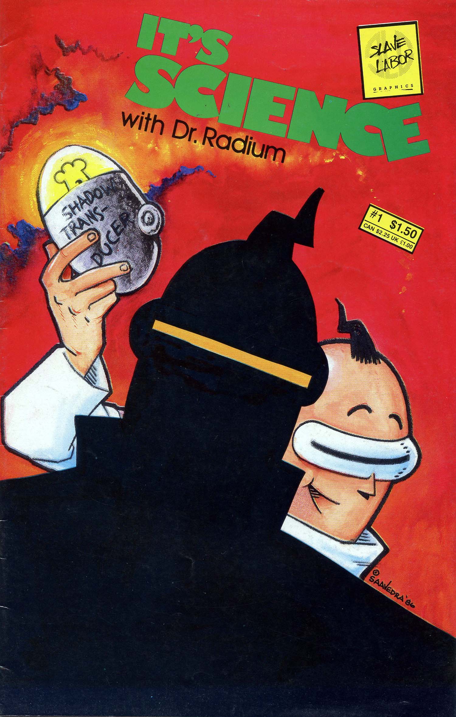
IT’S SCIENCE WITH DR. RADIUM #1 (September 1986)
This is the first of seven issues by Scott Saavedra published by Slave Labor Graphics.[6] It’s your standard small press black-and-white boom comic. The story is like a ‘70s Warner Brothers cartoon, a lowbrow slapstick comedy geared toward kids. There’s lots of mad scientist jokes, a time-traveling dumpster, and alien Elvis impersonators. It’s just silly, though nothing made me LOL. I enjoyed it the same way I enjoy an episode of Spongebob. ‘Nuff said!
 TIME WARP #1 (October 1979)
Who doesn’t love a good Michael Kaluta cover, especially when he’s riffing on Frank Frazetta? I also really dig the twisted title logo (by Todd Klein, natch) but did we need “science fiction” on the cover twice? And what genius came up with “doomsday tales and other things”?
It’s interesting to see a floppy issue with such an emphasis on writers. None of the artists are even listed on the cover. Somebody must’ve complained because on the second issue, the artists are given top billing, then the writers on #3, artists on #4, and the writers again on #5. It’s an odd marketing strategy but I guess the editors were trying to be fair.
The series was launched at a moment in American pop culture when sci-fi was resurgent after a long dormancy. Following the shuttering of the Apollo program in the early ‘70s, the genre had fallen out of vogue. But with the release of Star Wars in 1977, then Close Encounters, and Star Trek: The Motion Picture shortly thereafter (there’s even an ad for Star Trek inside the front cover), DC editors Joe Orlando and Jack C. Harris decided the time was right for a new sci-fi anthology. No doubt Orlando was also feeling nostalgic for his old EC days and was hoping to catch lightning in a bottle again.

The issue has eight short stories ranging from 3-8 pages. The first, “If the World Had to End Twice…” was written by Denny O’Neil, penciled by Rich Buckler, and inked by Dick Giordano. Years ago, Buckler was accused of swiping from Kirby and, in retaliation, sued TCJ for defamation before dropping the suit, so I know he may not be popular around these quarters, but I’ve always thought the guy was a talented artist.[7] Then again, Giordano could ink a monkey’s scribbles and make them look pretty good.
The story is not terrible, but it’s a little hokey. Basically, a megalomaniac named Jacob Saturn kills off the entire population of Earth and the only humans left are his family who are stranded in orbit on their giant laser satellite. It’s impossible not to conflate Saturn’s bald, gloating visage with Lex Luthor and I kept hoping Superman would burst through a wall and slug him in the jaw, but no such luck.

Next up was “Mating Game,” a Steve Ditko story written by Michael Fleisher. Sounds bugfuck, right? The story is awful. It’s dense, cliched, with stilted dialogue and awkward scene transitions. Honestly, it could have used an infusion of Stan Lee alliteration and hyperbole. But the art’s good, right? Well, let’s just say this one isn’t gonna make Ditko’s highlight reel. It feels like he rushed through these six pages. I’m sure “Sturdy Steve” at least got a cheap thrill drawing this spider-smashing scene and, lest you somehow missed the punchline, the murderous spider-monster’s human name is “Pete.”

Fortunately, Ditko redeemed himself in “Forecast,” a three-page tale by Harris later in the issue. Not that this story was anything special either, but his art is much trippier, more like the Marvel/Atlas-era Ditko we all know and love.
Fleisher, however, sunk even further with his second piece, simply called “Monsters” (with a title like that...). This forgettable script about a human transformed into a monster was done no favors by Jerry Grandenetti, whose faces look misshapen and figures are out of proportion.[8] Not that that distorted style can’t work, but here it’s at odds with the story. In spots, the characters’ expressions are hard to interpret, or feel out of synch with the action. It’s distracting and undermines what little narrative there is. Here’s an example of what I’m talking about:

“The Survivors” by Mike W. Barr and Tom Sutton is the story Kaluta’s cover is based on. There’s sexy women battling tentacled aliens, a painfully formulaic romance plot, and some nonsense about humans transforming into aliens and aliens transforming into humans. Sutton does a fine job delineating the action but that’s about all I can say. It’s a shame this series came out before DC’s Baxter paper era. The cheap newsprint doesn’t do the artwork justice. Sutton’s jaunty squiggles are particularly muddled.

In “Rescue” by Bob Rozakis, Don Newton and Dan Adkins draw in what I’d characterize as a softer, less detailed version of Wally Wood’s style, thus coming closer than any of the other pieces to the mood of those old EC books. The story itself was just ok; a ship crash lands on an alien planet, etc. It’s a standard sci-fi premise but with an ending that’s more of a head-scratcher than a twist.
Overall, these stories are so derivative, they’re clichés of clichés. It’s all straight out of DC’s Silver Age playbook. In fact, you could slap Strange Adventures or Mystery in Space logos on the cover and I bet nobody would even notice.[9] Honestly, the best piece in the book was a one-page strip featuring Wonder Woman rescuing some stranded astronauts by delivering them Hostess fruit pies in orbit.
Still, given the pedigree of the creators involved, I’d “do the time warp again.” You never know what gems might be hiding out there. The second issue has stories drawn by Orlando and Ditko, as well as Gil Kane, Howard Chaykin, and Michael Kaluta, among others. Who wouldn’t at least want to flip through that?
 SAM SLADE, ROBO-HUNTER #1-2 (October-November 1986)
When I think of Quality Comics, ironically, my first thought is how low quality they were. Mainly a series of colorized reprints from 2000 A.D., the art in some issues was so poorly reproduced that it often looked grainy and stretched out of proportion. I suspect this was because the pages were shrunk down from their native British tabloid size to fit the standard American pamphlet. Fortunately, these two issues of Sam Slade look fine.
You pretty much know the premise of the series from its title. Sam Slade is a Nick Fury-esque bounty hunter who tracks down renegade robots. It’s high concept sci-fi noir with a heavy dose of British sarcasm; in other words, your typical 2000 A.D. strip. Think Sherlock Holmes meets the Terminator, as if written by Dashiell Hammett, and you get the idea.

Like Judge Dredd, the Robo-Hunter is a long-running serial created by John Wagner (in 1978). However, for this story, Tharg recruited Pat Mills to take the script droid reins. The first two issues reprint “The Beast of Blackheart” from Progs #259-265 (from 1982). Because of its original weekly serialization, the story is broken into seven discrete episodes with a new intro/origin chapter added up front to contextualize the story for newbies like me.
If you’ve read any of Mills’s Marshall Law series (you should!) then you have a sense of his style of black humor. The humor in this story, however, isn’t political but more slapstick. Many of the punchlines are delivered by Slade’s wise-cracking robot cigar named Stoagie, a proto-vape stick who speaks in an ethnically insensitive Mexican accent.
The art is by Ian Gibson who’s best known as the co-creator of Alan Moore’s The Ballad of Halo Jones. When you think of all the great writers and artists that came of age in the pages of 2000 A. D. - Moore, Gibbons, Morrison, Mills, O’Neill, Bisley, etc - it’s easy to see how Gibson might have been forgotten, but his intricate linework is pretty impressive. He actually kind of reminds me of Bolland. At any rate, the guy clearly has chops (never mind that Slade has only one facial expression).

Given that the series is set in a space-age version of London overrun by bumbling droids, it’s also a good thing Gibson draws robots so well. His slouching, wide-eyed ‘bot designs radiate charm and humor; they’re basically metallic versions of the Muppets. Hoagy, Slade’s buffoon of a sidekick, for example, is just an inept Kermit the Frog.

Mills also scripted the backup feature called “Ro-Busters,” a train wreck of a story (literally) with pre-Watchmen art by Dave Gibbons from 1978. The style and tone are similar to Robo-Hunter, almost suggesting a shared universe, but this is pretty juvenile work. Nothing here foreshadows the greatness Gibbons would go on to.

DRAGONRING #1 (1986)
I don’t know why I got this, to be honest, probably because I suffer from every comic fan’s greatest weakness: the first issue syndrome. Let’s face it, we’re all #1 junkies! Publishers discovered our addiction decades ago and have been exploiting the shit out of us ever since. Hell, they’ll even feed us the same first issue with ten different covers. Just slap a “#1” on ‘em and we swallow them down like baby birds and beg for more. I like to think I’m above all that now, but I’m not. Sure, I may be able to resist it with new books, but when I’m deep in the dollar bins…
Plus, this cover by Guang Yap has it all! Mutants, monsters, a mass grave, a dude with a huge sword, a sexy gladiatrix, and, of course, the obligatory nerdy kid (cue the Pavlovian “hey, it’s me” response). Plus, there’s a dragon and a magic ring, apparently. It’s like every cheesy ‘80s fantasy comic merged into one, minus the turtles and aardvarks. All joking aside, though, I do like the spotlight effect, and the blood-drenched coloring on the approaching creatures. It’s a solid composition, and the skull in the logo is a nice touch, too.
Like the cover, this first issue, which was co-written by Yap and Aircel’s founder, Barry Blair, is a 32-page blitzkrieg of comic book clichés! There is a murder (some guy takes a throwing star to the face!), ninjas, a haunted castle, loin-clothed island natives, zombies, and martial arts fights (with nunchucks, of course, because it’s the ‘80s). And that’s all just the first chapter! The Lovecraftian sea monsters, alluring yet mysterious princess, “portal to a dark dimension,” dragon-like demons, evil “high priests,” hidden underground temples, human sacrifices, and a gnarled old man with a monkey lurking in the shadows all show up in subsequent chapters. Oh, and while all that’s going on some guy named Wharfin (that’s not a typo) hires “a swashbuckling soldier of fortune” named Kohl Drake and his young Japanese sidekick, Yue (who’s basically “Short Round” from Indiana Jones and the Temple of Doom), to take him to an island to claim some mysterious inheritance. Now that’s what I call bugfuck!

Yap’s style, which mixes photorealism with a lot of manga influences, kind of works and kind of doesn’t. It’s inconsistent from page to page. He’s great at drawing monsters and demons, and is also good at posing figures and staging scenes but, like a lot of artists who overuse photo references, his art is stiff in spots. Many panels are cluttered with extraneous details that slow down the pace and distract from the story. Some of the fights scenes, like the one below, are hard to follow. The shoddy printing also doesn’t help; pixilation erodes the finer details of Yap’s brushwork.


And yet this is no hack job. Yap and Blair were clearly passionate about this story and no doubt believed they were doing something cutting edge and valuable. To use another cliché (which seems appropriate in this case), Dragonring was a true labor of love.[10]
So, there you go. Given the slim pickings I think I did alright. Plus, that’s only half of my haul and I haven’t even gotten to the good stuff yet!
NEXT: Don’t miss the epic conclusion to “Bijou Funnies”[11] in The Strip Mine #3!
[1] “Angel of Harlem” by U2
[2] I do have The Outsiders Annual #1 (1986), an issue that Frank Santoro sold me years ago because of the exceptional Kevin Nowlan art. I’ve flipped through it many times, but never actually read the story. By the way, Frank’s sticker on this issue said: “Unbelievable Color Art by Kevin Nowlan. Comics Comics Approved.”
[3] I’m assuming this schematic is by Aparo but I’m not 100% sure.
[4] In fairness, it is odd that a hero who can transmute his body into any shape would need to groom himself at all.
[5] This story originally ran in The Outsiders #6 in April 1986. It’s hard to believe looking back, but apparently the Outsiders were so popular, their exploits were reprinted only a year later! I guess it was the era of the super-team (DeMatteis and Giffen’s Justice League, Claremont and Byrne’s X-Men, Wolfman and Perez’s Teen Titans, etc.) but my question is why didn’t DC also reuse Aparo’s far superior cover?
[6] To give you a sense of the kind of stuff Slave Labor was publishing back then, this issue included house ads for Samurai Penguin #3 and something called Hero Sandwich.
[7] The idea of “swiping” is a slippery one, especially in the digital era. Buckler was demonized for copying panels from Kirby, and perhaps rightly so (I haven’t looked back at this particular case too closely), but where is the line? It’s murky at best. Alex Ross has made a career out of copying, and Nick Drnaso’s copying of Chris Ware’s visual style landed him on many “Best of the Year” lists.
[8] To be fair, I have enjoyed some of Grandenetti’s work.
[9] In fact, that’s just what DC did. After Time Warp was cancelled in July 1980, Mystery in Space was re-launched a few months later in virtually the same format (starting with #111). I haven’t read these but the fact that this series was also cancelled after six issues tells me that it probably wasn’t much better.
[10] Later issues of Dragonring have some back-up pieces by Dave Cooper, who did some of his earliest work for Aircel.
[11] Apologies to Jay Lynch, et al.


