The reason for studying gray and how it relates to color is rooted in grisaille painting. Most traditional oil paintings before the 20th century were painted in gray first - then the colors were glazed over in very thin, transparent layers. What happens is that the gray tones show through the thin oil color and one can achieve a uniformity that would be very difficult without the gray underpainting. If you've ever been to the Metropolitan Museum of Art in New York City - then maybe you've seen the remarkable grisaille painting by Ingres (and his assistants). This all gray painting looks so strange in the gallery next to all the other paintings which are in color. It's my favorite painting in the museum because it shows the process of painting - specifically how many color paintings are made.
Back in the early 1990s when I first started making color comics, I was distressed that if I created a page in full color - all on one board - that I would only be able to reproduce that page in color. This was long before Photoshop and halfway decent photocopiers that would allow me to make a good looking black and white copy of my color page. So, my thinking was that if I created all my comics in gray I could either print my page in black and white and/or "glaze" colors over the gray underdrawing on a separate layer - and that the grays would show through the color to create volume and depth. I also realized that I could change the gray / black drawings themselves to color in the printing process. Long before Photoshop, I would use a color xerox machine to change the color from gray to any color I wished. I would program the CYMK percentages on the copier itself. Gray provided choices. Just black line drawings or full color all on the same page seemed to me to provide less choices.
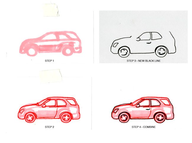
When creating for color reproduction, I like to work backwards a little bit. Think printmaking. I will make a color sketch first like in Figure 1 below and then I will find my "blackline". This is a two-step drawing made on the same piece of paper. Then I will take this color drawing and with a lightbox I will separate the two (or however many) colors into different "plates" as gray shapes. See Figure 2. Then I will make a new blackline, trying hopefully to make better lines than the original sketch. See Figure 3. And then, finally, I will combine the color plates and the new blackline into one drawing.


For me, this process lets me compose in color (the original sketch) and then have the freedom to change the colors if I so choose later. I can print the drawing as gray scale or in color. This is precisely because I am creating each color in gray - not just as solid black shapes. See Figure 2. If I want the girl's pants to be a different color then I can simply change it without marring the blackline.
Now, lets look at some of the drawings that I did for last week's column. Did you do your homework and draw some cars with a gray underdrawing? Good. Again, for me, the best reason to compose everything in gray - and not in direct color - is that each "black plate" or gray drawing can be simply changed to a "color plate" drawing. See Figure 4 below. Again, think printmaking. I took my gray drawing of the car and made it my "red plate". But that means that all my lines for the car are in red. I want to have some black lines over the red car. So I take my original sketch, put it on the lightbox, and make a new "blackline" plate. Then I combine the plates in the printing process.

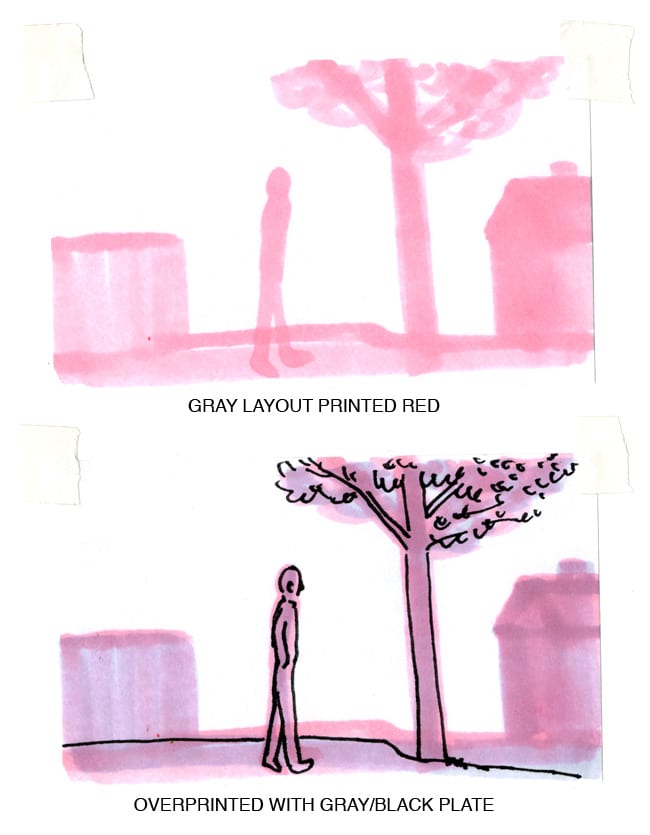
Let's look at one of the other gray drawings that I did last week and turn it into a color drawing. See Figure 5 below. I took the original gray underdrawing and printed it red. Then I took the same gray drawing with the blackline plate and overprinted the plates together. I like how the gray gives nuance and a fullness to the red plate.

I'm sure that for most comics makers who are reading this, these are simple processes that can be achieved in Photoshop. But, I encourage you to try thinking in layers with a lightbox and to explore how old fashioned printmaking techniques can lead you to a better understanding of color. What's exciting about making comics in 2011 is that there are more choices now than ever to make color comics. Only working in Photoshop will limit your choices. Just like refusing to use Photoshop - which I did for years - is a limitation. Being familiar with old fashioned printmaking and painting techniques is helpful to me because it lets me feel like I have my own voice as a colorist - and not like I'm trying to simply manipulate settings and filters so that my colors don't look like everybody else's Photoshop colors.


