Dean Sudarsky has worked in several capacities inside of comics—a former Fantagraphics intern, a 2016 Center for Cartoon Studies graduate, even a thrilling cartoonist in his own right—but it’s his current gig that makes him a true one-of-one in the industry. With New York Review Comics, Sudarsky has taken on perhaps the most crucial role in shepherding foreign-language comics masterworks into English: lettering them. Working on five books since 2017, Sudarsky has had to develop his own typefaces, mimic idiosyncrasies, and generally get into the head of the original artist in hopes, as he states in the below interview, that no one notices he’s been there on the page at all. I wanted to talk to him about this entirely distinctive role he’s held for nearly seven years. Our conversation starts in the midst of us catching up over the phone.
-RJ Casey
* * *
DEAN SUDARSKY: I think last week I made it three days in a row without going anywhere, but then I had to get food. [Laughter] That was a pretty good run.
RJ CASEY: I’m going to tie this into our lettering conversation. Is that how you generally work too? Do you do the hunker-down monk thing?
I find that I like being a monk who hunkers down inside, but it’s not all work-related, and anything I do that’s productive, I have to do in bursts. I’ve never been a real marathon runner. I get psyched up and do things with a lot of focus for two to four hours, then I have to stop and do something else. If there’s a deadline coming up it’s a little different. Then I can burn through towards the very end, but, in general, it’s easier for me to pace myself and do little sprints rather than long jogs.
That’s for art-making, or just your general way of functioning?
Yeah, anything. I guess except for Photoshopping. If it has to do with a computer, I can put on techno and do something for 10 hours and forget to eat. But when it comes down to sitting down and drawing and doing the lettering work, it has to be in focused short bursts.
Can you letter with music on? Whenever I’ve tried to write with music playing, I always end up writing down the lyrics unintentionally.
I can. [Laughs] Lately I’ve been listening to people streaming on Twitch, which is all talking. They just become shapes and I try not to read them as words as much. Maybe there’s something helpful about listening to language in that case.
I just want to clarify - you just listen to Twitch? You’re listening to just the audio of people playing video games?
Yeah, yeah. That’s been my habit in the last two years. It seems like everyone in my generation is crazy about podcasts, but I could never get into them. I always thought that two people bantering was annoying to listen to. But now I listen to the exact same thing in a different format. I don’t know why, but it’s easier for me to take in.
You’re not watching them play video games. You’re just listening.
I’m just listening. [Laughs] I think it maybe comes from being a younger brother who watched my older brother play a lot of video games as a kid. That’s my best theory. But I just listen to them go, “Ahh, fuck!” [Laughter] It’s cathartic somehow.
I’m going to get into my actual questions since it seems like we’re good to go. How were you initially contacted by New York Review Comics?
It was like 2016 or '17, and my friend Sophie Yanow told me-- she had done work with them as a translator for the Dominique Goblet book [Pretending is Lying]. She said that they were looking for a letterer and put me in touch with Lucas Adams. They had me do a test page. It was like a cold call, because they were trying out a couple of people, I think.
Do you remember what the test page was?
It was a page from the [Edmond] Baudoin book Piero, which was the next one they were working on. They paid me $100 to do one page, and it was really fun and exciting. It posed a clear challenge. I was thinking, “If I spend hours and hours on this, I can get it to look pixel-perfect. I could maybe trace letters and use the computer to make a perfect forgery.” But if I had to do a whole book like that and they expect me to work at that rate, it’s never going to happen. So you have to find a compromise between working fast and making it look good. You have to make the fee worth your time.
What’s the saying? You have to pick two out of three: fast, good and nice?
Fast, good and cheap, I think.
That’s it. [Laughter] My priorities are skewed.
“Nice.” [Laughs] I’d like to think I’m nice, but maybe if I’m doing fast, good and cheap, then I could be rude.
You obviously passed their tryout.
Yeah. They seemed enthusiastic about that. I definitely labored over that page a lot because I was new and had to learn the whole practice on the fly. I only ever lettered my own comics before. That translation wasn’t quite ready, so even though they originally tested me for the Baudoin book, the first thing I really did for them was the [Tadao] Tsuge book, Slum Wolf. That was different because that was making typefaces. The original book had typefaces in Japanese, but they wanted something kind of handwriting-y. That was definitely more foreign to me than just hand lettering. I had never done that. I had to use a program to make a hand-lettered typeface. That one was hard and rough. I learned a lot. The next time I did fonts for them, it went a lot smoother.

Ok, that’s why you’re credited in Slum Wolf as “Custom fonts by Dean Sudarsky.” You made your own computer font from your own handwriting? Is that correct?
Yeah. There’s a service called Calligraphr and you tell it which characters you want in your alphabet, you print out a template, you write your own letters in the boxes, and then they scan it and do a pretty good job of cleaning it up. Then it spits out a font file. Since it’s doing a lot of it automated, its spacing is super irregular. For most of the typeface work I’ve done, the real challenge has been getting it to look natural when you place the text in InDesign. I kern certain parts by hand and do all of that stuff. It takes a very long time. I actually don’t think it’s more efficient than hand lettering.
You’re responsible for placing the letters in the word balloons too?
The first few books I did for them, yes. Recently I’ve been trying to do less of that. It’s been a struggle the last few years - I’m part-time at an afterschool program in Providence, and the more involved I’ve got with that, the harder it is for me to take on long projects with New York Review during the school year. I’m trying to find ways to continue working with them, because I really do like it, but one of the compromises has been that I make the typefaces and place some of them, then hand off the rest of the placements to someone else at NYR. That gave me more time to work on the special texts, which is like shouting or background things that you have to do by hand that don’t look like any of the typefaces. I’ve started handing off that responsibility just recently. I’m a control freak, so it was hard for me to let go. [Laughs]
Did anything at CCS particularly prepare you for this unique position that you have?
I think the main value was the professional practices course and the more career-oriented stuff. That’s where I learned that I had any kind of proclivity for lettering. I didn’t think of myself as somebody who was particularly interested or skilled at that, but it was consistent feedback I got on my work, like, “This lettering is really good.” That was nice to hear. That’s probably why Sophie thought of me when they were looking for somebody. I had been drawing for a long time before I went to CCS, but I had never done anything really design-oriented. They helped me hone my eye for that. But I’m not a calligrapher, and there’s a lot of lettering skills that I don’t have. I’ve been learning all of that stuff as I go, but having a sharp eye helps, and being able to tell when something looks off. Letters are so regular that if they look a little different it’s very easy to see.
Are these skills you’ve developed carried over into your day-to-day life? Are you looking at lettering and kerning and fonts when you’re walking around outside?
I’m a bit of a typeface nerd, but I’m not at the same level as a hardcore graphic designer who does that stuff and knows a lot of fonts by sight. But, yes. [Casey laughs] When I first started doing this lettering work, I also worked part-time at a coffee shop. I wrote people’s names on their drinks and salads and stuff like that. People would always ask me to do it because it would come out nicer. One guy would always come in and order salads when I was working so he could get nice lettering on his salad box. That was cute.
Wow! He’s got all those salad lids framed at home.
Up in his office. [Laughter] Maybe? I’d like to think that.
Do you have a favorite font?
[Takes a deep breath] Yeah, probably. There’s reading fonts and there are design fonts--
Answer the question, Dean.
For reading, I like a serif alternative like Bembo. For sans-serif, I like Univers. For design-type ones, they feel like moods. It’s like listening to a new song, where you get really into one, then you overuse it and you don’t want to see it again.
What kind of homework do you do before taking on a new book?
That’s definitely the most fun part, in the first few weeks or first month. I feel most like a detective where I have to do my best to suss out what materials they were using. I have given up on trying to comb through interviews and archives to hear them talk about materials because a lot of these artists are French and they might be using a certain paper or something that I can’t really get my hands on. I will print out a couple pages of the original book and just learn. The thing is that I’m not trying to make copies of the letter forms, but copies of how they’re making the letter forms. If I can get what I feel like is a close approximation to the way that they’re thinking about moving through the various words. Do they end one letter and start another? Are there ligature connections? Are they completely static? How close is it to cursive or handwriting? I need to be able to reproduce the way they do it, not just the way it looks. There have been a couple times where I flattered myself and think I cracked the code in terms of what the letters look like, but it’s really uncomfortable or difficult for me to do naturally. That’s the second challenge - making this sustainable. I’m going to have to do this for many hours for a single book. There have been a couple times where I’ve changed posture and it’s become much easier. I’m like, “Ahh, this is how they were doing it.”
You’re really trying to get into the original artist’s headspace.
A little bit, you know? It’s not such a psychological game. I’m not eating what they eat for breakfast or looking out the window in the same direction or anything like that.
A lettering Daniel Day-Lewis.
No, I’m not! [Laughter] But for about two weeks I have to figure out how these artists letter these books, and I do my best to get as close as I can to what I think they’re doing. From there on, I just have to accept that it’s going to be a meeting between how my body moves through letters and what I think theirs does.
Do you keep communication with the translators throughout this process?
Yes. The last couple of books I’ve worked with Geoffrey Brock, and he’s great to work with. I also kind of have an editing eye, so as I’m going through stuff sometimes I’ll note things for them to reconsider. And sometimes the translation just doesn’t fit. I’ll have a tiny speech bubble to work with and I’ll propose a few options. There’s usually a spreadsheet with commentary between me, Lucas and the translator, where we can talk back and forth.
That must be helpful.
It is, yeah. When everything’s separated and hidden, it feels confusing. Sometimes Geoff will give me input on what he thinks will make sense and vice-versa.
How about the original artists? Any contact with them at all or heard any feedback?
I personally have not talked to any of them. There was one that I’m forgetting, which is embarrassing, but Lucas told me the artist got the book in their hands and was impressed. That was nice. But it would be hard for me to talk to them about it.
Why’s that?
It’s an honor, but it’s also stressful because I’m tasked with presenting somebody else’s work. The best job I can do is when people don’t notice. I guess that’s the general rule of communication design. If I do a bad job, it’s noticeable. I’m ferrying their work from the original language to English and I hope none of the goods were damaged in transit.

Slum Wolf was your first project. I know that you had to create different text for dialogue, narration and emphasis. Was that because the original book had different texts for those sorts of things?
I’m not sure. That was the only one where the original was a proper typeface and the English version was a handwriting typeface. That’s just what they asked me to do. They wanted those things to feel distinct, so where there was narration there was one type of letter, when people were talking there was another. When people were shouting or crying, there was a third.
How did you make them distinct?
This was the first time I had done typefaces and the first time I had thought about that stuff. The dialogue and the emphasis font are very similar, except that the emphasis is broader and bolded. The narrative one is a very different style, and one that I think I would do differently if I was going to do it again. It’s a little too design-y and I think it doesn’t read as well. My priorities are a little different now. It was my first job and I wanted to make something “cool,” you know? Now I would opt for something that prioritizes legibility and is a little bit less distracting.
Piero was your second NYRC book.
That’s maybe the one I’m most proud of because [Edmond Baudoin's] letters are very idiosyncratic. That was a really fun, albeit labor-intensive job. He letters with a nib, and I tried out lots of weird nibs to figure out the sizes. And within his own pages, an “A” looks completely different 3 times. It felt like it was simultaneously a hard code to crack but also there was a lot of liberty, because it’s a pretty zany book.

The text itself in that book is really part of the story.
It felt important.
There’s loose, childlike block lettering--
And it changes throughout. There is some rock 'n roll lettering when he’s talking about music, and when the alien is talking to the kid there’s a fairytale-like cursive. That was really fun.
Does imitation come naturally to you?
Until I started doing work for NYRC I never tried to imitate other handwriting, but in general I’m ok at copying drawing styles or reproducing from eye. I’ve got a good eye for detail. Sometimes the larger picture or the composition will be a little skewed, but the details look good and I think that lends itself better to this kind of lettering work. It’s very detail-focused.
Have you ever been stuck on a letter or word? You just can’t figure it out?
A big problem is that the French don’t ever use K or W, and English does a lot. The first few times I get to those letters in a new project, I have to make it up. I can’t really look for reference.
The Tenderness of Stones by Marion Fayolle came next after Piero. That has very slight, small cursive lettering throughout.
That was a long job because it’s a long book with lots of text, but the letters are extremely regular and everything is in its own space. I didn’t have to make a lot of spatial considerations because most of the text is captions rather than in speech bubbles. The regularity of that made the job much easier, although cursive is not natural to me. It’s very vertical and there’s not a slant. I think my letters came out a little bit more angular, while hers are pretty bubbly and soft.
Are you using a tool like a ruler to keep yourself straight on something like that?
I do everything on a light table, and I kept a grid behind the sheets I was working from with the pencil versions of the text that I was inking. With her text, the lines are so even that I just ended up using a Micron, I think. Also, this book presented a design-related challenge as well. There’s this section—and I still don’t know how she did it—where there’s block-printed Helvetica text with blue litho texture. I had to do some detective work to reverse-engineer it and sat at Photoshop for a long time and tried to figure out how to make letters with the same type treatment. I was making charcoal rubbings on different surfaces and scanning them and trying to figure out how to get this texture into the letters. I was trying to put different filters on it, but in the end I didn’t end up using any of that stuff and we found a good approximation. It was kind of a deadline issue, but had I more time - it was a problem I was having a lot of fun trying to figure out.

How long do you have for each project in terms of a deadline?
Usually the time is pretty generous. Some of them have taken the better part of a year, because - again, I’m doing this part-time, and I’m doing other things. And it’s very hard to letter for long periods every day. I have to do it in little chunks.
How are your eyes holding up?
Fine. [Laughs] It’s not my eyes, it’s my hands. Or my back. My eyeballs are used to being bathed in light table radiation - that’s no problem. I still haven’t figured out how to keep good posture for more than 10 minutes or so while I’m drawing or lettering. I have to take a lot of breaks and walk around and try to keep that stuff in mind.


Blutch’s Mitchum came next.
That was a very hard book.
You wrote somewhere that it was a really big challenge for you.
In terms of copying style, that was the hardest book. His lettering is super-cartoony and zany and irregular, but extremely recognizably him. It’s very flowy too, and seems very natural for him. I don’t get the impression that he’s really hunched over and crunching out these pristine letter forms, he’s just kind of zipping through. It was very hard for me to do things in his style that way. A lot of that felt-- my letters feel more labored than his original ones. You can tell that there’s a sense of looseness and play in them that was hard to capture.
Do you try to mimic that? If you feel an artist is loose with their letters, do you try to do your letters loose as well?
That’s the only way you can do it. If you try with a very controlled hand to make a loose letter or a loose shape, it’s kind of obvious to me. My style for my own stuff is not particularly loose, so it’s an uphill battle for sure. Intuiting the way he’s moving through it is the best idea for how it’s going to come out.
Was that what made it so challenging compared to the other books?
Yeah. Piero was challenging because the letters are so strange and unique, but there’s lots of freedom. For that book, I had to figure out how he was using the nibs to make the line thicknesses. It was more like understanding strokes rather than the letters themselves. After that, I could make the letters no problem, even when I had to make a W. Whereas with Blutch, the strokes are pretty even. I think I used a Micron or something with a little bit more give. It’s just very tight and whimsical at the same time. It’s hard to explain any better than that. I felt like if I made a letter or a line that was not very Blutch-like, it would be much more apparent.
How much liberty do you have to change word balloons to fit the text? How tight are the editors about things like that?
I only ever really worked with Lucas, so I can’t comment about anyone else. I’d say, in general, I’m a lot tighter on that stuff than he is. [Laughs] I’m very hesitant to make any alterations to the original that aren’t necessary. I try to avoid doing anything that feels like a liberty, and he’s, I think, tickled by that restraint.

That brings us to Social Fiction. In that book there are few instances where the artist [Chantal Montellier] uses English in the background on signs and posters. That English is kept when translating it from the original French. When those types of unique situations arise, do you consider changing that to the font that you’re using to make it more consistent?
Sometimes we do. That’s a question that would keep me up at night, and I’d ask Lucas and he’d be like, “I don’t know, do what’s right.” I go back and forth on stuff like that. As technical and boring as this is, I think what it comes down to for me-- for some of the books, you can tell the parts in which the lettering was replaced not because the letters look so different, but because the black is a slightly different quality. Like if the page has some graytone or some color, then the blacks are probably not 100% pure black just by nature of how the files are. Whereas when the text is placed on top, that’s usually a pure black. We can color-match it a little bit, but it might stand out. If all of the text has a slightly different quality, that might change how I think about doing stuff in the background.
Montellier will occasionally go big and bold for exclamations and she shapes the word balloon around those large letters.
She sure does.
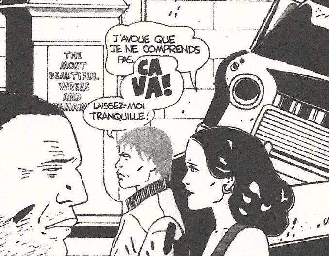

I’m looking at the original French page where she uses cava to mean “stop,” and she puts the “ca” on top of the “va.” In English, you chose to write “stop” with the “st” on top of the “op.”
Yeah.
I was wondering if those instances cause you any trouble. Did you consider altering the word balloon to keep the letters in “stop” altogether?
I would give precedence to reading order. When you stack the letters like that it changes how your eye navigates it. I don’t know - when I was a kid and first started reading comics, I was reading FoxTrot--
Shoutout Bill Amend.
Yes. [Laughs] And there was Calvin and Hobbes and Garfield. Sometimes I would really like a drawing, but most of the time I was just moving through the text as fast as possible to get to the punchlines. Having a well-ordered page obviously has a big influence on that. So when an artist makes a decision to stagger the text or change the way it’s presented, I try to honor that. The layout and the spatial quality of the speech bubble is very important too, but I want to make it a good reading experience first of all.
Even if it’s bisecting a word like “stop.”
Yeah. If it were naturally in English it would be less work for me, but I didn’t have to guess what the artist wanted because they did it.
How has this lettering job affected your own personal work?
First and foremost, I get to spend a lot of time up close with these books, and they’re all incredible. Being that close to and familiar with someone else’s artwork is always inspiring in some way, even if the styles are very different from how I work. Getting a feel for how they lay things out and use space gives me more confidence and things to add to my toolbox when it comes to my work. I have noticed that I’ve been getting less neat in my own work, and maybe that’s reactionary or something. There are some comics that I’ve been working on lately where even though I’m capable of making more pristine, legible letter forms, I like something that’s a little curvy and hard to read. [Laughs] I did that 65 Bugs book for Entropy Editions that’s closer to freehand writing for me, and I wanted to keep it that way.
Is there any communication with other letterers? Some sort of meet-up or online forum? Do you talk with anyone else about this stuff?
No. [Laughs]
You don’t have Todd Klein on speed dial.
I’ve never talked to another letterer.
It is a unique position that you hold.
I guess it is. What I do is not a very in-demand thing, and I can’t think of another publisher who’s really into lettering. It’s not something that I ever would have guessed I’d be doing.