This second part of a two-part column (here's part one) looks at twenty comics I read in the closing months of 2014, books that inspired some end-of-the-year reflection on “The State of American Comics,” present and past. These graphic novels, online comics, comic books, and comics tracts — a third of which appeared in 2014 — represent a range of genres: horror, western, memoir, informational, superhero, teen, and more. In some entries, I review the comic and in others I use it as an occasion to explore issues such Lichtenstein and pop art, meta-characters, formats, page orientation, Spidey vs. Spider-man, “philosophical nihilism,” etc. I include a few of my “2014’s Best” and wonder if we’re really living in, as everyone proclaims, a “New Golden Age of Comics.”
**
Little Dot #153 (Harvey, 1974)
Little Dot is the perfect comic book character: cute, odd, and meta in every way. Her name is Dot Polka. She is obsessed with dots. With dot-within-a-dot eyes, she wears the same polka dot dress every day. (I envy her dedication.)

And in her most meta dimension, she’s literally made out of little dots, the Ben-Day Dots that, as part of the era’s production methods, provide her colors.

It’s a kind of full-circle narcissism. Why wouldn’t she be obsessed with herself? For Dot, consciousness presents a continuous opportunity to see, interact with, and covet circles.(I’m puzzled, though, by her choice to store dots in square boxes.) While there may be no perfect circles in nature, they’re everywhere in the exaggerated geometric simplicity of “The World of Comics.” Since dot-love is the character’s and her stories’ premise, her writers and artists must, by necessity, share her dotty obsession. These comics — especially their covers — form an impressive, fetishistic catalog of clever ways to organize circles into attractive compositions. While not Baby Bjornstrand odd, these comics are, if looked at with fresh eyes, pretty peculiar.
Baby Bjornstrand by Renee French (Koyama Press, 2014)
The term criticism frequently calls to mind either evaluation (e.g., a review that tells you if it’s worth buying) or interpretation (e.g., an academic essay that emphasizes detailed analysis). But sometimes the best — and most difficult form — of critical writing can be description. Countless reviews are undone because the reviewer fails to describe a work in ways simultaneously accurate, interesting, and insightful. This brings me to Renee French. I don’t want to try to describe this book and inevitably fail: French has such a strange, yet accessible storytelling style that I don’t think I could characterize it. So instead, here’s an impressionistic response: Baby Bjornstrand looks like a magic-lantern record of a dream — alternately mundane and disturbing — projected onto a screen through a foggy lens and remembered days later with an un-dreamlike clarity and precision. (Or something.) [Check the preview to see if I’m way off.]
Fight The Enemy #1 (Tower, 1966)
Writing about Roy Lichtenstein, critic Adam Gopnik notes that the artist’s changes to the comic-book images he appropriated made his paintings “more like the comics than the comics were themselves.” In general, he’s right. But take this panel from a two-page “filler” piece in Fight The Enemy titled “Gallant Warriors”:
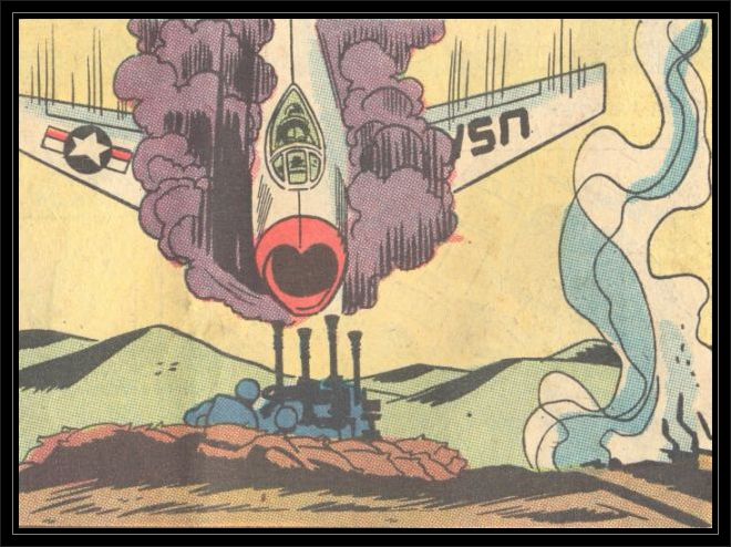
Blow it up, paint it on canvas, and it’s more Lichtenstein than Lichtenstein ever was himself. His compositions can sometime look pretty wonky, but this perfectly streamlined, minimalist comic-book panel screams The Essence of American Pop Art.
(Fight The Enemy doesn’t identify the panel's artist. The Grand Comics Database [comics.org], the most extensive source for such information, contains story credits for all of Fight The Enemy’s stories except this short piece. Twomorrows.com lists the penciller as Mike Sekowsky and inker as Frank Giacoia.)
Sugar Skull by Charles Burns (Pantheon, 2014)
A carefully plotted, stunningly drawn, beautifully colored, and exceedingly re-readable comic, Sugar Skull (one of my “Three Best of 2014”) completes Burn’s masterpiece, a trilogy with X’ed Out and The Hive. Sugar Skull received positive press, but not the number of reviews — and certainly not the amount of serious critical consideration — it deserves.

As mentioned in Part 1, people continually declare that comics is enjoying a “New Golden Age.” Perhaps as a result, the amount of new work means that important books like Sugar Skull will inevitably compete for limited media attention. But Burns’s trilogy challenges the premise of the “Golden Age” thesis: I seldom see new long comics this good, ones I’d put in league with Daniel Clowes’s David Boring or Art Spiegelman’s Maus. No doubt we’re living in an era of unparalleled quantity, but I’m not convinced we’ve entered one of unmatched quality (though I’m not sure I have read enough books to feel fully confident making such generalizations). [I’ve written on the trilogy for The Comics Journal: X’ed Out, The Hive.]
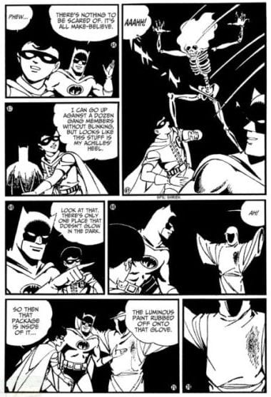
Batman: Batmanga Vol. I by Jiro Kuwata (DC, 2014).
Created in the mid-1960s but released in the US in 2014, these Japanese comics breathe new life into the ‘corporate property’ known as The Batman. The stories star great villains, like the wordily-named Lord Death Man (based on the US character, Death Man), and dynamically rendered action sequences, with some of the best (and longest) fight scenes I’ve read in a while. The plots, though mostly conventional superhero stuff, feature some genuinely weird and abrupt scene-to-scene transitions and unexpected plot twists. Given the dense and dark look of most current Batman comics, the manga approach lends an unexpected wholesomeness to the dynamic duo and an airy elegance to how their can be told. If I were a DC editor, I’d require my writers and artists to study these comics. My “Most Fun Superhero Comic of 2014/1966.”
All Aboard, Mr. Lincoln! (1959)
This thin all-newsprint comic celebrates President Lincoln’s relationship with the railroads, a subject of immediate concern to the Association of American Railroads, the force behind this promotional “picture story” pamphlet. According to a stamp on the cover, my copy was once property of the Parkway School Library, and some handwriting indicates it was housed in “Transportation #4,” perhaps a folder or box for loose items such as clippings, comics, and other paper ephemera. Could any current mainstream comic-book artist do as convincing a job as Bill Bunce does representing such a wide range of historical material, including numerous types of trains, boats, buildings, period costumes, etc.? While the brief (and visually minimalist) instructional comic is everywhere now, attractive informational comics like this one are largely gone. Printed solely on the natural, tactile medium of pulpy newsprint — without the standard glossy, heavier stock cover — All Aboard, Mr. Lincoln! represents a forgotten, and sadly obsolete comic-book format. I like to transport myself back to the days when the paper, ink, and staple comic was a popular content-delivery method for all manner of information and propaganda, when comics like this were regularly held in public libraries, instead of hidden away in private comic-book collections.

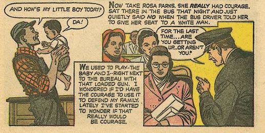
Martin Luther King and The Montgomery Story (The Fellowship of Reconciliation, 1957)
A ten-cent comic printed in the same all-newsprint format as All Aboard, this thin pamphlet is credited with motivating and instructing John Lewis and many other Civil Right activists. It mixes graphic narrative with how-to comics that explain the non-violent “Montgomery Method,” its philosophical origins, and its ability to transform black and white citizens into human beings capable of sympathizing with each other. The comic is powerful not only because of its bold art, moral conviction, and still-relevant subject matter, but because of what it says about its creators’ belief in the humble comic as a way to move people, and about the transformative role that comics once played in American social life.
Captain American Goes to War Against Drugs (Waldbaum’s/Marvel, 1990)
In this grocery store give-away, the Captain campaigns against drugs. But doesn’t a drug — the super soldier serum — make him Captain America? Such patriotic hypocrisy. Kind of like the ‘War on Drugs.’
Through the Woods by Emily Carroll (Simon and Schuster, 2014)
Horror comics can gross me out, but they seldom scare me. This anthology’s comics are genuinely scary and disturbing — and a few are gross, too. Yet, in terms of coloring, paper, and printing, the book’s aesthetic is the antithesis of gross: it glows, with glossy paper and colors ranging from hushed browns and grays to electric blues and reds.

In every story, a page’s art or colors bleeds to the book’s edge: the horror is not confined in the way it might be in a conventional comic-book, with a grid layout that’s bordered by bright white margins. On the back cover, the publisher directs readers to its teen website, but I hope this doesn’t scare any adults away from this collection. “A Best of 2014.”
Tomahawk #116 (DC, 1968)
I can’t recall seeing a mainstream Silver Age comic with this peculiar feature: twice in the story, artist Fred Ray shifts page orientation, moving from the traditional comic-book “portrait” alignment to “landscape,” a tactic that requires readers to change the book’s physical position.
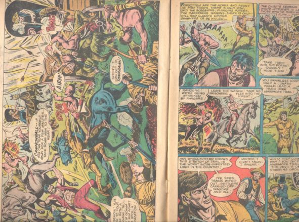
In fact, I’ve seldom seen this mode of widescreen reorientation used pre-2000, let alone used as well as Ray does; all of his scenes have a disturbing, visceral quality, communicated by the characters’ thickly-inked grimacing faces.

(A recent series of Darwyn Cooke covers for DC takes this inverted approach — but it’s weirder when used inside the narrative. And the master of unusual panel dimensions and page orientation certainly must be Chris Ware.)
The Mighty Crusaders #3 (Archie Comics, 1966)
I nominate this Paul Reinman cover for “Best Superhero Cover Ever.”
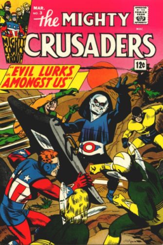
The blocky dynamism of the heroes’ poses, their claustrophobic arrangement encircling the leering villain, whose hand reaches out for us . . . Just perfect. Much of its power comes from the colors, especially the coordinated two-tone schemes of the heroes’ uniforms: blue and yellow, yellow and green, green and orange. Visually hinting at the psychological similarities that bond heroes and their villains, the Shield’s all-American colors reappear in the villain’s red, white, and blue garb. (Superman co-creator Jerry Siegel gave this creep an inspired name: “The Deathless Smiler.”) And the coloring coup-de-grace is the all-pink sky. Maybe superheroes work best when everything is blunt and bright. Forget Lichtenstein: This is Pop Art! (The cover may be colored by Victor Gorelick, who’s listed as the interior colorist under the very comic-booky name Vic Torr.)
Lisa Hanawalt in 2014
Audi celebrated Hanawalt in a video interview full of examples of her remarkable work. Patton Oswalt lavished her with praise. Institutions showered her with awards. And the year overflowed with the artist’s illustrations and comics; I particularly like her ongoing online Coyote Doggirl, with its electric watercolors, unfussy page layouts, and fast-paced adventure narrative.
With all of the recent interest in Hanawalt, some comics insiders would likely want you to know they’ve been Fanawalts (the name of her devoted followers — like Taylor Swift’s Swifties) for years.
The Fantastic Four: Marvel Treasury Edition #11 (Marvel, 1976)
A few years back, Marvel released an impressive hardcover titled Maximum Fantastic Four, a deconstruction of 1961’s Fantastic Four #1. Initiated by Walter Mosely, the book reimagines the pioneering issue by blowing up and cropping panels, then rearranging them on pages full of white space. It’s an interesting and potentially valuable idea, but unless you’re familiar with the story, the presentation may be a little hard to follow. While helpfully drawing attention to panel details, it disrupts Jack Kirby’s sense of panel-to-panel flow and page design, as well as his and Stan Lee’s pacing. And there’s already an ideal format for superhero comics: The Treasury Edition!

These oversized square-bound newsprint comics are perfect in every way. Good superhero stories need an expansive format — too often they feel, as Stan Lee might have put it, like majestic tales trapped in a puny world!
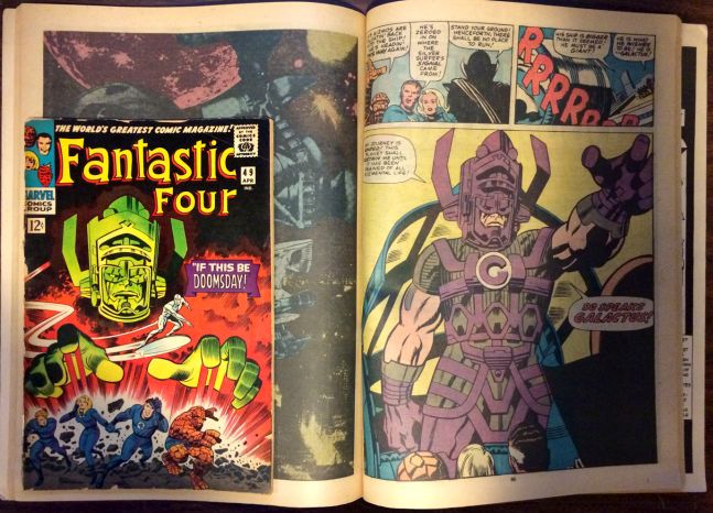
They become qualitatively better when printed at this size: the grandiose characters, their lofty pronouncements, the earth-shattering predicaments, and the dynamic art are finally allowed to breathe. If Marvel and DC wanted to reprint their best Silver- and Bronze-Age work in the right way (according to me), they’d follow the Treasury model, using newsprint (not the shiny paper of many deluxe editions) and imitating the original flat coloring (rather than updating it). Alas, just another fan-boy dream destined to remain unrealized . . .
Stickboy # 7 by Dennis Worden (Starhead, 1995)
The first half of the 1990s saw a mini-movement in alternative comics we might call “philosophical nihilism,” a loose “school” whose work featured dialogue-heavy comics in which a character rants about our shitty, futile, nonsensical word, an ethos at work in Ivan Brunetti’s Schizo and a few of Daniel Clowes’s Eightball pieces. (Some of Chris Ware’s wordless animal comic-strips could be seen as this school’s allies.) Worden may be less well known than these cartoonist, but he’s fully adept at the existentialist rant, with a funny, blunt drawing style well-suited to the angry pronouncements of this comic’s protagonist, Blockhead. As in some Schizo stories and Clowes’s “Why I Hate Christians,” the protagonist engages a seemingly well-adjusted foil in an interesting dialogue about Big Questions, such as the meaning of suffering.

An entertaining and well-done comic, Stickboy is really too smart and funny to be called nihilist, just as the era’s work by Clowes and Brunetti is too well-crafted and thoughtful to merit the term. These comics believe in something: the craft of cartooning and the power of comics.
The Hospital Suite by John Porcellino (Drawn & Quarterly, 2014)
What impresses me most about this book, which chronicles the author’s long battle with a host of illnesses, is its tone: a very hard-to-define kind of lightness. The subject matter, of course, is as heavy as it gets, with many gripping scenes of Porcellino suffering from an elusive disease that takes far too long to diagnose. In part, the book’s warm tone is an effect of Porcellino’s affect-less style, one of the most unadorned visual and narrative approaches in contemporary comics. The immediacy of the artist’s fine line work and his pages’ and panels’ extra-sparse, open compositions help to break down barriers between reader and art; Porcellino, a confident cartoonist, lets white space do much of the storytelling and design work.
All of these aspects are tied together by something that might seem surprising: while some call the comic an “illness memoir,” it’s also a comedy, driven by a gentle visual and verbal sense of humor. This tone helps The Hospital Suite avoid the autobiographical trap of self-serving self-absorption; yet the book never feels the least sugar-coated or dishonest. It’s a real achievement in memoir, comics, and art, as well as a touching lesson in how to think about, and how to tell, your own story. A “Best of 2014.”
Spidey Super Stories #15 and #21 (Marvel, 1975 and 1976)
Presented by Marvel and The Electric Company, these comic books are, as their groovy ’70’s mascot Easy Reader says, “easy to read,” with large lettering and a simple vocabulary suitable for younger children. Because they aspire to less lofty heights than Marvel’s ostensibly teenage- and adult focused-series like the Marvel flagship Amazing Spider-man, these Super Stories, perhaps surprisingly, are often more artistically successful than their contemporaries. They ditch the purple-prose melodrama that sometimes suffocates a serious Spider-man tale, but keep its light-hearted, jokey elements. To me, in serious Spider-man comics, the character’s comedy can wear out its welcome — and it even seems a little dumb in the context of an allegedly dramatic comic. Would he really deliver a never-ending stream of cornball in a mid-air battle with a supervillain doing his best to kill him? But here, everything is funny and punny (the puns are good, too), with unassuming art by Win Mortimer (draw in the John Romita mode), and panels arranged into grids that almost never exceed three tiers, as opposed to the denser layouts of their melodramatic cousins. By trying to do less, Spidey Super Stories succeeds. I look forward to reading these again and buying more issues.

Action Comics #380 (DC, 1969)
Taking a completely different approach than he would in Spidey Super Stories, a slick Win Mortimer draws the Legion of Superheroes story (written by Jim Shooter) in this Superman-centric title. Mortimer’s streamlined approach takes some cues from late-’60s minimalistic design: the narrative’s open environments, particularly the buildings and their interiors, are composed of simple shapes whose surfaces seldom have texture or detail — and when they do, they feature designs made from a few lines or repetitions of a basic pattern. The colorist advances this minimalism by keeping things simple:

Beginning in 1945, Mortimer’s career spanned over four decades. To stay in business, the artist, like so many others, adapted to the changing tastes of readers and editors, and Mortimer did this well, as these two differently-looking stories indicate. Both depart from his earlier, more detailed, mid-century comic-book/comic-strip art, best seen in the post-war Superman newspaper strip. (Another instance of adapt or perish: George Tuska’s 1970’s Iron Man, which I talked about in Part One, differs considerably from his 1950’s comics, which typically use a much cartoonier style. Stan Lee wanted Marvel comics to express a dramatic, hyper-masculine world-view, and in the ’60s and ’70s, Tuska’s older, and less dynamic approach didn’t fit the bill.
Teen-in #2 (Tower, 1969)
In the original “Golden Age” of American comic books (c.1933-1956), many publishers favored an anthology format, including multiple genres — superhero, adventure, crime, funny animal — in every issue, each piece typically created by a separate creative team. Since then, the mainstream anthology has suffered a slow and steady decline. Flip through the “new comics” racks today and almost every issue contains a single story — a loss to the medium. (The anthology, however, is alive in the alt-comics world.) The history of comics anthologies includes a sub-genre that, for me, is a highlight, what I call “the teen variety comic.” Perhaps the best example I’ve come across is the short-lived Tower Comics series Teen-in. #2 includes several color humor comics featuring the main cast of characters (as, say, any Archie comic would). It also contains a staple of the girl’s fashion comic (e.g., Patsy and Hedy, Millie the Model): “marvy” reader-submitted outfits drawn by the comic’s artists. It has a few oddities as well: two half-page black and white humor comics, and one long romance story beautifully “colored” in black, white, and gray tone (I think it’s the only romance comic like this I’ve ever seen).
 Taking a few ideas from the teen-magazine format, Teen-in includes several all-text features: a profile of The Ohio Express, hair-style tips, dating/romance letters and advice, and a how-to piece titled “Throw a Swingin’ Comic Strip Party.” The world may be evolving into a slightly more enlightened place, but the comic-book format continues its sad descent.
“On Optimism” (Anders Nilsen, 2014) (read it here)
Let’s end with Anders Nilsen, perhaps our most unpretentious philosophical cartoonist. In the cat philosopher’s first panel, Anders draws the sneakers with details (laces, stitching, soles). But they disappear in the next panel, never to reappear.
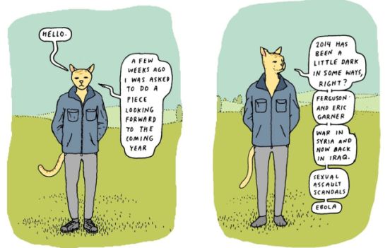
Why would an artist make this choice? Did he, as cartoonists sometimes do, establish visual details early on and rely on readers to “fill in” the missing elements when future iterations of the object reappear. Did he, as cartoonists sometimes do, want to avoid having to draw those small details a hundred more times? Both? Neither?
____________________________________________________________
Ken Parille is editor of The Daniel Clowes Reader: A Critical Edition of Ghost World and Other Stories. He teaches at East Carolina University and his writing has appeared in The Best American Comics Criticism, The Believer, Nathaniel Hawthorne Review, Tulsa Studies in Women’s Literature, Comic Art, Boston Review, and elsewhere.


