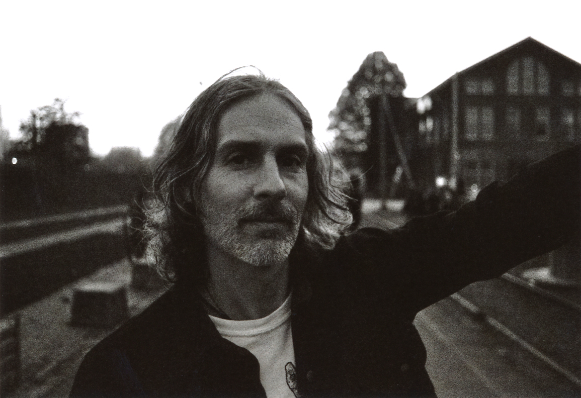
 Arik Roper’s multi-decade career encompasses both commercial and fine artwork. That his resume runs the gamut from mainstream (Nike, Land’s End) to the niche (Strange Attractor Journal, Southern Lord Records) speaks to a multifaceted sensibility. Roper demonstrates mastery in a variety of media and applications, but he is no mashup artist, generating novelty through inventive juxtaposition. Rather, he applies his craft to established frameworks; the album cover, the concert poster, the skateboard deck, and, through the strength of his vision, delivers bold, distinctive results that demonstrate a facility with and respect for the medium in which he is working. So, a concert poster is not just a concert poster. It aspires to the essence of a concert poster. While his art tends toward the fantastic, the term “fantasy artist” feels limiting in describing Roper’s work, though he does employ the aesthetic tropes of swords and sorcery and science fiction to dizzying effect, placing his figures in vast, formidable landscapes that seem always on the verge of swallowing them up. His strange environments are rooted in a harsh, but inviting naturalism. They evoke an abiding love of the natural world and a reverence for its more menacing elements. Ian Thomas interviewed Roper by telephone in early February 2021.
Ian Thomas: By way of background, can you talk a little bit about where you grew up and what your early life looked like?

Arik Roper: I grew up in Richmond, Virginia. Both my parents were artists. My mother was a commercial illustrator and my father was a fine artist and woodworker. I grew up in a household where I was exposed to a lot of art and other artists. I learned a lot about drawing and professional illustration from my mother. She'd be putting together presentations and doing these commercial illustrations when I was growing up and I got to use some of her tools, like the markers and the Letraset typefaces that don't really exist anymore, all these materials from the late seventies and eighties, before the advent of computers, obviously. Being around her working process showed me something about being a professional artist. That wasn’t something she specifically taught me, but I was exposed to it.
In reading some other interviews with you, it sounded to me like some of the draw of those very formative years was the the tools of the trade, so to speak, learning to use those very specialized tools and the tactile, physical aspects of drawing that maybe don’t figure as prominently into modern illustration processes.
Yeah, I think that definitely played part for me. For one thing, it allowed me to experiment with art materials that most kids didn't have access to, like real drawing pens and different tools. I was allowed to use them, to some degree. My mother showed me how to use some of the materials. I also learned by observation about work deadlines and I would see her working and making comps for presentation to a client or some ad agency she was working with. I learned some of the mechanics behind what professional art involves. A lot of the work she was doing was not creative in the sense that it wasn't something that she had much personal input with and wasn't even very enjoyable often.
She was a photographer and a painter and illustrator in her free time, as well. So, I got a lot of inspiration from that also. She would draw special things for me in the way that I asked her to. There were two aspects of her being an artist, the professional side and the personal creative side. My father wasn't an illustrator, his paintings were much more abstract, but he was the one who was into the sort of Pop Culture stuff that I picked up on like comics, movies, music and things like that, so I got exposed to lot of that through him.
Did the Pop Culture stuff, like the comics, resonate with you at that point as something you might be interested in doing?
I don’t remember thinking about it too clearly at the time that I wanted to do comics or I wanted to do this or that. I just knew that drawing was for me. That was what I felt like I was all about, what I was here to do, what my identity was. So, I never stopped doing it. A lot of kids are interested in drawing when they're young, then shift and get into other things, for whatever reason, and I was encouraged to keep doing it. I progressed with it. I guess I was pretty good for my age. As I grew, I got better and I would enter art contests and win awards sometimes . There was just never any question in my mind that this is what I would want to do for a living. I didn't think specifically about what type of illustration I wanted to pursue. I liked some comics, but I wasn't thinking I would be a comic book artist, per se.
As I got into high school and I was looking at colleges, I naturally wanted to go to art school. My father was working at Virginia Commonwealth University in the art department at that time. I was actually more interested in Animation at that point and I was thinking that I would probably pursue something in Animation, which would have been film school, basically. I was interested in films like Ralph Bakshi's work and almost any kind of animation, but especially the strange, unusual stuff like the seventies and eighties classics such as Heavy Metal, Wizards, and Fantastic Planet most of which my father first introduced me to. I was obsessed with those, so I wanted study animation and make animation that was more like that as opposed to Disney.
I was considering Cal Arts and some other film schools for animation, but when I found out that SVA had a cartooning department, a specific degree in cartooning, which I didn't see anywhere else, that's what sold me on trying to get in there. A degree in Cartooning sounded appealing me.

The process of getting into a school like that is you are presenting a portfolio as part of the application process, correct?
Right.
So what what kind of stuff was in that portfolio?
[Laughs] Looking back on it, it was fairly derivative, cliche stuff that I would never want to admit to today. But it was the kind of material that is not unusual for a 17-year-old who's into music and fantasy art. I had something that was close to a copy of an Iron Maiden album cover. And then I had drawings of an altar from a local cemetery and more mundane still life paintings which I submitted. I remember the person who looked at my portfolio she basically said ‘Don’t do this kind of art. This is boring.’ She was referring to the fantasy art. I thought, ‘Oh, really? No?’ She said ‘No. There’s too much of this. We don't need any more artists like this in the world.’ She preferred the other work I had in the portfolio. And I see where she was coming from. She was right in some ways, but I'm glad I didn't abandon that entirely.
So what did you get out of the experience of attending SVA?
On one hand the teachers were professional and expert but I was somewhat unimpressed with the body of work from the other students, in general. It wasn't an easy to school to get into if you were going on skill alone, but it became clear once there that if you had money then that was your card to get in. So I was a little disappointed about that, to see these people who just didn't really have that much talent, but must have been able to pay the tuition and attend. There was just a lot of cliche student work in the Cartooning department. The department was aimed on channeling students into the world of working for DC or Marvel and I had no interest in that, really. I was into underground comics like Robert Crumb and Vaughn Bodé and stuff like that which was less popular then than it is now.
When you say channeling you to work for DC or Marvel, is that reflected in the assignments and in the instruction?
Yes, it was geared toward that style of comic book industry work. Most of the references and conversations were about superhero comics and I just wasn't really interested in that. I had great teachers, some were currently working at DC. I had Denny O’Neil and Joe Orlando as teachers and these guys are legendary but they were instructing on how to create mainstream comics. I did have some other teachers who were illustrators who were doing different work like Gahan Wilson who worked for Playboy and some other teachers who were doing more of what I was interested in. I felt my classes were too limited to Comics and quickly started taking other illustration classes for my electives because I wanted to balance it out with different types of art instruction. I took a Science Fiction illustration class, I took literature classes, I took life drawing classes. All this to widen my experience, so that I wouldn't just be getting this one type of comic book illustration instruction.
And those classes that focused more on illustration clicked with you to a greater degree?
Yeah, those were more interesting to me. Being in these different classes also brought different types of people. Imagine what being in class with only people who want to draw superheroes. [Laughs] It’s a rather limited crowd. So, despite not being impressed generally with the student work at SVA, there were very good teachers and I respected the school and admired their approach to having the students really get their hands on the materials and make art. It was a gritty school, it had a “streets” quality which I appreciated.
Did your time in SVA run parallel to your getting into the music scene and starting to make flyers and show bill posters?
I’d done music flyers and some small things even in high school. I graduated from SVA in 1995 and I'd been doing a few jobs before and during that time, some clothing logos, maybe skateboard graphics. I started doing small freelance jobs probably in the latter part of SVA, just before I graduated. Some logo designs, for record labels or for flyers and t-shirts, but nothing nothing too big until after I graduated.
Can we fast forward to when, in your mind, you started doing things that felt significant? Would that be around the time you did the first Buzzoven album cover?
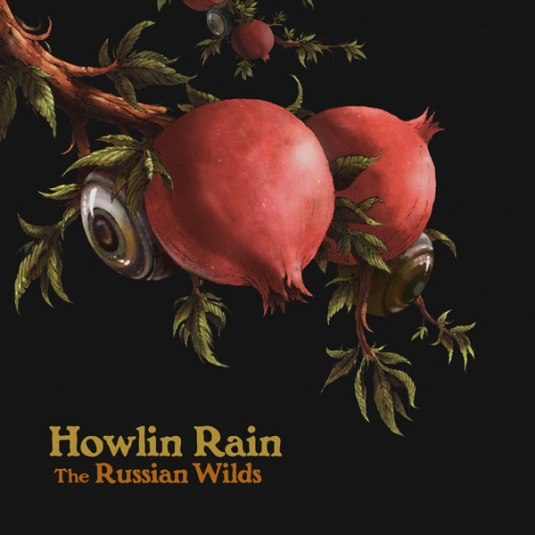
That was the first album cover—CD at the time— that I did. I guess I would count that as the first thing. I'd also done some T-shirts for them. That work became visible within that scene. Through them, I met some other bands that happened to get much bigger, like Sleep. I met Sleep through Buzzoven, probably around ’94, or so. Then, I started working with Tee Pee Records around ’95 or ‘96 when I met the owner and we became friends. I started doing a lot of things for Tee Pee which was somewhat defining that genre of Stoner Rock music, for lack of a better word, so a lot of that became sort of seminal to the later things that came out from other bands and artists. I remember Nebula and Core being early covers for Tee Pee.
So when you were starting to do work for Tee Pee Records, were those releases going exclusively to CD or was there a vinyl release for them, as well? I ask because the tradition and the celebration of album cover art is sort of predicated by the boldness and the size of the vinyl album jacket. For a long time, I think that the ability to celebrate or pay deeper consideration to album cover art was probably diminished by the CD being the dominant physical release of the album.
Tee Pee Records was doing vinyl, but it wasn't with every release. Most of the other labels weren't doing much vinyl because there wasn't much of a market for it at the time. So, the work was printed at CD size, but I would create these things much bigger and I would just think of them as being record covers even though they were going to be reproduced smaller. Tee Pee was doing vinyl releases in around ’96, ’97 for some of the covers I made.
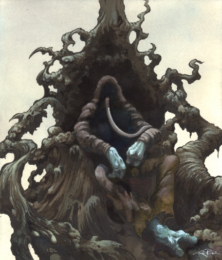
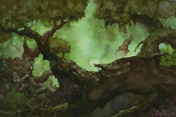
I’d like to switch gears and talk about your approach to your own art. I was trying to kind of hone in on what makes your art so unique, especially when considering the painting side of it, and it seems to me that Naturalism figures prominently. There are few artists, I think, who work in the Fantasy style and truly ground their art in the laws of the natural world. I feel like your work doesn't have the glints, and glimmers, and the embellishments that are typical of Fantasy art. When I think of Frank Frazetta, who I guess is one of the go-to examples when considering Fantasy art, I think how many of his figures dominated their landscapes. His figures were not always triumphing over their surroundings, but they were equal to them. In your work, I feel like the figures are sometimes equal to their surroundings but mostly dominated by their surroundings’ vastness. Does that make sense?
Yeah, definitely. I always prefer to let the landscape be a bit more of the focus than the action because I like to set the stage for the imagination to fill in some of the blanks and I think that landscapes do that. They can set an environment for which the mind will infer something that is about to happen or did happen. What else might live there or what might be just out of frame? There are a lot of possibilities in a landscape that doesn't have any any serious “action” in it. Even if it's just a small figure in the corner. Also the magnitude of nature is something that I've always been inspired by, so I think that just has naturally come through in my work because environments are something that I try to to create often more than direct action. Frazetta was an astounding artist, one of my favorites, but I never liked “heroic” fantasy much. I always preferred his use of color and atmosphere more than muscles and barbarians. “Fantasy “ is a broad word which unfortunately tends to describe a certain genre of art to most people’s minds. I think of it as vastly more.
I know that your growth as an artist has been a very incremental thing, but can you hone in on when that became your sensibility? When you had the awareness that was the tone you wanted to create in your work?
I don’t know if there was a certain point. It’s more something I can see when I look back on it. Building a visually fantastic aesthetic environment has always been a goal. Roger Dean was an early influence for me, he created these environments for the music to live in, when he was doing album art, which is what he's most known for. I probably took more cues from that than anything else and when I started doing music related art I wanted to make these environments for the music to to inhabit, so you could get this visual experience to go with the audio.
In my early work I was creating more visceral imagery, more work that was inspired by underground comix, like the Buzzoven covers for example. I lost some interest in that subject matter and didn’t want to create that kind of vibe anymore. That style indicated a certain stage of interest in my life which now seems primitive to me. I wanted to do work that was much more vast and about the space itself, and more about mystery. This is one of the reasons it worked so well with me for Sleep because the band sonically represented what I was already interested in. Eventually I was able to gear my work toward bands that allowed me to create art that fit my interests more.
My understanding of the Dopesmoker album cover, one of the pieces for which you are best known, is that you were given some narrative direction, some world-building information to draw upon. Is that right?
Do you mean the 2012 one? There was the one from the Tee Pee release from 2003, which is a totally different cover.

Yes, the 2012 release.
Well, I worked from the lyrics of the song. Me and Al [Cisneros] from the band discussed it together about how I should depict it. He told me to basically look at the lyrics, listen to the music and come up with what I thought the visuals called for.
Now in a situation where you don’t have that kind of background information, are you imposing a narrative in your artwork or are you trying to make a composition that you feel dovetails with the sound or otherwise provides a complementary visual component?
It depends on what the band is like. It varies by project because each one's a little different. I try to get information from the artist or the band about what they want, if anything. Sometimes they just leave it entirely up to me which is more challenging because then I have to really think about what I want to do with it.
Sometimes I follow the aesthetic that the band has, if they're established, or the lyrics , and if not that, then the sound itself. I try to evoke some sort of feeling that the music has in visual form. That's about as specific as I can be about that. I'm just trying to capture something, in visuals, that the music that music conveys to me when I'm hearing it. I try to push myself to summon imagery that’s unexpected and uncommon, like an ominous or vast landscape to convey a heavy sound for example.
Whenever you work with a band or really any kind of client, how collaborative a process is it? Is it a discussion throughout or are you setting terms at the beginning and then doing your best to deliver on those agreed-upon terms?
It's not usually a collaborative process in the respect that we go back and forth as it’s happening. Usually, I determine what it's going to be through a series of sketches and then I get their feedback, of course, because I want them to be happy with it. And then we agree on what it's going to be based on what I submit to them. Once that's decided, then I just go with it. I don't just check with them every with every step of the way.
Sure, that would be a nightmare.
Yeah, I don't want to do that. [Laughs]
You've been doing this for a lot of years, can you pinpoint qualities that kind of make for a fruitful collaboration or a rewarding project? Can you detect early on how it's going to go?
I guess to some degree. I turn down most things these days because it's not something I want to do. I'm very selective, because fortunately I can be. It's not that I'm not appreciative of people coming to me because I very much am flattered that people request me to work for them, but in reality, I’ve got a lot of work to do— different clients and jobs —and I just can’t do it all. I have to really pick and choose the things that I want to do. I enjoy doing work for different genres, not only Rock and Metal. It allows me to expand my visual approach to music. So, if it’s not something that appeals to me in some way, I often don’t take on the work. It seems a lot of work is for friends these days, people with who I have an ongoing relationship.
If I can ask, are you the person who is fielding those requests, whether you say yes or say no, or do you have staff to do that?
I work with an agency, but that's for mostly different type of work that I do, that’s mostly commercial work that isn’t often music related. Most of the work that you are referring to, that people are familiar with, I field that stuff myself.
I guess it depends on the client and the terms, but I was curious about whether you typically have any power in setting the terms for how your artwork will be used and under what conditions and to what degree you maintain ownership of your artwork.
I’d say most of the time, yes, but there are times when you just don’t have a choice. [If] you’re working with a big label—if I’m working with Sony Records or Warner Brothers or any of these major, top-tier labels, it’s all work-for-hire. It's a buyout. They pay you for it and it's theirs to do whatever they want with it. And if you don't like the terms, then just don't do it. That's how it is. There's not much room to negotiate with that aspect. You just have to be okay with that from the beginning. But those jobs also usually pay better, so it's usually worth it.
With other clients, I retain the rights to the images, themselves. I say that I have the right to do with this image what I want. I don't mean that I'm going to use it for another commercial venture. I'm not going to turn around and use it for another band and I'm not going to use it for something else that is going to conflict with the original purpose, but I can make a print of it and sell it myself if I want to or I can do anything with it. I don't ever give somebody the total exclusive rights to something.
I'd like to backtrack and talk about the the animation stuff. All I know about your body of work in animation is that you are credited on two shows on IMDB. You’re credited for a show from 1999 called Downtown and you’re credited for a show from 2014 called Creature Commandos. You worked on both of those?
Yes.
Can you talk about those experiences? Specifically, it seems like a lot would have changed in animation between those shows. I wonder what you made of those experiences. Is animation something you would like to revisit or something that you are revisiting?
Downtown, was a show from 1998-1999. I was working at MTV animation and I was hired to work on that show by Chris Prynoski, who is now the founder of Titmouse Animation. At the time, he had pitched and secured this show on MTV called Downtown. I knew him from SVA and he liked my artwork and he wanted me to work on it, so I was hired to be a storyboard revisionist on that series and I also ended up doing backgrounds and even directed a few parts. We only did one season because it didn’t get renewed, but it was an interesting show because he was trying to make a well designed and well written series. This was in contrast to the kind of shows that MTV had at that time, like Beavis and Butthead, Daria, and Celebrity Deathmatch. Those were low bars in terms of quality in my opinion. Celebrity Deathmatch was was kind of funny, but Beavis and Butthead and Daria were junk despite being occasionally entertaining. Beavis and Butthead pretty much ruined the quality of animation in ways we're still experiencing.
Downtown, that was well drawn, well animated, and very sensible in terms of space and direction and the way that it was laid out. It was all meant to be more like a Disney approach, in terms of how we were making it. Chris worked very hard on it and had real vision. It was all cel animation, too. This was before everything became digital. The cels were being sent overseas , but all the in-house stuff was done here in New York. So I got to catch the very end of the old style of producing animation. I also painted cels for the Ren and Stimpy Christmas special around the same time for a separate company.
Creature Commandos, yeah, that was something that I was hired by whoever was making that [Warner Brothers Animation-ed]. They approached me to do character design. So, I didn't actually work on any of the actual animation. I did character design and background design for— I guess it was a pilot or something because I don't even know if it was ever aired.
I was also hired to do the ThunderCats logo for the ThunderCats reboot that either was made or was all almost made. I don't even know if it ever aired on the Cartoon Network , but I never saw that either. [Laughs] That was 2009 or 2010 or something, but once again it was just a logo design.
More recently, I've been working on a pilot for Warner Brothers Animation doing background design for a new project, the pilot has been produced and it's being pitched now. I’ve always wanted to get more into animation and I actively want to start creating my own animation. Now that it's possible with just a computer and myself, I can actually do the kind of animation that I want to do. I've not really been impressed with the sort of animation made with Flash or After Effects. I don’t really like the way that animation looks. Frame by frame animation is the kind of thing I would like to do, if I'm going to do it, so I'm actually in the process now of trying to learn to do animation in Photoshop and whatever else. I hope is to move into doing animation and motion footage and take the work that I do into that realm, instead of only doing it as a static image.
One last question about that: What role did you play a role in the animated spot promoting the decks you made for Creature Skateboards? I thought that was very well done and very true to your sensibility.
That was done by somebody at Creature. They took my artwork and turned it into a fifteen second animated advertisement. I didn’t have anything to do with the production of the motion part, but it was based on the artwork that I did.
Were you happy with the way it turned out?
Oh, yeah, I thought it was really cool. I’ve worked for Creature a couple times, they’re easy and they’re professional and they get things done. They let me have a lot of creative input and—yeah, it was good. I was impressed by it.
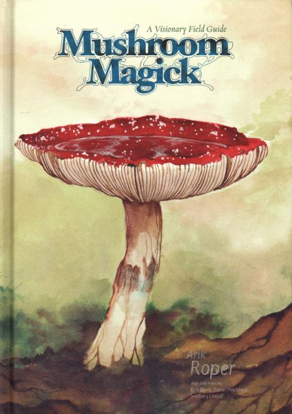
As we wrap up, I’d like to talk about your non-commercial work, stuff that wasn’t done for hire, per se. Can you talk a little bit about the experience of putting together the Mushroom Magick book? How did that come together and how was your experience putting that together?
That was in 2008, I believe. I had a contact at Abrams Books, who was a friend of a friend, and I was going to have a meeting with her because I wanted to do a book, but I was thinking more like a children's book, or something like that. I didn't have a very solid idea, but she knew I was an artist and she’d seen my work and she wanted to talk to me about something and I wanted to talk to her about something.
So, we had a meeting and, before I could even say what I wanted to do, she said ‘I've got an idea. Would you like to do a book about mushrooms?’ And I was said, Well, yeah, of course. I didn't even know that was an option, but I'd love to do that.’ And so she was able to get that green lit by Abrams, which was kind of surprising because they’re a bit more more traditional. They've done a lot of classic art books and things like that, a bit more highbrow. They have another imprint, Image, which was more geared toward stuff like street art and things that Mushroom Magick might fit better into, but she really wanted to get it onto the Abrams label. And so she was able to do that fortunately.
She and I basically crafted that book together, in terms of the content, and how it would be presented and she wanted it to be my vision, more or less. You have to go through a lot of hoops when you're working with a publisher like that, so I didn't get final say on how it looked because they have to speak to their bottom line, which is selling books, which means they get to decide what the cover’s going to look like, what the layout looks out like, what the font looks like. They have certain ideas about what works the best. I was flexible with all that. I was just happy to be able to do such a project. The goal was to illustrate as many psychoactive mushrooms as I was able to find out about, basically, which was close to a hundred. I worked on it intensely for a couple months. I was doing one or two of the mushrooms pieces a day and just cranking them out to meet the deadline. [I] submitted it on time. Then they spent another six months laying it out after they made me do all the work in two months! But it came out really well.
I got my friend Erik Davis to write a Foreword. I got Daniel Pinchbeck to do an introduction. I think it holds up as a nice piece of work. And fairly appealing, I think, to people, even if you're not into psychoactive mushrooms, per se. Mushrooms have a pretty wide cross audience. People like mushrooms, even if they're not into that aspect of them. There's the mycological crowd, as well. So, it's been popular. It's kind of a slow burner, though. It hasn't sold a ton, but it's been kind of like a very slow seller over the years. I still get emails about it. People will find it and be like “It’s such a cool little book. I love it!” It's got a cult classic aesthetic to it, where people can pick it up in 30 years and it'll just be something they can appreciate. I think it has a lot of character.
You’ve touched upon this in other interviews and I won't dwell on this too much, but what do you make of the reassessment that's been underway over the last maybe decade or so of the the benefits of things like psilocybin mushrooms. Do you have any opinion about that?
Reassessment meaning?
I guess the psychological benefits, the health benefits, of psychedelic experiences.
Oh, yeah, like the use of them for end-of-life treatment and psychotherapy and such. I think it's positive. They’re powerful tools and I think the more we learn about them, the better, and I think the more that they can be used to help people. There's a lot of potential for that and I think that it should be used and used respectfully. I don't love that the pharmaceutical industry is, in some ways, trying to strip the the—what should I say?

Sort of the spiritual element of it, maybe?
Yeah, you know they've isolated certain parts of marijuana into just its medicinal qualities and then - the psychoactive properties, they've separated that. That's fine, but I don't love the fact that pharmaceutical companies are trying to turn it into a commodity and make it something that I don't really think it is meant to be. I think it really is something that needs to be taken seriously and studied and used to help people, but it's very powerful and I don't think it should be diminished by treating it as something that can just be manipulated and turned into a pill, too easily. But I think, overall, it's a good thing. I just hope that it can be used in a respectful way because it's very powerful and can teach you a lot about yourself if you choose to use it wisely.
In my end, the best presentation of your work I’ve seen thus far has been the Outer Battery folio pieces that you put together.
One last thing. In my mind the best presentation of your work that I've seen thus far has been the the Outer Battery folio pieces that you put together—
That's that's not actually Outer Battery. Outer Battery is distributing it for me, but it’s my thing entirely.
Can you tell me about that? Was the work in those folios done outside of a commercial capacity? Is it personal work?
Most of that is personal work that I've done that's been unpublished before now. There are things that I did for shows or private commissions or just personal work and a lot of them haven't been seen by most of the public. The idea came to me because I was just looking through my stuff. I had so much work at this stage and I started pulling together all these things that fit this category. I came up with about 75 or 80 pieces that weren't published, that most people haven't seen, that I thought were good enough to actually show people. I had the idea to make these prints in this little folio. I did it with a friend of mine who works for this printer in Vermont. We put together this little project and did it and it was came together really quickly and it's just a fun side project to do and I got to make prints of these things and show them to people. I’ve done two volumes at this point, but I've got a lot more material. I’ve still got probably another 50 or 60 of these things, but I'm thinking of saving them and putting them in my book, which I'm working on this year. I'm finally doing a compilation book of my art, spanning the past twenty-something years and I think I'm going to take some of them and put them in there, instead of printing them this way, just so they can remain unseen until then.
So it sounds like this project is giving you a chance to reassess your career. Has that been a good thing to work on during the pandemic? I don’t know how much that stuff would have affected you. Has reassessment been a positive experience for you?
Yeah, it’s been positive. I mean, I’ve stayed very busy during all of this. I’ve just been working for different clients that haven’t been affected by the lockdowns, like game companies and others. But the process of going back through my old stuff and compiling stuff that I want to use for a book is interesting. I'm going back and looking at things that I haven’t in a long time and I can see developmental stages. I can see stuff I was doing fifteen years ago and see the things I don't like about that stuff now. I can see things that I had more patience for back then that now I might have less for, in terms of the way that I work.
Are you seeing qualities in your work that were there before you may have realized?
You mean things about it in retrospect that I wasn’t aware of?
Yeah.
Yes, as I was saying, when you look back at things from a higher point of view, you can see the patterns in things. I can see stages in my life, of things I was more interested in coming through at certain moments. I guess more to your question, there's some things I can see now in a piece that, at the time, I didn’t intend. That happens sometimes.


