 Colleen Doran has had a long career, but for comics readers, she remains perhaps best associated with A Distant Soil, the series she’s been writing and drawing on and off for more than three decades. For much of her career though she’s been collaborating with a number of writers on a wide variety of comics, graphic novels and digital comics. In these projects, Doran has been able to masterfully shift from one style and one approach to another so well that it can be easy to forget just how great an artist she really is. There are few artists with the skill to go from Reign of the Zodiac to Gone to Amerikay, Mangaman to The Book of Lost Souls, Orbiter to Amazing Fantastic Incredible Stan Lee, Beauty and the Beast to Shade, the Changing Man, Wonder Woman: The Once and Future Story to Hellraiser, Anne Rice’s The Master of Rampling Gate to Legion of Superheroes, Big Nemo to Superidol, much less with the seeming ease that Doran has been able to. She is a masterful artist, who has long been thinking about color and design in innovative and exciting ways, and one of the joys of each new book is seeing how she finds new ways to work and think.
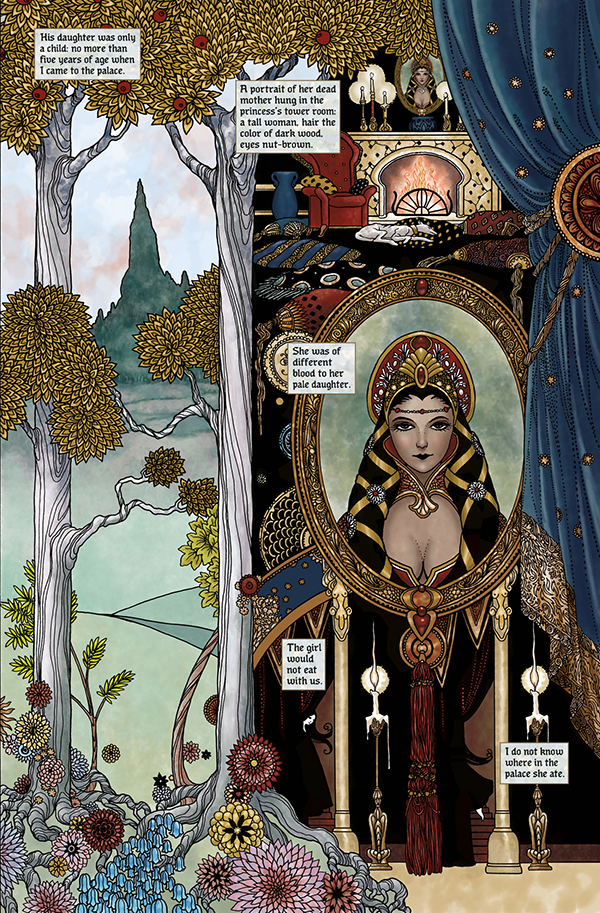
In her new book Snow, Glass, Apples, Doran adapts and illustrates a short story by Neil Gaiman. The two have collaborated a number of times in the past in both The Sandman and when Doran adapted the short story Troll Bridge to comics, and yet in this new graphic novel, Doran utilizes an art style and approach that she’s never tried before. The result is a book that quite frankly contains some of her finest artwork and solidifies her place as one of the greatest cartoonists of her generation. In supplemental material, Doran cited Harry Clarke as an artists she discovered decades ago and has long been influenced by in different ways. We spoke recently about Clarke, how she worked on the book, thinking about design, and more.
 How did you end up adapting Snow, Glass, Apples?
I’d been talking with Neil for some time about adapting various stories by him to graphic novel form, and while working on Troll Bridge, we pondered what the next story should be. I mentioned how much I wanted to try using a completely different style on a new book, and it was editor Daniel Chabon’s suggestion that we go with Snow, Glass, Apples, which I love. I jumped at it. I knew exactly how I wanted to do it.
You talk about this a little in the afterward of the book but who was Harry Clarke, and how did you originally discover his work?
He was the center of the Irish Arts and Crafts movement. He’s best known today for his work in stained glass, but he was an illustrator who was heavily influenced by Aubrey Beardsley. I first discovered his work having mistaken it for Beardsley, and did art in the style when I was a teenager.
His work is weird, much weirder than I went with on Snow, Glass Apples, his figures tubercular and grotesque. His line art ranges from very controlled and decorative, to kind of scratchy and heavily rendered. It’s a fever dream approach, which probably reflected his mental state as he was ill and died young. But he was immensely productive.
It was hard to find work by him when I first discovered it, but I was able to get Harry Clarke: His Graphic Art in the 1983 edition and I held on to it for dear life. His work is becoming more well-known though. There are some attractive new books. For awhile, he wasn’t as well-regarded as one would think. Modernism ate it. I was at a museum in Dublin last year. They described having found one of his stained glass panels by fishing it out of the trash.
What made Snow, Glass, Apples a good fit for this kind of style and what was the conversations around working on this adaptation and the process of it?
I’d always wanted to do a comic in this style, but most publishers didn’t seem very keen on the look, and any time I tried to push something like it in the past, I was blown off. I did a short story back in the 1980’s called Eugenie which was more Beardsley-esque, and it didn’t seem to make much of an impact, though in general, my work wasn’t well-regarded back in the day so maybe it wasn’t very good or maybe people just ignored it. Regardless, Neil Gaiman loves Harry Clarke’s work and owns an original. I told him I was aching to do something in this style, and sent him the art I’d done based on Clarke’s work years ago as proof of concept. He loved the idea of going full Harry on Snow.
It took me a few weeks to get into the mindset. To understand the use of black and white, negative space, his decorative sense, I just had to read and read and read. I did one sketch, which didn’t really fit the mood, Neil correctly decided it was too YA-looking, but I nailed the style by the second sketch.
I struggled a bit with how to approach the figures. As I said, Clarke’s figures are often kind of grotesque and I didn’t want to go that far. The body language he uses is also quite melodramatic and staged. I think people are going to assume the faces and figures in Snow are influenced by manga, but they are quite close to Clarke’s approach when his work was at its most decorative. I threw out pages where I thought I might be slipping into manga looks. Clarke developed those large eyes and stylized faces decades before the style was seen in manga.
He’s a mad genius, really something. I hope more people will take the time to discover his work.

Beyond just the artistic style you’re drawing in, you also have very few panels. You didn’t approach this like a typical comic.
Since the entire narrative takes place in the main character’s head, I wanted to pull away from discrete units of time delineated by panel borders, and flow from moment to moment. This is tricky because it can make for muddy storytelling. The transitions have to be clear without those borders telling you “Here is the moment now”.
Clarke did a lot of this narrative flow in his stained glass windows, which aren’t comics per se, but they are illustrations that flow from one to the next, sometimes in and sometimes outside of confining borders.
I remember when I got into comics, the hostility toward comics which didn’t utilize standard borders was off the scale. Editors just hated it. I wanted to design each page as a complete work of art as well as a comic narrative. Sometimes I nail it, sometimes not so much. But overall, I think I nailed it. I’ve used this approach before, on Troll Bridge and in some sequences of A Distant Soil. Basically, anywhere I want to suspend time or make time flow, instead of segmenting it.
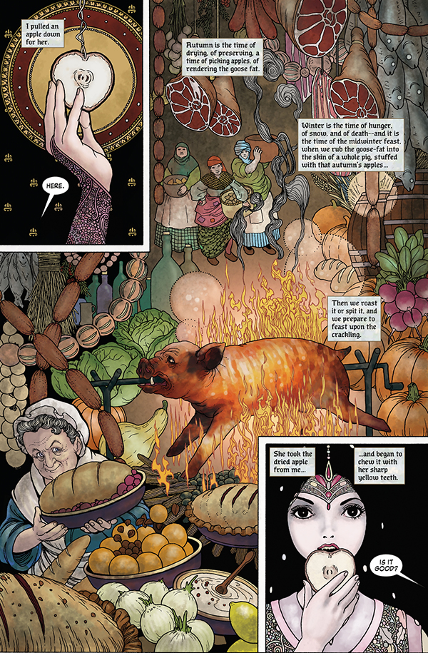
In Troll Bridge I used it to simulate the flow of rural time. In rural areas, time moves as a continuum, slowly, and without an awareness of the clock. You don’t even know what day it is, out here where I live we had to get a day clock so we’d be able to know when it’s Wednesday. That rhythmic flow was what I wanted to achieve in Troll Bridge. But I wanted Snow to be timeless and about sensation, to speed up or slow down the action using splash pages and decorative elements that draw the eye and push the reader to pause, feel, and get a sense of texture through their eyes.
 You’ve drawn a number of digital comics, so you’ve spent time thinking about how people read comics in different formats and layouts. Did that influence your thinking as you were drawing and designing these pages?
I don’t think about other projects when I’m working on a new book, except to think how I might do something differently from what I’ve done before. Whenever I work on a book, that’s just the whole world for me in that moment. I am thinking, “What is right for this book?” As if that book is a pocket universe and the magic rules are set, and that is the magic I must use. I only look back to see what I screwed up and don’t want to repeat.
For this book, I wanted to do something I hadn’t really seen much in recent comics, use decorative elements and a highly ornamental approach, which everyone has been telling me for years is dead because the fashion now favors cartoons that are simple and can be drawn quickly. I also wanted to avoid the highly polished video game look, which I like, but can get very standardized. I want the hand of man, the idiosyncratic element, and I wanted to incorporate ornamentation as a major storytelling element. Style itself influences the mood. Decorative detail can give the impression of tone, can make the reader pause and pay attention, can provide sensation through texture and contrast when a highly ornamental area is right next to a simple space.
I’m doubling down on craftsmanship, and pushing it farther and farther, and challenging myself. I think it suits me and I think people appreciate it. I remember seeing a comment by an artist who talked about how some people are real artists and some people just make Faberge Egg art. And I thought – I think you can be an artist and have the Faberge Eggs. In fact, I’d love to do a comic that has the look of a Faberge Egg! Craftsmanship and the style of decoration have meaning and add to the narrative. Mood is important and craftsmanship and decoration not only enhance mood, but can be used to add symbolic elements as well. Which I do.
The assumption re: more decorative art, is that the art is not serving a purpose beyond material pleasure. I don’t agree. It can be symbolic of course, but it can also be therapeutic for the artist, as well as the viewer. At first I assumed that the tiny decorative elements Clarke used in his work must be symbolic, but much of the time, that’s just not so. When you get a good look at the work, you can see he draws the same details over and over. Many of the tiny little bits I drew in Snow are as Clarke would have drawn them.
After doing that for about six months, I wondered how much of that approach for him was meditative, or therapeutic. That type of work puts you into an amazing zen state. Sounds weird, but thinking back on Clarke’s health issues, I wondered how much of that approach was a reaction to his infirmity. As someone with chronic health issues, I pay close attention to which art activities are draining and which are invigorating. You put too many hours into those niggling details per day, and you want to gnaw off your arm. But in short spurts, it is hypnotic. I’m betting it just made Clarke feel better to draw those things. It made me feel better. Until I had to do it for about ten hours a day, and then I wanted to run screaming into the night.
Anyway, all those decorations add texture that would, by another artist, have been achieved by standard methods like hatching. I love the juxtaposition of the large, flat areas of black or white with those mad, riot areas of texture. It’s like looking into a mandala.
 I think about your work and your style – and how one of your skills is the way you’ve been able to work so well in so many different styles. How much of that is just the requirements of being a working artist with a lot of different clients and needing to adapt to their needs? How much is it that you have styles you love which are not necessarily the styles that are in vogue or wanted?
I think it’s funny that people say “Oh, here is your style – but you have all these styles!” Should a singer only sing one type of song? Should an actor only take one type of role? I don’t think so. From some of my earliest interviews, I said over and over, being a cartoonist is like being an actor. Every book is a different role.
When I sit down to do a book, I don’t think about what I want as much as I think about what is right for that book. What suits that book? I then do whatever I have to do to become the artist that lives for that book. There are things I might want to try, such as using this Art Nouveau look on Snow, but I wouldn’t use it on The Punisher!
I don’t matter. If I had my career to do over again, I’d want to be completely invisible. I’m not thinking, “I simply must draw this so everyone can love the style I’ve worked on for forty years!” I’m thinking “Here in this pocket universe, I’m making the things that work in this place.” To me, someone like Daniel Day Lewis who disappears into his work is my life goal. Maybe I’ll just disappear and run off and make shoes. You never know. I was strongly advised not to do this by many creators. I was told it would make my work hard to recognize and ruin my brand.
People “read” a painting differently than a comics page. You noted that Clarke was most famous for his stained glass, and those windows are “read” differently than both. How are you playing with those ideas here?
People read paintings, and comics, and stained glass windows differently, because they are different mediums and their presentation evokes different contextual understanding. We don’t expect to “read” a painting, we do expect to read a comic. And I think most people realize that stained glass windows were narratives for the masses who couldn’t afford books and entered churches to see heavenly stories presented to them in the form of brightly colored light shows.
Now with stained glass windows, you have the leaded glass borders which can help lead the eye, but often when you’re looking at Clarke’s glass, and maybe this is more obvious when seeing the original than when you look at a copy in a book, the lead kind of disappears. The colors are so dazzling that the black is just negative space. It doesn’t necessarily frame the picture in a way that moves the narrative along, and the colors and illustration elements are supported by those lead frames but not always dependent on them as part of the storytelling framework. Much of the Harry Clarke imagery is purely decorative also, but as I mentioned before, the decoration is also about texture and adds shade because from a distance, it’s almost like a zipatone effect, giving the appearance of grey with tiny dots. Some of the pages in Snow taken as a whole, evoke that stained-glass look, and large decorative windows appear over and over in the work, often framing the action.
It’s all kind of meta.
 For this book, did you draw by hand and color digitally?
Almost all of my drawing is by hand, though I do take advantage of some time-saving things like spotting blacks with the paint bucket tool, or repeating a difficult to draw crown. I’m likely to go back and do it by hand anyway at a later time. Even though I’ve picked up a lot of digital skills in recent years, I still prefer to draw by hand. Once you’ve really got your drawing chops, digital doesn’t always save much time, except for perspective or repeating things like windows, which is godawful dull work.
Coloring is another matter. You just can’t beat digital color on line art. The undo tool saves the day every day.
I had a completely different idea in my mind’s eye for the color when I started out, because I’d never seen any of Clarke’s originals. All I’d seen were old, faded copies of copies of illustrations. I was talking with Neil about my color approach. I was going to go sepia all over the thing. I’d even done some tests, and my short story on American Gods was basically a color test for this book. But Neil was all, no, you need to rethink, the originals are very different. So I went to Dublin to have a look, and I was all WHAAAA, this is glorious, and I spent a small fortune on reference, and I took a lot of photos which I found out later was against museum policy, so I ran out like a madwoman, hanging on to my photos. Then I used the color picker in Photoshop to select colors from the photos. Basically, Clarke’s paintings and glass became my palettes. Can’t do that with analog.
You thanked Val Trullinger for doing the flats and helping you with the color on this book. Why did you want to do the color and what was the learning curve as far as that?
This is not the first book I colored, this was the first book I colored using this process: the black line art process generally used in comics, though I used a far more painterly approach than a monthly comic colorist generally would. Val was helpful, but she didn’t do all the flats. I did them as well. I brought Val in to help out during the last couple of weeks of production because I was running behind. I’d already done a good deal of the final color at that point and had been turning in pages for months.
Most assistants, especially flatters, don’t get art credit, but I try to always credit the people who work with me.
The first book I colored was an edition of A Distant Soil back in the 1980’s. I did watercolors for a graphic novel for Anne Rice back in the early 1990’s, and did a number of other short pieces in color as well, some digital and some by hand. Neil’s graphic novel Troll Bridge was colored digitally by me for example, as well as a short I did for American Gods, and my art on Tori Amos Comic Book Tattoo was a digitized combo of hand drawn, hand painted, hand made paper, and digital color. I do all the colors on my webcomic Finality with Warren Ellis.
I’d flatted line art using a computer program already when I called in Val. I hoped I’d be able to have help with final color because I was just so wiped out and really needed to meet the final printer deadline. I was fiddling with the line art to the very end. I tried Val’s full colors over a few pages, and some were pretty close to what I wanted. I was able to spend a few hours going over them to get them to look like my work. But it became obvious that it wasn’t going to be much of a time saver in the end. Our styles were too different. What I really needed was flats on top of my flats. Hard to describe if you don’t really understand the process, but computer flatting filters, Multi-Fill and Flatter Pro, use random colors to aid in color selection. I had Val create another layer on top of the computer flats that would give me secondary selection choices.
For example, the computer flatter program would choose maybe ten colors for someone’s hair. That means I have to go in and make ten selections to color one blonde head. Val would go back in and make another layer on top with just one color for hair. That way I could pick the one color when I needed it, but if I also needed to make internal selections within that mass, I had that option as well. Say someone has a head of red hair, but I want to select individually drawn strands and color them bit by bit. With my randomly colored flat layer, I can do that. If I’d just used a flatter and they’d gone in and just given me a flat red head, well, I’ve got to go in and select each strand and that’s time cost I couldn’t afford. Using Multi fill and a human flatter gave me two selection options. Flatting isn’t really meant to be a part of the final color, it’s primarily a technical tool for making quick digital selections. Because the drawings on this book were so heavily detailed in some areas, making selections was kind of a nightmare without flats.
When I started this book, I’d never used a flatter or flats before and some of the pages I did entirely without any flats, only hand selections. That’s what I meant when I talked about how I’d never done this kind of color before. Flats couldn’t be used on most early digital color I’d done, for example on Troll Bridge, because the art was colored over highly rendered pencil, not clean black lines, and the colors had to be very transparent. I colored that the same way I would color a painting: every little area stroke by stroke. Coloring it by computer probably didn’t save any time at all, really.
While I’d done colored line art for American Gods, I was coloring over sepia line art: I didn’t have to worry about how to achieve rich black and I didn’t use flats because I didn’t know how. Same with Finality, and most of the line art on that is pretty simple. Publishing on computer, I’m not worried about rich black on Finality, though god knows I’ll worry if we go to print, and I’ve changed my process since I started on it.
Anyway, because I didn’t know how to set up my black line layers on Snow, Glass, Apples properly from the start, I ended up having to make corrections late in production, which cost me hours and hours of labor and re-uploading finished art, and things got a bit messy, which is why I needed help there at the end. I hadn’t prepared files correctly from the beginning. Once you get the hang of it, it’s all fairly simple, but when I had a problem, I could call Val, and I ruined her life for about two weeks by having her stay up late and help me out. We ran into a few hairy problems, like ghosting and other newbie mistakes, but in the end it all worked out. She was an early mover on Photoshop, and is an art director, so she really understands the program.
I greatly underestimated the time cost of doing the color: I’d read amazing tales of colorists who turn around pages in 4 hours a whack. The time cost on Snow was way higher than I planned. And if I had my druthers, I’d have taken another two weeks! That would have given the editor a heart attack, however. Regardless, I won’t see hundreds of hours go down the rabbit hole to mistakes and inexperience on the next job.
What is it about working with Neil? You’ve worked with a lot of great writers over the years, but the two of you have worked together a number of times. What is it about his stories and how he tells stories that appeals to you?
He’s simply one of the best modern fantasy writers in the world. His work is endlessly engaging and very visual. Images start running around in my head while reading his stories, and his tales can be comforting or extremely disturbing, he has such great range! But he also has a great humanity in his work, such great character. I remember working on an issue of Sandman with Neil where we spent hours on the phone and he talked through the story, going over body language and motivation, getting into the character’s heads. I can’t tell you how rare that is.
He’s exactly the sort of writer an artist dreams of working with. I desperately want to make pictures of his stories the way I do with great, classic authors! I’m sure Neil’s work will stand the test of time as well. I feel a great responsibility when I sit down to draw his work. I don’t think I appreciated his work as much when I was young as I do now. I don’t think I was mature enough. Stories like Troll Bridge, I had to grow into those. I did a version of Troll Bridge as a short story over twenty years ago, and it was awful. I was so relieved I had another crack at it!
You’re always busy with a number of things and working on different projects, but after spending so much time working in this style – after thinking about this style for long – are you looking for another project well-suited for this style? Do you want to try something completely different?
My next graphic novel will be another different approach. I’m going to do something I don’t think I’ve ever seen in a comic before. Something that will seem very obvious when people see it. Technically highly challenging, far more difficult than Snow or Troll. But for obvious reasons, I can’t get into details yet. We’re looking at more than a year before release. I’ve been studying this approach for quite some time, and I think I’ll adapt to it fairly quickly, though most of it will be analog this go ‘round.
While I don’t think I’m going to challenge Chris Ware for skill, I’m giving range a hard go.
I want to do another project in future in the Harry Clarke style and I think I have a good chance at that one. I really love doing art this way, it feels so natural to me. I want to take it even further, make it weirder and more complex, more conceptual. I spent so much energy on the projects Troll Bridge and Snow, Glass, Apples learning new technical skills that I ate up a lot of resources: returning to these styles on another book should be a lot less of a production time sink. I learned a lot but I probably lost a good 300 hours or more just screwing stuff up and having to ride that learning curve.
I’m also working on A Distant Soil’s final volume, which I’m financing on my Patreon. I had to put that on the back burner for awhile, and I did a few issues some time ago for Jim Valentino at Shadowline/Image Comics. Unfortunately, I was pretty sick when I was trying to churn those out, and there were quality problems, I thought. But the new material I’m producing is the best I’ve ever done on the book. It will feel good to finally put that series to bed, but I am determined to do it with my art at the top of my game. I don’t want to fizzle out like I’ve some some projects do, like they were just desperate to get rid of the thing. Not going to happen on my watch.
I’d been picking at a book for Top Cow for awhile written by Matt Hawkins, but I selfishly put that on the back burner while I did Snow, and I’m not sure Matt wants to move forward with it now. I understand and support whatever decision he chooses to make.
And I’m back at work on Finality with Warren Ellis. It’s the first and only project I’ve ever done in brush and ink, so that is really fun for me. Digital color on that, too. Quite fun.


