
VS is the new Image series by Esad Ribic, Nic Klein, and Ivan Brandon. It takes place in the blurred borders between a first-person shooter and a reality show about war. The first issue follows soldier/gamer Satta Flynn, as he recovers from an injury and works to get back to fighting with his unit. The book slots alongside things like Robot Jox or Mobile Suit G Gundam; it's another story about protagonists participating in a sort of futuristic sporting replacement for war.
In contrast to something like Mobile Suit G Gundam, the war game aspect of the story exists in a kind of hyper-reality running parallel to a slightly more mundane world, and at least through the first issue, it’s not clear how the two worlds connect or what weight we are meant to give the things that happen in the “game.” Because of the artifice of the game world, where people stop fighting during commercial breaks, and seem to compete according to the the rules of a first-person shooting game, it’s hard to determine the physical stakes of what you see happening. While we do see Flynn recovering from some sort of injury to his legs, it’s unclear how he sustained those injuries and whether the last quarter of the book is happening in flashback or things are proceeding somewhat chronologically. While this displacement of stakes in terms of how we watch war is intellectually stimulating, the dramatic edge is almost nonexistent.
The lack of clarity of stakes and the composition of the book are the two things that most work against the strengths of VS. Because it is an American comic, it is very narrow. This narrowness is exacerbated by the decision to have most pages be four to nine panels, which when combined with the glut of text (mostly tactical jargon, unseen commentators, and commercial messaging) really cramps up the room the art has to express itself. All of that would be fine if this wasn’t a comic in that painted comic aesthetic style, and if this wasn’t a comic where the visual strengths are its atmosphere and well-toned bodies dramatically posed through space. The decision to make the book so narrow results in a lot of pages of stacked horizontal panels shoving figures into tiny distance which works against what you want to see. If this were done in a larger-format euro-album size it might be a lot easier to balance all of these things visually and lose yourself looking in each panel individually--which is what this kind of art is ostensibly for.
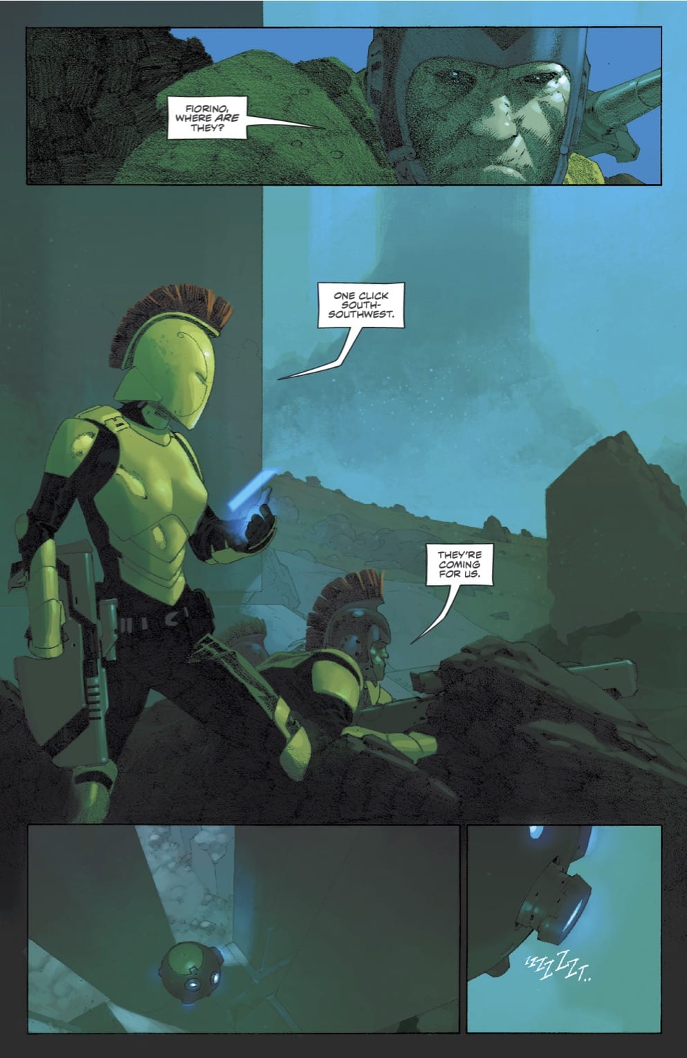 What works best in VS is the first page actually. While sparse, it's laden in atmosphere. You have this cool futuro-centurion-looking person talking to this scratchy faced textural closeup of another character and then a few panels of a small robot quietly clicking away across the blue misted landscape. Combined that with the really striking cover of the first issue, things immediately seem really interesting. That page forces all kind of questions, forces you to imagine a world that delivers bold aesthetic and design choices--and then every page after that is the book running away from that strength and doing its best to minimize it. Are the sort of meta-textual points about war as a reality-show spectator sport better than what the comic might have been sans that frame? Or even if the reveal of that frame had been pushed out deeper into the issue or series as a whole? Or if that frame had even just been less visually obtrusive? But that’s the thing, it’s meant to be visually intrusive--so it kind of makes the intentions of the story of the book somewhat at odds with the strengths and weakness of the art. For all of the time the book spends in the less interesting exterior world, it still doesn’t really explain the connection that world has to this other more interesting world--so you’re just all the more aggravated for being there. There’s a spread in the book that I think illustrates the misunderstanding at the core of VS. It’s a huge drawing of Flynn’s car speeding alone through a loopy outerworld futurescape--and while it is a pretty piece of art executed well--it’s what... a road, a car, some buildings; in a comic that’s at its strongest in terms of the body or even the biomechanical. To see so much space in the book given over to... I mean this city, it’s not the kind of city you’ve never seen before. It’s not some special kind of road that has been drawn for the first time ever into existence. It's all exactly what you would think if I told you there was a spread of a futuristic city in an Image comic.
Even in terms of the joy of “words on the page” there really are only a few spots where it feels like “okay this is what this book would like to be, and what it aspires to.” I think the hope is that eventually the world will get set up and then the writing and art can ease up a bit and focus on just producing more images like the opening page, and that as the book progresses there will be some kind of drama between characters that you've become invested in. But on the flip side, the book could also just coast on the overall competency of its execution and just be a thing that was made and exists. I definitely prefer this kind of thing to a poorly drawn autobio comic. At least there is one page that looks cool, and there is a cool cover. If a comic can give you one good page that you can remember after you’ve read it, it’s not a complete waste. This book has that one good page, and its cover. It also has really pretty sound effects and the overall color palette is really good at setting up an overarching atmosphere of the book as a whole. So that’s at least four things more than many other comics you might read.


