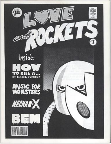
Here's how my brain works. When I think of Beto (Gilbert Hernandez), I think of the magazine format. I think specifically of the black-and-white magazine format the Hernandez brothers chose when they self-published Love and Rockets #1 in 1981. (Same year as the first Cometbus for all you punk scholars out there.)
And when I think of the magazine format, I think of CF. Why? Well, CF draws his originals on 8.5 x 11 paper — magazine format. Most of his zines, like Lowtide, are the same proportion as the magazine format, just reduced. Mini-comics makers know what I am talking about.
I really like the formats of both (Beto's) Love and Rockets: New Stories and (CF's) Powr Mastrs. They are really different but somehow very similar. At least to me anyways.

First, let's look at Beto. This L 'n R New Stories series has returned to the magazine format proportion (of the original L 'n R series) after a stint of using the standard comic book format. So, Beto switched from using a wide magazine proportion to a thinner comic book proportion. Now that L 'n R has switched back, Beto has, at times, retained the art-image live-area dimensions of the comic-book format within the magazine format. Meaning he is drawing a thinner, taller page than he was in the old magazine days. That thinner live area, is interestingly, the same as his recent graphic novels (Chance in Hell, Troublemakers, Love from the Shadows).
I did some nozin' aroun' and found out that the paper Beto uses for his original art is 12 inches tall and 9 inches wide. The art image area is 11 inches tall by 7 inches wide for his King Vampire story in newest L'nR (#4). I also found out that Beto indeed is choosing to use this proportion, because it is the same in the other "Fritz" stories. (Click here if you don't know who Fritz is.) There are, however, other stories in L 'n R New Stories that use the 8.5 x 11 live area proportion. Got that, Hercules? Good. Pay attention. Here comes the riff.
What I find interesting is how much I like the wide margins that are created by placing the comic book art image area proportion within the magazine proportion. Do you follow? The art area is thinner and has wide margins on each left right side. I particularly like the wide margin created between the two pages on the spread. Often in thickly bound comics - saddle-stitched or perfect bound - the margins are pinched and the spread doesn't open up or lay flat. I find the format of L 'n R New Stories easy to hold and the margins that surround Beto's art super appealing. I can thumb slowly through it like a flip book and read the spreads clearly because of the wide margins.
While flipping through Beto's King Vampire story I was reminded of CF. No, it wasn't the sex — it was the size of the printed live area. The printed size of Beto's live area reminded me of the size CF's Powr Mastrs. So I compared them.


The live area of CF's Powr Mastrs and how it creates margins is the opposite of Beto. Here's what I mean: CF's live area is closer to a magazine proportion but the book itself, the format, is a similar to a comic book proportion. Beto's live area is a comic book proportion but the book itself, the format, is a magazine proportion. What this means is that there is a wide margin on the left right sides of Betos's live area. On CF's pages there is a top margin. Follow me?
Check it out. I cut paper the same size as each book's live area and placed the paper on top of the each book's cover. See how L 'n R (on left) has wider side margins than top and bottom margins? And see how Powr Mastrs (on right) has wider top and bottom margins than side margins? (For the record, I like the thin side margins of Powr Mastrs. I just wanna riff on the differences.)

Now let's diagram the the live areas themselves on graph paper and compare them. Check out the pics below. See how taller Beto's live area is? See how the widths of the live areas are nearly identical, but the lengths are so different? What that does is change the weight of the "top squares" (the x's) and creates a different timing on the page. See how the tier below CF's "top square" is thin, and the tier beneath Beto's top square is wide? Different timings.


So what, right? Well, to me what's interesting is that these books are similar in height and I like the feel of reading them both — if they were cars I would say I like the way they handle. Smooth ride. Smooth read. And I think the format has a lot to do with that feeling. And to think that two of my favorite formats play around with the proportions and margins of their live areas — flip them, switch them. Beto the wide screen timing magazine format master is using comic book live area proportions - a lot. And CF the 8.5 x 11 master is making thin almost comic book proportioned books. Hunh. It pleases me.

----------------------
INTERMISSION FUNNIES by MICHAEL DEFORGE

---------------------
Frank's reading list:
San Diego Diary by Gabrielle Bell
various minis by Ron Regé Jr. - always perfect
-----------------------
Don't forget! I'm starting a cartooning correspondence course. An 8-week workshop. Application deadline is October 28th, 2011. Check out the details here.


