
Within the collection of the Museum of Modern Art in New York City, we come across Sherrie Levine's 1989 art work Untitled (Mr. Austridge: 2). It is not currently on view, but was up in the galleries from June 30, 2010 through September 12, 2011. It is an exact replica, save the grain of the wood support, of a drawing by George Herriman from his comic strip Krazy Kat.
About her work, Levine commented: "Every word, every image, is leased and mortgaged. We know that a picture is but a space in which a variety of images, none of them original, blend and clash. A picture is a tissue of quotations drawn from the innumerable centers of culture."
Except, in this case, it's one quotation from one specific area of culture. Levine might protest that her larger project shows this specific work as one fabric within the tissue, but for readers of Herriman, there'd be (at the very least) a compelling argument for the former. Now, that alone doesn't invalidate Levine's project in any way. I happen to find her work important and complex. The overarching unity of much of her work, the appropriation of 'idolized' male artists to question ideas about 'artistic genius,' is razor sharp art-as-critique and particularly prescient today.
Levine, if this was her intention, is correct to lump Herriman into the 'idolized' camp. He was beloved by peers and critics of his day, and continues to be in 2018. And yet, as a subject for appropriation, an important question arises: does Herriman have the same visual currency as a Walker Evans photograph?

Levine's Evans appropriation, which was on view at the Metropolitan Museum of Art for four months in 2009, is based on his iconic Depression-era photographs. Most anyone walking through the Met would, I'd argue, have at least a flickering idea of what this photo represents and that it was not a work solely to be associated with Levine. Even if a viewer couldn't place Evans by name, well, surely there is something else happening here than a new take on the Depression era from a 1981 perspective.
So what? Levine is obviously free to appropriate well known and not well known images, and if I confess (truly) that the Herriman appropriation makes me uncomfortable, that is largely what Levine is after. Levine's project syncs up with her practice very tightly.
But what does it say about 'real world' attitudes towards cartooning that while Levine's appropriation of Herriman has enjoyed extended periods of viewing at MoMA, not one work byHerriman exists in MoMA's permanent collection, much less on view? Does the prospect of 99.9% of MoMA visitors having no idea who Herriman is (and if they do, most likely a 0% knowledge of his obscure characters), complicate the relationship of cartoon art as material for appropriation in paintings, drawings, prints, etc?

It's not just MoMA that is oblivious to Herriman's art. The Met has neglected to place Herriman's work on view throughout its history as an institution. The Whitney's collection holds one Herriman page, but has never placed the work on view and neglected to include him in its major retrospective of American art, 'America is Hard to See', in 2015 (Levine was included). Call me naive, but I find that odd, especially for The Whitney, a museum devoted to American art. Herriman, the acknowledged master of an American art form and a living embodiment of the complexity of race within this country, might deserve some viewing time within this particular museum. (Multiple requests to the Whitney to confirm Herriman's exhibition history were not answered. I visited the museum in person to verify the viewing history of Herriman in their collection, but was redirected to email. Statements made in this article relied on their excellent online database.)
Again, so what? Painting and photography are displayed in galleries and museums because that is the optimal way to see work of that nature. Cartooning, on the other hand, is made in anticipation of reproduction in newspapers, magazines or books. Cartooning's greatest artist's absense from American museums is, in this thinking, no crime.
But to follow this logic to its conclusion, we'd exclude film from museum's collections as well. Movies are made to be viewed in cinemas or on television (and now on computers, tablets, and phones), a far different experience (if the viewers experience is what's at issue) than museum theaters. And yet it would be impossible to imagine MoMA without its stellar and essential film program. Even if one were to ignore screenings at the film program entirely, the implication of its existence is clear: film is part of the visual culture of art, worthy of an entire department of any significant museum. When a photographer like Cindy Sherman makes reference to the history of cinema, most of what is referenced is on view (or archived) in the same institution. This is a two-sided conversation.
When Levine appropriates Evans, viewers' prior knowledge of the photographer—which goes hand in hand with a greater appreciation of Levine's statement—is due in a large part to museum's dedication to the history of photography. However, when viewers encounter Levine's appropriation of Herriman, how could any but a few think anything other than 'I like that image!' or 'I don't like that image'? One of the most significant artists of the 20th century exists in the museum culture of New York City as an out-of-context statement by another artist.
So why is cartooning worthy of appropriation by artists that museums deem as significant to the conversation of art history, but not up to snuff enough to actually exist on its own merits within those institutions? The answer, I think, lies in how the general cultural public perceives what cartooning actually does. Is it possible that cartooning is only art in terms of an artistic person noticingit? Let's try to find out.

On the surface, this Christopher Columbus-esque tweet from celebrity art critic and culture personality Jerry Saltz seems to be some kind of attempt to rectify the problem. Hey museums and academia! Your definition of art is extremely limited! There's powerful imagery in cartooning! But, glaringly and depressingly, Saltz neglects to credit (or research, or think about) the artist who drew this 'great art,' Don Rosa.

More importantly though, for our purposes, the storytelling of the page is unimportant to Saltz. The trippy explosion image is what matters, in the same way that Levine views one image as enough to make a statement about Herriman. The true project of a cartoonist is at best misunderstood, or at worst ignored. To fit Herriman into her project on idolized male artists, Levine does not appropriate a full page of storytelling, the life blood of Herriman's concerns. She instead appropriates a nice image, the same way Saltz is smitten with one half of one panel, with the text cropped out.
What Saltz seems to be after with this tweet is some kind of intellectual point: this image is art, and I can see that while institutions cannot. Yet the TRUE intellectual project, Don Rosa's storytelling, is considered irrelevant. Unsuprisingly, after multiple people responded to credit Rosa, Saltz neglected to attribute the image.
What Saltz and Levine miss in their assessments is the idea of visual language and comics as information. Saltz's caricature of cartooning puts him at the summit of the mountains of madness, where many culture personality types reside in relation to cartooning, if we are to take them at their word. They notice nothing about what the medium does, but proclaim admiration (or knowledge) of its components, even when the components only relate to some outside obsession or gripe they're trying to sell you on. Really, at the end of the day, they see cartoonists as stylists, and congratulate themselves for noticing that style is one way to enter comics, even though it's apparent to all, especially teenage readers of Wizard Magazine circa 1992.

At this juncture, let's turn to one of the most visually appealing cartoonists we have, Will Elder. Elder's 'style' is irresistible. Every drawing and every figure is pleasurable to look at on its own (to use a description I find loathsome, his drawings 'work'). We can assume any detail from any of the above panels would be enough for Saltz to get worked up over. But that would be a misunderstanding of comic art that a prestigious critic should be able to work out on his own. What is being missed in focusing on style?
Elder, setting aside the years he spent learning his craft, shows an artistic dignity here that cannot be captured in focusing on one image. First, the consistency of the scale of his characters shows us Mole as an actor. How he moves in the air after being kicked and how he sits on the ground and stares: Elder's attitude about him is expressed every time we see him, and it's not a simple attitude. Mole is played for laughs, but also gives off a true seedy aroma. His focus on the discarded toothpick in panel 6, itself used for suspense in the middle section of panels, feels like a genuine thrill for character and reader alike. A new dimension of Mole, the third on this page alone, is realized by the end, and a genuine artistic experience is had. Elder is rendering an entire 'standup comedy on paper' performance on this page, the tone of which is dependent on his style, while its actual richness is dependent on everything else. There is a world view here, an actual vision of reality compressed and filtered through Elder's hands, where every angle and hair is translated into an ordered new reality. This is an entirely creative endeavor, a way of talking about the world where an artist like Elder gets to phrase everything and color his thoughts and expressions as far as his talent will allow. This is some of what the art of cartooning tries (often unsuccessfully) to get at.
And yet...


Did Roy Lichtenstein teach the world to disregard the actual tone and context of a story as subservient to the power of its emotional isolated images?
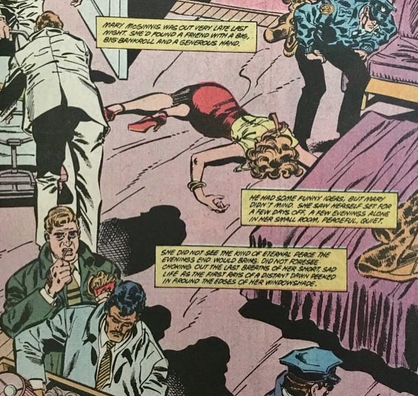
Out of more than 77,000 works in MoMA's permanent collection, not one of them is by Mike Sekowsky. One hundred forty-six are by Lichtenstein. (Again, for these numbers I'm using MoMA's excellent online resources. Questions for confirmation on numbers and viewing history were not answered when I inquired via e-mail.) What is it that Lichtenstein does that's so superior? Let's pretend it isn't about money (more on that later). Why is Lichtenstein's project more 'intellectual?' I don't think it is. Sekowsky is the one making the graphic choices that are beautiful and thought out. Lichtenstein is doing an excellent job of noticing these choices and re-coloring them. But why does that make him an artist and Sekowsky a hack? Doesn't that make Lichtenstein a commentator, a provocateur? Yes, those are important qualities for anyone looking at culture. I love looking at Lichtenstein's observations, and his provocations, particularly the eschewing of European painting's obsession with meaning and emotion for a simpler American vibe, are powerful. But how, with a straight face, can Lichtenstein be graphically applauded as some kind of visual master and Sekowsky viewed as less than nothing?

Is it, perhaps, that most people assume that Lichtenstein made his images himself? He was of course up front that he was an appropriator. But when people buy his work for their palatial estates, are they consuming it as edited commentary of visual culture, or are they buying it because it looks good? I'd bet it's both, but far more in the latter than the former, and no one seems to address that. Lichtenstein didn't appropriate pure shit. He appropriated images that looked good.
Sekowsky's work is not expensive. It's also small. Museums prestige rests, in some part, on a perceived notion that they possess some sort of intelligence that the world at large can access within their halls. If so, why can they only process this kind of imagery when it's really, really big and has a history of being exchanged for lots of money. Doesn't that make them dumb and shallow? I don't think they are, but looking at the facts leads you inevitably to this question. Either way, a well-made image, blown up to gargantuan size, seems to be how the art world can process (if we're being charitable) or use (if we're being fair) cartooning.

Essentially, what Lichtenstein brings to these images is new coloring. So perhaps that's where his importance comes from? Of course, that also betrays an ignorance of the art of cartooning, as Sekowsky and Romita Sr. did not pick their own colors. Lichtenstein then assumes the role of a colorist only, his one creative act in these works. Why then, if it's his only true job, are his colors extremely obvious, straight out of the tube?
Perhaps this is because he truly does view cartooning as trash and wants you to get the point. Then, it's simple. He's wrong and visually unsophisticated, as are curators who championed him. But I don't think that's what's going on. Simplification sells (and gets your name and style in people's heads) in a way that subtlety does not.

Adrienne Roy and Marie Severin are doing what Lichtenstein did: coloring comics. And yet they do it with a visual sophistication that gives the reader a complicated feeling, an emotional and intellectual addition to the material they work with. Looking at their choices side by side, it almost feels like Lichtenstein is the one that needs to be appropriated by Roy, to give his work some depth, some feeling. As is stands, Lichtenstein's choices put him on par with a Fox News set designer: shrill, obvious. But, Fox News is profitable, and highly calculated. There is, undeniably, a deep and strong artistry put into all the choices the network makes, just not the kind Lichtenstein's devotees might enjoy.

The case of Jeanette Hayes's boldfaced appropriation of Suehiro Maruo has been well documented, but deserves consideration within this context. Hayes's self-caricature that 'when you put something on the internet, it's mine' hinges on a misunderstanding (or sly misdirection) of Levine's style of appropriation. When asked for comment about the apparent tracing that Hayes subjected Maruo to, Castor Gallery (which displayed Hayes's below work without any mention of Maruo) made this statement: "Appropriation has been a form of artwork for a lot longer than any of us have been in the art world. I don't even think a response is worth the time."


Simply the idea of appropriation apparently justifies completely copying a cartoonist work. But I don't think Hayes is actually engaged in appropriation. To appropriate in the tradition of Levine, at least some attempt to digest or reconcile the source must be attempted.
When a painter appropriates a cartoon image out of context, it's a dubious enough statement on their art that they want to use imagery and don't care about the information or ideas that said image was in service of. That's shallow, unless it's used for consciously cynical purposes. But defending this practice with intellectual arguments about the 'history of appropriation' is even worse because the truth is far simpler. People take cartoon imagery and use it in their work for a simple reason: It looks cool. The proof is that they ignore the deeper beauty and meaning in the context/storytelling that the image is properly imbedded into. There is a lot going on in Maruo's work, as even a quick glimpse would tell the most disinterested viewer.

Hayes used Maruo's work because it looks good, and her gallery showed it because people buy things that look good. The flaw in their appropriation defense is most glaring when you view the actual work in person. (I went to Castor to see it when it was on view.) In the flesh, Hayes' work is rushed. Of course, that doesn't matter. How it looks on Instagram is what drives Hayes's notoriety, and therefore her sales. And it must be considered that Hayes is highly conscious of all this, and her art is a labyrinthian maze designed to make us confront our ideas of what the idea of an original image means. It's possible, sure. Let's make no mistake, Hayes is not a naive artist figuring these ideas out in public. She was profiled by the New York Times in 2013, which dubbed her practice 'the internet, rendered in oil.' Of course it's the work of other human beings who chose to work on paper that Hayes is rendering in oil... but what does the paper of record care? The Times has never, at any point in its history, written about Suehiro Maruo.


Hayes, obviously, did not ever contact Maruo before 'working' with his images. And while much has been made of painter Jamian Juliano-Villani asking Ralph Bakshi for his blessing to use his cartoon imagery in her work, less has been made of her statement that “if I [asked for permission] for everything, I’d be on the phone all day.” Once approval was earned from one artist, why bother continuing to do so? Juliano-Villani's paintings are reference collages, taking form multiple sources, mixing and matching into a composition of her own, but the original imagery is usually made by artists who are nowhere near as iconic as Bakshi, who is not exactly a household name to purchasers of buzzy paintings to begin with. Sources like the master pulp illustrator Virgil Finlay, who Juliano-Villani used as source in 2015, will leave most with the assumption that the lines and proportions of his figures are in fact Villani's. Ample research must be applied, even by a Finlay scholar, to find the random image that she used. Again, as with Hayes, maybe this is a many-sided Rubik's Cube project, where Juliano-Villani is shaking up our assumptions about intellectual property. If so, though, why are the vast majority of her sources hip, fun and ready made for a wall (as long as any subtle colors are discarded for ones that leave little to the imagination of the painters intent)? Why no Jan Van-Eyck references?
Still, Villani's project sounds like a truly worthwhile one (in theory at least): paintings that take from every possible source imaginable, filtered through the artists personal viewing history. If assessed as post-internet collage, she shows true creative taste, making selections that do say something about our visual landscape and about the image laden information reality we all live in. If this is the point though (and I don't think it fully is), why do the paintings have an unfortunate similarity to Hayes's, often falling apart when viewed in person? Finlay's and Bakshi's meticulous rendering instead feel unloved in its transfer to Juliano-Villani's canvases. No attempt is made to actually capture the sharpness and visual gestalt of the cartoon world that Juliano-Villani claims to be so set on commenting on. Instead, when seen in the flesh, merely the idea of referencing one's visual history remains. The beginnings of a worldview exist in this idea, one that may very well bear fruit. But where an intellectual appropriation project ends and another attitude (wanting something cool on a canvas that is owned by the artist, not the source) begins is a much thinner line than has been addressed, by the artist or the critics of the art. Still, time will tell where the potential purity of the germinating idea within these paintings leads this visually sensitive and ambitious artist.


Philip Guston seems to offer a compromise, incorporating his love of comic strips into his paintings while using his own hand and style as the filter. If there's anything to critique in relation to Guston's use of comic strips, it's the cultural conversation around his work. For young abstract and lightly figurative painters, Guston is a touchstone, often receiving breathless reactions from these artists. But if he's so transcendent, why are the names of his influences invisible to those who appreciate his work? Virtually all major institutions contain zero works by Bud Fisher, the creator of Mutt and Jeff, in their permanent collections, even though the essence of Fisher (and De Beck, Herriman) is central to the feeling of Guston's work. There's little to bicker with in Guston's actual use of this imagery though, except that the trick of taking 'comedic' work and peppering in a good deal of angst misses the emotional richness the strips had in their own right and assumes a cultural vantage point that was already occupied by the source.

Joan Brown's work, on the other hand, is far more successful at navigating these fault lines. Brown uses cartoon language but the shapes, compositions, and emotions are her own. No cartoonist's 'essence' is sampled or misunderstood in her art. Instead, like a true cartoonist, her visual world is built through dedication to her own creativity. Her work, I feel, will move people far more than Guston's as time goes on, as its feet are firmly planted in its own self-nurtured universe. Brown's is the true third way.
Still, Guston's compromised third way is not all that corrupt. In regards to respect and proper care for Fisher, the error does not lie with Guston but instead with those who administer his work. Wouldn't we take issue with a Picasso scholar for neglecting to mention the great debt the painter has to African art? Of course. Why then is the same not true for Guston and Fisher? If Fisher was so central to Guston, isn't it possible that he might plant some visual radicalism in a young museum attendee? After all, if Chaim Soutine isn't an obvious name to a casual museum-goer, they might still appreciate seeing a key De Kooning influence (plus Soutine's a bazillion times better) and charge forward with ideas of their own. Museums collect Soutine, and rightfully so.

Fisher, like Soutine, is worthy of our attention regardless of who he influenced. It should be stressed that he was a visually stunning artist that I, and countless others, still derive a great deal of pleasure from looking at over 100 years after Mutt and Jeff's debut. Fisher essentially created the daily comic strip, which on its own would seem to insure him some kind of cultural relevance, although it certainly has not. Marcel Duchamp's fountain contains an explicit reference to Fisher's strip, which was at the time enjoying the height of its popularity. You'd think an artist who birthed a new American art form, influenced Guston, was referenced by Duchamp and was also extremely visually adept might earn some place in the conversation of American art, but...y'know, small scale, works on paper, word balloons written by the artist, not sourced from another text. That's more than three strikes!
Let's make no mistake though: cartooning, artistically speaking, is doing fine without the validation of museums or influential art writers. It's part of the hard to explain magnetism this medium has for the artists who devote themselves to it. 'Ok, the offer, as I understand it, is I devote myself to this medium, trying to decipher its complexities, accepting how complicated and demanding it is... and in return, you're giving... nothing? No money, no acceptance or consideration from the world at large. Sounds good to me!' As silly as this sounds, this describes countless artists involved in this field, all making work using the full power of their hearts and minds. Is this part of what makes cartooning so beautiful, its lack of prestige or 'career' path, thus enforcing an art for art's sake default mode?
Perhaps. But art can provide important things to the public. Cartooning may be doing fine on its own, but I do think those who appreciate art (and whose only understanding of how to experience the story of art is to go to institutions to self-educate) might benefit a good deal from a confrontation with cartooning on the walls of their favorite museum.
In this specific moment in time of deep anxiety and unrest, a medium like cartooning offers something heartbreakingly beautiful: the ability to comment on the world with text and imagery (offering the widest net of possibilities, lacking only animations sonic qualities) without the requirement of capital to get off the ground. Why do museums continue to exclude a visual medium whose tools are available to virtually anyone? Yes, the elephant in the room with all of this is the money people pay for paintings, and with that a perceived importance. Work made on the kitchen table with tools that cost as much as a bag of vegetables does not sync up as an artifact to covet above the mantlepiece. But we are rejecting a lot of old, bad ideas these days. Embracing work for its creative power, despite it being made for a so-called medium, might just be a notion worth thinking about. Cartooning is truly open to all, in a moment when creativity that is independent of corporate interest is of paramount concern.
One of our greatest artists in cartooning is Julie Doucet, so let's end with an image from her. Doucet is an artist and cartoonist, a master of the form. Her work is deeply loved by myself and countless others. Her forms, shapes, use of drawing, collage, text, and her emotional and intellectual ideas have been honed over years and years of dedication, while her art, for better or for worse, remains extremely underground.


