
Why should you meet the comics creator Simon Roussin? Certainly, he's one of Europe's most original voices. But that's not all; Roussin is also a champion of the book for whom the package matters as much as the pages. Working with publishers who share this allegiance (L'Employé du Moi, Cornélius, Editions Magnani and Editions 2024), he makes everything from luscious, outsize tomes to small-scale treasures.
All of this artist's work is seductive. But Roussin, 32, also frequently changes visual strategies. He's used everything from felt-tip markers and screenprints to monochrome and painting in oils. His first books appear to be adventures which, like Tintin, hold appeal for readers from "seven to seventy". But their apparent artlessness is deceptive and the narratives in them break free of earlier moulds.
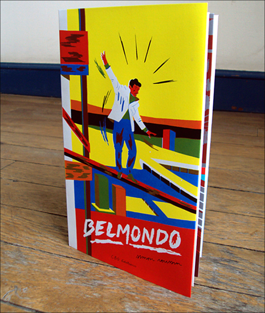
Above all, Roussin is an erudite cinephile who makes canny use of filmic genres and clichés. In a set of offbeat books with titles like Belmondo, Trintignant's Voice and Ciné-Club, he offers snapshots from Westerns, film noir and French cult classics. (In 2013, these "tributes" inspired the magazine So Film to give the artist a page of his own). Roussin has now launched a series calledCinérama that already features two books, Shangri-La and Coco-Fesse.
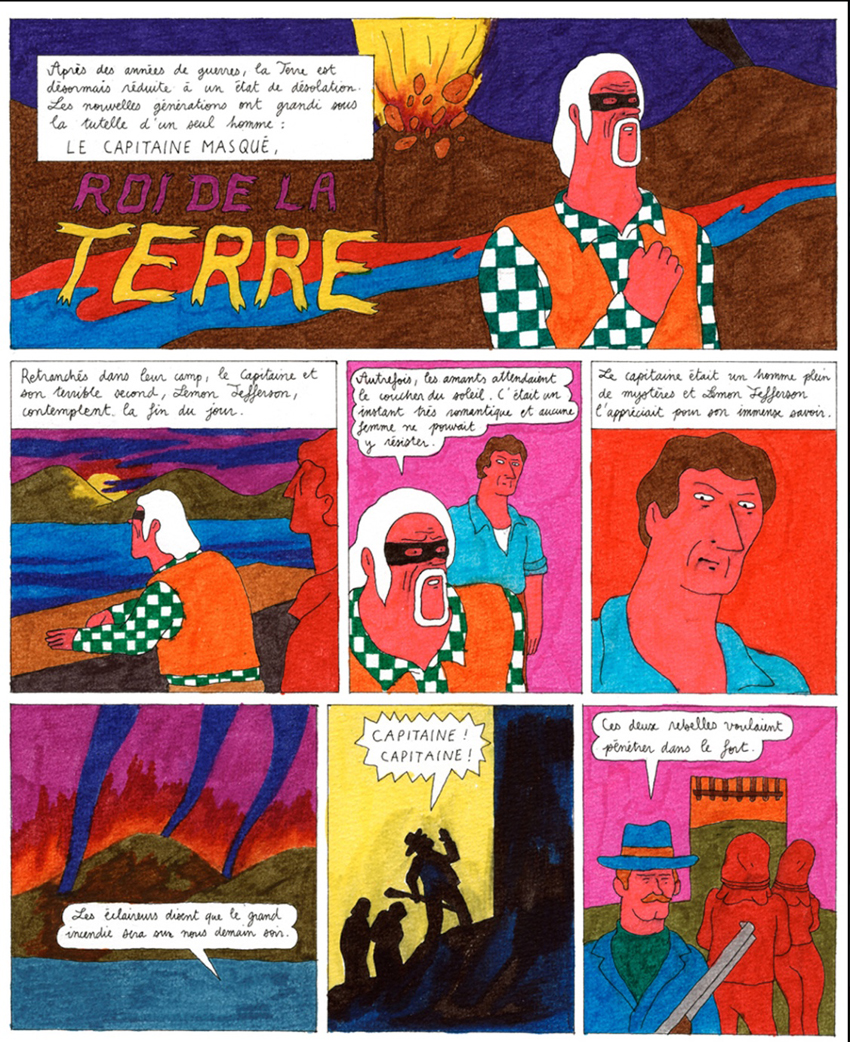
His work was first acclaimed for over-the-top colors, spectacular shades the artist achieved using felt-tip pens. French critics hailed his work with the markers as a kind of post-post-Modern ligne claire. In 2012, the flamboyant Lemon Jefferson et la grande aventure ("Lemon Jefferson and the Big Adventure") was nominated for the Grand Prize at Angoulême. Lemon was followed by the equally kaleidoscopic Le bandit au colt d'or ("Bandit with the Golden Gun"). But the same year Roussin published Heartbreak Valley – a sci-fi noir told in flat black, white and grey.
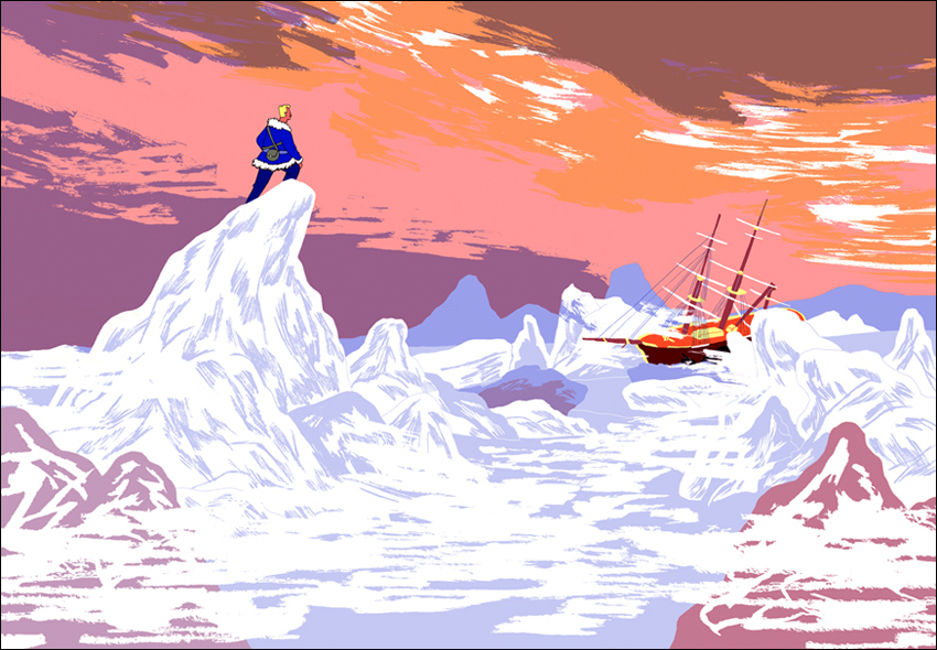
Next came the two-color Barthélémy, l'enfant sans âge ("Barthélémy the Ageless Child"). Barthélémy was like a "children's book" conceived by Herman Melville. Then, in 2016, Roussin changed direction – embarking on a three-volume series calledLes Ailes brisées ("Broken Wings"). It features epic tales of early aviation based in the history of the French Aéropostale.
From the end of World War I to 1933, the Aéropostale ran a Quixotic version of air mail. Staffed by war veterans and adventurers, the service aimed to connect France with her African and South American colonies. Except for the participation of Antoine St-Exupéry, the author of Le Petit Prince, most of their saga is now forgotten. But its ingredients – daring pilots, solitude and exotic places – fired Roussin's imagination. The first two volumes of this trio (Prisonnier des Glaces or "Prisoner of the Ice" in 2016) and Xibalba (in 2018), are enormous and absolutely beautiful books. Xibalba won its author a second Angoulême nomination.
Roussin's multi-layered talent hasn't come from nowhere. The artist spent three years in visual communications at L'Ecole superieure des arts appliques Alain Colas and another at Beaux-Arts Espinal (L'Ecole superiere d'art d'Epinal). The combination let him enter third-year illustration at the Arts Décoratifs de Strasbourg (now Haute école des arts du Rhin) – under its celebrated studio head Guillaume Dégé.[1] Dégé is responsible for shaping a host of well-known artists, names like Marion Fayolle, Lucie Larousse, Leon Maret, Matthias Malingrëy, Caroline Gamon, Alexis Beauclair, Julie Etrivert and Icinori (Mayumi Otero and Raphael Urwiller). He imbued them all with the importance of self-publishing, off-line learning and collective work. Roussin took these principles to heart. In 2009, with his classmates Marion Fayolle and Matthias Malingrëy, he founded a journal called Nyctalope.[2] The trio's little project had one surprising effect.
In 2013 a copy, bought as a souvenir, landed on a desk at the New York Times. That desk belonged to Alexandra Zsigmond, a commissioning editor on the paper's Opinion page. Fascinated by what she saw in the zine, Zsigmond contacted Dégé – and she began commissioning his students. Four years on, seventeen of them had published seventy-odd drawings in the Times. This feat was celebrated with an exhibition, Fit to Print, shown in both Manhattan and Strasbourg.
Like the young founders of publishers like L'Agrume, Editions Magnani and Editions 2024, these bédéistes and illustrators share a focus. Often as part of collectives like Troglodyte, they published graphzines and revues with names such as Vignette, Belles Illustrations and Gouffre. Although they share no overall trait or house style, all of them were, as Fayolle told Libération in 2017, determined "to go on working by hand".
No-one today is purely an artist or illustrator. He or she must also be a publicist, a networker, a secretary, a negotiator, a personal accountant and (most important of all) a digital dogsbody. In such a universe, saturated with redundant self-promotions, where is the time and space for nurturing personal projects?
I decided to ask Simon Roussin.

Cynthia Rose: Is it true that you've been doing comics since you were eight?
Simon Roussin: That's a little exaggerated. But it's true I've always wanted to be a cartoonist. Around eight, I started to trace and re-draw all my books, including everything I borrowed from the library. I started a series of stories with a recurring hero, "Ludo Flair", who I sent on different adventures. I especially liked police thrillers and, to get what I needed, I would recopy frames from all the books I knew – mainly Franco-Belgian classics from [Hergé's] Tintin to [Tibet's] Ric Hochet.
Much of what propels your visual interest comes from, on the one hand, cinema and, on the other, from those classic comics. Is that why all your work has real heroes rather than "protagonists"?
The cinema which really formed my perceptions was created from the 1950s to the 1980s – and it was mainly French and American films. Initially, I had a passion for actors like Steve McQueen, Belmondo, Paul Newman, Clint Eastwood and Lino Ventura. I would collect clippings and posters that featured them. Each of them, at some point, built a career around a certain fixed idea of their character… so any film in which Belmondo appeared became a film about "Belmondo". But I was also a big fan of Westerns and James Bond. All of those films featured the theme of a solitary hero who gets carried away on some adventure. It was the same in all in those Franco-Belgian comics I used to read in old Spirou magazines.
I read all those comics and watched those films without ever noticing the names of their authors. That came later, during my adolescence. What always attracted me was the principal character or the actor – that's probably the source of my attraction to the idea of a hero. But it's not to perpetuate the kind of figures that first attracted me, it's more about bringing that same sort of figure a personal resonance.

Early on, especially through Nyctalope, you were integrated into the working world of comics. How did Nyctalope come about?
Nyctalope is a review of narrative imagery, illustrations and comics. Initially, it was a class project co-ordinated by Marion Fayolle, Matthias Malingrëy and me. But it very soon became autonomous. We wanted to print and promote the work of our classmates, as well as that of illustrators whose work we liked – people who took an author-illustrator approach to serial imagery or to stories told in bandes dessinées. We wanted a way to experiment and propose things outside our courses, things that could help us later in our personal projects. Between 2009 to 2011, we printed four issues. After we left school, with the help of Editions Magnani, we produced one a year. The last issue, number 9, came out in January of 2017.
You collect articles and images about the cinema. What sort of things do you keep?
As a kid, I started to collect pictures and articles about film. My parents were big readers of Télérama and they recorded a lot of movies from TV. They would save those cassettes and slide articles about the films into the jackets. Those cuttings and photos of actors that I didn't yet know, plus the little yellow stars – the critical indicators of a quality film – all that really intrigued me. So when I'd seen the films, I archived all those papers into a binder I divided by actors, directors, genres and decades. I did that over quite a few years. Recently I had to part with most of those old folders, just because I needed space. But I kept a few files of articles I can use if I want to remember a movie or re-draw a photo.
My archiving system now is a little different; I collect screenshots of films that I can reuse, either for an illustration series or in paintings. Between 2013 and 2014, I also had that collaboration with So Film. They gave me a weekly column about a single film – movies that were often re-issues. Later, I got my own page at the end of the magazine, where I was given carte blanche. I might, for instance, make a list of movie moments by category… stuff like "death scenes", "swimsuits" or "Clint Eastwood's wounds".

Many of your first notices focused around ligne claire. Were you really attracted to that style, that kind of encircled, contained visual unity?
A lot of people mention ligne claire when they talk about my work. But that term has become kind of hackneyed; I'm not sure it even means much anymore. With my own drawing I feel like it was more self-enclosed at the start. But, more and more, it's opened out. In any case, I never aimed for some pastiche of ligne claire – I wasn't trying to reproduce any pre-existing style. But my first books were constructed in reference to my childhood reading, to those Franco-Belgian classics. I was drawn to that type of drawing, but I tried to make it more personal and more contemporary, by using the felt-tips – as well as by the choice of two and three-color printing. In the end, what I learned from ligne claire, and what I strive for, is just the idea that drawing needs to serve the story. That there should be no frills, no too-visible effects… just a simple and transparent composition.

Do you have any feeling you're a descendant in that "family", that linked group of Alain Saint-Ogan, Hergé, E.P. Jacobs, Yves Chaland, etc.?
Only in that all those writers have marked me and that, at some point along my way, each one somehow contributed. I always read their books and I'm still fascinated by Hergé and Chaland. But also I admire plenty of auteurs who had nothing to do with ligne claire. The Americans Milton Caniff, Lee Falk and Kirby, for instance, then [Belgians] Tillieux, Macherot, Peyo and Will, to name just a few of my vintage favourites…
You've always produced a wide range of personal projects. First, there was Nyctalope. Then your mini-works about the cinema: Steve McQueen, Belmondo, Trintignant's Voice, etc. Now, you've done the Cinérama series (Coco-Fesse[3] and Shangri-La). Also you've published oil paintings on movie themes as L'été indien ("Indian Summer"). How do all these projects work?
Those book projects take up more and more of my time. I can't devote myself to them one hundred percent; they have to be offset by commercial commissions. But when I'm spending several years on a book, I always feel the urge to develop smaller projects in parallel. I always liked serigraphy so, early in my studies, I made sure I learned to work with those techniques. Even with imagery intended for offset printing, I made a habit of working with limited colors and using overlays.
Making small, self-published books using serigraphy gives me a much, much shorter working time. Usually I allot myself a month for research (at the same time as my other work, of course), two months to realize all my images and then two or three weeks to print and assemble everything. This lets me participate in every stage of a book. I can pay close attention to its shape as an object, to its format and to all the colors. These books about the cinema let me share my enthusiasm for certain films, directors and actors. But they're also a way to try out fresh forms and techniques.
My little series of oil paintings came out of that same desire, to find a space for experimentation separate from commissions or bigger book projects. That book Indian Summer, for example, came from a request by Marseille's Studio Fotokino. Fotokino wanted to show my work in autumn 2017. But I wanted to exhibit something really new. So I started trying to do paintings in oils. I knew nothing at all about those techniques and found them intimidating; it took a long time before I was really won over. But now I've continued to make these little paintings. Sometimes they're for exhibitions but they're often just for me. That was the first time I ever worked on images that weren't meant to be printed, which alters quite a lot. The whole discovery of painting also changed the way I draw, which is bound to have an effect on projects yet to come.

You've used a lot of media: felt-tip pens, monochromes, oils, silkscreen prints… it seems like each project has imposed a particular method. What's the relationship between project and technique?
Whenever I start a project, I take the time to discover what kind of drawing technique it needs. Felt-tips aren't right for everything, nor is black-and-white, nor is flat color. My first comics were pretty naïve; they were attempts at rediscovering the old-fashioned stories I read as a child…so they had little subtext. For those reasons, felt-tip markers seemed an obvious choice. But, later, when I used the markers for Bandit with the Golden Gun and for the images that appeared as Ciné-Club, I chose the felt-tips to explore all their possibilities. Today, I still feel I could go back to them. In all the books since Barthélémy, too, I've use two or three-color printing. Again, that comes from serigraphy and also from the old comics which were printed with screens using two or three colors.
What place does the computer hold for you? Do you ever work digitally? Is the "social" side of the internet important for you?
I do use a computer at the coloring stage. But I always begin with a drawing on paper. I use flat digital tints in my coloring, but I also use the textures of felt-tips, markers, painting and screens. I scan all of those and then rework it digitally. As far as social networks, they've become unavoidable but I use them moderately. I share images on Instagram just because it's the simplest way to show your work in real time. Also I like to follow or discover work by other illustrators. But I have inner conflicts about the idea of self-promotion; it's not something I'm very comfortable with. So I try and do the minimum.

Your work appeals to our collective imagination. A reader has the sensation of seeing situations and characters he somehow already knows: the kind of hero, the woman-in-danger, the fantastic universe… But you always add new elements and disrupt our expectations. In Broken Wings, for instance, the landscape itself evolves and starts to become almost abstract. Through these departures, you turn what seems like a "classic formula" into something else. Am I wrong to think this?
No, that's the kind of direction I'm trying to take. It interests me a lot to start from archetypes, the kinds of figures pre-supposed by an adventure story. But when people like R. L. Stevenson, Maurice Leblanc, Howard Hawks and Raoul Walsh were there before me, how do I make a story like that which will work today? To breathe life into these formulae, which have their own set of intimate concerns and their own recurring motifs – deceptions, losses, doppelgangers, etc… That lets me evolve a universe and forge my own approach.
I'm not really interested in all the twists and turns as such. I'm more focused on what exists in between them. My interest lies with the characters and how they face consequences. Also I've become more and more interested in the actual staging, the composition and the rhythm between the frames. I'm focused on my characters' singularity, how they develop. For Xibalba, I wanted to start with these very codified characters and have them evolve according to their actions and the path of their thinking. I wanted the reader to see them doubting, being mistaken and changing their minds. But I also wanted that to happen within an exotic narrative… something that – normally – the reader would expect to move quickly and in a very straight line.
You enjoy everything that goes into making elegant books. But the two volumes of Broken Wings (Prisoner of the Ice and Xibalba) are really magnificent. How were they created?
The question of every book's format, its techniques and printing, its cover, everything up to and including the price – that's discussed all along with my editors. We start out talking about our general aims and desires, about the book's pagination, format and techniques….not to mention the actual story. Then, together, we find the forms best suited to meeting those projections. With Xibalba, for example, we found a very particular paper – really thin but also light and highly resistant. But we discovered that right at the end of the process, just before the book was printed. Prisoner of the Ice came from an in-house idea at Editions 2024. They wanted to launch a new collection of big books, volumes 30 by 40 cm printed with spot color. They felt I might enjoy that kind of project, because of the space it would give me to experiment…to handle big, silent landscapes in a really large format. So I started writing these stories about airmen, I began to document the Aréopostale and read up on polar exploration. I put aside the writing of what would later become Xibalba so I could throw myself into Prisoner of the Ice.
Tell me about Ciné-Club (a 2015 volume of favourite moments in film) and about the new Cinérama series: Shangri-La (#1), and Coco-Fesse (#2).
Right out of art school, I had this series of felt-tip drawings of movie scenes, just little moments which stuck in my memory. I like watching the same film several times or going through it like I was flipping through a book, to find a certain set-up or dialogue or scene. Some of these drawings were published in a magazine called Le Tigre. Then, in 2015, Editions Magnani brought them out as Ciné-Club. I still keep an inventory, little things I want to hang onto from movies I've seen. For example, in Palombella Rossa ("Red Wood Pigeon"), Nanni Moretti driving – "Mamaaa!" – or him in his football jersey. Maybe the final shot of Josef von Sternberg's Anatahan ("The Saga of Anatahan"). The moment in Brian de Palma's The Fury where Kirk Douglas jumps on the roof in his boxers and the end of the film, where John Cassavetes explodes. Or, in Peter Bogdanovich's They All Laughed, just Ben Gazzara in the street at night with Audrey Hepburn.
My inventory helps me imagine books like Shangri-La and Coco-Fesse. For each of those, I start by extracting a theme. I'll identify thirty or so films per book that seem to respond to my chosen themes, films which can overlap, go hand-in-hand with one another. In Shangri-La, the themes are memory, recollection and mourning; Coco-Fesse deals more with childhood, views about love and a raunchy, macho humor. But it's really only me who can see these themes. They're keys to help me create a sort of silent narrative but they're not the kind of thing that's going to interrupt or irritate a reader. They just provide a link between my images and the films they invoke.
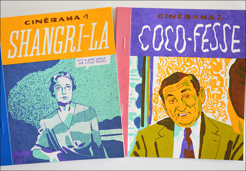
For me, these books are a chance to experiment, to discover new ways of constructing pages and images. They also help me understand color and printing better. I start out with originals on paper: some sketches, some outlines drawn in ink or with felt-tip markers or, sometimes, paintings. The books are printed in three colors, bound flat and stapled and then the backs are bound with colored adhesive tape. They're editions of 150 that I distribute directly through a set of bookstores I know really well. It's a collection I want to continue, so I can find new combinations of color and new formats.

Some of the readers here are working cartoonists and others aspire to be. Could you say a bit about the realities of that life? For example, how do you finance all your self-publishing?
When I left art school, I made a choice: I decided to do my books with independent publishers and counterbalance that by doing commercial illustration. In order to live, I do illustrations for the press, art work for cultural groups, posters, etc. That doesn't give me too much room to try new things but it has sometimes given me solutions for my own books. For example, it was through a commission to illustrate volcanoes that I developed my technique of mixing felt-tip marker and flat digital tints. That was something I went on to use in Prisoner of the Ice.
Two of my regular publishers, Magnani and 2024, started out around the same time as I did. [Editions Magnani was founded in 2011 by Julien Magnani, a graduate of Ecole Estienne, Editions 2024 by Olivier Bron and Simon Liberman, also illustration graduates from Strasbourg's Arts-Décoratifs]. Together, our story is one of fidelity; we have a commitment to keep on making books together. But it's also a political decision: the publishing landscape we have entered is one that's totally oversubscribed and dominated by very big publishers. Together, we're proposing more than books that are just a bit different. We're also trying to support the work of new authors and to honor all the stages – and the different talents – that contribute to making great books.
- To order copies of Shangri-La (Cinérama 1) or Coco-Fesse (Cinérama 2), contact Simon Roussin directly. Prints taken from some of his books are also available through the online store of Paris' Arts Factory

[1] Opposed to a reorganization that, among other things, shrank the number of illustration students, Dégé resigned his post at HEAR in 2018.
[2] Although in English nyctalope means someone who is "night-blind", in French it denotes someone with night vision ]
[3] The suggestively shaped "Coco-Fesse" ("sea coconut") resembles a pair of human buttocks seen from behind. One of Roussin's pages shows actor Gerard Jugnot holding one up. This moment comes from a 1983 film, La Fiancée qui venait du froid ("The Fiancée Who Came in from the Cold"). But Jugnot was part of a legendary comedy troupe, Le Splendid, famous for cult comedies like 1978's Les Bronzés ("French Fried Vacation") and their 1979 play Le Père Noël est une ordure ("Santa Claus Is a Stinker"), filmed in 1982.


