On June 23, 2013, at the website whatifkirby.com, Tom Kraft posted some terrific examples of mid-1960s Jack Kirby pencils under the heading of “Thor Pencil Photocopies, Part III.” The scans are part of the Jack Kirby Museum Digital Archive project. These pages are incredibly rare, there are only a handful of 60s Marvel Kirby pencil photocopies like this where we can see Jack’s work before it was inked with the margin notes intact, so let’s take a look at a few pages from The Mighty Thor # 166 (July 1969).

Before we begin, it’s important to note that these are Photostats, so they’ve lost a lot of the subtlety you would have seen in Jack’s original pencils. For example here is a black and white photograph of an unpublished page from the Silver Surfer graphic novel (1976).
You can see the image is fairly dark with lots of contrast despite being done in pencil; some of that quality is lost in the stats below. We’re basically looking at ghost images of Jack’s original pencils where the Photostat machine is picking up the darker lines and the lighter grays are lost, but we can still see a tremendous amount of detail.
In this story, Thor had just battled a character called “Him.” The character debuted in Fantastic Four # 66 and 67 (Sept - Oct 1967). Then he appeared in Thor #165 and 166 (Jun - July 1969). As you will see in his directions for Stan Lee at the bottom of page 16, Jack called the character “Cocoon-Man.” In this story Thor had just defeated “Him,” or at least a stalemate had been reached. “Him” encased himself in a cosmic cocoon and jettisoned himself into space. That is where the story picks up.
Thor 166, page 16

Thor 166, page 16, panel 1

Jack’s directions for Stan Lee: “In space – he drifts helplessly – (?) from battle.”
Lee’s dialogue mirrors Jack’s notes: Lee has off-panel captions that emphasize the cocoon is drifting through space. If you look closely at the image, note the wealth of detail in the background. Jack spent a lot of time adding all the cosmic energy to his outer space vistas. Crackling supernovas, explosive horizons, hundreds of planets and stars. In many ways Jack imagined the Universe as the Hubble telescope would capture it -- an infinite array of galaxies glowing brightly, pulsating suns, swirling clouds of stars, some being born, some dying. That powerful almost psychedelic backdrop added a richness and power to Kirby’s so-called cosmic work.
Here is a spectacular image of a large magellanic cloud taken by the Hubble telescope in 2008 (NASA).

Here's an image from 2007 of an extreme star cluster being born (NASA).

Thor 166, page 16, panel 2

Jack’s directions for Stan Lee are a continuation from panel 1: “Until he is lost to sight among galaxies.”
Stan chooses to add that the cocoon will drift until it “doth open once again.” Again, Kirby gives us a remarkable cosmic outer space scene charged with intergalactic energy and hundreds of planetoids all with shading suggesting a light source from above.
Thor 166, page 16, panel 3
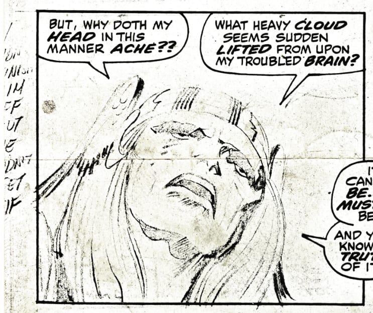
Jack’s directions for Stan Lee: we can’t make out Jack’s notes here, but you can see he wrote at least 9 words, there may have been a few more, so pretty safe to assume Jack had some thoughts on what Thor’s thought-process would be in this panel.
Lee’s dialogue has Thor proclaim that his head aches, then a cloud has been lifted from his brain. Lee’s transition between panels is what I’ll call Lee “soap operatic” dialogue. Thor exclaims, “It cannot be… it must not be… and yet, I know the truth of it…” This is standard 60s Lee superhero-talking-out-loud between action panels to fill in the word balloons over Jack's artwork -- nothing contributing to character, simply filling space with text.
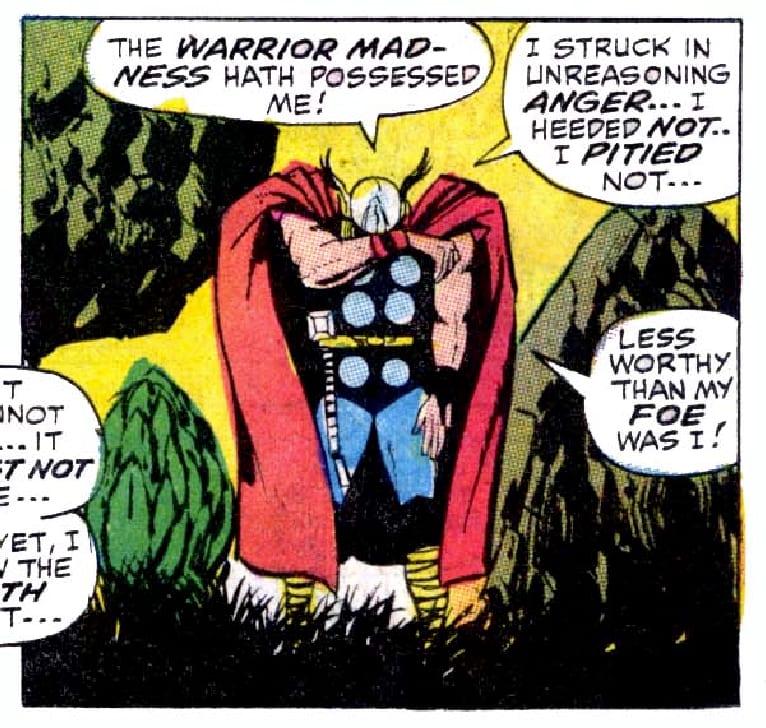
Thor 166, page 16, panel 4

Jack’s directions for Stan Lee: those notes have also been cut off. At least 5 partial words are there.
Stan has Thor realize that the “warrior madness” had possessed him; he had struck an enemy in anger without pity, therefore was a less worthy foe than his antagonist. Thor’s body language suggests regret, so chances are that either regret or exhaustion were Jack’s themes for this panel.
Thor 166, page 16, panel 5
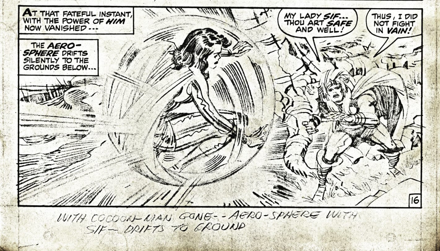
Jack’s directions for Stan Lee: “With Cocoon-Man gone – aero-sphere with Sif – drifts to ground.”
Stan’s caption follows Jack’s directions almost verbatim: “The aero-sphere drifts silently to the ground below.” The concept of the aero-sphere is just one example of how not just Jack’s ideas and visual depictions of ideas influenced Lee's text, but in many cases the actual terminology Kirby used to describe those ideas made it into Lee's text. All of those crazy names for characters and concepts is one of the things that made these 60s Marvel stories so successful, and as we see here -- there is a strong chance many of those ideas like the "aero-sphere" came from Kirby in the preliminary phase of the process where Jack was what I call the “Principal Author” of the stories; Lee simply copied what Jack wrote in the margins in the next phase as the “Secondary Author.” In this case, “transcriber” might be a more accurate designation.
Here is a document from 1966 many of you may not have seen before, forwarded to me by a reader that adds further evidence to the theory that Kirby was the Principal (or Primary) Author of his 60s stories. Thanks to Sean Howe, the author of Marvel Comics: The Untold Story, for unearthing these documents and for sending me the best scans he had of them. You can see this is a letter from Denny O'Neil addressed to a Marvel fan. The pencil art scan is page 2 from Fantastic Four # 47 (Feb 1966). There's much to discuss in the letter, but the section I want to call your attention to is the part where O'Neil writes: "The notes in the margins are Jack's -- he actually plots the story as he draws it after an initial, and usually brief, plot conference with our leader. From the marginal comments, Stan does the script." It would be interesing to know whether O'Neil ever actually saw Lee and Kirby meet for a story conference, and how much of Lee's ideas made it into Kirby's final story. Or by this time in 1966 where both men rarely met F2F, was this "brief plot conference" anecdote more urban legend than fact? It does appear pretty clear from this letter that O'Neil did believe Kirby was writing the story as he illustrated it, and that is what the evidence I've looked at over the years suggests as well. "Kirby plots the story as he draws it." Kirby develops important story elements panel-by-panel as he does the illustrations. Here are the documents:


Moving on with Jack's Thor story, Lee has Thor proclaim Sif is safe, and he did not fight in vain. Notice the beautiful energy Jack’s famous “squiggles” give Sif’s armor. Jack’s depiction of metal makes it look charged with lightning bolts, like it’s liquid mercury.

Thor 166, page 17

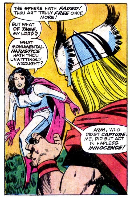
Thor 166, page 17, panel 1

Jack’s directions for Stan Lee: “Then sphere vanishes – Thor goes to Sif.”
Lee’s first caption mirrors Kirby’s directions. Thor says, “The sphere hath faded! Thou art truly free once more.”
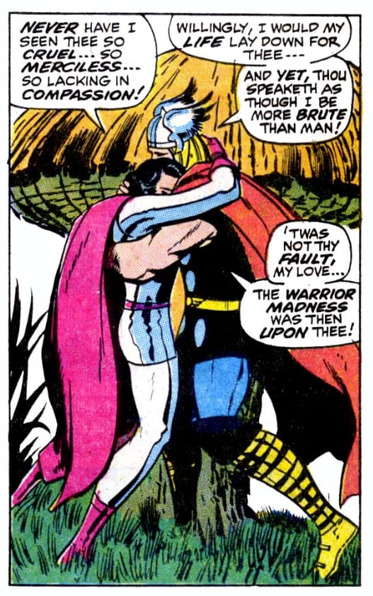
Thor 166, page 17, panel 2

Jack’s directions for Stan Lee: “Now they realize what they mean to each other.”
Not much in terms of characterization in Jack’s notes, so again, Lee had to add something to this panel, and he chooses to continue with the theme that Sif is angry, and she continues her rant saying she feels Thor had been “cruel,” and “merciless,” and “lacking in compassion.” Thor tells Sif it wasn’t his fault, it was the “warrior madness” that had been upon him. One wonders how Jack would have added dialogue to this scene. He seems to suggest in his margin notes this was a simple reunion where the two lovers realize how much they missed each other and need each other; it is a quiet, romantic scene -- a gentle hug. Lee's captions don't reflect the tenderness in Jack's image: as they embrace sweetly, Lee has Sif continue to berate Thor. Lee’s approach suggests a bit of a rift between the two: Sif being very critical of Thor, Thor making excuses. Either way, this is simply Jack rolling ahead with the story. Sif is free, she is back with Thor; Lee has to fill in the captions with something, and that is what he did. The story forges ahead.
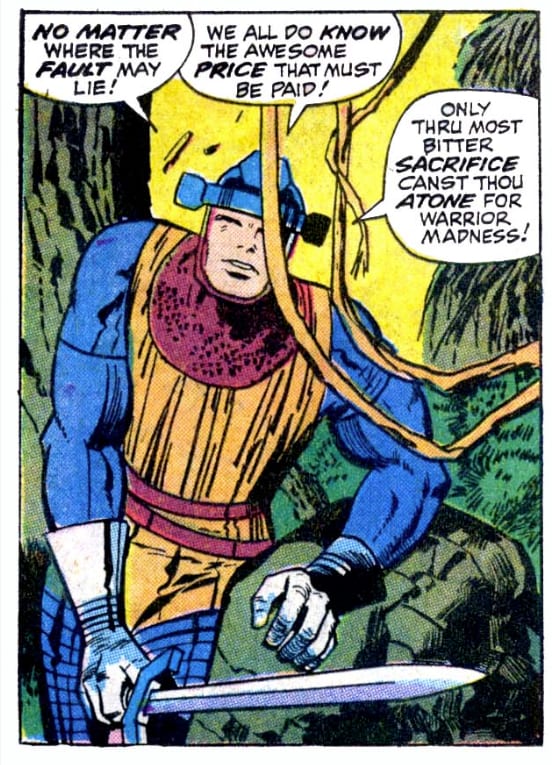
Thor 166, page 17, panel 3

Jack’s directions for Stan Lee: “Balder suddenly comes on scene – with Cocoon-Man gone – he was able to hack away at weakened roots.”
Lee’s text continues the theme of the “warrior madness” in Balder’s earlier captions.
Thor 166, page 17, panel 4

Jack’s directions for Stan Lee: “Altho’ weak, Balder says to Thor – you know that you had the warrior madness.”
Lee’s caption mirrors Jack’s directions in panel 3 where Thor says Balder has hacked himself to freedom. It appears that Lee, after reading Jack’s story first, in the captioning phase decided to emphasize this concept Jack presents in the margins of panel 4 of the “warrior madness” in the previous panels. Did Lee do this because he thought it added to the previous panels -- maybe he thought this was a powerful concept, or maybe it was simply a great way to fill the captions? Regardless, we see here, once again, virtually every single concept and theme in these stories appears in Jack’s margin notes. The concept of the “warrior madness" is in Jack’s directions for panel 4; Lee makes it the main theme of the entire page. And remember we can’t read the notes for page 166, panels 3 and 4, so Jack may have given Lee further instructions that made it into the captions.
Thor 166, page 18

Thor 166, page 18, panel 1
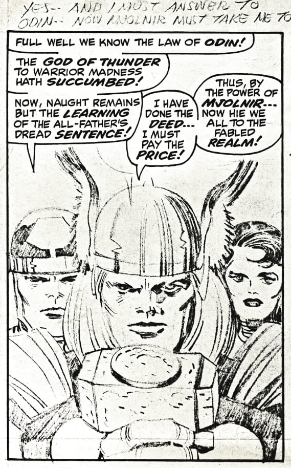
Jack’s directions for Stan Lee: “Yes, and I must answer to Odin – Now Mjolnir must take me to him.”
Lee’s text mirrors Jack’s directions, Balder proclaims there will be consequences from Odin because Thor succumbed to the warrior madness, and Lee has Thor add that his hammer, Mjolnir will take him there. This is all from Jack’s directions.
Thor 166, page 18, panel 2

Jack’s directions for Stan Lee: “On Asgard, Odin is ushered into Builder’s area – where they’ve been working on (?).” You can see Jack’s words trail off there, he’s running out of room on the page to give Lee directions.
This is a great example of Jack giving you a terrific cut, switching to another scene, the close-up of the trumpeter in armor heralding the arrival of Odin who we see in the background walking towards the reader. Lee’s captions provide a smooth transition.
Thor 166, page 18, panel 3
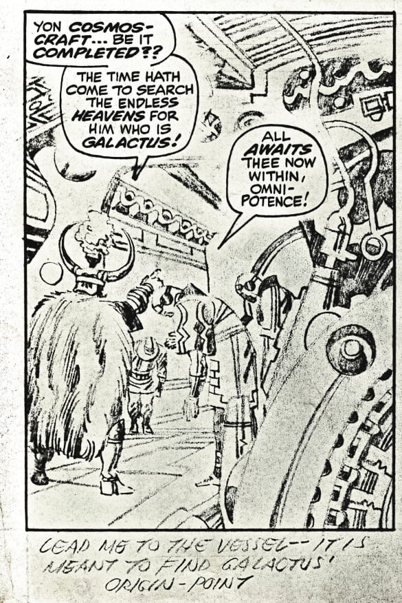
Jack’s directions for Stan Lee: “Lead me to the vessel – it is meant to find Galactus’ origin point.”
I think it’s interesting to note that Jack knew to put the apostrophe after the “s” in Galactus and he took the time to do so. I don’t want to read too much into that but I can tell you from working with hundreds of students at the University of Central Florida Writing Center when I was a graduate writing consultant back in the early 2000s, I can’t recall any students who knew how to do something like that. Part of it is that students are slowly losing basic writing skills, but I do think it requires a certain level of sophistication as a writer to know basic rules of grammar, like when to add a apostrophe after an "s." Again, I don’t want to make too much of this, most folks born in the depression era may have had much better writing skills than a lot of people today, but I do want to emphasize: Jack Kirby was a writer. Jack had been a published writer in comics since the 1930s. He was also a solid editor and he knew how to use the English language and make it ready for publication. Jack was not The Thing character from FF only capable of street smart wise-cracks. Even though his directions for Stan Lee are brief and conversational in these '60s pages that survive, we need to remember Jack was not just a penciller, he was an accomplished comics author.
Also consider the momentum of Jack’s stories. In just a page and a half, we’ve gone from Thor defeating Him (Cocoon-Man), accepting that he is probably facing punishment from Odin for succumbing to the warrior madness, now Odin is running around directing his minions to find Galactus. This is classic '60s comics, and you’d be hard pressed to find anyone in comics or cinema capable of creating such freewheeling stories today that top what Kirby was cranking out in the 1960s. Maybe modern cartoonists and filmmakers can equal Kirby with new technologies, but it would be hard to top him.
Lee’s captions here mirror Jack’s directions. Odin is searching for Galactus. Lee calls the vessel a “cosmos craft.” This appears to be a Lee contribution to the story, but as we saw in the last page we examined, we’d have to read the margins for the whole book to know -- Jack may have called it a “cosmos craft” later in the story and Lee inserted the concept here or maybe Jack called it something else. This is something Lee would sometimes do in these stories, he would give certain concepts or certain characters or ideas new names; as we saw, he called Jack’s “Cocoon-Man” by the name of “Him.” Eventually Marvel turned the character into Adam Warlock, and who knows what other elements have been added or will be added to Kirby’s original “Cocoon-Man” concept. Based on my experience looking at Jack's original artwork, Lee tends to use the names Jack provides in the margins unless they are generic like the term "vessel."
Thor 166, page 18, panel 4
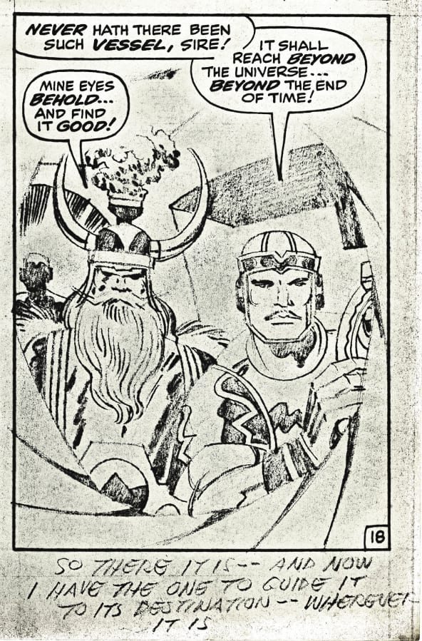
Jack’s directions for Stan Lee: “So there it is – and now I have the one to guide it to it’s destination – wherever it is.”
Lee’s caption for Odin's soldier mirrors Jack’s directions in the previous panel where Kirby called the machine a “vessel.” Odin then goes on to say, “Mine eyes behold – and find it good!” Here is one final page from the book that was at the whatifkirby site.
Thor 166, page 19
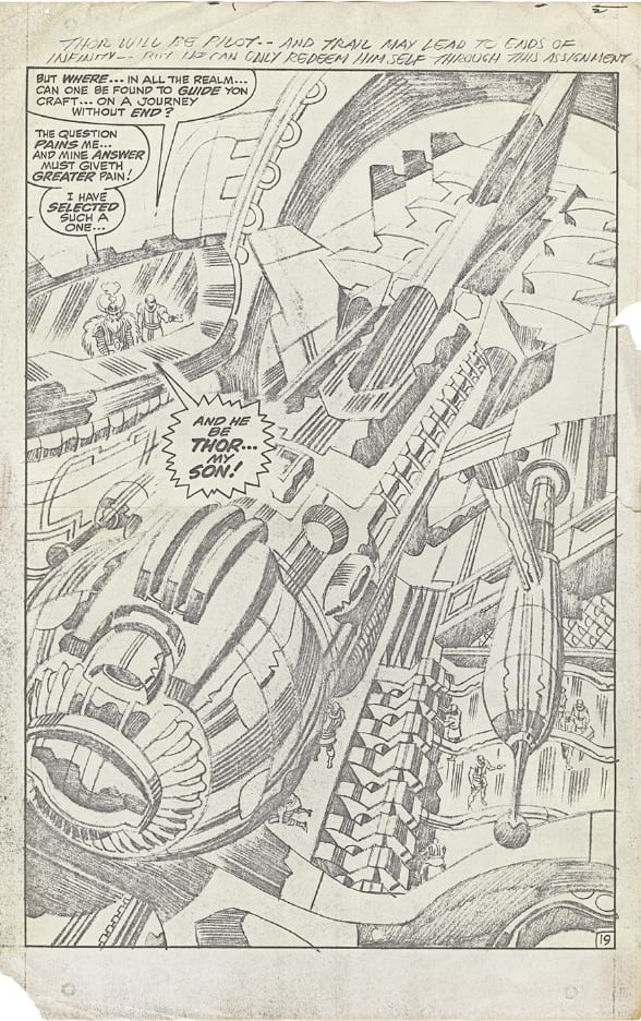
Jack’s directions for Stan Lee: “Thor will be pilot -- and trail may lead to ends of infinity – but he can only redeem himself through this assignment.”
I find this text by Kirby is a great example of brevity and clarity. It’s ironic because many comics fans over the years have claimed that maybe Stan Lee gave Jack Kirby a brief plot for a story like this. And he may have, we will probably never know for sure. But if Lee had given Kirby a plot, it probably would have been something like this: a simple one or two sentence assignment where Kirby was then supposedly allowed to add an idea or two to the Lee story. But ironically, here, for just this one page, Jack has given Lee a plot. Thor is going to pilot this remarkable Kirby contraption that may lead him to the edge of infinity, and only through that journey can he be redeemed.
Lee’s dialogue is anti-climactic. The Odin minion clearly isn’t very bright, and he asks mighty Odin, where in the realm could one find someone who could guide such a craft? Duh. Does Odin have any ideas? He does. And although it pains Odin, he screams in a caption that fills a huge part of the page, “And he be Thor… my son!” Definitely an opportunity lost by Lee here to use his job as the caption writer to add to the grandeur of this spectacular Kirby masterpiece of penciled technology. To me, this stands up with any great painting by any of our iconic “fine” a-list artists. You could easily hang this next to a Picasso from his cubism phase in any Museum on Earth and I suspect it might generate just as much discussion.
Jack did not need to put that much detail into a piece like this. A few very simple lines would have given his inker Vince Colletta enough to go on. So why did Kirby pack so much detail into an image like this, using thousands of pencil lines to provide shading for the illustration, especially considering he worked under such crushing deadlines cranking out an average of three entire comic books a month? I suspect that Jack Kirby was very passionate about his work. I think he was a perfectionist, and I think he enjoyed illustrating a page like this. He was finding the image throughout the illustration process, experimenting, and interestingly that quest for perfection is similar to the journey Jack talks about in his directions for Stan Lee on this page: the "trail may lead to ends of infinity – but he can only redeem himself through this assignment.” And that's what many artists do, yes they make a living if they are lucky plying their craft, but the process of creating imagery on a blank page can be an adventure into your own imagination and a great excuse to study history and art.
I wanted to focus on Jack's story and art which Lee then added the captions to (what Stan Lee called “Marvel Method”) in the first half of this article, so I didn’t show any of images of the published art. Showing the penciled panels again here may be a bit redundant, but I want to compare them to the published work inked by Vince Colletta.
Thor 166, page 16 (published)

Thor 166, page 16, panel 1

Colletta captures Jack’s composition here, and ultimately that was his job -- to make Jack’s pencils ready for publication, but Colletta has really obscured a lot of Jack’s energy in this panel. The bursts of those planets are gone, all the crackle is gone. It's a black background with some dots and a few starbursts. Over the years there has been much debate as to why Colletta did this. Did he think he improved Jack’s art by simplifying it? Or was he an inferior craftsman and lacked the ability to do detailed, complex imagery? My theory is that Vinnie was built for speed. That was his style: fast. Colletta could do a book in a week or a weekend, and it would look about the same. His style was haste. He cranked the pages out as fast as humanly possible and that meant you’d have a loss of detail on virtually every single panel. I think that’s what you see here. It takes time to use a straight edge to perfectly delineate all those speed-line bursts. It takes time to use a circle template to capture all those planets perfectly. It’s easier just to draw a few circles, splash down some black, then use white-out to add a few dots. Jack would have been better off drawing the cocoon and just adding an “x” for outer space, leaving it up to Vinnie to add a few circles, because you can see, other than embellishing the basic composition of the image, Colletta did not ink most of Jack’s background details. I also find the coloring of this panel bland, with all the orange planets. At least there are a few green ones for variety: oranges and limes. This panel could have been supercharged with color and energy, but the colorist was probably also in a mad rush to crank this out, so what we have here is a classic piece of 60' scomics-making, it is a piece of art that has a strong composition, but it has been heavily filtered along the way, the inks and color not necessarily enhancing it’s original potential impact.
Thor 166, page 16, panel 2

Again Vinnie gives us Jack’s basic composition, but it looks like he ignores 90% of Jack’s background detail. It looks to me that Vinnie simply colored most of this background in black, and then added some dots with white-out. Don't Jack's pencils seem to glow? There is fire and energy all over that panel. Colletta's version is generic, almost bleak. Again, boring colors, all yellow with a bit of green to depict outer space.
Thor 166, page 16, panel 3

This is very close to Jack’s original drawing. You can see Colletta tends to soften Kirby’s hard edges a bit. Jack’s Thor looks almost carved out of granite. Colletta makes him look a bit more like a character from a Marvel romance comic. But this did work. the books sold, so you can't fault Colletta for his technique on a panel like this.
Thor 166, page 16, panel 4
Notice Vinnie just makes the grass black. There is a tremendous amount of detail in the left side of the Kirby penciled image that is just gone; Vinnie turns it into a rock. It’s as if in every single panel Vinnie seemed like he would try and get rid of maybe 20% of the detail. Maybe that would shave an hour or so off of his workload every day.
Thor 166, page 16, panel 5

You can see Vinnie does delineate the tree, but I think his scratchy style takes away from the dynamism of Jack’s original pencils. The coloring on this whole page is atrocious. I get that this is 60s comics coloring, but this is a really masterful comics page, and the inks and coloring do not do it justice.
For the next 4 panels, not much to add. Colletta does his job here, he inks what Jack gave him. I’m not a fan of the way he softens Jack’s hard edges, but at least he is giving us most of the detail that Jack put into the pencil work, and you would think that is what an inker should do, at the very least. Jack put several hours into creating these illustrations; you would hope an inker with integrity would do his or her best to translate that artist’s vision.
Thor 166, page 17 (published)

Thor 166, page 17, panel 1
Thor 166, page 17, panel 2
Thor 166, page 17, panel 3
Thor 166, page 17, panel 4

Thor 166, page 18 (published)

Thor 166, page 18, panel 1

This is another example of how I think Vinnie softens Jack’s work a great deal, Kirby’s pencils have so much more strength and power, Colletta makes them seem a bit more generic, but that is the nature of the penciler/inker collaboration. Balder looks much more angry and determined in Kirby's image, notice how Colletta totally changes Sif's face, especially the lips.


This is Vinnie’s style, and although I’m personally not a fan of it, you can’t fault him for working in his own style. Plus the books were very successful, Colletta gave the Kirby line of books a bit of variety when compared with the books inked by Sinnott or other inkers like Stone or Giacoia, and clearly Lee was happy with Colletta’s work. And Kirby may have also been satisfied, although one wonders why he would pack in so much background detail if he knew Colletta was either obscuring or deleting so much of it. Jack may have simply been too busy to look at the published books or he wanted to spare himself the Lee pseudo-Shakespearean Thor dialogue.
Thor 166, page 18, panel 2

As you can see Vinnie eliminates a character holding a shield on the left, and all that background detail on the right is gone.


I can think of no other logical reason to do this other than wanting to save time. And these omissions do hurt the final image, and really the overall composition of the page. There was a tremendous amount of energy in those lost details and it adds to the illusion that Asgard is a real place packed with people and extraordinary architecture. Do Vinnie’s crimes of omission hurt the story? I’d say no, but there is no question in my mind that Jack’s uniked pencils with all those details intact are a lot more dynamic than Colletta’s distilled version. You do still have maybe 90% of Jack’s vision making it through the process in these stories, so it seems almost nit-picky to complain, but for the purposes of this article, I do think the deletions by Colletta are noteworthy, at the very least for the fact that they make zero sense.
Thor 166, page 18, panel 3

Massive amount of detail eradicated from this Kirby image. Two bowing soldiers... gone. That wonderful swirling Kirby-tech in the right is gone.


The circle to the left of Odin is gone. Vinnie doesn't follow Jack's pencils for the floor which gave you more of an illusion that the floor panels are receding into the background. Details are missing from all the machines and Vinnie adds new details not in Jack's original drawing. The panel has been Colletta-ized. Sanitized of important details. Mainly, now instead of standing before a crew of acolytes, Odin stands in front of one lone guy, like a master ranting at a servant. So Vinnie has changed the scene a bit here. It doesn’t hurt the overall story, but this is an unnecessary change, and the only reason I can think of for it is that it saved Vinnie time.
Thor 166, page 18, panel 4

Here is an example where Colletta embellished Jack's original composition for the most part, but again he softens some of Jack's sharpness. Notice the two zig-zags on the shoulder of the costume, in Jack's version you have more triangular lines -- it's almost as if Jack's sharp turns become smooth curves in Colletta's hands. Jack's pencils have a more technological feel, almost as if this is some kind of armor. And you can see how the shading on the hand is much different than Jack's pencils.
The final thing to add is that the coloring on this page is once again a disappointment. The guy blowing the horn is in all blue, then all the Kirby-tech in the other panels is in the same blue. It looks like the colorist was in just as much of a hurry as Vinnie was, and I guess that’s understandable. These folks were just cranking out disposable junk for kids, they had no idea anyone would take a close look at this in the future. And let's face it, this is classic '60s Marvel comics, the weird coloring and slapdash nature of the books gave the books from that era part of their charm.
Here’s the final page for today.
Thor 166, page 19

You have a few people missing off to the right, but for the most part, Colletta nails this. Jack’s unpublished pencils of this image blow away the published version. Glad they survived so we could get this rare glimpse into the process.
That's it for today. To wrap up this edition of Jack Kirby: Behind the Lines, here is another one of Jack's great World War II covers. Foxhole # 3, (Feb 1955). Hard to believe comics used to only be a dime. It's important to remember, this was not an artist trying to depict what war would have been like, this is an artist who experienced real combat. As most of you know, Jack was very lucky he didn't have both of his feet amputated during the war. I think he may be capturing a bit of that horrible feeling when your boots are totally drenched in wet, frozen mud in this image. But you still have to keep going, step by step.
One final note: this will be my last Jack Kirby: Behind the Lines article for The Comics Journal for the foreseeable future. I want to thank Dan Nadel and Tim Hodler for letting me do this series; I have tremendous respect for Gary Groth and all the people involved with the great Fantagraphics books line, so it was a lot of fun having an opportunity to talk about Jack here at The Comics Journal. If any other websites out there want me to continue the series, just drop me an email at [email protected] and I’ll seriously consider it, but it will be hard to top TCJ – just a great publication and an important part of comics history. I’ll be focusing a lot more on my own comics now -- you can see a few samples at my website robertsteibel.com and my daily comics project is at gocomics.com/apple-creek. I have Jack Kirby to thank for this new fun part of my life -- Jack’s work motivated me to try creating my own cartoons, and I hope future generations will also be inspired by Jack’s imagination and work ethic. Thanks to all of you out there who sent me Kirby scans over the years, and special thanks to the hundreds of fans, and especially the comics historians who unselfishly shared their research with me. It has been a tremendous honor to have the chance to discuss Jack Kirby will all of you. Paraphrasing Charles Dickens from his introduction to A Tale of Two Cities: these are the best of times and the worst of times; for me, studying the life and work of Jack Kirby has been the best of times. Long live the King.
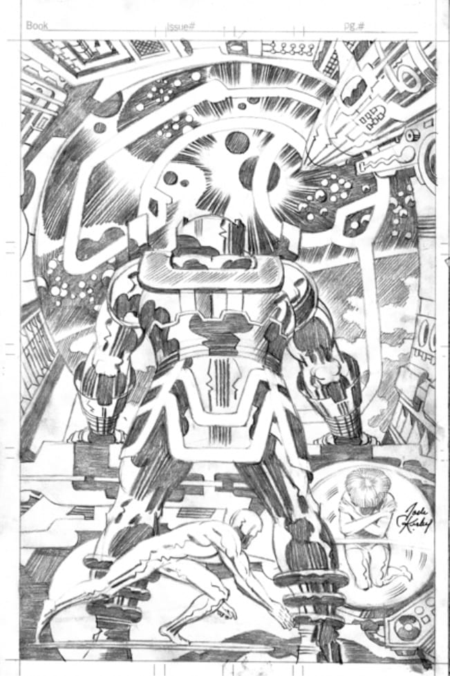
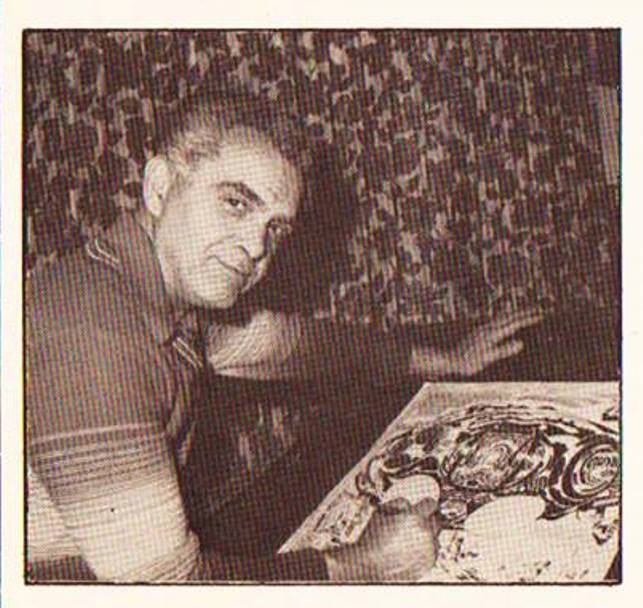 This photo of Jack is from the 2001: A Space Odyssey Marvel Treasury Special (1976). The art on Jack's drawing board is the 2-page spread from Eternals # 2 (Aug 1976).


“and the only reason I can think of for it is that it saved Vinnie time.” I would like to obviously thank Rob for this excellent series, but I was honestly surprised at how many “I can only speculate it was done for speed” etc. statements were made, since Robert seems completely sincere at making these assumptions as if he has never heard about this before. Isn’t it very common knowledge that this was the secret of Colletta? Any Kirby historian would know this, everyone from Roy Thomas to Romita has confirmed it, there exist several articles and a book from TwoMorrows which confirm that Vinnie was a “go to” guy for deadlines. I’m not complaining, but legit surprised that the author does *not* seem to know this over the course of his observations.
Rather than Robert Steibel being ignorant of Coletta’s “rush it through” attitude, it seemed to me in reading this article that he was trying to be exceedingly fair; giving Coletta all the breaks; not simply taking his infamous reputation as an accomplished fact…
…and still having to come to the inescapable conclusion that all that shameful deletion of Kirby’s figures and simplification/obliteration of detail “was done for speed.”
An excellently researched and perceptive last hurrah, Mr. Steibel! May some other website enable you to continue…
Given the increasing number of pages of Kirby pencils photocopies that have appeared in the last 10/15 years via TJKC, etc. my estimation of Colletta has been reduced to saying, without hyperbole, that he was without a doubt the worst inker in the history of comics. Those Thor pencils were possibly Kirby’s best work of the 1960s, and the finished work looks like Colletta inked them with limp spaghetti with one hand while phoning in a mob hit with the other. Such excrement issued forth from his fingers that his heirs should be as ashamed and apologetic as Kirby’s heirs are greedy and proud. Unreal what a hack that dude was.
In fact, looking at the pencils from FF#48 and the rest of the Kirby/Sinnott run, I even think less of Sinnott than before. Royer truly was the best Kirby inker: no unnecessary feathering, faithful to the design work and blacks, and so on. Sinnott to my eyes was too generic, too traditional for Kirby’s bold, direct linework, though later in the series he was better.
“Thor 166, page 19… You have a few people missing off to the right, but for the most part, Colletta nails this.”
Colletta did nothing but damage to that image.
Start with the craft’s three rear fins (?) at the top, Vinnie completely removes these, disrupting the composition and eliminating the suggestion of depth, the massive size of the craft receding under the arch in the background.
Next, after eliminating those fins, Vinnie adds a black moon shape, tangent to the black on the vertical stabilizer, again flattening what was supposed to have been a sense of deep space and making it difficult to distinguish the shapes.
Finally, look at the globe shaped protuberance of the craft. Kirby’s trademark squiggles are totally ignored, his careful and precise lines modelling the spherical form and creating the illusion of metallic sheen are replaced with arbitrarily placed blacks, and an excess of meaningless, repetitious lines.
In addition to the missing figures you mention, Vinnie neglects various background patterning in machinery and eliminates or alter textures such as the floor shine under those removed figures.
Why? Because he was a loathsome hack.
I think the text on the first Kirby page may be “spent from battle” given the context and what we can see. Another option is spared from but spent works better based on what you’ve shown of previous stuff. Can I also add my appreciation of your series on tcj. A joy to read.
“Royer truly was the best Kirby inker”
If I recall correctly, during Royer’s work on ‘The New Gods’, he was once billed as “A Celestial with his ebony brush.”
Looking at all the detail Kirby lovingly put into even minor comics panels, truly Kirby was a polar opposite to hackdom; the “Anti-Hack.”
And, great though Sinnott was, I’d praise Mike Royer and D. Bruce Berry even higher; more sensitive to the King’s fine details.
On a less positive note:
I recall an experience someone had meeting Coletta in a Con, where DC had set up a “show your portfolio to a DC editor” situation. There sat Colletta, brush in hand, pretending to ink a comics page…that had work by another inker on it…!
Google couldn’t dig up that anecdote, but here are other goodies that turned up:
———————–
What can you say about a universally recognized disaster? …my real problem with Colletta was not what he took out (though that was a real problem for sure), but what he did with what he left in. He did very little. If it was possible to suck the life out of a drawing, Vinnie Colletta knew how to do it. From vacant eyes to nondescript muscles, to flat uninspired backgrounds, Vinnie seemed to know every trick of the trade to leave the penciler’s efforts gasping for a breath.
…But you know what? Colletta didn’t start out to be a hack. He never was a great artist, but he certainly could ink a whole lot better than he did on the majority of his work from the mid-60’s on. The editors at DC and Marvel turned Colletta into a hack by accepting just about anything he delivered. Hey, if you could spend an hour inking a page or a day inking a page and you got paid the same amount and no matter what you turned in you still got more work? You might just “settle” for the work you could do in an hour too and start planning your retirement…
————————–
http://www.donnewton.com/colletta.asp
Erik Larsen points out the “positives” in Colletta’s inking, but still…
—————————–
…I have quite a few pages of original art from Kirby’s run on “Thor” and Vinnie erased or whited out incidental figures or details frequently — in one case, Vinnie whited out an entire train.
…A trick Vinnie utilized often was to scribble in excessive skinny lines in a frantic random pattern, which gave the illusion of pages being worked over, while simplifying or eliminated elements that needed to be inked with care. This made it appear as though he was bringing a lot to the page even though he was taking away as much as he was adding.
The first Marvel job I ever did was a fill-in on “Thor” and Vinnie inked it. When I saw the photocopies of the finished art I had trouble breathing for two days. I was just appalled by what it had become.
…The late, great Gil Kane once told a buddy of mine that Vinnie Colletta was his second favorite inker. My pal asked him who his first favorite inker was and Gil replied, “Anybody else.”
———————————-
http://www.comicbookresources.com/?page=article&id=16355
On the subject brought up earlier, as to whether Kirby knew what “shortcuts” Colletta was taking, Larsen continues:
———————————–
…It was Mark [Evanier] who pointed out to Jack what Vince Colletta was up to.
Kirby had not paid a hell of a lot of attention to the printed page. He thought that an inker was an inker and they were all pretty much the same. When it was pointed out that Vinnie was taking incredible liberties with his work and omitting details that Kirby thought were important — well, let’s just say that Mr. Colletta finally found himself working on other assignments.
…The real tragedy of Colletta was not that he was a hack, but rather that he turned others into hacks. Pencillers who had been putting in long hours at the drawing board and who were appalled to have their work butchered would start cutting corners themselves…because, as they’d say, “Vinnie will just ruin it anyway.”
——————————————–
Heavens, there are so many bad Colletta stories to choose from! It’s like a Bizarro buffet: “Let me get some of the sheep turds smothered in urine; a couple helpings of the sun-ripened roadkill on a bed of soggy straw; some ‘a these peanut shells rescued from the trash…”
…Anyway, here’s Fred Henbeck interviewed by Tom Spurgeon:
——————————————-
HEMBECK: …I took my portfolio around, and it was actually Vince Colletta… Honest to God, the guy looked at my portfolio, went through the whole thing, and said to me, “You know, kid, I’d tell you you could make it in comics, but I’d just be jerkin’ you off.” And he did the hand gesture at the same time…That’s the god’s honest truth. You don’t forget stuff like that. Then he smiled, shook my hand. I got my portfolio together, left the building, got on a train, went back home. I got into my car. I’m kind of in a daze at this point. I got in my car to drive out of the parking lot at the train station. Almost pulled out in front of another car that was coming at me. It just missed me.
This kind of shocked me. I remember thinking at this point, “I’m like the 5th Challenger. I’m living on borrowed time.”…So I’m going to do it, I’m going to keep working at this stuff.
It was Vince Colletta, after all. I hated Vince Colletta’s artwork, even before I met the guy. Everyone thinks, “Oh, Fred. He loves everything.” Well, maybe I love most everything. But I never really cared for his stuff. It was kind of difficult to hear that I wasn’t going to make it in comics from Vince Colletta. Of course, years later he wound up inking Fred Hembeck Destroys the Marvel Universe, which was kind of wacky. I remember pleading with the editor. “Please, anyone. Give me Chic Stone. Anybody. I love Chic Stone.” Larry Hama apparently liked to use a lot of the old-timers. I was saying, “You use Chic Stone a lot. I love Chic Stone. How about Chic Stone?” No, no, Vinnie. I would get the pages back to look at before they came out, and Colletta would leave the eyeballs out. You’ve seen my artwork. How do you leave the eyeballs out?…
—————————–
http://www.comicsreporter.com/index.php/cr_sunday_interview_fred_hembeck/
——————————
[In a “Thor” comic…] Colletta erased Laufey’s head!!!!
I get erasing details or erasing a background figure, but erasing the HEAD of a character?!! Wow!
——————————-
See for yourself, at http://goodcomics.comicbookresources.com/2009/02/26/comic-book-legends-revealed-196/
Bafflingly, Eddie Campbell, overall the finest comic book artist (and second greatest writer, after Moore) has written of:
Vincent Colletta, my favourite 1960s “Inker”
http://eddiecampbell.blogspot.com/2007/05/vincent-colletta-my-favourite-1960s.html
And…
——————————–
…arguing about Colletta erasing a few of Kirby’s pencilled figures is on the same level as arguing about who is stronger, Spiderman or the Hulk. If you care then you are a loony! Don’t tell me any more about it! Furthermore, consider how it must look to the outside world, who think it rather eccentric if not foolish for grown people to read comic books, let alone get upset and villify an artist for erasing another artist’s pencilled figures FIFTY YEARS AGO…
——————————-
http://eddiecampbell.blogspot.com/2008/04/i-feel-little-unclean-for-bringing-up.html
Oh, those foolish fanboys! Caring about their childish “art”! Unlike grownup stuff the “outside world” cares passionately about, like sports…
Amusingly, in his earlier commentary, Campbell had written:
——————————–
My personal theory about the decline of Colletta’s reputation…is that none of the reprints of the work have ever been adequate… In the years when I attempted to ‘reconstitute’ my collection of the Lee-Kirby-Colletta THOR, I noticed how poor the later reprintings of the stories always were. Sinnott and Giacoia and all the others never suffered in the same way; perhaps they knew how to make their lines indestructable. All Colletta’s charming qualities, the softening lines and subtle textures tended to go blank. The finest lines disappear, unless they’re close to other fine lines in which case they congeal into one thick line.
———————————–
Heavens, isn’t that a mild version of what Colletta deliberately did to Kirby’s art? Eliminating fine detail, turning other areas into a characterless blob of ink?
I would express my enthusiasm about your assessment of Colletta if it weren’t for your unfortunate remark about “greedy Kirby heirs.”
Cool.
Eddie Campbell defending Colletta? I file that in the same misbegotten category as Jacques Rivette singing the praises of ‘Showgirls’ and leave it at that.
I don’t have the info handy, but someone wrote not too long ago about how Stan Lee frequently made women characters that Kirby showed as strong and courageous (in suggested dialogue and marginal notes) into cringing, helpless ninnies.
These comparisons of Kirby’s pencils (even in photocopies) with Coletta’s inks show a similarly painful process. Where Kirby draws strong, mature women, Coletta softens, makes childish, and “blandifies” their features. The male characters routinely suffer as well, but with the women it’s particularly insulting. It’s like seeing a Lauren Bacall turned into a pouting baby-face like Jessica Alba…
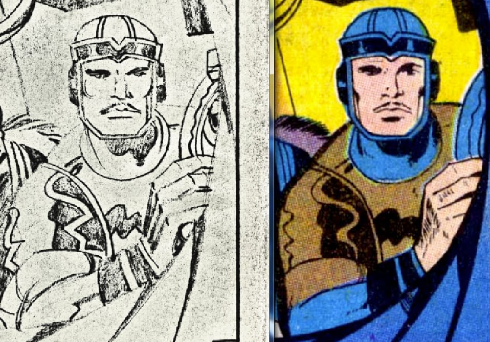
Here is a typical example. Notice Kirby depicts Sif as opposed to Lee’s version.
In Lee’s version Sif is “standing by her man” and irritated with Odin. In Kirby’s story it’s Thor she wants to kick in the rear. Kirby’s Thor has given up. Kirby shows Sif disgusted by Thor’s self-pity and she has to take charge of the situation in order to bail Thor out.
Lee has the “manly and noble” Thor saying, “Stand aside female.” to Sif.
Kirby’s border notes from Thor # 139 page two.
This page also contains a comment from Stan Lee to Sol Brodsky concerning Colletta’s inking.
Lee writes “Sol V.C. ruined this …”
Panel one.
She’s never been to Earth, but growing sound makes her uneasy.
Thor senses Odin needs him, but is powerless to get to him.
Panel two.
Besides Thor is to ashamed to face him anyhow.
Subway train is coming into sight. He makes up mind to.
Panel three.
Thor says, Odin will get you back to Asgard, as for me.
Panel four.
He faces onrushing train.
He says, I can never get back, not without my hammer.
Panel five.
Sif gestures.
She’s still a goddess.
goddess angry goddess who doesn’t stand for self pity.
Panel six.
She has (enchanti-force) and uses it.
She says, The thing to do is get your hammer back.
http://dyn2.heritagestatic.com/lf?set=path%5B2%2F6%2F3%2F7%2F2637064%5D%2Csizedata%5B840x2000%5D&call=url%5Bfile%3Aproduct.chain%5D
Rob is brilliant and I thank him once again for a pleasant and thoughtful recounting of this comic. It occurs to me that Marvel might consider producing an edition that restores this and the other art that was diminished by Colletta’s inks to their full detail in a deluxe edition. Heck, it has repackaged and reprinted them all in any number of other ways. “New” or “previously unpublished” Jack Kirby work is likely to be a hot seller.
The harm Colletta did to Kirby’s pencils is trivial compared to the harm Lee did to Kirby’s stories.
Geez, what was I thinking? How could I forget that you were and remain the arbiter of Kirby discourse here? I assure you I’ll try to get with the program, Boss.
Unfortunately, indeed so!
How Lee “dumbified” (and, to be fair, probably made more commercial, simplistically satisfying) a Kirby story detailed at http://twomorrows.com/kirby/articles/24compare.html .
“You Made Sue Storm Cry”
http://dresdencodak.tumblr.com/post/57312415288/you-made-sue-storm-cry
Some more Stan Lee sexism: https://fantasticflameon.wordpress.com/tag/blatant-sexism/
…Not that I remotely agree that Lee’s unfortunately par-for-the-course in that era sexism–obnoxious as it is–makes him a “misogynist.” (It’s a sad sign of these times how every ideological faction seems compelled to hysterically ramp up the iniquities of even the mildest members of the “other side” into massive monstrousness; scream louder and louder, so they may be heard above the overall din.)
What it does show is that Kirby — a thoughtful, well-read and philosophical man, for all his grown-up-in-the-Lower East Side* rough edges — was ahead of society’s curve. (Thanks for that example, Patrick Ford!)
Matt Seneca perceptively, poetically writes about “Kirby’s Women”:
——————–
In Kirby’s section of the comics medium, however — genre — women are rarely formidable, rarely anything but vulnerable and frightened or uncomprehending. None of those things fit in much with Kirby’s aesthetic, and neither did the Stan Lee-written damsel-in-distress girlfriends he drew for Thor and the Human Torch over most of the 1960s; they were so washed out and ill-defined that they looked like shadows in comparison to everything else sprung from the hand that made them.
The more design and thought Kirby put into a character, the more power the character accrued. He was never meant to draw the average action comic’s shrinking violet of a “gal.” When Kirby put his soul into drawing a woman, it came out like this panel from Weird Mystery Tales #1 (August 1972). His typical awkwardness in drawing women makes this panel all the more impressive, because here he really, really gets it right. The amphibious maiden seen here is literally too big for her frame, part of her cut off by the borders on every side, bursting out at the readers. She floats against an undefined color field, her light-as-air pose destroying the viewer’s sense of gravity and perspective. Are we looking down at her from above? Next to her? We aren’t given that information, and this is vertigo. Like so much else Kirby drew, this panel is an expression of the powerful, but it isn’t a masculine, dynamic power — it’s deeper, more atmospheric. The green-skinned being Kirby draws may not be inherently sexy, but her gently clasped fingers and her utterly languid pose are pure sensuality. So are the fluid black marks ribboning down her skin, the shadows they trace less an expression of realistic lighting and more an evocation of thick, decadent physicality. When a Kirby woman is sexy, it’s because she could blink and have the world at her feet.
———————–
More, at http://hilobrow.com/2011/04/03/kirby-women/
* https://www.tcj.com/jack-kirby-interview/
I have heard that the reason this series is discontinued is that there was “too much Kirby” content on TCJ.com. I won’t miss a lot of the commentary below the pieces, but I’ll miss Rob’s most coherent defenses to date of Kirby—- they have been significant, because as the ongoing court cases proceed, they make public exactly to what degree Kirby invested conceptually in his work and along the way, precisely how half-assed the efforts were by the people at Marvel who ruined that work, from the miserably shitty overwriting by Stan Lee to the wretchedly lazy inking by Vince Colletta, to the pathetic coloring by whoever. It would seem like other than Jack, only the letterers did their jobs properly.
And what becomes clear is that Kirby was not in any way compensated for the conceptualization and outright writing that he did, instead Stan Lee took and cashed those paychecks and took credit for that conceptualization and writing himself….that and the fact that Marvel did not ever compensate Kirby or his heirs for the value of the original art that was left in their safekeeping but NOT kept safe and NOT returned to its rightful owner (Kirby), form an obvious and VERY substantial unpaid debt that Marvel and Disney should be forced to make good on.
Annnnnd that’s a wrap for comments on this post. The wheels spin round and round, pushed by the same people, to no apparent end. Thank you, Rob, for all your hard work.