
Michael DeForge is the most startling, fully-formed young cartooning talent to burst on to the scene since Dash Shaw. Like Shaw, he has a rabid appetite for comics, literary, and other cultural influences, absorbing them rapidly and cycling right through them. While DeForge draws from video games, rock album art, horror movies, and a host of other visual (and not always narrative) art forms, he's still someone who's soaked in comics through-and-through. He's clearly someone who has read everything—superheroes, manga, undergrounds, autobio, etc.—and has a keen sense of comics history. DeForge combines that encyclopedic knowledge of comics with a strong sense of perspective regarding the medium, synthesizing and understanding its strengths and weaknesses. That allows him to comment on and critique not only the length and breadth of comics history, but also to closely examine his own work. Finally, his facility as a draftsman is jaw-dropping. He has a remarkable facility as a style mimic, and the control he has over the page (both in terms of design & line) is incredible for an artist as young as he is.
It's interesting to examine his career now, as just a small handful of his own comics have been published. Like Shaw, DeForge has an astounding work ethic and wants to get as much of his work out there as possible. Unlike Shaw, he hasn't tried his hand at a long-form comics project as of yet, or at least not one that has seen print. There's a certain self-critical restlessness to DeForge's work that also reminds me of Shaw, a sense of being immediately dissatisfied with what is compelling work.
I'll be curious to see how his storytelling instincts play out. There's a definite push and pull with theory, mark-making and narrative. His work is frequently immersive, but his drawing ability is such that even his comics that are heavy on theory are more visually attention-grabbing than the likes of Blaise Larmee, Jason Overby, etc. DeForge uses thinly-veiled stand-ins for some of his stories, but throws in so many bizarre style choices that a reader will be entertained even if they see the subject matter as navel-gazing or nihilistic. Above all else, DeForge is clearly self-conscious of every move he makes as a cartoonist, but doesn't allow this to get in the way of his storytelling choices. At a certain point, however, DeForge may need to commit to a particular style if he chooses to engage in a longer project, much like Shaw did for Bottomless Belly Button and then Bodyworld. In my view, he's the most impressive and promising practitioner of what Frank Santoro calls Fusion comics, a loosely-defined group of alt-genre cartoonists that includes Brandon Graham, James Stokoe, Kaz Strzepek, and Jon Vermilyea, among others.
I spoke to Santoro about DeForge a while back, and he also considers DeForge to be the best of the new Fusion artists. He noted, "Fusion to me is about being polished and being able to rise above 'amateur' assemblages like the Fort Thunder second wave... I think it's a broad term, but for me, [it] applies to those seeking to be 'mainstream' - something above most art comics and something way more sophisticated than most mainstream schools." Of DeForge, he said he's someone "who just goes for it and isn't concerned so much with posing." Santoro clearly values DeForge as an artist who avoids the kind obsession with theory that can strangle one's own work, so much so that he tabbed him to do a weekly gag strip as part of his Riff-Raff column here at TCJ.com. There's also an earthiness to what he does, a sympathy for the grotesque, that puts him as much in the continuum of EC Comics as it is in Fort Thunder or RAW.
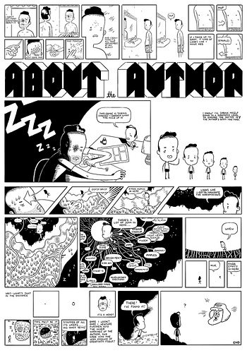
Let's take a closer look at some of his solo output, beginning with a variety of  minicomics. Gags is an intriguing early work from 2007. In it, we can see DeForge juxtaposing cliched text against weird images. Phrases like "I feel like things have been weird between us lately" are scrawled on the page, above a melting, shifting, monstrous humanoid creature. For good measure, there's a page filled with food & literature-related puns. (I quite liked "One Hundred Years of Salted Prunes.") From the very beginning of his career, DeForge enjoyed taking the piss out of emo comics with his images. His drawing would become much more refined than this and push the envelope much further.
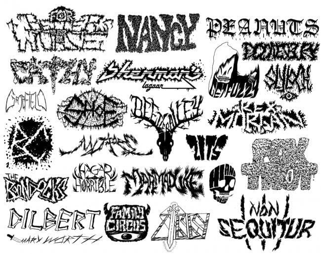
DeForge's secret weapon as a creator is his fascination with logos & lettering. In minis like Neighborhood Sacrifice and Cold Heat Special 7, he draws logo after logo inspired by heavy metal albums. The letters can be furry, melting, "demonic," sword-and-sorcery inspired or any number of other iterations—DeForge obviously takes great joy in rendering text as decoratively as possible. On the cover of Neighborhood Sacrifice and at several points in the Cold Heat mini, that decorative obsession takes the logos to the point of legibility and beyond. He's interested in the divide between legibility and simple form on the page, an aesthetic that's a key marker to DeForge as an illustrator. He walks the line between clearly delineating a narrative and wanting the reader to be kept off-balance, to be kept away from examining every detail on the page too closely. It's an approach that helps create uneasiness on the page, something DeForge exploits in his horror comics. That said, DeForge is happy to do this to get a laugh, like on a page of logos featuring daily newspaper comic strip logos with his reinterpretation of same. Seeing a dagger scratch out "Mary Worth", "Hi and Lois" forming a skull, and "Ziggy" reimagined as a warrior are all rather amusing.
The main event for DeForge, however, is his ongoing comic book series Lose, published by the excellent Koyama Press. DeForge is lucky that he has a publisher willing to accept the fact that alt comic books rarely make much money, because he has certainly thrived in this format. The first issue was the most impressive debut of a comic book series I've seen since Ivan Brunetti's Schizo #1, a comic that Lose has much in common with. Brunetti appears to be one of DeForge's significant comics influences. You can see that in the quality of the line, the effortless way both show off a variety of visual styles at the drop of the hat, and in the tone that is both transgressive and self-loathing (while still being for laughs), as well as in their shared reverence for older cartooning styles.

DeForge would later go on to describe the contents of this issue (in the indicia of Lose #3, no less) as "Directionless, parodic superhero subplot is broad and self-indulgent. Dense over-rendered panels used to mask uneven storytelling ability." This self-critique, even if done in jest, does hit home in some regards. A superhero parody focusing on Green Lantern and the rest of the Justice League as slacker assholes is not exactly original. That said, merging it with his autobiographical story (essentially parodying autobio with a genre tool even as he's parodying genre comics with alt-comics tools) was clever. Better still was that this leads to "DeForge's" guardian elf indirectly being sent to hell.

That's when the comic really starts to pick up, as the elf (a recurring character named Nesbit Lemon) realizes he has the wrong guy, complains to god about constantly being assigned to talk cartoonists out of killing themselves, and winds up in hell. That trip through hell starts to hint at DeForge's real skill as a horror/comedy artist. Nesbit happens upon a bar shaped like (Ernie Bushmiller's) Nancy's head, wherein he finds any number of cartoon characters down on their luck. This is where DeForge is both cycling through influences and showing off his chops a bit, as he renders everyone from Jimbo to Bullwinkle in the process of revealing the horrible fates of those who hang around in the bar too long. From there, DeForge puts Nesbit into the kind of horrific set piece that he would later perfect, with a hell of a sight gag thrown in as Nesbit is about to be sacrificed to a demon. Of course, the most horrific part of the proceedings is Nesbit meeting up with "DeForge" in that bar, with "DeForge" talking about his illustration gigs, getting jobs that "don't pay much, but the exposure is good!" and starting work on his graphic novel. DeForge's cartoon stand-in toward the end looks a lot like Brunetti's recent figure work: a huge, round head with stick figure arms and legs. It also bears his own stamp: wounds, sweat, and general ooze.

It's funny that DeForge characterizes what he did here as over-rendering, considering his control over his line and line weight in particular. It's dense but never distracting. Perhaps it would be a more accurate characterization to say that he's no longer comfortable with the drawings in this issue now because he's altered his style somewhat, which is not unusual for many cartoonists. More to the point, it's easy to study the structure of the issue and point to his influences, beyond just the style mimicry (Brunetti, Chris Ware, and peer Jon Vermilyea are obvious models, but there are others). This is a comic book suffused with comic book influences, and those influences would become more subdued in his later work.

I should note that body horror is not something I'm especially drawn to as a reader, and I tend to view it as a cheap and easy way to creep out one's audience. I note this because while I am not the target audience for the story that takes up the bulk of Lose #2, I still found it to be a tremendous success. "It's Chip" combines sibling rivalry and family/school dynamics with weird anthropomorphic cuteness with some truly disgusting, repulsive images. The character design choices in this story of two brothers who happen upon a horse carcass being devoured by huge spiders are inspired, borrowing a bit from Steve Weissman but mixing that with horrific naturalism in the way DeForge depicts the horse's entrails being eaten. At the same time, DeForge adds the tiny cartoony detail of the dead horse's eyes having an "x" on them, adding to the uneasiness as well as the humor of the piece.
 One of the spiders takes a shine to quiet, quirky Chip after he's pushed around by his loudmouth brother and winds up following Chip home after donning the dead horse's head. Meanwhile, he spits poison in Chip's brother's face after he spits on the spider. DeForge explores familiar schoolyard bullying tropes and then throws the spider-pet into the mix, acting as a kind of horrific bodyguard. From there, things deteriorate: the spider's poison leads to a deadly contagion, the spiders themselves storm the school, Chip's pet takes off in a series of lovely & eerie nighttime images, and a despondent Chip goes back to the horse carcass to see if he can find his friend. The final image of Chip falling on a sac filled with maggots and his sheer delight as the smiling friendly creatures crawl across his face is a hard one to shake, especially when DeForge pulls back the "camera" with a panel detailing the hundreds of maggots crawling on a gleeful Chip. DeForge commented on this issue by saying, "Good drawings. A little slow. Roughly 25% filler." The Lemon Nesbit story that follows is certainly anti-climactic after "It's Chip", and the slow and deliberate pacing that was a key to its success. He amps up the dread while also emphasizing the kind of longing emotional shots one sees in "a boy and his dog" stories. This is a story I'd point to if asked to name truly successful and innovative Fusion comics.

Lose #3 is his most ambitious comic yet and deservedly earned him three Ignatz nominations. It starts off with "Improv Night", a punch in the face of a story that starts off with a brutal parody of the banality of improv show "games," then turns into something strange and disturbing, before cycling around to its original premise in hilarious fashion. His figures in this story are elongated with big eyes, owing more to manga than to Brunetti or Ware. This three-page story is also perfectly paced, with a brisk 12-panel grid allowing DeForge to get truly weird for 10 or so panels after a shocking act of violence, all while leaving enough room for the final gag. You can read this strip at What Things Do.

The lead story in this issue is "Dog 2070", a return to a trope he briefly explores in the first issue of Lose with "Dogs In College". That trope is using anthropomorphic characters but having their animal aspects emerge alongside their human aspects in surprising and amusing ways. This story is dizzying at times as DeForge combines the sort of oblivious, sad-sack but also somewhat vicious and dull animal protagonist with what appears to be a post-apocalyptic background. The story does dip into Brunetti territory with some of the dark workplace humor, as in a hilarious sequence when the protagonist Stephen tries to draw attention away from a co-worker undergoing chemotherapy. The awkwardness of Stephen's interactions with his adult daughter and teenage sons is squirm-inducing, as he desperately tries to be a "cool dad" to mostly indifferent and entitled kids. Stephen only has the kids because his wife's new boyfriend is undergoing a family tragedy, and he can barely contain his glee when he finds out he'll be hosting them. That reveals his self-centeredness and utter lack of empathy in a nutshell.

There's a wonderful dryness to this story that makes its more outrageous aspects all the more effective. Stephen's son creates a website to get revenge on a girlfriend, and while Stephen does put a stop to this behavior, that doesn't stop Stephen from drunkenly slashing the girl's bicycle tires before giving her a bizarre lecture. The sight of them sitting near a bombed-out, trash-ridden lot that looks like something out of a Gilbert Hernandez nightmare while going through a creepy bit of high school drama is funny, sad and disturbing, especially since it's clear that Stephen never quite got over the slights and heartbreak he experienced as a teen. The final images of the story dwell on Stephen's vision of his family and himself as animalistic dogs, fighting over a piece of meat as "this wave of embarrassment washes over me." While it's a funny piece of visual work, subverting the reader's expectation of funny-animal comics, it's also a clear commentary as humans-as-animals.

The penultimate piece in the issue, "Mananangga", dips back into the monster/body horror well a bit, while once again dwelling on images of family. It's a series of images involving small creatures reclaiming larger, abandoned body shells and animating them. Two such creatures meet and mate, and then have to fight off another creature who seeks to take their child. It's a briskly paced five pages, once again jamming as many as 18 reader-whipping panels onto a page, but lingering on a single panel surrounded by white space at the end to frame the family's reunion. This is an unusually sweet story for DeForge.

He concludes the issue with more anthropomorphic fun with the "Ant Story" strips and their depiction of slacker ants and their periodic encounters with mortality. Here, once again, he jams 20+ tiny panels per page. These comics force DeForge to go minimalist, a tack he doesn't take in much of "Dog 2070". His own evaluation of this issue is "Drawings just 'OK' in this one. Pacing issues? Cover is an improvement." DeForge seems to be grappling with clutter vs clarity in his drawing style. One of the great things about "It's Chip" is how much open, airy space DeForge leaves in his panels. It's an effective counterpoint to the disturbing images. In "Dog 2070", DeForge seems to want things to feel cluttered, claustrophobic, and overwhelming, perhaps to mimic the feelings of its protagonist. It's not always an easy read, and I found my eye drifting away from panel details rather than being immersed in them. I thought that the most effective pages of the story were the ones that eased up a bit on rubble and instead zeroed in on its characters, who were weird enough on their own to draw in the reader's attention. Those quibbles aside, the depth of characterization and ingenuity in the portrayal of social awkwardness make this story one of his most memorable.

Along with Lose #3, DeForge's most recent solo work can be found in his minicomic, Open Country. It's a loosely sci-fi-oriented comic (much like Shaw's Bodyworld) set in a world where psychic projections are used as an art form. The story begins with a couple attending a gallery and finding a young woman sitting in a chair, projecting a giant image of herself naked and suffering, impaled upon various shapes in what seems like a combination of studio and broken city. Curious, the couple decides to try out the technique at home (psychic projection is comparable to "silkscreening, linocuts, darkroom photography"), leading to some initial squabbling and then a curious and potentially ominous occurrence during sleep. The figures are drawn in the same style as "Improv Night"--more elongated forms with exaggerated eyes that are somewhere between manga and Fort Thunder. At this point, DeForge's drawing has evolved to the point where picking apart his influences is becoming more difficult. This has the makings of an interesting story and will likely wind up as one of his longer efforts.

One of the reasons why I like DeForge is, like Shaw, he is an artist who just does the work. Whatever doubts he has about his own abilities or place in the world of comics doesn't stop him from drawing story after story. He's the engine behind any number of exciting anthologies, for example. He's restlessly looking for the style with which he's most comfortable and isn't afraid to undertake this search in public. He's had a handful of very interesting comics published to date, but one can't help think that his best work is ahead of him, especially given that he's only 24 years old. I'm enjoying this restless phase of his career as he explores every nook and cranny of comics history, but I'm eager to see how he harnesses his energy. Will he be a lifelong short-story specialist like Robert Crumb? Will he undertake huge, decade-spanning projects like Chris Ware? Will he develop from short stories into longer-form works like Daniel Clowes? When and how will he start to really experiment with color? Which of his current obsessions will retain their influence on his work and which will start to fade away? Most importantly, is he a comics lifer or will he burn out from the toll it can take on an artist?
At this point, it would seem that he at least will likely try a long-form comic. I wonder how such a thing would turn out. First of all, the topic of such a book would go a long way to making or breaking it. I'm guessing that such a book would touch on genre concerns of some kind, but I'm curious to see what that project might look like. Body horror? Adventure strip? Slice-of-life drama? Anthropomorphic weirdness? Metacommentary about comics and being an artist? ("Dog 2070" seems a first attempt at combining all of these things). I'm particularly curious to see if he's driven enough to do a full-length horror story, espedcially given his own self-critique about pacing: it's one thing for a short story to drag out for a couple of extra pages, but quite another for 20 pages of filler in a graphic novel. Given that horror is his greatest genre strength, however, what might he do instead? Perhaps a collection of three or four 20-30 page stories might fit the bill better than a single story, but that would also be a thwarting of ambition. This is the burden of his promise. Even the greatest of cartoonists only have so many works of lasting value in them, and DeForge will need to choose his projects carefully, continuing to work hard but treating that work as play, taking joy in his labor.


