
Seymour Chwast, of Push Pin Studios fame, is one of our living legendary graphic designers. In recent years, he's turned into a cartoonist for four graphic novel adaptations: Dante's Divine Comedy, The Odyssey, The Canterbury Tales, and A Connecticut Yankee in King Arthur's Court. I'd never seen him interviewed as a cartoonist before, so I thought I'd use The Comics Journal as an excuse to ask him a few questions about this new body of work. Thanks to tcj.com for hosting this, RJ Casey for transcribing, and Chwast for talking to me.
DASH SHAW: I recently, on Youtube, saw the Yoplait Dick Tracy commercial that you’d done.
SEYMOUR CHWAST: Really?
And it was incredible. It made me think — and Dick Tracy is inside the Dante comic as well. His profile to me looks like Dick Tracy... Did you grow up reading Dick Tracy?
Oh, sure. It was a daily strip in the newspaper. But, the spot wasn’t my idea. I did it for Bob Blechman’s animation studio, The Ink Tank.
What were the main comics you loved growing up?
Anything from the ’30s was good.
Roy Crane? The Captain Easy comics?
It was mostly newspaper comics. For comics books, I guess I went with Superman and Batman. Captain Easy was interesting because the style was more realist than other adventure strips.
Popeye?
Not in my paper.

Did you ever make a daily comic pitch or proposal?
I tried to do it a couple times with Ed Sorel. Doing a strip, but it didn’t develop.
Can you tell me more about that? Around what time?
They were both political cartoons. The idea of it being daily or on a Sunday or whatever, King Features was interested for a bit. Then it went away.
So you drew with Sorel?
He would write it and I would draw it.
Did you draw comics for a college paper or anything before Push Pin?
No. I did some comics for myself when I was about 10 years old. I had a couple of characters: Jim Lighting and Lucky Dave. Those were my two characters along with Agent V.
So you had comic book aspirations as a teenager, then in college it was full-on design.
Yeah.
When I see your work at Push Pin, I see a cartooning or cartoonist sensibility inside the design. Did you feel like comics was informing a lot of that work?
It was the way I drew. I never was interested in doing something very realistic. So it had to be more graphic and humor came along with it. But also, I was inspired so much by the comics of the ’30s.
How do you think that manifested itself in the design?
Well, graphic design is a whole other thing for me. I love doing posters and I call myself a graphic designer. That’s separate from my illustration.
So, you’d say, basically, a line-based cartoony illustration was your form of drawing when you were executing those posters.
Yes. Posters can go any way. Posters are another problem altogether. The style and attitude/point of view are determined by the concept and where the work will appear.
Yeah. When I read about Push Pin, it seems like it became so revered and so influential immediately. Or very quickly. Did it feel like that?
Well, when we’re doing it in the ’60s, we knew something was happening. A revival of old styles of graphic design.
But you started in the mid-1950s.
In ’55 we decided to form a studio, my classmates from Cooper Union. Basically, Milt Glaser and Ed Sorel—
Oh, I know. But it didn’t feel like a giant thing until the ’60s?
Well, all we were trying to do was make a living. We didn’t especially think it was something bigger than that. We were able to get work especially through the promotion that we did. The Push Pin Almanack and the Push Pin Graphic.
Did you draw comics inside of those?
Sometimes, while solving a problem. Yeah, I did one comic page with woodcuts.

Did you feel like sometimes there was a high/low divide? Sometimes a client wouldn’t want something that looks cartoony? Did you sense that?
They wouldn’t hire me if they didn’t like my style and ideas.
OK. It seemed like Push Pin was immediately very prestigious, and this is before Lichtenstein and all that stuff-- Was there any sense that it was subversive that there would be these very cartoony looking drawings?
The complaints we got included us being too “far out”. When we had a show at the Louvre in Paris in 1970 the critics thought we were subversive because our work seemed revolutionary and uncommercial.
In the content? Not just in the fact that it looked cartoony?
The cartoony part was not especially part of this. It was whatever style we were working in. Some of it was cartoony. Some of it was graphic illustration. Some of it was pure design. It was different, especially the illustration. It was different from the old style, Norman Rockwell kind of thing.
Totally. When I look at a lot of the drawings you did at that time, all of the things I think of are after you. Sometimes it looks like the Heta-uma illustrations from Japan in the ’80s. A very thick line that looks like it’s drawn the same size as print. It’s hard for me to think of something that looks like that before you. Am I crazy?
Well, it’s nice to think that I invented something. Can you be a little more specific?
Were there illustration peers in the mid-’50s that had… Wasn't Ben Shahn really popular then?
Oh, yeah. I learned a lot from him. He inspired me.
Did that give you permission to draw—
Flat.
In a flat way.
Yeah.
As opposed to the Norman Rockwell school of illustration.
Exactly.
He also paired it with, for lack of better word, a smart sensibility and point of view.
There was a certain immediacy in that kind of style that was very different from what had been done. It was very strong and different.
At the Push Pin studio, was it exciting to see Zap comics?
We were sort of amused by it.
[Laughs.] OK. It didn’t blow your minds.
It didn’t affect us any.
Because you were already doing this other stuff.
Well, it was different from what we were doing. A lot of it was sort of political in some way. We didn’t go overboard with that. Crumb was good, but he was different. A lot of our work was based on the use of typography. Typography was big in what we were doing. When we started doing book jackets, typography was important, along with the image. I loved 19th century type. It was important.
I’m just curious… You were doing so many other things, but it's hard to find any of the Push Pin Graphics myself now because they would just go to editors. On Ebay I can find some. It also seems like you were making a lot of your own content, as opposed to waiting to meet jobs. Weren’t a lot of these books Push Pin were doing completely yours—like the Literary Cat book. Wasn’t that your vision and your idea?
Some issues of the Push Pin Graphic are still available online through pushpininc.com. I designed The Literary Cat, The Literary Dog and The Illustrated Cat under the imprint Push Pin Press.
You were designers making your own content. Like for the Push Pin Graphic. You weren’t waiting for a job.
The Push Pin Graphic, yeah. We developed our own ideas and weren’t waiting. The purpose was to get work. It was a marketing tool, but we wanted to do that kind of stuff that we liked in the way we liked to do it. While at first, we sort of stuck to a simple format—it started out as a tabloid newspaper style—then it became more ambitious. It became more brochures. There was a calendar or dealing with a chart of spices or quotations by La Rochefoucauld or whatever.
When you had that meeting, did anyone ever say, “Let’s not just send it to art directors-- let's publish it and put it in book stores”?
We weren’t ready for books. It wasn’t enough. They were incidental. They were good for—
To me they’re like zines.
In the Push Pin Graphic three of us did a book of dreams, recipes or quotations. We weren’t thinking of developing those ideas into books. We didn’t know how that would happen.
OK.
It was too illustrative. We did the history of how the kings and queens of England died. That might of been a funny book. We were just interested in producing the Graphic itself and mailing them out as promotion pieces.
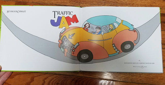
You did so many children’s books and you wrote and drew a lot of them. Did Traffic Jam have another writer on it? I don’t think so.
That was all mine.
I’m curious about the decision to do a graphic novel and why an adaptation and not your own story.
Because I can’t write.
But you wrote all of those others. In The Nose—
Children’s stories. That’s why children’s stories are not great literature.
They’re fantastic to my daughter and me.
Oh, good.
I have to say, as so many of those children’s books are out of print, I find them through Ebay and I’m totally floored by them. To me, they’re on par with anything by Dr. Seuss. It’s a huge body of work that I don’t… I think they’re fantastically written and I hope there’s plans to get them back in print. But the point is, you didn’t feel confident in your writing to just do a graphic novel?
No, no.
But you were confident enough to do children’s books.
Yeah, to write them. A lot of them are design based. They’re all over the place. To think about Traffic Jam, it opens up to this big thing. That’s what fascinated me. The story is very simple, you know. The cat trying to cross the street with a kitten in her mouth.
If you feel that way, that’s how you feel, but I still think you could do a graphic novel that’s completely written by you if you wanted to. But you didn’t want to.
I wouldn’t know how. The graphic novels I’ve been seeing were stories of depressed teenagers. That’s the impression that I got out of all of them. That’s the stuff that’s out there.
But you must have seen Raw and Art Spiegelman.
Sure. I guess so. But doing a novel like Maus, I couldn’t write anything like that. I don’t have that kind of experience. Spiegelman had a real story to tell. If I was inspired by something like that, maybe I could have written one.
I guess you don’t have to name names, but what were the depressed teenager graphic novels? Surely you must have seen a wide range of graphic novels.
There’s The Rabbi’s Cat.
Joann Sfar.
I saw, what is it called, Ghost Stories?
Ghost World?
Yeah. I loved the movie. To have kids walking down the street is very boring. I couldn’t draw pictures like that.
It’s not visually exciting enough for you?
Yeah. I was adding another layer of interest for the reader without changing the meaning. A little like Shakespeare done in the modern dress. But Dante’s story of battling families sure sounds like Scorsese to me. With the three classics I adapted, there’s always enough action in it that I could turn into design. It’s not the words. They are less literary and more action stuff.
Visual.
Visual, exactly.
Something that struck me looking at these is that usually cartoonists who are informed by newspaper comics from the ’30s, when they do graphic novels, it’s very dense. But yours is very open. It feels like maybe it was because you had all those years working in children’s books. It has a floating ease—
Really?
When you just flip through it, it isn’t like 24 panels a page of someone… It doesn’t look like Popeye Sunday pages, you know?
Right.
It’s open and often the way the text is placed is like you’re never hit with a paragraph. Even if you pick up Zap, someone’s talking for like a paragraph. Yours doesn’t have that.
No. Less talking, otherwise the drawing becomes less interesting. I designed this thing in spreads. I do that so it works out mostly following the principles of design from my design background. I need to make it work. That’s the exciting part for me.
Is it like x number of pages from the original per spread? Is that how you approached it?
I first estimate it based on one page of translation is equal to one page of my art and I make adjustments as I go along. Pacing is very important to me. I might follow a crowded spread with a quieter one. A landscape with an intimate scene.
And really reduced it. I mean, a lot.
Sure. I did War and Peace as a page in The New York Times Book Review.
I have to see that.
It’s interesting.
Were there parts of this that you were particularly proud of solving in what was in the source material into… Is there a particular sequence where you think this summarizes it? Is there a part that pops into your head?
In any of these? I really like the things that just sort of move the story along. That’s not very impressive, but…
Why pick these particular adaptations if you didn’t want to write something yourself? Why go straight to Dante?
I didn’t have to write anything. I just had to read the translation.
But you could have picked a million books.
[Seymour Laughs.]
Were you immediately thinking of the lineage? There’s Art Young’s Inferno and Doré drawings. Is that maybe what initially made you think you wanted to participate in that?
The work of those people is in the back of mind all the time. Art Young, but also going back to Goya, Daumier and the German Expressionists.
You thought, “I love all this stuff,” and that was behind that first decision?
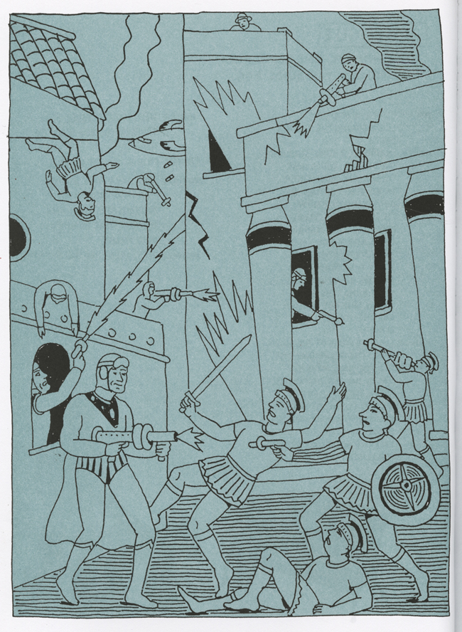
It has great stuff to illustrate in here. What I did was to involve the mafia.
Yeah, yeah. You personalized it to your time.
Yeah. Sure. Dante, himself, and Virgil are sort of ’30s characters. I brought some of the fights between the families that were happening at the time. Bringing in cars. Sure.
Is part of it that spending so many years working as a designer you kind of wanted to give yourself an assignment? Do you think that was part of the impetus?
It’s a funny way to put it. I’m looking for work that I would like to do.
Yeah.
I’d love to do more graphic novels. The material isn’t out there for me to adapt. Most things have been done. That’s too bad. There’s things that I would have liked to have done, but somebody has already done it.
Like what?
Kafka.
Not just to illustrate, but do as comics specifically.
To do it as a graphic novel. There’s one that I want to do, but can’t find a publisher for: Candide.
Wow.
Great, funny, satirical book that I would love to do. I can’t sell the idea. I don’t understand why. It’s not that obscure. But great material. I’ve done a bunch of scripts, but it’s been a long time since I’ve tried to peddle that.
Did you work with an editor on these that were giving you notes on the pages?
No. Nobody gave me anything. I just did it.
While you were working on it, do you think it was for a teenager who doesn’t know who Dante is? Does it have an ideal reader you thought of? Was there a target audience you were making this for?
Yeah, me. I never read anything like that before, or any of these. The Canterbury Tales, that was enlightening for me.
That was the one that felt the most to me like the way you drew and the content were harmonious. While the other ones, I felt like part of the joke was that the way you draw is very different than how people are talking.
Oh. Which one was that?
The way you drew and the way people talk felt—
Different?
Different, of course, in Dante and The Odyssey. But in Canterbury Tales, it felt more obviously related. Did it feel like that when you were drawing?
So, the language is—
That it has a goofiness… It doesn’t make sense why I’d say that?
No.
No? OK. [Laughs.] Obviously when you were doing this you knew that this subject matter paired with your drawing would be a juxtaposition, right?
What do you mean?
That it would be funny or unusual that this guy from the ’30s is talking like this.
Yeah, I did it because it made it more interesting. I didn’t want two guys like Virgil walking in a toga. That’s just less interesting. Dante is in the usual…
So you didn't think it might be funny, you just thought it would be more interesting.
I was hoping it would be a little bit funny and a little bit interesting. Yeah.
OK.
I’m trying to do that with Job.
Oh.
You know, from the Bible? It’s another one I can’t find a publisher for. I’m sort of doing that because all sorts of terrible things happen to him. They are again sort of mafia types involved in it. But nobody’s interesting in doing it.
This to me is a huge body of work for someone who’s not most known for being a cartoonist. To make four graphic novels, that’s a lot.
It’s just a matter of having enough time to do each one, along with the other work that I’m doing.
So you don’t see it as… Did you see it as a side pursuit?
No, no. This was important to me. But there were other assignments that I got and other work that I was doing. I was also producing another sort of minor, less ambitious Push Pin Graphic called The Nose. I did that for about ten years. Maybe twice a year. Once or twice a year.

How can I read those without spending a ton of money online? Are there plans to put together a collected book that’s just The Nose?
Gingko turned it down after a couple years. Somebody might come along to do it.
What about reprinting the children’s books?
A couple of them have been reprinted. The Pancake King, which I didn't write. I did that about 40 years ago. And Princeton Architectural Press reprinted it from the original book. They did a great job. It was worthwhile. It’s a good book. I have a couple books, the numbers book and the alphabet book. And another book called Tall City, Wide Country.
I don’t know that one.
It’s interesting because you have to turn the book around halfway.
What about archiving… I’ve only seen a few animations online. How many animations were you involved in?
A couple dozen, I guess. None for quite awhile. I worked with Bob Blechman for that and other animators.
Are there any plans to have those archived or somehow we can see them?
I don’t know. I have tapes, you know, in my studio and country house.
OK. [Laughs.]
But I don’t have plans to do anything with them.
OK. Thanks so much for your time.
Sure. I hope I’ve been helpful.


