Lobster Johnson is absolute in its simplicity. You keep searching for something beneath the surface - hidden meanings, depth of character, the grand cosmic visions that guided Mike Mignola’s Hellboy (and John Arcudi’s work on B.P.R.D.)... you keep searching, but for naught. For Lobster Johnson is exactly as simple as it appears at first, second and fifteenth glance: there’s this guy called the Lobster. He lives in the first half of the 20th century. He kills people. Bad people, to be sure - gangsters and killers and arsonists and other naughty folk. That’s it. That’s as far as you go.
That’s the charm of the 400-or-so pages collected in this volume, repacking three out-of-print paperback collections.1 There’s absolutely no fat. A threat arises, the Lobster and his crew try to kill it, various difficulties arise, but in the end they succeed. Many a bullet is exchanged. Our brave / lunatic protagonist utters some of his traditional one-liners as he dispatches his foes. Some bad guy gloats as they near their moment of ultimate triumph, only to be foiled. Other characters of this type, be they pre-superhero pulp icons (the Shadow, the Spider), or more recent creations like the Punisher, tend to have at least the pretense of depth. They have some personal life, or at least a tragic backstory that lead them to crime fighting. Not here; after all these pages you would be none the wiser regarding the Lobster’s motives, or even his real name.2
I guess if you are one of those Hellboy freaks who's read every spin-off story three times and knows whether the Rasputin miniseries came before B.P.R.D. 1946 you might’ve pieced all the clues together and came up with a satisfying answer... but I don’t care. The fun of this series—and it is very fun—is that we don’t know anything we don’t need to know. The Lobster’s stories wouldn’t be any better if we learned his name was Jeff and he started crime fighting because Al Capone stabbed his pet cat. It’s all process and plot stuff: a guy who’s pretty good at his trade goes at it.3
By getting rid of all that excess material, anything that isn’t concerned directly with the action, the creative team builds a lean, mean comics machine. A lot of it is down to the art. Mignola’s original design is, of course, great - the Lobster's claw mark is a particularly fine touch, just this side of ridiculous without becoming overtly comedic.4 Outside of Hellboy, the character has been passed around several artists, including Jason Armstrong (not represented in this collection), Kevin Nowlan, Joe Querio and Wilfredo Torres. And while they lack Mignola’s atmospheric prowess, they substitute crystal-clear action storytelling, which is what the script mostly demands: where every gunshot is a big ‘BANG’ and every punch a ‘POW’.5
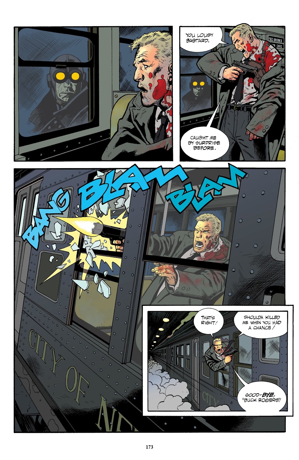
The star of the show, however, is Tonči Zonjić. To quote Tegan O’Neil, he’s “one of those tremendously talented Croatian artists” who can draw seemingly everything the script demands of them, in a seemingly effortless manner. There isn’t a lot of flash to what Zonjić does, at least not in a manner which calls attention to itself. One of my favorite examples is in chapter four of The Burning Hand - the Lobster finishes his big dramatic landing with a small “WHUMP” in panel one, unveils an anti-aircraft gun in panel two and fires it with a massive “POOM” in panel three (again, kudos to Clem Robins).

It’s such a well-constructed page: the change of angle and tighter focus between panels one and two (moving our gaze from behind the Lobster to his front); the depiction of the cannon fire in panel three (two separate explosions - of the muzzle and of the impact); the way it captures the moving parts of the machinery... everything about it works. And yet the creators aren’t afraid to undersell the moment, to kid it a little. It would’ve been the big climax shot in many different versions of this story, but for Lobster Johnson this is ordinary - he just found another gun he could shoot.
And it’s not just the pleasures of punching and kicking at work here. Whenever Zonjić is drawing, these are particularly good-looking comics in a Tothian manner. Y’know – “Strip it all down to essentials and draw the hell out of what's left.” I return again to the above-mentioned page, and the way a lot of the detail disappears in the third panel, because details are no longer needed to establish setting; the light of the explosion is going to overwhelm them. Zonjić puts the most important element of the scene in the middle of the page, and he draws the hell of it.
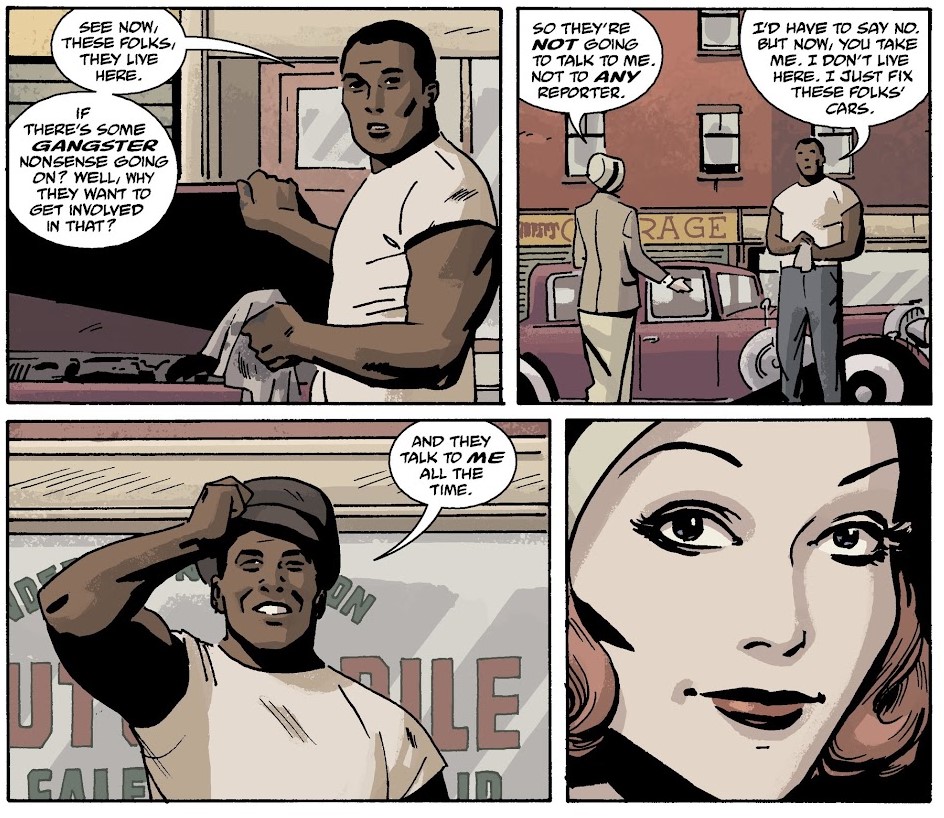
Another Tothian touch is the period details and the look of the supporting cast. I won’t pretend to be a New York historian, amd I can’t be sure how precise Zonjić’s geography is, or how true-to-life are his fashion choices. But they work in establishing a proper sense of time and location, even if it is more our idea of 1940s New York City than the actual place.6 In terms of cast, other than the Lobster and the occasional supernatural baddie, it’s mostly regular people in regular clothes, so Zonjić needs to make them memorable and easily identifiable. We end up with a nice gallery of figures. The kind in which every woman is a ‘dame’ and every guy is a ‘mug’.
Am I overselling this? It feels like I am. Yet, at the same time, you can’t really oversell something like Lobster Johnson, which gives you exactly what it promises and not an inch more or less. Which is quite of an achievement in a field filled with promises of exciting pulp-ish adventures that mostly fail to deliver, or try and pretend they have something to say that doesn’t involved stylized violence and fashionable suits. The Lobster feels like the genuine article, something that could be ripped from the pages of Police Comics in the 1940s, when characters like the Mouthpiece and Firebrand were free to dispense their brutal justice for a crowd of blood-hungry children.

Now, those comics weren’t particularly great - but they must have felt great at the time, when you could will them into being what you wanted. In many ways, Lobster Johnson feels like the pulp comics version of Indiana Jones.7 Spielberg and Lucas wanted Raiders of the Lost Ark to be just ‘the good parts’ of old movie serials; the same excitement that they remembered from their youth (unlike the disappointing schlock they saw as they revisited them), filtered down to the most important bits. Lobster Johnson is the same ‘good parts version’ of these old comics, given the blockbuster treatment (i.e. Zonjić’s art).

All of which it makes it extra appropriate that the Lobster ended up being exactly this same type of schlocky pulp figure in the world of Hellboy. It’s an ignoble fate, but one most-deserved.
* * *
- The most inexplicable thing about this collection is the absence of the first published Lobster Johnson collection, The Iron Prometheus.
- Even though there’s a whole story arc about a journalist nosing in to his personal history.
- Parker comes to mind, as well as Golgo 13 - though the Lobster is not as straightforward in his methods as either.
- The Lobster is preposterous, but the comics must never admit this - they must never wink at the reader.
- Clem Robins, who does most of the Hellboy-related comics' lettering, is really the mood-setter here: a lot of the lettering effects are BIG, but usually appear in clear lines, as if establishing the Lobster’s enthusiasm for his job, alongside his attempts at professionalism.
- Though I can certainly believe he performed a hellish amount of period research.
- And not just because he gets the shit kicked out of him in pretty much every story.