
So let’s talk about negative space. A very important principle throughout the fields of visual art and design, and no less important in comics where negative space often fulfills the very necessary task of helping to pull the reader’s eyes across and down the page. What is negative space? Any empty space on the page, which only seems obvious until you start thinking about it and realize that the artist needs to take as much care in deciding where not to put the lines.
I was thinking of negative space through Little Girls, the debut graphic novel from the writer-artist team of Nicholas Aflleje and Sarah Delaine, with Ashley Lanni and Adam Wollet on colors and lettering, respectively. The reason why isn’t hard to figure out: as an artist, Delaine is quite fond of utilizing negative space, and does so on almost every page. Sometimes it works and sometimes it doesn’t. Early sequences set indoors take advantage of the right angles and industrial curves of contemporary furnishing to frame panel design. It’s when the characters have to interact with one another that problems arise.
An early passage where the book’s two main characters meet will serve to illustrate what I mean. Drawing figures against the backdrop of buildings is useful for keeping objects at more or less scale. When Sam and Lielet meet, the latter is being harassed by a group of older kids in the middle of the road and far from any structures. Lielet’s size relative to the members of the bullying clique seems to change from panel to panel. Sometimes they and the reader appear to tower over here, surely no more than three feet tall. Then, another panel reveals Lielet to be only a couple inches shorter than the bullies.
 It doesn’t help that the backgrounds on these pages are often simply colored gradients. Now, I recognize that in many quarters merely broaching the topic of colored gradients is probably enough to disqualify the query out of hand. I have seen computerized gradients used well in comic book coloring, I promise you I have, at some point in the last three decades of gradually expanding technical capabilities within the field. I just can’t remember where, which is actually a good illustration of the principle that - even when using computers - flat colors are almost always preferable. A flat color is a design choice whereas a gradient often seems to take the place of a conscious design choice, serving instead the purpose of simply occupying space on the page and pulling the eye for all the wrong reasons. An attractive nuisance of page design.
This is especially distressing since other passages of the book betray significant signs of craft. The plot involves two schoolgirls in 2004 Ethiopia: Sam, the new girl and a white student who has been the victim of many disruptive moves at the behest of her dads’ job, and Lielet, an expert in local lore as well as perpetual target of the cool kids. There’s some kind of mystery afoot connected to recent shady doings in the local animal kingdom, leading ultimately to a supernatural war between local packs of hyenas and lions. The hyenas have an evil ghost hyena helping them out by getting rid of the lions, which makes sense as something the hyenas would want to do since everything I know about the natural hierarchy of African animals was given me by Disney movies.
The bits with the lions and hyenas are consistently better and more interesting than the sequences of the main characters interaction with themselves. Delaine seems to have a knack for wildlife, which is to be fair a difficult topic in the world of mainstream comics, where being able to draw a horse is second only to knowing how to draw a car on the list of “Optional Skills.” The book seems unsure at times whether it wants to be something more along the lines of an explicit coming-of-age story for the two young protagonists. There’s some of that, yes, but most of the book features the two Junior detectives chasing down answers regarding mysterious happenings, and then war between gangs of charismatic megafauna.
It’s an odd book that comes together best when the narrative is being held up by animals. The parts of the book that just feature Sam and Lielet interacting, ostensibly suspenseful, are paced in a far more deliberate fashion. Sometimes when basic cable shows trying to ape the formula of award-winning cable programming take superficial elements like deliberate pacing and minimalist dialogue without understanding the underlying principles at work, the result is something very much like this comic: filled with kinds of narrative negative space that could have, in surer hands, created suspense, but which here only strains the readers’ patience.
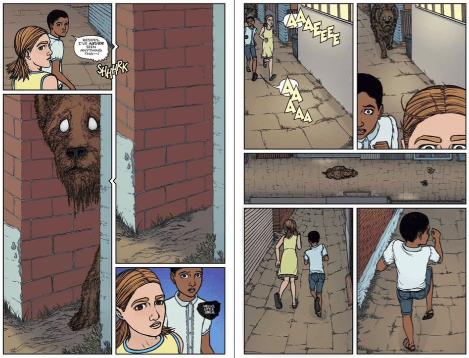 With so much negative space on every page and nowhere near enough in the way of captions or dialogue to provide narrative density, the reader’s attention drifts in the attempt to follow the characters as they float before oceans of the computerized gradients conveniently placed throughout the area. The bits with the animals running around and fighting in the grass are much nicer, and effective.


