
Paul Coker Jr., prolific cartoonist, illustrator, and longtime MAD Magazine contributor, passed away at his home in Santa Fe, New Mexico, on July 23, 2022, at the age of 93. He is survived by his wife, Rosemary Smithson Coker, stepdaughters Lee and Carol Smithson, and two step-grandchildren.
Coker was born March 5, 1929, and grew up in Lawrence, Kansas, the son of Paul Allan Coker Sr. and Bernice Rutherford Coker. Talented yet modest, Coker was drawn to cartooning at a young age, making his first professional sale by age 12 to a nature magazine called The Open Road for Boys, and also contributing comics and illustrations to his school newspaper. He excelled in art class and went on to study painting and illustration at the University of Kansas, also based in Lawrence. He earned a Bachelor of Fine Arts in 1951. A two-year stint in the United States Navy followed; Coker’s duties during his service included illustrating visual aids for recruit training.
Many of his colleagues at the New York-based MAD Magazine attributed Coker’s reserved, self-effacing demeanor to his Midwestern upbringing. “I think it was a Kansas thing,” says John Ficarra, who served as MAD’s editor-in-chief from 1985 to 2018. “Paul was extremely self-effacing, a very quiet, private man. Very reserved. And he couldn’t take a compliment. The only way he’d take a compliment is if I snuck up behind him and stuck it in his pocket. He’d turn in the most immaculate job and I’d tell him how great it was, and he’d say ‘no, no, you really should have given it to Dave [Berg], because he would have–’ And I’d laugh, and I’d tell him he had to accept that he was really good and would just have to get over it.”
Upon leaving the Navy, Coker returned home, found employment with Kansas City broadcasting station WHB-TV, and began his freelance cartooning career in earnest. One of his first clients, the Kansas City-based Hallmark, hired him as a staff designer in 1955. Clever and innovative, always pushing the envelope, Coker soon established himself as one of Hallmark’s funniest, sharpest cartoonists, especially the work he produced with writer Phil Hahn. “People wanted to move away from the more traditional, syrupy cards, and his were very new and edgy,” says Sam Viviano, who served as Coker’s art director at MAD from 1999 to 2018.
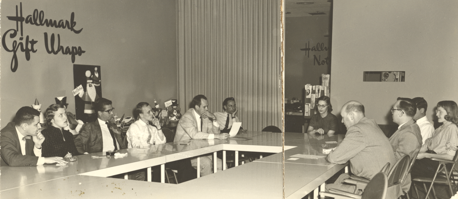
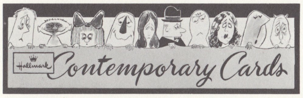
“He made up a few ideas which were wonderful, totally different from anything we did,” recalls Jeannette Lee (1918-2017), who served as Hallmark’s art director during Coker’s tenure. “They were funny, cartoon drawings, which poked fun at people. Through this stash we evolved the Contemporary [Cards] line.”

(Below) Early 1960s Contemporary Cards signage illustrated and lettered by Coker.
Courtesy of the Hallmark Archives, Hallmark Cards, Inc., Kansas City, Missouri, USA.
“Contemporary Cards was developed as a supplement for the core [Hallmark] line, because there was a need for a different concept in humor,” says Hallmark Historian and Archivist Samantha Bradbeer. “It was a briefer and more concise form from an editorial standpoint, and the humor was quirky, fresh, and occasionally bawdy.” Coker designed many of the cards in the first version of the line, which debuted under the name “Fancy Free.”
* * *
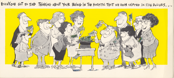
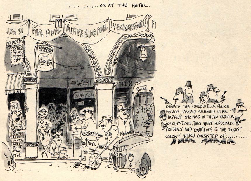
GALLERY: A selection of Coker’s early greeting cards for Hallmark, courtesy of the Hallmark Archives, Hallmark Cards, Inc., Kansas City, Missouri, USA
(click and drag to open the cards)


In 1960, with Coker’s reputation growing, he decided to move to New York to build a career in the lucrative magazine publishing industry. He continued work for Hallmark on a freelance basis, regularly creating new material for the Contemporary Cards imprint until the line was discontinued in the 1990s, and illustrated cards for Hallmark International’s European market for a number of years beyond that.
It didn’t take Coker long to carve out a successful career as a magazine cartoonist, regularly contributing to such magazines as Esquire, Good Housekeeping, Pageant, Look, McCall’s, and Playboy. It was around this time that Phil Hahn, longtime friend and frequent Hallmark collaborator, moved to New York to establish himself as a comedy writer. When Hahn decided to pitch to MAD Magazine, he asked Coker to sketch out several of his scripts. Editor Al Feldstein hired both men to contribute to MAD on a freelance basis.

Hahn’s & Coker’s first article for MAD, “A Mad Peek Behind the Scenes”, was published in MAD #60, with a January 1961 cover date. That same month saw the publication of the sixth issue of Harvey Kurtzman’s humor magazine Help!, which included the illustrated travel diary “Inside Coker, Inside Cuba”, recounting the cartoonist’s recent trip to Havana. Although he enjoyed the all-expenses-paid trips provided by Kurtzman, Coker didn’t find steady work at Help!, while MAD became the most reliable source of freelance income for the remainder of his career.
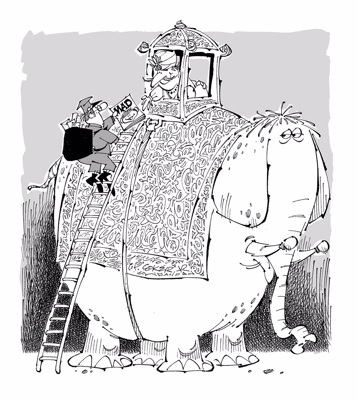
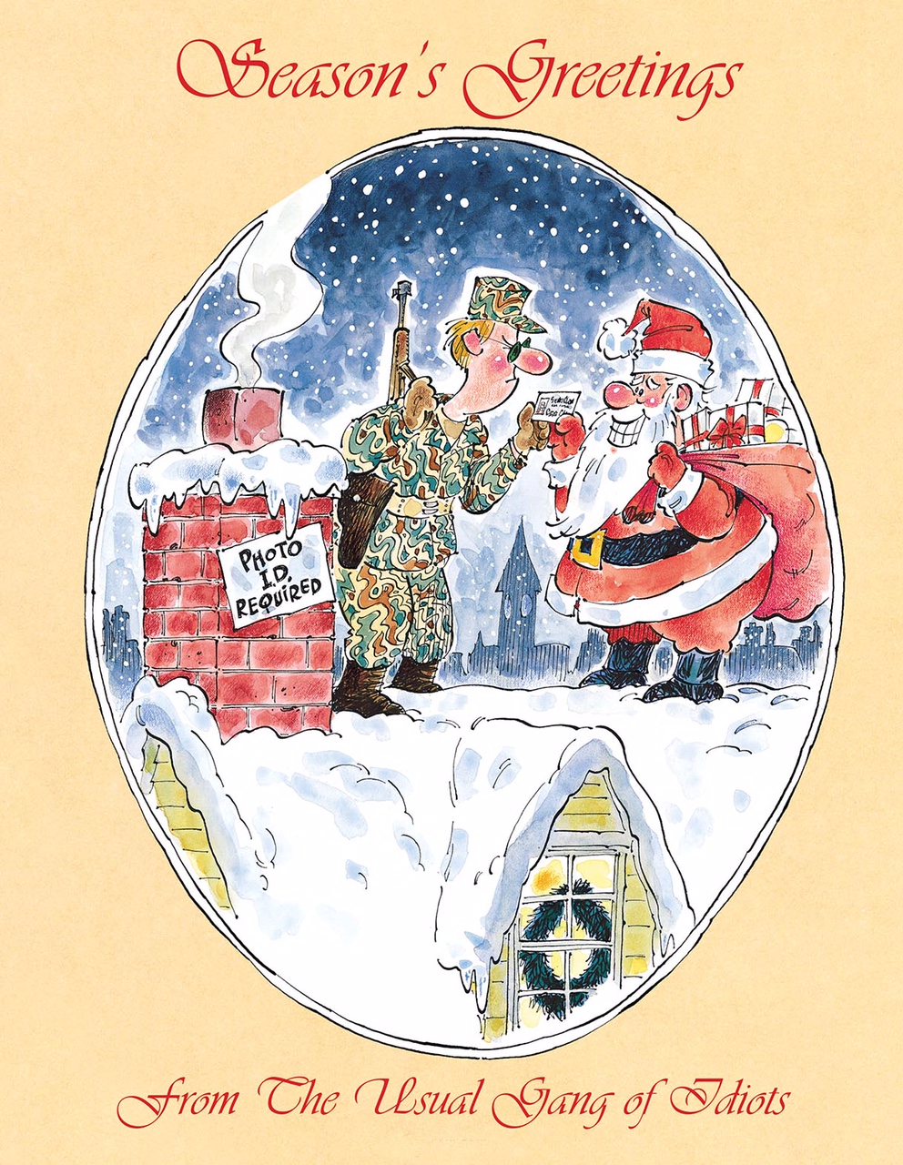
Coker, often paired with Hahn at the outset of his MAD career, established himself as a quick, reliable artist, eager to take on any and all assignments. He became part of the group of regular contributors affectionately known as the Usual Gang of Idiots. “I don’t think he ever turned down a job, and I don’t think he ever missed a deadline during my 38 years,” says John Ficarra. Although they often collaborated on one-off articles for the magazine, Coker & Hahn found their greatest success with a recurring feature, “Horrifying Clichés”, which debuted in MAD #103 in June 1966, and continued to appear in the magazine for the next 50 years.
Coker truly came into his own with the feature, which brought new life to old, familiar clichés by depicting them as monsters and other fantastical creatures. A woman seized by an UNCONTROLLABLE DESIRE, for example, is depicted struggling to escape the grasp of an amorous beast called “Desire”, while a man burying A GRUDGE is shown digging the grave of the unfortunate “Grudge” who crossed his path.

“Those were really kind of out of character for MAD,” recalls Sam Viviano. “They were whimsical and required a little bit of a leap of faith by the reader. But people clearly got it, because that was an immensely popular feature when I took over [as art director in 1999], and I continued to publish them, and we always received very good feedback on them. They played to Paul’s strengths, because they featured animals and beasts, but they also had a gothic look to them, and Paul did beautiful cross-hatching and pen work.”
“I became a Paul Coker fan the moment I first laid eyes on one of his Horrifying Clichés pieces,” says graphic novelist Derf Backderf. “They're still my favorite. I don’t think he ever got his due as a member of the ‘Usual Gang’ at MAD. That’s understandable. He was walking alongside giants. Coker’s work, however, was consistently excellent, stylistically distinctive, instantly recognizable, and always a total pleasure to read.”
* * *
GALLERY: Coker's notes to Charles Kochman, editor of The MAD Monster Book of Horrifying Clichés, a 2002 collection of Coker's & Hahn's work. Courtesy Charles Kochman. Used with permission.


As Hahn scaled back on his MAD work to focus on television, writing for shows such as Get Smart and Rowan & Martin’s Laugh-In, Coker teamed up with a who’s who of MAD’s top scripters, including Stan Hart, Frank Jacobs and Dick DeBartolo, as well as writers who were talented artists in their own right, such as Sergio Aragonés, Don Martin, Duck Edwing and Paul Peter Porges. ”As an editor, I know you’re not supposed to say who your favorites are, but Paul was definitely one of my favorites,” says Ficarra. “And that goes back to when I was a reader. Back in those days, a lot of Paul’s articles were team-ups with Paul Peter Porges, who was working primarily as a writer. They always caught me, and I always thought they were terrific. To Paul [Coker]’s credit, he went to his editors and said, ‘I’m really just copying from Paul [Porges]'s sketches, and he should be illustrating his own work.’ It was based on that recommendation that Porges went on to be a successful writer-artist at MAD.”
Multiple generations grew up on MAD, and Coker, as one of the magazine’s most prolific contributors, had a profound influence on a surprisingly diverse pool of comic creators. “I never had an official list of favorite MAD artists back when I consumed that magazine with a passion, basically between 1965 to about '72,” says cartoonist Peter Bagge, “but if I had, Coker would have routinely been at the top of that list. I thought he had a perfect drawing style–one that I used to try in vain to emulate. I recall MAD ran some samples of a daily strip he once submitted, but that apparently no syndicate was interested in, and I was both stunned and outraged that such a slight could have possibly happened.”
Judd Winick, creator of the best-selling Hilo graphic novels for young readers, also cut his teeth on Coker’s MAD art. “He was incredibly stylized, but not as much as the others. His people and characters tend to look different from one another. He was just a hell of a designer!” observes Winick. “This isn’t knocking all the other cartoonists, but most of their people look roughly in the same ballpark. Coker could drive wherever you wanted to go. I think that's what made him a vital part of MAD. Sometimes you need someone who can zigzag a little bit more than the rest.”
Perhaps because of Coker’s quiet demeanor, Midwestern mindset, and the irregular publication schedule of Horrifying Clichés, he never achieved the recognition afforded other members of the Usual Gang of Idiots. According to his colleagues, that seemed to suit him just fine. “That modesty, I think, is part of why he was one of the undersung artists at MAD,” says Viviano. “It seems like it was only about the last decade or so people started to be more vocal about their appreciation of his work. During the prime period of MAD’s existence, when he was one of the major contributors, I don’t know how many people would have listed him when you asked people about their favorite MAD artist… and one of the main reasons, aside from that modesty, is that aside from Horrifying Clichés, he didn’t have a regular feature in the magazine. Not the Lighter Side, or the Fold-In, or Spy vs. Spy, or the movie parodies.
“Paul did all kinds of things, and a lot of his work was in, a relative sense, miniature. Smaller drawings, not necessarily the big, full-page splashes that caught your attention. Horrifying Clichés was a recurring feature, but not a regular feature. People weren’t able to peg him immediately because of that. But I do think he was an artist’s artist. Artists loved his work. There was nobody like him.”
Ficarra likens Coker to a reliable character actor, while cartoonist Michael Jantze offers up a more musical comparison: “Paul was like George Harrison, the quiet talented one!”

Fitting his modesty, one of Coker’s most regular contributions to MAD over the years was the illustration of the magazine’s subscription ads: funny, detailed illustrations that many readers overlooked while focusing on the flashier, full-page illustrations. “One of my favorite Paul Coker features was the run of MAD subscription ads he did in the '60s,” recalls Sam Viviano. “Every issue there’d be a little ad on the letters page with a tiny little illustration, and every single one was a gem. I remember discovering a number of them in our flat files when I was art director. There was one in particular I told him I loved, when I was in the process of returning all of that to the artists, and he told me to keep that one. I was always reluctant to tell him how much I’d enjoyed one of his illustrations, because he’d always insist on gifting them to me.”
Coker’s charming Hallmark cards and whimsical illustrations in MAD caught the attention of animation studio Rankin/Bass in the mid-'60s, during a period when a number of outstanding cartoonists were developing animated shorts and specials for the studio. “Coker started doing freelance for Rankin/Bass in 1966,” recalls animation historian Jerry Beck. “Around that time, Harvey Kurtzman, Jack Davis, and even Frank Frazetta were contributing to their productions.” Coker produced uncredited designs for the The Wacky World of Mother Goose and Cricket on the Hearth before being hired to oversee character and background art for the 1969 special Frosty the Snowman, which quickly became a holiday television staple. After Frosty, the Heat Miser and the Snow Miser from 1974's The Year Without a Santa Claus were Coker’s most memorable character designs.
Over a 15-year period, Coker worked as a character or production designer on around 20 projects for Rankin/Bass. “And the shows he designed were among the most popular the studio ever made,” Beck observes. “Coker’s charming art style ultimately became the ‘look’ of Rankin/Bass, so much so that his unique hand lettering is seen as the font of Rankin/Bass Productions.”
Stephanie Gladden, currently a character designer for SpongeBob SquarePants, met Coker when he was part of a group of MAD cartoonists, including Jack Davis, Al Jaffee and Sergio Aragonés, invited to a weekend-long celebration of their cartooning careers hosted by the Savannah College of Art and Design. The 2011 event, dubbed “It’s a SCAD, MAD, MAD, MAD Weekend”, provided students a rare opportunity to spend time with their artistic heroes. Gladden fondly recalls Coker’s spotlight panel. “Paul was asked about working for Rankin/Bass and he said it really was as simple as them calling him up and asking if he would design some things for them. Although he'd never worked in the field, he though it might be fun and the money was good. But he admitted even he didn't expect to design so many Rankin/Bass shows!”
“His cartooning style naturally lent itself to animation because it has all the right elements: liveliness, form, line of action, and appeal,” Gladden continues. “It's possible Rankin/Bass hired him only due to his popularity, but Coker soon proved to be [a] top-notch animation production designer. I've also found it somewhat amazing that his style is so recognizable in the character design whether the animation is hand drawn or stop-motion.”

It’s hard to overstate just how pervasive Coker’s artwork was in the early 1970s, when the Rankin/Bass animated specials reached a majority of children and families, his Hallmark cards were available in grocery stores, pharmacies, and flower shops coast to coast, and MAD was at its peak circulation, with each issue selling more than two million copies–and reaching millions more when those issues were passed around the home or schoolyard. “There was a point in the early 1970s when it seemed as if I was surrounded by Coker art,” notes Derf. “Inside the pages of MAD, on the many Hallmark greeting cards the women in my family peppered me with on birthdays or to honor minor achievements in my kid world, or in those Rankin/Bass holiday specials on the tube.”
Sam Viviano also marvels at Coker’s versatility and cultural impact. “MAD was never, in and of itself, a full-time career. Nobody apart from Bill Gaines and maybe Al Feldstein got rich off of MAD. All of these guys did advertising work, storyboards and animatics for ad agencies, but Paul, he had a very solid body of work in those three particular areas, greeting cards, animation, and MAD, and that was fairly unusual,” Viviano says. “Maybe Jack Davis has the edge on him there, but Paul was one of those guys who would be in the Hall of Fame on more than one team.”
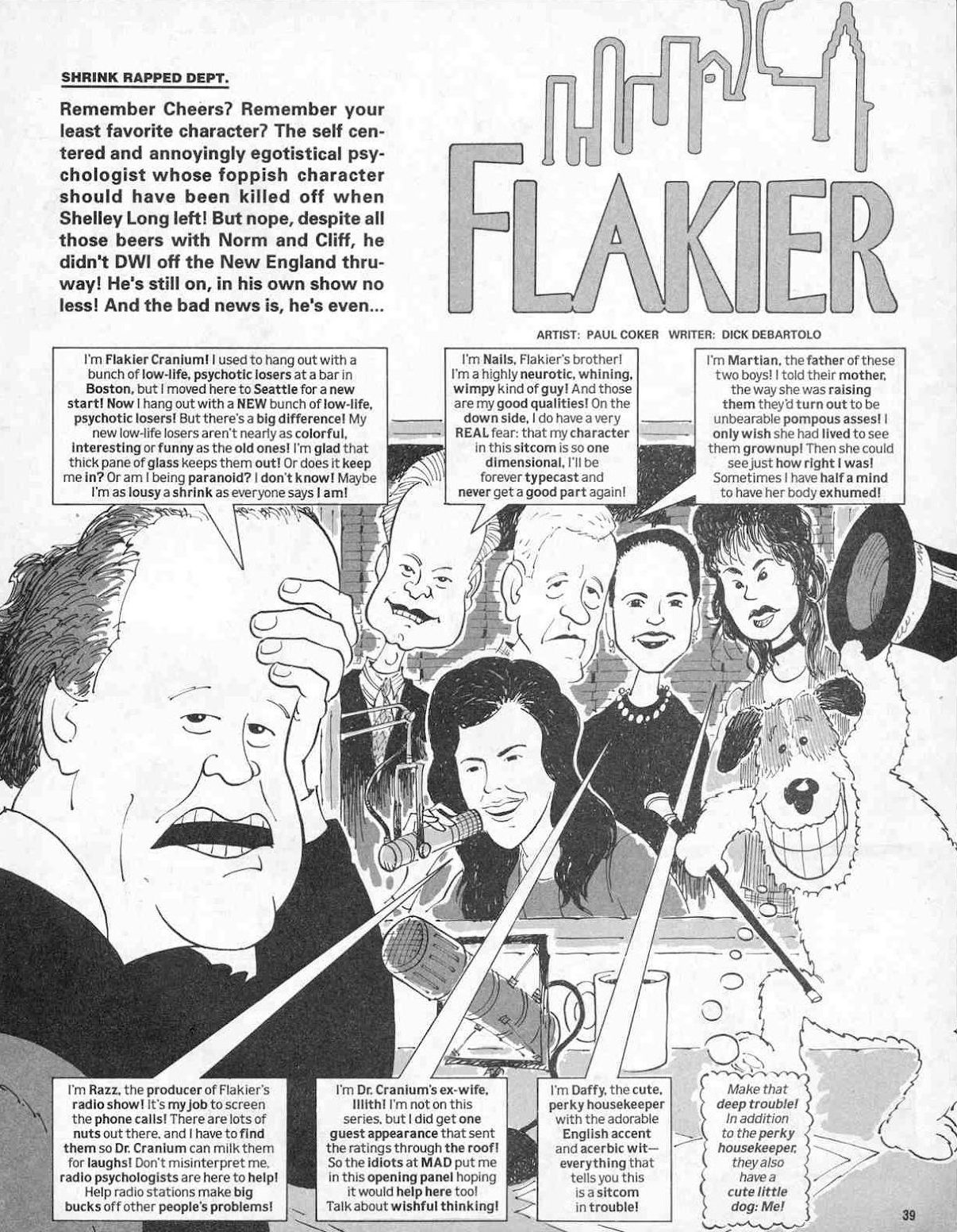
Although he was best known at MAD for Horrifying Clichés, Coker was a team player who was up for any assignment that came his way. “I remember when we had several parodies planned for one issue. [Mort] Drucker was doing one, [Angelo] Torres was doing another, and we had this [parody of the] TV show Frasier, and we said, you know what? Let’s take a flyer and do it with Coker,” recalls John Ficarra. “And he turned in a wonderful job, terrific caricatures, done in his style, but there was something about the likenesses, and the expressions, and he just filled the panels so well. From an editor’s point of view, Paul was great, because you never had to tell him where the joke was. He had great instincts for that, gravitated to it, and brought more life to it. Some artists needed notes, pencils or doodles from the editor, Paul you could pretty much let run wild, and he’d never disappoint.”
Coker’s cartoons were also featured in several MAD paperbacks, which sold very well during his first 25 years with the magazine. “Paul and I did a book together, around 1984,” Ficarra recalls. “I had proposed a book on fears and phobias, and Feldstein asked who I wanted to draw it, and I said ‘Coker.’ He was my absolute first choice. I’d say he saved the book. He also did one book on his own, the only time he ever wrote his own work, The MAD Pet Book, and I think it’s one of the ten best MAD paperback books ever. His love of animals and pets comes through in this book.”

“We were talking once, and he told me about his animals, and he said there’s a secret line in the eyes,” Ficarra continues, “and since he told me that, I can’t look at his drawings without looking at the animals’ eyes... there’s some extra detail in there, whether it’s a shifty look, a look of stupidity, amazement–so much of the joke lies in the animals’ eyes. And it’s in the people, as well.”
That funny, idiosyncratic style appealed to millions of fans, but fellow cartoonists especially appreciated Coker’s artistry. “There are many things I learned by looking at Paul Coker's work,” says Judd Winick. “He's big on exaggerations. Huge poses! And bananas design! He would swing for the bleachers with so many characters. Big big noses, tiny short legs. And monsters and creatures that were all over the map. He wasn't really working off one stylistic palette. But at the same time, Paul Coker always looks like Paul Coker.”
Derf Backderf agrees with that assessment. “What I love about Coker’s art is the playfulness in every line. His free and easy pen stroke equals the joy you find in a Don Martin or Sergio piece. Coker wasn’t as insane as those two. He straddled the line between commercial art and pure comics fun, much the way Jack Davis did, and always seemed to have a good time, no matter how wretched the assignment,” says Derf. “He elevated hokey writing, even schlock, and that is no easy feat. I often passed the time on one of Mom's boring shopping trips by reading all the Paul Coker cards in the greeting card aisle! Hey, man, comics is comics, but how many cartoonists can claim an appeal like that?”
By the 1980s, Coker had returned to Lawrence, Kansas, to take care of his elderly father. He returned to New York only rarely to visit the MAD offices. His colleagues did, however, enjoy his company on the annual MAD trips organized by publisher Bill Gaines as a thank-you to his staff and freelancers, and as an opportunity for his artists and writers, scattered throughout the country, to spend time together and get to know each other in person. “The writers and artists would work together eight, ten times a year, but always through the editor, and they might never talk to each other at all,” observes Ficarra. “It was Gaines’ genius that he came up with these trips [starting in 1960] because it would bond the guys together, but it would also bond them to the magazine.”
The MAD trips were men-only, no spouses allowed, until the mid-1980s, when Gaines relented and allowed attendees to bring their wives along on their globetrotting escapades. Coker, who had gotten married later in life, as he was approaching age 60, welcomed the opportunity to bring his wife, Rosemary, along on the trips to meet his colleagues, many of whom he’d known for several decades. “The cruise to Bermuda, in 1991, was co-ed. That’s when I really got to know Paul and his wife, Rosemary, who’d gotten married a couple of years prior,” recalls Viviano. “In 1993, after Bill Gaines passed away, we went on the last MAD trip, to Monte Carlo. Most of the earlier trips were ‘just the guys,’ and they were all much younger, and were very rambunctious, from the stories I’ve heard. These were Bill’s way of bringing all these people who were spread out across the country, who worked together but not in the same office, and create that little family that fans thought existed. It was really summer camp. Judging from my own trips, they were enormously enjoyable. Bill pulled out all the stops to make sure everybody had a good time.”
Rosemary, herself a former editor and writer for Contemporary Cards, immediately won over Coker’s friends and co-workers, and was readily accepted into the group. “She won the hearts of the MAD guys right away,” notes Ficarra. “We were in Paris, and we did a day trip to Monet’s gardens, and we stopped at a French countryside restaurant, right out of a storybook, and we proceeded to engorge ourselves for hours. When we got on the bus, everyone was stuffed, tired, and Rosemary opened her purse and said, ‘who wants candy?’ And she had brought a small shopping bag full of every kind of junk candy you could imagine. The MAD guys, being the MAD guys, finished every last bit of it. That kind of behavior really endeared her to us.”

As for Coker, although he enjoyed the MAD trips, he rarely made himself the center of attention. “But when Paul did stand out,” notes Viviano, “it really made its effect. On the cruise to Bermuda, Rosemary brought along a bunch of red clown noses, and we have photos of everybody wearing these noses. To see Paul, who’s very diminutive, put this big red clown nose on and start dancing–it was an indelible memory.
“At root, the MAD gang are a lot of different kinds of people. Gregarious, outgoing, quiet, opposite ends of the political spectrum–it was Bill’s intention to bring everyone together for a fun time. For adventure! They went to Mexico, where Sergio’s mother fixed them dinner! They went to Paris and Italy several times. Japan. For a lot of these guys, it was quite an experience. And to be able to do that with a crowd of colleagues, who over the year would become your friends… Paul enjoyed them. I think he made a lot of friends that way.”
The MAD trips ended with Gaines’ death in 1992, and Coker’s visits to the MAD offices in New York became more infrequent. The quiet, unassuming Coker occasionally attended special MAD-themed events such as the 2011 Savannah College of Art and Design’s MAD reunion or the 2015 National Cartoonists Society’s Reuben Awards, at which he received the Milton Caniff Lifetime Achievement Award. Most of the time, however, he was more than content to spend time at home with his wife and family. In the early 2000s, Coker and Rosemary moved to Santa Fe, New Mexico, both for the warm weather and for the city’s thriving arts scene. Coker didn’t officially retire as a professional artist until he turned 90.
* * *
GALLERY: Photographs from the 2011 “It’s a SCAD, MAD, MAD, MAD Weekend” at the Savannah College of Art and Design, courtesy Michael Jantze. Used with permission.


Cartoonist John Kovaleski spent the summer of 2014 in nearby Albuquerque and arranged to pay a visit to Coker at his Santa Fe studio. He received a warm reception from Coker and Rosemary and was surprised by the simplicity of Coker’s home studio. “I asked to see his studio, and he said it’s a mess, it’s not very impressive. But the funny thing is, their condo was just kind of immaculate,” Kovaleski recalls. “Very well put together. He must have been about 85 at the time, but he was very trim, very erudite. We were in their living room most of the time, and they had a very nice, tastefully decorated space. The studio was up in Paul’s bedroom, and, I remember now he didn’t say it was messy, he said ‘it wasn’t much.’ And indeed, it wasn’t much.
“He had one regular bookshelf, like you’d get at Walmart, he had a desk, covered with papers. Not much on the walls. Then he had a stack, maybe three feet tall, of papers, on the floor. At that time, he was drawing on his lap, maybe on a clipboard. It was surprising. Everyone always says that [their] studio’s a mess or isn’t much to see, but I’m always interested in other artist’s studios, and this was fascinating because it didn’t seem to match him, and there wasn’t that much around him.
“At that time, he was using some sort of marker for his drawings. He was doing some spot illustrations that day, and it was still his style, very small, but [he’d] kind of gotten away from his start and stop line that he did for MAD. He said he’d gotten kind of tired of that, but had to go back to it whenever he drew for them.”
More than six decades into his career as a professional cartoonist, Coker still found enjoyment in his MAD work, and still felt he had more to learn as an artist. Sam Viviano noted that although Coker’s style became looser as he got older, the spontaneity and liveliness that defined his artwork was always there, all the way through his final MAD article in 2018. “One of the things I loved about Paul’s later work for us is that it was in color. For good or bad, it was part of my administration as art director, that transition into color,” Viviano recalls. “Not all of the old guys wanted to do or could do color, but Paul was the exception. He did beautiful watercolors. Loose, almost impressionistic, with dabs of color. He was well into his 80s and he told me was taking watercolor classes in Santa Fe. That was one of the things that impressed me about Paul. He never stopped being an art student.
“In fact, one of the times he was visiting the MAD offices in New York, late in the day when they were closing up, John Ficarra offered to take him out to dinner, but Paul turned him down because he wanted to go to the Art Students’ League to do some live sketching. It isn’t easy to turn down a free dinner, and that shows his dedication to his art.”
Coker’s retirement from MAD in 2018 marked the end of an era in more ways than one. The landmark 550th issue concluded the magazine’s original run since it launched as an EC comic book in 1952. MAD shuttered its New York offices, leading to the the departure of Ficarra as editor-in-chief, Viviano as art director, and almost every member of the New York-based staff as the magazine geared up for a move to Burbank, California, and a relaunch with a new first issue.
“As art director, it dawned on me that I was working with a sizable number of people who’d been working at MAD for over 50 years. Not just one or two, maybe eight or nine. A pretty large number of people working for one client for that long,” Viviano recalls. “Paul had told me was retiring, and had retired from everything else but MAD. He became more and more dissatisfied with his own work as he approached his 90s. He turned down a job in 2017, and that was the first time he’d done that. I know he was disappointed with the quality of his work, but I still loved it. It was somewhat looser than his earlier work, but that’s true of anybody who’s working at that point in their life.”
Coker enjoyed success and acclaim in every one of his artistic endeavors and maintained such high standards throughout his career that, especially with his “Midwestern modesty”, it was easy to take for granted just how unique and how talented he was. Viviano is grateful that appreciation for Coker and his artistry seemed to grow steadily in the artist’s later years, as fans of MAD, fans of his Hallmark cards, fans of Frosty the Snowman, grew increasingly vocal in their admiration for the humble, self-effacing cartoonist.
“A lot of MAD artists, particularly Davis and Drucker, have lots of imitators. I can’t think of anyone who ever imitated Paul Coker,” says Viviano. “I don’t know that anyone could imitate Paul Coker. Because his visuals were so idiosyncratic, in composition, in drawing, and that style. The thing that always amazed me was that ink line, the kind of stop-and-start… I could never figure out how he did it, and never asked him. To me, that’s what every illustrator should strive for, a style that’s immediately identifiable as yours, that inimitable quality that’s yours alone. He was a joy to work with. You always knew that what you were going to get in the end was something that no one else could do.”

Ficarra concurs. “It was always really important for an artist to bring us a look that we didn’t have already. We got artists all the time who’d try to ape Sergio, or Drucker, and we’d write back and say, this is very nice, but why would we hire you when we’ve already got Mort Drucker? Come up with your own style, one that’s unique to you, and get back to us. Sometimes they’d come through with their own style, but more often than not you’d never hear from them again. But nobody ever tried to draw like Paul. Nobody ever could.”
* * *
Special thanks to Hallmark Historian and Archivist Samantha Bradbeer for her research assistance and for granting access to Hallmark’s archives for this article.


