On a recent trip to Japan, I saw a truly eye-opening show at the Yayoi Art Museum in Tokyo. Defying a small budget, characterless exhibition spaces, and rudimentary display cases, the Yayoi Museum regularly organizes superb shows on twentieth-century illustration (usually Japanese), with some crossover into comics and related narrative pictorial print media. The Ueki Kin’ya (b. 1921) exhibition two years ago – which unearthed a once-famous, now-forgotten, extremely talented artist of samurai emonogatari from the 1950s – was the talk of the town of manga studies for a couple of months. Thinking back, that exhibition was the shadow inspiration for my piece on emanga.
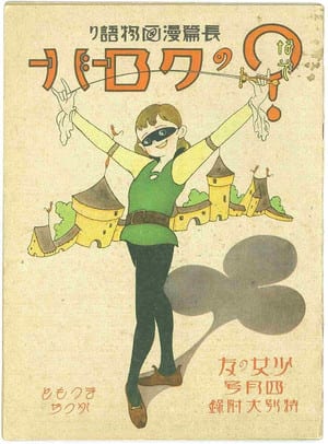
The recent show, a retrospective of illustrator and manga author Matsumoto Katsuji (1904-86), was filled with the kind of frilly, sentimental shōjo stuff that usually makes me gag. But there was at the center of the show a ray of sharp, clarifying light that has changed my understanding of the development of manga in that transitional era of the 1930s, when the medium went from adult pastime and occasional kids plaything to big-time commercial entertainment. In that spotlight stood one work in particular: Matsumoto’s The Mysterious Clover (Nazo no kuroobaa), an 16-page, magazine-format (7 x 10 in.), premium insert furoku for the April 1934 issue of the monthly Shōjo no tomo (A Girl’s Friend), an iconic magazine in the history of shōjo culture.
This was actually the booklet’s re-rediscovery. There had been a Matsumoto show at the Yayoi in 2006, leading to multiple public expressions of amazement and declarations that manga historiography will never be the same. That revolution did not happen. Soon after, Clover seems to have sunk back under the radar, registering since only as a blip in manga studies – a brighter blip, but still a blip. Now there’s a new and more formidable buzz around the work. A miniaturized black and white reprinting of Clover appeared in the November issue of Tsumugu, a monthly magazine dedicated mainly to illustration and fiction. I’ve heard chatter of full-color publication, which is good because the Tsumugu version is almost too small to read.
In the meantime, let me do what I can to keep the momentum going by poking around inside the aesthetic novelty and historical genesis of the work, and a bit into Matsumoto’s early career more generally. This will be a multipart exploration, this time introducing Matsumoto, with analysis of Clover to follow. This is my first foray into the world of shōjo, and I cannot claim to have done thorough research, so beware disclaimers, airy hypotheticals, and amateur ignorance. Please send recommendations. While the Ten Cent Manga series languishes in purgatory, this is a push to move the inquiry beyond shōnen manga and back before Tezuka.

First, some background. The subtitle of a catalogue of Matsumoto’s work from 2006, published to coincide with the first Yayoi show, sums up the artist's reputation: The Illustrator who Invented Shōwa Cuteness. A more accurate tag might be: The Artist who Domesticated North American Cuteness in Japan. This is easy to see in Matsumoto’s most famous character, Kurukuru kurumi chan, which means something like: Little Dizzy Wizzy Walnut. While better known through related merchandising (postcards, stickers, water decals, bookmarks, posters, postcards, figurines, stationery, paper dolls), Kurumi chan was the star of her own manga for thirty-five years, commencing in Shōjo no tomo in 1938. Her image metamorphosed dramatically over the years and across media, to the point where it is sometimes hard to recognize the various Kurumi chans as the same character or by the same artist.
 クリスマス・カード(封筒付)「くるくるクルミちゃん-ウツシエ・ツーリング」(7枚-封筒付-昭17) 装幀封筒9枚.jpg)

Kurumi’s look, in popular memory, has been defined largely by the merch. She has many of the exaggerated neotenic features and sartorial accouterments that are associated with Japanese kawaii: an oversized head, low wide-set eyes, fat truncated limbs, adorable hand gestures, bell dress, a ribbon in the hair. Side by side in catalogues of shōjo collectibles, you can quickly see where Hello Kitty (b. 1974) got her look. “I am often asked,” said Matsumoto in 1974, “where the idea of the character came from. But I really don’t remember.”
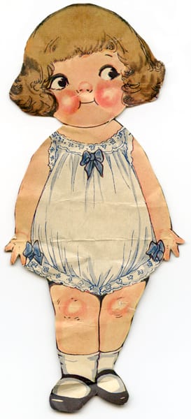
A browse of Trina Robbins’s Pretty in Ink: North American Women Cartoonists, 1896-2013 (Fantagraphics, 2013) will compensate, with dispatch, for the artist’s memory lapse. Kurumi chan is the Japanese extension of Grace Dayton and Margaret G. Hays’s chubby kiddies, Rose O’Neill’s Kewpies – who were well known in Japan (see image below) – and (across the Atlantic) Mabel Lucie Attwell’s thumb-sucking cherubs. If Matsumoto is indeed the starting point of kawaii, then future scholars are advised to look into what led to the adoption of early twentieth century American models for visualizing preschool girlhood – aged younger than schoolgirl-aged shōjo, note – and the elaboration of a child-targeted consumer culture around that imagery. The dreamy romanticization of the innocent child in the Taishō period is only a preparatory stage.
Though in retrospect it is hard to see the Campbell Kids or Kewpies as anything but sappy sweet, in their day they expressed progressive social values. Matsumoto might have picked up on some of this. Drayton’s Campbell Kids reflected social reformers’ promotion of healthy, hygienic, and active children, resulting in a ruddy and plump “Dutch” look. “New Kid dolls,” writes Miriam Formanek-Brunell in her study of nineteenth and early twentieth century dolls in America, “replaced previous generations of fragile fashion plates with strong, sturdy, and independent representations. New Kid girl dolls wore ‘rational’ clothes that no longer restricted behavior but permitted the freedom and range of movement girls themselves preferred. Their intelligence and ‘character’ replaced the genteel, passive mindlessness of previous generations of dolls.” That these were boyish, masculine traits being injected into the realm of girls’ play and fantasy came out more overtly in the case of O’Neill’s Kewpies. Though later marketed as female dolls, the Kewpies were originally boys during their cartoon run, beginning in 1909. Some of their activities – parodying adults for losing touch with the child within – were gender non-specific, while others clearly reflected the era’s feminist movement. “An educated woman with a social conscience,” Formanek-Brunell explains, “O’Neill designed politically conscious and benevolent Kewpies who, like their creator, carried suffrage placards, debated the opposition, and vigilantly watched over working-class neighborhoods as ‘social housekeepers.’”


In Kurumi merch, such traits are only superficially visible. The girls on stationery and stickers are far more likely to be milking goats or striking adorable poses than leading the charge. But when it comes to the manga, Matsumoto revives the “unusual amalgam of the New Woman and emancipated New Man” that underwrote Drayton and O’Neill’s original creations, before the advertising and doll industry turned them into simple tools for turning modern frowns upside down. For not only is Kurumi of the manga plucky, her stylization indicates influences that are more adult and urbane. Kurumi chan, like her settings, is essentially composed of thin contour lines of near-unvarying gauge. Matsumoto twists his line like a hangar wire, creating open-form abstractions, which he sets against straight edges delineating setting and against punchy spaces of white and solid black. After the war, Kurumi chan will become more compact and angular, but many of the original design principles still apply. If one were to attempt to construct a purely nativist art history, perhaps you could argue that the style was a modernist simplification of the single-line and simple stroke brush-based cartooning that was popular in short format humor manga of the 1920s. But whatever Meiji heritage there might be in Matsumoto’s style, it has been thoroughly reprocessed through Jazz Age chic.


Born in 1904 in the port town of Kōbe, which was known (like Yokohama) for its wealth and its traffic in Western goods and peoples, Matsumoto would have been familiar with the look of cosmopolitan oshare (stylishness) from an early age. His first paid illustration job was for New Youth (Shin seinen) in 1921. By the following year, he was regularly contributing story and spot illustrations to many magazines published by Hakubunkan, a leader in youth publishing with a modernist bent.
When and how I do not know, but at some point in the late 1920s Matsumoto must have encountered Ethel Hays’ work, or something similar. By the mid 30s, a fair portion of his manga and illustration work has that Art Deco quality typical of Hays’ drawings of young, privileged American men and women, especially of the varsity and flapper types. Telling is Matsumoto’s tendency, as in the early Kurumi chan strips, to take background and furniture lines that would (in a more naturalistic paradigm) reach the panel edge and instead terminate them a few fingers before the frame. One finds this commonly in Hays’s work. It gives the image an emblematic quality, a decorative versus structural quality. Even when the stories fail to compel, it's easy to get pleasantly lost in the compositions. Matsumoto’s heavy stylization of text – with its hairpin curves and irregular serif flourishes – as well appears inspired by Art Deco typefaces and hand lettering. The big-headed cartooning, meanwhile, suggests something in the vein of John Held Jr. The way Matsumoto's characters saunter, meanwhile, suggests a linear version of George McManus . . . or is my cartooning history out-of-whack? That Matsumoto’s earliest manga were in a more heavily modernist mode I will discuss in a moment.


Beyond Kurumi chan, Matsumoto’s work for shōjo magazines in the 1930s reveals an artist capable of a wide array of styles, deployed accordingly for different jobs. His illustrations for Han Christian Andersen stories in Shōjo no tomo combine the faces of popular twenties’ jojōga (lyrical pictures) artists like Takabatake Kachō and Fukiya Kōji with a simplified Walter Crane, faux-woodcut quality. The big eyes, inverted triangular faces, and attention to the details of fashion bespeak study of Nakahara Jun’ichi, one of Matsumoto’s colleagues at Shōjo no tomo.
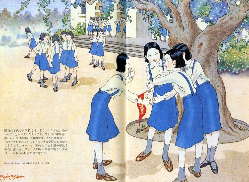
Despite this variety, some claim that an American touch is what distinguishes Matsumoto's work in this defining era of Japanese illustration. “In girls’ schools in the 1930s,” writes Yayoi Museum curator Uchida Shizue, “it seems that every class was divided into two camps. There was the Nakahara Jun’ichi camp, and there was the Matsumoto Katsuji camp. It was thought that you could tell someone’s personality and likes based simply on which of the two she was a fan of. The prim and proper, dreamy-eyed European-type girl fell in the Jun’ichi camp. The sunny and mischievous American-type girl fell, of course, in the Matsumoto camp.” One of Matsumoto’s disciples, Ueda Toshiko, who attended girls’ school in the 30s, said the same in the late 80s, recalling that the division even dictated “how you wore your school uniform and your hair. The Katsuji type was American: forthright, spunky, and cheerful to the root. The Jun’ichi type was European: prim and proper.”
With the rapid exchange between the Western metropoles and the mixed parentage of modern Japanese culture, it is not always possible to say this is French and that is American within any artist’s work at this point. But there is merit in what Uchida and Ueda say about the affect of Matsumoto’s figures, which is certainly different from that of the wispy jojōga of his peers. Puckishness does indeed characterize many of Matsumoto’s female manga characters, but mainly those of his manga. His illustration work leans to the passive side. In an oral history of children’s illustration from the 1970s, Matsumoto made some comments suggesting that the difference was partially a function of contrasting media. “Jojōga is something mainly for girls in puberty, so first of all everything has to be beautiful. The girl’s face has to be beautiful, her clothes and hair have to be exact, and you have to pay attention to every little accouterment. One typically does pen drawings for jojōga, because they print cleaner than photographic plates or halftone screens. After drawing jōjoga for so long, I simply got bored with them and couldn’t stand it any longer. So I took a break and began drawing humorous manga.”

Kurumi chan is certainly humorous. Being prone to accidents and inclined to pranks is part of her appeal. More important is what this comic dimension enabled in terms of character. It is traditionally claimed that the otenba (tomboy) type in shōjo manga first appears with Kurokane Shōsuke's Anmitsu Pricess (Anmitsu hime) in the late 1940s, but this is obviously false. From the very first chapter of the manga in 1938, Kurumi chan outwits and outperforms her male peers even in conventionally male domains like athletics and schoolwork. Grown men are likewise bested, usually after discounting her as a pushover. Her frilly dress and bow are a ploy. She is at heart a tomboy – this despite Kurumi chan of the merch being so sticky sweet. Clover, as we will see, has previously elevated this quality to a core trait of heroism.


Was there, as Ueda and Uchida state, something American about this type of femininity? In 1974, the artist himself described a willed shift in his practice in the mid 20s. “It was around that time that Fukiya Kōji’s jojōga began appearing within girls’ and women’s magazines and became very popular. In an issue of Reijōkai (Girls’ World), there was a photograph of Fukiya, about to embark by ship for France, being sent off by his fans. I thought, ‘I want to be like that. Fine, it’s decided, I’ll start drawing jojōga.’ Takabatake Kachō and Fukiya Kōji sell on sentimentality, but I’ll have to do something different. So I came up with this sunny and cute jojōga style.” I mentioned above that the visual form of said “sunny cuteness” – at least in the case of Kurumi chan – was likely inspired by the Grace Drayton school of baby doll cartooning, and perhaps by flapper cartoons. Next time I will introduce Douglas Fairbanks Sr. to show that spunkiness radiated more generally in Matsumoto’s mind as an American attribute.

Meanwhile, it might also be perceived in the various references to American campus life in his work for Shōjo no tomo in the early-mid 30s. There is more than one image of girls singing and otherwise consorting boisterously in their rooms with American university-style pennants adorning the walls. Similar subject matter can be found in the comics of Ethel Hays and Virginia Huget, though their heterosexual cavorting is a far cry from the homosocial world of contemporary shōjo magazines – yet it is worth pointing out that Matsumoto broke that “sister relationship” mold in 1934 with a series called Pepeko and Chakō. Granted the boy and girl protagonists in that manga are brother and sister, but there is a lurking eroticism to the work that draws on romantic heterosexual coupling. There are softer expressions of this in Kurumi chan, despite the star being preteen.
Good-natured adolescent joie de vivre was not the only trait Matsumoto seems to have culled from American culture. As a premium insert for Shōjo no tomo in 1934, Matsumoto designed a paper pennant inscribed with the magazine’s name. It is significant that upon this wall-mounted symbol of American youth there are details that bespeak an interest in the European medieval, namely the Gutenberg-esque font, the coat of arms, and the cameo-like side portrait. In Matsumoto’s work at this juncture, one begins to see the rise of a Hollywood-inflected medieval aesthetic that marks a stark departure from his Art Deco and jojōga roots. This was important for The Mysterious Clover, as I will explain next time.

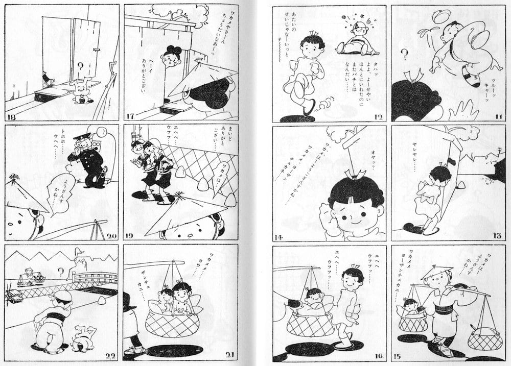
Most of the above material, plus a wide range of Matsumoto’s children’s books and magazine illustrations from the postwar decades, was in the Yayoi show. While singly Matsumoto’s illustration work is not strong enough to arrest at least my attention, with over 100 samples lined up chronologically, the charming distinction of Matsumoto’s career as a whole was easy to perceive. The Yayoi show also included interesting supplementary items in the way of other shōjo manga from the early 1930s, including work by Tagawa Suihō and his disciple Kurakane Shōsuke, Hirai Fusando, and names I have never heard of like Kawamori Hisao (Pinko ponko, 1927) and Sugita Santarō (The Adventures of Miss Japan, 1930). Matsumoto also worked in the abstracted modernist mode that characterizes many of these early examples of shōjo manga. The best-known example is the one included in Matt Thorn’s Wikipedia article on Matsumoto: the Poku chan series from 1930-34. The image below is from Poku chan and the Painting Professor (Poku chan to ekaki no shenshe, 1931). Japanese readers might note the funny spelling of “sensei” in the title. It is the protagonist’s mispronunciation, for she is Chinese. The manga, which follows their comical travels, is filled with them. The figuration is extreme. Look at their feet: nothing more than letter serifs. There’s a real pleasure in reducing bodies to what looks like quick, disconnected strokes. Meanwhile, the built world is a diagram.
After the war, Matsumoto would remodel Kurumi chan in a softened version of this Art Deco style. Yet the crucial decade – the thirties – would be marked by an obfuscation of the artist’s machine-age roots. With a view to what the mainstream of manga came to be in that decade, and with a view to how formalist discourse in manga has been structured, it is really this anti-modernism in Matsumoto’s work that matters most. Existing manga historiography is capable of consigning Matsumoto’s Jazz Age abstraction and urban chic to footnotes. What really scrambles things is The Mysterious Clover and its seemingly Disney-inspired combination of dynamic visual staging and an Anglosaxon romance with the European middle ages. The booklet makes Shishido Sakō’s Speed Tarō (published in book form in 1931) seem less like a dead-end, at the same time that it demonstrates that forms of “cinematic” dynamism need not have all stemmed from the same set of influences. Matsumoto’s sources do not appear to have been the American comic strips and Russian and German modernist films that inspired Shishido. Looking forward in time, Clover makes Tezuka’s earliest cinematic experiments of the mid-late 40s (also Disney-inspired) look decisively stiff. It also reveals what critic Ōtsuka Eiji calls Tagawa’s “Mickey Method” (Mikkii shoshiki) for what it really is: a Twenties-style “Felix Method” largely untouched by the sophistication of Disney in matters of character animation and cinematic staging. In comparison with other Disney-influenced manga of the time, Matsumoto’s Clover is also waves ahead – and that is mainly because he did not equate Disney with Mickey. His Disney was more expansive and up-to-date, and more attuned to the “naturalism” of Disney films of the mid 30s. It is only appropriate, then, that he should have latched on to Douglas Fairbanks Sr., whose cinematic presence had nothing to do with montage, extreme camera angles, or animation’s abstractions – which is to say, with the things that are usually construed as manga’s cinematic inheritance.


