When I started reading Marvel comic books in the 1970s, I was baffled by the lettering. While it didn’t appear to be typeset, the dialogue, narration, and sound effects looked too perfect to be done solely by hand. I was sure that the letterers must have had some help — maybe a weird mechanical device controlled their fingers as they worked. How else, I thought, could they form the thousands of words in a comic book’s balloons and caption boxes with such precision and consistency? Years later I learned — with some amazement, and a little disappointment — that no strange machines were involved. Letterers typically used a plastic “Ames Guide,” T-square, and pencil to create reference lines for words inked freehand. Like the artists who drew a comic’s pictures, letterers worked on pages much larger than the book’s printed size. When the original art was photographed and reduced during production, guide lines and other imperfections vanished, leaving behind only the letterer’s calligraphy.
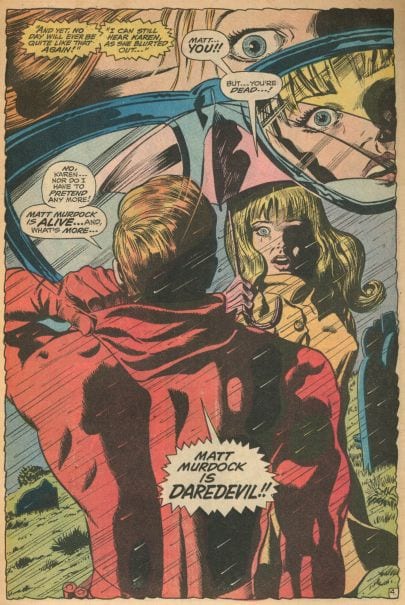
I especially loved the lettering in Marvel’s early superhero comics. Often done by Artie Simek or Sam Rosen, it looked much stronger than other companies’ text, giving the characters’ already bombastic pronouncements an even greater sense of drama:

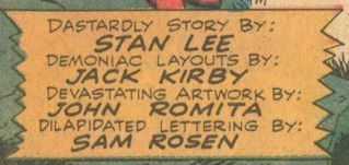
Yet I had the impression that, of all the people involved in comic-book production, letterers were considered the least important, not only by fans, but by the companies who hired them. In some of the story credits he wrote, Marvel’s Stan Lee would praise the art (and his own scripts) as “daring” or “vigorous” and then make a joke about the letterer, whose name always appeared last: “lettered with a soggy penpoint by S. Rosen.”
After reading many credits like this — and noticing that letterers regularly went unnamed in other companies’ comics — I got the message. In the comic-book production hierarchy, lettering took last place.
Though histories of comics focus on artists, writers, and editors, letterers played a crucial role in developing and expanding the aesthetic that defines the classic American comic book: oversized sound effects, text in capital letters, copious words in bold, sentences ending in ellipses or large exclamation points (seldom in the mundane, undramatic period). The power of the best mid- and late-century comics comes not only from the artist’s bold visuals, but from the writer’s prose as rendered in a strong, precise, and easily-readable hand.
Despite Lee’s occasional jokes about letterers, he understood their significance and preferred to hire those whose force and clarity matched the drawings of the artists they worked with, innovators such as Jack Kirby, John Buscema, Gene Colan, and Steve Ditko. And it was often letterers, not artists, who created a comic book’s all-important title logo, a design element almost as significant as a superhero’s costume.

**
I didn’t see Roy Lichtenstein’s comic-book paintings until long after I read my first comic, but I sensed he was drawn to the same amped-up visuals that I was. While comics could be pure kitsch, like other pulp fictions they could express emotions in moving, if at times blunt ways. Wanting to access this energy, Lichtenstein appropriated comic-book panels he described as “highly charged,” an emotional response partially generated by the imagery’s connection to his life. Having served in Europe during World War II, he was fascinated by war comics, and the sources for his “crying women” paintings, critics have claimed, often play out his troubled relationship with his then-wife; when a comic-book source featured a brunette, Lichtenstein often turned her blonde, like his wife. As Adam Gopnik rightly notes, Lichtenstein’s changes made his “images more like the comics than the comics were themselves.”(1) The artist thickened objects’ black outlines, brightened colors, and eliminated details, acts that clarified and exaggerated the originals’ graphic sensibility. But, puzzlingly, he took the opposite approach to lettering, making it less comics-like. He often ignored the originals’ careful spacing, placement, and design, all of which gave comic-book text a near machine-like accuracy and authority. Though Lichtenstein’s visuals magnify comics’ “highly charged” pop-art vibe, his lettering frequently weakens it, obscuring traces of his works’ pulp origin. To put it another way, Lichtenstein’s lettering sometimes looks kind of sloppy.
The artist has cast such a shadow that nowadays, when many people think of classic American comics imagery, they imagine, not actual comic-book panels, but Lichtenstein’s paintings and their countless pop-culture parodies. The same holds true, it seems, for comic-book publishers. Rather than dig into the company’s vast archive of romance comics for inspiration, the 2015 cover for Marvel’s Secret Love looked to Lichtenstein, especially for its lettering:

When I think about Lichtenstein’s art, I can’t help but recall what’s missing: the carefully composed, artful lettering on display in his comic-book sources. Perhaps Lichtenstein should have recruited master letterers such as Marvel’s Simek or Rosen.
**
The comics Lichtenstein appropriated were created with an aesthetic and through a printing process that emphasized the primacy of black lines. A panel’s objects were defined by strong black ink outlines that easily distinguished them from the color background, an instant legibility also shared by the text’s black all-capital letters. This mutual reliance on black marks establishes an important visual connection between a comic’s words and its pictures, a relationship apparent in this Gaspar Saladino-lettered and Irv Novick-drawn panel from a 1962 war comic:
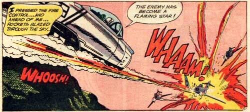
Lichtenstein revised this image for Whaam! (1963), his best-known work:

In Lichtenstein’s painting, unlike its source, the imagery’s thick black line work threatens to overwhelm the narrow, almost wobbly narration lettering. Even at the painting’s large size, the thin text skews the original comic’s word-image balance: the proportions are off. When compared to bold contours of the jet and the explosion, Whaam!’s narration, in which letters crowd together, reads like a tentative italics, the wrong format for such stark imagery. And while all of the source’s lines of text are parallel to the panel’s rectangular border, some of Lichtenstein’s lines (especially “through the sky”) slant toward the bottom right. The yellow text-box’s placement, which differs considerably from its source’s location, also makes for an odd design element: its left side merges into the jet’s tail, awkwardly blending diegetic and non-diegetic features. All of these questionable choices work against the blunt clarity central to post-war comic-book lettering design. When designing Whaam!, maybe Lichtenstein should have studied Saladino more carefully.(2)
In the first panel of his triptych As I Opened Fire (1964), Lichtenstein magnifies the pop power of this Jerry Grandenetti image from All American Men of War:
He intensifies its stylization by eliminating the plane’s nickname and the engine’s exhaust pipes:

Flat grey areas become silver, red, and blue; the propeller blades transform into a bold circular design; and the sound effect and its exclamation point swell. But, as in Whaam!, the artist seems less invested in his narration lettering, deemphasizing its compositional role by shrinking the letters’ proportions as well as their rectangular caption box, which has too much empty space on the right side. The reedy text looks like that found in comics produced by companies whose standards — and production budgets — were far lower than Marvel’s and DC’s. Needing to crank out page after page in order to eke out a living, these publishers’ letterers sometimes rushed through their work.

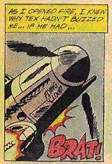
Like many of his Pop-Art peers, Lichtenstein sought to bring a machine-like industrial aesthetic to fine art, exaggerating the look generated by the limitations of commercial printing. But if he desired a “technical, almost engineering” appearance, as he often said, lettering like that in Whaam! and As I Opened Fire defeats it. Despite being hand-lettered, the source text looks far more engineered than Lichtenstein’s words. In this detail from the drawing I Know . . . Brad (1963), Lichtenstein makes what any comic-book editor would consider several mistakes, flaws that bring unwanted attention to the lettering. The “I” starts too close to the balloon’s edge and the spacing between “I” and “Know” and “Feel” and “Brad” is awkwardly inconsistent.

The distance between the “M” and the balloon’s left side and the gap between the exclamation point and the balloon’s right side differ dramatically. The top oval of the thought balloon’s tail pushes near the “RA” in “BRAD” and the lettering slopes to the lower right, out of alignment with the image’s horizontal lines, such as those that form the blinds and window sash.
By the end of the second line of text, there’s more trouble. Lichtenstein fails to leave room for the exclamation point, the most important punctuation mark in American comics history: its excessive use signifies comic’s pulpy, commercial theatricality. Having backed himself into a corner, he compromises by cramming in a tiny exclamation point that’s incongruous with the character’s melodramatic expression. (Here, as in Whaam! and elsewhere, some of his letterforms use strange proportions: the “R,” for example, features an over-sized enclosed space and a very short leg.)

Invested primarily in the meanings of Lichtenstein’s text rather than its design, art critics frequently discuss the complex semantic interaction between his paintings’ words and imagery but pay little attention to the lettering itself, especially to the kinds of problems affecting works like 1964’s I Know . . . Brad:


The last period in the ellipsis crowds the balloon’s right border (compare this spacing with that before the “M”) and the thought balloon’s bubble tail comes closer to the text than a skilled letterer would place it. He messes with another consistency rule when he creates the peculiar spacing before and after the apostrophe (it's closer to"Brad" than to "feel"), a flaw especially apparent when compared to the original’s conventional layout.
Viewing Brattata (1962) along with its Russ Heath-illustrated source reveals more of the issues that affect both versions of I Know . . . Brad:
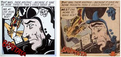
In Lichtenstein, lines of narration crowd each other and creep over the panel border on the left edge, but not the right. The dialogue threatens the word balloon’s boundaries, the spacing between words changes randomly, and the thin sound effect looks bland, lacking the original’s cartoony style. Based on a George Tuska Buck Rodgers comic-strip panel, Lichtenstein’s Emeralds (1961)
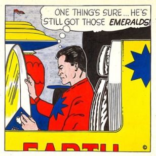
also suffers from placement and punctuation glitches (e.g., the undersized apostrophes), along with erratic shifts in the letters’ heights. His shaky, inconsistent text often looks like it was created without the help of guide lines.

Because Lichtenstein needlessly increased the gap between “those” and “emeralds,” he’s forced, as in I Know . . . Brad (1963), to shove a small exclamation point against the panel’s border. And in contrast to the distance maintained between the other words’ letters, the L, D, and S in “emeralds” nearly run together — did he forgot that bold text is thicker and therefore requires additional space?

**
In the “text and image” aesthetic of comics, words function like pictures, something Lichtenstein, in these works at least, didn’t seem to fully grasp. His lettering frequently feels like an afterthought, and its carelessness weakens his compositions. Part of comics’ pulp power resides not only in the words’ meanings but in their appearance, in the ways that their shapes interact with and echo other elements within a panel and on a page. The design errors that plague Lichtenstein’s work seldom occur in the era’s best produced comics, despite the fact that commercial letterers typically fashioned hundreds of text-filled word balloons and captions boxes per day (it’s this repetition that made them more proficient than Lichtenstein). They worked under the pressure of looming production deadlines and within the limited confines of comic-book production art pages. Given that Lichtenstein operated with large canvasses and more time to plan each detail, it’s surprising that his lettering frequently looks like a rush-job — a problem his paintings’ sizes only further exaggerate.
With its large size and place in museum collections and on gallery walls, the fine art painting invites, even appears to demand, “extended contemplation.” Yet the children’s comic book, at a size smaller than most magazines, calls only for a quick read. Unlike a painting, the mass-produced serial comic also generates its own obsolescence — another issue will always be out soon. It’s ironic, then, that the longer I look at a Simek- or Saladino-lettered comic, the more masterful it becomes. I can’t say the same of most Lichtensteins.
Working against the individualist ethos of abstract impressionism, Lichtenstein wanted to eradicate the artist’s personality from the art. Yet his lettering reveals, in ways that his images do not, the artist’s hand: the hand of a wonky letterer. Comic-book editors assigned art and lettering to different production team members, not only because a division-of-labor model sped up assembly and increased profits, but because the tasks were recognized as distinct skills. Like Lichtenstein, many comic-book artists were strong image makers but weak letterers. Perhaps to avoid Lichtenstein’s lettering difficulties, the Secret Love cover imitates its predecessor’s font but not its erratic layout and cramped spacing:

Knowing the pulp importance of the exclamation point, the letterer employs a stronger, more comic-book-y one than the weedy form Lichtenstein favored.

**
For decades, comic-book fans have bristled at the mention of Roy Lichtenstein. They believe he should have given some credit — and a lot of cash — to the artists whose work he swiped. They resent the fact that our culture celebrates millionaire fine artists, yet ignores low-brow draftsmen who labored in assembly-line obscurity. Lichtenstein’s defenders — his fans — respond to attacks on the artist by invoking “all art is appropriation” as a seemingly critique-proof way to dismiss, and even erase, the skill and originality of the commercial artists who invented and expanded the aesthetic he relied on. Lichtenstein’s achievement, they say, lies in the ways he reimagined disposable mass-produced imagery and made it museum-worthy. They’re right about this, but Lichtenstein’s imagination was curiously selective. He didn’t always see what was happening in his comic-book sources. The original panels deliver a “highly charged” effect precisely because of the semantic and design interplay between boldly drawn black-outlined images and precisely drawn black letters. By concentrating on his sources’ drawings — and not their hand-drawn words — Lichtenstein overlooked much of comic books’ graphic power.
Perhaps it’s time we look carefully at lettering and think about the people who created it. After all, Whaam!, one of the twentieth-century’s most recognizable works of art, takes its title — and much of its impact — from its sound effect lettering. It would be a happy consequence if, despite Lichtenstein’s deficiencies with text, his art helped us to appreciate the countless and frequently anonymous work-for-hire-letterers who did so much to define American Pop Art, whether it hangs on a museum wall or graces a comic-book page.
_____________________________
Notes:
1. Adam Gopnik, http://www.oberlin.edu/amam/Lichtenstein_Craig.htm
2. The Grand Comics Database (https://www.comics.org/), the most extensive source for comic-book credits, does not identify the comic’s letterer; it is certainly Gaspar Saladino, one of DC’s most talented and prolific letterers of the era. Please read seminal letterer and historian Todd Klein on Saladino: https://kleinletters.com/Blog/gaspar-saladino-1927-2016/. Full credits for the comics I cite above can be found at comics.org.
3. In 1965 Stan Lee tried to capitalize on the Pop Art movement’s visibility and legitimacy by referring to Marvel as “Marvel Pop Art Productions.” After fans complained, he quickly reverted to the earlier name.

4. Colorists, too, have not been given their due. For many decades, their names never appeared in comic-book credits. Even after letterers began to receive acknowledgment, colorists still went unnamed.
_____________________________
Ken Parille is editor of The Daniel Clowes Reader: A Critical Edition of Ghost World and Other Stories. He teaches at East Carolina University and his writing has appeared in The Best American Comics Criticism, Comic Art, Tulsa Studies in Women’s Literature, Nathaniel Hawthorne Review, Boston Review, GuitarOne, The Believer, and elsewhere.