This week, we'll be looking at paper sizes available for making comics on American photocopier machines. We will also be doing some exercises to better understand these fixed proportions. So bust out your ruler, triangle, and compass. Also, you're gonna need some 8.5 x 11 AND some 11 x 17 paper. What? You don't have a compass? Well, go out and buy one at the drug store and come back later. And buy some graph paper if you don't have any. Always comes in handy. Everyone else ready? Okay, let's get to it.
First, take a sheet of standard 8.5 x 11-inch copy paper and fold it in half along the 11 inch side. This is a standard "digest" size proportion - 5.5 x 8.5. This size is also conveniently the same proportion as North American comic books which measure 6.5 x 10.25 inches. Also this size - "half eight and a half by eleven" I like to say - is proportionate to 11 x 17. Take your 5.5 x 8.5 piece of folded paper and place it in the corner of an 11 x 17 sheet. See photo 1. Take a long ruler and notice how they are proportionate to each other. How convenient. I like to use the diagonal line trick when figuring out proportions. (I just can't deal with a proportional scale wheel.)

Maybe you knew all this, maybe you didn't. Either way the sizes of paper easily available and the dominance of certain formats for comics is something worth looking into, I think, if you're interested in comics. I think this is especially true for the maker. Understanding why certain formats "feel" right over others can guide one's creative decisions in the planning stages. Far too many times I've come across comics that were obviously printed at the wrong size in relation to the artwork. Ever see a regular "digest size" minicomic with a really wide margin at the top or bottom? It's usually because the artist drew the page on 8.5 x 11-inch paper and assumed that this proportion would shrink exactly down to the proportion of the digest size. Well, as many of you know, it doesn't shrink down exactly to that size. Regular copy paper is a wider proportion than a comic book page. So if you use 8.5 x 11 paper to draw your originals for your standard digest size mini comic then you have to create a 7 x 11 inch area to draw within to make it line up. Right? Right. Let's go to the workbook part. I promise it'll make sense.
Most comic books have what's called a "live area" where the artwork is contained - it's the containment lines that create the margins all around - and this live area is almost always 6 x 9 inches. There are lots of "full bleed" comics these days, but we're gonna talk about the kind with the margins for the sake of argument. Most North American comic books have a live area on the page of 6 x 9 inches. And that 6 x 9 area is floating on a 6.5 x 10.25-inch floppy comic book. (Comics were almost seven inches wide in the '50s and are sometimes as thin as six-and-a-quarter inches wide these days - but the live area has remained fairly consistent.)
Why 6 x 9 inches for the size of the live area? Is it strange to think that the standard six-panel grid of North American comic books was borne out of simple math? Well, instead of going into the history of how floppy comic books came into existence, let's just look at this proportion itself: 6 x 9. If you look at a two-page comic-book spread with two six-panel grids per page, you'll see a 3/4 grid. Three down, four across. And if you take out the margin between the two pages, the actual measurement of the two rectangles together is 9 x 12 inches. Didn't I read somewhere that 9 x 12 is a very harmonious proportion? Well, let's measure it.
Get out a sheet of 11 x 17 paper. Measure 14 inches on the two long sides. Draw a line and create a 11 x 14 area. Now take an X-Acto blade or scissors and cut off that three inch margin - so that all you are left with is a sheet of 11 x 14 paper. Measure in one inch on all sides of the 11 x 14 area to create a 9 x 12 area. Draw margins. See photo 2.

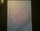
Measure 1.5 inches along each side. Connect all the dots and you should have six squares along the 9-inch side and eight squares along the 12-inch side. See photo 3.

Use a different pencil. A colored pencil. Turn the 9 x 12 page horizontally - short side east, long side north. First draw a colored pencil line around the 9 x 12-inch area itself. Now, starting at the top left corner measure over two squares - draw a line with colored pencil six squares down from north to south. Repeat every two squares. Then starting at the top left corner, measure down two squares. Draw a horizontal west to east across eight squares. Measure down four squares from top left corner. Draw another horizontal line west to east across eight squares. You have drawn one 12-panel grid or two 6-panel grids depending on how you look at it. See photo 4.

So what's so special about a 9 x 12 rectangle anyways? Or a 6 x 9 rectangle? So what, right? Okay, bust out the compass. Turn the paper so that the 12-inch sides of the area are east and west. Nine-inch sides are north and south. Find the center of the 9 x 12 area. With compass point at center and radius to the east edge of the area, draw a circle. See photo 5. Now start in the bottom left corner and measure up 6 squares. Draw a diagonal line to the bottom right corner. Start in the bottom right corner and measure up 6 squares. Draw a diagonal line to the bottom left corner. This is a square proportion. You've just drawn the "bottom square". Repeat from the top. Create "x" for the top square. Now find the center of the bottom square. With compass point at the center of the bottom square draw a circle with radius to edge of the bottom square area. Repeat with the top square area. See photos 6 and 7.


What's special about the 9 x 12 proportion is that when these circles are drawn they line up with the center of the squares that comprise the rectangle. See photo 8. There is a harmony to this proportion that is remarkable. See Le Corbusier and 3/4 grids. Try drawing a slightly different rectangle - a little wider or a little thinner - and draw the circles of the center, top, and bottom squares, and the circles won't line up in the same way. I'm not gonna go into why the 9 x 12 proportion is so special here, because I want to zero in on the paper sizes and how this all connects to making comics with copy paper. I always thought American copy-paper sizes were strange and almost arbitrary - but now I think I understand them better. Let's keep going.

So turn your 9 x 12 rectangle horizontally again. Look at your 12-panel horizontal grid. Spy the two pages - the two 6-panel grids on each side. Two halves of a perfect proportion. So 6 x 9-inch live areas somehow became the standard for the printed comic book. The 9 x 12-inch grid is separated into equal halves and a margin is included. Does that margin change the "harmony"of the 6 x 9 grid? Is the standard comic-book size a harmonious proportion? We will get to that - but let's stick with the 6 x 9 printed live area.
The 6 x 9-inch live area is proportionate to 11 x 17. Most original art for North American comic books is done at 10 x 15 inches - which is also proportionate to 11 x 17. (Basically it's so you can work on 11 x 17 paper and have a margin. If you drew the live area at 11 x 17, your border would be the edge of the page. At 10 x 15 inches, the art is drawn "one and two thirds up," although everybody says, "I drew the art 'half up.'" I think the expression "drawn half up" is something a lot of cartoonists picked up from the illustration world, where art was routinely drawn 150 percent larger than the print version. Maybe someone can correct me in the comments.)
What's interesting to me about 9 x 12 is that it is so close to 8.5 x 11-inch proportion that it made me wonder if there was some mechanical limitation that made "them" decide to make typing/copy paper 8.5 x 11 and not 9 x 12. If you do the diagonal line trick, 8.25 x 11 would be closer in proportion than 8.5 x 11. But the interesting thing is that 11 x 17 paper - which of course is just two sheets of 8.5 x 11 paper together - is proportionate to a 6 x 9 area, or half of a perfect proportion. So that means if 8.5 x 11 paper was 8.25 x 11, and closer in proportion to 9 x 12, it would throw off the 11 x 17 proportion. It would be 11 x 16.5 paper, and that would not be proportionate to 6 x 9.
So if 6 x 9 is proportionate to 11 x 17, and 6 x 9 is half of a perfect 9 x 12 proportion - would the double page spread of an 11 x 17 newspaper be proportionate to 9 x 12?
Yes, it is. The spread of an 11 x 17 newspaper - which measures 17 x 22 inches - is the same perfect proportion as 9 x 12. But like I said, if 8.5 x 11 paper were more closely proportionate to 9 x 12-inch paper, then the 11 x 17 paper proportion would be off. Hunh. So is that why an 11 x 17 newspaper comic is so pleasant to read—because of its proportion? Interesting if you think about how some 11 x 17 books don't create a 17 x 22 area when opened, because the spine prevents the book from being laid flat. Does that change the "feel" of the book that much? I doubt it, but it is something interesting to think about.
I do think that floppy 24-page comic books often "feel" better, because they can lay flat, unlike a perfect-bound comic. The 6.5 x 10.25-inch comic page is basically proportionate to a 6 x 9 rectangle and is also harmonious. But the double-page spread is constricted sometimes by glue bindings, and the double harmonious 6 x 9 created can't really stretch out to its full 9 x 12 proportion. The halves of the proportion work - the binding is a hinge - but it can feel off, simply because the binding is preventing the book from laying flat. A 24-page floppy comic book with staples can flatten out. Anyways. Something to think about.
Lastly, the live area for a random Tintin page? Proportionate to 9 x 12. So that means that the standard live area of North American and European comics relate directly to the 9 x 12-inch proportion.
NEXT WEEK: Giving up the center
thanks to MM


I love page size ratios and proportions, and your demonstration really improved my understanding of the American page sizes. It all makes more sense now.
Just for curiosity, the 6,25×10,25 inches comic book size you mentioned is very close to the Golden Ratio.
Thank you very much for the insights!
What about when the "live area" is no longer 6×9? What about all those artists that go full bleed, in full or selectively on the page? Do you think the page has lost something when this is done?
I enjoyed this, and I'm curious to see how your appreciation of the dual six panel grid jives with your center panel love.
fascinating. amongst so much chaos, we find "unparalleled" order
Great stuff.
For a Golden Rectangle:
With a compass, put a square on the left side of a rectangular sheet, its side corresponding exactly to the rectangle's short side.
Bisect the square horizontally.
Extend a straightline from the bottom left-hand corner of the square through the point wher the bisection intersects with the right-hand side of the square and prolong it until it intersects the upper side of the rectangle.
Drop a perpendicular line from this intersection.
The resulting rectangle is a Golden Rectangle.
Try it, Frank!
Maybe I've watched too many nature shows lately, but looking at image 8 it starts to make sense why a natural preference for that ratio would emerge. That grid lines up almost perfectly with our field of vision, including the focal area where our eyes converge. As predators, humans evolved with eyes front on our head and our stereoscopic vision lines up in the middle in a manner that almost looks as if that's what Frank was trying to describe. This simple proportion is likely based on two eyes fixing an image onto the skin of a dead animal (which is where most believe the preference for rectangular pages came from- the stretched skin of a dead animal making a natural rectangle once you remove the appendages). Where are they most likely to place an image? Right where the lines of vision naturally converge. Started looking to see if I could find anything to back up this hunch and found this image which to me doesn't look far off from Frank's 8th image: http://www.ssa.gov/disability/professionals/blueb…
Now look at that chart combined with Frank's eighth image! http://www.flickr.com/photos/joewilly/5529363402/
Wow. I'd say they line up perfectly (given that Frank's image is just slightly tilted).
This is nitpicking I know & probably missing the point but … you say 11 x 16.5 […] would not be proportionate to 6 x 9. Both of those ratios are exactly 2:3. 11 x 17 is 1/2 inch wider.