Don’t expect to find this on any list of “Great Comic Book Pages”:
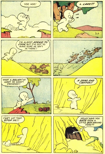
It appears to lack what such pages typically offer: a conspicuous use of the comics form that highlights the artist’s drawing and design skills. Harvey comics, which feature characters such as Casper, Richie Rich, and Little Dot, aren’t known for their compositional creativity. In fact, they’re often derided as bland and formulaic. Typically, a Harvey comic book’s title announces the theme that drives countless plots. In Casper the Friendly Ghost, for example, Casper’s repeated attempts at friendliness are thwarted by his ghostliness—he accidentally scares would-be companions. The company’s visual strategies are equally basic: this page from “Search Party” consists of sparsely-filled, same-sized panels all drawn as ‘wide shots’ (showing the full character and his environment) and colored with a limited flat palette. But we shouldn’t be fooled into thinking that Harvey’s reliance on a few narrative ‘blueprints’ guarantees an uninteresting comic or reflects an unexceptional design sensibility. The more we look (or at least the more I look) at this page, the more carefully organized and attractive it becomes. It may even be great. . .
Employing a linear and transparent sense of time (i.e., elapsed fictional time approximates reading time), the page develops repetitive visual and emotional rhythms: anticipation followed by disappointment or relief. Searching for a lost boy, Casper quickly navigates numerous topographical features, moving from valley to lake and then from canyon to cave via a series of magical entries and exits. The page begins and ends symmetrically, with openings: the valley’s gap in panel 1 and the cave’s entrance in panel 8.
Consistently positioned toward left of center, Casper looks and moves from left to right; these are hyper-conventional choices in an American comic, which, like prose, reads left to right. In “Search Party,” a character violates this directional movement constraint only once; during the climatic scene, a villainous bear runs the opposite way after he’s frightened by our hero:
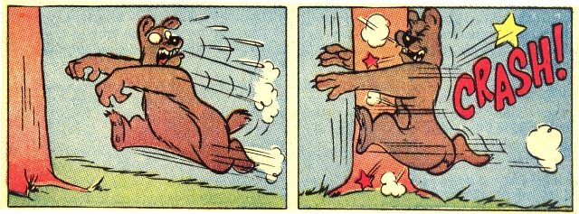
This scene features the only time in the story in which a panel border's integrity is violated:

The artist (most likely Harvey mainstay Warren Kremer) makes a customary choice by using a democratic grid, a layout of same-sized panels. Most two-panel rows form a question-answer or call-response unit, a pairing visually emphasized in rows 1-3, where a landscape line in the first panel aligns with one across the gutter—I’ve added red lines to show these connections:

As a momentary variation—a release from a pattern—Casper disappears in the grid’s important last panel (the dark cave appears in the location occupied by the white ghost in previous panels). This anomaly sets up the next page’s opening joke (a comic exit), whose visual comic timing is created by the pause produced by the page turn:

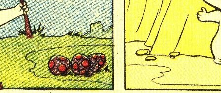
Row 3 features a visual echo that’s easily overlooked. A group of mushrooms in the left panel correspond to a group of rocks in the right:
Like the question/answer pairing, this echo binds consecutive panels into a design unit. While the artist’s choices are unexceptional, he executes the streamlined visuals, anxious gags, and rapid pacing with a confident sense of economy and zero affectation.
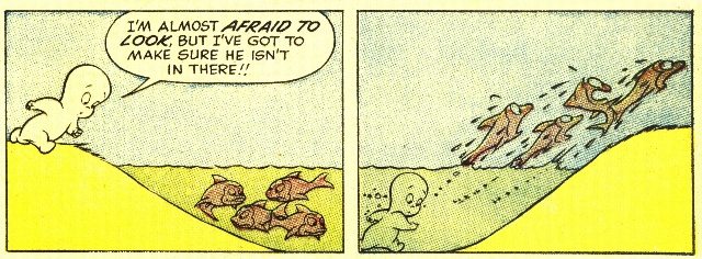
By contrast, the second row is oddly innovative. It creates more interpretive potential than readers might expect from a mass-produced children’s comic—and its unusual synthetic point-of-view (POV) highlights the “special mechanics of comics”:
The first panel is stranger than it initially looks. On its left side, we see Casper descending a grassy ridge. He appears to walk toward us a slight angle. This side offers a possible perspective, one that any character in Casper’s world would be able to share. The panel's right side, however, can be processed in different, even contradictory ways: as a skewed perspective of fish swimming near the water’s surface and/or a diagrammatic cross-section perspective that figuratively slices through reality. This cross-section creates an impossible perspective, simultaneously showing underground and above-ground. No character within the fictional world could reproduce this POV: even from beneath the surface, the perspective is inaccessible—it’s artificial.* By blending two POVs within a single panel—it’s not clear where one ends and the other starts—the artist does more than employ discrete perspectives: he devises a new, synthetic POV to keep the gag moving.
Unlike the two-part first panel, the entire second panel is a conventional cross-section. While such an artificial perspective might be jarring in a film—a sudden violation of the established POV—comic readers tend to naturalize “unnatural” perspectives. Because the medium is inherently diagrammatic, forms like the cross-section—a fantasy POV—fail to register as a ‘disruption.’ In comics, form itself can as much a fantasy as the narrative—when compared to our world, formal structures can be ‘impossible.’ And despite the sequence’s ambiguity, the two-panel set-up and joke are instantly legible. When viewed simultaneously—as their design encourages—the panels form a curious representation of a lake, affirming comics’ structural affinity with diagrams. Adding to the overall strangeness, the grass and dirt in this sequence are yellow and the lake water is green.
The page’s careful construction doesn’t advertise itself as graphically interesting, though it is. Harvey’s elegantly bleak, un-cinematic minimalism stems from the company’s house style, perhaps the longest-running “look” in the history of American comic books, lasting from the 1940s through the ’80s. A series of imperatives about page layout, panel composition, and coloring, the house style was designed to be quickly produced by artists and colorists and instantly consumed by child readers.
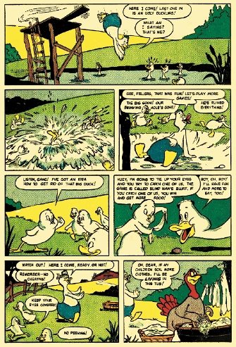
This commitment to ‘standardized simplicity’ unifies the hundreds of Harvey titles and thousands of stories into a single fictional world that’s far more visually and thematically coherent than that of any other American comics publisher.** Harvey’s formulas shouldn’t discourage us from seeing their comics’ virtues. Sometimes, the perfect execution of simple narrative ideas makes for a great page—and great comics.
CODA:
When selecting great pages, many readers choose layouts containing little or no text, perhaps believing that narration or dialogue disrupts a composition’s integrity, preventing us from processing a page as a coherent design. Given readers' repeated claim that comics’ uniqueness stems from its combination of words and images, it’s surprising that the presence of text would be seen as an ‘impediment to greatness.’ This may be another example of the ‘visual bias’ that many readers bring to comics . . .
_____________________________________________________________
NOTES:
* If the entire first panel were a cross-section, Casper’s right leg likely wouldn’t extend below the plane of the ground.
** In late 1970s promotional ads, Harvey claims to have sold over a billion comic books.


